# Icon
Renders a Phosphor icon with size and color set through class names.
Icon is an open-source mobile component from suiss/uim for React Native and Expo, with SwiftUI and Jetpack Compose versions built from the same design tokens. The @esuiss/uim CLI copies its source into your project, so you own the code.
Source: https://uim.suiss.app/docs/components/icon

```tsx
import { StarIcon } from "phosphor-react-native"
import { Icon } from "@/components/ui/icon"
export function IconExample() {
return (
)
}
```
```swift
import EsuissUI
import PhosphorSwift
import SwiftUI
struct IconExample: View {
var body: some View {
IconGlyph(image: Ph.star.regular)
}
}
struct IconGlyph: View {
let image: Image
var size: CGFloat = 20
var color: Color = .label
var body: some View {
image
.resizable()
.scaledToFit()
.frame(width: size, height: size)
.foregroundStyle(color)
}
}
```
```kotlin
import androidx.compose.foundation.layout.Arrangement
import androidx.compose.foundation.layout.Row
import androidx.compose.runtime.Composable
import androidx.compose.ui.Alignment
import androidx.compose.ui.unit.dp
import com.adamglin.PhosphorIcons
import com.adamglin.phosphoricons.Regular
import com.adamglin.phosphoricons.regular.Star
import com.esuiss.ui.components.Icon
@Composable
fun IconRow(content: @Composable () -> Unit) {
Row(horizontalArrangement = Arrangement.spacedBy(16.dp), verticalAlignment = Alignment.CenterVertically) {
content()
}
}
@Composable
fun IconDefault() {
IconRow {
Icon(PhosphorIcons.Regular.Star, contentDescription = null)
}
}
```
`Icon` takes a Phosphor icon component in `as` and maps `size-*` classes to its size and `text-*` classes to its color. It defaults to `size-5 text-label`.
Icons inherit text and icon classes from their parent, so an `Icon` inside a `Button`, `Badge` or menu item picks up the right size and color without extra classes. Components provide these through `IconClassContext`.
## Installation
```bash title="Terminal"
npx @esuiss/uim@latest add icon
```
```bash title="Terminal"
npx @esuiss/uim@latest add icon --platform swift
```
```bash title="Terminal"
npx @esuiss/uim@latest add icon --platform kotlin
```
The CLI also adds what it builds on: [Text](/docs/components/text).
### Manual
**Uniwind**
1. Install the dependencies:
```bash title="Terminal"
npx expo install cn phosphor-react-native react-native-svg uniwind
```
2. Add the pieces it builds on: [Text](/docs/components/text).
3. Copy the source into `components/ui/icon.tsx`:
```tsx title="uniwind/components/ui/icon.tsx"
import { cn } from "cn"
import type {
Icon as PhosphorIcon,
IconProps as PhosphorIconProps,
} from "phosphor-react-native"
import * as React from "react"
import { withUniwind } from "uniwind"
import { TextClassContext } from "@/components/ui/text"
type IconProps = PhosphorIconProps & {
as: PhosphorIcon
className?: string
}
const IconClassContext = React.createContext(undefined)
function IconImpl({ as: IconComponent, ...props }: IconProps) {
return
}
const StyledIcon = withUniwind(IconImpl, {
size: {
fromClassName: "className",
styleProperty: "width",
},
color: {
fromClassName: "className",
styleProperty: "color",
},
})
function Icon({ as: IconComponent, className, ...props }: IconProps) {
const textClass = React.useContext(TextClassContext)
const iconClass = React.useContext(IconClassContext)
return (
)
}
export type { IconProps }
export { Icon, IconClassContext }
```
4. Update the import paths to match your project.
**NativeWind**
1. Install the dependencies:
```bash title="Terminal"
npx expo install cn nativewind phosphor-react-native react-native-svg
```
2. Add the pieces it builds on: [Text](/docs/components/text).
3. Copy the source into `components/ui/icon.tsx`:
```tsx title="nativewind/components/ui/icon.tsx"
import { cn } from "cn"
import { cssInterop } from "nativewind"
import type {
Icon as PhosphorIcon,
IconProps as PhosphorIconProps,
} from "phosphor-react-native"
import * as React from "react"
import { TextClassContext } from "@/components/ui/text"
type IconProps = PhosphorIconProps & {
as: PhosphorIcon
className?: string
}
const IconClassContext = React.createContext(undefined)
function IconImpl({ as: IconComponent, ...props }: IconProps) {
return
}
const StyledIcon = cssInterop(IconImpl, {
className: {
target: "style",
nativeStyleToProp: {
color: true,
width: "size",
},
},
})
function Icon({ as: IconComponent, className, ...props }: IconProps) {
const textClass = React.useContext(TextClassContext)
const iconClass = React.useContext(IconClassContext)
return (
)
}
export type { IconProps }
export { Icon, IconClassContext }
```
4. Update the import paths to match your project.
**StyleSheet**
1. Install the dependencies:
```bash title="Terminal"
npx expo install phosphor-react-native react-native-svg
```
2. Add the pieces it builds on: [Text](/docs/components/text).
3. Copy the source into `components/ui/icon.tsx`:
```tsx title="stylesheet/components/ui/icon.tsx"
import type {
Icon as PhosphorIcon,
IconProps as PhosphorIconProps,
} from "phosphor-react-native"
import * as React from "react"
import { TextStyleContext } from "@/components/ui/text"
import { useTheme } from "@/components/ui/theme"
type IconProps = PhosphorIconProps & {
as: PhosphorIcon
}
const IconSizeContext = React.createContext(undefined)
function Icon({ as: IconComponent, size, color, ...props }: IconProps) {
const { colors } = useTheme()
const inherited = React.useContext(TextStyleContext)
const inheritedSize = React.useContext(IconSizeContext)
const inheritedColor =
typeof inherited?.color === "string" ? inherited.color : undefined
return (
)
}
export type { IconProps }
export { Icon, IconSizeContext }
```
4. Update the import paths to match your project.
**Jetpack Compose**
1. Set `minSdk` to 24 or higher and add the dependencies:
```kotlin title="build.gradle.kts"
implementation(platform("androidx.compose:compose-bom:2026.09.00"))
implementation("androidx.compose.foundation:foundation")
implementation("androidx.compose.ui:ui")
```
2. Copy the theme files every view uses:
```kt title="kotlin/theme/Theme.kt"
package com.esuiss.ui.theme
import androidx.compose.foundation.isSystemInDarkTheme
import androidx.compose.runtime.Composable
import androidx.compose.runtime.CompositionLocalProvider
import androidx.compose.runtime.Immutable
import androidx.compose.runtime.staticCompositionLocalOf
import androidx.compose.ui.Modifier
import androidx.compose.ui.draw.dropShadow
import androidx.compose.ui.graphics.Color
import androidx.compose.ui.graphics.Shape
import androidx.compose.ui.graphics.shadow.Shadow as DropShadow
import androidx.compose.ui.text.TextStyle
import androidx.compose.ui.text.style.LineHeightStyle
import androidx.compose.ui.unit.Dp
import androidx.compose.ui.unit.DpOffset
import androidx.compose.ui.unit.em
import androidx.compose.ui.unit.sp
internal fun textStyle(size: Double, lineHeight: Double, letterSpacing: Double) = TextStyle(
fontSize = size.sp,
lineHeight = lineHeight.sp,
letterSpacing = letterSpacing.em,
lineHeightStyle = LineHeightStyle(
alignment = LineHeightStyle.Alignment.Center,
trim = LineHeightStyle.Trim.None,
),
)
@Immutable
data class Shadow(
val offsetX: Dp,
val offsetY: Dp,
val blur: Dp,
val color: Color,
)
fun Modifier.shadow(shadow: Shadow, shape: Shape): Modifier = dropShadow(
shape,
DropShadow(
radius = shadow.blur,
color = shadow.color,
offset = DpOffset(shadow.offsetX, shadow.offsetY),
),
)
val LocalColors = staticCompositionLocalOf { LightColors }
object EsuissTheme {
val colors: Colors
@Composable get() = LocalColors.current
val typography: Typography
get() = Typography
val radius: Radius
get() = Radius
val shadows: Shadows
get() = Shadows
}
@Composable
fun EsuissTheme(
darkTheme: Boolean = isSystemInDarkTheme(),
content: @Composable () -> Unit,
) {
CompositionLocalProvider(
LocalColors provides if (darkTheme) DarkColors else LightColors,
content = content,
)
}
```
```kt title="kotlin/theme/Tokens.kt"
package com.esuiss.ui.theme
import androidx.compose.runtime.Immutable
import androidx.compose.ui.graphics.Color
import androidx.compose.ui.unit.dp
@Immutable
data class Colors(
val surface: Color,
val surfaceSecondary: Color,
val surfaceTertiary: Color,
val surfaceRaised: Color,
val label: Color,
val labelSecondary: Color,
val labelTertiary: Color,
val labelQuaternary: Color,
val control: Color,
val controlPressed: Color,
val controlSelected: Color,
val controlDisabled: Color,
val onControlSelected: Color,
val itemPressed: Color,
val itemSelected: Color,
val separator: Color,
val separatorStrong: Color,
val accent: Color,
val accentPressed: Color,
val accentSelected: Color,
val accentDisabled: Color,
val onAccent: Color,
val accentSurface: Color,
val accentSurfacePressed: Color,
val link: Color,
val focus: Color,
val scrim: Color,
val media: Color,
val onMedia: Color,
val danger: Color,
val dangerSurface: Color,
val dangerSurfacePressed: Color,
val success: Color,
val successSurface: Color,
val warning: Color,
val warningSurface: Color,
val blue: Color,
val green: Color,
val orange: Color,
val red: Color,
val yellow: Color,
val purple: Color,
val pink: Color,
val indigo: Color,
val teal: Color,
val mint: Color,
val cyan: Color,
val brown: Color,
val gray: Color,
val isDark: Boolean,
)
val LightColors = Colors(
surface = Color(0xFFFFFFFF),
surfaceSecondary = Color(0xFFF5F5F7),
surfaceTertiary = Color(0xFFE8E8ED),
surfaceRaised = Color(0xFFFFFFFF),
label = Color(0xFF1D1D1F),
labelSecondary = Color(0xFF6E6E73),
labelTertiary = Color(0xFF86868B),
labelQuaternary = Color(0xFFD2D2D7),
control = Color(0xFF000000).copy(alpha = 0.04f),
controlPressed = Color(0xFF000000).copy(alpha = 0.12f),
controlSelected = Color(0xFF1D1D1F),
controlDisabled = Color(0xFF000000).copy(alpha = 0.03f),
onControlSelected = Color(0xFFFFFFFF),
itemPressed = Color(0xFF000000).copy(alpha = 0.08f),
itemSelected = Color(0xFF000000).copy(alpha = 0.06f),
separator = Color(0xFFD2D2D7),
separatorStrong = Color(0xFF86868B),
accent = Color(0xFF0071E3),
accentPressed = Color(0xFF005BB8),
accentSelected = Color(0xFF0071E3),
accentDisabled = Color(0xFF0071E3).copy(alpha = 0.4f),
onAccent = Color(0xFFFFFFFF),
accentSurface = Color(0xFF0071E3).copy(alpha = 0.09f),
accentSurfacePressed = Color(0xFF0071E3).copy(alpha = 0.18f),
link = Color(0xFF0066CC),
focus = Color(0xFF0071E3),
scrim = Color(0xFF000000).copy(alpha = 0.48f),
media = Color(0xFF000000),
onMedia = Color(0xFFFFFFFF),
danger = Color(0xFFD0000A),
dangerSurface = Color(0xFFD70015).copy(alpha = 0.08f),
dangerSurfacePressed = Color(0xFFD70015).copy(alpha = 0.16f),
success = Color(0xFF008009),
successSurface = Color(0xFFEFFAF1),
warning = Color(0xFFB64400),
warningSurface = Color(0xFFFFF5EA),
blue = Color(0xFF007AFF),
green = Color(0xFF34C759),
orange = Color(0xFFFF9500),
red = Color(0xFFFF3B30),
yellow = Color(0xFFFFCC00),
purple = Color(0xFFAF52DE),
pink = Color(0xFFFF2D55),
indigo = Color(0xFF5856D6),
teal = Color(0xFF30B0C7),
mint = Color(0xFF00C7BE),
cyan = Color(0xFF32ADE6),
brown = Color(0xFFA2845E),
gray = Color(0xFF8E8E93),
isDark = false,
)
val DarkColors = Colors(
surface = Color(0xFF000000),
surfaceSecondary = Color(0xFF161617),
surfaceTertiary = Color(0xFF2C2C2E),
surfaceRaised = Color(0xFF1D1D1F),
label = Color(0xFFF5F5F7),
labelSecondary = Color(0xFFA1A1A6),
labelTertiary = Color(0xFF86868B),
labelQuaternary = Color(0xFF424245),
control = Color(0xFFFFFFFF).copy(alpha = 0.1f),
controlPressed = Color(0xFFFFFFFF).copy(alpha = 0.22f),
controlSelected = Color(0xFFF5F5F7),
controlDisabled = Color(0xFFFFFFFF).copy(alpha = 0.05f),
onControlSelected = Color(0xFF000000),
itemPressed = Color(0xFFFFFFFF).copy(alpha = 0.12f),
itemSelected = Color(0xFFFFFFFF).copy(alpha = 0.1f),
separator = Color(0xFF424245),
separatorStrong = Color(0xFF6E6E73),
accent = Color(0xFF0071E3),
accentPressed = Color(0xFF004D9E),
accentSelected = Color(0xFF0071E3),
accentDisabled = Color(0xFF0071E3).copy(alpha = 0.4f),
onAccent = Color(0xFFFFFFFF),
accentSurface = Color(0xFF0071E3).copy(alpha = 0.18f),
accentSurfacePressed = Color(0xFF0071E3).copy(alpha = 0.3f),
link = Color(0xFF2997FF),
focus = Color(0xFF0071E3),
scrim = Color(0xFF000000).copy(alpha = 0.48f),
media = Color(0xFF000000),
onMedia = Color(0xFFFFFFFF),
danger = Color(0xFFFF5447),
dangerSurface = Color(0xFFFF453A).copy(alpha = 0.2f),
dangerSurfacePressed = Color(0xFFFF453A).copy(alpha = 0.36f),
success = Color(0xFF30D158),
successSurface = Color(0xFF30D158).copy(alpha = 0.16f),
warning = Color(0xFFFF9F0A),
warningSurface = Color(0xFFFF9F0A).copy(alpha = 0.16f),
blue = Color(0xFF0A84FF),
green = Color(0xFF30D158),
orange = Color(0xFFFF9F0A),
red = Color(0xFFFF453A),
yellow = Color(0xFFFFD60A),
purple = Color(0xFFBF5AF2),
pink = Color(0xFFFF375F),
indigo = Color(0xFF5E5CE6),
teal = Color(0xFF40C8E0),
mint = Color(0xFF66D4CF),
cyan = Color(0xFF64D2FF),
brown = Color(0xFFAC8E68),
gray = Color(0xFF8E8E93),
isDark = true,
)
object Radius {
val xs = 3.dp
val sm = 5.dp
val md = 8.dp
val lg = 10.dp
val xl = 12.dp
val xl2 = 18.dp
val xl3 = 28.dp
val full = 9999.dp
}
object Typography {
val xs3 = textStyle(11.0, 13.0, 0.006)
val xs2 = textStyle(12.0, 16.0, 0.0)
val xs = textStyle(13.0, 18.0, -0.006)
val sm = textStyle(15.0, 20.0, -0.016)
val md = textStyle(16.0, 21.0, -0.02)
val base = textStyle(17.0, 22.0, -0.026)
val lg = textStyle(20.0, 25.0, -0.023)
val xl = textStyle(22.0, 28.0, -0.012)
val xl2 = textStyle(28.0, 34.0, 0.014)
val xl3 = textStyle(34.0, 41.0, 0.012)
val all = listOf(xs3, xs2, xs, sm, md, base, lg, xl, xl2, xl3)
}
object Shadows {
val md = Shadow(2.dp, 4.dp, 12.dp, Color.Black.copy(alpha = 0.08f))
val lg = Shadow(0.dp, 4.dp, 24.dp, Color.Black.copy(alpha = 0.12f))
}
```
3. Copy the source and every file it uses:
```kt title="kotlin/components/Icon.kt"
package com.esuiss.ui.components
import androidx.compose.foundation.Image
import androidx.compose.foundation.layout.size
import androidx.compose.runtime.Composable
import androidx.compose.ui.Modifier
import androidx.compose.ui.graphics.Color
import androidx.compose.ui.graphics.ColorFilter
import androidx.compose.ui.graphics.takeOrElse
import androidx.compose.ui.graphics.vector.ImageVector
import androidx.compose.ui.unit.Dp
import com.esuiss.ui.theme.EsuissTheme
@Composable
fun Icon(
imageVector: ImageVector,
contentDescription: String?,
modifier: Modifier = Modifier,
size: Dp = LocalIconSize.current,
tint: Color = LocalContentColor.current.takeOrElse { EsuissTheme.colors.label },
) {
Image(
imageVector = imageVector,
contentDescription = contentDescription,
modifier = modifier.size(size),
colorFilter = ColorFilter.tint(tint),
)
}
```
```kt title="kotlin/components/Content.kt"
package com.esuiss.ui.components
import androidx.compose.runtime.compositionLocalOf
import androidx.compose.ui.graphics.Color
import androidx.compose.ui.text.TextStyle
import androidx.compose.ui.unit.Dp
import androidx.compose.ui.unit.dp
val LocalContentStyle = compositionLocalOf { TextStyle.Default }
val LocalContentColor = compositionLocalOf { Color.Unspecified }
val LocalIconSize = compositionLocalOf { 20.dp }
```
4. Update the `com.esuiss.ui` package names to match your project.
## Usage
```tsx
import { Icon } from "@/components/ui/icon"
```
```tsx
```
Pass the icon component, not an element: ``. Override the size and color with `className`, such as `size-6 text-danger`. Other Phosphor props, such as `weight` and `mirrored`, are passed through.
Wrap a subtree in `IconClassContext.Provider` to set default classes for the icons inside your own components.
## Examples
### Sizes
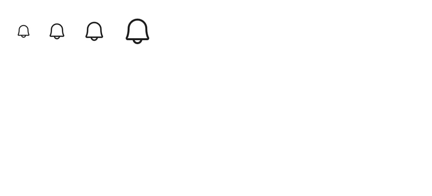
Icons at several `size-*` classes.
```tsx
import { BellIcon } from "phosphor-react-native"
import { View } from "react-native"
import { Icon } from "@/components/ui/icon"
export function IconSizesExample() {
return (
)
}
```
```swift
import EsuissUI
import PhosphorSwift
import SwiftUI
struct IconSizesExample: View {
var body: some View {
HStack(spacing: 16) {
IconGlyph(image: Ph.bell.regular, size: 16)
IconGlyph(image: Ph.bell.regular)
IconGlyph(image: Ph.bell.regular, size: 24)
IconGlyph(image: Ph.bell.regular, size: 32)
}
}
}
struct IconGlyph: View {
let image: Image
var size: CGFloat = 20
var color: Color = .label
var body: some View {
image
.resizable()
.scaledToFit()
.frame(width: size, height: size)
.foregroundStyle(color)
}
}
```
```kotlin
import androidx.compose.foundation.layout.Arrangement
import androidx.compose.foundation.layout.Row
import androidx.compose.runtime.Composable
import androidx.compose.ui.Alignment
import androidx.compose.ui.unit.dp
import com.adamglin.PhosphorIcons
import com.adamglin.phosphoricons.Regular
import com.adamglin.phosphoricons.regular.Bell
import com.esuiss.ui.components.Icon
@Composable
fun IconRow(content: @Composable () -> Unit) {
Row(horizontalArrangement = Arrangement.spacedBy(16.dp), verticalAlignment = Alignment.CenterVertically) {
content()
}
}
@Composable
fun IconSizes() {
IconRow {
Icon(PhosphorIcons.Regular.Bell, contentDescription = null, size = 16.dp)
Icon(PhosphorIcons.Regular.Bell, contentDescription = null)
Icon(PhosphorIcons.Regular.Bell, contentDescription = null, size = 24.dp)
Icon(PhosphorIcons.Regular.Bell, contentDescription = null, size = 32.dp)
}
}
```
### Colors
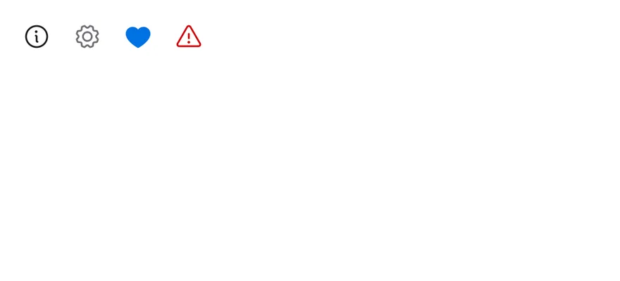
Icons in different color tokens.
```tsx
import { GearIcon, HeartIcon, InfoIcon, WarningIcon } from "phosphor-react-native"
import { View } from "react-native"
import { Icon } from "@/components/ui/icon"
export function IconColorsExample() {
return (
)
}
```
```swift
import EsuissUI
import PhosphorSwift
import SwiftUI
struct IconColorsExample: View {
var body: some View {
HStack(spacing: 16) {
IconGlyph(image: Ph.info.regular)
IconGlyph(image: Ph.gear.regular, color: .labelSecondary)
IconGlyph(image: Ph.heart.fill, color: .accent)
IconGlyph(image: Ph.warning.regular, color: .danger)
}
}
}
struct IconGlyph: View {
let image: Image
var size: CGFloat = 20
var color: Color = .label
var body: some View {
image
.resizable()
.scaledToFit()
.frame(width: size, height: size)
.foregroundStyle(color)
}
}
```
```kotlin
import androidx.compose.foundation.layout.Arrangement
import androidx.compose.foundation.layout.Row
import androidx.compose.runtime.Composable
import androidx.compose.ui.Alignment
import androidx.compose.ui.unit.dp
import com.adamglin.PhosphorIcons
import com.adamglin.phosphoricons.Fill
import com.adamglin.phosphoricons.Regular
import com.adamglin.phosphoricons.regular.Gear
import com.adamglin.phosphoricons.regular.Info
import com.adamglin.phosphoricons.regular.Warning
import com.esuiss.ui.components.Icon
import com.esuiss.ui.theme.EsuissTheme
@Composable
fun IconRow(content: @Composable () -> Unit) {
Row(horizontalArrangement = Arrangement.spacedBy(16.dp), verticalAlignment = Alignment.CenterVertically) {
content()
}
}
@Composable
fun IconColors() {
val colors = EsuissTheme.colors
IconRow {
Icon(PhosphorIcons.Regular.Info, contentDescription = null)
Icon(PhosphorIcons.Regular.Gear, contentDescription = null, tint = colors.labelSecondary)
Icon(PhosphorIcons.Fill.FillHeart, contentDescription = null, tint = colors.accent)
Icon(PhosphorIcons.Regular.Warning, contentDescription = null, tint = colors.danger)
}
}
```
### Weights
The available Phosphor weights.

```tsx
import { StarIcon } from "phosphor-react-native"
import { View } from "react-native"
import { Icon } from "@/components/ui/icon"
export function IconWeightsExample() {
return (
)
}
```
```swift
import EsuissUI
import PhosphorSwift
import SwiftUI
struct IconWeightsExample: View {
var body: some View {
HStack(spacing: 16) {
IconGlyph(image: Ph.star.thin, size: 24)
IconGlyph(image: Ph.star.light, size: 24)
IconGlyph(image: Ph.star.regular, size: 24)
IconGlyph(image: Ph.star.bold, size: 24)
IconGlyph(image: Ph.star.fill, size: 24)
IconGlyph(image: Ph.star.duotone, size: 24)
}
}
}
struct IconGlyph: View {
let image: Image
var size: CGFloat = 20
var color: Color = .label
var body: some View {
image
.resizable()
.scaledToFit()
.frame(width: size, height: size)
.foregroundStyle(color)
}
}
```
```kotlin
import androidx.compose.foundation.layout.Arrangement
import androidx.compose.foundation.layout.Row
import androidx.compose.runtime.Composable
import androidx.compose.ui.Alignment
import androidx.compose.ui.unit.dp
import com.adamglin.PhosphorIcons
import com.adamglin.phosphoricons.Bold
import com.adamglin.phosphoricons.Duotone
import com.adamglin.phosphoricons.Fill
import com.adamglin.phosphoricons.Light
import com.adamglin.phosphoricons.Regular
import com.adamglin.phosphoricons.Thin
import com.adamglin.phosphoricons.regular.Star
import com.esuiss.ui.components.Icon
@Composable
fun IconRow(content: @Composable () -> Unit) {
Row(horizontalArrangement = Arrangement.spacedBy(16.dp), verticalAlignment = Alignment.CenterVertically) {
content()
}
}
@Composable
fun IconWeights() {
IconRow {
Icon(PhosphorIcons.Thin.ThinStar, contentDescription = null, size = 24.dp)
Icon(PhosphorIcons.Light.LightStar, contentDescription = null, size = 24.dp)
Icon(PhosphorIcons.Regular.Star, contentDescription = null, size = 24.dp)
Icon(PhosphorIcons.Bold.BoldStar, contentDescription = null, size = 24.dp)
Icon(PhosphorIcons.Fill.FillStar, contentDescription = null, size = 24.dp)
Icon(PhosphorIcons.Duotone.DuotoneStar, contentDescription = null, size = 24.dp)
}
}
```
## API Reference
### Icon
Styled Phosphor icon.
## Accessibility
- Icons have no label of their own. When an icon is the only content of a pressable, give the pressable an `accessibilityLabel`.
## Notes
- The default color is the `text-label` token, so icons follow light and dark mode with the system appearance.