# Chart

Line, area, bar, pie, radial and radar charts drawn with SVG, with touch tooltips and legends.

Chart is an open-source mobile component from suiss/uim for React Native and Expo, with SwiftUI and Jetpack Compose versions built from the same design tokens. The @esuiss/uim CLI copies its source into your project, so you own the code.

Source: https://uim.suiss.app/docs/components/chart
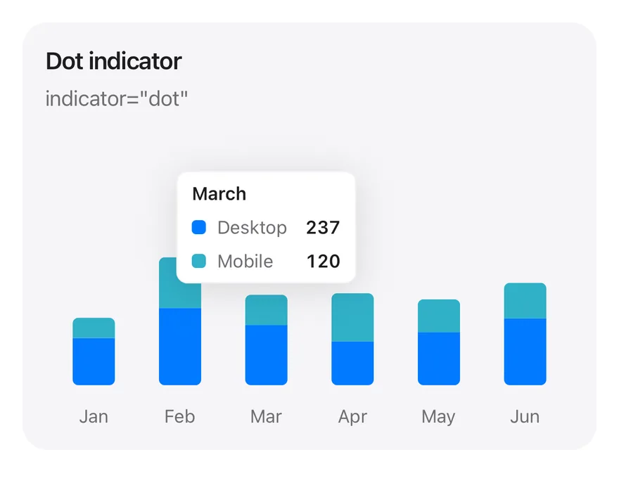
![Preview](https://uim.suiss.app/previews/components-chart--tooltip-dot.light.webp)

```tsx
import * as React from "react"
import { Card, CardContent, CardDescription, CardHeader, CardTitle } from "@/components/ui/card"
import { Bar, BarChart, type ChartConfig, ChartContainer, ChartTooltip, ChartTooltipContent, XAxis } from "@/components/ui/chart"

const monthData = [
  { month: "January", desktop: 186, mobile: 80 },
  { month: "February", desktop: 305, mobile: 200 },
  { month: "March", desktop: 237, mobile: 120 },
  { month: "April", desktop: 173, mobile: 190 },
  { month: "May", desktop: 209, mobile: 130 },
  { month: "June", desktop: 264, mobile: 140 },
]

const deviceConfig = {
  desktop: { label: "Desktop", color: "blue" },
  mobile: { label: "Mobile", color: "teal" },
} satisfies ChartConfig

function StackedTooltipChart({
  title,
  description,
  defaultIndex,
  content,
}: {
  title: string
  description: string
  defaultIndex: number
  content: React.ReactElement
}) {
  return (
    <Card variant="filled" size="sm">
      <CardHeader>
        <CardTitle>{title}</CardTitle>
        <CardDescription>{description}</CardDescription>
      </CardHeader>
      <CardContent>
        <ChartContainer
          config={deviceConfig}
          accessibilityLabel={title}
          className="h-52 w-full"
        >
          <BarChart
            data={monthData}
            margin={{ top: 70, right: 4, left: 4, bottom: 0 }}
          >
            <XAxis
              dataKey="month"
              tickMargin={8}
              interval={0}
              tickFormatter={(value: string) => value.slice(0, 3)}
            />
            <ChartTooltip
              defaultIndex={defaultIndex}
              cursor={false}
              content={content}
            />
            <Bar
              dataKey="desktop"
              stackId="a"
              radius={[0, 0, 4, 4]}
              maxBarSize={30}
            />
            <Bar
              dataKey="mobile"
              stackId="a"
              radius={[4, 4, 0, 0]}
              maxBarSize={30}
            />
          </BarChart>
        </ChartContainer>
      </CardContent>
    </Card>
  )
}

export function ChartTooltipDotExample() {
  return (
    <StackedTooltipChart
      title="Dot indicator"
      description='indicator="dot"'
      defaultIndex={2}
      content={<ChartTooltipContent indicator="dot" />}
    />
  )
}
```

```swift
import Charts
import EsuissUI
import SwiftUI

struct ChartTooltipDotExample: View {
  var body: some View {
    ChartStackedTooltip(title: "Dot indicator", description: "indicator=\"dot\"", defaultIndex: 2) { payload in
      ChartTooltipContent(payload, indicator: .dot)
    }
  }
}

let chartMonthData: [(month: String, desktop: Double, mobile: Double)] = [
  ("January", 186, 80),
  ("February", 305, 200),
  ("March", 237, 120),
  ("April", 173, 190),
  ("May", 209, 130),
  ("June", 264, 140),
]

let chartDevices: ChartConfig = [
  "desktop": .init("Desktop", color: .blue),
  "mobile": .init("Mobile", color: .teal),
]

struct ChartStackedTooltip<Tooltip: View>: View {
  let title: String
  let description: String
  var config = chartDevices
  let defaultIndex: Int
  @ViewBuilder let tooltip: (ChartTooltipPayload) -> Tooltip

  var body: some View {
    Card(.filled, size: .sm) {
      CardHeader(LocalizedStringKey(title), description: LocalizedStringKey(description))
      CardContent {
        ChartContainer(config: config) {
          ChartAnimator(animationDuration: 400) { progress in
            Chart {
              ForEach(chartMonthData.indices, id: \.self) { index in
                let item = chartMonthData[index]
                BarMark(
                  x: .value("Month", item.month),
                  yStart: .value("Start", 0),
                  yEnd: .value("Desktop", item.desktop * progress),
                  width: .fixed(30)
                )
                .clipShape(UnevenRoundedRectangle(bottomLeadingRadius: 4, bottomTrailingRadius: 4, style: .continuous))
                .foregroundStyle(config.color("desktop"))
                BarMark(
                  x: .value("Month", item.month),
                  yStart: .value("Start", item.desktop * progress),
                  yEnd: .value("Mobile", (item.desktop + item.mobile) * progress),
                  width: .fixed(30)
                )
                .clipShape(UnevenRoundedRectangle(topLeadingRadius: 4, topTrailingRadius: 4, style: .continuous))
                .foregroundStyle(config.color("mobile"))
                ChartAnchorMark(x: .value("Month", item.month), y: .value("Mobile", item.desktop + item.mobile))
              }
            }
            .chartYScale(range: .plotDimension(endPadding: 70))
            .chartXAxis { ChartAxis.x(values: chartMonthData.map(\.month)) { String($0.prefix(3)) } }
            .chartYAxis(.hidden)
            .chartTooltip(
              x: chartMonthData.map(\.month),
              defaultIndex: defaultIndex,
              cursor: false,
              accessibilityLabel: title,
              items: { index in
                [
                  ChartTooltipItem("desktop", value: chartMonthData[index].desktop),
                  ChartTooltipItem("mobile", value: chartMonthData[index].mobile),
                ]
              },
              content: tooltip
            )
          }
        }
        .frame(height: 208)
      }
    }
  }
}
```

```kotlin
import androidx.compose.foundation.layout.fillMaxWidth
import androidx.compose.foundation.layout.height
import androidx.compose.runtime.Composable
import androidx.compose.ui.Modifier
import androidx.compose.ui.unit.dp
import com.adamglin.phosphoricons.regular.Desktop
import com.esuiss.ui.components.BarChart
import com.esuiss.ui.components.Card
import com.esuiss.ui.components.CardContent
import com.esuiss.ui.components.CardHeader
import com.esuiss.ui.components.CardSize
import com.esuiss.ui.components.CardVariant
import com.esuiss.ui.components.ChartConfig
import com.esuiss.ui.components.ChartConfigItem
import com.esuiss.ui.components.ChartContainer
import com.esuiss.ui.components.ChartMargin
import com.esuiss.ui.components.ChartRadius
import com.esuiss.ui.components.ChartTooltipContent
import com.esuiss.ui.components.ChartTooltipIndicator
import com.esuiss.ui.components.ChartTooltipScope

@Composable
fun ChartTooltipDotExample() {
    ChartStackedTooltip("Dot indicator", "indicator=\"dot\"", 2) { ChartTooltipContent(indicator = ChartTooltipIndicator.Dot) }
}

class ChartMonth(val month: String, val desktop: Double, val mobile: Double)

val chartMonthData = listOf(
    ChartMonth("January", 186.0, 80.0),
    ChartMonth("February", 305.0, 200.0),
    ChartMonth("March", 237.0, 120.0),
    ChartMonth("April", 173.0, 190.0),
    ChartMonth("May", 209.0, 130.0),
    ChartMonth("June", 264.0, 140.0),
)

val chartDeviceConfig = ChartConfig(
    "desktop" to ChartConfigItem("Desktop") { blue },
    "mobile" to ChartConfigItem("Mobile") { teal },
)

@Composable
fun ChartTooltipCard(title: String, description: String, content: @Composable () -> Unit) {
    Card(variant = CardVariant.Filled, size = CardSize.Sm) {
        CardHeader(title, description = description)
        CardContent { content() }
    }
}

@Composable
fun ChartStackedTooltip(
    title: String,
    description: String,
    defaultIndex: Int,
    config: ChartConfig = chartDeviceConfig,
    tooltip: @Composable ChartTooltipScope.() -> Unit,
) {
    ChartTooltipCard(title, description) {
        ChartContainer(config, Modifier.fillMaxWidth().height(208.dp)) {
            BarChart(
                chartMonthData,
                margin = ChartMargin(top = 70.dp, right = 4.dp, bottom = 0.dp, left = 4.dp),
                accessibilityLabel = title,
            ) {
                XAxis(label = { it.month }, tickMargin = 8.dp, interval = 0, tickFormatter = { it.take(3) })
                ChartTooltip(defaultIndex = defaultIndex, cursor = null, content = tooltip)
                Bar("desktop", value = { it.desktop }, stackId = "a", radius = ChartRadius(0.dp, 0.dp, 4.dp, 4.dp), maxBarSize = 30.dp)
                Bar("mobile", value = { it.mobile }, stackId = "a", radius = ChartRadius(4.dp, 4.dp, 0.dp, 0.dp), maxBarSize = 30.dp)
            }
        }
    }
}
```

Charts are composed declaratively: a chart root such as `LineChart`, `AreaChart`, `BarChart`, `ComposedChart`, `PieChart`, `RadialBarChart` or `RadarChart` goes inside a `ChartContainer`, and series and axes such as `Line`, `Area`, `Bar`, `XAxis`, `YAxis` and `CartesianGrid` are added as children. These child components render nothing themselves; the root reads them and draws everything with `react-native-svg`.

Charts animate in when they first render: bars grow from the baseline, lines draw along their path, areas reveal from left to right, pie and radial sectors sweep open and radar shapes grow from the center. When the data changes, shapes animate from their previous values to the new ones.

Colors are theme tokens, not hex values. A series `color` such as `blue`, `teal` or `accent` resolves to the current token color, so charts follow light and dark mode automatically.

## Installation

```bash title="Terminal"
npx @esuiss/uim@latest add chart
```

```bash title="Terminal"
npx @esuiss/uim@latest add chart --platform swift
```

```bash title="Terminal"
npx @esuiss/uim@latest add chart --platform kotlin
```

The CLI also adds what it builds on: [Icon](/docs/components/icon), [Text](/docs/components/text).

### Manual

**Uniwind**

1. Install the dependencies:

```bash title="Terminal"
npx expo install cn phosphor-react-native react-native-svg
```

2. Add the pieces it builds on: [Icon](/docs/components/icon), [Text](/docs/components/text), and the primitives `components/primitives/chart.tsx`.

3. Copy the source into `components/ui/chart.tsx`:

```tsx title="uniwind/components/ui/chart.tsx"
import { cn } from "cn"
import type {
  Icon as PhosphorIcon,
  IconProps as PhosphorIconProps,
} from "phosphor-react-native"
import * as React from "react"
import { View } from "react-native"
import Svg, {
  Circle,
  ClipPath,
  Defs,
  LinearGradient,
  Path,
  Rect,
  Stop,
} from "react-native-svg"
import * as ChartPrimitive from "@/components/primitives/chart"
import { Icon } from "@/components/ui/icon"
import { Text, TextClassContext } from "@/components/ui/text"

const CHART_COLORS = {
  blue: { text: "text-blue", bg: "bg-blue", border: "border-blue" },
  green: { text: "text-green", bg: "bg-green", border: "border-green" },
  orange: { text: "text-orange", bg: "bg-orange", border: "border-orange" },
  red: { text: "text-red", bg: "bg-red", border: "border-red" },
  yellow: { text: "text-yellow", bg: "bg-yellow", border: "border-yellow" },
  purple: { text: "text-purple", bg: "bg-purple", border: "border-purple" },
  pink: { text: "text-pink", bg: "bg-pink", border: "border-pink" },
  indigo: { text: "text-indigo", bg: "bg-indigo", border: "border-indigo" },
  teal: { text: "text-teal", bg: "bg-teal", border: "border-teal" },
  mint: { text: "text-mint", bg: "bg-mint", border: "border-mint" },
  cyan: { text: "text-cyan", bg: "bg-cyan", border: "border-cyan" },
  brown: { text: "text-brown", bg: "bg-brown", border: "border-brown" },
  gray: { text: "text-gray", bg: "bg-gray", border: "border-gray" },
  accent: { text: "text-accent", bg: "bg-accent", border: "border-accent" },
  success: { text: "text-success", bg: "bg-success", border: "border-success" },
  danger: { text: "text-danger", bg: "bg-danger", border: "border-danger" },
  warning: { text: "text-warning", bg: "bg-warning", border: "border-warning" },
  link: { text: "text-link", bg: "bg-link", border: "border-link" },
  control: { text: "text-control", bg: "bg-control", border: "border-control" },
  label: { text: "text-label", bg: "bg-label", border: "border-label" },
  "label-secondary": {
    text: "text-label-secondary",
    bg: "bg-label-secondary",
    border: "border-label-secondary",
  },
  "label-tertiary": {
    text: "text-label-tertiary",
    bg: "bg-label-tertiary",
    border: "border-label-tertiary",
  },
  "label-quaternary": {
    text: "text-label-quaternary",
    bg: "bg-label-quaternary",
    border: "border-label-quaternary",
  },
  separator: {
    text: "text-separator",
    bg: "bg-separator",
    border: "border-separator",
  },
  "separator-strong": {
    text: "text-separator-strong",
    bg: "bg-separator-strong",
    border: "border-separator-strong",
  },
  surface: { text: "text-surface", bg: "bg-surface", border: "border-surface" },
  "surface-secondary": {
    text: "text-surface-secondary",
    bg: "bg-surface-secondary",
    border: "border-surface-secondary",
  },
  "surface-raised": {
    text: "text-surface-raised",
    bg: "bg-surface-raised",
    border: "border-surface-raised",
  },
  "on-accent": {
    text: "text-on-accent",
    bg: "bg-on-accent",
    border: "border-on-accent",
  },
} as const

type ChartColor = keyof typeof CHART_COLORS

type ChartConfig = Record<
  string,
  { label?: string; color?: ChartColor; icon?: PhosphorIcon }
>

const DEFAULT_COLORS: ChartPrimitive.DefaultColors = {
  grid: "separator",
  cursor: "separator",
  spoke: "separator-strong",
  reference: "separator",
  fallback: "label",
}

const TEXT_CLASS: Record<ChartPrimitive.TextItem["role"], string> = {
  tick: "text-xs text-label-secondary",
  label: "text-xs font-semibold text-label",
  reference: "text-xs font-semibold text-label-secondary",
}

function isChartColor(value: string | undefined): value is ChartColor {
  return value !== undefined && value in CHART_COLORS
}

type PaletteRender = (color: string) => React.ReactNode

const PaletteContext = React.createContext<PaletteRender | null>(null)

function PaletteSwatch({ color }: PhosphorIconProps) {
  const render = React.useContext(PaletteContext)
  return <>{render?.(color ?? "transparent")}</>
}

function ChartPalette({
  colors,
  children,
}: {
  colors: readonly ChartColor[]
  children: (palette: Partial<Record<ChartColor, string>>) => React.ReactNode
}) {
  const resolve = (
    index: number,
    palette: Partial<Record<ChartColor, string>>
  ): React.ReactNode => {
    const token = colors[index]
    if (token === undefined) return children(palette)
    return (
      <PaletteContext.Provider
        value={(value) => resolve(index + 1, { ...palette, [token]: value })}
      >
        <Icon as={PaletteSwatch} className={CHART_COLORS[token].text} />
      </PaletteContext.Provider>
    )
  }
  return <>{resolve(0, {})}</>
}

function shapeColors(shapes: ChartPrimitive.Shape[]) {
  const colors = new Set<ChartColor>()
  for (const shape of shapes) {
    if (isChartColor(shape.fill)) colors.add(shape.fill)
    if (isChartColor(shape.stroke)) colors.add(shape.stroke)
    for (const stop of shape.gradient?.stops ?? []) {
      if (isChartColor(stop.color)) colors.add(stop.color)
    }
  }
  return [...colors]
}

function ChartSurface({ shapes, width, height }: ChartPrimitive.SurfaceProps) {
  const id = React.useId().replace(/[^\w-]/g, "")
  return (
    <ChartPalette colors={shapeColors(shapes)}>
      {(palette) => {
        const paint = (token: string | undefined) =>
          isChartColor(token) ? (palette[token] ?? "transparent") : "none"
        return (
          <Svg width={width} height={height}>
            <Defs>
              {shapes
                .filter((shape) => shape.gradient)
                .map((shape) => (
                  <LinearGradient
                    key={shape.key}
                    id={`${id}-${shape.key}`}
                    x1="0"
                    y1="0"
                    x2={shape.gradient?.horizontal ? "1" : "0"}
                    y2={shape.gradient?.horizontal ? "0" : "1"}
                  >
                    {shape.gradient?.stops.map((stop) => (
                      <Stop
                        key={`${stop.offset}-${stop.color}`}
                        offset={stop.offset}
                        stopColor={paint(stop.color)}
                        stopOpacity={stop.opacity}
                      />
                    ))}
                  </LinearGradient>
                ))}
              {shapes.map((shape) =>
                shape.clip ? (
                  <ClipPath
                    key={`${shape.key}-clip`}
                    id={`${id}-${shape.key}-clip`}
                  >
                    <Rect
                      x={shape.clip.x}
                      y={shape.clip.y}
                      width={shape.clip.width}
                      height={shape.clip.height}
                    />
                  </ClipPath>
                ) : null
              )}
            </Defs>
            {shapes.map((shape) => {
              const fill = shape.gradient
                ? `url(#${id}-${shape.key})`
                : paint(shape.fill)
              const key = shape.clip ? `${shape.key}-clipped` : shape.key
              const clipPath = shape.clip
                ? `url(#${id}-${shape.key}-clip)`
                : undefined
              if (shape.circle) {
                return (
                  <Circle
                    key={key}
                    clipPath={clipPath}
                    cx={shape.circle.cx}
                    cy={shape.circle.cy}
                    r={shape.circle.r}
                    fill={fill}
                    fillOpacity={shape.fillOpacity}
                    stroke={paint(shape.stroke)}
                    strokeWidth={shape.strokeWidth}
                  />
                )
              }
              return (
                <Path
                  key={key}
                  clipPath={clipPath}
                  d={shape.d}
                  fill={fill}
                  fillOpacity={shape.fillOpacity}
                  stroke={paint(shape.stroke)}
                  strokeWidth={shape.strokeWidth}
                  strokeOpacity={shape.strokeOpacity}
                  strokeDasharray={shape.strokeDasharray}
                />
              )
            })}
          </Svg>
        )
      }}
    </ChartPalette>
  )
}

function renderSurface(props: ChartPrimitive.SurfaceProps) {
  return <ChartSurface {...props} />
}

function renderText(text: ChartPrimitive.TextItem) {
  return (
    <Text
      numberOfLines={1}
      className={cn(TEXT_CLASS[text.role], text.className)}
    >
      {text.value}
    </Text>
  )
}

const SIZED = /(^|\s)(h-|size-|aspect-)/

function ChartContainer({
  className,
  ...props
}: Omit<ChartPrimitive.ContainerProps, "config"> & {
  config: ChartConfig
}) {
  return (
    <ChartPrimitive.Container
      className={cn(
        "w-full",
        !SIZED.test(className ?? "") && "aspect-video",
        className
      )}
      {...props}
    />
  )
}

function useChart() {
  const { config } = ChartPrimitive.useContainerContext()
  return { config: config as ChartConfig }
}

type ChartRootProps = Pick<
  ChartPrimitive.RootProps,
  "onActiveIndexChange" | "children"
>

type CartesianChartProps = ChartRootProps &
  Pick<ChartPrimitive.RootProps, "data" | "margin">

function LineChart(props: CartesianChartProps) {
  return (
    <ChartPrimitive.Root
      kind="line"
      colors={DEFAULT_COLORS}
      renderSurface={renderSurface}
      renderText={renderText}
      {...props}
    />
  )
}

function AreaChart(
  props: CartesianChartProps & Pick<ChartPrimitive.RootProps, "stackOffset">
) {
  return (
    <ChartPrimitive.Root
      kind="area"
      colors={DEFAULT_COLORS}
      renderSurface={renderSurface}
      renderText={renderText}
      {...props}
    />
  )
}

function BarChart(
  props: CartesianChartProps &
    Pick<ChartPrimitive.RootProps, "layout" | "barGap" | "barCategoryGap">
) {
  return (
    <ChartPrimitive.Root
      kind="bar"
      colors={DEFAULT_COLORS}
      renderSurface={renderSurface}
      renderText={renderText}
      {...props}
    />
  )
}

function ComposedChart(props: CartesianChartProps) {
  return (
    <ChartPrimitive.Root
      kind="composed"
      colors={DEFAULT_COLORS}
      renderSurface={renderSurface}
      renderText={renderText}
      {...props}
    />
  )
}

function PieChart(
  props: ChartRootProps & Pick<ChartPrimitive.RootProps, "margin">
) {
  return (
    <ChartPrimitive.Root
      kind="pie"
      colors={DEFAULT_COLORS}
      renderSurface={renderSurface}
      renderText={renderText}
      {...props}
    />
  )
}

function RadialBarChart(
  props: ChartRootProps &
    Pick<
      ChartPrimitive.RootProps,
      | "data"
      | "margin"
      | "innerRadius"
      | "outerRadius"
      | "startAngle"
      | "endAngle"
      | "barSize"
      | "cx"
      | "cy"
    >
) {
  return (
    <ChartPrimitive.Root
      kind="radial"
      colors={DEFAULT_COLORS}
      renderSurface={renderSurface}
      renderText={renderText}
      {...props}
    />
  )
}

function RadarChart(
  props: ChartRootProps &
    Pick<ChartPrimitive.RootProps, "data" | "margin" | "outerRadius" | "cy">
) {
  return (
    <ChartPrimitive.Root
      kind="radar"
      colors={DEFAULT_COLORS}
      renderSurface={renderSurface}
      renderText={renderText}
      {...props}
    />
  )
}

const CartesianGrid: (props: ChartPrimitive.CartesianGridProps) => null =
  ChartPrimitive.CartesianGrid

const XAxis: (props: ChartPrimitive.XAxisProps) => null = ChartPrimitive.XAxis

const YAxis: (props: Omit<ChartPrimitive.YAxisProps, "tickStyle">) => null =
  ChartPrimitive.YAxis

const Line: (props: ChartPrimitive.LineProps<ChartColor>) => null =
  ChartPrimitive.Line

const Area: (props: ChartPrimitive.AreaProps<ChartColor>) => null =
  ChartPrimitive.Area

const Bar: (props: ChartPrimitive.BarProps<ChartColor>) => null =
  ChartPrimitive.Bar

const ReferenceLine: (
  props: ChartPrimitive.ReferenceLineProps<ChartColor>
) => null = ChartPrimitive.ReferenceLine

const ReferenceArea: (
  props: ChartPrimitive.ReferenceAreaProps<ChartColor>
) => null = ChartPrimitive.ReferenceArea

const LabelList: (props: Omit<ChartPrimitive.LabelListProps, "style">) => null =
  ChartPrimitive.LabelList

const Cell: (props: ChartPrimitive.CellProps<ChartColor>) => null =
  ChartPrimitive.Cell

const Pie: (props: ChartPrimitive.PieProps<ChartColor>) => null =
  ChartPrimitive.Pie

const RadialBar: (props: ChartPrimitive.RadialBarProps<ChartColor>) => null =
  ChartPrimitive.RadialBar

const PolarAngleAxis: (
  props: Omit<ChartPrimitive.PolarAngleAxisProps, "tickStyle">
) => null = ChartPrimitive.PolarAngleAxis

const PolarRadiusAxis: (
  props: Omit<ChartPrimitive.PolarRadiusAxisProps, "tickStyle">
) => null = ChartPrimitive.PolarRadiusAxis

const PolarGrid: (props: ChartPrimitive.PolarGridProps<ChartColor>) => null =
  ChartPrimitive.PolarGrid

const Radar: (props: ChartPrimitive.RadarProps<ChartColor>) => null =
  ChartPrimitive.Radar

const ChartTooltip: (props: ChartPrimitive.TooltipProps<ChartColor>) => null =
  ChartPrimitive.Tooltip

const ChartLegend: (props: ChartPrimitive.LegendProps) => null =
  ChartPrimitive.Legend

function configKeyOf(
  config: ChartConfig,
  item: { payload?: ChartPrimitive.ChartDatum },
  key: string
) {
  const value = item.payload?.[key]
  if (typeof value === "string" && value in config) return value
  return key
}

function wrapText(node: React.ReactNode, className?: string) {
  if (typeof node === "string" || typeof node === "number") {
    return <Text className={className}>{node}</Text>
  }
  return node
}

function ChartTooltipContent({
  className,
  indicator = "dot",
  hideLabel = false,
  hideIndicator = false,
  labelFormatter,
  formatter,
  nameKey,
}: {
  className?: string
  indicator?: "line" | "dot" | "dashed"
  hideLabel?: boolean
  hideIndicator?: boolean
  nameKey?: string
  labelFormatter?: (
    label: React.ReactNode,
    payload: ChartPrimitive.TooltipItem[]
  ) => React.ReactNode
  formatter?: (
    value: ChartPrimitive.ChartValue,
    name: string,
    item: ChartPrimitive.TooltipItem,
    index: number,
    payload: ChartPrimitive.ChartDatum
  ) => React.ReactNode
}) {
  const { config } = useChart()
  const { active, payload, label } = ChartPrimitive.useTooltipContext()
  const [first] = payload
  if (!active || !first) return null
  let tooltipLabel: React.ReactNode = null
  if (!hideLabel) {
    const itemConfig = config[configKeyOf(config, first, first.dataKey)]
    const value =
      typeof label === "string"
        ? (config[label]?.label ?? label)
        : itemConfig?.label
    const content = labelFormatter ? labelFormatter(value, payload) : value
    if (content !== undefined && content !== null && content !== "") {
      tooltipLabel = (
        <TextClassContext.Provider value="text-xs font-semibold text-label">
          {wrapText(content)}
        </TextClassContext.Provider>
      )
    }
  }
  const nestLabel = payload.length === 1 && indicator !== "dot"
  return (
    <TextClassContext.Provider value="text-xs text-label">
      <View
        className={cn(
          "min-w-32 gap-1.5 rounded-md border border-label/5 bg-surface-raised px-2.5 py-1.5 shadow-lg dark:border-label/10",
          className
        )}
      >
        {nestLabel ? null : tooltipLabel}
        <View className="gap-1.5">
          {payload.map((item, index) => {
            const key = nameKey ?? item.name ?? item.dataKey
            const itemConfig = config[configKeyOf(config, item, key)]
            const color = isChartColor(item.color)
              ? CHART_COLORS[item.color]
              : undefined
            return (
              <View
                key={`${item.dataKey}-${item.name}`}
                className={cn(
                  "w-full flex-row gap-2",
                  indicator === "dot" ? "items-center" : "items-stretch"
                )}
              >
                {formatter ? (
                  wrapText(
                    formatter(item.value, item.name, item, index, item.payload)
                  )
                ) : (
                  <>
                    {itemConfig?.icon ? (
                      <Icon
                        as={itemConfig.icon}
                        className="size-2.5 text-label-secondary"
                      />
                    ) : hideIndicator ? null : (
                      <View
                        className={cn(
                          "shrink-0 rounded-xs",
                          indicator === "dot" && cn("size-2.5", color?.bg),
                          indicator === "line" && cn("w-1", color?.bg),
                          indicator === "dashed" &&
                            cn(
                              "w-0 border-[1.5px] border-dashed",
                              color?.border
                            ),
                          nestLabel && indicator === "dashed" && "my-0.5"
                        )}
                      />
                    )}
                    <View
                      className={cn(
                        "grow flex-row justify-between gap-2",
                        nestLabel ? "items-end" : "items-center"
                      )}
                    >
                      <View className="gap-1.5">
                        {nestLabel ? tooltipLabel : null}
                        <Text className="text-xs text-label-secondary">
                          {itemConfig?.label ?? item.name}
                        </Text>
                      </View>
                      <Text className="font-mono text-xs font-semibold text-label tabular-nums">
                        {ChartPrimitive.formatValue(item.value)}
                      </Text>
                    </View>
                  </>
                )}
              </View>
            )
          })}
        </View>
      </View>
    </TextClassContext.Provider>
  )
}

function ChartLegendContent({
  className,
  nameKey,
}: {
  className?: string
  nameKey?: string
}) {
  const { config } = useChart()
  const items = ChartPrimitive.useLegendContext()
  if (!items.length) return null
  const keys = Object.keys(config)
  const resolved = items.map((item) => {
    const key = nameKey ?? item.dataKey
    const configKey =
      typeof item.payload?.[key] === "string"
        ? String(item.payload[key])
        : item.value in config
          ? item.value
          : item.dataKey
    return { item, configKey }
  })
  const order = (key: string) => {
    const index = keys.indexOf(key)
    return index === -1 ? keys.length : index
  }
  resolved.sort((a, b) => order(a.configKey) - order(b.configKey))
  return (
    <View
      className={cn(
        "flex-row flex-wrap items-center justify-center gap-x-4 gap-y-1.5 pt-3",
        className
      )}
    >
      {resolved.map(({ item, configKey }) => {
        const itemConfig = config[configKey]
        return (
          <View
            key={`${item.dataKey}-${item.value}`}
            className="flex-row items-center gap-1.5"
          >
            {itemConfig?.icon ? (
              <Icon
                as={itemConfig.icon}
                className="size-3 text-label-secondary"
              />
            ) : (
              <View
                className={cn(
                  "size-2 shrink-0 rounded-xs",
                  isChartColor(item.color) && CHART_COLORS[item.color].bg
                )}
              />
            )}
            <Text className="text-xs text-label">{itemConfig?.label}</Text>
          </View>
        )
      })}
    </View>
  )
}

export type { ChartColor, ChartConfig }
export {
  Area,
  AreaChart,
  Bar,
  BarChart,
  CartesianGrid,
  Cell,
  ChartContainer,
  ChartLegend,
  ChartLegendContent,
  ChartPalette,
  ChartTooltip,
  ChartTooltipContent,
  ComposedChart,
  LabelList,
  Line,
  LineChart,
  Pie,
  PieChart,
  PolarAngleAxis,
  PolarGrid,
  PolarRadiusAxis,
  Radar,
  RadarChart,
  RadialBar,
  RadialBarChart,
  ReferenceArea,
  ReferenceLine,
  useChart,
  XAxis,
  YAxis,
}
```

4. Update the import paths to match your project.

**NativeWind**

1. Install the dependencies:

```bash title="Terminal"
npx expo install cn phosphor-react-native react-native-svg
```

2. Add the pieces it builds on: [Icon](/docs/components/icon), [Text](/docs/components/text), and the primitives `components/primitives/chart.tsx`.

3. Copy the source into `components/ui/chart.tsx`:

```tsx title="nativewind/components/ui/chart.tsx"
import { cn } from "cn"
import type {
  Icon as PhosphorIcon,
  IconProps as PhosphorIconProps,
} from "phosphor-react-native"
import * as React from "react"
import { View } from "react-native"
import Svg, {
  Circle,
  ClipPath,
  Defs,
  LinearGradient,
  Path,
  Rect,
  Stop,
} from "react-native-svg"
import * as ChartPrimitive from "@/components/primitives/chart"
import { Icon } from "@/components/ui/icon"
import { Text, TextClassContext } from "@/components/ui/text"

const CHART_COLORS = {
  blue: { text: "text-blue", bg: "bg-blue", border: "border-blue" },
  green: { text: "text-green", bg: "bg-green", border: "border-green" },
  orange: { text: "text-orange", bg: "bg-orange", border: "border-orange" },
  red: { text: "text-red", bg: "bg-red", border: "border-red" },
  yellow: { text: "text-yellow", bg: "bg-yellow", border: "border-yellow" },
  purple: { text: "text-purple", bg: "bg-purple", border: "border-purple" },
  pink: { text: "text-pink", bg: "bg-pink", border: "border-pink" },
  indigo: { text: "text-indigo", bg: "bg-indigo", border: "border-indigo" },
  teal: { text: "text-teal", bg: "bg-teal", border: "border-teal" },
  mint: { text: "text-mint", bg: "bg-mint", border: "border-mint" },
  cyan: { text: "text-cyan", bg: "bg-cyan", border: "border-cyan" },
  brown: { text: "text-brown", bg: "bg-brown", border: "border-brown" },
  gray: { text: "text-gray", bg: "bg-gray", border: "border-gray" },
  accent: { text: "text-accent", bg: "bg-accent", border: "border-accent" },
  success: { text: "text-success", bg: "bg-success", border: "border-success" },
  danger: { text: "text-danger", bg: "bg-danger", border: "border-danger" },
  warning: { text: "text-warning", bg: "bg-warning", border: "border-warning" },
  link: { text: "text-link", bg: "bg-link", border: "border-link" },
  control: { text: "text-control", bg: "bg-control", border: "border-control" },
  label: { text: "text-label", bg: "bg-label", border: "border-label" },
  "label-secondary": {
    text: "text-label-secondary",
    bg: "bg-label-secondary",
    border: "border-label-secondary",
  },
  "label-tertiary": {
    text: "text-label-tertiary",
    bg: "bg-label-tertiary",
    border: "border-label-tertiary",
  },
  "label-quaternary": {
    text: "text-label-quaternary",
    bg: "bg-label-quaternary",
    border: "border-label-quaternary",
  },
  separator: {
    text: "text-separator",
    bg: "bg-separator",
    border: "border-separator",
  },
  "separator-strong": {
    text: "text-separator-strong",
    bg: "bg-separator-strong",
    border: "border-separator-strong",
  },
  surface: { text: "text-surface", bg: "bg-surface", border: "border-surface" },
  "surface-secondary": {
    text: "text-surface-secondary",
    bg: "bg-surface-secondary",
    border: "border-surface-secondary",
  },
  "surface-raised": {
    text: "text-surface-raised",
    bg: "bg-surface-raised",
    border: "border-surface-raised",
  },
  "on-accent": {
    text: "text-on-accent",
    bg: "bg-on-accent",
    border: "border-on-accent",
  },
} as const

type ChartColor = keyof typeof CHART_COLORS

type ChartConfig = Record<
  string,
  { label?: string; color?: ChartColor; icon?: PhosphorIcon }
>

const DEFAULT_COLORS: ChartPrimitive.DefaultColors = {
  grid: "separator",
  cursor: "separator",
  spoke: "separator-strong",
  reference: "separator",
  fallback: "label",
}

const TEXT_CLASS: Record<ChartPrimitive.TextItem["role"], string> = {
  tick: "text-xs text-label-secondary",
  label: "text-xs font-semibold text-label",
  reference: "text-xs font-semibold text-label-secondary",
}

function isChartColor(value: string | undefined): value is ChartColor {
  return value !== undefined && value in CHART_COLORS
}

type PaletteRender = (color: string) => React.ReactNode

const PaletteContext = React.createContext<PaletteRender | null>(null)

function PaletteSwatch({ color }: PhosphorIconProps) {
  const render = React.useContext(PaletteContext)
  return <>{render?.(color ?? "transparent")}</>
}

function ChartPalette({
  colors,
  children,
}: {
  colors: readonly ChartColor[]
  children: (palette: Partial<Record<ChartColor, string>>) => React.ReactNode
}) {
  const resolve = (
    index: number,
    palette: Partial<Record<ChartColor, string>>
  ): React.ReactNode => {
    const token = colors[index]
    if (token === undefined) return children(palette)
    return (
      <PaletteContext.Provider
        value={(value) => resolve(index + 1, { ...palette, [token]: value })}
      >
        <Icon as={PaletteSwatch} className={CHART_COLORS[token].text} />
      </PaletteContext.Provider>
    )
  }
  return <>{resolve(0, {})}</>
}

function shapeColors(shapes: ChartPrimitive.Shape[]) {
  const colors = new Set<ChartColor>()
  for (const shape of shapes) {
    if (isChartColor(shape.fill)) colors.add(shape.fill)
    if (isChartColor(shape.stroke)) colors.add(shape.stroke)
    for (const stop of shape.gradient?.stops ?? []) {
      if (isChartColor(stop.color)) colors.add(stop.color)
    }
  }
  return [...colors]
}

function ChartSurface({ shapes, width, height }: ChartPrimitive.SurfaceProps) {
  const id = React.useId().replace(/[^\w-]/g, "")
  return (
    <ChartPalette colors={shapeColors(shapes)}>
      {(palette) => {
        const paint = (token: string | undefined) =>
          isChartColor(token) ? (palette[token] ?? "transparent") : "none"
        return (
          <Svg width={width} height={height}>
            <Defs>
              {shapes
                .filter((shape) => shape.gradient)
                .map((shape) => (
                  <LinearGradient
                    key={shape.key}
                    id={`${id}-${shape.key}`}
                    x1="0"
                    y1="0"
                    x2={shape.gradient?.horizontal ? "1" : "0"}
                    y2={shape.gradient?.horizontal ? "0" : "1"}
                  >
                    {shape.gradient?.stops.map((stop) => (
                      <Stop
                        key={`${stop.offset}-${stop.color}`}
                        offset={stop.offset}
                        stopColor={paint(stop.color)}
                        stopOpacity={stop.opacity}
                      />
                    ))}
                  </LinearGradient>
                ))}
              {shapes.map((shape) =>
                shape.clip ? (
                  <ClipPath
                    key={`${shape.key}-clip`}
                    id={`${id}-${shape.key}-clip`}
                  >
                    <Rect
                      x={shape.clip.x}
                      y={shape.clip.y}
                      width={shape.clip.width}
                      height={shape.clip.height}
                    />
                  </ClipPath>
                ) : null
              )}
            </Defs>
            {shapes.map((shape) => {
              const fill = shape.gradient
                ? `url(#${id}-${shape.key})`
                : paint(shape.fill)
              const key = shape.clip ? `${shape.key}-clipped` : shape.key
              const clipPath = shape.clip
                ? `url(#${id}-${shape.key}-clip)`
                : undefined
              if (shape.circle) {
                return (
                  <Circle
                    key={key}
                    clipPath={clipPath}
                    cx={shape.circle.cx}
                    cy={shape.circle.cy}
                    r={shape.circle.r}
                    fill={fill}
                    fillOpacity={shape.fillOpacity}
                    stroke={paint(shape.stroke)}
                    strokeWidth={shape.strokeWidth}
                  />
                )
              }
              return (
                <Path
                  key={key}
                  clipPath={clipPath}
                  d={shape.d}
                  fill={fill}
                  fillOpacity={shape.fillOpacity}
                  stroke={paint(shape.stroke)}
                  strokeWidth={shape.strokeWidth}
                  strokeOpacity={shape.strokeOpacity}
                  strokeDasharray={shape.strokeDasharray}
                />
              )
            })}
          </Svg>
        )
      }}
    </ChartPalette>
  )
}

function renderSurface(props: ChartPrimitive.SurfaceProps) {
  return <ChartSurface {...props} />
}

function renderText(text: ChartPrimitive.TextItem) {
  return (
    <Text
      numberOfLines={1}
      className={cn(TEXT_CLASS[text.role], text.className)}
    >
      {text.value}
    </Text>
  )
}

const SIZED = /(^|\s)(h-|size-|aspect-)/

function ChartContainer({
  className,
  ...props
}: Omit<ChartPrimitive.ContainerProps, "config"> & {
  config: ChartConfig
}) {
  return (
    <ChartPrimitive.Container
      className={cn(
        "w-full",
        !SIZED.test(className ?? "") && "aspect-video",
        className
      )}
      {...props}
    />
  )
}

function useChart() {
  const { config } = ChartPrimitive.useContainerContext()
  return { config: config as ChartConfig }
}

type ChartRootProps = Pick<
  ChartPrimitive.RootProps,
  "onActiveIndexChange" | "children"
>

type CartesianChartProps = ChartRootProps &
  Pick<ChartPrimitive.RootProps, "data" | "margin">

function LineChart(props: CartesianChartProps) {
  return (
    <ChartPrimitive.Root
      kind="line"
      colors={DEFAULT_COLORS}
      renderSurface={renderSurface}
      renderText={renderText}
      {...props}
    />
  )
}

function AreaChart(
  props: CartesianChartProps & Pick<ChartPrimitive.RootProps, "stackOffset">
) {
  return (
    <ChartPrimitive.Root
      kind="area"
      colors={DEFAULT_COLORS}
      renderSurface={renderSurface}
      renderText={renderText}
      {...props}
    />
  )
}

function BarChart(
  props: CartesianChartProps &
    Pick<ChartPrimitive.RootProps, "layout" | "barGap" | "barCategoryGap">
) {
  return (
    <ChartPrimitive.Root
      kind="bar"
      colors={DEFAULT_COLORS}
      renderSurface={renderSurface}
      renderText={renderText}
      {...props}
    />
  )
}

function ComposedChart(props: CartesianChartProps) {
  return (
    <ChartPrimitive.Root
      kind="composed"
      colors={DEFAULT_COLORS}
      renderSurface={renderSurface}
      renderText={renderText}
      {...props}
    />
  )
}

function PieChart(
  props: ChartRootProps & Pick<ChartPrimitive.RootProps, "margin">
) {
  return (
    <ChartPrimitive.Root
      kind="pie"
      colors={DEFAULT_COLORS}
      renderSurface={renderSurface}
      renderText={renderText}
      {...props}
    />
  )
}

function RadialBarChart(
  props: ChartRootProps &
    Pick<
      ChartPrimitive.RootProps,
      | "data"
      | "margin"
      | "innerRadius"
      | "outerRadius"
      | "startAngle"
      | "endAngle"
      | "barSize"
      | "cx"
      | "cy"
    >
) {
  return (
    <ChartPrimitive.Root
      kind="radial"
      colors={DEFAULT_COLORS}
      renderSurface={renderSurface}
      renderText={renderText}
      {...props}
    />
  )
}

function RadarChart(
  props: ChartRootProps &
    Pick<ChartPrimitive.RootProps, "data" | "margin" | "outerRadius" | "cy">
) {
  return (
    <ChartPrimitive.Root
      kind="radar"
      colors={DEFAULT_COLORS}
      renderSurface={renderSurface}
      renderText={renderText}
      {...props}
    />
  )
}

const CartesianGrid: (props: ChartPrimitive.CartesianGridProps) => null =
  ChartPrimitive.CartesianGrid

const XAxis: (props: ChartPrimitive.XAxisProps) => null = ChartPrimitive.XAxis

const YAxis: (props: Omit<ChartPrimitive.YAxisProps, "tickStyle">) => null =
  ChartPrimitive.YAxis

const Line: (props: ChartPrimitive.LineProps<ChartColor>) => null =
  ChartPrimitive.Line

const Area: (props: ChartPrimitive.AreaProps<ChartColor>) => null =
  ChartPrimitive.Area

const Bar: (props: ChartPrimitive.BarProps<ChartColor>) => null =
  ChartPrimitive.Bar

const ReferenceLine: (
  props: ChartPrimitive.ReferenceLineProps<ChartColor>
) => null = ChartPrimitive.ReferenceLine

const ReferenceArea: (
  props: ChartPrimitive.ReferenceAreaProps<ChartColor>
) => null = ChartPrimitive.ReferenceArea

const LabelList: (props: Omit<ChartPrimitive.LabelListProps, "style">) => null =
  ChartPrimitive.LabelList

const Cell: (props: ChartPrimitive.CellProps<ChartColor>) => null =
  ChartPrimitive.Cell

const Pie: (props: ChartPrimitive.PieProps<ChartColor>) => null =
  ChartPrimitive.Pie

const RadialBar: (props: ChartPrimitive.RadialBarProps<ChartColor>) => null =
  ChartPrimitive.RadialBar

const PolarAngleAxis: (
  props: Omit<ChartPrimitive.PolarAngleAxisProps, "tickStyle">
) => null = ChartPrimitive.PolarAngleAxis

const PolarRadiusAxis: (
  props: Omit<ChartPrimitive.PolarRadiusAxisProps, "tickStyle">
) => null = ChartPrimitive.PolarRadiusAxis

const PolarGrid: (props: ChartPrimitive.PolarGridProps<ChartColor>) => null =
  ChartPrimitive.PolarGrid

const Radar: (props: ChartPrimitive.RadarProps<ChartColor>) => null =
  ChartPrimitive.Radar

const ChartTooltip: (props: ChartPrimitive.TooltipProps<ChartColor>) => null =
  ChartPrimitive.Tooltip

const ChartLegend: (props: ChartPrimitive.LegendProps) => null =
  ChartPrimitive.Legend

function configKeyOf(
  config: ChartConfig,
  item: { payload?: ChartPrimitive.ChartDatum },
  key: string
) {
  const value = item.payload?.[key]
  if (typeof value === "string" && value in config) return value
  return key
}

function wrapText(node: React.ReactNode, className?: string) {
  if (typeof node === "string" || typeof node === "number") {
    return <Text className={className}>{node}</Text>
  }
  return node
}

function ChartTooltipContent({
  className,
  indicator = "dot",
  hideLabel = false,
  hideIndicator = false,
  labelFormatter,
  formatter,
  nameKey,
}: {
  className?: string
  indicator?: "line" | "dot" | "dashed"
  hideLabel?: boolean
  hideIndicator?: boolean
  nameKey?: string
  labelFormatter?: (
    label: React.ReactNode,
    payload: ChartPrimitive.TooltipItem[]
  ) => React.ReactNode
  formatter?: (
    value: ChartPrimitive.ChartValue,
    name: string,
    item: ChartPrimitive.TooltipItem,
    index: number,
    payload: ChartPrimitive.ChartDatum
  ) => React.ReactNode
}) {
  const { config } = useChart()
  const { active, payload, label } = ChartPrimitive.useTooltipContext()
  const [first] = payload
  if (!active || !first) return null
  let tooltipLabel: React.ReactNode = null
  if (!hideLabel) {
    const itemConfig = config[configKeyOf(config, first, first.dataKey)]
    const value =
      typeof label === "string"
        ? (config[label]?.label ?? label)
        : itemConfig?.label
    const content = labelFormatter ? labelFormatter(value, payload) : value
    if (content !== undefined && content !== null && content !== "") {
      tooltipLabel = (
        <TextClassContext.Provider value="text-xs font-semibold text-label">
          {wrapText(content)}
        </TextClassContext.Provider>
      )
    }
  }
  const nestLabel = payload.length === 1 && indicator !== "dot"
  return (
    <TextClassContext.Provider value="text-xs text-label">
      <View
        className={cn(
          "min-w-32 gap-1.5 rounded-md border border-label-5 bg-surface-raised px-2.5 py-1.5 shadow-lg dark:border-label-10",
          className
        )}
      >
        {nestLabel ? null : tooltipLabel}
        <View className="gap-1.5">
          {payload.map((item, index) => {
            const key = nameKey ?? item.name ?? item.dataKey
            const itemConfig = config[configKeyOf(config, item, key)]
            const color = isChartColor(item.color)
              ? CHART_COLORS[item.color]
              : undefined
            return (
              <View
                key={`${item.dataKey}-${item.name}`}
                className={cn(
                  "w-full flex-row gap-2",
                  indicator === "dot" ? "items-center" : "items-stretch"
                )}
              >
                {formatter ? (
                  wrapText(
                    formatter(item.value, item.name, item, index, item.payload)
                  )
                ) : (
                  <>
                    {itemConfig?.icon ? (
                      <Icon
                        as={itemConfig.icon}
                        className="size-2.5 text-label-secondary"
                      />
                    ) : hideIndicator ? null : (
                      <View
                        className={cn(
                          "shrink-0 rounded-xs",
                          indicator === "dot" && cn("size-2.5", color?.bg),
                          indicator === "line" && cn("w-1", color?.bg),
                          indicator === "dashed" &&
                            cn(
                              "w-0 border-[1.5px] border-dashed",
                              color?.border
                            ),
                          nestLabel && indicator === "dashed" && "my-0.5"
                        )}
                      />
                    )}
                    <View
                      className={cn(
                        "grow flex-row justify-between gap-2",
                        nestLabel ? "items-end" : "items-center"
                      )}
                    >
                      <View className="gap-1.5">
                        {nestLabel ? tooltipLabel : null}
                        <Text className="text-xs text-label-secondary">
                          {itemConfig?.label ?? item.name}
                        </Text>
                      </View>
                      <Text className="font-mono text-xs font-semibold text-label tabular-nums">
                        {ChartPrimitive.formatValue(item.value)}
                      </Text>
                    </View>
                  </>
                )}
              </View>
            )
          })}
        </View>
      </View>
    </TextClassContext.Provider>
  )
}

function ChartLegendContent({
  className,
  nameKey,
}: {
  className?: string
  nameKey?: string
}) {
  const { config } = useChart()
  const items = ChartPrimitive.useLegendContext()
  if (!items.length) return null
  const keys = Object.keys(config)
  const resolved = items.map((item) => {
    const key = nameKey ?? item.dataKey
    const configKey =
      typeof item.payload?.[key] === "string"
        ? String(item.payload[key])
        : item.value in config
          ? item.value
          : item.dataKey
    return { item, configKey }
  })
  const order = (key: string) => {
    const index = keys.indexOf(key)
    return index === -1 ? keys.length : index
  }
  resolved.sort((a, b) => order(a.configKey) - order(b.configKey))
  return (
    <View
      className={cn(
        "flex-row flex-wrap items-center justify-center gap-x-4 gap-y-1.5 pt-3",
        className
      )}
    >
      {resolved.map(({ item, configKey }) => {
        const itemConfig = config[configKey]
        return (
          <View
            key={`${item.dataKey}-${item.value}`}
            className="flex-row items-center gap-1.5"
          >
            {itemConfig?.icon ? (
              <Icon
                as={itemConfig.icon}
                className="size-3 text-label-secondary"
              />
            ) : (
              <View
                className={cn(
                  "size-2 shrink-0 rounded-xs",
                  isChartColor(item.color) && CHART_COLORS[item.color].bg
                )}
              />
            )}
            <Text className="text-xs text-label">{itemConfig?.label}</Text>
          </View>
        )
      })}
    </View>
  )
}

export type { ChartColor, ChartConfig }
export {
  Area,
  AreaChart,
  Bar,
  BarChart,
  CartesianGrid,
  Cell,
  ChartContainer,
  ChartLegend,
  ChartLegendContent,
  ChartPalette,
  ChartTooltip,
  ChartTooltipContent,
  ComposedChart,
  LabelList,
  Line,
  LineChart,
  Pie,
  PieChart,
  PolarAngleAxis,
  PolarGrid,
  PolarRadiusAxis,
  Radar,
  RadarChart,
  RadialBar,
  RadialBarChart,
  ReferenceArea,
  ReferenceLine,
  useChart,
  XAxis,
  YAxis,
}
```

4. Update the import paths to match your project.

**StyleSheet**

1. Install the dependencies:

```bash title="Terminal"
npx expo install phosphor-react-native react-native-svg
```

2. Add the pieces it builds on: [Icon](/docs/components/icon), [Text](/docs/components/text), and the primitives `components/primitives/chart.tsx`.

3. Copy the source into `components/ui/chart.tsx`:

```tsx title="stylesheet/components/ui/chart.tsx"
import type { Icon as PhosphorIcon } from "phosphor-react-native"
import * as React from "react"
import {
  type StyleProp,
  StyleSheet,
  type TextStyle,
  View,
  type ViewStyle,
} from "react-native"
import Svg, {
  Circle,
  ClipPath,
  Defs,
  LinearGradient,
  Path,
  Rect,
  Stop,
} from "react-native-svg"
import * as ChartPrimitive from "@/components/primitives/chart"
import { Icon } from "@/components/ui/icon"
import { Text, TextStyleContext } from "@/components/ui/text"
import {
  fontSize,
  radius,
  shadow,
  type ThemeColors,
  useTheme,
} from "@/components/ui/theme"

const CHART_COLORS = {
  blue: "blue",
  green: "green",
  orange: "orange",
  red: "red",
  yellow: "yellow",
  purple: "purple",
  pink: "pink",
  indigo: "indigo",
  teal: "teal",
  mint: "mint",
  cyan: "cyan",
  brown: "brown",
  gray: "gray",
  accent: "accent",
  success: "success",
  danger: "danger",
  warning: "warning",
  link: "link",
  control: "control",
  label: "label",
  "label-secondary": "labelSecondary",
  "label-tertiary": "labelTertiary",
  "label-quaternary": "labelQuaternary",
  separator: "separator",
  "separator-strong": "separatorStrong",
  surface: "surface",
  "surface-secondary": "surfaceSecondary",
  "surface-raised": "surfaceRaised",
  "on-accent": "onAccent",
} as const satisfies Record<string, keyof ThemeColors>

type ChartColor = keyof typeof CHART_COLORS

type ChartConfig = Record<
  string,
  { label?: string; color?: ChartColor; icon?: PhosphorIcon }
>

const DEFAULT_COLORS: ChartPrimitive.DefaultColors = {
  grid: "separator",
  cursor: "separator",
  spoke: "separator-strong",
  reference: "separator",
  fallback: "label",
}

const styles = StyleSheet.create({
  container: { width: "100%" },
  ratio: { aspectRatio: 16 / 9 },
  tick: { ...fontSize.xs },
  label: { ...fontSize.xs, fontWeight: "600" },
  tooltip: {
    minWidth: 128,
    gap: 6,
    borderRadius: radius.md,
    borderWidth: 1,
    paddingHorizontal: 10,
    paddingVertical: 6,
    ...shadow.lg,
  },
  items: { gap: 6 },
  item: { width: "100%", flexDirection: "row", gap: 8 },
  dot: { width: 10, height: 10, flexShrink: 0, borderRadius: radius.xs },
  line: { width: 4, flexShrink: 0, borderRadius: radius.xs },
  dashed: {
    width: 0,
    flexShrink: 0,
    borderWidth: 1.5,
    borderStyle: "dashed",
    borderRadius: radius.xs,
  },
  nested: { marginVertical: 2 },
  row: {
    flexGrow: 1,
    flexDirection: "row",
    justifyContent: "space-between",
    gap: 8,
  },
  name: { gap: 6 },
  value: {
    ...fontSize.xs,
    fontFamily: "Menlo",
    fontWeight: "600",
    fontVariant: ["tabular-nums"],
  },
  legend: {
    flexDirection: "row",
    flexWrap: "wrap",
    alignItems: "center",
    justifyContent: "center",
    columnGap: 16,
    rowGap: 6,
    paddingTop: 12,
  },
  legendItem: { flexDirection: "row", alignItems: "center", gap: 6 },
  swatch: { width: 8, height: 8, flexShrink: 0, borderRadius: radius.xs },
})

function isChartColor(value: string | undefined): value is ChartColor {
  return value !== undefined && value in CHART_COLORS
}

function resolveColor(colors: ThemeColors, token: string | undefined) {
  return isChartColor(token) ? colors[CHART_COLORS[token]] : undefined
}

function ChartPalette({
  colors: tokens,
  children,
}: {
  colors: readonly ChartColor[]
  children: (palette: Partial<Record<ChartColor, string>>) => React.ReactNode
}) {
  const { colors } = useTheme()
  const palette: Partial<Record<ChartColor, string>> = {}
  for (const token of tokens) palette[token] = colors[CHART_COLORS[token]]
  return <>{children(palette)}</>
}

function ChartSurface({ shapes, width, height }: ChartPrimitive.SurfaceProps) {
  const { colors } = useTheme()
  const id = React.useId().replace(/[^\w-]/g, "")
  const paint = (token: string | undefined) =>
    isChartColor(token) ? colors[CHART_COLORS[token]] : "none"
  return (
    <Svg width={width} height={height}>
      <Defs>
        {shapes
          .filter((shape) => shape.gradient)
          .map((shape) => (
            <LinearGradient
              key={shape.key}
              id={`${id}-${shape.key}`}
              x1="0"
              y1="0"
              x2={shape.gradient?.horizontal ? "1" : "0"}
              y2={shape.gradient?.horizontal ? "0" : "1"}
            >
              {shape.gradient?.stops.map((stop) => (
                <Stop
                  key={`${stop.offset}-${stop.color}`}
                  offset={stop.offset}
                  stopColor={paint(stop.color)}
                  stopOpacity={stop.opacity}
                />
              ))}
            </LinearGradient>
          ))}
        {shapes.map((shape) =>
          shape.clip ? (
            <ClipPath key={`${shape.key}-clip`} id={`${id}-${shape.key}-clip`}>
              <Rect
                x={shape.clip.x}
                y={shape.clip.y}
                width={shape.clip.width}
                height={shape.clip.height}
              />
            </ClipPath>
          ) : null
        )}
      </Defs>
      {shapes.map((shape) => {
        const fill = shape.gradient
          ? `url(#${id}-${shape.key})`
          : paint(shape.fill)
        const key = shape.clip ? `${shape.key}-clipped` : shape.key
        const clipPath = shape.clip
          ? `url(#${id}-${shape.key}-clip)`
          : undefined
        if (shape.circle) {
          return (
            <Circle
              key={key}
              clipPath={clipPath}
              cx={shape.circle.cx}
              cy={shape.circle.cy}
              r={shape.circle.r}
              fill={fill}
              fillOpacity={shape.fillOpacity}
              stroke={paint(shape.stroke)}
              strokeWidth={shape.strokeWidth}
            />
          )
        }
        return (
          <Path
            key={key}
            clipPath={clipPath}
            d={shape.d}
            fill={fill}
            fillOpacity={shape.fillOpacity}
            stroke={paint(shape.stroke)}
            strokeWidth={shape.strokeWidth}
            strokeOpacity={shape.strokeOpacity}
            strokeDasharray={shape.strokeDasharray}
          />
        )
      })}
    </Svg>
  )
}

function ChartText({ text }: { text: ChartPrimitive.TextItem }) {
  const { colors } = useTheme()
  return (
    <Text
      numberOfLines={1}
      style={[
        text.role === "tick" ? styles.tick : styles.label,
        {
          color: text.role === "label" ? colors.label : colors.labelSecondary,
        },
        text.style,
      ]}
    >
      {text.value}
    </Text>
  )
}

function renderSurface(props: ChartPrimitive.SurfaceProps) {
  return <ChartSurface {...props} />
}

function renderText(text: ChartPrimitive.TextItem) {
  return <ChartText text={text} />
}

function ChartContainer({
  style,
  ...props
}: Omit<ChartPrimitive.ContainerProps, "config" | "className"> & {
  config: ChartConfig
}) {
  const flat = StyleSheet.flatten(style)
  const sized = flat?.height !== undefined || flat?.aspectRatio !== undefined
  return (
    <ChartPrimitive.Container
      style={[styles.container, sized ? null : styles.ratio, style]}
      {...props}
    />
  )
}

function useChart() {
  const { config } = ChartPrimitive.useContainerContext()
  return { config: config as ChartConfig }
}

type ChartRootProps = Pick<
  ChartPrimitive.RootProps,
  "onActiveIndexChange" | "children"
>

type CartesianChartProps = ChartRootProps &
  Pick<ChartPrimitive.RootProps, "data" | "margin">

function LineChart(props: CartesianChartProps) {
  return (
    <ChartPrimitive.Root
      kind="line"
      colors={DEFAULT_COLORS}
      renderSurface={renderSurface}
      renderText={renderText}
      {...props}
    />
  )
}

function AreaChart(
  props: CartesianChartProps & Pick<ChartPrimitive.RootProps, "stackOffset">
) {
  return (
    <ChartPrimitive.Root
      kind="area"
      colors={DEFAULT_COLORS}
      renderSurface={renderSurface}
      renderText={renderText}
      {...props}
    />
  )
}

function BarChart(
  props: CartesianChartProps &
    Pick<ChartPrimitive.RootProps, "layout" | "barGap" | "barCategoryGap">
) {
  return (
    <ChartPrimitive.Root
      kind="bar"
      colors={DEFAULT_COLORS}
      renderSurface={renderSurface}
      renderText={renderText}
      {...props}
    />
  )
}

function ComposedChart(props: CartesianChartProps) {
  return (
    <ChartPrimitive.Root
      kind="composed"
      colors={DEFAULT_COLORS}
      renderSurface={renderSurface}
      renderText={renderText}
      {...props}
    />
  )
}

function PieChart(
  props: ChartRootProps & Pick<ChartPrimitive.RootProps, "margin">
) {
  return (
    <ChartPrimitive.Root
      kind="pie"
      colors={DEFAULT_COLORS}
      renderSurface={renderSurface}
      renderText={renderText}
      {...props}
    />
  )
}

function RadialBarChart(
  props: ChartRootProps &
    Pick<
      ChartPrimitive.RootProps,
      | "data"
      | "margin"
      | "innerRadius"
      | "outerRadius"
      | "startAngle"
      | "endAngle"
      | "barSize"
      | "cx"
      | "cy"
    >
) {
  return (
    <ChartPrimitive.Root
      kind="radial"
      colors={DEFAULT_COLORS}
      renderSurface={renderSurface}
      renderText={renderText}
      {...props}
    />
  )
}

function RadarChart(
  props: ChartRootProps &
    Pick<ChartPrimitive.RootProps, "data" | "margin" | "outerRadius" | "cy">
) {
  return (
    <ChartPrimitive.Root
      kind="radar"
      colors={DEFAULT_COLORS}
      renderSurface={renderSurface}
      renderText={renderText}
      {...props}
    />
  )
}

const CartesianGrid: (props: ChartPrimitive.CartesianGridProps) => null =
  ChartPrimitive.CartesianGrid

const XAxis: (props: ChartPrimitive.XAxisProps) => null = ChartPrimitive.XAxis

const YAxis: (props: Omit<ChartPrimitive.YAxisProps, "tickClassName">) => null =
  ChartPrimitive.YAxis

const Line: (props: ChartPrimitive.LineProps<ChartColor>) => null =
  ChartPrimitive.Line

const Area: (props: ChartPrimitive.AreaProps<ChartColor>) => null =
  ChartPrimitive.Area

const Bar: (props: ChartPrimitive.BarProps<ChartColor>) => null =
  ChartPrimitive.Bar

const ReferenceLine: (
  props: ChartPrimitive.ReferenceLineProps<ChartColor>
) => null = ChartPrimitive.ReferenceLine

const ReferenceArea: (
  props: ChartPrimitive.ReferenceAreaProps<ChartColor>
) => null = ChartPrimitive.ReferenceArea

const LabelList: (
  props: Omit<ChartPrimitive.LabelListProps, "className">
) => null = ChartPrimitive.LabelList

const Cell: (props: ChartPrimitive.CellProps<ChartColor>) => null =
  ChartPrimitive.Cell

const Pie: (props: ChartPrimitive.PieProps<ChartColor>) => null =
  ChartPrimitive.Pie

const RadialBar: (props: ChartPrimitive.RadialBarProps<ChartColor>) => null =
  ChartPrimitive.RadialBar

const PolarAngleAxis: (
  props: Omit<ChartPrimitive.PolarAngleAxisProps, "tickClassName">
) => null = ChartPrimitive.PolarAngleAxis

const PolarRadiusAxis: (
  props: Omit<ChartPrimitive.PolarRadiusAxisProps, "tickClassName">
) => null = ChartPrimitive.PolarRadiusAxis

const PolarGrid: (props: ChartPrimitive.PolarGridProps<ChartColor>) => null =
  ChartPrimitive.PolarGrid

const Radar: (props: ChartPrimitive.RadarProps<ChartColor>) => null =
  ChartPrimitive.Radar

const ChartTooltip: (props: ChartPrimitive.TooltipProps<ChartColor>) => null =
  ChartPrimitive.Tooltip

const ChartLegend: (props: ChartPrimitive.LegendProps) => null =
  ChartPrimitive.Legend

function configKeyOf(
  config: ChartConfig,
  item: { payload?: ChartPrimitive.ChartDatum },
  key: string
) {
  const value = item.payload?.[key]
  if (typeof value === "string" && value in config) return value
  return key
}

function wrapText(node: React.ReactNode) {
  if (typeof node === "string" || typeof node === "number") {
    return <Text>{node}</Text>
  }
  return node
}

function ChartTooltipContent({
  style,
  indicator = "dot",
  hideLabel = false,
  hideIndicator = false,
  labelFormatter,
  formatter,
  nameKey,
}: {
  style?: StyleProp<ViewStyle>
  indicator?: "line" | "dot" | "dashed"
  hideLabel?: boolean
  hideIndicator?: boolean
  nameKey?: string
  labelFormatter?: (
    label: React.ReactNode,
    payload: ChartPrimitive.TooltipItem[]
  ) => React.ReactNode
  formatter?: (
    value: ChartPrimitive.ChartValue,
    name: string,
    item: ChartPrimitive.TooltipItem,
    index: number,
    payload: ChartPrimitive.ChartDatum
  ) => React.ReactNode
}) {
  const { colors, isDark } = useTheme()
  const { config } = useChart()
  const { active, payload, label } = ChartPrimitive.useTooltipContext()
  const [first] = payload
  if (!active || !first) return null
  const baseText: TextStyle = { ...fontSize.xs, color: colors.label }
  let tooltipLabel: React.ReactNode = null
  if (!hideLabel) {
    const itemConfig = config[configKeyOf(config, first, first.dataKey)]
    const value =
      typeof label === "string"
        ? (config[label]?.label ?? label)
        : itemConfig?.label
    const content = labelFormatter ? labelFormatter(value, payload) : value
    if (content !== undefined && content !== null && content !== "") {
      tooltipLabel = (
        <TextStyleContext.Provider value={{ ...baseText, fontWeight: "600" }}>
          {wrapText(content)}
        </TextStyleContext.Provider>
      )
    }
  }
  const nestLabel = payload.length === 1 && indicator !== "dot"
  return (
    <TextStyleContext.Provider value={baseText}>
      <View
        style={[
          styles.tooltip,
          {
            backgroundColor: colors.surfaceRaised,
            borderColor: isDark ? `${colors.label}1a` : `${colors.label}0d`,
          },
          style,
        ]}
      >
        {nestLabel ? null : tooltipLabel}
        <View style={styles.items}>
          {payload.map((item, index) => {
            const key = nameKey ?? item.name ?? item.dataKey
            const itemConfig = config[configKeyOf(config, item, key)]
            const color = resolveColor(colors, item.color)
            return (
              <View
                key={`${item.dataKey}-${item.name}`}
                style={[
                  styles.item,
                  {
                    alignItems: indicator === "dot" ? "center" : "stretch",
                  },
                ]}
              >
                {formatter ? (
                  wrapText(
                    formatter(item.value, item.name, item, index, item.payload)
                  )
                ) : (
                  <>
                    {itemConfig?.icon ? (
                      <Icon
                        as={itemConfig.icon}
                        size={10}
                        color={colors.labelSecondary}
                      />
                    ) : hideIndicator ? null : (
                      <View
                        style={[
                          indicator === "dot" && [
                            styles.dot,
                            { backgroundColor: color },
                          ],
                          indicator === "line" && [
                            styles.line,
                            { backgroundColor: color },
                          ],
                          indicator === "dashed" && [
                            styles.dashed,
                            { borderColor: color },
                          ],
                          nestLabel && indicator === "dashed" && styles.nested,
                        ]}
                      />
                    )}
                    <View
                      style={[
                        styles.row,
                        { alignItems: nestLabel ? "flex-end" : "center" },
                      ]}
                    >
                      <View style={styles.name}>
                        {nestLabel ? tooltipLabel : null}
                        <Text
                          style={[
                            fontSize.xs,
                            { color: colors.labelSecondary },
                          ]}
                        >
                          {itemConfig?.label ?? item.name}
                        </Text>
                      </View>
                      <Text style={[styles.value, { color: colors.label }]}>
                        {ChartPrimitive.formatValue(item.value)}
                      </Text>
                    </View>
                  </>
                )}
              </View>
            )
          })}
        </View>
      </View>
    </TextStyleContext.Provider>
  )
}

function ChartLegendContent({
  style,
  nameKey,
}: {
  style?: StyleProp<ViewStyle>
  nameKey?: string
}) {
  const { colors } = useTheme()
  const { config } = useChart()
  const items = ChartPrimitive.useLegendContext()
  if (!items.length) return null
  const keys = Object.keys(config)
  const resolved = items.map((item) => {
    const key = nameKey ?? item.dataKey
    const configKey =
      typeof item.payload?.[key] === "string"
        ? String(item.payload[key])
        : item.value in config
          ? item.value
          : item.dataKey
    return { item, configKey }
  })
  const order = (key: string) => {
    const index = keys.indexOf(key)
    return index === -1 ? keys.length : index
  }
  resolved.sort((a, b) => order(a.configKey) - order(b.configKey))
  return (
    <View style={[styles.legend, style]}>
      {resolved.map(({ item, configKey }) => {
        const itemConfig = config[configKey]
        return (
          <View key={`${item.dataKey}-${item.value}`} style={styles.legendItem}>
            {itemConfig?.icon ? (
              <Icon
                as={itemConfig.icon}
                size={12}
                color={colors.labelSecondary}
              />
            ) : (
              <View
                style={[
                  styles.swatch,
                  { backgroundColor: resolveColor(colors, item.color) },
                ]}
              />
            )}
            <Text style={[fontSize.xs, { color: colors.label }]}>
              {itemConfig?.label}
            </Text>
          </View>
        )
      })}
    </View>
  )
}

export type { ChartColor, ChartConfig }
export {
  Area,
  AreaChart,
  Bar,
  BarChart,
  CartesianGrid,
  Cell,
  ChartContainer,
  ChartLegend,
  ChartLegendContent,
  ChartPalette,
  ChartTooltip,
  ChartTooltipContent,
  ComposedChart,
  LabelList,
  Line,
  LineChart,
  Pie,
  PieChart,
  PolarAngleAxis,
  PolarGrid,
  PolarRadiusAxis,
  Radar,
  RadarChart,
  RadialBar,
  RadialBarChart,
  ReferenceArea,
  ReferenceLine,
  useChart,
  XAxis,
  YAxis,
}
```

4. Update the import paths to match your project.

**SwiftUI**

1. Target iOS 17 or later.

2. Copy the theme files every view uses:

```swift title="swift/Theme/Theme.swift"
import SwiftUI
import UIKit

struct RGBA: Sendable {
  let red: CGFloat
  let green: CGFloat
  let blue: CGFloat
  let alpha: CGFloat

  init(_ hex: UInt32, _ alpha: CGFloat = 1) {
    red = CGFloat((hex >> 16) & 0xFF) / 255
    green = CGFloat((hex >> 8) & 0xFF) / 255
    blue = CGFloat(hex & 0xFF) / 255
    self.alpha = alpha
  }

  var uiColor: UIColor {
    UIColor(red: red, green: green, blue: blue, alpha: alpha)
  }
}

extension Color {
  static func adaptive(light: RGBA, dark: RGBA) -> Color {
    let lightColor = light.uiColor
    let darkColor = dark.uiColor
    return Color(uiColor: UIColor { traits in
      traits.userInterfaceStyle == .dark ? darkColor : lightColor
    })
  }
}

public struct TextStyle: Sendable, Hashable {
  public let size: CGFloat
  public let lineHeight: CGFloat
  public let letterSpacing: CGFloat

  public init(size: CGFloat, lineHeight: CGFloat, letterSpacing: CGFloat) {
    self.size = size
    self.lineHeight = lineHeight
    self.letterSpacing = letterSpacing
  }

  public func font(weight: Font.Weight = .regular) -> Font {
    .system(size: size, weight: weight)
  }

  public var lineSpacing: CGFloat {
    max(0, lineHeight - UIFont.systemFont(ofSize: size).lineHeight)
  }
}

extension Hashable where Self == Font {
  public static func textStyle(_ style: TextStyle, weight: Font.Weight = .regular) -> Font {
    style.font(weight: weight)
  }
}

private struct TextStyleModifier: ViewModifier {
  let style: TextStyle
  let weight: Font.Weight

  func body(content: Content) -> some View {
    content
      .font(style.font(weight: weight))
      .tracking(style.letterSpacing)
      .lineSpacing(style.lineSpacing)
      .padding(.vertical, style.lineSpacing / 2)
  }
}

extension View {
  public func textStyle(_ style: TextStyle, weight: Font.Weight = .regular) -> some View {
    modifier(TextStyleModifier(style: style, weight: weight))
  }
}

public struct Shadow: Sendable, Hashable {
  public let color: Color
  public let radius: CGFloat
  public let x: CGFloat
  public let y: CGFloat

  public init(color: Color, radius: CGFloat, x: CGFloat = 0, y: CGFloat = 0) {
    self.color = color
    self.radius = radius
    self.x = x
    self.y = y
  }
}

extension View {
  public func shadow(_ shadow: Shadow) -> some View {
    self.shadow(color: shadow.color, radius: shadow.radius, x: shadow.x, y: shadow.y)
  }
}
```

```swift title="swift/Theme/Tokens.swift"
import SwiftUI

extension Color {
  public static let surface = Color.adaptive(light: .init(0xFFFFFF), dark: .init(0x000000))
  public static let surfaceSecondary = Color.adaptive(light: .init(0xF5F5F7), dark: .init(0x161617))
  public static let surfaceTertiary = Color.adaptive(light: .init(0xE8E8ED), dark: .init(0x2C2C2E))
  public static let surfaceRaised = Color.adaptive(light: .init(0xFFFFFF), dark: .init(0x1D1D1F))
  public static let label = Color.adaptive(light: .init(0x1D1D1F), dark: .init(0xF5F5F7))
  public static let labelSecondary = Color.adaptive(light: .init(0x6E6E73), dark: .init(0xA1A1A6))
  public static let labelTertiary = Color.adaptive(light: .init(0x86868B), dark: .init(0x86868B))
  public static let labelQuaternary = Color.adaptive(light: .init(0xD2D2D7), dark: .init(0x424245))
  public static let control = Color.adaptive(light: .init(0x000000, 0.04), dark: .init(0xFFFFFF, 0.1))
  public static let controlPressed = Color.adaptive(light: .init(0x000000, 0.12), dark: .init(0xFFFFFF, 0.22))
  public static let controlSelected = Color.adaptive(light: .init(0x1D1D1F), dark: .init(0xF5F5F7))
  public static let controlDisabled = Color.adaptive(light: .init(0x000000, 0.03), dark: .init(0xFFFFFF, 0.05))
  public static let onControlSelected = Color.adaptive(light: .init(0xFFFFFF), dark: .init(0x000000))
  public static let itemPressed = Color.adaptive(light: .init(0x000000, 0.08), dark: .init(0xFFFFFF, 0.12))
  public static let itemSelected = Color.adaptive(light: .init(0x000000, 0.06), dark: .init(0xFFFFFF, 0.1))
  public static let separator = Color.adaptive(light: .init(0xD2D2D7), dark: .init(0x424245))
  public static let separatorStrong = Color.adaptive(light: .init(0x86868B), dark: .init(0x6E6E73))
  public static let accent = Color.adaptive(light: .init(0x0071E3), dark: .init(0x0071E3))
  public static let accentPressed = Color.adaptive(light: .init(0x005BB8), dark: .init(0x004D9E))
  public static let accentSelected = Color.adaptive(light: .init(0x0071E3), dark: .init(0x0071E3))
  public static let accentDisabled = Color.adaptive(light: .init(0x0071E3, 0.4), dark: .init(0x0071E3, 0.4))
  public static let onAccent = Color.adaptive(light: .init(0xFFFFFF), dark: .init(0xFFFFFF))
  public static let accentSurface = Color.adaptive(light: .init(0x0071E3, 0.09), dark: .init(0x0071E3, 0.18))
  public static let accentSurfacePressed = Color.adaptive(light: .init(0x0071E3, 0.18), dark: .init(0x0071E3, 0.3))
  public static let link = Color.adaptive(light: .init(0x0066CC), dark: .init(0x2997FF))
  public static let focus = Color.adaptive(light: .init(0x0071E3), dark: .init(0x0071E3))
  public static let scrim = Color.adaptive(light: .init(0x000000, 0.48), dark: .init(0x000000, 0.48))
  public static let media = Color.adaptive(light: .init(0x000000), dark: .init(0x000000))
  public static let onMedia = Color.adaptive(light: .init(0xFFFFFF), dark: .init(0xFFFFFF))
  public static let danger = Color.adaptive(light: .init(0xD0000A), dark: .init(0xFF5447))
  public static let dangerSurface = Color.adaptive(light: .init(0xD70015, 0.08), dark: .init(0xFF453A, 0.2))
  public static let dangerSurfacePressed = Color.adaptive(light: .init(0xD70015, 0.16), dark: .init(0xFF453A, 0.36))
  public static let success = Color.adaptive(light: .init(0x008009), dark: .init(0x30D158))
  public static let successSurface = Color.adaptive(light: .init(0xEFFAF1), dark: .init(0x30D158, 0.16))
  public static let warning = Color.adaptive(light: .init(0xB64400), dark: .init(0xFF9F0A))
  public static let warningSurface = Color.adaptive(light: .init(0xFFF5EA), dark: .init(0xFF9F0A, 0.16))
}

public enum Radius {
  public static let xs: CGFloat = 3
  public static let sm: CGFloat = 5
  public static let md: CGFloat = 8
  public static let lg: CGFloat = 10
  public static let xl: CGFloat = 12
  public static let xl2: CGFloat = 18
  public static let xl3: CGFloat = 28
  public static let full: CGFloat = 9999
}

extension TextStyle {
  public static let xs3 = TextStyle(size: 11, lineHeight: 13, letterSpacing: 0.066)
  public static let xs2 = TextStyle(size: 12, lineHeight: 16, letterSpacing: 0)
  public static let xs = TextStyle(size: 13, lineHeight: 18, letterSpacing: -0.078)
  public static let sm = TextStyle(size: 15, lineHeight: 20, letterSpacing: -0.24)
  public static let md = TextStyle(size: 16, lineHeight: 21, letterSpacing: -0.32)
  public static let base = TextStyle(size: 17, lineHeight: 22, letterSpacing: -0.442)
  public static let lg = TextStyle(size: 20, lineHeight: 25, letterSpacing: -0.46)
  public static let xl = TextStyle(size: 22, lineHeight: 28, letterSpacing: -0.264)
  public static let xl2 = TextStyle(size: 28, lineHeight: 34, letterSpacing: 0.392)
  public static let xl3 = TextStyle(size: 34, lineHeight: 41, letterSpacing: 0.408)

  public static let allCases: [TextStyle] = [.xs3, .xs2, .xs, .sm, .md, .base, .lg, .xl, .xl2, .xl3]
}

extension Shadow {
  public static let md = Shadow(color: .black.opacity(0.08), radius: 6, x: 2, y: 4)
  public static let lg = Shadow(color: .black.opacity(0.12), radius: 12, y: 4)
}
```

3. Copy the source and every file it uses:

```swift title="swift/Components/Chart.swift"
import Charts
import SwiftUI

public struct ChartConfig: ExpressibleByDictionaryLiteral, Sendable {
  public struct Item: Sendable {
    public var label: String?
    public var color: Color?
    public var icon: Image?

    public init(_ label: String? = nil, color: Color? = nil, icon: Image? = nil) {
      self.label = label
      self.color = color
      self.icon = icon
    }
  }

  public let keys: [String]
  private let items: [String: Item]

  public init(_ elements: [(String, Item)]) {
    keys = elements.map(\.0)
    items = Dictionary(elements, uniquingKeysWith: { _, last in last })
  }

  public init(dictionaryLiteral elements: (String, Item)...) {
    self.init(elements)
  }

  public subscript(key: String) -> Item? {
    items[key]
  }

  public func label(_ key: String) -> String {
    items[key]?.label ?? key
  }

  public func color(_ key: String) -> Color {
    items[key]?.color ?? .labelTertiary
  }
}

extension EnvironmentValues {
  @Entry var chartConfig = ChartConfig([])
}

public struct ChartContainer<Content: View>: View {
  let config: ChartConfig
  let content: Content

  public init(config: ChartConfig, @ViewBuilder content: () -> Content) {
    self.config = config
    self.content = content()
  }

  public var body: some View {
    VStack(spacing: 0) {
      content
    }
    .frame(maxWidth: .infinity)
    .environment(\.chartConfig, config)
    .font(TextStyle.xs.font())
    .foregroundStyle(Color.label)
  }
}

public enum ChartAnimationEasing: CaseIterable, Sendable {
  case ease, easeIn, easeOut, easeInOut, linear

  public func animation(duration: Double) -> Animation {
    let seconds = duration / 1000
    return switch self {
    case .ease: .timingCurve(0.25, 0.1, 0.25, 1, duration: seconds)
    case .easeIn: .timingCurve(0.42, 0, 1, 1, duration: seconds)
    case .easeOut: .timingCurve(0, 0, 0.58, 1, duration: seconds)
    case .easeInOut: .timingCurve(0.42, 0, 0.58, 1, duration: seconds)
    case .linear: .linear(duration: seconds)
    }
  }

  var curve: UnitCurve {
    switch self {
    case .ease: .bezier(startControlPoint: UnitPoint(x: 0.25, y: 0.1), endControlPoint: UnitPoint(x: 0.25, y: 1))
    case .easeIn: .bezier(startControlPoint: UnitPoint(x: 0.42, y: 0), endControlPoint: UnitPoint(x: 1, y: 1))
    case .easeOut: .bezier(startControlPoint: UnitPoint(x: 0, y: 0), endControlPoint: UnitPoint(x: 0.58, y: 1))
    case .easeInOut: .bezier(startControlPoint: UnitPoint(x: 0.42, y: 0), endControlPoint: UnitPoint(x: 0.58, y: 1))
    case .linear: .linear
    }
  }
}

extension EnvironmentValues {
  @Entry var chartAnimationActive = true
}

public struct ChartAnimator<Content: View>: View {
  let isAnimationActive: Bool
  let animationDuration: Double
  let animationEasing: ChartAnimationEasing
  let content: (Double) -> Content

  @State private var start: Date?
  @State private var finished = false
  @Environment(\.chartAnimationActive) private var allowed
  @Environment(\.accessibilityReduceMotion) private var reduceMotion

  public init(
    isAnimationActive: Bool = true,
    animationDuration: Double = 1500,
    animationEasing: ChartAnimationEasing = .ease,
    @ViewBuilder content: @escaping (Double) -> Content
  ) {
    self.isAnimationActive = isAnimationActive
    self.animationDuration = animationDuration
    self.animationEasing = animationEasing
    self.content = content
  }

  private var animates: Bool {
    isAnimationActive && allowed && !reduceMotion && !finished
  }

  private var running: Bool {
    animates && start != nil
  }

  public var body: some View {
    TimelineView(.animation(minimumInterval: nil, paused: !running)) { context in
      content(progress(at: context.date))
    }
    .onAppear {
      if animates && start == nil {
        start = .now
      }
    }
    .task(id: running) {
      guard running else { return }
      do {
        try await Task.sleep(for: .milliseconds(Int(animationDuration)))
        finished = true
      } catch {}
    }
  }

  private func progress(at date: Date) -> Double {
    guard animates else { return 1 }
    guard let start else { return 0 }
    let time = min(max(date.timeIntervalSince(start) * 1000 / max(animationDuration, 1), 0), 1)
    return animationEasing.curve.value(at: time)
  }
}

struct ChartDataAnimation<Value: Equatable>: ViewModifier {
  let isAnimationActive: Bool
  let animationDuration: Double
  let animationEasing: ChartAnimationEasing
  let value: Value

  @Environment(\.chartAnimationActive) private var allowed
  @Environment(\.accessibilityReduceMotion) private var reduceMotion

  func body(content: Content) -> some View {
    if isAnimationActive && allowed && !reduceMotion {
      content.animation(animationEasing.animation(duration: animationDuration), value: value)
    } else {
      content
    }
  }
}

struct ChartRevealContent<Content: ChartContent, X: Plottable>: ChartContent {
  let content: Content
  let progress: Double
  let start: X
  let end: X

  var body: some ChartContent {
    if progress < 1 {
      content.mask {
        RectangleMark(xStart: .value("Reveal", start), xEnd: .value("Reveal", end))
          .offset(xStart: -16, yStart: -16, yEnd: 16)
      }
    } else {
      content
    }
  }
}

extension ChartContent {
  public func chartReveal(_ progress: Double, x domain: ClosedRange<Double>) -> some ChartContent {
    ChartRevealContent(
      content: self, progress: progress, start: domain.lowerBound,
      end: domain.lowerBound + (domain.upperBound - domain.lowerBound) * min(max(progress, 0), 1)
    )
  }

  public func chartReveal(_ progress: Double, x domain: ClosedRange<Int>) -> some ChartContent {
    chartReveal(progress, x: Double(domain.lowerBound)...Double(domain.upperBound))
  }

  public func chartReveal(_ progress: Double, x domain: ClosedRange<Date>) -> some ChartContent {
    ChartRevealContent(
      content: self, progress: progress, start: domain.lowerBound,
      end: domain.lowerBound.addingTimeInterval(
        domain.upperBound.timeIntervalSince(domain.lowerBound) * min(max(progress, 0), 1)
      )
    )
  }
}

public struct ChartAnchorMark<X: Plottable, Y: Plottable>: ChartContent {
  let x: PlottableValue<X>
  let y: PlottableValue<Y>

  public init(x: PlottableValue<X>, y: PlottableValue<Y>) {
    self.x = x
    self.y = y
  }

  public var body: some ChartContent {
    PointMark(x: x, y: y)
      .symbolSize(0)
      .opacity(0)
  }
}

public struct ChartSectorRest: ChartContent {
  let value: Double

  public init(total: Double, progress: Double) {
    value = total * (1 - min(max(progress, 0), 1))
  }

  public var body: some ChartContent {
    if value > 0 {
      SectorMark(angle: .value("Rest", value))
        .foregroundStyle(Color.clear)
    }
  }
}

public enum ChartAxis {
  public static func x<Value: Plottable>(
    values: [Value],
    format: @escaping (Value) -> String = { "\($0)" }
  ) -> some AxisContent {
    AxisMarks(values: values) { value in
      label(value, format: format, anchor: .top)
    }
  }

  public static func y<Value: Plottable>(
    values: [Value],
    edge: HorizontalEdge = .trailing,
    grid: Bool = true,
    emphasized: Bool = false,
    format: @escaping (Value) -> String = { "\($0)" }
  ) -> some AxisContent {
    let position: AxisMarkPosition = edge == .leading ? .leading : .trailing
    let categorical = Value.self == String.self
    return AxisMarks(preset: categorical ? .extended : .automatic, position: position, values: values) { value in
      if grid {
        gridLine()
      }
      label(value, format: format, emphasized: emphasized, centered: categorical ? true : nil)
    }
  }

  public static func y(
    count: Int,
    edge: HorizontalEdge = .trailing,
    grid: Bool = true,
    format: @escaping (Double) -> String = { $0.formatted() }
  ) -> some AxisContent {
    AxisMarks(position: edge == .leading ? .leading : .trailing, values: .automatic(desiredCount: count)) { value in
      if grid {
        gridLine()
      }
      label(value, format: format)
    }
  }

  public static func grid(values: [Double]) -> some AxisContent {
    AxisMarks(values: values) { _ in
      gridLine()
    }
  }

  public static func grid(count: Int = 5) -> some AxisContent {
    AxisMarks(values: .automatic(desiredCount: count)) { _ in
      gridLine()
    }
  }

  static func gridLine() -> some AxisMark {
    AxisGridLine(stroke: StrokeStyle(lineWidth: 1, dash: [2, 4]))
      .foregroundStyle(Color.separator.opacity(0.5))
  }

  static func label<Value: Plottable>(
    _ value: AxisValue,
    format: @escaping (Value) -> String,
    emphasized: Bool = false,
    anchor: UnitPoint? = nil,
    centered: Bool? = nil
  ) -> some AxisMark {
    AxisValueLabel(centered: centered, anchor: anchor, collisionResolution: .disabled) {
      if let plotted = value.as(Value.self) {
        Text(verbatim: format(plotted))
          .font(TextStyle.xs.font(weight: emphasized ? .semibold : .regular))
          .foregroundStyle(emphasized ? Color.label : .labelSecondary)
      }
    }
  }
}

public struct ChartTooltipItem: Identifiable, Sendable {
  public let key: String
  public let value: Double
  public var color: Color?

  public var id: String { key }

  public init(_ key: String, value: Double, color: Color? = nil) {
    self.key = key
    self.value = value
    self.color = color
  }
}

public struct ChartTooltipPayload: Sendable {
  public let index: Int
  public let label: String
  public let items: [ChartTooltipItem]

  public init(index: Int, label: String, items: [ChartTooltipItem]) {
    self.index = index
    self.label = label
    self.items = items
  }

  public var total: Double {
    items.reduce(0) { $0 + $1.value }
  }
}

public enum ChartTooltipIndicator: CaseIterable, Sendable {
  case dot, line, dashed
}

public struct ChartTooltipContent<LabelContent: View, ValueContent: View>: View {
  let payload: ChartTooltipPayload
  let indicator: ChartTooltipIndicator
  let hideLabel: Bool
  let hideIndicator: Bool
  let labelFormatter: ((ChartTooltipPayload) -> LabelContent)?
  let formatter: ((ChartTooltipItem) -> ValueContent)?

  @Environment(\.chartConfig) private var config
  @Environment(\.colorScheme) private var colorScheme

  public init(
    _ payload: ChartTooltipPayload,
    indicator: ChartTooltipIndicator = .dot,
    hideLabel: Bool = false,
    hideIndicator: Bool = false,
    @ViewBuilder labelFormatter: @escaping (ChartTooltipPayload) -> LabelContent,
    @ViewBuilder formatter: @escaping (ChartTooltipItem) -> ValueContent
  ) {
    self.payload = payload
    self.indicator = indicator
    self.hideLabel = hideLabel
    self.hideIndicator = hideIndicator
    self.labelFormatter = labelFormatter
    self.formatter = formatter
  }

  public var body: some View {
    let nest = payload.items.count == 1 && indicator != .dot
    let shape = RoundedRectangle(cornerRadius: Radius.md, style: .continuous)
    VStack(alignment: .leading, spacing: 6) {
      if !nest {
        title
      }
      VStack(alignment: .leading, spacing: 6) {
        ForEach(payload.items) { item in
          row(item, nest: nest)
        }
      }
    }
    .font(TextStyle.xs.font())
    .foregroundStyle(Color.label)
    .padding(.horizontal, 10)
    .padding(.vertical, 6)
    .frame(minWidth: 128, alignment: .leading)
    .background(Color.surfaceRaised, in: shape)
    .overlay {
      shape.strokeBorder(Color.label.opacity(colorScheme == .dark ? 0.1 : 0.05))
    }
    .shadow(.lg)
    .fixedSize()
  }

  @ViewBuilder private var title: some View {
    if !hideLabel {
      if let labelFormatter {
        labelFormatter(payload)
          .font(TextStyle.xs.font(weight: .semibold))
      } else {
        let value = config[payload.label]?.label ?? payload.label
        if !value.isEmpty {
          Text(LocalizedStringKey(value))
            .font(TextStyle.xs.font(weight: .semibold))
        }
      }
    }
  }

  @ViewBuilder private func row(_ item: ChartTooltipItem, nest: Bool) -> some View {
    if let formatter {
      HStack(spacing: 8) {
        formatter(item)
      }
      .frame(maxWidth: .infinity, alignment: .leading)
    } else {
      HStack(alignment: indicator == .dot ? .center : .top, spacing: 8) {
        if let icon = config[item.key]?.icon {
          icon
            .resizable()
            .frame(width: 10, height: 10)
            .foregroundStyle(Color.labelSecondary)
        } else if !hideIndicator {
          ChartTooltipIndicatorMark(indicator: indicator, color: item.color ?? config.color(item.key), nest: nest)
        }
        HStack(alignment: nest ? .bottom : .center, spacing: 8) {
          VStack(alignment: .leading, spacing: 6) {
            if nest {
              title
            }
            Text(LocalizedStringKey(config.label(item.key)))
              .foregroundStyle(Color.labelSecondary)
          }
          Spacer(minLength: 8)
          Text(item.value, format: .number)
            .font(TextStyle.xs.font(weight: .semibold))
            .monospacedDigit()
            .foregroundStyle(Color.label)
        }
      }
      .fixedSize(horizontal: false, vertical: true)
    }
  }
}

extension ChartTooltipContent where LabelContent == EmptyView {
  public init(
    _ payload: ChartTooltipPayload,
    indicator: ChartTooltipIndicator = .dot,
    hideLabel: Bool = false,
    hideIndicator: Bool = false,
    @ViewBuilder formatter: @escaping (ChartTooltipItem) -> ValueContent
  ) {
    self.payload = payload
    self.indicator = indicator
    self.hideLabel = hideLabel
    self.hideIndicator = hideIndicator
    labelFormatter = nil
    self.formatter = formatter
  }
}

extension ChartTooltipContent where ValueContent == EmptyView {
  public init(
    _ payload: ChartTooltipPayload,
    indicator: ChartTooltipIndicator = .dot,
    hideLabel: Bool = false,
    hideIndicator: Bool = false,
    @ViewBuilder labelFormatter: @escaping (ChartTooltipPayload) -> LabelContent
  ) {
    self.payload = payload
    self.indicator = indicator
    self.hideLabel = hideLabel
    self.hideIndicator = hideIndicator
    self.labelFormatter = labelFormatter
    formatter = nil
  }
}

extension ChartTooltipContent where LabelContent == EmptyView, ValueContent == EmptyView {
  public init(
    _ payload: ChartTooltipPayload,
    indicator: ChartTooltipIndicator = .dot,
    hideLabel: Bool = false,
    hideIndicator: Bool = false
  ) {
    self.payload = payload
    self.indicator = indicator
    self.hideLabel = hideLabel
    self.hideIndicator = hideIndicator
    labelFormatter = nil
    formatter = nil
  }
}

struct ChartTooltipIndicatorMark: View {
  let indicator: ChartTooltipIndicator
  let color: Color
  let nest: Bool

  var body: some View {
    switch indicator {
    case .dot:
      RoundedRectangle(cornerRadius: Radius.xs / 1.5, style: .continuous)
        .fill(color)
        .frame(width: 10, height: 10)
    case .line:
      RoundedRectangle(cornerRadius: Radius.xs / 1.5, style: .continuous)
        .fill(color)
        .frame(width: 4)
        .frame(maxHeight: .infinity)
    case .dashed:
      ChartDashedLine()
        .stroke(color, style: StrokeStyle(lineWidth: 1.5, dash: [3, 2]))
        .frame(width: 1.5)
        .frame(maxHeight: .infinity)
        .padding(.vertical, nest ? 2 : 0)
    }
  }
}

struct ChartDashedLine: Shape {
  func path(in rect: CGRect) -> Path {
    var path = Path()
    path.move(to: CGPoint(x: rect.midX, y: rect.minY))
    path.addLine(to: CGPoint(x: rect.midX, y: rect.maxY))
    return path
  }
}

public struct ChartLegendContent: View {
  let keys: [String]?
  let hideIcon: Bool

  @Environment(\.chartConfig) private var config

  public init(keys: [String]? = nil, hideIcon: Bool = false) {
    self.keys = keys
    self.hideIcon = hideIcon
  }

  public var body: some View {
    let shown = config.keys.filter { key in
      keys.map { $0.contains(key) } ?? (config[key]?.color != nil)
    }
    ChartLegendLayout(horizontalSpacing: 16, verticalSpacing: 6) {
      ForEach(shown, id: \.self) { key in
        HStack(spacing: 6) {
          if let icon = config[key]?.icon, !hideIcon {
            icon
              .resizable()
              .frame(width: 12, height: 12)
              .foregroundStyle(Color.labelSecondary)
          } else {
            RoundedRectangle(cornerRadius: Radius.xs / 1.5, style: .continuous)
              .fill(config.color(key))
              .frame(width: 8, height: 8)
          }
          Text(LocalizedStringKey(config.label(key)))
            .font(TextStyle.xs.font())
            .foregroundStyle(Color.label)
        }
        .accessibilityElement(children: .combine)
      }
    }
    .frame(maxWidth: .infinity)
    .padding(.top, 12)
  }
}

struct ChartLegendLayout: Layout {
  var horizontalSpacing: CGFloat
  var verticalSpacing: CGFloat
  var centered = true

  func sizeThatFits(proposal: ProposedViewSize, subviews: Subviews, cache: inout ()) -> CGSize {
    let rows = arrange(width: proposal.width ?? .infinity, subviews: subviews)
    let width = rows.map(\.width).max() ?? 0
    let height = rows.map(\.height).reduce(0, +) + verticalSpacing * CGFloat(max(rows.count - 1, 0))
    return CGSize(width: proposal.width ?? width, height: height)
  }

  func placeSubviews(in bounds: CGRect, proposal: ProposedViewSize, subviews: Subviews, cache: inout ()) {
    var y = bounds.minY
    for row in arrange(width: bounds.width, subviews: subviews) {
      var x = bounds.minX + (centered ? max(0, (bounds.width - row.width) / 2) : 0)
      for index in row.indices {
        let size = subviews[index].sizeThatFits(.unspecified)
        subviews[index].place(
          at: CGPoint(x: x, y: y + (row.height - size.height) / 2),
          anchor: .topLeading,
          proposal: ProposedViewSize(size)
        )
        x += size.width + horizontalSpacing
      }
      y += row.height + verticalSpacing
    }
  }

  private struct Row {
    var indices: [Int] = []
    var width: CGFloat = 0
    var height: CGFloat = 0
  }

  private func arrange(width: CGFloat, subviews: Subviews) -> [Row] {
    var rows: [Row] = []
    var row = Row()
    for index in subviews.indices {
      let size = subviews[index].sizeThatFits(.unspecified)
      let next = row.indices.isEmpty ? size.width : row.width + horizontalSpacing + size.width
      if !row.indices.isEmpty && next > width {
        rows.append(row)
        row = Row()
      }
      row.width = row.indices.isEmpty ? size.width : row.width + horizontalSpacing + size.width
      row.height = max(row.height, size.height)
      row.indices.append(index)
    }
    if !row.indices.isEmpty { rows.append(row) }
    return rows
  }
}

enum ChartSelectionAxis {
  case x, y, angle, radius, spoke
}

struct ChartTooltipModifier<Value: Plottable & Hashable, Tooltip: View>: ViewModifier {
  let axis: ChartSelectionAxis
  let values: [Value]
  let labels: [String]
  let external: Binding<Int?>?
  let cursor: Bool
  let sticky: Bool
  let summary: String?
  let items: (Int) -> [ChartTooltipItem]
  let tooltip: (ChartTooltipPayload) -> Tooltip
  let rotation: Angle
  let sweep: Angle
  let hit: ((CGPoint, CGSize) -> Int?)?
  let radius: ClosedRange<CGFloat>

  @State private var owned: Int?
  @State private var raw: Value?
  @State private var press: ChartPress?
  @State private var size = CGSize.zero
  @State private var outside = false
  @Environment(\.chartConfig) private var config
  @Environment(\.locale) private var locale

  init(
    axis: ChartSelectionAxis,
    values: [Value],
    labels: [String]?,
    selection: Binding<Int?>?,
    defaultIndex: Int?,
    cursor: Bool,
    sticky: Bool,
    summary: String?,
    items: @escaping (Int) -> [ChartTooltipItem],
    tooltip: @escaping (ChartTooltipPayload) -> Tooltip,
    rotation: Angle = .zero,
    sweep: Angle = .degrees(360),
    hit: ((CGPoint, CGSize) -> Int?)? = nil,
    radius: ClosedRange<CGFloat> = 0...1
  ) {
    self.axis = axis
    self.radius = radius
    self.rotation = rotation
    self.sweep = sweep
    self.hit = hit
    self.values = values
    self.labels = labels ?? values.map { "\($0)" }
    external = selection
    self.cursor = cursor
    self.sticky = sticky
    self.summary = summary
    self.items = items
    self.tooltip = tooltip
    _owned = State(initialValue: defaultIndex)
  }

  private var selection: Int? {
    let value = external?.wrappedValue ?? owned
    guard let value, values.indices.contains(value) else { return nil }
    return value
  }

  private func select(_ index: Int?) {
    if let external {
      external.wrappedValue = index
    } else {
      owned = index
    }
  }

  func body(content: Content) -> some View {
    decorated(content)
      .hapticFeedback(.selection, trigger: selection, condition: HapticMoments.lifted)
      .accessibilityElement(children: .ignore)
      .accessibilityLabel(Text(verbatim: accessibilityLabel))
      .accessibilityValue(Text(verbatim: accessibilityValue))
      .accessibilityAdjustableAction { direction in
        switch direction {
        case .increment:
          select(min(values.count - 1, (selection ?? -1) + 1))
        case .decrement:
          select(max(0, (selection ?? values.count) - 1))
        @unknown default:
          break
        }
      }
  }

  @ViewBuilder private func decorated(_ content: Content) -> some View {
    switch axis {
    case .x, .y:
      cartesian(content)
    case .angle:
      content
        .rotationEffect(rotation)
        .onGeometryChange(for: CGSize.self) { $0.size } action: { size = $0 }
        .gesture(
          DragGesture(minimumDistance: 0)
            .onChanged { gesture in
              if let index = sector(at: gesture.location) {
                hold(index)
              } else if press == nil {
                outside = true
              }
            }
            .onEnded { _ in
              if outside && press == nil {
                select(nil)
              } else {
                release()
              }
              outside = false
            }
        )
        .overlay(alignment: .topLeading) {
          polarTooltip
        }
    case .radius, .spoke:
      content
        .onGeometryChange(for: CGSize.self) { $0.size } action: { size = $0 }
        .contentShape(Rectangle())
        .gesture(
          DragGesture(minimumDistance: 0)
            .onChanged { gesture in
              if let index = hit?(gesture.location, size) {
                hold(index)
              } else if press == nil {
                outside = true
              }
            }
            .onEnded { _ in
              if outside && press == nil {
                select(nil)
              } else {
                release()
              }
              outside = false
            }
        )
        .overlay(alignment: .topLeading) {
          polarTooltip
        }
    }
  }

  @ViewBuilder private var polarTooltip: some View {
    if let index = selection {
      ChartTooltipLayout(anchor: CGPoint(x: trailing(index) ? 1 : 0, y: 0), axis: .angle) {
        tooltip(payload(index))
      }
      .allowsHitTesting(false)
    }
  }

  private func sector(at location: CGPoint) -> Int? {
    let dx = location.x - size.width / 2
    let dy = location.y - size.height / 2
    let distance = hypot(dx, dy) / max(min(size.width, size.height) / 2, 1)
    guard radius.contains(distance) else { return nil }
    let numbers = values.map { Self.number($0) ?? 0 }
    let total = numbers.reduce(0, +)
    let span = abs(sweep.radians)
    guard total > 0, span > 0 else { return nil }
    var angle = (atan2(Double(dx), Double(-dy)) - rotation.radians).truncatingRemainder(dividingBy: 2 * .pi)
    if angle < 0 { angle += 2 * .pi }
    guard angle <= span + 0.0001 else { return nil }
    let target = angle / span * total
    var sum = 0.0
    for (index, number) in numbers.enumerated() {
      sum += number
      if target <= sum { return index }
    }
    return numbers.indices.last
  }

  private func trailing(_ index: Int) -> Bool {
    if axis == .spoke {
      return sin(2 * .pi * Double(index) / Double(max(values.count, 1))) < -0.0001
    }
    guard axis == .angle else { return false }
    let numbers = values.map { Self.number($0) ?? 0 }
    let total = numbers.reduce(0, +)
    guard total > 0 else { return false }
    let before = numbers.prefix(index).reduce(0, +)
    let middle = rotation.radians + sweep.radians * (before + numbers[index] / 2) / total
    return sin(middle) < -0.0001
  }

  private func cartesian(_ content: Content) -> some View {
    selectable(content)
      .onChange(of: raw) { _, value in
        update(value)
      }
      .chartBackground { proxy in
        GeometryReader { geometry in
          if cursor, axis == .x, let index = selection, let frame = proxy.plotFrame,
            let x = proxy.position(forX: values[index])
          {
            let plot = geometry[frame]
            Rectangle()
              .fill(Color.separator)
              .frame(width: 1, height: plot.height)
              .position(x: plot.minX + x, y: plot.midY)
          }
        }
      }
      .chartOverlay(alignment: .topLeading) { proxy in
        GeometryReader { geometry in
          if let index = selection, let frame = proxy.plotFrame {
            let plot = geometry[frame]
            ChartTooltipLayout(anchor: anchor(index, proxy: proxy, plot: plot), axis: axis) {
              tooltip(payload(index))
            }
            .allowsHitTesting(false)
          }
        }
      }
  }

  @ViewBuilder private func selectable(_ content: Content) -> some View {
    if axis == .y {
      content.chartYSelection(value: $raw)
    } else {
      content.chartXSelection(value: $raw)
    }
  }

  private func payload(_ index: Int) -> ChartTooltipPayload {
    ChartTooltipPayload(index: index, label: labels[index], items: items(index))
  }

  private func anchor(_ index: Int, proxy: ChartProxy, plot: CGRect) -> CGPoint {
    switch axis {
    case .x:
      CGPoint(x: plot.minX + (proxy.position(forX: values[index]) ?? 0), y: 0)
    case .y:
      CGPoint(x: plot.maxX, y: plot.minY + (proxy.position(forY: values[index]) ?? 0))
    case .angle, .radius, .spoke:
      .zero
    }
  }

  private func update(_ value: Value?) {
    guard let value else {
      release()
      return
    }
    guard let index = index(of: value) else { return }
    hold(index)
  }

  private func release() {
    if let press, !press.moved, press.wasSelected {
      select(nil)
    } else if !sticky {
      select(nil)
    }
    press = nil
  }

  private func hold(_ index: Int) {
    if var current = press {
      if index != current.start {
        current.moved = true
        press = current
      }
    } else {
      press = ChartPress(start: index, wasSelected: selection == index)
    }
    select(index)
  }

  private func index(of value: Value) -> Int? {
    if let index = values.firstIndex(of: value) { return index }
    guard let target = Self.number(value) else { return nil }
    return values.indices.min { lhs, rhs in
      abs((Self.number(values[lhs]) ?? .infinity) - target) < abs((Self.number(values[rhs]) ?? .infinity) - target)
    }
  }

  private static func number(_ value: Value) -> Double? {
    switch value.primitivePlottable as Any {
    case let number as Double: number
    case let number as Int: Double(number)
    case let number as Float: Double(number)
    case let number as CGFloat: Double(number)
    case let date as Date: date.timeIntervalSinceReferenceDate
    default: nil
    }
  }

  private var accessibilityLabel: String {
    var parts: [String] = []
    if let summary { parts.append(summary) }
    if let first = labels.first, let last = labels.last, labels.count > 1 {
      parts.append("\(first) – \(last)")
    }
    return parts.joined(separator: ", ")
  }

  private var accessibilityValue: String {
    guard let index = selection else { return "" }
    let entries = items(index).map { item in
      "\(config.label(item.key)) \(item.value.formatted(.number.locale(locale)))"
    }
    return "\(labels[index]): \(entries.joined(separator: ", "))"
  }
}

struct ChartPress: Equatable {
  var start: Int
  var wasSelected: Bool
  var moved = false
}

struct ChartTooltipLayout: Layout {
  var anchor: CGPoint
  var axis: ChartSelectionAxis

  func sizeThatFits(proposal: ProposedViewSize, subviews: Subviews, cache: inout ()) -> CGSize {
    proposal.replacingUnspecifiedDimensions()
  }

  func placeSubviews(in bounds: CGRect, proposal: ProposedViewSize, subviews: Subviews, cache: inout ()) {
    guard let view = subviews.first else { return }
    let size = view.sizeThatFits(.unspecified)
    let origin: CGPoint
    switch axis {
    case .x:
      origin = CGPoint(
        x: min(max(bounds.minX, bounds.minX + anchor.x - size.width / 2), bounds.maxX - size.width),
        y: bounds.minY
      )
    case .y:
      origin = CGPoint(
        x: bounds.minX + anchor.x - size.width,
        y: min(max(bounds.minY, bounds.minY + anchor.y - size.height / 2), bounds.maxY - size.height)
      )
    case .angle, .radius, .spoke:
      origin = CGPoint(x: anchor.x > 0 ? bounds.maxX - size.width : bounds.minX, y: bounds.minY)
    }
    view.place(at: origin, anchor: .topLeading, proposal: ProposedViewSize(size))
  }
}

extension View {
  public func chartTooltip<Value: Plottable & Hashable, Tooltip: View>(
    x values: [Value],
    labels: [String]? = nil,
    selection: Binding<Int?>? = nil,
    defaultIndex: Int? = nil,
    cursor: Bool = true,
    sticky: Bool = true,
    accessibilityLabel: String? = nil,
    items: @escaping (Int) -> [ChartTooltipItem],
    @ViewBuilder content: @escaping (ChartTooltipPayload) -> Tooltip
  ) -> some View {
    modifier(
      ChartTooltipModifier(
        axis: .x, values: values, labels: labels, selection: selection, defaultIndex: defaultIndex,
        cursor: cursor, sticky: sticky, summary: accessibilityLabel, items: items, tooltip: content
      )
    )
  }

  public func chartTooltip<Value: Plottable & Hashable, Tooltip: View>(
    y values: [Value],
    labels: [String]? = nil,
    selection: Binding<Int?>? = nil,
    defaultIndex: Int? = nil,
    sticky: Bool = true,
    accessibilityLabel: String? = nil,
    items: @escaping (Int) -> [ChartTooltipItem],
    @ViewBuilder content: @escaping (ChartTooltipPayload) -> Tooltip
  ) -> some View {
    modifier(
      ChartTooltipModifier(
        axis: .y, values: values, labels: labels, selection: selection, defaultIndex: defaultIndex,
        cursor: false, sticky: sticky, summary: accessibilityLabel, items: items, tooltip: content
      )
    )
  }

  public func chartTooltip<Tooltip: View>(
    angle values: [Double],
    labels: [String],
    startAngle: Angle = .zero,
    endAngle: Angle = .degrees(360),
    innerRadius: CGFloat = 0,
    outerRadius: CGFloat = 1,
    selection: Binding<Int?>? = nil,
    defaultIndex: Int? = nil,
    sticky: Bool = true,
    accessibilityLabel: String? = nil,
    items: @escaping (Int) -> [ChartTooltipItem],
    @ViewBuilder content: @escaping (ChartTooltipPayload) -> Tooltip
  ) -> some View {
    modifier(
      ChartTooltipModifier(
        axis: .angle, values: values, labels: labels, selection: selection, defaultIndex: defaultIndex,
        cursor: false, sticky: sticky, summary: accessibilityLabel, items: items, tooltip: content,
        rotation: startAngle, sweep: endAngle - startAngle, radius: innerRadius...outerRadius
      )
    )
  }
}

public struct RadialBar: Identifiable, Sendable {
  public let key: String
  public let value: Double
  public var color: Color?

  public var id: String { key }

  public init(_ key: String, value: Double, color: Color? = nil) {
    self.key = key
    self.value = value
    self.color = color
  }
}

public enum RadialBarTrack: CaseIterable, Sendable {
  case none, control, tint
}

public struct RadialBarChart<Tooltip: View>: View {
  let bars: [RadialBar]
  let domain: ClosedRange<Double>?
  let innerRadius: CGFloat
  let outerRadius: CGFloat
  let barSize: CGFloat?
  let startAngle: Angle
  let endAngle: Angle
  let rounded: Bool
  let track: RadialBarTrack
  let showsLabels: Bool
  let interactive: Bool
  let selection: Binding<Int?>?
  let defaultIndex: Int?
  let sticky: Bool
  let summary: String?
  let isAnimationActive: Bool
  let animationDuration: Double
  let animationEasing: ChartAnimationEasing
  let tooltip: (ChartTooltipPayload) -> Tooltip

  @Environment(\.chartConfig) private var config

  public init(
    _ bars: [RadialBar],
    domain: ClosedRange<Double>? = nil,
    innerRadius: CGFloat = 0,
    outerRadius: CGFloat = 0.8,
    barSize: CGFloat? = nil,
    startAngle: Angle = .degrees(90),
    endAngle: Angle = .degrees(-270),
    rounded: Bool = false,
    track: RadialBarTrack = .none,
    showsLabels: Bool = false,
    selection: Binding<Int?>? = nil,
    defaultIndex: Int? = nil,
    sticky: Bool = true,
    accessibilityLabel: String? = nil,
    isAnimationActive: Bool = true,
    animationDuration: Double = 1500,
    animationEasing: ChartAnimationEasing = .ease,
    @ViewBuilder tooltip: @escaping (ChartTooltipPayload) -> Tooltip
  ) {
    self.bars = bars
    self.domain = domain
    self.innerRadius = innerRadius
    self.outerRadius = outerRadius
    self.barSize = barSize
    self.startAngle = startAngle
    self.endAngle = endAngle
    self.rounded = rounded
    self.track = track
    self.showsLabels = showsLabels
    interactive = true
    self.selection = selection
    self.defaultIndex = defaultIndex
    self.sticky = sticky
    summary = accessibilityLabel
    self.isAnimationActive = isAnimationActive
    self.animationDuration = animationDuration
    self.animationEasing = animationEasing
    self.tooltip = tooltip
  }

  public var body: some View {
    let canvas = ChartAnimator(
      isAnimationActive: isAnimationActive, animationDuration: animationDuration, animationEasing: animationEasing
    ) { progress in
      GeometryReader { geometry in
        let layout = RadialBarLayout(chart: self, size: geometry.size)
        ZStack {
          ForEach(bars.indices, id: \.self) { index in
            let color = bars[index].color ?? config.color(bars[index].key)
            let ring = layout.ring(index)
            if track != .none {
              ChartArc(
                center: layout.center, radius: ring.middle, thickness: ring.thickness,
                start: startAngle, end: endAngle, rounded: rounded
              )
              .fill(track == .tint ? color.opacity(0.22) : Color.control)
            }
            ChartSweep(
              arc: ChartArc(
                center: layout.center, radius: ring.middle, thickness: ring.thickness,
                start: startAngle, end: layout.angle(layout.low + (bars[index].value - layout.low) * progress),
                rounded: rounded
              )
            )
            .fill(color)
          }
          if showsLabels && progress >= 1 {
            ForEach(bars.indices, id: \.self) { index in
              ForEach(layout.glyphs(String(localized: String.LocalizationValue(config.label(bars[index].key))), ring: index), id: \.offset) { glyph in
                Text(verbatim: glyph.text)
                  .font(TextStyle.xs2.font(weight: .semibold))
                  .foregroundStyle(Color.onAccent)
                  .fixedSize()
                  .rotationEffect(glyph.rotation)
                  .position(glyph.point)
              }
            }
            .allowsHitTesting(false)
          }
        }
      }
    }
    .modifier(
      ChartDataAnimation(
        isAnimationActive: isAnimationActive, animationDuration: animationDuration, animationEasing: animationEasing,
        value: bars.map(\.value)
      )
    )
    if interactive {
      canvas
        .modifier(
          ChartTooltipModifier(
            axis: .radius, values: bars.map(\.value), labels: bars.map { config.label($0.key) },
            selection: selection, defaultIndex: defaultIndex, cursor: false, sticky: sticky, summary: summary,
            items: { [ChartTooltipItem(bars[$0].key, value: bars[$0].value, color: bars[$0].color)] },
            tooltip: tooltip,
            hit: { location, size in RadialBarLayout(chart: self, size: size).index(at: location) }
          )
        )
    } else {
      canvas
        .accessibilityHidden(true)
    }
  }
}

extension RadialBarChart where Tooltip == EmptyView {
  public init(
    _ bars: [RadialBar],
    domain: ClosedRange<Double>? = nil,
    innerRadius: CGFloat = 0,
    outerRadius: CGFloat = 0.8,
    barSize: CGFloat? = nil,
    startAngle: Angle = .degrees(90),
    endAngle: Angle = .degrees(-270),
    rounded: Bool = false,
    track: RadialBarTrack = .none,
    isAnimationActive: Bool = true,
    animationDuration: Double = 1500,
    animationEasing: ChartAnimationEasing = .ease
  ) {
    self.bars = bars
    self.domain = domain
    self.innerRadius = innerRadius
    self.outerRadius = outerRadius
    self.barSize = barSize
    self.startAngle = startAngle
    self.endAngle = endAngle
    self.rounded = rounded
    self.track = track
    showsLabels = false
    interactive = false
    selection = nil
    defaultIndex = nil
    sticky = true
    summary = nil
    self.isAnimationActive = isAnimationActive
    self.animationDuration = animationDuration
    self.animationEasing = animationEasing
    tooltip = { _ in EmptyView() }
  }
}

struct RadialBarLayout {
  struct Ring {
    var middle: CGFloat
    var thickness: CGFloat
  }

  let center: CGPoint
  let inner: CGFloat
  let band: CGFloat
  let thickness: CGFloat
  let count: Int
  let low: Double
  let high: Double
  let start: Angle
  let end: Angle

  init<Tooltip: View>(chart: RadialBarChart<Tooltip>, size: CGSize) {
    let margin: CGFloat = 5
    let maxRadius = max(0, min(size.width, size.height) / 2 - margin)
    center = CGPoint(x: size.width / 2, y: size.height / 2)
    inner = maxRadius * chart.innerRadius
    count = max(chart.bars.count, 1)
    band = (maxRadius * chart.outerRadius - inner) / CGFloat(count)
    thickness = chart.barSize ?? max(1, band * 0.8)
    low = chart.domain?.lowerBound ?? 0
    high = chart.domain?.upperBound ?? Self.niceMax(chart.bars.map(\.value).max() ?? 1)
    start = chart.startAngle
    end = chart.endAngle
  }

  func ring(_ index: Int) -> Ring {
    Ring(middle: inner + band * (CGFloat(index) + 0.5), thickness: thickness)
  }

  func angle(_ value: Double) -> Angle {
    let ratio = high > low ? (value - low) / (high - low) : 0
    return start + (end - start) * min(max(ratio, 0), 1)
  }

  struct Glyph {
    var offset: Int
    var text: String
    var point: CGPoint
    var rotation: Angle
  }

  func glyphs(_ label: String, ring index: Int) -> [Glyph] {
    let middle = max(ring(index).middle, 1)
    let font = UIFont.systemFont(ofSize: TextStyle.xs2.size, weight: .semibold)
    let direction: Double = end.degrees >= start.degrees ? 1 : -1
    var distance = 5 + thickness / 2
    return Array(label).enumerated().map { offset, character in
      let text = String(character)
      let width = (text as NSString).size(withAttributes: [.font: font]).width
      let angle = start.radians + direction * Double(distance + width / 2) / Double(middle)
      distance += width
      return Glyph(
        offset: offset,
        text: text,
        point: ChartArc.point(center: center, radius: middle, angle: angle),
        rotation: .radians(direction > 0 ? angle : angle + .pi)
      )
    }
  }

  func index(at location: CGPoint) -> Int? {
    let distance = hypot(location.x - center.x, location.y - center.y)
    let position = (distance - inner) / max(band, 1)
    guard position >= 0 else { return nil }
    let index = Int(position)
    return index < count ? index : nil
  }

  static func niceMax(_ value: Double) -> Double {
    guard value > 0 else { return 1 }
    var correction = 0.0
    while correction < 20 {
      let rough = value / 4
      let digits = floor(log10(rough)) + 1
      let unit = pow(10, digits)
      let ratio = rough / unit
      let scale = digits != 1 ? 0.05 : 0.1
      let step = ((ratio / scale).rounded(.up) * scale + correction * scale) * unit
      let ups = (value / step).rounded(.up)
      if ups + 1 <= 5 { return ups * step }
      correction += 1
    }
    return value
  }
}

struct ChartSweep: Shape {
  var arc: ChartArc

  var animatableData: AnimatablePair<Double, Double> {
    get { AnimatablePair(arc.start.radians, arc.end.radians) }
    set {
      arc.start = .radians(newValue.first)
      arc.end = .radians(newValue.second)
    }
  }

  func path(in rect: CGRect) -> Path {
    arc.path(in: rect)
  }
}

struct ChartArc: Shape {
  var center: CGPoint
  var radius: CGFloat
  var thickness: CGFloat
  var start: Angle
  var end: Angle
  var rounded: Bool

  static func point(center: CGPoint, radius: CGFloat, angle: Double) -> CGPoint {
    CGPoint(x: center.x + radius * CGFloat(sin(angle)), y: center.y - radius * CGFloat(cos(angle)))
  }

  func path(in rect: CGRect) -> Path {
    let sweep = end.radians - start.radians
    guard radius > 0, abs(sweep) > 0.0001 else { return Path() }
    let full = abs(sweep) >= 2 * .pi - 0.0001
    let cap = rounded && !full ? Double(thickness / 2 / radius) : 0
    let direction: Double = sweep >= 0 ? 1 : -1
    var from = start.radians + direction * cap
    var to = end.radians - direction * cap
    if (to - from) * direction < 0 {
      from = (start.radians + end.radians) / 2
      to = from
    }
    var line = Path()
    let steps = max(2, Int(abs(to - from) / (.pi / 180)) + 1)
    for step in 0...steps {
      let angle = from + (to - from) * Double(step) / Double(steps)
      let point = Self.point(center: center, radius: radius, angle: angle)
      if step == 0 {
        line.move(to: point)
      } else {
        line.addLine(to: point)
      }
    }
    if full {
      line.closeSubpath()
    }
    return line.strokedPath(StrokeStyle(lineWidth: thickness, lineCap: rounded ? .round : .butt, lineJoin: .round))
  }
}

public enum PolarGridType: CaseIterable, Sendable {
  case polygon, circle
}

public struct PolarGrid: Sendable {
  public var gridType: PolarGridType
  public var stroke: Color
  public var strokeWidth: CGFloat
  public var fill: Color?
  public var fillOpacity: Double

  public init(
    gridType: PolarGridType = .polygon,
    stroke: Color = .separator,
    strokeWidth: CGFloat = 1,
    fill: Color? = nil,
    fillOpacity: Double = 1
  ) {
    self.gridType = gridType
    self.stroke = stroke
    self.strokeWidth = strokeWidth
    self.fill = fill
    self.fillOpacity = fillOpacity
  }
}

public struct PolarAngleAxis: Sendable {
  public var textStyle: TextStyle
  public var highlightsSelection: Bool

  public init(textStyle: TextStyle = .xs, highlightsSelection: Bool = false) {
    self.textStyle = textStyle
    self.highlightsSelection = highlightsSelection
  }
}

public struct PolarRadiusAxis: Sendable {
  public var angle: Angle
  public var tickCount: Int

  public init(angle: Angle, tickCount: Int = 5) {
    self.angle = angle
    self.tickCount = tickCount
  }
}

public struct Radar: Identifiable, Sendable {
  public let key: String
  public let values: [Double]
  public var color: Color?
  public var fillOpacity: Double
  public var strokeWidth: CGFloat
  public var strokeOpacity: Double
  public var dot: CGFloat?

  public var id: String { key }

  public init(
    _ key: String,
    values: [Double],
    color: Color? = nil,
    fillOpacity: Double = 0.3,
    strokeWidth: CGFloat = 2,
    strokeOpacity: Double = 1,
    dot: CGFloat? = nil
  ) {
    self.key = key
    self.values = values
    self.color = color
    self.fillOpacity = fillOpacity
    self.strokeWidth = strokeWidth
    self.strokeOpacity = strokeOpacity
    self.dot = dot
  }
}

public struct RadarChart<Tooltip: View>: View {
  let series: [Radar]
  let labels: [String]
  let domain: ClosedRange<Double>?
  let outerRadius: CGFloat
  let center: UnitPoint
  let margin: EdgeInsets
  let grid: PolarGrid?
  let angleAxis: PolarAngleAxis
  let radiusAxis: PolarRadiusAxis?
  let selection: Binding<Int?>?
  let sticky: Bool
  let summary: String?
  let items: ((Int) -> [ChartTooltipItem])?
  let isAnimationActive: Bool
  let animationDuration: Double
  let animationEasing: ChartAnimationEasing
  let tooltip: (ChartTooltipPayload) -> Tooltip

  @State private var owned: Int?
  @Environment(\.chartConfig) private var config

  public init(
    _ series: [Radar],
    labels: [String],
    domain: ClosedRange<Double>? = nil,
    outerRadius: CGFloat = 0.8,
    center: UnitPoint = .center,
    margin: EdgeInsets = EdgeInsets(top: 5, leading: 5, bottom: 5, trailing: 5),
    grid: PolarGrid? = PolarGrid(),
    angleAxis: PolarAngleAxis = PolarAngleAxis(),
    radiusAxis: PolarRadiusAxis? = nil,
    selection: Binding<Int?>? = nil,
    defaultIndex: Int? = nil,
    sticky: Bool = true,
    accessibilityLabel: String? = nil,
    items: ((Int) -> [ChartTooltipItem])? = nil,
    isAnimationActive: Bool = true,
    animationDuration: Double = 1500,
    animationEasing: ChartAnimationEasing = .ease,
    @ViewBuilder tooltip: @escaping (ChartTooltipPayload) -> Tooltip
  ) {
    self.series = series
    self.labels = labels
    self.domain = domain
    self.outerRadius = outerRadius
    self.center = center
    self.margin = margin
    self.grid = grid
    self.angleAxis = angleAxis
    self.radiusAxis = radiusAxis
    self.selection = selection
    self.sticky = sticky
    summary = accessibilityLabel
    self.items = items
    self.isAnimationActive = isAnimationActive
    self.animationDuration = animationDuration
    self.animationEasing = animationEasing
    self.tooltip = tooltip
    _owned = State(initialValue: defaultIndex)
  }

  private var current: Int? {
    guard let value = selection?.wrappedValue ?? owned, labels.indices.contains(value) else { return nil }
    return value
  }

  public var body: some View {
    ChartAnimator(
      isAnimationActive: isAnimationActive, animationDuration: animationDuration, animationEasing: animationEasing
    ) { progress in
      GeometryReader { geometry in
        let layout = RadarLayout(chart: self, size: geometry.size)
        ZStack(alignment: .topLeading) {
          if let grid {
            gridView(grid, layout: layout)
          }
          if let index = current {
            ChartSpokes(center: layout.center, radius: layout.outer, angles: [layout.angle(index)])
              .stroke(Color.separatorStrong, lineWidth: 1)
          }
          ForEach(series) { radar in
            let color = radar.color ?? config.color(radar.key)
            let ratios = ChartVector(values: radar.values.map { layout.ratio($0) * progress })
            ZStack {
              RadarPolygon(center: layout.center, radius: layout.outer, ratios: ratios)
                .fill(color)
                .opacity(radar.fillOpacity)
              if radar.strokeWidth > 0 {
                RadarPolygon(center: layout.center, radius: layout.outer, ratios: ratios)
                  .stroke(color, style: StrokeStyle(lineWidth: radar.strokeWidth, lineJoin: .round))
                  .opacity(radar.strokeOpacity)
              }
            }
          }
          ForEach(series) { radar in
            if let dot = radar.dot {
              let color = radar.color ?? config.color(radar.key)
              ForEach(radar.values.indices, id: \.self) { index in
                Circle()
                  .fill(color)
                  .frame(width: (dot + radar.strokeWidth / 2) * 2, height: (dot + radar.strokeWidth / 2) * 2)
                  .position(layout.point(index, ratio: layout.ratio(radar.values[index]) * progress))
                  .opacity(radar.strokeOpacity)
              }
            }
          }
          if let index = current {
            ForEach(series) { radar in
              if radar.values.indices.contains(index) {
                Circle()
                  .fill(radar.color ?? config.color(radar.key))
                  .frame(width: 8, height: 8)
                  .position(layout.point(index, ratio: layout.ratio(radar.values[index]) * progress))
                  .opacity(radar.strokeOpacity)
              }
            }
          }
          if let radiusAxis {
            ChartPointLayout(placements: layout.radiusTicks(radiusAxis)) {
              ForEach(layout.radiusValues(radiusAxis), id: \.self) { value in
                Text(verbatim: value.formatted())
                  .font(TextStyle.xs2.font())
                  .foregroundStyle(Color.labelTertiary)
                  .fixedSize()
              }
            }
          }
          ChartPointLayout(placements: labels.indices.map(layout.labelPlacement)) {
            ForEach(labels.indices, id: \.self) { index in
              let active = angleAxis.highlightsSelection && current == index
              Text(LocalizedStringKey(labels[index]))
                .font(angleAxis.textStyle.font(weight: active ? .semibold : .regular))
                .foregroundStyle(active ? Color.label : .labelSecondary)
                .fixedSize()
            }
          }
        }
        .frame(width: geometry.size.width, height: geometry.size.height)
      }
    }
    .modifier(
      ChartDataAnimation(
        isAnimationActive: isAnimationActive, animationDuration: animationDuration, animationEasing: animationEasing,
        value: series.map(\.values)
      )
    )
    .modifier(
      ChartTooltipModifier(
        axis: .spoke, values: labels.indices.map(Double.init), labels: labels,
        selection: selection ?? $owned, defaultIndex: nil, cursor: false, sticky: sticky, summary: summary,
        items: items ?? { index in
          series.compactMap { radar in
            radar.values.indices.contains(index)
              ? ChartTooltipItem(radar.key, value: radar.values[index], color: radar.color) : nil
          }
        },
        tooltip: tooltip,
        hit: { location, size in RadarLayout(chart: self, size: size).index(at: location) }
      )
    )
  }

  @ViewBuilder private func gridView(_ grid: PolarGrid, layout: RadarLayout) -> some View {
    let circle = grid.gridType == .circle
    let radii = layout.gridRadii(radiusAxis?.tickCount ?? 5)
    if let fill = grid.fill {
      ChartRings(center: layout.center, radii: [radii.max() ?? 0], count: layout.count, circle: circle)
        .fill(fill)
        .opacity(grid.fillOpacity)
    }
    ChartRings(center: layout.center, radii: radii, count: layout.count, circle: circle)
      .stroke(grid.stroke, lineWidth: grid.strokeWidth)
    ChartSpokes(center: layout.center, radius: layout.outer, angles: (0..<layout.count).map(layout.angle))
      .stroke(grid.stroke, lineWidth: grid.strokeWidth)
  }
}

struct RadarLayout {
  let center: CGPoint
  let outer: CGFloat
  let count: Int
  let low: Double
  let high: Double

  init<Tooltip: View>(chart: RadarChart<Tooltip>, size: CGSize) {
    let plot = CGRect(
      x: chart.margin.leading,
      y: chart.margin.top,
      width: max(0, size.width - chart.margin.leading - chart.margin.trailing),
      height: max(0, size.height - chart.margin.top - chart.margin.bottom)
    )
    center = CGPoint(x: plot.minX + plot.width * chart.center.x, y: plot.minY + plot.height * chart.center.y)
    outer = min(plot.width, plot.height) / 2 * chart.outerRadius
    count = max(chart.labels.count, 1)
    low = chart.domain?.lowerBound ?? 0
    high = chart.domain?.upperBound ?? RadialBarLayout.niceMax(chart.series.flatMap(\.values).max() ?? 1)
  }

  func angle(_ index: Int) -> Double {
    2 * .pi * Double(index) / Double(count)
  }

  func ratio(_ value: Double) -> Double {
    high > low ? max(0, (value - low) / (high - low)) : 0
  }

  func point(_ index: Int, ratio: Double) -> CGPoint {
    ChartArc.point(center: center, radius: outer * CGFloat(ratio), angle: angle(index))
  }

  func gridRadii(_ ticks: Int) -> [CGFloat] {
    let steps = max(ticks - 1, 1)
    return (0...steps).map { outer * CGFloat($0) / CGFloat(steps) }
  }

  func radiusValues(_ axis: PolarRadiusAxis) -> [Double] {
    let steps = max(axis.tickCount - 1, 1)
    return (0...steps).map { low + (high - low) * Double($0) / Double(steps) }
  }

  func radiusTicks(_ axis: PolarRadiusAxis) -> [ChartPointLayout.Placement] {
    gridRadii(axis.tickCount).map { radius in
      ChartPointLayout.Placement(
        point: ChartArc.point(center: center, radius: radius, angle: axis.angle.radians),
        anchor: .bottomLeading
      )
    }
  }

  func labelPlacement(_ index: Int) -> ChartPointLayout.Placement {
    let angle = angle(index)
    let horizontal = sin(angle)
    let vertical = cos(angle)
    let x: CGFloat = horizontal > 0.00001 ? 0 : horizontal < -0.00001 ? 1 : 0.5
    let y: CGFloat = abs(horizontal) <= 0.5.squareRoot() ? (vertical > 0 ? 1 : 0) : 0.5
    return ChartPointLayout.Placement(
      point: ChartArc.point(center: center, radius: outer + 8, angle: angle),
      anchor: UnitPoint(x: x, y: y)
    )
  }

  func index(at location: CGPoint) -> Int? {
    var angle = atan2(Double(location.x - center.x), Double(center.y - location.y))
    if angle < 0 { angle += 2 * .pi }
    return Int((angle / (2 * .pi / Double(count))).rounded()) % count
  }
}

struct ChartPointLayout: Layout {
  struct Placement {
    var point: CGPoint
    var anchor: UnitPoint
  }

  var placements: [Placement]

  func sizeThatFits(proposal: ProposedViewSize, subviews: Subviews, cache: inout ()) -> CGSize {
    proposal.replacingUnspecifiedDimensions()
  }

  func placeSubviews(in bounds: CGRect, proposal: ProposedViewSize, subviews: Subviews, cache: inout ()) {
    for (index, subview) in subviews.enumerated() where placements.indices.contains(index) {
      let placement = placements[index]
      subview.place(
        at: CGPoint(x: bounds.minX + placement.point.x, y: bounds.minY + placement.point.y),
        anchor: placement.anchor,
        proposal: .unspecified
      )
    }
  }
}

struct ChartVector: VectorArithmetic {
  var values: [Double]

  static var zero: ChartVector { ChartVector(values: []) }

  static func + (lhs: ChartVector, rhs: ChartVector) -> ChartVector {
    combine(lhs, rhs, +)
  }

  static func - (lhs: ChartVector, rhs: ChartVector) -> ChartVector {
    combine(lhs, rhs, -)
  }

  mutating func scale(by rhs: Double) {
    values = values.map { $0 * rhs }
  }

  var magnitudeSquared: Double {
    values.reduce(0) { $0 + $1 * $1 }
  }

  private static func combine(_ lhs: ChartVector, _ rhs: ChartVector, _ operation: (Double, Double) -> Double) -> ChartVector {
    let count = max(lhs.values.count, rhs.values.count)
    return ChartVector(values: (0..<count).map { index in
      operation(
        lhs.values.indices.contains(index) ? lhs.values[index] : 0,
        rhs.values.indices.contains(index) ? rhs.values[index] : 0
      )
    })
  }
}

struct RadarPolygon: Shape {
  var center: CGPoint
  var radius: CGFloat
  var ratios: ChartVector

  var animatableData: ChartVector {
    get { ratios }
    set { ratios = newValue }
  }

  func path(in rect: CGRect) -> Path {
    let count = ratios.values.count
    guard count > 0 else { return Path() }
    var path = Path()
    for (index, ratio) in ratios.values.enumerated() {
      let point = ChartArc.point(
        center: center, radius: radius * CGFloat(max(ratio, 0)), angle: 2 * .pi * Double(index) / Double(count)
      )
      if index == 0 {
        path.move(to: point)
      } else {
        path.addLine(to: point)
      }
    }
    path.closeSubpath()
    return path
  }
}

struct ChartRings: Shape {
  var center: CGPoint
  var radii: [CGFloat]
  var count: Int
  var circle: Bool

  func path(in rect: CGRect) -> Path {
    var path = Path()
    for radius in radii where radius > 0 {
      if circle {
        path.addEllipse(in: CGRect(x: center.x - radius, y: center.y - radius, width: radius * 2, height: radius * 2))
      } else {
        for index in 0..<max(count, 1) {
          let point = ChartArc.point(center: center, radius: radius, angle: 2 * .pi * Double(index) / Double(max(count, 1)))
          if index == 0 {
            path.move(to: point)
          } else {
            path.addLine(to: point)
          }
        }
        path.closeSubpath()
      }
    }
    return path
  }
}

struct ChartSpokes: Shape {
  var center: CGPoint
  var radius: CGFloat
  var angles: [Double]

  func path(in rect: CGRect) -> Path {
    var path = Path()
    for angle in angles {
      path.move(to: center)
      path.addLine(to: ChartArc.point(center: center, radius: radius, angle: angle))
    }
    return path
  }
}
```

```swift title="swift/Components/Haptics.swift"
import SwiftUI

extension EnvironmentValues {
  @Entry public var hapticsEnabled = true
}

extension View {
  public func haptics(_ enabled: Bool) -> some View {
    environment(\.hapticsEnabled, enabled)
  }

  func hapticFeedback<Trigger: Equatable>(_ feedback: SensoryFeedback, trigger: Trigger) -> some View {
    modifier(HapticFeedbackModifier(feedback: feedback, trigger: trigger) { _, _ in true })
  }

  func hapticFeedback<Trigger: Equatable>(
    _ feedback: SensoryFeedback,
    trigger: Trigger,
    condition: @escaping (Trigger, Trigger) -> Bool
  ) -> some View {
    modifier(HapticFeedbackModifier(feedback: feedback, trigger: trigger, condition: condition))
  }
}

private struct HapticFeedbackModifier<Trigger: Equatable>: ViewModifier {
  let feedback: SensoryFeedback
  let trigger: Trigger
  let condition: (Trigger, Trigger) -> Bool

  @Environment(\.hapticsEnabled) private var enabled

  func body(content: Content) -> some View {
    let enabled = enabled
    let condition = condition
    content.sensoryFeedback(feedback, trigger: trigger) { old, new in
      enabled && condition(old, new)
    }
  }
}

enum HapticMoments {
  static func step(_ value: Double, bounds: ClosedRange<Double>, step: Double?) -> Int? {
    guard let step, step > 0 else { return nil }
    return Int(((value - bounds.lowerBound) / step).rounded())
  }

  static func lifted<Value: Equatable>(_ old: Value?, _ new: Value?) -> Bool {
    new != nil && old != new
  }

  static func crossed<Value: Equatable>(_ old: Value?, _ new: Value?) -> Bool {
    old == nil && new != nil
  }

  static func moved(_ old: Int?, _ new: Int?) -> Bool {
    guard let old, let new else { return false }
    return old != new
  }
}

struct HapticButton<Style: ButtonStyle>: View {
  let feedback: SensoryFeedback
  let action: () -> Bool
  let style: Style

  @State private var count = 0

  init(_ feedback: SensoryFeedback = .selection, style: Style, action: @escaping () -> Bool) {
    self.feedback = feedback
    self.style = style
    self.action = action
  }

  var body: some View {
    Button {
      if action() { count += 1 }
    } label: {
      EmptyView()
    }
    .buttonStyle(style)
    .hapticFeedback(feedback, trigger: count)
  }
}
```

```swift title="swift/Components/Item.swift"
import SwiftUI

public enum ItemVariant: CaseIterable, Sendable {
  case `default`, outline, muted
}

public enum ItemSize: CaseIterable, Sendable {
  case `default`, sm, xs

  var horizontalPadding: CGFloat {
    switch self {
    case .default: 16
    case .sm: 14
    case .xs: 12
    }
  }

  var verticalPadding: CGFloat {
    switch self {
    case .default: 14
    case .sm: 12
    case .xs: 10
    }
  }

  var gap: CGFloat {
    self == .xs ? 10 : 14
  }

  var groupGap: CGFloat {
    switch self {
    case .default: 16
    case .sm: 10
    case .xs: 8
    }
  }

  var mediaImage: CGFloat {
    switch self {
    case .default: 40
    case .sm: 32
    case .xs: 24
    }
  }
}

public enum ItemGroupVariant: CaseIterable, Sendable {
  case `default`, inset
}

extension EnvironmentValues {
  @Entry var itemSize: ItemSize = .default
  @Entry var itemGroupInset = false
  @Entry var itemHasDescription = false
}

struct ItemGapKey: PreferenceKey {
  static var defaultValue: CGFloat? { nil }

  static func reduce(value: inout CGFloat?, nextValue: () -> CGFloat?) {
    guard let next = nextValue() else { return }
    value = min(value ?? next, next)
  }
}

struct ItemDescriptionKey: PreferenceKey {
  static var defaultValue: Bool { false }

  static func reduce(value: inout Bool, nextValue: () -> Bool) {
    value = value || nextValue()
  }
}

enum ItemSlot: Sendable {
  case media, content, actions, fullRow, other
}

struct ItemSlotKey: LayoutValueKey {
  static let defaultValue = ItemSlot.other
}

public struct ItemGroup<Content: View>: View {
  let variant: ItemGroupVariant
  let content: Content

  @State private var gap: CGFloat?

  public init(_ variant: ItemGroupVariant = .default, @ViewBuilder content: () -> Content) {
    self.variant = variant
    self.content = content()
  }

  public var body: some View {
    let inset = variant == .inset
    let shape = RoundedRectangle(cornerRadius: Radius.xl2, style: .continuous)
    VStack(alignment: .leading, spacing: inset ? 0 : gap ?? ItemSize.default.groupGap) {
      content
    }
    .frame(maxWidth: .infinity, alignment: .leading)
    .environment(\.itemGroupInset, inset)
    .onPreferenceChange(ItemGapKey.self) { gap = $0 }
    .transformPreference(ItemGapKey.self) { $0 = nil }
    .background(inset ? Color.surfaceSecondary : .clear, in: shape)
    .clipShape(inset ? AnyShape(shape) : AnyShape(Rectangle()))
    .accessibilityElement(children: .contain)
  }
}

public struct ItemSeparator: View {
  @Environment(\.itemGroupInset) private var inset

  public init() {}

  public var body: some View {
    Separator()
      .padding(.vertical, inset ? 0 : 8)
      .padding(.leading, inset ? 16 : 0)
  }
}

public struct Item<Content: View>: View {
  let variant: ItemVariant
  let size: ItemSize
  let action: (() -> Void)?
  let content: Content

  @State private var hasDescription = false
  @Environment(\.itemGroupInset) private var inset

  public init(
    _ variant: ItemVariant = .default,
    size: ItemSize = .default,
    action: (() -> Void)? = nil,
    @ViewBuilder content: () -> Content
  ) {
    self.variant = variant
    self.size = size
    self.action = action
    self.content = content()
  }

  public var body: some View {
    Group {
      if let action {
        Button(action: action) {
          surface
        }
        .buttonStyle(ItemButtonStyle(variant: variant, inset: inset))
      } else {
        surface.background(ItemBackground(variant: variant, inset: inset, pressed: false))
      }
    }
    .preference(key: ItemGapKey.self, value: size.groupGap)
  }

  private var surface: some View {
    ItemLayout(gap: size.gap, topAlignMedia: hasDescription) {
      content
    }
    .scaledFont(.base)
    .foregroundStyle(Color.label)
    .padding(.horizontal, size.horizontalPadding)
    .padding(.vertical, size.verticalPadding)
    .frame(maxWidth: .infinity, alignment: .leading)
    .environment(\.itemSize, size)
    .environment(\.itemHasDescription, hasDescription)
    .onPreferenceChange(ItemDescriptionKey.self) { hasDescription = $0 }
    .contentShape(Rectangle())
  }
}

private struct ItemBackground: View {
  let variant: ItemVariant
  let inset: Bool
  let pressed: Bool

  var body: some View {
    let shape = RoundedRectangle(cornerRadius: inset ? 0 : Radius.xl, style: .continuous)
    ZStack {
      shape.fill(variant == .muted ? Color.surfaceSecondary.opacity(0.5) : .clear)
      if pressed {
        shape.fill(Color.itemPressed)
      }
      if variant == .outline {
        shape.strokeBorder(Color.separator)
      }
    }
  }
}

private struct ItemButtonStyle: ButtonStyle {
  let variant: ItemVariant
  let inset: Bool

  @Environment(\.isEnabled) private var isEnabled

  func makeBody(configuration: Configuration) -> some View {
    configuration.label
      .background(ItemBackground(variant: variant, inset: inset, pressed: configuration.isPressed && isEnabled))
      .opacity(isEnabled ? 1 : 0.5)
  }
}

struct ItemLayout: Layout {
  var gap: CGFloat
  var topAlignMedia: Bool

  private struct Line {
    var indices: [Int]
    var full: Bool
  }

  private func lines(_ subviews: Subviews) -> [Line] {
    var result: [Line] = []
    var current: [Int] = []
    for index in subviews.indices {
      if subviews[index][ItemSlotKey.self] == .fullRow {
        if !current.isEmpty { result.append(Line(indices: current, full: false)) }
        current = []
        result.append(Line(indices: [index], full: true))
      } else {
        current.append(index)
      }
    }
    if !current.isEmpty { result.append(Line(indices: current, full: false)) }
    return result
  }

  private func widths(_ line: Line, subviews: Subviews, width: CGFloat?) -> [CGFloat] {
    if line.full {
      return [width ?? subviews[line.indices[0]].sizeThatFits(.unspecified).width]
    }
    let spacing = gap * CGFloat(max(line.indices.count - 1, 0))
    let flexible = line.indices.first { subviews[$0][ItemSlotKey.self] == .content }
    var fixed: [Int: CGFloat] = [:]
    for index in line.indices where index != flexible {
      fixed[index] = subviews[index].sizeThatFits(.unspecified).width
    }
    let used = fixed.values.reduce(0, +) + spacing
    return line.indices.map { index in
      if index == flexible {
        if let width { return max(width - used, 0) }
        return subviews[index].sizeThatFits(.unspecified).width
      }
      return fixed[index] ?? 0
    }
  }

  func sizeThatFits(proposal: ProposedViewSize, subviews: Subviews, cache: inout ()) -> CGSize {
    var height: CGFloat = 0
    var widest: CGFloat = 0
    let all = lines(subviews)
    for (position, line) in all.enumerated() {
      let sizes = widths(line, subviews: subviews, width: proposal.width)
      var lineHeight: CGFloat = 0
      for (index, width) in zip(line.indices, sizes) {
        lineHeight = max(lineHeight, subviews[index].sizeThatFits(ProposedViewSize(width: width, height: nil)).height)
      }
      let spacing = gap * CGFloat(max(line.indices.count - 1, 0))
      widest = max(widest, sizes.reduce(0, +) + (line.full ? 0 : spacing))
      height += lineHeight + (position > 0 ? gap : 0)
    }
    return CGSize(width: proposal.width ?? widest, height: height)
  }

  func placeSubviews(in bounds: CGRect, proposal: ProposedViewSize, subviews: Subviews, cache: inout ()) {
    var y = bounds.minY
    for line in lines(subviews) {
      let sizes = widths(line, subviews: subviews, width: bounds.width)
      var heights: [CGFloat] = []
      for (index, width) in zip(line.indices, sizes) {
        heights.append(subviews[index].sizeThatFits(ProposedViewSize(width: width, height: nil)).height)
      }
      let lineHeight = heights.max() ?? 0
      var x = bounds.minX
      for (offset, index) in line.indices.enumerated() {
        let width = sizes[offset]
        let height = heights[offset]
        let top = topAlignMedia && subviews[index][ItemSlotKey.self] == .media
        let originY = top ? y + 2 : y + (lineHeight - height) / 2
        subviews[index].place(
          at: CGPoint(x: x, y: originY),
          anchor: .topLeading,
          proposal: ProposedViewSize(width: width, height: height)
        )
        x += width + gap
      }
      y += lineHeight + gap
    }
  }
}

public enum ItemMediaVariant: CaseIterable, Sendable {
  case `default`, icon, image
}

public struct ItemMedia<Content: View>: View {
  let variant: ItemMediaVariant
  let content: Content

  @Environment(\.itemSize) private var size

  public init(_ variant: ItemMediaVariant = .default, @ViewBuilder content: () -> Content) {
    self.variant = variant
    self.content = content()
  }

  public var body: some View {
    Group {
      switch variant {
      case .default:
        HStack(spacing: 8) { content }
      case .icon:
        content.frame(width: 16, height: 16)
      case .image:
        content
          .scaledToFill()
          .frame(width: size.mediaImage, height: size.mediaImage)
          .clipShape(RoundedRectangle(cornerRadius: size == .xs ? Radius.sm : Radius.md, style: .continuous))
      }
    }
    .accessibilityHidden(variant != .default)
    .layoutValue(key: ItemSlotKey.self, value: .media)
  }
}

public struct ItemContent<Content: View>: View {
  let content: Content

  @Environment(\.itemSize) private var size

  public init(@ViewBuilder content: () -> Content) {
    self.content = content()
  }

  public var body: some View {
    VStack(alignment: .leading, spacing: size == .xs ? 2 : 4) {
      content
    }
    .frame(maxWidth: .infinity, alignment: .leading)
    .layoutValue(key: ItemSlotKey.self, value: .content)
  }
}

public struct ItemTitle<Content: View>: View {
  let content: Content

  public init(@ViewBuilder content: () -> Content) {
    self.content = content()
  }

  public var body: some View {
    HStack(spacing: 8) {
      content
    }
    .scaledTextStyle(.base, weight: .semibold)
    .foregroundStyle(Color.label)
    .lineLimit(1)
    .accessibilityElement(children: .combine)
  }
}

extension ItemTitle where Content == Text {
  public init(_ title: LocalizedStringKey) {
    self.init { Text(title) }
  }

  public init(verbatim title: String) {
    self.init { Text(verbatim: title) }
  }
}

public struct ItemDescription: View {
  let text: Text

  public init(_ description: LocalizedStringKey) {
    text = Text(description)
  }

  public init(verbatim description: String) {
    text = Text(verbatim: description)
  }

  public var body: some View {
    text
      .scaledTextStyle(.sm)
      .foregroundStyle(Color.labelSecondary)
      .multilineTextAlignment(.leading)
      .lineLimit(2)
      .fixedSize(horizontal: false, vertical: true)
      .preference(key: ItemDescriptionKey.self, value: true)
  }
}

public struct ItemActions<Content: View>: View {
  let content: Content

  public init(@ViewBuilder content: () -> Content) {
    self.content = content()
  }

  public var body: some View {
    HStack(spacing: 8) {
      content
    }
    .fixedSize()
    .layoutValue(key: ItemSlotKey.self, value: .actions)
  }
}

public struct ItemHeader<Content: View>: View {
  let content: Content

  public init(@ViewBuilder content: () -> Content) {
    self.content = content()
  }

  public var body: some View {
    SpaceBetween(spacing: 8) {
      content
    }
    .frame(maxWidth: .infinity)
    .layoutValue(key: ItemSlotKey.self, value: .fullRow)
  }
}

public struct ItemFooter<Content: View>: View {
  let content: Content

  public init(@ViewBuilder content: () -> Content) {
    self.content = content()
  }

  public var body: some View {
    SpaceBetween(spacing: 8) {
      content
    }
    .frame(maxWidth: .infinity)
    .layoutValue(key: ItemSlotKey.self, value: .fullRow)
  }
}

struct SpaceBetween: Layout {
  var spacing: CGFloat

  func sizeThatFits(proposal: ProposedViewSize, subviews: Subviews, cache: inout ()) -> CGSize {
    let sizes = subviews.map { $0.sizeThatFits(.unspecified) }
    let natural = sizes.reduce(0) { $0 + $1.width } + spacing * CGFloat(max(subviews.count - 1, 0))
    return CGSize(width: proposal.width ?? natural, height: sizes.map(\.height).max() ?? 0)
  }

  func placeSubviews(in bounds: CGRect, proposal: ProposedViewSize, subviews: Subviews, cache: inout ()) {
    let sizes = subviews.map { $0.sizeThatFits(.unspecified) }
    let total = sizes.reduce(0) { $0 + $1.width }
    let gaps = CGFloat(max(subviews.count - 1, 0))
    let gap = subviews.count > 1 ? max(spacing, (bounds.width - total) / gaps) : 0
    var x = bounds.minX
    for (index, view) in subviews.enumerated() {
      let size = sizes[index]
      view.place(
        at: CGPoint(x: x, y: bounds.midY - size.height / 2),
        anchor: .topLeading,
        proposal: ProposedViewSize(size)
      )
      x += size.width + gap
    }
  }
}
```

```swift title="swift/Components/Separator.swift"
import SwiftUI

public struct Separator: View {
  let orientation: Axis

  public init(_ orientation: Axis = .horizontal) {
    self.orientation = orientation
  }

  public var body: some View {
    Rectangle()
      .fill(Color.separator)
      .frame(width: orientation == .vertical ? 1 : nil, height: orientation == .horizontal ? 1 : nil)
      .frame(maxWidth: orientation == .horizontal ? .infinity : nil, maxHeight: orientation == .vertical ? .infinity : nil)
      .accessibilityHidden(true)
  }
}
```

```swift title="swift/Components/TextVariant.swift"
import SwiftUI

public enum TextVariant: CaseIterable, Sendable {
  case `default`, h1, h2, h3, h4, p, blockquote, code, lead, large, small, muted

  var style: TextStyle {
    switch self {
    case .h1: .xl3
    case .h2: .xl2
    case .h3: .xl
    case .h4, .lead, .large: .lg
    case .code, .small, .muted: .sm
    default: .base
    }
  }

  var weight: Font.Weight {
    switch self {
    case .h1, .h2: .bold
    case .h3, .h4, .large, .code: .semibold
    case .small: .medium
    default: .regular
    }
  }

  var color: Color {
    switch self {
    case .lead, .muted: .labelSecondary
    default: .label
    }
  }

  var isHeading: Bool {
    switch self {
    case .h1, .h2, .h3, .h4: true
    default: false
    }
  }
}

private struct TextVariantModifier: ViewModifier {
  let variant: TextVariant

  func body(content: Content) -> some View {
    switch variant {
    case .blockquote:
      styled(content)
        .italic()
        .padding(.leading, 12)
        .overlay(alignment: .leading) {
          Rectangle().fill(Color.separator).frame(width: 2)
        }
        .padding(.top, 16)
    case .code:
      styled(content)
        .monospaced()
        .padding(.horizontal, 4)
        .padding(.vertical, 2)
        .background(Color.surfaceSecondary, in: RoundedRectangle(cornerRadius: Radius.sm, style: .continuous))
    case .p:
      styled(content).padding(.top, 12)
    default:
      styled(content)
    }
  }

  private func styled(_ content: Content) -> some View {
    content
      .scaledTextStyle(variant.style, weight: variant.weight)
      .foregroundStyle(variant.color)
      .accessibilityAddTraits(variant.isHeading ? .isHeader : [])
  }
}

extension View {
  public func textVariant(_ variant: TextVariant) -> some View {
    modifier(TextVariantModifier(variant: variant))
  }
}

private struct ScaledTextStyleModifier: ViewModifier {
  let style: TextStyle
  let weight: Font.Weight

  @ScaledMetric(relativeTo: .body) private var scale: CGFloat = 1

  func body(content: Content) -> some View {
    let size = style.size * scale
    let lineSpacing = max(0, style.lineHeight * scale - UIFont.systemFont(ofSize: size).lineHeight)
    content
      .font(.system(size: size, weight: weight))
      .tracking(style.letterSpacing)
      .lineSpacing(lineSpacing)
      .padding(.vertical, lineSpacing / 2)
  }
}

extension View {
  func scaledTextStyle(_ style: TextStyle, weight: Font.Weight = .regular) -> some View {
    modifier(ScaledTextStyleModifier(style: style, weight: weight))
  }

  func scaledFont(_ style: TextStyle, weight: Font.Weight = .regular) -> some View {
    modifier(ScaledFontModifier(style: style, weight: weight))
  }
}

private struct ScaledFontModifier: ViewModifier {
  let style: TextStyle
  let weight: Font.Weight

  @ScaledMetric(relativeTo: .body) private var scale: CGFloat = 1

  func body(content: Content) -> some View {
    content
      .font(.system(size: style.size * scale, weight: weight))
      .tracking(style.letterSpacing)
  }
}
```

4. Add the files to your app target.

**Jetpack Compose**

1. Set `minSdk` to 24 or higher and add the dependencies:

```kotlin title="build.gradle.kts"
implementation(platform("androidx.compose:compose-bom:2026.09.00"))
implementation("androidx.compose.foundation:foundation")
implementation("androidx.compose.ui:ui")
```

2. Copy the theme files every view uses:

```kt title="kotlin/theme/Theme.kt"
package com.esuiss.ui.theme

import androidx.compose.foundation.isSystemInDarkTheme
import androidx.compose.runtime.Composable
import androidx.compose.runtime.CompositionLocalProvider
import androidx.compose.runtime.Immutable
import androidx.compose.runtime.staticCompositionLocalOf
import androidx.compose.ui.Modifier
import androidx.compose.ui.draw.dropShadow
import androidx.compose.ui.graphics.Color
import androidx.compose.ui.graphics.Shape
import androidx.compose.ui.graphics.shadow.Shadow as DropShadow
import androidx.compose.ui.text.TextStyle
import androidx.compose.ui.text.style.LineHeightStyle
import androidx.compose.ui.unit.Dp
import androidx.compose.ui.unit.DpOffset
import androidx.compose.ui.unit.em
import androidx.compose.ui.unit.sp

internal fun textStyle(size: Double, lineHeight: Double, letterSpacing: Double) = TextStyle(
    fontSize = size.sp,
    lineHeight = lineHeight.sp,
    letterSpacing = letterSpacing.em,
    lineHeightStyle = LineHeightStyle(
        alignment = LineHeightStyle.Alignment.Center,
        trim = LineHeightStyle.Trim.None,
    ),
)

@Immutable
data class Shadow(
    val offsetX: Dp,
    val offsetY: Dp,
    val blur: Dp,
    val color: Color,
)

fun Modifier.shadow(shadow: Shadow, shape: Shape): Modifier = dropShadow(
    shape,
    DropShadow(
        radius = shadow.blur,
        color = shadow.color,
        offset = DpOffset(shadow.offsetX, shadow.offsetY),
    ),
)

val LocalColors = staticCompositionLocalOf { LightColors }

object EsuissTheme {
    val colors: Colors
        @Composable get() = LocalColors.current

    val typography: Typography
        get() = Typography

    val radius: Radius
        get() = Radius

    val shadows: Shadows
        get() = Shadows
}

@Composable
fun EsuissTheme(
    darkTheme: Boolean = isSystemInDarkTheme(),
    content: @Composable () -> Unit,
) {
    CompositionLocalProvider(
        LocalColors provides if (darkTheme) DarkColors else LightColors,
        content = content,
    )
}
```

```kt title="kotlin/theme/Tokens.kt"
package com.esuiss.ui.theme

import androidx.compose.runtime.Immutable
import androidx.compose.ui.graphics.Color
import androidx.compose.ui.unit.dp

@Immutable
data class Colors(
    val surface: Color,
    val surfaceSecondary: Color,
    val surfaceTertiary: Color,
    val surfaceRaised: Color,
    val label: Color,
    val labelSecondary: Color,
    val labelTertiary: Color,
    val labelQuaternary: Color,
    val control: Color,
    val controlPressed: Color,
    val controlSelected: Color,
    val controlDisabled: Color,
    val onControlSelected: Color,
    val itemPressed: Color,
    val itemSelected: Color,
    val separator: Color,
    val separatorStrong: Color,
    val accent: Color,
    val accentPressed: Color,
    val accentSelected: Color,
    val accentDisabled: Color,
    val onAccent: Color,
    val accentSurface: Color,
    val accentSurfacePressed: Color,
    val link: Color,
    val focus: Color,
    val scrim: Color,
    val media: Color,
    val onMedia: Color,
    val danger: Color,
    val dangerSurface: Color,
    val dangerSurfacePressed: Color,
    val success: Color,
    val successSurface: Color,
    val warning: Color,
    val warningSurface: Color,
    val blue: Color,
    val green: Color,
    val orange: Color,
    val red: Color,
    val yellow: Color,
    val purple: Color,
    val pink: Color,
    val indigo: Color,
    val teal: Color,
    val mint: Color,
    val cyan: Color,
    val brown: Color,
    val gray: Color,
    val isDark: Boolean,
)

val LightColors = Colors(
    surface = Color(0xFFFFFFFF),
    surfaceSecondary = Color(0xFFF5F5F7),
    surfaceTertiary = Color(0xFFE8E8ED),
    surfaceRaised = Color(0xFFFFFFFF),
    label = Color(0xFF1D1D1F),
    labelSecondary = Color(0xFF6E6E73),
    labelTertiary = Color(0xFF86868B),
    labelQuaternary = Color(0xFFD2D2D7),
    control = Color(0xFF000000).copy(alpha = 0.04f),
    controlPressed = Color(0xFF000000).copy(alpha = 0.12f),
    controlSelected = Color(0xFF1D1D1F),
    controlDisabled = Color(0xFF000000).copy(alpha = 0.03f),
    onControlSelected = Color(0xFFFFFFFF),
    itemPressed = Color(0xFF000000).copy(alpha = 0.08f),
    itemSelected = Color(0xFF000000).copy(alpha = 0.06f),
    separator = Color(0xFFD2D2D7),
    separatorStrong = Color(0xFF86868B),
    accent = Color(0xFF0071E3),
    accentPressed = Color(0xFF005BB8),
    accentSelected = Color(0xFF0071E3),
    accentDisabled = Color(0xFF0071E3).copy(alpha = 0.4f),
    onAccent = Color(0xFFFFFFFF),
    accentSurface = Color(0xFF0071E3).copy(alpha = 0.09f),
    accentSurfacePressed = Color(0xFF0071E3).copy(alpha = 0.18f),
    link = Color(0xFF0066CC),
    focus = Color(0xFF0071E3),
    scrim = Color(0xFF000000).copy(alpha = 0.48f),
    media = Color(0xFF000000),
    onMedia = Color(0xFFFFFFFF),
    danger = Color(0xFFD0000A),
    dangerSurface = Color(0xFFD70015).copy(alpha = 0.08f),
    dangerSurfacePressed = Color(0xFFD70015).copy(alpha = 0.16f),
    success = Color(0xFF008009),
    successSurface = Color(0xFFEFFAF1),
    warning = Color(0xFFB64400),
    warningSurface = Color(0xFFFFF5EA),
    blue = Color(0xFF007AFF),
    green = Color(0xFF34C759),
    orange = Color(0xFFFF9500),
    red = Color(0xFFFF3B30),
    yellow = Color(0xFFFFCC00),
    purple = Color(0xFFAF52DE),
    pink = Color(0xFFFF2D55),
    indigo = Color(0xFF5856D6),
    teal = Color(0xFF30B0C7),
    mint = Color(0xFF00C7BE),
    cyan = Color(0xFF32ADE6),
    brown = Color(0xFFA2845E),
    gray = Color(0xFF8E8E93),
    isDark = false,
)

val DarkColors = Colors(
    surface = Color(0xFF000000),
    surfaceSecondary = Color(0xFF161617),
    surfaceTertiary = Color(0xFF2C2C2E),
    surfaceRaised = Color(0xFF1D1D1F),
    label = Color(0xFFF5F5F7),
    labelSecondary = Color(0xFFA1A1A6),
    labelTertiary = Color(0xFF86868B),
    labelQuaternary = Color(0xFF424245),
    control = Color(0xFFFFFFFF).copy(alpha = 0.1f),
    controlPressed = Color(0xFFFFFFFF).copy(alpha = 0.22f),
    controlSelected = Color(0xFFF5F5F7),
    controlDisabled = Color(0xFFFFFFFF).copy(alpha = 0.05f),
    onControlSelected = Color(0xFF000000),
    itemPressed = Color(0xFFFFFFFF).copy(alpha = 0.12f),
    itemSelected = Color(0xFFFFFFFF).copy(alpha = 0.1f),
    separator = Color(0xFF424245),
    separatorStrong = Color(0xFF6E6E73),
    accent = Color(0xFF0071E3),
    accentPressed = Color(0xFF004D9E),
    accentSelected = Color(0xFF0071E3),
    accentDisabled = Color(0xFF0071E3).copy(alpha = 0.4f),
    onAccent = Color(0xFFFFFFFF),
    accentSurface = Color(0xFF0071E3).copy(alpha = 0.18f),
    accentSurfacePressed = Color(0xFF0071E3).copy(alpha = 0.3f),
    link = Color(0xFF2997FF),
    focus = Color(0xFF0071E3),
    scrim = Color(0xFF000000).copy(alpha = 0.48f),
    media = Color(0xFF000000),
    onMedia = Color(0xFFFFFFFF),
    danger = Color(0xFFFF5447),
    dangerSurface = Color(0xFFFF453A).copy(alpha = 0.2f),
    dangerSurfacePressed = Color(0xFFFF453A).copy(alpha = 0.36f),
    success = Color(0xFF30D158),
    successSurface = Color(0xFF30D158).copy(alpha = 0.16f),
    warning = Color(0xFFFF9F0A),
    warningSurface = Color(0xFFFF9F0A).copy(alpha = 0.16f),
    blue = Color(0xFF0A84FF),
    green = Color(0xFF30D158),
    orange = Color(0xFFFF9F0A),
    red = Color(0xFFFF453A),
    yellow = Color(0xFFFFD60A),
    purple = Color(0xFFBF5AF2),
    pink = Color(0xFFFF375F),
    indigo = Color(0xFF5E5CE6),
    teal = Color(0xFF40C8E0),
    mint = Color(0xFF66D4CF),
    cyan = Color(0xFF64D2FF),
    brown = Color(0xFFAC8E68),
    gray = Color(0xFF8E8E93),
    isDark = true,
)

object Radius {
    val xs = 3.dp
    val sm = 5.dp
    val md = 8.dp
    val lg = 10.dp
    val xl = 12.dp
    val xl2 = 18.dp
    val xl3 = 28.dp
    val full = 9999.dp
}

object Typography {
    val xs3 = textStyle(11.0, 13.0, 0.006)
    val xs2 = textStyle(12.0, 16.0, 0.0)
    val xs = textStyle(13.0, 18.0, -0.006)
    val sm = textStyle(15.0, 20.0, -0.016)
    val md = textStyle(16.0, 21.0, -0.02)
    val base = textStyle(17.0, 22.0, -0.026)
    val lg = textStyle(20.0, 25.0, -0.023)
    val xl = textStyle(22.0, 28.0, -0.012)
    val xl2 = textStyle(28.0, 34.0, 0.014)
    val xl3 = textStyle(34.0, 41.0, 0.012)

    val all = listOf(xs3, xs2, xs, sm, md, base, lg, xl, xl2, xl3)
}

object Shadows {
    val md = Shadow(2.dp, 4.dp, 12.dp, Color.Black.copy(alpha = 0.08f))
    val lg = Shadow(0.dp, 4.dp, 24.dp, Color.Black.copy(alpha = 0.12f))
}
```

3. Copy the source and every file it uses:

```kt title="kotlin/components/Chart.kt"
package com.esuiss.ui.components

import androidx.compose.animation.core.Animatable
import androidx.compose.animation.core.CubicBezierEasing
import androidx.compose.animation.core.Easing
import androidx.compose.animation.core.LinearEasing
import androidx.compose.animation.core.tween
import androidx.compose.foundation.Canvas
import androidx.compose.foundation.background
import androidx.compose.foundation.border
import androidx.compose.foundation.gestures.detectHorizontalDragGestures
import androidx.compose.foundation.gestures.detectTapGestures
import androidx.compose.foundation.layout.Arrangement
import androidx.compose.foundation.layout.Box
import androidx.compose.foundation.layout.BoxScope
import androidx.compose.foundation.layout.BoxWithConstraints
import androidx.compose.foundation.layout.Column
import androidx.compose.foundation.layout.FlowRow
import androidx.compose.foundation.layout.IntrinsicSize
import androidx.compose.foundation.layout.Row
import androidx.compose.foundation.layout.RowScope
import androidx.compose.foundation.layout.Spacer
import androidx.compose.foundation.layout.fillMaxHeight
import androidx.compose.foundation.layout.fillMaxSize
import androidx.compose.foundation.layout.fillMaxWidth
import androidx.compose.foundation.layout.height
import androidx.compose.foundation.layout.padding
import androidx.compose.foundation.layout.size
import androidx.compose.foundation.layout.width
import androidx.compose.foundation.layout.widthIn
import androidx.compose.foundation.shape.RoundedCornerShape
import androidx.compose.foundation.text.BasicText
import androidx.compose.runtime.Composable
import androidx.compose.runtime.CompositionLocalProvider
import androidx.compose.runtime.LaunchedEffect
import androidx.compose.runtime.State
import androidx.compose.runtime.getValue
import androidx.compose.runtime.key
import androidx.compose.runtime.mutableStateOf
import androidx.compose.runtime.remember
import androidx.compose.runtime.rememberUpdatedState
import androidx.compose.runtime.setValue
import androidx.compose.runtime.staticCompositionLocalOf
import androidx.compose.ui.Alignment
import androidx.compose.ui.Modifier
import androidx.compose.ui.draw.clip
import androidx.compose.ui.draw.clipToBounds
import androidx.compose.ui.draw.drawBehind
import androidx.compose.ui.geometry.CornerRadius
import androidx.compose.ui.geometry.Offset
import androidx.compose.ui.geometry.Rect
import androidx.compose.ui.geometry.RoundRect
import androidx.compose.ui.graphics.Brush
import androidx.compose.ui.graphics.Color
import androidx.compose.ui.graphics.Path
import androidx.compose.ui.graphics.PathEffect
import androidx.compose.ui.graphics.PathFillType
import androidx.compose.ui.graphics.PathMeasure
import androidx.compose.ui.graphics.SolidColor
import androidx.compose.ui.graphics.StrokeCap
import androidx.compose.ui.graphics.StrokeJoin
import androidx.compose.ui.graphics.drawscope.DrawScope
import androidx.compose.ui.graphics.drawscope.Stroke
import androidx.compose.ui.graphics.drawscope.clipRect
import androidx.compose.ui.graphics.drawscope.rotate
import androidx.compose.ui.graphics.vector.ImageVector
import androidx.compose.ui.input.pointer.pointerInput
import androidx.compose.ui.layout.Layout
import androidx.compose.ui.platform.LocalDensity
import androidx.compose.ui.semantics.ProgressBarRangeInfo
import androidx.compose.ui.semantics.contentDescription
import androidx.compose.ui.semantics.progressBarRangeInfo
import androidx.compose.ui.semantics.semantics
import androidx.compose.ui.semantics.setProgress
import androidx.compose.ui.semantics.stateDescription
import androidx.compose.ui.text.TextLayoutResult
import androidx.compose.ui.text.TextMeasurer
import androidx.compose.ui.text.TextStyle
import androidx.compose.ui.text.drawText
import androidx.compose.ui.text.font.FontFamily
import androidx.compose.ui.text.font.FontWeight
import androidx.compose.ui.text.rememberTextMeasurer
import androidx.compose.ui.unit.Constraints
import androidx.compose.ui.unit.Density
import androidx.compose.ui.unit.Dp
import androidx.compose.ui.unit.TextUnit
import androidx.compose.ui.unit.dp
import androidx.compose.ui.unit.sp
import com.esuiss.ui.theme.Colors
import com.esuiss.ui.theme.EsuissTheme
import com.esuiss.ui.theme.Radius
import com.esuiss.ui.theme.Shadows
import com.esuiss.ui.theme.Typography
import com.esuiss.ui.theme.shadow
import java.math.BigDecimal
import java.math.MathContext
import java.text.NumberFormat
import kotlin.math.PI
import kotlin.math.abs
import kotlin.math.asin
import kotlin.math.atan2
import kotlin.math.ceil
import kotlin.math.cos
import kotlin.math.floor
import kotlin.math.hypot
import kotlin.math.log10
import kotlin.math.max
import kotlin.math.min
import kotlin.math.pow
import kotlin.math.roundToInt
import kotlin.math.sign
import kotlin.math.sin
import kotlin.math.sqrt

class ChartConfigItem(
    val label: String? = null,
    val icon: ImageVector? = null,
    val color: (Colors.() -> Color)? = null,
)

class ChartConfig(vararg items: Pair<String, ChartConfigItem>) {
    private val entries = linkedMapOf(*items)

    val keys: List<String> get() = entries.keys.toList()

    operator fun get(key: String): ChartConfigItem? = entries[key]
}

val LocalChartConfig = staticCompositionLocalOf { ChartConfig() }

@Composable
fun ChartContainer(
    config: ChartConfig,
    modifier: Modifier = Modifier,
    content: @Composable BoxScope.() -> Unit,
) {
    val colors = EsuissTheme.colors
    CompositionLocalProvider(
        LocalChartConfig provides config,
        LocalContentStyle provides Typography.xs.copy(color = colors.label),
        LocalContentColor provides colors.label,
    ) {
        Box(modifier, content = content)
    }
}

@Composable
fun chartColor(key: String): Color = configColor(LocalChartConfig.current, key, EsuissTheme.colors)

private fun configColor(config: ChartConfig, key: String, colors: Colors): Color =
    config[key]?.color?.invoke(colors) ?: colors.labelSecondary

enum class ChartCurve { Natural, Monotone, Linear, Step }

enum class ChartLayout { Horizontal, Vertical }

enum class ChartStackOffset { None, Expand }

enum class ChartAxisOrientation { Left, Right }

enum class ChartTooltipIndicator { Dot, Line, Dashed }

enum class ChartLabelPosition { Top, InsideStart }

enum class ChartEasing { Ease, EaseIn, EaseOut, EaseInOut, Linear }

internal class ChartAnimation(val active: Boolean, val duration: Int, val easing: ChartEasing)

private fun ChartEasing.curve(): Easing = when (this) {
    ChartEasing.Ease -> CubicBezierEasing(0.25f, 0.1f, 0.25f, 1f)
    ChartEasing.EaseIn -> CubicBezierEasing(0.42f, 0f, 1f, 1f)
    ChartEasing.EaseOut -> CubicBezierEasing(0f, 0f, 0.58f, 1f)
    ChartEasing.EaseInOut -> CubicBezierEasing(0.42f, 0f, 0.58f, 1f)
    ChartEasing.Linear -> LinearEasing
}

@Composable
private fun rememberEntrance(animation: ChartAnimation): State<Float> {
    val animated = animation.active && !formReducedMotion()
    val progress = remember { Animatable(if (animated) 0f else 1f) }
    val duration = animation.duration
    val easing = animation.easing
    LaunchedEffect(animated) {
        if (animated) progress.animateTo(1f, tween(duration, easing = easing.curve())) else progress.snapTo(1f)
    }
    return progress.asState()
}

data class ChartMargin(
    val top: Dp = 5.dp,
    val right: Dp = 5.dp,
    val bottom: Dp = 5.dp,
    val left: Dp = 5.dp,
)

data class ChartDot(
    val radius: Dp,
    val color: Color? = null,
    val strokeColor: Color? = null,
    val strokeWidth: Dp = 0.dp,
)

data class ChartRadius(
    val topStart: Dp,
    val topEnd: Dp,
    val bottomEnd: Dp,
    val bottomStart: Dp,
) {
    constructor(all: Dp) : this(all, all, all, all)
}

data class ChartCell(val color: Color? = null, val alpha: Float = 1f)

data class ChartCursor(val color: Color? = null, val width: Dp = 1.dp)

data class ChartSector(val lift: Dp = 0.dp, val ring: ChartRing? = null)

data class ChartRing(val gap: Dp, val width: Dp)

data class ChartLabelList(
    val position: ChartLabelPosition = ChartLabelPosition.Top,
    val offset: Dp = 5.dp,
    val color: Color? = null,
    val fontSize: TextUnit = 12.sp,
    val formatter: ((index: Int, value: Double) -> String)? = null,
)

sealed interface ChartFill {
    data class Solid(val color: Color? = null, val alpha: Float = 1f) : ChartFill

    data class VerticalGradient(val color: Color? = null, val topAlpha: Float, val bottomAlpha: Float) : ChartFill

    data class HorizontalGradient(val stops: List<Pair<Float, Color>>) : ChartFill
}

class ChartTooltipItem internal constructor(
    val key: String,
    val dataKey: String,
    val value: Double,
    val base: Double?,
    val color: Color,
    val index: Int,
    val payload: Any?,
)

class ChartTooltipScope internal constructor(
    val label: String,
    val items: List<ChartTooltipItem>,
)

internal class ChartTooltipSpec(
    val defaultIndex: Int?,
    val cursor: ChartCursor?,
    val content: @Composable ChartTooltipScope.() -> Unit,
)

internal fun chartNumber(value: Double): String {
    val format = NumberFormat.getNumberInstance()
    format.maximumFractionDigits = 3
    return format.format(value)
}

private fun itemValueText(item: ChartTooltipItem): String =
    if (item.base != null) "${chartNumber(item.base)}–${chartNumber(item.value)}" else chartNumber(item.value)

@Composable
fun ChartTooltipScope.ChartTooltipContent(
    modifier: Modifier = Modifier,
    indicator: ChartTooltipIndicator = ChartTooltipIndicator.Dot,
    hideLabel: Boolean = false,
    hideIndicator: Boolean = false,
    labelFormatter: (@Composable (label: String, items: List<ChartTooltipItem>) -> Unit)? = null,
    formatter: (@Composable RowScope.(item: ChartTooltipItem) -> Unit)? = null,
    color: Color? = null,
    payload: List<ChartTooltipItem> = items,
) {
    if (payload.isEmpty()) return
    val colors = EsuissTheme.colors
    val config = LocalChartConfig.current
    val baseStyle = Typography.xs.copy(color = colors.label)
    val labelStyle = baseStyle.copy(fontWeight = FontWeight.SemiBold)
    val labelText = config[label]?.label ?: label
    val showLabel = !hideLabel && (labelFormatter != null || labelText.isNotEmpty())
    val nest = payload.size == 1 && indicator != ChartTooltipIndicator.Dot
    val tooltipLabel: @Composable () -> Unit = {
        CompositionLocalProvider(LocalContentStyle provides labelStyle) {
            if (labelFormatter != null) labelFormatter(labelText, payload) else BasicText(labelText, style = labelStyle)
        }
    }
    val shape = RoundedCornerShape(Radius.md)
    CompositionLocalProvider(LocalContentStyle provides baseStyle, LocalContentColor provides colors.label) {
        Column(
            modifier = modifier
                .width(IntrinsicSize.Max)
                .widthIn(min = 128.dp)
                .shadow(Shadows.lg, shape)
                .clip(shape)
                .background(colors.surfaceRaised, shape)
                .border(1.dp, colors.label.copy(alpha = if (colors.isDark) 0.1f else 0.05f), shape)
                .padding(horizontal = 10.dp, vertical = 6.dp),
            verticalArrangement = Arrangement.spacedBy(6.dp),
        ) {
            if (showLabel && !nest) tooltipLabel()
            for (item in payload) {
                Row(
                    modifier = Modifier
                        .fillMaxWidth()
                        .height(IntrinsicSize.Min),
                    horizontalArrangement = Arrangement.spacedBy(8.dp),
                    verticalAlignment = if (indicator == ChartTooltipIndicator.Dot) Alignment.CenterVertically else Alignment.Top,
                ) {
                    if (formatter != null) {
                        formatter(item)
                    } else {
                        val icon = config[item.key]?.icon
                        if (icon != null) {
                            Icon(icon, null, Modifier.align(Alignment.CenterVertically), size = 10.dp, tint = colors.labelSecondary)
                        } else if (!hideIndicator) {
                            TooltipIndicator(indicator, color ?: item.color, nest)
                        }
                        Row(
                            modifier = Modifier.weight(1f),
                            verticalAlignment = if (nest) Alignment.Bottom else Alignment.CenterVertically,
                        ) {
                            Column(verticalArrangement = Arrangement.spacedBy(6.dp)) {
                                if (nest && showLabel) tooltipLabel()
                                BasicText(
                                    config[item.key]?.label ?: item.key,
                                    style = baseStyle.copy(color = colors.labelSecondary),
                                )
                            }
                            Spacer(Modifier.weight(1f).widthIn(min = 8.dp))
                            BasicText(
                                itemValueText(item),
                                style = baseStyle.copy(
                                    fontFamily = FontFamily.Monospace,
                                    fontWeight = FontWeight.SemiBold,
                                    fontFeatureSettings = "tnum",
                                ),
                            )
                        }
                    }
                }
            }
        }
    }
}

@Composable
private fun TooltipIndicator(indicator: ChartTooltipIndicator, color: Color, nest: Boolean) {
    when (indicator) {
        ChartTooltipIndicator.Dot -> Box(
            Modifier
                .size(10.dp)
                .background(color, RoundedCornerShape(Radius.xs)),
        )
        ChartTooltipIndicator.Line -> Box(
            Modifier
                .width(4.dp)
                .fillMaxHeight()
                .background(color, RoundedCornerShape(Radius.xs)),
        )
        ChartTooltipIndicator.Dashed -> Box(
            Modifier
                .padding(vertical = if (nest) 2.dp else 0.dp)
                .width(3.dp)
                .fillMaxHeight()
                .drawBehind {
                    drawLine(
                        color,
                        Offset(size.width / 2, 0f),
                        Offset(size.width / 2, size.height),
                        strokeWidth = size.width,
                        pathEffect = PathEffect.dashPathEffect(floatArrayOf(3.dp.toPx(), 2.dp.toPx())),
                    )
                },
        )
    }
}

@Composable
fun ChartLegendContent(
    keys: List<String>,
    modifier: Modifier = Modifier,
    hideIcon: Boolean = false,
) {
    val colors = EsuissTheme.colors
    val config = LocalChartConfig.current
    val order = config.keys
    val sorted = keys.distinct().sortedBy { key -> order.indexOf(key).let { if (it < 0) order.size else it } }
    if (sorted.isEmpty()) return
    FlowRow(
        modifier = modifier
            .fillMaxWidth()
            .padding(top = 12.dp),
        horizontalArrangement = Arrangement.spacedBy(16.dp, Alignment.CenterHorizontally),
        verticalArrangement = Arrangement.spacedBy(6.dp),
    ) {
        for (key in sorted) {
            val item = config[key]
            Row(horizontalArrangement = Arrangement.spacedBy(6.dp), verticalAlignment = Alignment.CenterVertically) {
                val icon = item?.icon
                if (icon != null && !hideIcon) {
                    Icon(icon, null, size = 12.dp, tint = colors.labelSecondary)
                } else {
                    Box(
                        Modifier
                            .size(8.dp)
                            .background(configColor(config, key, colors), RoundedCornerShape(Radius.xs)),
                    )
                }
                BasicText(item?.label ?: key, style = Typography.xs.copy(color = colors.label))
            }
        }
    }
}

internal enum class SeriesKind { Line, Area, Bar }

internal sealed class CartesianLayer<T>

internal class SeriesLayer<T>(
    val kind: SeriesKind,
    val dataKey: String,
    val value: (T) -> Double?,
    val base: ((T) -> Double)?,
    val curve: ChartCurve,
    val stroke: Color?,
    val strokeWidth: Dp,
    val strokeDasharray: List<Float>?,
    val fill: ChartFill,
    val dot: ChartDot?,
    val dotColor: ((T) -> Color)?,
    val activeDot: ChartDot?,
    val stackId: String?,
    val radius: ChartRadius,
    val barSize: Dp?,
    val maxBarSize: Dp?,
    val nameKey: ((T) -> String)?,
    val cells: ((Int) -> ChartCell)?,
    val background: Color?,
    val labelList: ChartLabelList?,
    val animation: ChartAnimation,
) : CartesianLayer<T>()

internal class ReferenceLineLayer<T>(
    val y: Double,
    val stroke: Color?,
    val strokeDasharray: List<Float>?,
    val label: String?,
) : CartesianLayer<T>()

internal class ReferenceAreaLayer<T>(
    val x1: Int,
    val x2: Int,
    val fill: Color?,
    val fillOpacity: Float,
) : CartesianLayer<T>()

internal class CategoryAxis<T>(
    val label: (T) -> String,
    val hide: Boolean,
    val tickMargin: Dp,
    val interval: Int?,
    val ticks: List<Int>?,
    val minTickGap: Dp,
    val tickFormatter: ((String) -> String)?,
    val orientation: ChartAxisOrientation,
    val width: Dp?,
    val tickStyle: TextStyle?,
)

internal class ValueAxis(
    val hide: Boolean,
    val orientation: ChartAxisOrientation,
    val tickMargin: Dp,
    val width: Dp?,
    val domain: ClosedFloatingPointRange<Double>?,
    val ticks: List<Double>?,
    val tickCount: Int,
    val tickFormatter: ((Double) -> String)?,
)

class CartesianChartScope<T> internal constructor() {
    internal val layers = mutableListOf<CartesianLayer<T>>()
    internal var grid: List<Float>? = null
    internal var hasGrid = false
    internal var xCategory: CategoryAxis<T>? = null
    internal var xValue: ValueAxis? = null
    internal val yCategories = mutableListOf<CategoryAxis<T>>()
    internal var yValue: ValueAxis? = null
    internal var tooltip: ChartTooltipSpec? = null
    internal var legend: Boolean? = null

    fun CartesianGrid(strokeDasharray: List<Float>? = null) {
        hasGrid = true
        grid = strokeDasharray
    }

    fun XAxis(
        label: (T) -> String,
        hide: Boolean = false,
        tickMargin: Dp = 2.dp,
        interval: Int? = null,
        ticks: List<Int>? = null,
        minTickGap: Dp = 5.dp,
        tickFormatter: ((String) -> String)? = null,
    ) {
        xCategory = CategoryAxis(label, hide, tickMargin, interval, ticks, minTickGap, tickFormatter, ChartAxisOrientation.Left, null, null)
    }

    fun XAxis(domain: ClosedFloatingPointRange<Double>? = null) {
        xValue = ValueAxis(true, ChartAxisOrientation.Left, 0.dp, null, domain, null, 5, null)
    }

    fun YAxis(
        orientation: ChartAxisOrientation = ChartAxisOrientation.Left,
        hide: Boolean = false,
        tickMargin: Dp = 2.dp,
        width: Dp? = null,
        domain: ClosedFloatingPointRange<Double>? = null,
        ticks: List<Double>? = null,
        tickCount: Int = 5,
        tickFormatter: ((Double) -> String)? = null,
    ) {
        yValue = ValueAxis(hide, orientation, tickMargin, width, domain, ticks, tickCount, tickFormatter)
    }

    fun YAxis(
        label: (T) -> String,
        orientation: ChartAxisOrientation = ChartAxisOrientation.Left,
        tickMargin: Dp = 2.dp,
        width: Dp? = null,
        tickStyle: TextStyle? = null,
        tickFormatter: ((String) -> String)? = null,
    ) {
        yCategories += CategoryAxis(label, false, tickMargin, null, null, 5.dp, tickFormatter, orientation, width, tickStyle)
    }

    fun Line(
        dataKey: String,
        value: (T) -> Double?,
        curve: ChartCurve = ChartCurve.Linear,
        stroke: Color? = null,
        strokeWidth: Dp = 1.dp,
        strokeDasharray: List<Float>? = null,
        dot: ChartDot? = null,
        dotColor: ((T) -> Color)? = null,
        activeDot: ChartDot? = ChartDot(4.dp),
        labelList: ChartLabelList? = null,
        isAnimationActive: Boolean = true,
        animationDuration: Int = 1500,
        animationEasing: ChartEasing = ChartEasing.Ease,
    ) {
        layers += SeriesLayer(
            SeriesKind.Line, dataKey, value, null, curve, stroke, strokeWidth, strokeDasharray, ChartFill.Solid(alpha = 0f),
            dot, dotColor, activeDot, null, ChartRadius(0.dp), null, null, null, null, null, labelList,
            ChartAnimation(isAnimationActive, animationDuration, animationEasing),
        )
    }

    fun Area(
        dataKey: String,
        value: (T) -> Double?,
        base: ((T) -> Double)? = null,
        curve: ChartCurve = ChartCurve.Linear,
        stroke: Color? = null,
        strokeWidth: Dp = 1.dp,
        fill: ChartFill = ChartFill.Solid(alpha = 0.6f),
        stackId: String? = null,
        dot: ChartDot? = null,
        activeDot: ChartDot? = ChartDot(4.dp),
        isAnimationActive: Boolean = true,
        animationDuration: Int = 1500,
        animationEasing: ChartEasing = ChartEasing.Ease,
    ) {
        layers += SeriesLayer(
            SeriesKind.Area, dataKey, value, base, curve, stroke, strokeWidth, null, fill,
            dot, null, activeDot, stackId, ChartRadius(0.dp), null, null, null, null, null, null,
            ChartAnimation(isAnimationActive, animationDuration, animationEasing),
        )
    }

    fun Bar(
        dataKey: String,
        value: (T) -> Double?,
        base: ((T) -> Double)? = null,
        fill: ChartFill = ChartFill.Solid(),
        radius: ChartRadius = ChartRadius(0.dp),
        barSize: Dp? = null,
        maxBarSize: Dp? = null,
        stackId: String? = null,
        nameKey: ((T) -> String)? = null,
        cells: ((Int) -> ChartCell)? = null,
        background: Color? = null,
        labelList: ChartLabelList? = null,
        isAnimationActive: Boolean = true,
        animationDuration: Int = 400,
        animationEasing: ChartEasing = ChartEasing.Ease,
    ) {
        layers += SeriesLayer(
            SeriesKind.Bar, dataKey, value, base, ChartCurve.Linear, null, 0.dp, null, fill,
            null, null, null, stackId, radius, barSize, maxBarSize, nameKey, cells, background, labelList,
            ChartAnimation(isAnimationActive, animationDuration, animationEasing),
        )
    }

    fun ReferenceLine(
        y: Double,
        stroke: Color? = null,
        strokeDasharray: List<Float>? = null,
        label: String? = null,
    ) {
        layers += ReferenceLineLayer(y, stroke, strokeDasharray, label)
    }

    fun ReferenceArea(x1: Int, x2: Int, fill: Color? = null, fillOpacity: Float = 0.5f) {
        layers += ReferenceAreaLayer(x1, x2, fill, fillOpacity)
    }

    fun ChartTooltip(
        defaultIndex: Int? = null,
        cursor: ChartCursor? = ChartCursor(),
        content: @Composable ChartTooltipScope.() -> Unit = { ChartTooltipContent() },
    ) {
        tooltip = ChartTooltipSpec(defaultIndex, cursor, content)
    }

    fun ChartLegend(hideIcon: Boolean = false) {
        legend = hideIcon
    }
}

@Composable
fun <T> LineChart(
    data: List<T>,
    modifier: Modifier = Modifier,
    margin: ChartMargin = ChartMargin(),
    accessibilityLabel: String? = null,
    selectedIndex: Int? = null,
    onSelectedIndexChange: ((Int?) -> Unit)? = null,
    content: CartesianChartScope<T>.() -> Unit,
) = CartesianChart(
    data, modifier, margin, ChartLayout.Horizontal, ChartStackOffset.None, 4.dp, null,
    accessibilityLabel, selectedIndex, onSelectedIndexChange, content,
)

@Composable
fun <T> AreaChart(
    data: List<T>,
    modifier: Modifier = Modifier,
    margin: ChartMargin = ChartMargin(),
    stackOffset: ChartStackOffset = ChartStackOffset.None,
    accessibilityLabel: String? = null,
    selectedIndex: Int? = null,
    onSelectedIndexChange: ((Int?) -> Unit)? = null,
    content: CartesianChartScope<T>.() -> Unit,
) = CartesianChart(
    data, modifier, margin, ChartLayout.Horizontal, stackOffset, 4.dp, null,
    accessibilityLabel, selectedIndex, onSelectedIndexChange, content,
)

@Composable
fun <T> BarChart(
    data: List<T>,
    modifier: Modifier = Modifier,
    margin: ChartMargin = ChartMargin(),
    layout: ChartLayout = ChartLayout.Horizontal,
    barGap: Dp = 4.dp,
    barCategoryGap: Dp? = null,
    accessibilityLabel: String? = null,
    selectedIndex: Int? = null,
    onSelectedIndexChange: ((Int?) -> Unit)? = null,
    content: CartesianChartScope<T>.() -> Unit,
) = CartesianChart(
    data, modifier, margin, layout, ChartStackOffset.None, barGap, barCategoryGap,
    accessibilityLabel, selectedIndex, onSelectedIndexChange, content,
)

@Composable
fun <T> ComposedChart(
    data: List<T>,
    modifier: Modifier = Modifier,
    margin: ChartMargin = ChartMargin(),
    accessibilityLabel: String? = null,
    selectedIndex: Int? = null,
    onSelectedIndexChange: ((Int?) -> Unit)? = null,
    content: CartesianChartScope<T>.() -> Unit,
) = CartesianChart(
    data, modifier, margin, ChartLayout.Horizontal, ChartStackOffset.None, 4.dp, null,
    accessibilityLabel, selectedIndex, onSelectedIndexChange, content,
)

private data class SeriesFrame(val raw: List<Double>, val top: List<Double>, val bottom: List<Double>)

private data class ChartFrame(val series: Map<String, SeriesFrame>, val lo: Double, val hi: Double)

private fun lerpList(from: List<Double>, to: List<Double>, t: Float): List<Double> =
    if (from.size != to.size) {
        to
    } else {
        to.indices.map { i ->
            val a = from[i]
            val b = to[i]
            if (a.isNaN() || b.isNaN()) b else a + (b - a) * t
        }
    }

private fun blendFrames(from: ChartFrame, to: ChartFrame, t: Float, still: Set<String>): ChartFrame {
    if (t >= 1f) return to
    val series = to.series.mapValues { (key, target) ->
        if (key in still) return@mapValues target
        val origin = from.series[key] ?: return@mapValues target
        SeriesFrame(lerpList(origin.raw, target.raw, t), lerpList(origin.top, target.top, t), lerpList(origin.bottom, target.bottom, t))
    }
    return ChartFrame(series, from.lo + (to.lo - from.lo) * t, from.hi + (to.hi - from.hi) * t)
}

@Composable
private fun rememberFrame(target: ChartFrame, transition: ChartAnimation?, still: Set<String>): ChartFrame {
    val reduced = formReducedMotion()
    val progress = remember { Animatable(1f) }
    var from by remember { mutableStateOf(target) }
    var to by remember { mutableStateOf(target) }
    val current by rememberUpdatedState(transition)
    val stillKeys by rememberUpdatedState(still)
    LaunchedEffect(target) {
        if (target == to) return@LaunchedEffect
        from = blendFrames(from, to, progress.value, stillKeys)
        to = target
        val spec = current
        if (reduced || spec == null) {
            progress.snapTo(1f)
        } else {
            progress.snapTo(0f)
            progress.animateTo(1f, tween(spec.duration, easing = spec.easing.curve()))
        }
    }
    return blendFrames(from, to, progress.value, still)
}

private fun formatStep(rough: Double, correction: Int): Double {
    if (rough <= 0.0 || rough.isNaN()) return 0.0
    val digits = floor(log10(rough)).toInt() + 1
    val unit = 10.0.pow(digits)
    val ratio = rough / unit
    val scale = if (digits != 1) 0.05 else 0.1
    return clean((ceil(ratio / scale - 1e-9) + correction) * scale * unit)
}

private fun clean(value: Double): Double =
    if (value.isFinite()) BigDecimal(value).round(MathContext(12)).toDouble() else value

private fun niceTicks(min: Double, max: Double, count: Int): List<Double> {
    val n = max(count, 2)
    if (min == max) {
        if (min == 0.0) return listOf(0.0, 1.0)
        return listOf(min)
    }
    var correction = 0
    while (correction < 20) {
        val step = formatStep((max - min) / (n - 1), correction)
        if (step <= 0.0) return listOf(min, max)
        val middle = if (min <= 0 && max >= 0) 0.0 else ((min + max) / 2).let { clean(it - it.mod(step)) }
        var below = ceil((middle - min) / step - 1e-9).toInt()
        var up = ceil((max - middle) / step - 1e-9).toInt()
        val total = below + up + 1
        if (total > n) {
            correction++
            continue
        }
        if (total < n) {
            if (max > 0) up += n - total else below += n - total
        }
        return (0 until below + up + 1).map { clean(middle - below * step + it * step) }
    }
    return listOf(min, max)
}

private fun fixedTicks(min: Double, max: Double, count: Int): List<Double> {
    val step = formatStep((max - min) / (max(count, 2) - 1), 0)
    if (step <= 0.0) return listOf(min, max)
    val values = mutableListOf<Double>()
    var v = min
    while (v < max - 0.99 * step) {
        values += v
        v += step
    }
    values += max
    return values
}

private fun <T> cartesianFrame(
    data: List<T>,
    series: List<SeriesLayer<T>>,
    stackOffset: ChartStackOffset,
    axis: ValueAxis?,
): ChartFrame {
    val n = data.size
    val stacks = mutableMapOf<String, DoubleArray>()
    val totals = mutableMapOf<String, DoubleArray>()
    if (stackOffset == ChartStackOffset.Expand) {
        for (s in series) {
            val id = s.stackId ?: continue
            val total = totals.getOrPut(id) { DoubleArray(n) }
            for (i in 0 until n) total[i] += s.value(data[i]) ?: 0.0
        }
    }
    val frames = linkedMapOf<String, SeriesFrame>()
    for (s in series) {
        val raw = data.map { s.value(it) ?: Double.NaN }
        val id = s.stackId
        if (id != null) {
            val acc = stacks.getOrPut(id) { DoubleArray(n) }
            val total = totals[id]
            val bottom = ArrayList<Double>(n)
            val top = ArrayList<Double>(n)
            for (i in 0 until n) {
                val v = if (raw[i].isNaN()) 0.0 else raw[i]
                val scale = if (total != null && total[i] != 0.0) 1.0 / total[i] else 1.0
                bottom += acc[i] * scale
                acc[i] += v
                top += acc[i] * scale
            }
            frames[s.dataKey] = SeriesFrame(raw, top, bottom)
        } else {
            val bottom = s.base?.let { base -> data.map(base) } ?: List(n) { Double.NaN }
            frames[s.dataKey] = SeriesFrame(raw, raw, bottom)
        }
    }
    val domain = axis?.domain
    if (domain != null) return ChartFrame(frames, domain.start, domain.endInclusive)
    if (stackOffset == ChartStackOffset.Expand) return ChartFrame(frames, 0.0, 1.0)
    var lo = 0.0
    var hi = 0.0
    var any = false
    for (frame in frames.values) {
        for (v in frame.top + frame.bottom) {
            if (v.isNaN()) continue
            lo = min(lo, v)
            hi = max(hi, v)
            any = true
        }
    }
    if (!any) return ChartFrame(frames, 0.0, 1.0)
    val ticks = niceTicks(lo, hi, axis?.tickCount ?: 5)
    return ChartFrame(frames, ticks.first(), ticks.last())
}

private fun appendCurve(path: Path, points: List<Offset>, curve: ChartCurve, move: Boolean) {
    if (points.isEmpty()) return
    if (move) path.moveTo(points[0].x, points[0].y) else path.lineTo(points[0].x, points[0].y)
    if (points.size == 1) return
    when (curve) {
        ChartCurve.Linear -> for (i in 1 until points.size) path.lineTo(points[i].x, points[i].y)
        ChartCurve.Step -> for (i in 1 until points.size) {
            val mid = (points[i - 1].x + points[i].x) / 2
            path.lineTo(mid, points[i - 1].y)
            path.lineTo(mid, points[i].y)
            if (i == points.size - 1) path.lineTo(points[i].x, points[i].y)
        }
        ChartCurve.Monotone -> appendMonotone(path, points)
        ChartCurve.Natural -> appendNatural(path, points)
    }
}

private fun appendMonotone(path: Path, p: List<Offset>) {
    val n = p.size
    if (n == 2) {
        path.lineTo(p[1].x, p[1].y)
        return
    }
    val t = FloatArray(n)
    for (i in 1 until n - 1) {
        val h0 = p[i].x - p[i - 1].x
        val h1 = p[i + 1].x - p[i].x
        val s0 = if (h0 != 0f) (p[i].y - p[i - 1].y) / h0 else 0f
        val s1 = if (h1 != 0f) (p[i + 1].y - p[i].y) / h1 else 0f
        val q = if (h0 + h1 != 0f) (s0 * h1 + s1 * h0) / (h0 + h1) else 0f
        val v = (sign(s0) + sign(s1)) * min(min(abs(s0), abs(s1)), 0.5f * abs(q))
        t[i] = if (v.isNaN()) 0f else v
    }
    val hs = p[1].x - p[0].x
    t[0] = if (hs != 0f) (3 * (p[1].y - p[0].y) / hs - t[1]) / 2 else t[1]
    val he = p[n - 1].x - p[n - 2].x
    t[n - 1] = if (he != 0f) (3 * (p[n - 1].y - p[n - 2].y) / he - t[n - 2]) / 2 else t[n - 2]
    for (i in 0 until n - 1) {
        val dx = (p[i + 1].x - p[i].x) / 3
        path.cubicTo(p[i].x + dx, p[i].y + dx * t[i], p[i + 1].x - dx, p[i + 1].y - dx * t[i + 1], p[i + 1].x, p[i + 1].y)
    }
}

private fun naturalControls(x: FloatArray): Pair<FloatArray, FloatArray> {
    val n = x.size - 1
    val a = FloatArray(n)
    val b = FloatArray(n)
    val r = FloatArray(n)
    a[0] = 0f
    b[0] = 2f
    r[0] = x[0] + 2 * x[1]
    for (i in 1 until n - 1) {
        a[i] = 1f
        b[i] = 4f
        r[i] = 4 * x[i] + 2 * x[i + 1]
    }
    a[n - 1] = 2f
    b[n - 1] = 7f
    r[n - 1] = 8 * x[n - 1] + x[n]
    for (i in 1 until n) {
        val m = a[i] / b[i - 1]
        b[i] -= m
        r[i] -= m * r[i - 1]
    }
    a[n - 1] = r[n - 1] / b[n - 1]
    for (i in n - 2 downTo 0) a[i] = (r[i] - a[i + 1]) / b[i]
    b[n - 1] = (x[n] + a[n - 1]) / 2
    for (i in 0 until n - 1) b[i] = 2 * x[i + 1] - a[i + 1]
    return a to b
}

private fun appendNatural(path: Path, p: List<Offset>) {
    if (p.size == 2) {
        path.lineTo(p[1].x, p[1].y)
        return
    }
    val (ax, bx) = naturalControls(FloatArray(p.size) { p[it].x })
    val (ay, by) = naturalControls(FloatArray(p.size) { p[it].y })
    for (i in 0 until p.size - 1) path.cubicTo(ax[i], ay[i], bx[i], by[i], p[i + 1].x, p[i + 1].y)
}

private fun roundedRect(rect: Rect, radius: ChartRadius, density: Density): Path {
    val limit = min(rect.width, rect.height) / 2
    fun r(value: Dp) = with(density) { min(value.toPx(), limit) }.let { CornerRadius(it, it) }
    return Path().apply {
        addRoundRect(RoundRect(rect, r(radius.topStart), r(radius.topEnd), r(radius.bottomEnd), r(radius.bottomStart)))
    }
}

private fun dashEffect(dash: List<Float>?, density: Density): PathEffect? =
    dash?.takeIf { it.isNotEmpty() }?.let { values -> PathEffect.dashPathEffect(FloatArray(values.size) { values[it] * density.density }) }

private fun fillBrush(fill: ChartFill, fallback: Color, bounds: Rect): Brush = when (fill) {
    is ChartFill.Solid -> SolidColor((fill.color ?: fallback).let { it.copy(alpha = it.alpha * fill.alpha) })
    is ChartFill.VerticalGradient -> {
        val color = fill.color ?: fallback
        Brush.verticalGradient(
            listOf(color.copy(alpha = color.alpha * fill.topAlpha), color.copy(alpha = color.alpha * fill.bottomAlpha)),
            startY = bounds.top,
            endY = bounds.bottom,
        )
    }
    is ChartFill.HorizontalGradient -> Brush.horizontalGradient(
        *fill.stops.toTypedArray(),
        startX = bounds.left,
        endX = bounds.right,
    )
}

private fun solidColor(fill: ChartFill): Color? = when (fill) {
    is ChartFill.Solid -> fill.color
    is ChartFill.VerticalGradient -> fill.color
    is ChartFill.HorizontalGradient -> fill.stops.getOrNull(fill.stops.size / 2)?.second
}

private class AxisLabel(val layout: TextLayoutResult, val topLeft: Offset)

private class BarShape(val rect: Rect, val background: Rect?, val color: Color, val alpha: Float)

@Composable
private fun rememberSelection(
    defaultIndex: Int?,
    selectedIndex: Int?,
    onSelectedIndexChange: ((Int?) -> Unit)?,
): Pair<Int?, (Int?) -> Unit> {
    val haptics = rememberHaptics()
    var internal by remember { mutableStateOf(defaultIndex) }
    val selected = if (onSelectedIndexChange != null) selectedIndex else internal
    val select: (Int?) -> Unit = { index ->
        if (index != selected) {
            if (index != null) haptics.selection()
            if (onSelectedIndexChange != null) onSelectedIndexChange(index) else internal = index
        }
    }
    return selected to select
}

private fun Modifier.chartGestures(
    enabled: Boolean,
    hit: State<(Offset) -> Int?>,
    selected: State<Int?>,
    select: State<(Int?) -> Unit>,
): Modifier = if (!enabled) {
    this
} else {
    this
        .pointerInput(Unit) {
            detectTapGestures { offset ->
                val index = hit.value(offset)
                select.value(if (index == null || index == selected.value) null else index)
            }
        }
        .pointerInput(Unit) {
            detectHorizontalDragGestures(
                onDragStart = { offset -> hit.value(offset)?.let { select.value(it) } },
            ) { change, _ ->
                change.consume()
                hit.value(change.position)?.let { select.value(it) }
            }
        }
}

private fun Modifier.chartSemantics(
    description: String,
    interactive: Boolean,
    count: Int,
    selected: Int?,
    describe: (Int) -> String,
    select: (Int?) -> Unit,
): Modifier = semantics {
    contentDescription = description
    if (interactive && count > 0) {
        stateDescription = selected?.let(describe) ?: ""
        progressBarRangeInfo = ProgressBarRangeInfo((selected ?: 0).toFloat(), 0f..(count - 1).coerceAtLeast(1).toFloat(), (count - 2).coerceAtLeast(0))
        setProgress { value ->
            select(value.roundToInt().coerceIn(0, count - 1))
            true
        }
    }
}

@Composable
private fun TooltipOverlay(
    scope: ChartTooltipScope,
    anchor: Rect,
    content: @Composable ChartTooltipScope.() -> Unit,
) {
    val gap = with(LocalDensity.current) { 8.dp.roundToPx() }
    Layout(content = { Box { scope.content() } }, modifier = Modifier.fillMaxSize()) { measurables, constraints ->
        val placeable = measurables.first().measure(Constraints(maxWidth = constraints.maxWidth, maxHeight = constraints.maxHeight))
        layout(constraints.maxWidth, constraints.maxHeight) {
            val limit = max(0, constraints.maxWidth - placeable.width)
            val above = anchor.top.roundToInt() - gap - placeable.height
            if (above >= 0) {
                placeable.place((anchor.center.x - placeable.width / 2f).roundToInt().coerceIn(0, limit), above)
            } else {
                val right = anchor.right.roundToInt() + gap
                val left = anchor.left.roundToInt() - gap - placeable.width
                val x = when {
                    right + placeable.width <= constraints.maxWidth -> right
                    left >= 0 -> left
                    else -> right.coerceIn(0, limit)
                }
                placeable.place(x, 0)
            }
        }
    }
}

private fun measure(measurer: TextMeasurer, text: String, style: TextStyle) = measurer.measure(text, style, maxLines = 1)

@Composable
private fun <T> CartesianChart(
    data: List<T>,
    modifier: Modifier,
    margin: ChartMargin,
    layout: ChartLayout,
    stackOffset: ChartStackOffset,
    barGap: Dp,
    barCategoryGap: Dp?,
    accessibilityLabel: String?,
    selectedIndex: Int?,
    onSelectedIndexChange: ((Int?) -> Unit)?,
    content: CartesianChartScope<T>.() -> Unit,
) {
    val scope = CartesianChartScope<T>().apply(content)
    val config = LocalChartConfig.current
    val colors = EsuissTheme.colors
    val density = LocalDensity.current
    val measurer = rememberTextMeasurer()
    val vertical = layout == ChartLayout.Vertical
    val series = scope.layers.filterIsInstance<SeriesLayer<T>>()
    val band = series.any { it.kind == SeriesKind.Bar }
    val valueAxis = if (vertical) scope.xValue else scope.yValue
    val frame = rememberFrame(
        cartesianFrame(data, series, stackOffset, valueAxis),
        series.firstOrNull { it.animation.active }?.animation,
        series.filter { !it.animation.active }.map { it.dataKey }.toSet(),
    )
    val entrance = series.associate { s -> s.dataKey to key(s.dataKey) { rememberEntrance(s.animation) } }
    fun grow(s: SeriesLayer<T>): Float = entrance[s.dataKey]?.value ?: 1f
    val tooltip = scope.tooltip
    val (selected, select) = rememberSelection(tooltip?.defaultIndex, selectedIndex, onSelectedIndexChange)
    val interactive = tooltip != null || onSelectedIndexChange != null
    val n = data.size
    val categoryAxis = if (vertical) scope.yCategories.firstOrNull() else scope.xCategory
    fun categoryLabel(i: Int) = categoryAxis?.label?.invoke(data[i]) ?: ""
    fun seriesKey(s: SeriesLayer<T>, i: Int) = s.nameKey?.invoke(data[i]) ?: s.dataKey
    fun seriesColor(s: SeriesLayer<T>, i: Int): Color =
        s.cells?.invoke(i)?.color ?: (if (s.kind == SeriesKind.Line) s.stroke else solidColor(s.fill)) ?: s.stroke ?: configColor(config, seriesKey(s, i), colors)
    fun items(i: Int): List<ChartTooltipItem> = series.mapNotNull { s ->
        val f = frame.series[s.dataKey] ?: return@mapNotNull null
        val raw = f.raw.getOrNull(i) ?: return@mapNotNull null
        if (raw.isNaN()) return@mapNotNull null
        val base = s.base?.invoke(data[i])
        ChartTooltipItem(seriesKey(s, i), s.dataKey, raw, base, seriesColor(s, i), i, data[i])
    }
    fun describe(i: Int): String {
        val label = categoryLabel(i).let { config[it]?.label ?: it }
        val values = items(i).joinToString(", ") { "${config[it.key]?.label ?: it.key} ${itemValueText(it)}" }
        return if (label.isEmpty()) values else "$label: $values"
    }
    val description = listOfNotNull(
        accessibilityLabel,
        if (n > 1 && categoryAxis != null) "${categoryLabel(0)} to ${categoryLabel(n - 1)}" else null,
    ).joinToString(", ")
    val tickStyle = Typography.xs.copy(color = colors.labelSecondary)
    val legendKeys = series.flatMap { s -> if (s.nameKey != null) data.map { s.nameKey.invoke(it) } else listOf(s.dataKey) }

    Column(modifier.fillMaxSize()) {
        BoxWithConstraints(
            Modifier
                .weight(1f)
                .fillMaxWidth(),
        ) {
            val width = constraints.maxWidth.toFloat()
            val height = constraints.maxHeight.toFloat()
            val px = { dp: Dp -> with(density) { dp.toPx() } }
            val tickSize = px(6.dp)
            val lo = frame.lo
            val hi = frame.hi
            val tolerance = abs(hi - lo) * 1e-6
            val ticks = (
                valueAxis?.ticks ?: if (valueAxis?.domain != null || stackOffset == ChartStackOffset.Expand) {
                    fixedTicks(lo, hi, valueAxis?.tickCount ?: 5)
                } else {
                    niceTicks(lo, hi, valueAxis?.tickCount ?: 5)
                }
                ).filter { it >= min(lo, hi) - tolerance && it <= max(lo, hi) + tolerance }
            val valueLabels = if (!vertical && valueAxis != null && !valueAxis.hide) {
                ticks.map { measure(measurer, valueAxis.tickFormatter?.invoke(it) ?: chartNumber(it), tickStyle) }
            } else {
                emptyList()
            }
            var leftWidth = 0f
            var rightWidth = 0f
            if (valueLabels.isNotEmpty() && valueAxis != null) {
                val w = valueAxis.width?.let(px) ?: ((valueLabels.maxOf { it.size.width }) + tickSize + px(valueAxis.tickMargin))
                if (valueAxis.orientation == ChartAxisOrientation.Right) rightWidth = w else leftWidth = w
            }
            val categoryLabels = if (vertical) {
                scope.yCategories.map { axis ->
                    val style = axis.tickStyle?.let { tickStyle.merge(it) } ?: tickStyle
                    val labels = data.map { measure(measurer, axis.label(it).let { l -> axis.tickFormatter?.invoke(l) ?: l }, style) }
                    val w = axis.width?.let(px) ?: ((labels.maxOfOrNull { it.size.width } ?: 0) + tickSize + px(axis.tickMargin))
                    if (axis.orientation == ChartAxisOrientation.Right) rightWidth += w else leftWidth += w
                    axis to labels
                }
            } else {
                emptyList()
            }
            val xAxis = scope.xCategory
            val xHeight = if (!vertical && xAxis != null && !xAxis.hide) {
                max(px(30.dp), tickSize + px(xAxis.tickMargin) + measure(measurer, "0", tickStyle).size.height)
            } else {
                0f
            }
            val plot = Rect(
                px(margin.left) + leftWidth,
                px(margin.top),
                width - px(margin.right) - rightWidth,
                height - px(margin.bottom) - xHeight,
            )
            val catStart = if (vertical) plot.top else plot.left
            val catLength = if (vertical) plot.height else plot.width
            val bandSize = if (n > 0) catLength / n else catLength
            fun center(i: Int): Float = when {
                band -> catStart + bandSize * (i + 0.5f)
                n <= 1 -> catStart + catLength / 2
                else -> catStart + catLength * i / (n - 1)
            }
            val span = if (hi - lo == 0.0) 1.0 else hi - lo
            fun valuePx(v: Double): Float = if (vertical) {
                plot.left + ((v - lo) / span * plot.width).toFloat()
            } else {
                plot.bottom - ((v - lo) / span * plot.height).toFloat()
            }
            val baselineValue = when {
                lo <= 0.0 && hi >= 0.0 -> 0.0
                lo > 0.0 -> lo
                else -> hi
            }
            val bars = series.filter { it.kind == SeriesKind.Bar }
            val groups = bars.map { it.stackId ?: "#${it.dataKey}" }.distinct()
            val gapPx = px(barGap)
            val barSizePx: Float
            val barStart: Float
            if (groups.isNotEmpty()) {
                val explicit = bars.firstNotNullOfOrNull { it.barSize }?.let(px)
                val size = if (explicit != null) {
                    explicit
                } else {
                    val offset = barCategoryGap?.let(px) ?: (bandSize * 0.1f)
                    val original = (bandSize - 2 * offset - (groups.size - 1) * gapPx) / groups.size
                    val cap = bars.mapNotNull { it.maxBarSize }.minOrNull()?.let(px)
                    if (cap != null) min(original, cap) else original
                }
                barSizePx = max(0f, size)
                barStart = (bandSize - (groups.size * barSizePx + (groups.size - 1) * gapPx)) / 2
            } else {
                barSizePx = 0f
                barStart = 0f
            }
            fun barShape(s: SeriesLayer<T>, i: Int): BarShape? {
                val f = frame.series[s.dataKey] ?: return null
                val raw = f.raw.getOrNull(i) ?: return null
                if (raw.isNaN()) return null
                val top = f.top[i]
                val bottom = f.bottom[i].let { if (it.isNaN()) baselineValue else it }
                val g = groups.indexOf(s.stackId ?: "#${s.dataKey}")
                val pos = catStart + bandSize * i + barStart + g * (barSizePx + gapPx)
                val scale = grow(s)
                val base = valuePx(baselineValue)
                val a = base + (valuePx(top) - base) * scale
                val b = base + (valuePx(bottom) - base) * scale
                val rect = if (vertical) {
                    Rect(min(a, b), pos, max(a, b), pos + barSizePx)
                } else {
                    Rect(pos, min(a, b), pos + barSizePx, max(a, b))
                }
                val backgroundRect = s.background?.let {
                    if (vertical) Rect(plot.left, pos, plot.right, pos + barSizePx) else Rect(pos, plot.top, pos + barSizePx, plot.bottom)
                }
                val cell = s.cells?.invoke(i)
                return BarShape(rect, backgroundRect, seriesColor(s, i), cell?.alpha ?: 1f)
            }
            fun points(s: SeriesLayer<T>, values: List<Double>): List<Offset?> =
                values.mapIndexed { i, v -> if (v.isNaN()) null else Offset(center(i), valuePx(v)) }
            fun anchor(i: Int): Rect {
                var top = Float.MAX_VALUE
                var end = Float.MIN_VALUE
                for (s in series) {
                    val f = frame.series[s.dataKey] ?: continue
                    if (f.raw.getOrNull(i)?.isNaN() != false) continue
                    if (s.kind == SeriesKind.Bar) {
                        val shape = barShape(s, i) ?: continue
                        top = min(top, shape.rect.top)
                        end = max(end, shape.rect.right)
                    } else {
                        top = min(top, valuePx(f.top[i]))
                    }
                }
                if (vertical) {
                    val c = center(i)
                    val x = if (end == Float.MIN_VALUE) plot.center.x else (plot.left + end) / 2
                    return Rect(x, c - bandSize / 2, x, c + bandSize / 2)
                }
                val y = if (top == Float.MAX_VALUE) plot.top else top
                return Rect(center(i), y, center(i), y)
            }
            val hit: (Offset) -> Int? = { offset ->
                if (n == 0) {
                    null
                } else {
                    val p = if (vertical) offset.y else offset.x
                    val index = when {
                        band -> floor((p - catStart) / bandSize).toInt()
                        n == 1 -> 0
                        else -> ((p - catStart) / catLength * (n - 1)).roundToInt()
                    }
                    index.coerceIn(0, n - 1)
                }
            }
            val hitState = rememberUpdatedState(hit)
            val selectedState = rememberUpdatedState(selected)
            val selectState = rememberUpdatedState(select)

            val xLabels = mutableListOf<AxisLabel>()
            if (!vertical && xAxis != null && !xAxis.hide && n > 0) {
                val candidates = xAxis.ticks ?: xAxis.interval?.let { step -> (0 until n).filter { it % (step + 1) == 0 } } ?: (0 until n).toList()
                val measured = candidates.filter { it in 0 until n }.map { i ->
                    i to measure(measurer, xAxis.label(data[i]).let { xAxis.tickFormatter?.invoke(it) ?: it }, tickStyle)
                }
                val kept = if (xAxis.interval == null) {
                    val result = mutableListOf<Pair<Int, TextLayoutResult>>()
                    var limit = Float.MAX_VALUE
                    for ((i, text) in measured.asReversed()) {
                        if (text.size.width == 0) continue
                        val start = (center(i) - text.size.width / 2f).coerceIn(0f, max(0f, width - text.size.width))
                        val end = start + text.size.width
                        if (end + px(xAxis.minTickGap) <= limit) {
                            result += i to text
                            limit = start
                        }
                    }
                    result
                } else {
                    measured
                }
                for ((i, text) in kept) {
                    val w = text.size.width.toFloat()
                    val x = (center(i) - w / 2).coerceIn(0f, max(0f, width - w))
                    xLabels += AxisLabel(text, Offset(x, plot.bottom + tickSize + px(xAxis.tickMargin) - px(4.dp)))
                }
            }
            val yLabels = mutableListOf<AxisLabel>()
            if (valueAxis != null && valueLabels.isNotEmpty()) {
                ticks.forEachIndexed { index, tick ->
                    val text = valueLabels[index]
                    val y = valuePx(tick) - text.size.height / 2f
                    val x = if (valueAxis.orientation == ChartAxisOrientation.Right) {
                        plot.right + tickSize + px(valueAxis.tickMargin)
                    } else {
                        plot.left - tickSize - px(valueAxis.tickMargin) - text.size.width
                    }
                    yLabels += AxisLabel(text, Offset(x, y))
                }
            }
            for ((axis, labels) in categoryLabels) {
                labels.forEachIndexed { i, text ->
                    val y = center(i) - text.size.height / 2f
                    val x = if (axis.orientation == ChartAxisOrientation.Right) {
                        plot.right + tickSize + px(axis.tickMargin)
                    } else {
                        plot.left - tickSize - px(axis.tickMargin) - text.size.width
                    }
                    yLabels += AxisLabel(text, Offset(x, y))
                }
            }
            val referenceLabels = scope.layers.filterIsInstance<ReferenceLineLayer<T>>().associateWith { layer ->
                layer.label?.let { measure(measurer, it, tickStyle.copy(fontWeight = FontWeight.SemiBold)) }
            }
            val labelTexts = series.associateWith { s ->
                val list = s.labelList ?: return@associateWith emptyList<TextLayoutResult?>()
                val style = TextStyle(color = list.color ?: colors.label, fontSize = list.fontSize, fontWeight = FontWeight.SemiBold)
                (0 until n).map { i ->
                    val raw = frame.series[s.dataKey]?.raw?.getOrNull(i)
                    if (raw == null || raw.isNaN()) null else measure(measurer, list.formatter?.invoke(i, raw) ?: chartNumber(raw), style)
                }
            }

            Box(
                Modifier
                    .fillMaxSize()
                    .chartSemantics(description, interactive, n, selected, ::describe, select)
                    .chartGestures(interactive, hitState, selectedState, selectState),
            ) {
                Canvas(Modifier.fillMaxSize()) {
                    if (scope.hasGrid && !vertical) {
                        val effect = dashEffect(scope.grid, density)
                        for (tick in ticks) {
                            val y = valuePx(tick)
                            drawLine(colors.separator.copy(alpha = colors.separator.alpha * 0.5f), Offset(plot.left, y), Offset(plot.right, y), 1.dp.toPx(), pathEffect = effect)
                        }
                    }
                    val cursor = tooltip?.cursor
                    if (cursor != null && selected != null && selected in 0 until n) {
                        val c = center(selected)
                        val color = cursor.color ?: colors.separator
                        if (vertical) {
                            drawLine(color, Offset(plot.left, c), Offset(plot.right, c), cursor.width.toPx())
                        } else {
                            drawLine(color, Offset(c, plot.top), Offset(c, plot.bottom), cursor.width.toPx())
                        }
                    }
                    val reveals = mutableMapOf<SeriesLayer<T>, Float>()
                    for (layer in scope.layers) {
                        when (layer) {
                            is ReferenceAreaLayer -> {
                                if (n == 0) continue
                                val a = center(layer.x1.coerceIn(0, n - 1))
                                val b = center(layer.x2.coerceIn(0, n - 1))
                                val color = layer.fill ?: colors.control
                                drawRect(
                                    color.copy(alpha = color.alpha * layer.fillOpacity),
                                    Offset(min(a, b), plot.top),
                                    androidx.compose.ui.geometry.Size(abs(b - a), plot.height),
                                )
                            }
                            is ReferenceLineLayer -> {
                                val y = valuePx(layer.y)
                                drawLine(
                                    layer.stroke ?: colors.separator,
                                    Offset(plot.left, y),
                                    Offset(plot.right, y),
                                    1.dp.toPx(),
                                    pathEffect = dashEffect(layer.strokeDasharray, density),
                                )
                                referenceLabels[layer]?.let { text ->
                                    drawText(text, topLeft = Offset(plot.left + 5.dp.toPx(), y - 5.dp.toPx() - text.size.height))
                                }
                            }
                            is SeriesLayer -> {
                                val g = grow(layer)
                                val reveal = if (layer.kind == SeriesKind.Area && g < 1f) plot.left + plot.width * g else null
                                reveals[layer] = drawSeries(data, layer, frame, ::points, ::barShape, ::seriesColor, valuePx(baselineValue), density, g, reveal)
                            }
                        }
                    }
                    if (selected != null && selected in 0 until n) {
                        for (s in series) {
                            val dot = s.activeDot ?: continue
                            val v = frame.series[s.dataKey]?.top?.getOrNull(selected) ?: continue
                            if (v.isNaN() || frame.series[s.dataKey]?.raw?.getOrNull(selected)?.isNaN() != false) continue
                            drawDot(dot, Offset(center(selected), valuePx(v)), dot.color ?: seriesColor(s, selected))
                        }
                    }
                    for (s in series) {
                        val list = s.labelList ?: continue
                        val texts = labelTexts[s] ?: continue
                        if (s.kind == SeriesKind.Bar && grow(s) < 1f) continue
                        val reveal = reveals[s] ?: Float.MAX_VALUE
                        for (i in 0 until n) {
                            val text = texts.getOrNull(i) ?: continue
                            if (center(i) > reveal + 0.5f) continue
                            val top = if (s.kind == SeriesKind.Bar) {
                                barShape(s, i)?.rect?.top ?: continue
                            } else {
                                valuePx(frame.series[s.dataKey]?.top?.get(i) ?: continue)
                            }
                            drawText(
                                text,
                                topLeft = Offset(center(i) - text.size.width / 2f, top - list.offset.toPx() - text.size.height),
                            )
                        }
                    }
                    for (label in xLabels + yLabels) drawText(label.layout, topLeft = label.topLeft)
                }
                if (tooltip != null && selected != null && selected in 0 until n) {
                    val list = items(selected)
                    if (list.isNotEmpty()) {
                        TooltipOverlay(ChartTooltipScope(categoryLabel(selected), list), anchor(selected), tooltip.content)
                    }
                }
            }
        }
        val legend = scope.legend
        if (legend != null) ChartLegendContent(legendKeys, hideIcon = legend)
    }
}

private fun DrawScope.drawDot(dot: ChartDot, center: Offset, color: Color) {
    drawCircle(color, dot.radius.toPx(), center)
    if (dot.strokeWidth > 0.dp) {
        drawCircle(dot.strokeColor ?: Color.Transparent, dot.radius.toPx(), center, style = Stroke(dot.strokeWidth.toPx()))
    }
}

private fun <T> DrawScope.drawSeries(
    data: List<T>,
    s: SeriesLayer<T>,
    frame: ChartFrame,
    points: (SeriesLayer<T>, List<Double>) -> List<Offset?>,
    barShape: (SeriesLayer<T>, Int) -> BarShape?,
    seriesColor: (SeriesLayer<T>, Int) -> Color,
    baseline: Float,
    density: Density,
    grow: Float,
    reveal: Float?,
): Float {
    val f = frame.series[s.dataKey] ?: return Float.MAX_VALUE
    val n = f.raw.size
    var limit = Float.MAX_VALUE
    when (s.kind) {
        SeriesKind.Bar -> {
            for (i in 0 until n) {
                val shape = barShape(s, i) ?: continue
                shape.background?.let { drawPath(roundedRect(it, s.radius, density), s.background ?: Color.Transparent) }
                if (shape.rect.width <= 0f && shape.rect.height <= 0f) continue
                val brush = fillBrush(s.fill, shape.color, shape.rect)
                drawPath(roundedRect(shape.rect, s.radius, density), brush, alpha = shape.alpha)
            }
        }
        SeriesKind.Line, SeriesKind.Area -> {
            val top = points(s, f.top)
            val color = seriesColor(s, 0)
            val segments = mutableListOf<List<Int>>()
            var current = mutableListOf<Int>()
            for (i in 0 until n) {
                if (top[i] == null || f.raw[i].isNaN() && s.stackId == null) {
                    if (current.isNotEmpty()) segments += current
                    current = mutableListOf()
                } else {
                    current += i
                }
            }
            if (current.isNotEmpty()) segments += current
            if (reveal != null) limit = reveal
            if (s.kind == SeriesKind.Area) {
                val bottom = points(s, f.bottom)
                for (segment in segments) {
                    if (segment.size < 2) continue
                    val path = Path()
                    val upper = segment.map { top[it]!! }
                    appendCurve(path, upper, s.curve, true)
                    val lower = segment.map { i -> bottom[i] ?: Offset(top[i]!!.x, baseline) }.asReversed()
                    if (s.stackId != null || bottom.any { it != null }) {
                        appendCurve(path, lower, s.curve, false)
                    } else {
                        path.lineTo(lower.first().x, lower.first().y)
                        path.lineTo(lower.last().x, lower.last().y)
                    }
                    path.close()
                    val bounds = path.getBounds()
                    clipTo(reveal) {
                        drawPath(path, fillBrush(s.fill, color, Rect(bounds.left, upper.minOf { it.y }, bounds.right, bounds.bottom)))
                    }
                }
            }
            if (s.strokeWidth > 0.dp) {
                val effect = dashEffect(s.strokeDasharray, density)
                val paths = segments.filter { it.size >= 2 }.map { segment ->
                    Path().apply { appendCurve(this, segment.map { top[it]!! }, s.curve, true) }
                }
                val measure = PathMeasure()
                val lengths = paths.map { measure.setPath(it, false); measure.length }
                var remaining = if (s.kind == SeriesKind.Line && grow < 1f) lengths.sum() * grow else Float.MAX_VALUE
                if (s.kind == SeriesKind.Line && grow < 1f) limit = Float.MIN_VALUE
                paths.forEachIndexed { index, full ->
                    if (remaining <= 0f) return@forEachIndexed
                    val length = lengths[index]
                    val path = if (remaining >= length) {
                        full
                    } else {
                        measure.setPath(full, false)
                        Path().also { measure.getSegment(0f, remaining, it, true) }
                    }
                    if (s.kind == SeriesKind.Line && grow < 1f) {
                        measure.setPath(full, false)
                        limit = measure.getPosition(min(remaining, length)).x
                    }
                    remaining -= length
                    clipTo(reveal) {
                        drawPath(
                            path,
                            s.stroke ?: color,
                            style = Stroke(s.strokeWidth.toPx(), cap = if (effect == null) StrokeCap.Round else StrokeCap.Butt, join = StrokeJoin.Round, pathEffect = effect),
                        )
                    }
                }
            }
            val dot = s.dot
            if (dot != null) {
                for (i in 0 until n) {
                    val p = top[i] ?: continue
                    if (f.raw[i].isNaN()) continue
                    if (p.x > limit + 0.5f) continue
                    drawDot(dot, p, dot.color ?: s.dotColor?.invoke(data[i]) ?: s.stroke ?: color)
                }
            }
        }
    }
    return limit
}

private inline fun DrawScope.clipTo(reveal: Float?, block: DrawScope.() -> Unit) {
    if (reveal == null) {
        block()
    } else {
        clipRect(-size.width, -size.height, reveal, size.height * 2, block = block)
    }
}

internal class PieSpec(
    val values: List<Double>,
    val keys: List<String>,
    val payloads: List<Any?>,
    val innerRadius: Float,
    val outerRadius: Float,
    val cx: Float,
    val cy: Float,
    val startAngle: Float,
    val endAngle: Float,
    val paddingAngle: Float,
    val cornerRadius: Dp,
    val stroke: Color?,
    val strokeWidth: Dp,
    val fillOpacity: Float,
    val cells: ((Int) -> ChartCell)?,
    val sectors: ((Int) -> ChartSector)?,
    val label: ((Int) -> String)?,
    val labelLine: Color?,
    val animation: ChartAnimation,
)

class PieChartScope internal constructor() {
    internal val pies = mutableListOf<PieSpec>()
    internal var tooltip: ChartTooltipSpec? = null
    internal var legend: Boolean? = null

    fun <T> Pie(
        data: List<T>,
        value: (T) -> Double,
        nameKey: (T) -> String,
        innerRadius: Float = 0f,
        outerRadius: Float = 0.8f,
        cx: Float = 0.5f,
        cy: Float = 0.5f,
        startAngle: Float = 0f,
        endAngle: Float = 360f,
        paddingAngle: Float = 0f,
        cornerRadius: Dp = 0.dp,
        stroke: Color? = null,
        strokeWidth: Dp = 1.dp,
        fillOpacity: Float = 1f,
        cells: ((Int) -> ChartCell)? = null,
        sectors: ((Int) -> ChartSector)? = null,
        label: ((Int) -> String)? = null,
        labelLine: Color? = null,
        isAnimationActive: Boolean = true,
        animationDuration: Int = 1500,
        animationEasing: ChartEasing = ChartEasing.Ease,
    ) {
        pies += PieSpec(
            data.map(value), data.map(nameKey), data, innerRadius, outerRadius, cx, cy, startAngle, endAngle, paddingAngle,
            cornerRadius, stroke, strokeWidth, fillOpacity, cells, sectors, label, labelLine,
            ChartAnimation(isAnimationActive, animationDuration, animationEasing),
        )
    }

    fun ChartTooltip(
        defaultIndex: Int? = null,
        content: @Composable ChartTooltipScope.() -> Unit = { ChartTooltipContent() },
    ) {
        tooltip = ChartTooltipSpec(defaultIndex, null, content)
    }

    fun ChartLegend(hideIcon: Boolean = false) {
        legend = hideIcon
    }
}

internal class RadialBarSpec<T>(
    val dataKey: String,
    val value: (T) -> Double,
    val nameKey: ((T) -> String)?,
    val fill: Color?,
    val cornerRadius: Dp,
    val background: Color?,
    val stackId: String?,
    val stroke: Color?,
    val strokeWidth: Dp,
    val cells: ((Int) -> ChartCell)?,
    val labelList: ChartLabelList?,
    val animation: ChartAnimation,
)

class RadialBarChartScope<T> internal constructor() {
    internal val bars = mutableListOf<RadialBarSpec<T>>()
    internal var domain: ClosedFloatingPointRange<Double>? = null
    internal var tooltip: ChartTooltipSpec? = null
    internal var legend: Boolean? = null

    fun PolarAngleAxis(domain: ClosedFloatingPointRange<Double>) {
        this.domain = domain
    }

    fun RadialBar(
        dataKey: String,
        value: (T) -> Double,
        nameKey: ((T) -> String)? = null,
        fill: Color? = null,
        cornerRadius: Dp = 0.dp,
        background: Color? = null,
        stackId: String? = null,
        stroke: Color? = null,
        strokeWidth: Dp = 0.dp,
        cells: ((Int) -> ChartCell)? = null,
        labelList: ChartLabelList? = null,
        isAnimationActive: Boolean = true,
        animationDuration: Int = 1500,
        animationEasing: ChartEasing = ChartEasing.Ease,
    ) {
        bars += RadialBarSpec(
            dataKey, value, nameKey, fill, cornerRadius, background, stackId, stroke, strokeWidth, cells, labelList,
            ChartAnimation(isAnimationActive, animationDuration, animationEasing),
        )
    }

    fun ChartTooltip(
        defaultIndex: Int? = null,
        content: @Composable ChartTooltipScope.() -> Unit = { ChartTooltipContent() },
    ) {
        tooltip = ChartTooltipSpec(defaultIndex, null, content)
    }

    fun ChartLegend(hideIcon: Boolean = false) {
        legend = hideIcon
    }
}

private fun polar(center: Offset, radius: Float, angle: Float): Offset {
    val rad = angle * PI.toFloat() / 180f
    return Offset(center.x + radius * cos(rad), center.y - radius * sin(rad))
}

private fun Path.cornerArc(center: Offset, radius: Float, from: Offset, to: Offset) {
    val start = atan2(from.y - center.y, from.x - center.x) * 180f / PI.toFloat()
    val end = atan2(to.y - center.y, to.x - center.x) * 180f / PI.toFloat()
    var sweep = end - start
    while (sweep > 180f) sweep -= 360f
    while (sweep < -180f) sweep += 360f
    arcTo(Rect(center, radius), start, sweep, false)
}

internal fun sectorPath(center: Offset, inner: Float, outer: Float, startAngle: Float, endAngle: Float, cornerRadius: Float): Path {
    val path = Path()
    val sweep = endAngle - startAngle
    if (outer <= 0f || sweep == 0f) return path
    if (abs(sweep) >= 360f) {
        path.addOval(Rect(center, outer))
        if (inner > 0f) {
            path.addOval(Rect(center, inner))
            path.fillType = PathFillType.EvenOdd
        }
        return path
    }
    val s = sign(sweep)
    val half = abs(sweep) / 2f * PI.toFloat() / 180f
    val sinHalf = sin(half)
    var cr = min(cornerRadius, (outer - inner) / 2f)
    cr = min(cr, outer * sinHalf / (1f + sinHalf))
    if (cr <= 0.5f) {
        val a = polar(center, outer, startAngle)
        path.moveTo(a.x, a.y)
        path.arcTo(Rect(center, outer), -startAngle, -sweep, false)
        if (inner > 0f) {
            path.arcTo(Rect(center, inner), -endAngle, sweep, false)
        } else {
            path.lineTo(center.x, center.y)
        }
        path.close()
        return path
    }
    val dOuter = asin(cr / (outer - cr)) * 180f / PI.toFloat()
    val side = sqrt((outer - cr) * (outer - cr) - cr * cr)
    val s0 = polar(center, side, startAngle)
    path.moveTo(s0.x, s0.y)
    path.cornerArc(polar(center, outer - cr, startAngle + s * dOuter), cr, s0, polar(center, outer, startAngle + s * dOuter))
    path.arcTo(Rect(center, outer), -(startAngle + s * dOuter), -(sweep - 2 * s * dOuter), false)
    val s1 = polar(center, side, endAngle)
    path.cornerArc(polar(center, outer - cr, endAngle - s * dOuter), cr, polar(center, outer, endAngle - s * dOuter), s1)
    if (inner > 0f) {
        val dInner = asin(min(1f, cr / (inner + cr))) * 180f / PI.toFloat()
        val innerSide = sqrt((inner + cr) * (inner + cr) - cr * cr)
        val i1 = polar(center, innerSide, endAngle)
        path.lineTo(i1.x, i1.y)
        path.cornerArc(polar(center, inner + cr, endAngle - s * dInner), cr, i1, polar(center, inner, endAngle - s * dInner))
        path.arcTo(Rect(center, inner), -(endAngle - s * dInner), sweep - 2 * s * dInner, false)
        val i0 = polar(center, innerSide, startAngle)
        path.cornerArc(polar(center, inner + cr, startAngle + s * dInner), cr, polar(center, inner, startAngle + s * dInner), i0)
    } else {
        path.lineTo(center.x, center.y)
    }
    path.close()
    return path
}

private fun angleOf(center: Offset, point: Offset): Float {
    val a = atan2(-(point.y - center.y), point.x - center.x) * 180f / PI.toFloat()
    return if (a < 0) a + 360f else a
}

private fun angleWithin(angle: Float, start: Float, end: Float): Boolean {
    val lo = min(start, end)
    val hi = max(start, end)
    var a = angle
    while (a < lo) a += 360f
    while (a > lo + 360f) a -= 360f
    return a <= hi
}

private class PieSlice(
    val pie: Int,
    val index: Int,
    val start: Float,
    val end: Float,
    val inner: Float,
    val outer: Float,
    val center: Offset,
    val color: Color,
)

@Composable
fun PieChart(
    modifier: Modifier = Modifier,
    margin: ChartMargin = ChartMargin(),
    accessibilityLabel: String? = null,
    selectedIndex: Int? = null,
    onSelectedIndexChange: ((Int?) -> Unit)? = null,
    content: PieChartScope.() -> Unit,
) {
    val scope = PieChartScope().apply(content)
    val config = LocalChartConfig.current
    val colors = EsuissTheme.colors
    val density = LocalDensity.current
    val measurer = rememberTextMeasurer()
    val tooltip = scope.tooltip
    val (selected, select) = rememberSelection(tooltip?.defaultIndex, selectedIndex, onSelectedIndexChange)
    val interactive = tooltip != null || onSelectedIndexChange != null
    val offsets = scope.pies.runningFold(0) { acc, pie -> acc + pie.values.size }
    val count = offsets.last()
    fun locate(flat: Int): Pair<Int, Int>? {
        for (p in scope.pies.indices) if (flat < offsets[p + 1]) return p to flat - offsets[p]
        return null
    }
    fun sliceColor(p: Int, i: Int): Color =
        scope.pies[p].cells?.invoke(i)?.color ?: configColor(config, scope.pies[p].keys[i], colors)
    fun items(flat: Int): List<ChartTooltipItem> {
        val (p, i) = locate(flat) ?: return emptyList()
        val pie = scope.pies[p]
        return listOf(ChartTooltipItem(pie.keys[i], pie.keys[i], pie.values[i], null, sliceColor(p, i), i, pie.payloads[i]))
    }
    fun describe(flat: Int) = items(flat).joinToString(", ") { "${config[it.key]?.label ?: it.key}: ${itemValueText(it)}" }
    val description = listOfNotNull(accessibilityLabel, scope.pies.firstOrNull()?.keys?.joinToString(", ") { config[it]?.label ?: it }).joinToString(", ")
    val legendKeys = scope.pies.lastOrNull()?.keys ?: emptyList()
    val labelStyle = Typography.xs.copy(color = colors.label, fontWeight = FontWeight.SemiBold)
    val entrance = scope.pies.mapIndexed { p, pie -> key(p) { rememberEntrance(pie.animation) } }

    Column(modifier.fillMaxSize()) {
        BoxWithConstraints(
            Modifier
                .weight(1f)
                .fillMaxWidth(),
        ) {
            val px = { dp: Dp -> with(density) { dp.toPx() } }
            val left = px(margin.left)
            val top = px(margin.top)
            val innerWidth = constraints.maxWidth - left - px(margin.right)
            val innerHeight = constraints.maxHeight - top - px(margin.bottom)
            val maxRadius = min(innerWidth, innerHeight) / 2f
            val slices = mutableListOf<PieSlice>()
            scope.pies.forEachIndexed { p, pie ->
                val center = Offset(left + pie.cx * innerWidth, top + pie.cy * innerHeight)
                val delta = (pie.endAngle - pie.startAngle).let { sign(it) * min(abs(it), 360f) }
                val nonZero = pie.values.count { it != 0.0 }
                val padding = (if (abs(delta) >= 360f) nonZero else nonZero - 1).coerceAtLeast(0) * pie.paddingAngle
                val real = abs(delta) - padding
                val total = pie.values.sum().takeIf { it > 0 } ?: 1.0
                var start = pie.startAngle
                pie.values.forEachIndexed { i, v ->
                    if (i > 0) start += sign(delta) * pie.paddingAngle * (if (v != 0.0) 1 else 0)
                    val end = start + sign(delta) * (v / total * real).toFloat()
                    slices += PieSlice(p, i, start, end, pie.innerRadius * maxRadius, pie.outerRadius * maxRadius, center, sliceColor(p, i))
                    start = end
                }
            }
            val hit: (Offset) -> Int? = { offset ->
                slices.lastOrNull { slice ->
                    val d = hypot(offset.x - slice.center.x, offset.y - slice.center.y)
                    val lift = scope.pies[slice.pie].sectors?.invoke(slice.index)?.lift?.let(px) ?: 0f
                    d >= slice.inner && d <= slice.outer + lift && angleWithin(angleOf(slice.center, offset), slice.start, slice.end)
                }?.let { offsets[it.pie] + it.index }
            }
            val hitState = rememberUpdatedState(hit)
            val selectedState = rememberUpdatedState(selected)
            val selectState = rememberUpdatedState(select)
            val labels = slices.associateWith { slice ->
                scope.pies[slice.pie].label?.invoke(slice.index)?.let { measure(measurer, it, labelStyle) }
            }
            Box(
                Modifier
                    .fillMaxSize()
                    .chartSemantics(description, interactive, count, selected, ::describe, select)
                    .chartGestures(interactive, hitState, selectedState, selectState),
            ) {
                Canvas(Modifier.fillMaxSize().clipToBounds()) {
                    for (slice in slices) {
                        val pie = scope.pies[slice.pie]
                        val g = entrance[slice.pie].value
                        val start = pie.startAngle + (slice.start - pie.startAngle) * g
                        val end = pie.startAngle + (slice.end - pie.startAngle) * g
                        val sector = pie.sectors?.invoke(slice.index)
                        val cell = pie.cells?.invoke(slice.index)
                        val outer = slice.outer + (sector?.lift?.toPx() ?: 0f)
                        val path = sectorPath(slice.center, slice.inner, outer, start, end, pie.cornerRadius.toPx())
                        val alpha = pie.fillOpacity * (cell?.alpha ?: 1f)
                        drawPath(path, slice.color, alpha = alpha)
                        sector?.ring?.let { ring ->
                            val r0 = outer + ring.gap.toPx()
                            drawPath(sectorPath(slice.center, r0, r0 + ring.width.toPx(), start, end, 0f), slice.color, alpha = alpha)
                        }
                        if (pie.stroke != null && pie.strokeWidth > 0.dp) {
                            drawPath(path, pie.stroke, style = Stroke(pie.strokeWidth.toPx(), join = StrokeJoin.Round))
                        }
                    }
                    for (slice in slices) {
                        val text = labels[slice] ?: continue
                        if (entrance[slice.pie].value < 1f) continue
                        val pie = scope.pies[slice.pie]
                        val mid = (slice.start + slice.end) / 2f
                        val from = polar(slice.center, slice.outer, mid)
                        val to = polar(slice.center, slice.outer + 20.dp.toPx(), mid)
                        pie.labelLine?.let { drawLine(it, from, to, 1.dp.toPx()) }
                        val x = if (to.x > slice.center.x) to.x else to.x - text.size.width
                        drawText(text, topLeft = Offset(x, to.y - text.size.height / 2f))
                    }
                }
                if (tooltip != null && selected != null && selected in 0 until count) {
                    val list = items(selected)
                    val (p, i) = locate(selected) ?: (0 to 0)
                    val slice = slices.firstOrNull { it.pie == p && it.index == i }
                    if (list.isNotEmpty() && slice != null) {
                        val point = polar(slice.center, slice.outer, (slice.start + slice.end) / 2f)
                        TooltipOverlay(ChartTooltipScope("", list), Rect(point, point), tooltip.content)
                    }
                }
            }
        }
        val legend = scope.legend
        if (legend != null) ChartLegendContent(legendKeys, hideIcon = legend)
    }
}

@Composable
fun <T> RadialBarChart(
    data: List<T>,
    modifier: Modifier = Modifier,
    margin: ChartMargin = ChartMargin(),
    innerRadius: Float = 0f,
    outerRadius: Float = 0.8f,
    cx: Float = 0.5f,
    cy: Float = 0.5f,
    startAngle: Float = 0f,
    endAngle: Float = 360f,
    barSize: Dp? = null,
    accessibilityLabel: String? = null,
    selectedIndex: Int? = null,
    onSelectedIndexChange: ((Int?) -> Unit)? = null,
    content: RadialBarChartScope<T>.() -> Unit,
) {
    val scope = RadialBarChartScope<T>().apply(content)
    val config = LocalChartConfig.current
    val colors = EsuissTheme.colors
    val density = LocalDensity.current
    val measurer = rememberTextMeasurer()
    val tooltip = scope.tooltip
    val (selected, select) = rememberSelection(tooltip?.defaultIndex, selectedIndex, onSelectedIndexChange)
    val interactive = tooltip != null || onSelectedIndexChange != null
    val n = data.size
    fun key(bar: RadialBarSpec<T>, i: Int) = bar.nameKey?.invoke(data[i]) ?: bar.dataKey
    fun color(bar: RadialBarSpec<T>, i: Int) = bar.cells?.invoke(i)?.color ?: bar.fill ?: configColor(config, key(bar, i), colors)
    fun items(i: Int) = scope.bars.map { bar ->
        ChartTooltipItem(key(bar, i), bar.dataKey, bar.value(data[i]), null, color(bar, i), i, data[i])
    }
    fun describe(i: Int) = items(i).joinToString(", ") { "${config[it.key]?.label ?: it.key}: ${itemValueText(it)}" }
    val description = listOfNotNull(accessibilityLabel).joinToString(", ")
    val legendKeys = (0 until n).flatMap { i -> scope.bars.map { key(it, i) } }
    val stacks = (0 until n).map { i ->
        val acc = mutableMapOf<String, Double>()
        scope.bars.map { bar ->
            val id = bar.stackId ?: "#${bar.dataKey}"
            val from = acc[id] ?: 0.0
            val to = from + bar.value(data[i])
            acc[id] = to
            from to to
        }
    }
    val domain = scope.domain ?: run {
        val max = stacks.flatten().maxOfOrNull { it.second } ?: 1.0
        niceTicks(0.0, max, 5).let { it.first()..it.last() }
    }
    val groups = scope.bars.map { it.stackId ?: "#${it.dataKey}" }.distinct()
    val entrance = scope.bars.mapIndexed { b, bar -> key(b, bar.dataKey) { rememberEntrance(bar.animation) } }

    Column(modifier.fillMaxSize()) {
        BoxWithConstraints(
            Modifier
                .weight(1f)
                .fillMaxWidth(),
        ) {
            val px = { dp: Dp -> with(density) { dp.toPx() } }
            val left = px(margin.left)
            val top = px(margin.top)
            val innerWidth = constraints.maxWidth - left - px(margin.right)
            val innerHeight = constraints.maxHeight - top - px(margin.bottom)
            val maxRadius = min(innerWidth, innerHeight) / 2f
            val center = Offset(left + cx * innerWidth, top + cy * innerHeight)
            val r0 = innerRadius * maxRadius
            val r1 = outerRadius * maxRadius
            val bandSize = if (n > 0) (r1 - r0) / n else r1 - r0
            val gap = px(4.dp)
            val size = barSize?.let(px) ?: ((bandSize - 2 * bandSize * 0.1f - (groups.size - 1) * gap) / groups.size.coerceAtLeast(1))
            val start = (bandSize - (groups.size * size + (groups.size - 1) * gap)) / 2f
            val span = (domain.endInclusive - domain.start).takeIf { it != 0.0 } ?: 1.0
            fun angle(v: Double) = startAngle + ((v - domain.start) / span).toFloat() * (endAngle - startAngle)
            fun ring(i: Int, bar: RadialBarSpec<T>): Pair<Float, Float> {
                val g = groups.indexOf(bar.stackId ?: "#${bar.dataKey}")
                val inner = r0 + bandSize * i + start + g * (size + gap)
                return inner to inner + size
            }
            val hit: (Offset) -> Int? = { offset ->
                val d = hypot(offset.x - center.x, offset.y - center.y)
                if (n == 0 || d < r0 || d > r1) null else floor((d - r0) / bandSize).toInt().coerceIn(0, n - 1)
            }
            val hitState = rememberUpdatedState(hit)
            val selectedState = rememberUpdatedState(selected)
            val selectState = rememberUpdatedState(select)
            Box(
                Modifier
                    .fillMaxSize()
                    .chartSemantics(description, interactive, n, selected, ::describe, select)
                    .chartGestures(interactive, hitState, selectedState, selectState),
            ) {
                Canvas(Modifier.fillMaxSize().clipToBounds()) {
                    for (i in 0 until n) {
                        scope.bars.forEachIndexed { b, bar ->
                            val (inner, outer) = ring(i, bar)
                            val corner = bar.cornerRadius.toPx()
                            bar.background?.let {
                                drawPath(sectorPath(center, inner, outer, startAngle, endAngle, corner), it)
                            }
                            val (from, to) = stacks[i][b]
                            val a0 = angle(from)
                            val path = sectorPath(center, inner, outer, a0, a0 + (angle(to) - a0) * entrance[b].value, corner)
                            drawPath(path, color(bar, i), alpha = bar.cells?.invoke(i)?.alpha ?: 1f)
                            if (bar.stroke != null && bar.strokeWidth > 0.dp) {
                                drawPath(path, bar.stroke, style = Stroke(bar.strokeWidth.toPx(), join = StrokeJoin.Round))
                            }
                        }
                    }
                    for (i in 0 until n) {
                        scope.bars.forEachIndexed { b, bar ->
                            val list = bar.labelList ?: return@forEachIndexed
                            if (entrance[b].value < 1f) return@forEachIndexed
                            val (inner, outer) = ring(i, bar)
                            val (from, _) = stacks[i][b]
                            val raw = bar.value(data[i])
                            val text = measure(
                                measurer,
                                list.formatter?.invoke(i, raw) ?: chartNumber(raw),
                                TextStyle(color = list.color ?: colors.onAccent, fontSize = list.fontSize, fontWeight = FontWeight.SemiBold),
                            )
                            val mid = (inner + outer) / 2f
                            val direction = sign(endAngle - startAngle).let { if (it == 0f) 1f else it }
                            val a = angle(from) + direction * (list.offset.toPx() / mid) * 180f / PI.toFloat()
                            val point = polar(center, mid, a)
                            val rotation = if (direction < 0) 90f - a else -90f - a
                            rotate(rotation, point) {
                                drawText(text, topLeft = Offset(point.x, point.y - text.size.height / 2f))
                            }
                        }
                    }
                }
                if (tooltip != null && selected != null && selected in 0 until n) {
                    val list = items(selected)
                    val outer = scope.bars.maxOfOrNull { ring(selected, it).second } ?: r1
                    val point = Offset(center.x, center.y - outer)
                    if (list.isNotEmpty()) TooltipOverlay(ChartTooltipScope("", list), Rect(point, point), tooltip.content)
                }
            }
        }
        val legend = scope.legend
        if (legend != null) ChartLegendContent(legendKeys, hideIcon = legend)
    }
}

enum class PolarGridType { Polygon, Circle }

internal class PolarGridSpec(
    val gridType: PolarGridType,
    val stroke: Color?,
    val strokeWidth: Dp,
    val fill: Color?,
    val fillOpacity: Float,
)

internal class PolarAngleAxisSpec<T>(
    val label: (T) -> String,
    val tickStyle: TextStyle?,
    val activeTickStyle: TextStyle?,
)

internal class PolarRadiusAxisSpec(
    val angle: Float,
    val domain: ClosedFloatingPointRange<Double>?,
    val tickCount: Int,
    val tick: Boolean,
    val tickStyle: TextStyle?,
)

internal class RadarSpec<T>(
    val dataKey: String,
    val value: (T) -> Double,
    val fill: Color?,
    val fillOpacity: Float,
    val stroke: Color?,
    val strokeWidth: Dp,
    val strokeOpacity: Float,
    val dot: ChartDot?,
    val activeDot: ChartDot?,
    val animation: ChartAnimation,
)

class RadarChartScope<T> internal constructor() {
    internal var grid: PolarGridSpec? = null
    internal var angleAxis: PolarAngleAxisSpec<T>? = null
    internal var radiusAxis: PolarRadiusAxisSpec? = null
    internal val radars = mutableListOf<RadarSpec<T>>()
    internal var tooltip: ChartTooltipSpec? = null
    internal var legend: Boolean? = null

    fun PolarGrid(
        gridType: PolarGridType = PolarGridType.Polygon,
        stroke: Color? = null,
        strokeWidth: Dp = 1.dp,
        fill: Color? = null,
        fillOpacity: Float = 1f,
    ) {
        grid = PolarGridSpec(gridType, stroke, strokeWidth, fill, fillOpacity)
    }

    fun PolarAngleAxis(
        label: (T) -> String,
        tickStyle: TextStyle? = null,
        activeTickStyle: TextStyle? = null,
    ) {
        angleAxis = PolarAngleAxisSpec(label, tickStyle, activeTickStyle)
    }

    fun PolarRadiusAxis(
        angle: Float = 0f,
        domain: ClosedFloatingPointRange<Double>? = null,
        tickCount: Int = 5,
        tick: Boolean = true,
        tickStyle: TextStyle? = null,
    ) {
        radiusAxis = PolarRadiusAxisSpec(angle, domain, tickCount, tick, tickStyle)
    }

    fun Radar(
        dataKey: String,
        value: (T) -> Double,
        fill: Color? = null,
        fillOpacity: Float = 1f,
        stroke: Color? = null,
        strokeWidth: Dp = 1.dp,
        strokeOpacity: Float = 1f,
        dot: ChartDot? = null,
        activeDot: ChartDot? = ChartDot(4.dp),
        isAnimationActive: Boolean = true,
        animationDuration: Int = 1500,
        animationEasing: ChartEasing = ChartEasing.Ease,
    ) {
        radars += RadarSpec(
            dataKey, value, fill, fillOpacity, stroke, strokeWidth, strokeOpacity, dot, activeDot,
            ChartAnimation(isAnimationActive, animationDuration, animationEasing),
        )
    }

    fun ChartTooltip(
        defaultIndex: Int? = null,
        cursor: ChartCursor? = ChartCursor(),
        content: @Composable ChartTooltipScope.() -> Unit = { ChartTooltipContent() },
    ) {
        tooltip = ChartTooltipSpec(defaultIndex, cursor, content)
    }

    fun ChartLegend(hideIcon: Boolean = false) {
        legend = hideIcon
    }
}

private class RadarTick(val layout: TextLayoutResult, val topLeft: Offset, val rotation: Float, val pivot: Offset)

@Composable
fun <T> RadarChart(
    data: List<T>,
    modifier: Modifier = Modifier,
    margin: ChartMargin = ChartMargin(),
    outerRadius: Float = 0.8f,
    cy: Float = 0.5f,
    accessibilityLabel: String? = null,
    selectedIndex: Int? = null,
    onSelectedIndexChange: ((Int?) -> Unit)? = null,
    content: RadarChartScope<T>.() -> Unit,
) {
    val scope = RadarChartScope<T>().apply(content)
    val config = LocalChartConfig.current
    val colors = EsuissTheme.colors
    val density = LocalDensity.current
    val measurer = rememberTextMeasurer()
    val tooltip = scope.tooltip
    val (selected, select) = rememberSelection(tooltip?.defaultIndex, selectedIndex, onSelectedIndexChange)
    val interactive = tooltip != null || onSelectedIndexChange != null
    val n = data.size
    val angleAxis = scope.angleAxis
    val radiusAxis = scope.radiusAxis
    fun categoryLabel(i: Int) = angleAxis?.label?.invoke(data[i]) ?: ""
    fun color(radar: RadarSpec<T>) = radar.fill ?: radar.stroke ?: configColor(config, radar.dataKey, colors)
    fun items(i: Int) = scope.radars.map { radar ->
        ChartTooltipItem(radar.dataKey, radar.dataKey, radar.value(data[i]), null, color(radar), i, data[i])
    }
    fun describe(i: Int): String {
        val label = categoryLabel(i).let { config[it]?.label ?: it }
        val values = items(i).joinToString(", ") { "${config[it.key]?.label ?: it.key} ${itemValueText(it)}" }
        return if (label.isEmpty()) values else "$label: $values"
    }
    val description = listOfNotNull(
        accessibilityLabel,
        if (angleAxis != null && n > 0) (0 until n).joinToString(", ") { categoryLabel(it) } else null,
    ).joinToString(", ")
    val legendKeys = scope.radars.map { it.dataKey }
    val ticks = run {
        val domain = radiusAxis?.domain
        val count = radiusAxis?.tickCount ?: 5
        if (domain != null) {
            niceTicks(domain.start, domain.endInclusive, count).filter { it >= domain.start - 1e-9 && it <= domain.endInclusive + 1e-9 }
        } else {
            val max = scope.radars.flatMap { radar -> data.map(radar.value) }.maxOrNull()?.coerceAtLeast(0.0) ?: 1.0
            niceTicks(0.0, max, count)
        }
    }
    val lo = radiusAxis?.domain?.start ?: ticks.first()
    val hi = radiusAxis?.domain?.endInclusive ?: ticks.last()
    val tickStyle = Typography.xs.copy(color = colors.labelSecondary)
    val entrance = scope.radars.associateWith { radar -> key(radar.dataKey) { rememberEntrance(radar.animation) } }

    Column(modifier.fillMaxSize()) {
        BoxWithConstraints(
            Modifier
                .weight(1f)
                .fillMaxWidth(),
        ) {
            val px = { dp: Dp -> with(density) { dp.toPx() } }
            val left = px(margin.left)
            val top = px(margin.top)
            val innerWidth = constraints.maxWidth - left - px(margin.right)
            val innerHeight = constraints.maxHeight - top - px(margin.bottom)
            val center = Offset(left + innerWidth / 2f, top + cy * innerHeight)
            val radius = outerRadius * min(innerWidth, innerHeight) / 2f
            val span = (hi - lo).takeIf { it != 0.0 } ?: 1.0
            fun radiusOf(v: Double) = (((v - lo) / span).toFloat() * radius).coerceAtLeast(0f)
            fun angleOf(i: Int) = 90f - 360f * i / n.coerceAtLeast(1)
            fun vertex(radar: RadarSpec<T>, i: Int) = polar(center, radiusOf(radar.value(data[i])) * (entrance[radar]?.value ?: 1f), angleOf(i))
            val hit: (Offset) -> Int? = { offset ->
                if (n == 0) {
                    null
                } else {
                    val angle = atan2(-(offset.y - center.y), offset.x - center.x) * 180f / PI.toFloat()
                    val step = 360f / n
                    (((90f - angle) / step).roundToInt() % n + n) % n
                }
            }
            val hitState = rememberUpdatedState(hit)
            val selectedState = rememberUpdatedState(selected)
            val selectState = rememberUpdatedState(select)
            val angleTicks = if (angleAxis != null) {
                (0 until n).map { i ->
                    val active = i == selected && angleAxis.activeTickStyle != null
                    val base = angleAxis.tickStyle?.let { tickStyle.merge(it) } ?: tickStyle
                    val style = if (active) base.merge(angleAxis.activeTickStyle) else base
                    val layout = measure(measurer, categoryLabel(i), style)
                    val a = angleOf(i)
                    val point = polar(center, radius + px(8.dp), a)
                    val rad = a * PI.toFloat() / 180f
                    val cos = cos(rad)
                    val sin = -sin(rad)
                    val w = layout.size.width.toFloat()
                    val x = when {
                        cos > 1e-5f -> point.x
                        cos < -1e-5f -> point.x - w
                        else -> point.x - w / 2f
                    }
                    val cap = 0.71f * with(density) { style.fontSize.toPx() }
                    val baseline = when {
                        abs(cos) <= cos(PI.toFloat() / 4f) && sin > 0f -> point.y + cap
                        abs(cos) <= cos(PI.toFloat() / 4f) -> point.y
                        else -> point.y + cap / 2f
                    }
                    RadarTick(layout, Offset(x, baseline - layout.firstBaseline), 0f, point)
                }
            } else {
                emptyList()
            }
            val radiusTicks = if (radiusAxis != null && radiusAxis.tick) {
                val style = radiusAxis.tickStyle?.let { tickStyle.merge(it) } ?: tickStyle
                ticks.map { value ->
                    val layout = measure(measurer, chartNumber(value), style)
                    val point = polar(center, radiusOf(value), radiusAxis.angle)
                    RadarTick(layout, Offset(point.x, point.y - layout.firstBaseline), 90f - radiusAxis.angle, point)
                }
            } else {
                emptyList()
            }
            Box(
                Modifier
                    .fillMaxSize()
                    .chartSemantics(description, interactive, n, selected, ::describe, select)
                    .chartGestures(interactive, hitState, selectedState, selectState),
            ) {
                Canvas(Modifier.fillMaxSize()) {
                    val grid = scope.grid
                    if (grid != null && n > 0) {
                        val stroke = grid.stroke ?: colors.separator
                        val width = grid.strokeWidth.toPx()
                        fun ring(r: Float): Path = Path().apply {
                            if (grid.gridType == PolarGridType.Circle) {
                                addOval(Rect(center, r))
                            } else {
                                for (i in 0 until n) {
                                    val p = polar(center, r, angleOf(i))
                                    if (i == 0) moveTo(p.x, p.y) else lineTo(p.x, p.y)
                                }
                                close()
                            }
                        }
                        val radii = ticks.map(::radiusOf).filter { it > 0f }
                        val outer = radii.maxOrNull() ?: radius
                        if (grid.fill != null) {
                            val path = ring(outer)
                            drawPath(path, grid.fill, alpha = grid.fillOpacity)
                            drawPath(path, stroke, style = Stroke(width, join = StrokeJoin.Round))
                        }
                        for (i in 0 until n) drawLine(stroke, center, polar(center, outer, angleOf(i)), width)
                        for (r in radii) drawPath(ring(r), stroke, style = Stroke(width, join = StrokeJoin.Round))
                    }
                    val cursor = tooltip?.cursor
                    if (cursor != null && selected != null && selected in 0 until n) {
                        drawLine(cursor.color ?: colors.separatorStrong, center, polar(center, radius, angleOf(selected)), max(cursor.width.toPx(), 1.5.dp.toPx()))
                    }
                    for (radar in scope.radars) {
                        if (n == 0) break
                        val path = Path()
                        for (i in 0 until n) {
                            val p = vertex(radar, i)
                            if (i == 0) path.moveTo(p.x, p.y) else path.lineTo(p.x, p.y)
                        }
                        path.close()
                        val fill = radar.fill ?: configColor(config, radar.dataKey, colors)
                        if (radar.fillOpacity > 0f) drawPath(path, fill, alpha = radar.fillOpacity)
                        val stroke = radar.stroke ?: configColor(config, radar.dataKey, colors)
                        if (radar.strokeWidth > 0.dp && radar.strokeOpacity > 0f) {
                            drawPath(path, stroke, alpha = radar.strokeOpacity, style = Stroke(radar.strokeWidth.toPx(), join = StrokeJoin.Round))
                        }
                        val dot = radar.dot ?: continue
                        val ring = dot.strokeColor ?: stroke.copy(alpha = stroke.alpha * radar.strokeOpacity)
                        for (i in 0 until n) drawDot(dot.copy(strokeColor = ring), vertex(radar, i), dot.color ?: fill)
                    }
                    if (selected != null && selected in 0 until n) {
                        for (radar in scope.radars) {
                            val dot = radar.activeDot ?: continue
                            drawDot(dot, vertex(radar, selected), dot.color ?: color(radar))
                        }
                    }
                    for (tick in radiusTicks + angleTicks) {
                        if (tick.rotation == 0f) {
                            drawText(tick.layout, topLeft = tick.topLeft)
                        } else {
                            rotate(tick.rotation, tick.pivot) { drawText(tick.layout, topLeft = tick.topLeft) }
                        }
                    }
                }
                if (tooltip != null && selected != null && selected in 0 until n) {
                    val list = items(selected)
                    if (list.isNotEmpty()) {
                        val point = scope.radars.map { vertex(it, selected) }.minByOrNull { it.y } ?: polar(center, radius, angleOf(selected))
                        TooltipOverlay(ChartTooltipScope(categoryLabel(selected), list), Rect(point, point), tooltip.content)
                    }
                }
            }
        }
        val legend = scope.legend
        if (legend != null) ChartLegendContent(legendKeys, hideIcon = legend)
    }
}
```

```kt title="kotlin/components/Content.kt"
package com.esuiss.ui.components

import androidx.compose.runtime.compositionLocalOf
import androidx.compose.ui.graphics.Color
import androidx.compose.ui.text.TextStyle
import androidx.compose.ui.unit.Dp
import androidx.compose.ui.unit.dp

val LocalContentStyle = compositionLocalOf { TextStyle.Default }

val LocalContentColor = compositionLocalOf { Color.Unspecified }

val LocalIconSize = compositionLocalOf { 20.dp }
```

```kt title="kotlin/components/FormSupport.kt"
package com.esuiss.ui.components

import android.provider.Settings
import androidx.compose.animation.core.CubicBezierEasing
import androidx.compose.foundation.background
import androidx.compose.foundation.border
import androidx.compose.foundation.gestures.Orientation
import androidx.compose.foundation.text.selection.TextSelectionColors
import androidx.compose.runtime.Composable
import androidx.compose.runtime.mutableStateOf
import androidx.compose.runtime.remember
import androidx.compose.ui.Modifier
import androidx.compose.ui.draw.clip
import androidx.compose.ui.draw.drawWithContent
import androidx.compose.ui.geometry.Offset
import androidx.compose.ui.geometry.Size
import androidx.compose.ui.graphics.Color
import androidx.compose.ui.graphics.Shape
import androidx.compose.ui.layout.Layout
import androidx.compose.ui.layout.layout
import androidx.compose.ui.platform.LocalContext
import androidx.compose.ui.unit.Constraints
import androidx.compose.ui.unit.Dp
import androidx.compose.ui.unit.LayoutDirection
import androidx.compose.ui.unit.constrainHeight
import androidx.compose.ui.unit.constrainWidth
import androidx.compose.ui.unit.dp
import com.esuiss.ui.theme.Colors
import com.esuiss.ui.theme.Shadow

internal val FormShadowXs = Shadow(0.dp, 1.dp, 2.dp, Color.Black.copy(alpha = 0.05f))

internal val FormShadowSm = Shadow(0.dp, 1.dp, 3.dp, Color.Black.copy(alpha = 0.1f))

internal val FormEasing = CubicBezierEasing(0.32f, 0.72f, 0f, 1f)

internal fun Modifier.formTouchTarget(): Modifier = layout { measurable, constraints ->
    val minimum = 48.dp.roundToPx()
    val placeable = measurable.measure(constraints)
    val width = constraints.constrainWidth(maxOf(placeable.width, minimum))
    val height = constraints.constrainHeight(maxOf(placeable.height, minimum))
    layout(width, height) {
        placeable.place((width - placeable.width) / 2, (height - placeable.height) / 2)
    }
}

@Composable
internal fun formReducedMotion(): Boolean {
    val context = LocalContext.current
    return remember(context) {
        Settings.Global.getFloat(context.contentResolver, Settings.Global.ANIMATOR_DURATION_SCALE, 1f) == 0f
    }
}

internal fun formSelectionColors(colors: Colors) = TextSelectionColors(
    handleColor = colors.accent,
    backgroundColor = colors.accent.copy(alpha = 0.3f),
)

internal fun Modifier.formInputSurface(
    colors: Colors,
    shape: Shape,
    focused: Boolean,
    invalid: Boolean,
    enabled: Boolean,
): Modifier {
    val background = when {
        !enabled -> colors.controlDisabled
        invalid -> colors.danger.copy(alpha = if (colors.isDark) 0.1f else 0.05f)
        else -> colors.control
    }
    val border = when {
        invalid -> colors.danger
        focused -> colors.focus
        else -> Color.Transparent
    }
    return clip(shape).background(background, shape).border(1.dp, border, shape)
}

@Composable
internal fun FormDividedStack(
    orientation: Orientation,
    dividerColor: Color,
    modifier: Modifier = Modifier,
    dividerInsetStart: Dp = 0.dp,
    content: @Composable () -> Unit,
) {
    val boundaries = remember { mutableStateOf(IntArray(0)) }
    val vertical = orientation == Orientation.Vertical
    Layout(
        content = content,
        modifier = modifier.drawWithContent {
            drawContent()
            val stroke = 1.dp.toPx()
            val inset = dividerInsetStart.toPx()
            boundaries.value.forEach { position ->
                if (vertical) {
                    val start = if (layoutDirection == LayoutDirection.Rtl) 0f else inset
                    drawRect(dividerColor, Offset(start, position.toFloat()), Size(size.width - inset, stroke))
                } else {
                    val x = if (layoutDirection == LayoutDirection.Rtl) size.width - position - stroke else position.toFloat()
                    drawRect(dividerColor, Offset(x, 0f), Size(stroke, size.height))
                }
            }
        },
    ) { measurables, constraints ->
        if (vertical) {
            val width = if (constraints.hasFixedWidth) {
                constraints.maxWidth
            } else {
                constraints.constrainWidth(measurables.maxOfOrNull { it.maxIntrinsicWidth(Constraints.Infinity) } ?: 0)
            }
            val placeables = measurables.map {
                it.measure(Constraints(minWidth = width, maxWidth = width))
            }
            val offsets = IntArray(placeables.size)
            var y = 0
            placeables.forEachIndexed { index, placeable ->
                offsets[index] = y
                y += placeable.height
            }
            val next = offsets.drop(1).toIntArray()
            if (!next.contentEquals(boundaries.value)) boundaries.value = next
            layout(width, constraints.constrainHeight(y)) {
                placeables.forEachIndexed { index, placeable -> placeable.placeRelative(0, offsets[index]) }
            }
        } else {
            val height = if (constraints.hasFixedHeight) {
                constraints.maxHeight
            } else {
                constraints.constrainHeight(measurables.maxOfOrNull { it.maxIntrinsicHeight(Constraints.Infinity) } ?: 0)
            }
            val placeables = measurables.map {
                it.measure(Constraints(minHeight = height, maxHeight = height))
            }
            val offsets = IntArray(placeables.size)
            var x = 0
            placeables.forEachIndexed { index, placeable ->
                offsets[index] = x
                x += placeable.width
            }
            val next = offsets.drop(1).toIntArray()
            if (!next.contentEquals(boundaries.value)) boundaries.value = next
            layout(constraints.constrainWidth(x), height) {
                placeables.forEachIndexed { index, placeable -> placeable.placeRelative(offsets[index], 0) }
            }
        }
    }
}
```

```kt title="kotlin/components/Haptics.kt"
package com.esuiss.ui.components

import androidx.compose.runtime.Composable
import androidx.compose.runtime.CompositionLocalProvider
import androidx.compose.runtime.remember
import androidx.compose.runtime.staticCompositionLocalOf
import androidx.compose.ui.hapticfeedback.HapticFeedback
import androidx.compose.ui.hapticfeedback.HapticFeedbackType
import androidx.compose.ui.platform.LocalHapticFeedback

val LocalHapticsEnabled = staticCompositionLocalOf { true }

@Composable
fun ProvideHaptics(enabled: Boolean, content: @Composable () -> Unit) {
    CompositionLocalProvider(LocalHapticsEnabled provides enabled, content = content)
}

internal class Haptics(private val feedback: HapticFeedback, private val enabled: Boolean) {
    fun perform(type: HapticFeedbackType) {
        if (enabled) feedback.performHapticFeedback(type)
    }

    fun toggle(on: Boolean) = perform(if (on) HapticFeedbackType.ToggleOn else HapticFeedbackType.ToggleOff)

    fun selection() = perform(HapticFeedbackType.SegmentTick)
}

@Composable
internal fun rememberHaptics(): Haptics {
    val feedback = LocalHapticFeedback.current
    val enabled = LocalHapticsEnabled.current
    return remember(feedback, enabled) { Haptics(feedback, enabled) }
}
```

```kt title="kotlin/components/Icon.kt"
package com.esuiss.ui.components

import androidx.compose.foundation.Image
import androidx.compose.foundation.layout.size
import androidx.compose.runtime.Composable
import androidx.compose.ui.Modifier
import androidx.compose.ui.graphics.Color
import androidx.compose.ui.graphics.ColorFilter
import androidx.compose.ui.graphics.takeOrElse
import androidx.compose.ui.graphics.vector.ImageVector
import androidx.compose.ui.unit.Dp
import com.esuiss.ui.theme.EsuissTheme

@Composable
fun Icon(
    imageVector: ImageVector,
    contentDescription: String?,
    modifier: Modifier = Modifier,
    size: Dp = LocalIconSize.current,
    tint: Color = LocalContentColor.current.takeOrElse { EsuissTheme.colors.label },
) {
    Image(
        imageVector = imageVector,
        contentDescription = contentDescription,
        modifier = modifier.size(size),
        colorFilter = ColorFilter.tint(tint),
    )
}
```

4. Update the `com.esuiss.ui` package names to match your project.

## Usage

```tsx
import { ChartPalette, ChartContainer, LineChart, AreaChart, BarChart, ComposedChart, PieChart, RadialBarChart, RadarChart, ChartTooltipContent, ChartLegendContent } from "@/components/ui/chart"
```

```tsx
<StackedTooltipChart
  title="Dot indicator"
  description='indicator="dot"'
  defaultIndex={2}
  content={<ChartTooltipContent indicator="dot" />}
/>
```

Describe each series in a `ChartConfig` object with a `label`, a token `color` and an optional `icon`, and pass it to `ChartContainer` as `config`. The container is full width with a 16:9 aspect ratio unless you give it an `h-`, `size-` or `aspect-` class.

Add `ChartTooltip` with `content={<ChartTooltipContent />}` to make the chart respond to touch: touching or dragging selects the nearest data point, draws a cursor and shows the tooltip, with a selection haptic. `ChartTooltipContent` supports `indicator` (`dot`, `line` or `dashed`), `hideLabel`, `hideIndicator`, `labelFormatter`, `formatter` and `nameKey`. Use `defaultIndex` on `ChartTooltip` to start with a point selected, or `onActiveIndexChange` on the chart to react to selection.

`Line`, `Area`, `Bar`, `Pie`, `RadialBar` and `Radar` take `isAnimationActive`, `animationDuration` and `animationEasing`. Bars default to 400 ms and curves, sectors and radar shapes to 1500 ms, with `ease` easing. Set `isAnimationActive={false}` to draw a series in its final state, for example when its data changes on every interaction.

Add `ChartLegend` with `content={<ChartLegendContent />}` for a legend in config order. `useChart()` returns the config inside a container, and `ChartPalette` resolves token colors for custom drawing.

## Examples

### Tooltip line

Tooltip with a line indicator.

![Preview](https://uim.suiss.app/previews/components-chart--tooltip-line.light.webp)

```tsx
import * as React from "react"
import { Card, CardContent, CardDescription, CardHeader, CardTitle } from "@/components/ui/card"
import { Bar, BarChart, type ChartConfig, ChartContainer, ChartTooltip, ChartTooltipContent, XAxis } from "@/components/ui/chart"

const monthData = [
  { month: "January", desktop: 186, mobile: 80 },
  { month: "February", desktop: 305, mobile: 200 },
  { month: "March", desktop: 237, mobile: 120 },
  { month: "April", desktop: 173, mobile: 190 },
  { month: "May", desktop: 209, mobile: 130 },
  { month: "June", desktop: 264, mobile: 140 },
]

const deviceConfig = {
  desktop: { label: "Desktop", color: "blue" },
  mobile: { label: "Mobile", color: "teal" },
} satisfies ChartConfig

function StackedTooltipChart({
  title,
  description,
  defaultIndex,
  content,
}: {
  title: string
  description: string
  defaultIndex: number
  content: React.ReactElement
}) {
  return (
    <Card variant="filled" size="sm">
      <CardHeader>
        <CardTitle>{title}</CardTitle>
        <CardDescription>{description}</CardDescription>
      </CardHeader>
      <CardContent>
        <ChartContainer
          config={deviceConfig}
          accessibilityLabel={title}
          className="h-52 w-full"
        >
          <BarChart
            data={monthData}
            margin={{ top: 70, right: 4, left: 4, bottom: 0 }}
          >
            <XAxis
              dataKey="month"
              tickMargin={8}
              interval={0}
              tickFormatter={(value: string) => value.slice(0, 3)}
            />
            <ChartTooltip
              defaultIndex={defaultIndex}
              cursor={false}
              content={content}
            />
            <Bar
              dataKey="desktop"
              stackId="a"
              radius={[0, 0, 4, 4]}
              maxBarSize={30}
            />
            <Bar
              dataKey="mobile"
              stackId="a"
              radius={[4, 4, 0, 0]}
              maxBarSize={30}
            />
          </BarChart>
        </ChartContainer>
      </CardContent>
    </Card>
  )
}

export function ChartTooltipLineExample() {
  return (
    <StackedTooltipChart
      title="Line indicator"
      description='indicator="line"'
      defaultIndex={2}
      content={<ChartTooltipContent indicator="line" />}
    />
  )
}
```

```swift
import Charts
import EsuissUI
import SwiftUI

struct ChartTooltipLineExample: View {
  var body: some View {
    ChartStackedTooltip(title: "Line indicator", description: "indicator=\"line\"", defaultIndex: 2) { payload in
      ChartTooltipContent(payload, indicator: .line)
    }
  }
}

let chartMonthData: [(month: String, desktop: Double, mobile: Double)] = [
  ("January", 186, 80),
  ("February", 305, 200),
  ("March", 237, 120),
  ("April", 173, 190),
  ("May", 209, 130),
  ("June", 264, 140),
]

let chartDevices: ChartConfig = [
  "desktop": .init("Desktop", color: .blue),
  "mobile": .init("Mobile", color: .teal),
]

struct ChartStackedTooltip<Tooltip: View>: View {
  let title: String
  let description: String
  var config = chartDevices
  let defaultIndex: Int
  @ViewBuilder let tooltip: (ChartTooltipPayload) -> Tooltip

  var body: some View {
    Card(.filled, size: .sm) {
      CardHeader(LocalizedStringKey(title), description: LocalizedStringKey(description))
      CardContent {
        ChartContainer(config: config) {
          ChartAnimator(animationDuration: 400) { progress in
            Chart {
              ForEach(chartMonthData.indices, id: \.self) { index in
                let item = chartMonthData[index]
                BarMark(
                  x: .value("Month", item.month),
                  yStart: .value("Start", 0),
                  yEnd: .value("Desktop", item.desktop * progress),
                  width: .fixed(30)
                )
                .clipShape(UnevenRoundedRectangle(bottomLeadingRadius: 4, bottomTrailingRadius: 4, style: .continuous))
                .foregroundStyle(config.color("desktop"))
                BarMark(
                  x: .value("Month", item.month),
                  yStart: .value("Start", item.desktop * progress),
                  yEnd: .value("Mobile", (item.desktop + item.mobile) * progress),
                  width: .fixed(30)
                )
                .clipShape(UnevenRoundedRectangle(topLeadingRadius: 4, topTrailingRadius: 4, style: .continuous))
                .foregroundStyle(config.color("mobile"))
                ChartAnchorMark(x: .value("Month", item.month), y: .value("Mobile", item.desktop + item.mobile))
              }
            }
            .chartYScale(range: .plotDimension(endPadding: 70))
            .chartXAxis { ChartAxis.x(values: chartMonthData.map(\.month)) { String($0.prefix(3)) } }
            .chartYAxis(.hidden)
            .chartTooltip(
              x: chartMonthData.map(\.month),
              defaultIndex: defaultIndex,
              cursor: false,
              accessibilityLabel: title,
              items: { index in
                [
                  ChartTooltipItem("desktop", value: chartMonthData[index].desktop),
                  ChartTooltipItem("mobile", value: chartMonthData[index].mobile),
                ]
              },
              content: tooltip
            )
          }
        }
        .frame(height: 208)
      }
    }
  }
}
```

```kotlin
import androidx.compose.foundation.layout.fillMaxWidth
import androidx.compose.foundation.layout.height
import androidx.compose.runtime.Composable
import androidx.compose.ui.Modifier
import androidx.compose.ui.unit.dp
import com.adamglin.phosphoricons.regular.Desktop
import com.esuiss.ui.components.BarChart
import com.esuiss.ui.components.Card
import com.esuiss.ui.components.CardContent
import com.esuiss.ui.components.CardHeader
import com.esuiss.ui.components.CardSize
import com.esuiss.ui.components.CardVariant
import com.esuiss.ui.components.ChartConfig
import com.esuiss.ui.components.ChartConfigItem
import com.esuiss.ui.components.ChartContainer
import com.esuiss.ui.components.ChartMargin
import com.esuiss.ui.components.ChartRadius
import com.esuiss.ui.components.ChartTooltipContent
import com.esuiss.ui.components.ChartTooltipIndicator
import com.esuiss.ui.components.ChartTooltipScope

@Composable
fun ChartTooltipLineExample() {
    ChartStackedTooltip("Line indicator", "indicator=\"line\"", 2) { ChartTooltipContent(indicator = ChartTooltipIndicator.Line) }
}

class ChartMonth(val month: String, val desktop: Double, val mobile: Double)

val chartMonthData = listOf(
    ChartMonth("January", 186.0, 80.0),
    ChartMonth("February", 305.0, 200.0),
    ChartMonth("March", 237.0, 120.0),
    ChartMonth("April", 173.0, 190.0),
    ChartMonth("May", 209.0, 130.0),
    ChartMonth("June", 264.0, 140.0),
)

val chartDeviceConfig = ChartConfig(
    "desktop" to ChartConfigItem("Desktop") { blue },
    "mobile" to ChartConfigItem("Mobile") { teal },
)

@Composable
fun ChartTooltipCard(title: String, description: String, content: @Composable () -> Unit) {
    Card(variant = CardVariant.Filled, size = CardSize.Sm) {
        CardHeader(title, description = description)
        CardContent { content() }
    }
}

@Composable
fun ChartStackedTooltip(
    title: String,
    description: String,
    defaultIndex: Int,
    config: ChartConfig = chartDeviceConfig,
    tooltip: @Composable ChartTooltipScope.() -> Unit,
) {
    ChartTooltipCard(title, description) {
        ChartContainer(config, Modifier.fillMaxWidth().height(208.dp)) {
            BarChart(
                chartMonthData,
                margin = ChartMargin(top = 70.dp, right = 4.dp, bottom = 0.dp, left = 4.dp),
                accessibilityLabel = title,
            ) {
                XAxis(label = { it.month }, tickMargin = 8.dp, interval = 0, tickFormatter = { it.take(3) })
                ChartTooltip(defaultIndex = defaultIndex, cursor = null, content = tooltip)
                Bar("desktop", value = { it.desktop }, stackId = "a", radius = ChartRadius(0.dp, 0.dp, 4.dp, 4.dp), maxBarSize = 30.dp)
                Bar("mobile", value = { it.mobile }, stackId = "a", radius = ChartRadius(4.dp, 4.dp, 0.dp, 0.dp), maxBarSize = 30.dp)
            }
        }
    }
}
```

### Tooltip dashed

Tooltip with a dashed indicator.

![Preview](https://uim.suiss.app/previews/components-chart--tooltip-dashed.light.webp)

```tsx
import * as React from "react"
import { Card, CardContent, CardDescription, CardHeader, CardTitle } from "@/components/ui/card"
import { Bar, BarChart, type ChartConfig, ChartContainer, ChartTooltip, ChartTooltipContent, XAxis } from "@/components/ui/chart"

const monthData = [
  { month: "January", desktop: 186, mobile: 80 },
  { month: "February", desktop: 305, mobile: 200 },
  { month: "March", desktop: 237, mobile: 120 },
  { month: "April", desktop: 173, mobile: 190 },
  { month: "May", desktop: 209, mobile: 130 },
  { month: "June", desktop: 264, mobile: 140 },
]

const deviceConfig = {
  desktop: { label: "Desktop", color: "blue" },
  mobile: { label: "Mobile", color: "teal" },
} satisfies ChartConfig

function StackedTooltipChart({
  title,
  description,
  defaultIndex,
  content,
}: {
  title: string
  description: string
  defaultIndex: number
  content: React.ReactElement
}) {
  return (
    <Card variant="filled" size="sm">
      <CardHeader>
        <CardTitle>{title}</CardTitle>
        <CardDescription>{description}</CardDescription>
      </CardHeader>
      <CardContent>
        <ChartContainer
          config={deviceConfig}
          accessibilityLabel={title}
          className="h-52 w-full"
        >
          <BarChart
            data={monthData}
            margin={{ top: 70, right: 4, left: 4, bottom: 0 }}
          >
            <XAxis
              dataKey="month"
              tickMargin={8}
              interval={0}
              tickFormatter={(value: string) => value.slice(0, 3)}
            />
            <ChartTooltip
              defaultIndex={defaultIndex}
              cursor={false}
              content={content}
            />
            <Bar
              dataKey="desktop"
              stackId="a"
              radius={[0, 0, 4, 4]}
              maxBarSize={30}
            />
            <Bar
              dataKey="mobile"
              stackId="a"
              radius={[4, 4, 0, 0]}
              maxBarSize={30}
            />
          </BarChart>
        </ChartContainer>
      </CardContent>
    </Card>
  )
}

export function ChartTooltipDashedExample() {
  return (
    <StackedTooltipChart
      title="Dashed indicator"
      description='indicator="dashed"'
      defaultIndex={2}
      content={<ChartTooltipContent indicator="dashed" />}
    />
  )
}
```

```swift
import Charts
import EsuissUI
import SwiftUI

struct ChartTooltipDashedExample: View {
  var body: some View {
    ChartStackedTooltip(title: "Dashed indicator", description: "indicator=\"dashed\"", defaultIndex: 2) { payload in
      ChartTooltipContent(payload, indicator: .dashed)
    }
  }
}

let chartMonthData: [(month: String, desktop: Double, mobile: Double)] = [
  ("January", 186, 80),
  ("February", 305, 200),
  ("March", 237, 120),
  ("April", 173, 190),
  ("May", 209, 130),
  ("June", 264, 140),
]

let chartDevices: ChartConfig = [
  "desktop": .init("Desktop", color: .blue),
  "mobile": .init("Mobile", color: .teal),
]

struct ChartStackedTooltip<Tooltip: View>: View {
  let title: String
  let description: String
  var config = chartDevices
  let defaultIndex: Int
  @ViewBuilder let tooltip: (ChartTooltipPayload) -> Tooltip

  var body: some View {
    Card(.filled, size: .sm) {
      CardHeader(LocalizedStringKey(title), description: LocalizedStringKey(description))
      CardContent {
        ChartContainer(config: config) {
          ChartAnimator(animationDuration: 400) { progress in
            Chart {
              ForEach(chartMonthData.indices, id: \.self) { index in
                let item = chartMonthData[index]
                BarMark(
                  x: .value("Month", item.month),
                  yStart: .value("Start", 0),
                  yEnd: .value("Desktop", item.desktop * progress),
                  width: .fixed(30)
                )
                .clipShape(UnevenRoundedRectangle(bottomLeadingRadius: 4, bottomTrailingRadius: 4, style: .continuous))
                .foregroundStyle(config.color("desktop"))
                BarMark(
                  x: .value("Month", item.month),
                  yStart: .value("Start", item.desktop * progress),
                  yEnd: .value("Mobile", (item.desktop + item.mobile) * progress),
                  width: .fixed(30)
                )
                .clipShape(UnevenRoundedRectangle(topLeadingRadius: 4, topTrailingRadius: 4, style: .continuous))
                .foregroundStyle(config.color("mobile"))
                ChartAnchorMark(x: .value("Month", item.month), y: .value("Mobile", item.desktop + item.mobile))
              }
            }
            .chartYScale(range: .plotDimension(endPadding: 70))
            .chartXAxis { ChartAxis.x(values: chartMonthData.map(\.month)) { String($0.prefix(3)) } }
            .chartYAxis(.hidden)
            .chartTooltip(
              x: chartMonthData.map(\.month),
              defaultIndex: defaultIndex,
              cursor: false,
              accessibilityLabel: title,
              items: { index in
                [
                  ChartTooltipItem("desktop", value: chartMonthData[index].desktop),
                  ChartTooltipItem("mobile", value: chartMonthData[index].mobile),
                ]
              },
              content: tooltip
            )
          }
        }
        .frame(height: 208)
      }
    }
  }
}
```

```kotlin
import androidx.compose.foundation.layout.fillMaxWidth
import androidx.compose.foundation.layout.height
import androidx.compose.runtime.Composable
import androidx.compose.ui.Modifier
import androidx.compose.ui.unit.dp
import com.adamglin.phosphoricons.regular.Desktop
import com.esuiss.ui.components.BarChart
import com.esuiss.ui.components.Card
import com.esuiss.ui.components.CardContent
import com.esuiss.ui.components.CardHeader
import com.esuiss.ui.components.CardSize
import com.esuiss.ui.components.CardVariant
import com.esuiss.ui.components.ChartConfig
import com.esuiss.ui.components.ChartConfigItem
import com.esuiss.ui.components.ChartContainer
import com.esuiss.ui.components.ChartMargin
import com.esuiss.ui.components.ChartRadius
import com.esuiss.ui.components.ChartTooltipContent
import com.esuiss.ui.components.ChartTooltipIndicator
import com.esuiss.ui.components.ChartTooltipScope

@Composable
fun ChartTooltipDashedExample() {
    ChartStackedTooltip("Dashed indicator", "indicator=\"dashed\"", 2) { ChartTooltipContent(indicator = ChartTooltipIndicator.Dashed) }
}

class ChartMonth(val month: String, val desktop: Double, val mobile: Double)

val chartMonthData = listOf(
    ChartMonth("January", 186.0, 80.0),
    ChartMonth("February", 305.0, 200.0),
    ChartMonth("March", 237.0, 120.0),
    ChartMonth("April", 173.0, 190.0),
    ChartMonth("May", 209.0, 130.0),
    ChartMonth("June", 264.0, 140.0),
)

val chartDeviceConfig = ChartConfig(
    "desktop" to ChartConfigItem("Desktop") { blue },
    "mobile" to ChartConfigItem("Mobile") { teal },
)

@Composable
fun ChartTooltipCard(title: String, description: String, content: @Composable () -> Unit) {
    Card(variant = CardVariant.Filled, size = CardSize.Sm) {
        CardHeader(title, description = description)
        CardContent { content() }
    }
}

@Composable
fun ChartStackedTooltip(
    title: String,
    description: String,
    defaultIndex: Int,
    config: ChartConfig = chartDeviceConfig,
    tooltip: @Composable ChartTooltipScope.() -> Unit,
) {
    ChartTooltipCard(title, description) {
        ChartContainer(config, Modifier.fillMaxWidth().height(208.dp)) {
            BarChart(
                chartMonthData,
                margin = ChartMargin(top = 70.dp, right = 4.dp, bottom = 0.dp, left = 4.dp),
                accessibilityLabel = title,
            ) {
                XAxis(label = { it.month }, tickMargin = 8.dp, interval = 0, tickFormatter = { it.take(3) })
                ChartTooltip(defaultIndex = defaultIndex, cursor = null, content = tooltip)
                Bar("desktop", value = { it.desktop }, stackId = "a", radius = ChartRadius(0.dp, 0.dp, 4.dp, 4.dp), maxBarSize = 30.dp)
                Bar("mobile", value = { it.mobile }, stackId = "a", radius = ChartRadius(4.dp, 4.dp, 0.dp, 0.dp), maxBarSize = 30.dp)
            }
        }
    }
}
```

### Tooltip no indicator

Tooltip with only names and values.

![Preview](https://uim.suiss.app/previews/components-chart--tooltip-no-indicator.light.webp)

```tsx
import * as React from "react"
import { Card, CardContent, CardDescription, CardHeader, CardTitle } from "@/components/ui/card"
import { Bar, BarChart, type ChartConfig, ChartContainer, ChartTooltip, ChartTooltipContent, XAxis } from "@/components/ui/chart"

const monthData = [
  { month: "January", desktop: 186, mobile: 80 },
  { month: "February", desktop: 305, mobile: 200 },
  { month: "March", desktop: 237, mobile: 120 },
  { month: "April", desktop: 173, mobile: 190 },
  { month: "May", desktop: 209, mobile: 130 },
  { month: "June", desktop: 264, mobile: 140 },
]

const deviceConfig = {
  desktop: { label: "Desktop", color: "blue" },
  mobile: { label: "Mobile", color: "teal" },
} satisfies ChartConfig

function StackedTooltipChart({
  title,
  description,
  defaultIndex,
  content,
}: {
  title: string
  description: string
  defaultIndex: number
  content: React.ReactElement
}) {
  return (
    <Card variant="filled" size="sm">
      <CardHeader>
        <CardTitle>{title}</CardTitle>
        <CardDescription>{description}</CardDescription>
      </CardHeader>
      <CardContent>
        <ChartContainer
          config={deviceConfig}
          accessibilityLabel={title}
          className="h-52 w-full"
        >
          <BarChart
            data={monthData}
            margin={{ top: 70, right: 4, left: 4, bottom: 0 }}
          >
            <XAxis
              dataKey="month"
              tickMargin={8}
              interval={0}
              tickFormatter={(value: string) => value.slice(0, 3)}
            />
            <ChartTooltip
              defaultIndex={defaultIndex}
              cursor={false}
              content={content}
            />
            <Bar
              dataKey="desktop"
              stackId="a"
              radius={[0, 0, 4, 4]}
              maxBarSize={30}
            />
            <Bar
              dataKey="mobile"
              stackId="a"
              radius={[4, 4, 0, 0]}
              maxBarSize={30}
            />
          </BarChart>
        </ChartContainer>
      </CardContent>
    </Card>
  )
}

export function ChartTooltipNoIndicatorExample() {
  return (
    <StackedTooltipChart
      title="No indicator"
      description="Just the name and value"
      defaultIndex={2}
      content={<ChartTooltipContent hideIndicator />}
    />
  )
}
```

```swift
import Charts
import EsuissUI
import SwiftUI

struct ChartTooltipNoIndicatorExample: View {
  var body: some View {
    ChartStackedTooltip(title: "No indicator", description: "Just the name and value", defaultIndex: 2) { payload in
      ChartTooltipContent(payload, hideIndicator: true)
    }
  }
}

let chartMonthData: [(month: String, desktop: Double, mobile: Double)] = [
  ("January", 186, 80),
  ("February", 305, 200),
  ("March", 237, 120),
  ("April", 173, 190),
  ("May", 209, 130),
  ("June", 264, 140),
]

let chartDevices: ChartConfig = [
  "desktop": .init("Desktop", color: .blue),
  "mobile": .init("Mobile", color: .teal),
]

struct ChartStackedTooltip<Tooltip: View>: View {
  let title: String
  let description: String
  var config = chartDevices
  let defaultIndex: Int
  @ViewBuilder let tooltip: (ChartTooltipPayload) -> Tooltip

  var body: some View {
    Card(.filled, size: .sm) {
      CardHeader(LocalizedStringKey(title), description: LocalizedStringKey(description))
      CardContent {
        ChartContainer(config: config) {
          ChartAnimator(animationDuration: 400) { progress in
            Chart {
              ForEach(chartMonthData.indices, id: \.self) { index in
                let item = chartMonthData[index]
                BarMark(
                  x: .value("Month", item.month),
                  yStart: .value("Start", 0),
                  yEnd: .value("Desktop", item.desktop * progress),
                  width: .fixed(30)
                )
                .clipShape(UnevenRoundedRectangle(bottomLeadingRadius: 4, bottomTrailingRadius: 4, style: .continuous))
                .foregroundStyle(config.color("desktop"))
                BarMark(
                  x: .value("Month", item.month),
                  yStart: .value("Start", item.desktop * progress),
                  yEnd: .value("Mobile", (item.desktop + item.mobile) * progress),
                  width: .fixed(30)
                )
                .clipShape(UnevenRoundedRectangle(topLeadingRadius: 4, topTrailingRadius: 4, style: .continuous))
                .foregroundStyle(config.color("mobile"))
                ChartAnchorMark(x: .value("Month", item.month), y: .value("Mobile", item.desktop + item.mobile))
              }
            }
            .chartYScale(range: .plotDimension(endPadding: 70))
            .chartXAxis { ChartAxis.x(values: chartMonthData.map(\.month)) { String($0.prefix(3)) } }
            .chartYAxis(.hidden)
            .chartTooltip(
              x: chartMonthData.map(\.month),
              defaultIndex: defaultIndex,
              cursor: false,
              accessibilityLabel: title,
              items: { index in
                [
                  ChartTooltipItem("desktop", value: chartMonthData[index].desktop),
                  ChartTooltipItem("mobile", value: chartMonthData[index].mobile),
                ]
              },
              content: tooltip
            )
          }
        }
        .frame(height: 208)
      }
    }
  }
}
```

```kotlin
import androidx.compose.foundation.layout.fillMaxWidth
import androidx.compose.foundation.layout.height
import androidx.compose.runtime.Composable
import androidx.compose.ui.Modifier
import androidx.compose.ui.unit.dp
import com.adamglin.phosphoricons.regular.Desktop
import com.esuiss.ui.components.BarChart
import com.esuiss.ui.components.Card
import com.esuiss.ui.components.CardContent
import com.esuiss.ui.components.CardHeader
import com.esuiss.ui.components.CardSize
import com.esuiss.ui.components.CardVariant
import com.esuiss.ui.components.ChartConfig
import com.esuiss.ui.components.ChartConfigItem
import com.esuiss.ui.components.ChartContainer
import com.esuiss.ui.components.ChartMargin
import com.esuiss.ui.components.ChartRadius
import com.esuiss.ui.components.ChartTooltipContent
import com.esuiss.ui.components.ChartTooltipScope

@Composable
fun ChartTooltipNoIndicatorExample() {
    ChartStackedTooltip("No indicator", "Just the name and value", 2) { ChartTooltipContent(hideIndicator = true) }
}

class ChartMonth(val month: String, val desktop: Double, val mobile: Double)

val chartMonthData = listOf(
    ChartMonth("January", 186.0, 80.0),
    ChartMonth("February", 305.0, 200.0),
    ChartMonth("March", 237.0, 120.0),
    ChartMonth("April", 173.0, 190.0),
    ChartMonth("May", 209.0, 130.0),
    ChartMonth("June", 264.0, 140.0),
)

val chartDeviceConfig = ChartConfig(
    "desktop" to ChartConfigItem("Desktop") { blue },
    "mobile" to ChartConfigItem("Mobile") { teal },
)

@Composable
fun ChartTooltipCard(title: String, description: String, content: @Composable () -> Unit) {
    Card(variant = CardVariant.Filled, size = CardSize.Sm) {
        CardHeader(title, description = description)
        CardContent { content() }
    }
}

@Composable
fun ChartStackedTooltip(
    title: String,
    description: String,
    defaultIndex: Int,
    config: ChartConfig = chartDeviceConfig,
    tooltip: @Composable ChartTooltipScope.() -> Unit,
) {
    ChartTooltipCard(title, description) {
        ChartContainer(config, Modifier.fillMaxWidth().height(208.dp)) {
            BarChart(
                chartMonthData,
                margin = ChartMargin(top = 70.dp, right = 4.dp, bottom = 0.dp, left = 4.dp),
                accessibilityLabel = title,
            ) {
                XAxis(label = { it.month }, tickMargin = 8.dp, interval = 0, tickFormatter = { it.take(3) })
                ChartTooltip(defaultIndex = defaultIndex, cursor = null, content = tooltip)
                Bar("desktop", value = { it.desktop }, stackId = "a", radius = ChartRadius(0.dp, 0.dp, 4.dp, 4.dp), maxBarSize = 30.dp)
                Bar("mobile", value = { it.mobile }, stackId = "a", radius = ChartRadius(4.dp, 4.dp, 0.dp, 0.dp), maxBarSize = 30.dp)
            }
        }
    }
}
```

### Tooltip no label

Tooltip with the category label hidden.

![Preview](https://uim.suiss.app/previews/components-chart--tooltip-no-label.light.webp)

```tsx
import * as React from "react"
import { Card, CardContent, CardDescription, CardHeader, CardTitle } from "@/components/ui/card"
import { Bar, BarChart, type ChartConfig, ChartContainer, ChartTooltip, ChartTooltipContent, XAxis } from "@/components/ui/chart"

const monthData = [
  { month: "January", desktop: 186, mobile: 80 },
  { month: "February", desktop: 305, mobile: 200 },
  { month: "March", desktop: 237, mobile: 120 },
  { month: "April", desktop: 173, mobile: 190 },
  { month: "May", desktop: 209, mobile: 130 },
  { month: "June", desktop: 264, mobile: 140 },
]

const deviceConfig = {
  desktop: { label: "Desktop", color: "blue" },
  mobile: { label: "Mobile", color: "teal" },
} satisfies ChartConfig

function StackedTooltipChart({
  title,
  description,
  defaultIndex,
  content,
}: {
  title: string
  description: string
  defaultIndex: number
  content: React.ReactElement
}) {
  return (
    <Card variant="filled" size="sm">
      <CardHeader>
        <CardTitle>{title}</CardTitle>
        <CardDescription>{description}</CardDescription>
      </CardHeader>
      <CardContent>
        <ChartContainer
          config={deviceConfig}
          accessibilityLabel={title}
          className="h-52 w-full"
        >
          <BarChart
            data={monthData}
            margin={{ top: 70, right: 4, left: 4, bottom: 0 }}
          >
            <XAxis
              dataKey="month"
              tickMargin={8}
              interval={0}
              tickFormatter={(value: string) => value.slice(0, 3)}
            />
            <ChartTooltip
              defaultIndex={defaultIndex}
              cursor={false}
              content={content}
            />
            <Bar
              dataKey="desktop"
              stackId="a"
              radius={[0, 0, 4, 4]}
              maxBarSize={30}
            />
            <Bar
              dataKey="mobile"
              stackId="a"
              radius={[4, 4, 0, 0]}
              maxBarSize={30}
            />
          </BarChart>
        </ChartContainer>
      </CardContent>
    </Card>
  )
}

export function ChartTooltipNoLabelExample() {
  return (
    <StackedTooltipChart
      title="No label"
      description="The month is hidden"
      defaultIndex={2}
      content={<ChartTooltipContent hideLabel />}
    />
  )
}
```

```swift
import Charts
import EsuissUI
import SwiftUI

struct ChartTooltipNoLabelExample: View {
  var body: some View {
    ChartStackedTooltip(title: "No label", description: "The month is hidden", defaultIndex: 2) { payload in
      ChartTooltipContent(payload, hideLabel: true)
    }
  }
}

let chartMonthData: [(month: String, desktop: Double, mobile: Double)] = [
  ("January", 186, 80),
  ("February", 305, 200),
  ("March", 237, 120),
  ("April", 173, 190),
  ("May", 209, 130),
  ("June", 264, 140),
]

let chartDevices: ChartConfig = [
  "desktop": .init("Desktop", color: .blue),
  "mobile": .init("Mobile", color: .teal),
]

struct ChartStackedTooltip<Tooltip: View>: View {
  let title: String
  let description: String
  var config = chartDevices
  let defaultIndex: Int
  @ViewBuilder let tooltip: (ChartTooltipPayload) -> Tooltip

  var body: some View {
    Card(.filled, size: .sm) {
      CardHeader(LocalizedStringKey(title), description: LocalizedStringKey(description))
      CardContent {
        ChartContainer(config: config) {
          ChartAnimator(animationDuration: 400) { progress in
            Chart {
              ForEach(chartMonthData.indices, id: \.self) { index in
                let item = chartMonthData[index]
                BarMark(
                  x: .value("Month", item.month),
                  yStart: .value("Start", 0),
                  yEnd: .value("Desktop", item.desktop * progress),
                  width: .fixed(30)
                )
                .clipShape(UnevenRoundedRectangle(bottomLeadingRadius: 4, bottomTrailingRadius: 4, style: .continuous))
                .foregroundStyle(config.color("desktop"))
                BarMark(
                  x: .value("Month", item.month),
                  yStart: .value("Start", item.desktop * progress),
                  yEnd: .value("Mobile", (item.desktop + item.mobile) * progress),
                  width: .fixed(30)
                )
                .clipShape(UnevenRoundedRectangle(topLeadingRadius: 4, topTrailingRadius: 4, style: .continuous))
                .foregroundStyle(config.color("mobile"))
                ChartAnchorMark(x: .value("Month", item.month), y: .value("Mobile", item.desktop + item.mobile))
              }
            }
            .chartYScale(range: .plotDimension(endPadding: 70))
            .chartXAxis { ChartAxis.x(values: chartMonthData.map(\.month)) { String($0.prefix(3)) } }
            .chartYAxis(.hidden)
            .chartTooltip(
              x: chartMonthData.map(\.month),
              defaultIndex: defaultIndex,
              cursor: false,
              accessibilityLabel: title,
              items: { index in
                [
                  ChartTooltipItem("desktop", value: chartMonthData[index].desktop),
                  ChartTooltipItem("mobile", value: chartMonthData[index].mobile),
                ]
              },
              content: tooltip
            )
          }
        }
        .frame(height: 208)
      }
    }
  }
}
```

```kotlin
import androidx.compose.foundation.layout.fillMaxWidth
import androidx.compose.foundation.layout.height
import androidx.compose.runtime.Composable
import androidx.compose.ui.Modifier
import androidx.compose.ui.unit.dp
import com.adamglin.phosphoricons.regular.Desktop
import com.esuiss.ui.components.BarChart
import com.esuiss.ui.components.Card
import com.esuiss.ui.components.CardContent
import com.esuiss.ui.components.CardHeader
import com.esuiss.ui.components.CardSize
import com.esuiss.ui.components.CardVariant
import com.esuiss.ui.components.ChartConfig
import com.esuiss.ui.components.ChartConfigItem
import com.esuiss.ui.components.ChartContainer
import com.esuiss.ui.components.ChartMargin
import com.esuiss.ui.components.ChartRadius
import com.esuiss.ui.components.ChartTooltipContent
import com.esuiss.ui.components.ChartTooltipScope

@Composable
fun ChartTooltipNoLabelExample() {
    ChartStackedTooltip("No label", "The month is hidden", 2) { ChartTooltipContent(hideLabel = true) }
}

class ChartMonth(val month: String, val desktop: Double, val mobile: Double)

val chartMonthData = listOf(
    ChartMonth("January", 186.0, 80.0),
    ChartMonth("February", 305.0, 200.0),
    ChartMonth("March", 237.0, 120.0),
    ChartMonth("April", 173.0, 190.0),
    ChartMonth("May", 209.0, 130.0),
    ChartMonth("June", 264.0, 140.0),
)

val chartDeviceConfig = ChartConfig(
    "desktop" to ChartConfigItem("Desktop") { blue },
    "mobile" to ChartConfigItem("Mobile") { teal },
)

@Composable
fun ChartTooltipCard(title: String, description: String, content: @Composable () -> Unit) {
    Card(variant = CardVariant.Filled, size = CardSize.Sm) {
        CardHeader(title, description = description)
        CardContent { content() }
    }
}

@Composable
fun ChartStackedTooltip(
    title: String,
    description: String,
    defaultIndex: Int,
    config: ChartConfig = chartDeviceConfig,
    tooltip: @Composable ChartTooltipScope.() -> Unit,
) {
    ChartTooltipCard(title, description) {
        ChartContainer(config, Modifier.fillMaxWidth().height(208.dp)) {
            BarChart(
                chartMonthData,
                margin = ChartMargin(top = 70.dp, right = 4.dp, bottom = 0.dp, left = 4.dp),
                accessibilityLabel = title,
            ) {
                XAxis(label = { it.month }, tickMargin = 8.dp, interval = 0, tickFormatter = { it.take(3) })
                ChartTooltip(defaultIndex = defaultIndex, cursor = null, content = tooltip)
                Bar("desktop", value = { it.desktop }, stackId = "a", radius = ChartRadius(0.dp, 0.dp, 4.dp, 4.dp), maxBarSize = 30.dp)
                Bar("mobile", value = { it.mobile }, stackId = "a", radius = ChartRadius(4.dp, 4.dp, 0.dp, 0.dp), maxBarSize = 30.dp)
            }
        }
    }
}
```

### Tooltip label formatter

A formatted date as the tooltip label.

![Preview](https://uim.suiss.app/previews/components-chart--tooltip-label-formatter.light.webp)

```tsx
import { Card, CardContent, CardDescription, CardHeader, CardTitle } from "@/components/ui/card"
import { Area, AreaChart, type ChartConfig, ChartContainer, ChartTooltip, ChartTooltipContent, XAxis } from "@/components/ui/chart"

const MONTHS = [
  "January",
  "February",
  "March",
  "April",
  "May",
  "June",
  "July",
  "August",
  "September",
  "October",
  "November",
  "December",
]

const WEEKDAYS = [
  "Sunday",
  "Monday",
  "Tuesday",
  "Wednesday",
  "Thursday",
  "Friday",
  "Saturday",
]

function dayKey(date: Date) {
  return [
    date.getFullYear(),
    String(date.getMonth() + 1).padStart(2, "0"),
    String(date.getDate()).padStart(2, "0"),
  ].join("-")
}

function fromKey(key: string) {
  const [year = 0, month = 1, day = 1] = key.split("-").map(Number)
  return new Date(year, month - 1, day)
}

const energyConfig = {
  energy: { label: "Active energy", color: "red" },
} satisfies ChartConfig

const energyValues = [
  512, 604, 455, 389, 662, 598, 431, 520, 690, 447, 575, 402, 633, 558,
]

const fortnight = energyValues.map((energy, index) => ({
  date: dayKey(new Date(2026, 8, 23 + index)),
  energy,
}))

function LabelFormatterDemo() {
  return (
    <Card variant="filled" size="sm">
      <CardHeader>
        <CardTitle>Custom label</CardTitle>
        <CardDescription>The date written out in full</CardDescription>
      </CardHeader>
      <CardContent>
        <ChartContainer
          config={energyConfig}
          accessibilityLabel="Custom label"
          className="h-52 w-full"
        >
          <AreaChart
            data={fortnight}
            margin={{ top: 70, right: 12, left: 12, bottom: 0 }}
          >
            <XAxis
              dataKey="date"
              tickMargin={8}
              interval={2}
              tickFormatter={(value: string) => String(Number(value.slice(8)))}
            />
            <ChartTooltip
              defaultIndex={8}
              content={
                <ChartTooltipContent
                  indicator="line"
                  labelFormatter={(_, payload) => {
                    const date = fromKey(String(payload[0]?.payload.date))
                    return `${WEEKDAYS[date.getDay()]}, ${MONTHS[date.getMonth()]} ${date.getDate()}`
                  }}
                />
              }
            />
            <Area
              dataKey="energy"
              type="monotone"
              strokeWidth={2}
              fill={{
                stops: [
                  { offset: 0, opacity: 0.38 },
                  { offset: 1, opacity: 0.02 },
                ],
              }}
            />
          </AreaChart>
        </ChartContainer>
      </CardContent>
    </Card>
  )
}

export function ChartTooltipLabelFormatterExample() {
  return (
    <LabelFormatterDemo />
  )
}
```

```swift
import Charts
import EsuissUI
import SwiftUI

let chartEnglish = Locale(identifier: "en_US")

let chartEnergyValues: [Double] = [512, 604, 455, 389, 662, 598, 431, 520, 690, 447, 575, 402, 633, 558]

let chartEnergyConfig: ChartConfig = [
  "energy": .init("Active energy", color: .red),
]

func chartDate(year: Int, month: Int, day: Int) -> Date {
  let calendar = Foundation.Calendar(identifier: .gregorian)
  let first = calendar.date(from: DateComponents(year: year, month: month, day: 1)) ?? .now
  return calendar.date(byAdding: .day, value: day - 1, to: first) ?? first
}

struct ChartLabelFormatterDemo: View {
  @State private var selection: Int? = 8

  var body: some View {
    let dates = chartEnergyValues.indices.map { chartDate(year: 2026, month: 9, day: 23 + $0) }
    let color = chartEnergyConfig.color("energy")
    Card(.filled, size: .sm) {
      CardHeader("Custom label", description: "The date written out in full")
      CardContent {
        ChartContainer(config: chartEnergyConfig) {
          ChartAnimator { progress in
            Chart {
              ForEach(chartEnergyValues.indices, id: \.self) { index in
                AreaMark(x: .value("Day", index), y: .value("Energy", chartEnergyValues[index]))
                  .interpolationMethod(.monotone)
                  .foregroundStyle(
                    LinearGradient(colors: [color.opacity(0.38), color.opacity(0.02)], startPoint: .top, endPoint: .bottom)
                  )
                LineMark(x: .value("Day", index), y: .value("Energy", chartEnergyValues[index]))
                  .interpolationMethod(.monotone)
                  .lineStyle(StrokeStyle(lineWidth: 2))
                  .foregroundStyle(color)
              }
              .chartReveal(progress, x: 0...(chartEnergyValues.count - 1))
              if let selection {
                PointMark(x: .value("Day", selection), y: .value("Energy", chartEnergyValues[selection]))
                  .symbolSize(64)
                  .foregroundStyle(color)
              }
            }
            .chartXScale(domain: 0...(chartEnergyValues.count - 1), range: .plotDimension(padding: 12))
            .chartYScale(range: .plotDimension(endPadding: 70))
            .chartXAxis {
              ChartAxis.x(values: Array(stride(from: 0, to: chartEnergyValues.count, by: 3))) {
                "\(Foundation.Calendar(identifier: .gregorian).component(.day, from: dates[$0]))"
              }
            }
            .chartYAxis(.hidden)
            .chartTooltip(
              x: Array(chartEnergyValues.indices),
              selection: $selection,
              defaultIndex: 8,
              accessibilityLabel: "Custom label",
              items: { [ChartTooltipItem("energy", value: chartEnergyValues[$0])] }
            ) { payload in
              ChartTooltipContent(payload, indicator: .line) { payload in
                Text(verbatim: dates[payload.index].formatted(
                  .dateTime.weekday(.wide).month(.wide).day().locale(chartEnglish)
                ))
              }
            }
          }
        }
        .frame(height: 208)
      }
    }
  }
}
```

```kotlin
import androidx.compose.foundation.layout.fillMaxWidth
import androidx.compose.foundation.layout.height
import androidx.compose.runtime.Composable
import androidx.compose.runtime.remember
import androidx.compose.ui.Modifier
import androidx.compose.ui.text.font.FontWeight
import androidx.compose.ui.unit.dp
import com.esuiss.ui.components.AreaChart
import com.esuiss.ui.components.Card
import com.esuiss.ui.components.CardContent
import com.esuiss.ui.components.CardHeader
import com.esuiss.ui.components.CardSize
import com.esuiss.ui.components.CardVariant
import com.esuiss.ui.components.ChartConfig
import com.esuiss.ui.components.ChartConfigItem
import com.esuiss.ui.components.ChartContainer
import com.esuiss.ui.components.ChartCurve
import com.esuiss.ui.components.ChartFill
import com.esuiss.ui.components.ChartMargin
import com.esuiss.ui.components.ChartTooltipContent
import com.esuiss.ui.components.ChartTooltipIndicator
import com.esuiss.ui.components.Text
import com.esuiss.ui.theme.EsuissTheme
import com.esuiss.ui.theme.Typography
import java.text.SimpleDateFormat
import java.util.Calendar
import java.util.Locale

val chartEnergyConfig = ChartConfig("energy" to ChartConfigItem("Active energy") { red })

val chartEnergyValues = listOf(512, 604, 455, 389, 662, 598, 431, 520, 690, 447, 575, 402, 633, 558)

class ChartEnergy(val date: Calendar, val energy: Double)

fun chartEnergy(values: List<Int>, year: Int, month: Int, day: Int) = values.mapIndexed { index, value ->
    ChartEnergy(Calendar.getInstance().apply { clear(); set(year, month, day + index, 12, 0) }, value.toDouble())
}

@Composable
fun ChartTooltipCard(title: String, description: String, content: @Composable () -> Unit) {
    Card(variant = CardVariant.Filled, size = CardSize.Sm) {
        CardHeader(title, description = description)
        CardContent { content() }
    }
}

@Composable
fun ChartLabelFormatter() {
    val colors = EsuissTheme.colors
    val data = remember { chartEnergy(chartEnergyValues, 2026, Calendar.SEPTEMBER, 23) }
    val longDate = remember { SimpleDateFormat("EEEE, MMMM d", Locale.US) }
    ChartTooltipCard("Custom label", "The date written out in full") {
        ChartContainer(chartEnergyConfig, Modifier.fillMaxWidth().height(208.dp)) {
            AreaChart(
                data,
                margin = ChartMargin(top = 70.dp, right = 12.dp, bottom = 0.dp, left = 12.dp),
                accessibilityLabel = "Custom label",
            ) {
                XAxis(label = { it.date.get(Calendar.DAY_OF_MONTH).toString() }, tickMargin = 8.dp, interval = 2)
                ChartTooltip(defaultIndex = 8) {
                    ChartTooltipContent(
                        indicator = ChartTooltipIndicator.Line,
                        labelFormatter = { _, items ->
                            Text(
                                longDate.format(data[items.first().index].date.time),
                                style = Typography.xs.copy(color = colors.label, fontWeight = FontWeight.SemiBold),
                            )
                        },
                    )
                }
                Area(
                    "energy",
                    value = { it.energy },
                    curve = ChartCurve.Monotone,
                    strokeWidth = 2.dp,
                    fill = ChartFill.VerticalGradient(topAlpha = 0.38f, bottomAlpha = 0.02f),
                )
            }
        }
    }
}
```

### Tooltip formatter

Custom value formatting with `formatter`.

![Preview](https://uim.suiss.app/previews/components-chart--tooltip-formatter.light.webp)

```tsx
import { View } from "react-native"
import { Card, CardContent, CardDescription, CardHeader, CardTitle } from "@/components/ui/card"
import { Bar, BarChart, type ChartConfig, ChartContainer, ChartTooltip, ChartTooltipContent, XAxis } from "@/components/ui/chart"
import { Text } from "@/components/ui/text"

const WEEKDAYS = [
  "Sunday",
  "Monday",
  "Tuesday",
  "Wednesday",
  "Thursday",
  "Friday",
  "Saturday",
]

function formatNumber(value: number, digits = 0) {
  try {
    return new Intl.NumberFormat("en-US", {
      minimumFractionDigits: digits,
      maximumFractionDigits: digits,
    }).format(value)
  } catch {
    const [whole = "0", fraction] = value.toFixed(digits).split(".")
    const grouped = whole.replace(/\B(?=(\d{3})+(?!\d))/g, ",")
    return fraction ? `${grouped}.${fraction}` : grouped
  }
}

function dayKey(date: Date) {
  return [
    date.getFullYear(),
    String(date.getMonth() + 1).padStart(2, "0"),
    String(date.getDate()).padStart(2, "0"),
  ].join("-")
}

function fromKey(key: string) {
  const [year = 0, month = 1, day = 1] = key.split("-").map(Number)
  return new Date(year, month - 1, day)
}

const energyConfig = {
  energy: { label: "Active energy", color: "red" },
} satisfies ChartConfig

const energyValues = [
  512, 604, 455, 389, 662, 598, 431, 520, 690, 447, 575, 402, 633, 558,
]

const week = energyValues.slice(-7).map((energy, index) => ({
  date: dayKey(new Date(2026, 9, index)),
  energy,
}))

function FormatterDemo() {
  return (
    <Card variant="filled" size="sm">
      <CardHeader>
        <CardTitle>With units</CardTitle>
        <CardDescription>A unit next to the value</CardDescription>
      </CardHeader>
      <CardContent>
        <ChartContainer
          config={energyConfig}
          accessibilityLabel="With units"
          className="h-52 w-full"
        >
          <BarChart
            data={week}
            margin={{ top: 70, right: 4, left: 4, bottom: 0 }}
          >
            <XAxis
              dataKey="date"
              tickMargin={8}
              interval={0}
              tickFormatter={(value: string) =>
                (WEEKDAYS[fromKey(value).getDay()] ?? "").slice(0, 3)
              }
            />
            <ChartTooltip
              defaultIndex={3}
              cursor={false}
              content={
                <ChartTooltipContent
                  hideLabel
                  formatter={(value) => (
                    <View className="flex-row items-baseline gap-1.5">
                      <Text className="text-label-secondary">
                        Active energy
                      </Text>
                      <Text className="font-semibold text-label tabular-nums">
                        {formatNumber(Number(value))}
                      </Text>
                      <Text className="text-2xs text-label-secondary">
                        kcal
                      </Text>
                    </View>
                  )}
                />
              }
            />
            <Bar dataKey="energy" radius={4} maxBarSize={26} />
          </BarChart>
        </ChartContainer>
      </CardContent>
    </Card>
  )
}

export function ChartTooltipFormatterExample() {
  return (
    <FormatterDemo />
  )
}
```

```swift
import Charts
import EsuissUI
import SwiftUI

let chartEnglish = Locale(identifier: "en_US")

let chartEnergyValues: [Double] = [512, 604, 455, 389, 662, 598, 431, 520, 690, 447, 575, 402, 633, 558]

let chartEnergyConfig: ChartConfig = [
  "energy": .init("Active energy", color: .red),
]

func chartDate(year: Int, month: Int, day: Int) -> Date {
  let calendar = Foundation.Calendar(identifier: .gregorian)
  let first = calendar.date(from: DateComponents(year: year, month: month, day: 1)) ?? .now
  return calendar.date(byAdding: .day, value: day - 1, to: first) ?? first
}

struct ChartFormatterDemo: View {
  let week = Array(chartEnergyValues.suffix(7))

  var body: some View {
    let labels = week.indices.map {
      chartDate(year: 2026, month: 10, day: $0).formatted(.dateTime.weekday(.abbreviated).locale(chartEnglish))
    }
    Card(.filled, size: .sm) {
      CardHeader("With units", description: "A unit next to the value")
      CardContent {
        ChartContainer(config: chartEnergyConfig) {
          ChartAnimator(animationDuration: 400) { progress in
            Chart {
              ForEach(week.indices, id: \.self) { index in
                BarMark(x: .value("Day", labels[index]), y: .value("Energy", week[index] * progress), width: .fixed(26))
                  .clipShape(RoundedRectangle(cornerRadius: 4, style: .continuous))
                  .foregroundStyle(chartEnergyConfig.color("energy"))
                ChartAnchorMark(x: .value("Day", labels[index]), y: .value("Energy", week[index]))
              }
            }
            .chartYScale(range: .plotDimension(endPadding: 70))
            .chartXAxis { ChartAxis.x(values: labels) { $0 } }
            .chartYAxis(.hidden)
            .chartTooltip(
              x: labels,
              defaultIndex: 3,
              cursor: false,
              accessibilityLabel: "With units",
              items: { [ChartTooltipItem("energy", value: week[$0])] }
            ) { payload in
              ChartTooltipContent(payload, hideLabel: true) { item in
                HStack(alignment: .firstTextBaseline, spacing: 6) {
                  Text("Active energy")
                    .foregroundStyle(Color.labelSecondary)
                  Text(verbatim: item.value.formatted(.number.locale(chartEnglish)))
                    .font(TextStyle.xs.font(weight: .semibold))
                    .monospacedDigit()
                    .foregroundStyle(Color.label)
                  Text("kcal")
                    .font(TextStyle.xs2.font())
                    .foregroundStyle(Color.labelSecondary)
                }
              }
            }
          }
        }
        .frame(height: 208)
      }
    }
  }
}
```

```kotlin
import androidx.compose.foundation.layout.Arrangement
import androidx.compose.foundation.layout.Row
import androidx.compose.foundation.layout.fillMaxWidth
import androidx.compose.foundation.layout.height
import androidx.compose.runtime.Composable
import androidx.compose.runtime.remember
import androidx.compose.ui.Modifier
import androidx.compose.ui.text.font.FontWeight
import androidx.compose.ui.unit.dp
import com.esuiss.ui.components.BarChart
import com.esuiss.ui.components.Card
import com.esuiss.ui.components.CardContent
import com.esuiss.ui.components.CardHeader
import com.esuiss.ui.components.CardSize
import com.esuiss.ui.components.CardVariant
import com.esuiss.ui.components.ChartConfig
import com.esuiss.ui.components.ChartConfigItem
import com.esuiss.ui.components.ChartContainer
import com.esuiss.ui.components.ChartMargin
import com.esuiss.ui.components.ChartRadius
import com.esuiss.ui.components.ChartTooltipContent
import com.esuiss.ui.components.Text
import com.esuiss.ui.theme.EsuissTheme
import com.esuiss.ui.theme.Typography
import java.text.NumberFormat
import java.text.SimpleDateFormat
import java.util.Calendar
import java.util.Locale

val chartEnergyConfig = ChartConfig("energy" to ChartConfigItem("Active energy") { red })

val chartEnergyValues = listOf(512, 604, 455, 389, 662, 598, 431, 520, 690, 447, 575, 402, 633, 558)

class ChartEnergy(val date: Calendar, val energy: Double)

fun chartEnergy(values: List<Int>, year: Int, month: Int, day: Int) = values.mapIndexed { index, value ->
    ChartEnergy(Calendar.getInstance().apply { clear(); set(year, month, day + index, 12, 0) }, value.toDouble())
}

fun chartNumber(value: Double): String = NumberFormat.getNumberInstance(Locale.US).apply {
    minimumFractionDigits = 0
    maximumFractionDigits = 0
}.format(value)

@Composable
fun ChartTooltipCard(title: String, description: String, content: @Composable () -> Unit) {
    Card(variant = CardVariant.Filled, size = CardSize.Sm) {
        CardHeader(title, description = description)
        CardContent { content() }
    }
}

@Composable
fun ChartFormatter() {
    val colors = EsuissTheme.colors
    val data = remember { chartEnergy(chartEnergyValues.takeLast(7), 2026, Calendar.OCTOBER, 0) }
    val weekday = remember { SimpleDateFormat("EEE", Locale.US) }
    ChartTooltipCard("With units", "A unit next to the value") {
        ChartContainer(chartEnergyConfig, Modifier.fillMaxWidth().height(208.dp)) {
            BarChart(
                data,
                margin = ChartMargin(top = 70.dp, right = 4.dp, bottom = 0.dp, left = 4.dp),
                accessibilityLabel = "With units",
            ) {
                XAxis(label = { weekday.format(it.date.time) }, tickMargin = 8.dp, interval = 0)
                ChartTooltip(defaultIndex = 3, cursor = null) {
                    ChartTooltipContent(
                        hideLabel = true,
                        formatter = { item ->
                            Row(horizontalArrangement = Arrangement.spacedBy(6.dp)) {
                                Text(
                                    "Active energy",
                                    Modifier.alignByBaseline(),
                                    style = Typography.xs.copy(color = colors.labelSecondary),
                                )
                                Text(
                                    chartNumber(item.value),
                                    Modifier.alignByBaseline(),
                                    style = Typography.xs.copy(color = colors.label, fontWeight = FontWeight.SemiBold, fontFeatureSettings = "tnum"),
                                )
                                Text("kcal", Modifier.alignByBaseline(), style = Typography.xs2.copy(color = colors.labelSecondary))
                            }
                        },
                    )
                }
                Bar("energy", value = { it.energy }, radius = ChartRadius(4.dp), maxBarSize = 26.dp)
            }
        }
    }
}
```

### Tooltip icons

Config icons in place of color indicators.

![Preview](https://uim.suiss.app/previews/components-chart--tooltip-icons.light.webp)

```tsx
import { DesktopIcon, DeviceMobileIcon } from "phosphor-react-native"
import { Card, CardContent, CardDescription, CardHeader, CardTitle } from "@/components/ui/card"
import { Bar, BarChart, type ChartConfig, ChartContainer, ChartTooltip, ChartTooltipContent, XAxis } from "@/components/ui/chart"

const monthData = [
  { month: "January", desktop: 186, mobile: 80 },
  { month: "February", desktop: 305, mobile: 200 },
  { month: "March", desktop: 237, mobile: 120 },
  { month: "April", desktop: 173, mobile: 190 },
  { month: "May", desktop: 209, mobile: 130 },
  { month: "June", desktop: 264, mobile: 140 },
]

const iconConfig = {
  desktop: { label: "Desktop", color: "blue", icon: DesktopIcon },
  mobile: { label: "Mobile", color: "teal", icon: DeviceMobileIcon },
} satisfies ChartConfig

function IconsDemo() {
  return (
    <Card variant="filled" size="sm">
      <CardHeader>
        <CardTitle>With icons</CardTitle>
        <CardDescription>An icon instead of a color</CardDescription>
      </CardHeader>
      <CardContent>
        <ChartContainer
          config={iconConfig}
          accessibilityLabel="With icons"
          className="h-52 w-full"
        >
          <BarChart
            data={monthData}
            margin={{ top: 70, right: 4, left: 4, bottom: 0 }}
          >
            <XAxis
              dataKey="month"
              tickMargin={8}
              interval={0}
              tickFormatter={(value: string) => value.slice(0, 3)}
            />
            <ChartTooltip
              defaultIndex={3}
              cursor={false}
              content={<ChartTooltipContent />}
            />
            <Bar
              dataKey="desktop"
              stackId="a"
              radius={[0, 0, 4, 4]}
              maxBarSize={30}
            />
            <Bar
              dataKey="mobile"
              stackId="a"
              radius={[4, 4, 0, 0]}
              maxBarSize={30}
            />
          </BarChart>
        </ChartContainer>
      </CardContent>
    </Card>
  )
}

export function ChartTooltipIconsExample() {
  return (
    <IconsDemo />
  )
}
```

```swift
import Charts
import EsuissUI
import PhosphorSwift
import SwiftUI

struct ChartTooltipIconsExample: View {
  var body: some View {
    ChartStackedTooltip(
      title: "With icons",
      description: "An icon instead of a color",
      config: chartDeviceIcons,
      defaultIndex: 3
    ) { payload in
      ChartTooltipContent(payload)
    }
  }
}

let chartMonthData: [(month: String, desktop: Double, mobile: Double)] = [
  ("January", 186, 80),
  ("February", 305, 200),
  ("March", 237, 120),
  ("April", 173, 190),
  ("May", 209, 130),
  ("June", 264, 140),
]

let chartDevices: ChartConfig = [
  "desktop": .init("Desktop", color: .blue),
  "mobile": .init("Mobile", color: .teal),
]

let chartDeviceIcons: ChartConfig = [
  "desktop": .init("Desktop", color: .blue, icon: Ph.desktop.regular),
  "mobile": .init("Mobile", color: .teal, icon: Ph.deviceMobile.regular),
]

struct ChartStackedTooltip<Tooltip: View>: View {
  let title: String
  let description: String
  var config = chartDevices
  let defaultIndex: Int
  @ViewBuilder let tooltip: (ChartTooltipPayload) -> Tooltip

  var body: some View {
    Card(.filled, size: .sm) {
      CardHeader(LocalizedStringKey(title), description: LocalizedStringKey(description))
      CardContent {
        ChartContainer(config: config) {
          ChartAnimator(animationDuration: 400) { progress in
            Chart {
              ForEach(chartMonthData.indices, id: \.self) { index in
                let item = chartMonthData[index]
                BarMark(
                  x: .value("Month", item.month),
                  yStart: .value("Start", 0),
                  yEnd: .value("Desktop", item.desktop * progress),
                  width: .fixed(30)
                )
                .clipShape(UnevenRoundedRectangle(bottomLeadingRadius: 4, bottomTrailingRadius: 4, style: .continuous))
                .foregroundStyle(config.color("desktop"))
                BarMark(
                  x: .value("Month", item.month),
                  yStart: .value("Start", item.desktop * progress),
                  yEnd: .value("Mobile", (item.desktop + item.mobile) * progress),
                  width: .fixed(30)
                )
                .clipShape(UnevenRoundedRectangle(topLeadingRadius: 4, topTrailingRadius: 4, style: .continuous))
                .foregroundStyle(config.color("mobile"))
                ChartAnchorMark(x: .value("Month", item.month), y: .value("Mobile", item.desktop + item.mobile))
              }
            }
            .chartYScale(range: .plotDimension(endPadding: 70))
            .chartXAxis { ChartAxis.x(values: chartMonthData.map(\.month)) { String($0.prefix(3)) } }
            .chartYAxis(.hidden)
            .chartTooltip(
              x: chartMonthData.map(\.month),
              defaultIndex: defaultIndex,
              cursor: false,
              accessibilityLabel: title,
              items: { index in
                [
                  ChartTooltipItem("desktop", value: chartMonthData[index].desktop),
                  ChartTooltipItem("mobile", value: chartMonthData[index].mobile),
                ]
              },
              content: tooltip
            )
          }
        }
        .frame(height: 208)
      }
    }
  }
}
```

```kotlin
import androidx.compose.foundation.layout.fillMaxWidth
import androidx.compose.foundation.layout.height
import androidx.compose.runtime.Composable
import androidx.compose.ui.Modifier
import androidx.compose.ui.unit.dp
import com.adamglin.PhosphorIcons
import com.adamglin.phosphoricons.Regular
import com.adamglin.phosphoricons.regular.Desktop
import com.adamglin.phosphoricons.regular.DeviceMobile
import com.esuiss.ui.components.BarChart
import com.esuiss.ui.components.Card
import com.esuiss.ui.components.CardContent
import com.esuiss.ui.components.CardHeader
import com.esuiss.ui.components.CardSize
import com.esuiss.ui.components.CardVariant
import com.esuiss.ui.components.ChartConfig
import com.esuiss.ui.components.ChartConfigItem
import com.esuiss.ui.components.ChartContainer
import com.esuiss.ui.components.ChartMargin
import com.esuiss.ui.components.ChartRadius
import com.esuiss.ui.components.ChartTooltipContent
import com.esuiss.ui.components.ChartTooltipScope

@Composable
fun ChartTooltipIconsExample() {
    ChartStackedTooltip("With icons", "An icon instead of a color", 3, chartIconConfig) { ChartTooltipContent() }
}

class ChartMonth(val month: String, val desktop: Double, val mobile: Double)

val chartMonthData = listOf(
    ChartMonth("January", 186.0, 80.0),
    ChartMonth("February", 305.0, 200.0),
    ChartMonth("March", 237.0, 120.0),
    ChartMonth("April", 173.0, 190.0),
    ChartMonth("May", 209.0, 130.0),
    ChartMonth("June", 264.0, 140.0),
)

val chartDeviceConfig = ChartConfig(
    "desktop" to ChartConfigItem("Desktop") { blue },
    "mobile" to ChartConfigItem("Mobile") { teal },
)

val chartIconConfig = ChartConfig(
    "desktop" to ChartConfigItem("Desktop", PhosphorIcons.Regular.Desktop) { blue },
    "mobile" to ChartConfigItem("Mobile", PhosphorIcons.Regular.DeviceMobile) { teal },
)

@Composable
fun ChartTooltipCard(title: String, description: String, content: @Composable () -> Unit) {
    Card(variant = CardVariant.Filled, size = CardSize.Sm) {
        CardHeader(title, description = description)
        CardContent { content() }
    }
}

@Composable
fun ChartStackedTooltip(
    title: String,
    description: String,
    defaultIndex: Int,
    config: ChartConfig = chartDeviceConfig,
    tooltip: @Composable ChartTooltipScope.() -> Unit,
) {
    ChartTooltipCard(title, description) {
        ChartContainer(config, Modifier.fillMaxWidth().height(208.dp)) {
            BarChart(
                chartMonthData,
                margin = ChartMargin(top = 70.dp, right = 4.dp, bottom = 0.dp, left = 4.dp),
                accessibilityLabel = title,
            ) {
                XAxis(label = { it.month }, tickMargin = 8.dp, interval = 0, tickFormatter = { it.take(3) })
                ChartTooltip(defaultIndex = defaultIndex, cursor = null, content = tooltip)
                Bar("desktop", value = { it.desktop }, stackId = "a", radius = ChartRadius(0.dp, 0.dp, 4.dp, 4.dp), maxBarSize = 30.dp)
                Bar("mobile", value = { it.mobile }, stackId = "a", radius = ChartRadius(4.dp, 4.dp, 0.dp, 0.dp), maxBarSize = 30.dp)
            }
        }
    }
}
```

### Tooltip custom

A fully custom tooltip rendered from a function.

![Preview](https://uim.suiss.app/previews/components-chart--tooltip-custom.light.webp)

```tsx
import { View } from "react-native"
import { Card, CardContent, CardDescription, CardHeader, CardTitle } from "@/components/ui/card"
import { Bar, BarChart, type ChartConfig, ChartContainer, ChartTooltip, XAxis } from "@/components/ui/chart"
import { Text } from "@/components/ui/text"

function formatNumber(value: number, digits = 0) {
  try {
    return new Intl.NumberFormat("en-US", {
      minimumFractionDigits: digits,
      maximumFractionDigits: digits,
    }).format(value)
  } catch {
    const [whole = "0", fraction] = value.toFixed(digits).split(".")
    const grouped = whole.replace(/\B(?=(\d{3})+(?!\d))/g, ",")
    return fraction ? `${grouped}.${fraction}` : grouped
  }
}

const stepsData = [
  { day: "Monday", steps: 8412 },
  { day: "Tuesday", steps: 10230 },
  { day: "Wednesday", steps: 6120 },
  { day: "Thursday", steps: 12480 },
  { day: "Friday", steps: 9050 },
  { day: "Saturday", steps: 14320 },
  { day: "Sunday", steps: 4870 },
]

const stepsConfig = {
  steps: { label: "Steps", color: "orange" },
} satisfies ChartConfig

function CustomDemo() {
  return (
    <Card variant="filled" size="sm">
      <CardHeader>
        <CardTitle>Custom content</CardTitle>
        <CardDescription>A tooltip built from scratch</CardDescription>
      </CardHeader>
      <CardContent>
        <ChartContainer
          config={stepsConfig}
          accessibilityLabel="Custom content"
          className="h-52 w-full"
        >
          <BarChart
            data={stepsData}
            margin={{ top: 70, right: 4, left: 4, bottom: 0 }}
          >
            <XAxis
              dataKey="day"
              tickMargin={8}
              interval={0}
              tickFormatter={(value: string) => value.slice(0, 3)}
            />
            <ChartTooltip
              defaultIndex={5}
              cursor={false}
              content={({ active, payload, label }) => {
                const entry = payload[0]
                if (!active || !entry) return null
                return (
                  <View className="min-w-28 rounded-xl border border-label/5 bg-surface-raised px-3 py-2 shadow-lg dark:border-label/10">
                    <Text className="text-2xs font-semibold tracking-wide text-label-secondary uppercase">
                      Total
                    </Text>
                    <View className="flex-row items-baseline gap-1">
                      <Text className="text-2xl font-semibold tabular-nums">
                        {formatNumber(Number(entry.value))}
                      </Text>
                      <Text className="text-xs font-semibold text-label-secondary">
                        steps
                      </Text>
                    </View>
                    <Text className="text-xs text-label-secondary">
                      {label}
                    </Text>
                  </View>
                )
              }}
            />
            <Bar dataKey="steps" radius={4} maxBarSize={26} />
          </BarChart>
        </ChartContainer>
      </CardContent>
    </Card>
  )
}

export function ChartTooltipCustomExample() {
  return (
    <CustomDemo />
  )
}
```

```swift
import Charts
import EsuissUI
import SwiftUI

let chartEnglish = Locale(identifier: "en_US")

struct ChartCustomDemo: View {
  let steps: [(day: String, steps: Double)] = [
    ("Monday", 8412),
    ("Tuesday", 10230),
    ("Wednesday", 6120),
    ("Thursday", 12480),
    ("Friday", 9050),
    ("Saturday", 14320),
    ("Sunday", 4870),
  ]
  let config: ChartConfig = ["steps": .init("Steps", color: .orange)]

  @Environment(\.colorScheme) private var colorScheme

  var body: some View {
    let shape = RoundedRectangle(cornerRadius: Radius.xl, style: .continuous)
    Card(.filled, size: .sm) {
      CardHeader("Custom content", description: "A tooltip built from scratch")
      CardContent {
        ChartContainer(config: config) {
          ChartAnimator(animationDuration: 400) { progress in
            Chart {
              ForEach(steps.indices, id: \.self) { index in
                BarMark(x: .value("Day", steps[index].day), y: .value("Steps", steps[index].steps * progress), width: .fixed(26))
                  .clipShape(RoundedRectangle(cornerRadius: 4, style: .continuous))
                  .foregroundStyle(config.color("steps"))
                ChartAnchorMark(x: .value("Day", steps[index].day), y: .value("Steps", steps[index].steps))
              }
            }
            .chartYScale(range: .plotDimension(endPadding: 70))
            .chartXAxis { ChartAxis.x(values: steps.map(\.day)) { String($0.prefix(3)) } }
            .chartYAxis(.hidden)
            .chartTooltip(
              x: steps.map(\.day),
              defaultIndex: 5,
              cursor: false,
              accessibilityLabel: "Custom content",
              items: { [ChartTooltipItem("steps", value: steps[$0].steps)] }
            ) { payload in
              VStack(alignment: .leading, spacing: 0) {
                Text("TOTAL")
                  .font(TextStyle.xs2.font(weight: .semibold))
                  .tracking(0.5)
                  .foregroundStyle(Color.labelSecondary)
                HStack(alignment: .firstTextBaseline, spacing: 4) {
                  Text(verbatim: payload.total.formatted(.number.locale(chartEnglish)))
                    .font(TextStyle.xl2.font(weight: .semibold))
                    .monospacedDigit()
                    .foregroundStyle(Color.label)
                  Text("steps")
                    .font(TextStyle.xs.font(weight: .semibold))
                    .foregroundStyle(Color.labelSecondary)
                }
                Text(verbatim: payload.label)
                  .font(TextStyle.xs.font())
                  .foregroundStyle(Color.labelSecondary)
              }
              .padding(.horizontal, 12)
              .padding(.vertical, 8)
              .frame(minWidth: 112, alignment: .leading)
              .background(Color.surfaceRaised, in: shape)
              .overlay {
                shape.strokeBorder(Color.label.opacity(colorScheme == .dark ? 0.1 : 0.05))
              }
              .shadow(.lg)
              .fixedSize()
            }
          }
        }
        .frame(height: 208)
      }
    }
  }
}
```

```kotlin
import androidx.compose.foundation.background
import androidx.compose.foundation.border
import androidx.compose.foundation.layout.Arrangement
import androidx.compose.foundation.layout.Column
import androidx.compose.foundation.layout.Row
import androidx.compose.foundation.layout.fillMaxWidth
import androidx.compose.foundation.layout.height
import androidx.compose.foundation.layout.padding
import androidx.compose.foundation.layout.widthIn
import androidx.compose.foundation.shape.RoundedCornerShape
import androidx.compose.runtime.Composable
import androidx.compose.ui.Modifier
import androidx.compose.ui.text.font.FontWeight
import androidx.compose.ui.unit.dp
import com.esuiss.ui.components.BarChart
import com.esuiss.ui.components.Card
import com.esuiss.ui.components.CardContent
import com.esuiss.ui.components.CardHeader
import com.esuiss.ui.components.CardSize
import com.esuiss.ui.components.CardVariant
import com.esuiss.ui.components.ChartConfig
import com.esuiss.ui.components.ChartConfigItem
import com.esuiss.ui.components.ChartContainer
import com.esuiss.ui.components.ChartMargin
import com.esuiss.ui.components.ChartRadius
import com.esuiss.ui.components.Text
import com.esuiss.ui.theme.EsuissTheme
import com.esuiss.ui.theme.Radius
import com.esuiss.ui.theme.Shadows
import com.esuiss.ui.theme.Typography
import com.esuiss.ui.theme.shadow
import java.text.NumberFormat
import java.util.Locale

fun chartNumber(value: Double): String = NumberFormat.getNumberInstance(Locale.US).apply {
    minimumFractionDigits = 0
    maximumFractionDigits = 0
}.format(value)

@Composable
fun ChartTooltipCard(title: String, description: String, content: @Composable () -> Unit) {
    Card(variant = CardVariant.Filled, size = CardSize.Sm) {
        CardHeader(title, description = description)
        CardContent { content() }
    }
}

class ChartSteps(val day: String, val steps: Double)

val chartStepsData = listOf(
    ChartSteps("Monday", 8412.0),
    ChartSteps("Tuesday", 10230.0),
    ChartSteps("Wednesday", 6120.0),
    ChartSteps("Thursday", 12480.0),
    ChartSteps("Friday", 9050.0),
    ChartSteps("Saturday", 14320.0),
    ChartSteps("Sunday", 4870.0),
)

val chartStepsConfig = ChartConfig("steps" to ChartConfigItem("Steps") { orange })

@Composable
fun ChartCustom() {
    val colors = EsuissTheme.colors
    ChartTooltipCard("Custom content", "A tooltip built from scratch") {
        ChartContainer(chartStepsConfig, Modifier.fillMaxWidth().height(208.dp)) {
            BarChart(
                chartStepsData,
                margin = ChartMargin(top = 70.dp, right = 4.dp, bottom = 0.dp, left = 4.dp),
                accessibilityLabel = "Custom content",
            ) {
                XAxis(label = { it.day }, tickMargin = 8.dp, interval = 0, tickFormatter = { it.take(3) })
                ChartTooltip(defaultIndex = 5, cursor = null) {
                    val entry = items.firstOrNull() ?: return@ChartTooltip
                    val shape = RoundedCornerShape(Radius.xl)
                    Column(
                        Modifier
                            .widthIn(min = 112.dp)
                            .shadow(Shadows.lg, shape)
                            .background(colors.surfaceRaised, shape)
                            .border(1.dp, colors.label.copy(alpha = if (colors.isDark) 0.1f else 0.05f), shape)
                            .padding(horizontal = 12.dp, vertical = 8.dp),
                    ) {
                        Text(
                            "TOTAL",
                            style = Typography.xs2.copy(color = colors.labelSecondary, fontWeight = FontWeight.SemiBold),
                        )
                        Row(horizontalArrangement = Arrangement.spacedBy(4.dp)) {
                            Text(
                                chartNumber(entry.value),
                                Modifier.alignByBaseline(),
                                style = Typography.xl2.copy(color = colors.label, fontWeight = FontWeight.SemiBold, fontFeatureSettings = "tnum"),
                            )
                            Text(
                                "steps",
                                Modifier.alignByBaseline(),
                                style = Typography.xs.copy(color = colors.labelSecondary, fontWeight = FontWeight.SemiBold),
                            )
                        }
                        Text(label, style = Typography.xs.copy(color = colors.labelSecondary))
                    }
                }
                Bar("steps", value = { it.steps }, radius = ChartRadius(4.dp), maxBarSize = 26.dp)
            }
        }
    }
}
```

### Tooltip interactive

Settings that change the tooltip on a stacked bar chart with a legend.

![Preview](https://uim.suiss.app/previews/components-chart--tooltip-interactive.light.webp)

```tsx
import * as React from "react"
import { View } from "react-native"
import { Card, CardContent, CardHeader } from "@/components/ui/card"
import { Bar, BarChart, CartesianGrid, type ChartConfig, ChartContainer, ChartLegend, ChartLegendContent, ChartTooltip, ChartTooltipContent, XAxis, YAxis } from "@/components/ui/chart"
import { Label } from "@/components/ui/label"
import { Switch } from "@/components/ui/switch"
import { Text } from "@/components/ui/text"
import { ToggleGroup, ToggleGroupItem } from "@/components/ui/toggle-group"

function formatTotal(value: number) {
  try {
    return new Intl.NumberFormat(undefined, {
      maximumFractionDigits: 1,
    }).format(value)
  } catch {
    return String(Math.round(value * 10) / 10)
  }
}

type Indicator = "dot" | "line" | "dashed"

const INDICATORS: Record<Indicator, string> = {
  dot: "Dot",
  line: "Line",
  dashed: "Dashed",
}

const revenueData = [
  ["Q1 25", 69.1, 9, 26.3],
  ["Q2 25", 46.8, 8, 26.6],
  ["Q3 25", 44.6, 8, 27.4],
  ["Q4 25", 46.2, 8.7, 28.8],
  ["Q1 26", 71, 9.5, 29.1],
  ["Q2 26", 49.4, 8.6, 29.4],
  ["Q3 26", 47.3, 8.9, 30.1],
  ["Q4 26", 49, 9.3, 31.2],
].map(([quarter, phones, laptops, services]) => ({
  quarter: quarter as string,
  phones: phones as number,
  laptops: laptops as number,
  services: services as number,
}))

const revenueConfig = {
  phones: { label: "Phones", color: "blue" },
  laptops: { label: "Laptops", color: "teal" },
  services: { label: "Services", color: "purple" },
} satisfies ChartConfig

function Setting({
  id,
  label,
  checked,
  onCheckedChange,
}: {
  id: string
  label: string
  checked: boolean
  onCheckedChange: (checked: boolean) => void
}) {
  return (
    <View className="flex-row items-center gap-2.5">
      <Switch
        size="sm"
        checked={checked}
        onCheckedChange={onCheckedChange}
        accessibilityLabelledBy={id}
      />
      <Label nativeID={id} onPress={() => onCheckedChange(!checked)}>
        <Text className="text-sm">{label}</Text>
      </Label>
    </View>
  )
}

function InteractiveDemo() {
  const [indicator, setIndicator] = React.useState<Indicator>("dot")
  const [showTotal, setShowTotal] = React.useState(true)
  const [hideLabel, setHideLabel] = React.useState(false)
  const [hideIndicator, setHideIndicator] = React.useState(false)

  return (
    <Card variant="filled" size="sm">
      <CardHeader className="gap-0.5">
        <Text className="text-lg font-semibold">Tooltip settings</Text>
        <Text className="text-sm text-label-secondary">
          Quarterly revenue · billions · sample data. Change the settings and
          touch the bars.
        </Text>
      </CardHeader>
      <CardContent className="gap-5">
        <View className="flex-row flex-wrap items-end gap-x-6 gap-y-3">
          <View className="gap-1.5">
            <Text className="text-xs font-semibold text-label-secondary">
              Indicator
            </Text>
            <ToggleGroup
              spacing={0}
              value={[indicator]}
              onValueChange={(value) => {
                if (value[0]) setIndicator(value[0] as Indicator)
              }}
              accessibilityLabel="Indicator"
            >
              {(Object.keys(INDICATORS) as Indicator[]).map((key) => (
                <ToggleGroupItem key={key} value={key} size="sm">
                  <Text>{INDICATORS[key]}</Text>
                </ToggleGroupItem>
              ))}
            </ToggleGroup>
          </View>
          <View className="flex-row flex-wrap gap-x-5 gap-y-2.5 pb-1">
            <Setting
              id="tooltip-total"
              label="Total in title"
              checked={showTotal}
              onCheckedChange={setShowTotal}
            />
            <Setting
              id="tooltip-hide-title"
              label="Hide title"
              checked={hideLabel}
              onCheckedChange={setHideLabel}
            />
            <Setting
              id="tooltip-hide-indicator"
              label="Hide indicator"
              checked={hideIndicator}
              onCheckedChange={setHideIndicator}
            />
          </View>
        </View>
        <ChartContainer
          config={revenueConfig}
          accessibilityLabel="Quarterly revenue"
          className="h-72 w-full"
        >
          <BarChart
            data={revenueData}
            margin={{ top: 10, right: 4, left: 12, bottom: 0 }}
          >
            <CartesianGrid vertical={false} strokeDasharray="2 4" />
            <XAxis dataKey="quarter" tickMargin={8} minTickGap={8} />
            <YAxis
              orientation="right"
              tickMargin={6}
              width="auto"
              tickFormatter={(value: number) => `${value}B`}
            />
            <ChartTooltip
              defaultIndex={4}
              cursor={false}
              content={
                <ChartTooltipContent
                  indicator={indicator}
                  hideLabel={hideLabel}
                  hideIndicator={hideIndicator}
                  labelFormatter={
                    showTotal
                      ? (label, payload) => (
                          <View className="flex-row justify-between gap-4">
                            <Text>{label}</Text>
                            <Text className="tabular-nums">
                              {formatTotal(
                                payload.reduce(
                                  (sum, item) => sum + Number(item.value),
                                  0
                                )
                              )}
                              B
                            </Text>
                          </View>
                        )
                      : undefined
                  }
                />
              }
            />
            <ChartLegend content={<ChartLegendContent />} />
            <Bar
              dataKey="services"
              stackId="a"
              radius={[0, 0, 4, 4]}
              maxBarSize={44}
            />
            <Bar dataKey="laptops" stackId="a" maxBarSize={44} />
            <Bar
              dataKey="phones"
              stackId="a"
              radius={[4, 4, 0, 0]}
              maxBarSize={44}
            />
          </BarChart>
        </ChartContainer>
      </CardContent>
    </Card>
  )
}

export function ChartTooltipInteractiveExample() {
  return (
    <InteractiveDemo />
  )
}
```

```swift
import Charts
import EsuissUI
import SwiftUI

struct ChartInteractiveDemo: View {
  let quarters: [(quarter: String, phones: Double, laptops: Double, services: Double)] = [
    ("Q1 25", 69.1, 9, 26.3),
    ("Q2 25", 46.8, 8, 26.6),
    ("Q3 25", 44.6, 8, 27.4),
    ("Q4 25", 46.2, 8.7, 28.8),
    ("Q1 26", 71, 9.5, 29.1),
    ("Q2 26", 49.4, 8.6, 29.4),
    ("Q3 26", 47.3, 8.9, 30.1),
    ("Q4 26", 49, 9.3, 31.2),
  ]
  let config: ChartConfig = [
    "phones": .init("Phones", color: .blue),
    "laptops": .init("Laptops", color: .teal),
    "services": .init("Services", color: .purple),
  ]
  let order = ["services", "laptops", "phones"]

  @State private var indicator: ChartTooltipIndicator = .dot
  @State private var showTotal = true
  @State private var hideLabel = false
  @State private var hideIndicator = false

  func value(_ key: String, _ index: Int) -> Double {
    switch key {
    case "phones": quarters[index].phones
    case "laptops": quarters[index].laptops
    default: quarters[index].services
    }
  }

  var indicatorSelection: Binding<ChartTooltipIndicator?> {
    Binding(
      get: { indicator },
      set: { next in
        if let next { indicator = next }
      }
    )
  }

  var body: some View {
    Card(.filled, size: .sm) {
      VStack(alignment: .leading, spacing: 2) {
        Text("Tooltip settings")
          .textStyle(.lg, weight: .semibold)
        Text("Quarterly revenue · billions · sample data. Change the settings and touch the bars.")
          .textStyle(.sm)
          .foregroundStyle(Color.labelSecondary)
      }
      .padding(.horizontal, 16)
      CardContent {
        VStack(alignment: .leading, spacing: 20) {
          FlowRow(spacing: 12) {
            VStack(alignment: .leading, spacing: 6) {
              Text("Indicator")
                .textStyle(.xs, weight: .semibold)
                .foregroundStyle(Color.labelSecondary)
              ToggleGroup(selection: indicatorSelection, size: .sm, spacing: 0) {
                ToggleGroupItem("Dot", value: ChartTooltipIndicator.dot)
                ToggleGroupItem("Line", value: ChartTooltipIndicator.line)
                ToggleGroupItem("Dashed", value: ChartTooltipIndicator.dashed)
              }
              .accessibilityLabel(Text("Indicator"))
            }
            ChartSetting(label: "Total in title", isOn: $showTotal)
            ChartSetting(label: "Hide title", isOn: $hideLabel)
            ChartSetting(label: "Hide indicator", isOn: $hideIndicator)
          }
          ChartContainer(config: config) {
            ChartAnimator(animationDuration: 400) { progress in
              Chart {
                ForEach(quarters.indices, id: \.self) { index in
                  ForEach(order, id: \.self) { key in
                    let start = order.prefix { $0 != key }.reduce(0) { $0 + value($1, index) }
                    BarMark(
                      x: .value("Quarter", quarters[index].quarter),
                      yStart: .value("Start", start * progress),
                      yEnd: .value("End", (start + value(key, index)) * progress),
                      width: .fixed(30)
                    )
                    .clipShape(
                      UnevenRoundedRectangle(
                        topLeadingRadius: key == "phones" ? 4 : 0,
                        bottomLeadingRadius: key == "services" ? 4 : 0,
                        bottomTrailingRadius: key == "services" ? 4 : 0,
                        topTrailingRadius: key == "phones" ? 4 : 0,
                        style: .continuous
                      )
                    )
                    .foregroundStyle(config.color(key))
                  }
                  ChartAnchorMark(
                    x: .value("Quarter", quarters[index].quarter),
                    y: .value("End", order.reduce(0) { $0 + value($1, index) })
                  )
                }
              }
              .chartXAxis { ChartAxis.x(values: [0, 2, 4, 6].map { quarters[$0].quarter }) { $0 } }
              .chartYAxis { ChartAxis.y(count: 5) { "\(Int($0))B" } }
              .chartTooltip(
                x: quarters.map(\.quarter),
                defaultIndex: 4,
                cursor: false,
                accessibilityLabel: "Quarterly revenue",
                items: { index in order.map { ChartTooltipItem($0, value: value($0, index)) } }
              ) { payload in
                if showTotal {
                  ChartTooltipContent(payload, indicator: indicator, hideLabel: hideLabel, hideIndicator: hideIndicator) {
                    payload in
                    HStack(spacing: 16) {
                      Text(verbatim: payload.label)
                      Spacer(minLength: 0)
                      Text("\(payload.total, format: .number.precision(.fractionLength(0...1)))B")
                        .monospacedDigit()
                    }
                  }
                } else {
                  ChartTooltipContent(payload, indicator: indicator, hideLabel: hideLabel, hideIndicator: hideIndicator)
                }
              }
            }
            ChartLegendContent()
          }
          .frame(height: 288)
        }
      }
    }
  }
}

struct ChartSetting: View {
  let label: LocalizedStringKey
  @Binding var isOn: Bool

  var body: some View {
    Toggle(isOn: $isOn) {
      Text(label).textStyle(.sm)
    }
    .toggleStyle(.switch(size: .sm))
  }
}
```

```kotlin
import androidx.compose.foundation.clickable
import androidx.compose.foundation.layout.Arrangement
import androidx.compose.foundation.layout.Column
import androidx.compose.foundation.layout.FlowRow
import androidx.compose.foundation.layout.Row
import androidx.compose.foundation.layout.fillMaxWidth
import androidx.compose.foundation.layout.height
import androidx.compose.foundation.layout.padding
import androidx.compose.runtime.Composable
import androidx.compose.runtime.getValue
import androidx.compose.runtime.mutableStateOf
import androidx.compose.runtime.saveable.rememberSaveable
import androidx.compose.runtime.setValue
import androidx.compose.ui.Alignment
import androidx.compose.ui.Modifier
import androidx.compose.ui.semantics.contentDescription
import androidx.compose.ui.semantics.semantics
import androidx.compose.ui.text.font.FontWeight
import androidx.compose.ui.unit.dp
import com.esuiss.ui.components.BarChart
import com.esuiss.ui.components.Card
import com.esuiss.ui.components.CardContent
import com.esuiss.ui.components.CardSize
import com.esuiss.ui.components.CardVariant
import com.esuiss.ui.components.ChartAxisOrientation
import com.esuiss.ui.components.ChartConfig
import com.esuiss.ui.components.ChartConfigItem
import com.esuiss.ui.components.ChartContainer
import com.esuiss.ui.components.ChartMargin
import com.esuiss.ui.components.ChartRadius
import com.esuiss.ui.components.ChartTooltipContent
import com.esuiss.ui.components.ChartTooltipIndicator
import com.esuiss.ui.components.Label
import com.esuiss.ui.components.Switch
import com.esuiss.ui.components.SwitchSize
import com.esuiss.ui.components.Text
import com.esuiss.ui.components.ToggleGroup
import com.esuiss.ui.components.ToggleGroupItem
import com.esuiss.ui.components.ToggleSize
import com.esuiss.ui.theme.EsuissTheme
import com.esuiss.ui.theme.Typography
import java.text.NumberFormat

class ChartRevenue(val quarter: String, val phones: Double, val laptops: Double, val services: Double)

val chartRevenueData = listOf(
    ChartRevenue("Q1 25", 69.1, 9.0, 26.3),
    ChartRevenue("Q2 25", 46.8, 8.0, 26.6),
    ChartRevenue("Q3 25", 44.6, 8.0, 27.4),
    ChartRevenue("Q4 25", 46.2, 8.7, 28.8),
    ChartRevenue("Q1 26", 71.0, 9.5, 29.1),
    ChartRevenue("Q2 26", 49.4, 8.6, 29.4),
    ChartRevenue("Q3 26", 47.3, 8.9, 30.1),
    ChartRevenue("Q4 26", 49.0, 9.3, 31.2),
)

val chartRevenueConfig = ChartConfig(
    "phones" to ChartConfigItem("Phones") { blue },
    "laptops" to ChartConfigItem("Laptops") { teal },
    "services" to ChartConfigItem("Services") { purple },
)

fun chartTotal(value: Double): String = NumberFormat.getNumberInstance().apply {
    maximumFractionDigits = 1
}.format(value)

fun chartTick(value: Double): String =
    if (value == Math.floor(value)) value.toLong().toString() else value.toString()

@Composable
fun ChartSetting(label: String, checked: Boolean, onCheckedChange: (Boolean) -> Unit) {
    Row(horizontalArrangement = Arrangement.spacedBy(10.dp), verticalAlignment = Alignment.CenterVertically) {
        Switch(checked, onCheckedChange, Modifier.semantics { contentDescription = label }, size = SwitchSize.Sm)
        Label(Modifier.clickable(interactionSource = null, indication = null) { onCheckedChange(!checked) }) {
            Text(label, style = Typography.sm)
        }
    }
}

@Composable
fun ChartInteractive() {
    val colors = EsuissTheme.colors
    var indicator by rememberSaveable { mutableStateOf("dot") }
    var showTotal by rememberSaveable { mutableStateOf(true) }
    var hideLabel by rememberSaveable { mutableStateOf(false) }
    var hideIndicator by rememberSaveable { mutableStateOf(false) }
    Card(variant = CardVariant.Filled, size = CardSize.Sm) {
        CardContent {
            Column(verticalArrangement = Arrangement.spacedBy(2.dp)) {
                Text("Tooltip settings", style = Typography.lg.copy(fontWeight = FontWeight.SemiBold))
                Text(
                    "Quarterly revenue · billions · sample data. Change the settings and touch the bars.",
                    style = Typography.sm.copy(color = colors.labelSecondary),
                )
            }
        }
        CardContent {
            Column(verticalArrangement = Arrangement.spacedBy(20.dp)) {
                FlowRow(
                    horizontalArrangement = Arrangement.spacedBy(24.dp),
                    verticalArrangement = Arrangement.spacedBy(12.dp),
                    itemVerticalAlignment = Alignment.Bottom,
                ) {
                    Column(verticalArrangement = Arrangement.spacedBy(6.dp)) {
                        Text(
                            "Indicator",
                            style = Typography.xs.copy(color = colors.labelSecondary, fontWeight = FontWeight.SemiBold),
                        )
                        ToggleGroup(
                            value = indicator,
                            onValueChange = { if (it != null) indicator = it },
                            modifier = Modifier.semantics { contentDescription = "Indicator" },
                            size = ToggleSize.Sm,
                            spacing = 0,
                        ) {
                            ToggleGroupItem("Dot", "dot")
                            ToggleGroupItem("Line", "line")
                            ToggleGroupItem("Dashed", "dashed")
                        }
                    }
                    FlowRow(
                        modifier = Modifier.padding(bottom = 4.dp),
                        horizontalArrangement = Arrangement.spacedBy(20.dp),
                        verticalArrangement = Arrangement.spacedBy(10.dp),
                    ) {
                        ChartSetting("Total in title", showTotal) { showTotal = it }
                        ChartSetting("Hide title", hideLabel) { hideLabel = it }
                        ChartSetting("Hide indicator", hideIndicator) { hideIndicator = it }
                    }
                }
                ChartContainer(chartRevenueConfig, Modifier.fillMaxWidth().height(288.dp)) {
                    BarChart(
                        chartRevenueData,
                        margin = ChartMargin(top = 10.dp, right = 4.dp, bottom = 0.dp, left = 12.dp),
                        accessibilityLabel = "Quarterly revenue",
                    ) {
                        CartesianGrid(strokeDasharray = listOf(2f, 4f))
                        XAxis(label = { it.quarter }, tickMargin = 8.dp, minTickGap = 8.dp)
                        YAxis(orientation = ChartAxisOrientation.Right, tickMargin = 6.dp, tickFormatter = { "${chartTick(it)}B" })
                        ChartTooltip(defaultIndex = 4, cursor = null) {
                            ChartTooltipContent(
                                indicator = when (indicator) {
                                    "line" -> ChartTooltipIndicator.Line
                                    "dashed" -> ChartTooltipIndicator.Dashed
                                    else -> ChartTooltipIndicator.Dot
                                },
                                hideLabel = hideLabel,
                                hideIndicator = hideIndicator,
                                labelFormatter = if (showTotal) {
                                    { label, items ->
                                        Row(Modifier.fillMaxWidth(), horizontalArrangement = Arrangement.spacedBy(16.dp)) {
                                            Text(
                                                label,
                                                Modifier.weight(1f),
                                                style = Typography.xs.copy(color = colors.label, fontWeight = FontWeight.SemiBold),
                                            )
                                            Text(
                                                "${chartTotal(items.sumOf { it.value })}B",
                                                style = Typography.xs.copy(color = colors.label, fontWeight = FontWeight.SemiBold, fontFeatureSettings = "tnum"),
                                            )
                                        }
                                    }
                                } else {
                                    null
                                },
                            )
                        }
                        ChartLegend()
                        Bar("services", value = { it.services }, stackId = "a", radius = ChartRadius(0.dp, 0.dp, 4.dp, 4.dp), maxBarSize = 44.dp)
                        Bar("laptops", value = { it.laptops }, stackId = "a", maxBarSize = 44.dp)
                        Bar("phones", value = { it.phones }, stackId = "a", radius = ChartRadius(4.dp, 4.dp, 0.dp, 0.dp), maxBarSize = 44.dp)
                    }
                }
            }
        }
    }
}
```

## API Reference

### ChartPalette

Resolves token colors to concrete values.

### ChartContainer

Sizes the chart and provides the config.

### LineChart

Cartesian chart for `Line` series.

### AreaChart

Cartesian chart for `Area` series, with optional stacking.

### BarChart

Cartesian chart for `Bar` series, vertical or horizontal.

### ComposedChart

Cartesian chart that mixes lines, areas and bars.

### PieChart

Pie and donut charts built from `Pie`.

### RadialBarChart

Circular bars built from `RadialBar`.

### RadarChart

Polar chart built from `Radar` and `PolarGrid`.

### ChartTooltipContent

Default tooltip card.

### ChartLegendContent

Default legend with swatches or icons.

## Accessibility

- The chart is one accessible element labelled with its series names and data range; pass `accessibilityLabel` to `ChartContainer` to override the names.
- With a tooltip it has the `adjustable` role: VoiceOver and TalkBack swipe actions step through data points, and the selected values are announced as the value text.
- Without a tooltip it has the `image` role.
- With Reduce Motion on, charts skip the enter and update animations and draw in their final state.

## Notes

- Series colors accept named tokens such as `blue`, `green`, `teal`, `accent`, `success`, `danger` and `label`; grid and cursor lines use `separator`.
- Value labels from `LabelList` and pie `label` appear once a series finishes animating.
- Light and dark follow the system appearance.
