# Avatar
A round image for a person or entity, with initials or an icon as a fallback.
Avatar is an open-source mobile component from suiss/uim for React Native and Expo, with SwiftUI and Jetpack Compose versions built from the same design tokens. The @esuiss/uim CLI copies its source into your project, so you own the code.
Source: https://uim.suiss.app/docs/components/avatar

```tsx
import { Avatar, AvatarFallback, AvatarImage } from "@/components/ui/avatar"
import { Text } from "@/components/ui/text"
export function AvatarExample() {
return (
AL
)
}
```
```swift
import EsuissUI
import SwiftUI
struct AvatarExample: View {
var body: some View {
Avatar(url: URL(string: "https://i.pravatar.cc/150?img=5"), initials: "AL")
.accessibilityLabel(Text("Ada Lovelace"))
}
}
```
```kotlin
import androidx.compose.foundation.layout.Row
import androidx.compose.runtime.Composable
import androidx.compose.runtime.remember
import androidx.compose.ui.graphics.Brush
import androidx.compose.ui.graphics.Color
import androidx.compose.ui.graphics.painter.BrushPainter
import androidx.compose.ui.semantics.contentDescription
import com.esuiss.ui.components.Avatar
import com.esuiss.ui.components.AvatarFallback
import com.esuiss.ui.components.AvatarSize
import com.esuiss.ui.theme.EsuissTheme
class AvatarPerson(val name: String, val initials: String, val tones: @Composable () -> List)
val avatarPeople = listOf(
AvatarPerson("Ada Lovelace", "AL") { listOf(EsuissTheme.colors.pink, EsuissTheme.colors.purple) },
AvatarPerson("Alan Turing", "AT") { listOf(EsuissTheme.colors.teal, EsuissTheme.colors.blue) },
AvatarPerson("Grace Hopper", "GH") { listOf(EsuissTheme.colors.orange, EsuissTheme.colors.red) },
)
@Composable
fun AvatarPhoto(person: AvatarPerson, size: AvatarSize = AvatarSize.Default, badge: (@Composable () -> Unit)? = null) {
val tones = person.tones()
val photo = remember(tones) { BrushPainter(Brush.linearGradient(tones)) }
Avatar(
size = size,
image = photo,
contentDescription = person.name,
badge = badge,
fallback = { AvatarFallback(person.initials) },
)
}
@Composable
fun AvatarDefault() {
Row {
AvatarPhoto(avatarPeople[0])
}
}
```
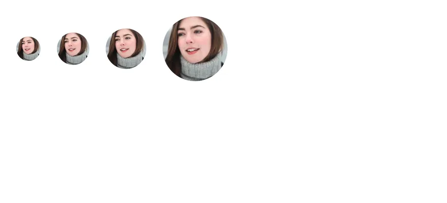
`Avatar` is a round `View` that holds an `AvatarImage` and an `AvatarFallback`. The image stays hidden until it loads, and the fallback is shown while it loads or if it fails. Four sizes are available: `sm`, `default`, `lg` and `xl`; the fallback text, icons and badge scale with the size.
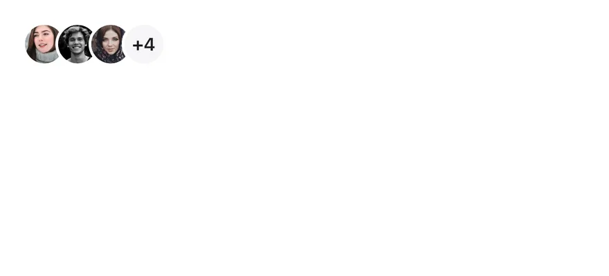
`AvatarBadge` adds a small status dot in the bottom-end corner, and `AvatarGroup` overlaps several avatars with an outline between them, with `AvatarGroupCount` for the remaining number.
## Installation
```bash title="Terminal"
npx @esuiss/uim@latest add avatar
```
```bash title="Terminal"
npx @esuiss/uim@latest add avatar --platform swift
```
```bash title="Terminal"
npx @esuiss/uim@latest add avatar --platform kotlin
```
The CLI also adds what it builds on: [Icon](/docs/components/icon), [Text](/docs/components/text).
### Manual
**Uniwind**
1. Install the dependencies:
```bash title="Terminal"
npx expo install cn
```
2. Add the pieces it builds on: [Icon](/docs/components/icon), [Text](/docs/components/text), and the primitives `components/primitives/avatar.tsx`, `components/primitives/use-render.tsx`.
3. Copy the source into `components/ui/avatar.tsx`:
```tsx title="uniwind/components/ui/avatar.tsx"
import { cn } from "cn"
import * as React from "react"
import { View } from "react-native"
import * as AvatarPrimitive from "@/components/primitives/avatar"
import { resolveClassName } from "@/components/primitives/use-render"
import { IconClassContext } from "@/components/ui/icon"
import { Text, TextClassContext } from "@/components/ui/text"
type AvatarSize = "default" | "sm" | "lg" | "xl"
const AvatarSizeContext = React.createContext("default")
const AvatarGroupItemContext = React.createContext(null)
const ROOT_SIZE: Record = {
sm: "size-6",
default: "size-8",
lg: "size-10",
xl: "size-16",
}
const FALLBACK_TEXT: Record = {
sm: "text-3xs",
default: "text-xs",
lg: "text-md",
xl: "text-2xl",
}
const FALLBACK_ICON: Record = {
sm: "size-3.5",
default: "size-5",
lg: "size-6",
xl: "size-10",
}
const BADGE_SIZE: Record = {
sm: "size-3",
default: "size-4",
lg: "size-4.5",
xl: "size-5.5",
}
const BADGE_ICON: Record = {
sm: "size-0",
default: "size-2",
lg: "size-2.5",
xl: "size-3",
}
const COUNT_ICON: Record = {
sm: "size-3",
default: "size-4",
lg: "size-5",
xl: "size-7",
}
function Avatar({
className,
size = "default",
...props
}: React.ComponentProps & {
size?: AvatarSize
}) {
const groupIndex = React.useContext(AvatarGroupItemContext)
const grouped = groupIndex !== null
return (
cn(
"relative shrink-0 rounded-full",
ROOT_SIZE[size],
grouped && "border-2 border-surface",
grouped && groupIndex > 0 && (size === "xl" ? "-ms-4" : "-ms-2"),
resolveClassName(className, state)
)
}
{...props}
/>
)
}
function AvatarImage({
className,
...props
}: React.ComponentProps) {
return (
cn(
"aspect-square size-full rounded-full",
resolveClassName(className, state)
)
}
resizeMode="cover"
{...props}
/>
)
}
function AvatarFallback({
className,
children,
...props
}: React.ComponentProps) {
const size = React.useContext(AvatarSizeContext)
return (
cn(
"size-full flex-row items-center justify-center rounded-full bg-label-secondary dark:bg-label-secondary/60",
resolveClassName(className, state)
)
}
{...props}
>
{typeof children === "string" || typeof children === "number" ? (
{children}
) : (
children
)}
)
}
function AvatarBadge({
className,
children,
...props
}: React.ComponentProps & React.RefAttributes) {
const size = React.useContext(AvatarSizeContext)
return (
{size === "sm" ? null : children}
)
}
function AvatarGroup({
className,
children,
...props
}: React.ComponentProps & React.RefAttributes) {
let index = 0
const items = React.Children.map(children, (child) => {
if (!React.isValidElement(child)) return child
const value = index
index += 1
return (
{child}
)
})
return (
{items}
)
}
function AvatarGroupCount({
className,
size = "default",
...props
}: React.ComponentProps &
React.RefAttributes & {
size?: AvatarSize
}) {
const groupIndex = React.useContext(AvatarGroupItemContext)
return (
0 &&
(size === "xl" ? "-ms-4" : "-ms-2"),
className
)}
{...props}
/>
)
}
export {
Avatar,
AvatarBadge,
AvatarFallback,
AvatarGroup,
AvatarGroupCount,
AvatarImage,
}
```
4. Update the import paths to match your project.
**NativeWind**
1. Install the dependencies:
```bash title="Terminal"
npx expo install cn
```
2. Add the pieces it builds on: [Icon](/docs/components/icon), [Text](/docs/components/text), and the primitives `components/primitives/avatar.tsx`, `components/primitives/use-render.tsx`.
3. Copy the source into `components/ui/avatar.tsx`:
```tsx title="nativewind/components/ui/avatar.tsx"
import { cn } from "cn"
import * as React from "react"
import { View } from "react-native"
import * as AvatarPrimitive from "@/components/primitives/avatar"
import { resolveClassName } from "@/components/primitives/use-render"
import { IconClassContext } from "@/components/ui/icon"
import { Text, TextClassContext } from "@/components/ui/text"
type AvatarSize = "default" | "sm" | "lg" | "xl"
const AvatarSizeContext = React.createContext("default")
const AvatarGroupItemContext = React.createContext(null)
const ROOT_SIZE: Record = {
sm: "size-6",
default: "size-8",
lg: "size-10",
xl: "size-16",
}
const FALLBACK_TEXT: Record = {
sm: "text-3xs",
default: "text-xs",
lg: "text-md",
xl: "text-2xl",
}
const FALLBACK_ICON: Record = {
sm: "size-3.5",
default: "size-5",
lg: "size-6",
xl: "size-10",
}
const BADGE_SIZE: Record = {
sm: "size-3",
default: "size-4",
lg: "size-[1.125rem]",
xl: "size-[1.375rem]",
}
const BADGE_ICON: Record = {
sm: "size-0",
default: "size-2",
lg: "size-2.5",
xl: "size-3",
}
const COUNT_ICON: Record = {
sm: "size-3",
default: "size-4",
lg: "size-5",
xl: "size-7",
}
function Avatar({
className,
size = "default",
...props
}: React.ComponentProps & {
size?: AvatarSize
}) {
const groupIndex = React.useContext(AvatarGroupItemContext)
const grouped = groupIndex !== null
return (
cn(
"relative shrink-0 rounded-full",
ROOT_SIZE[size],
grouped && "border-2 border-surface",
grouped && groupIndex > 0 && (size === "xl" ? "-ms-4" : "-ms-2"),
resolveClassName(className, state)
)
}
{...props}
/>
)
}
function AvatarImage({
className,
...props
}: React.ComponentProps) {
return (
cn(
"aspect-square size-full rounded-full",
resolveClassName(className, state)
)
}
resizeMode="cover"
{...props}
/>
)
}
function AvatarFallback({
className,
children,
...props
}: React.ComponentProps) {
const size = React.useContext(AvatarSizeContext)
return (
cn(
"size-full flex-row items-center justify-center rounded-full bg-label-secondary dark:bg-label-secondary-60",
resolveClassName(className, state)
)
}
{...props}
>
{typeof children === "string" || typeof children === "number" ? (
{children}
) : (
children
)}
)
}
function AvatarBadge({
className,
children,
...props
}: React.ComponentProps & React.RefAttributes) {
const size = React.useContext(AvatarSizeContext)
return (
{size === "sm" ? null : children}
)
}
function AvatarGroup({
className,
children,
...props
}: React.ComponentProps & React.RefAttributes) {
let index = 0
const items = React.Children.map(children, (child) => {
if (!React.isValidElement(child)) return child
const value = index
index += 1
return (
{child}
)
})
return (
{items}
)
}
function AvatarGroupCount({
className,
size = "default",
...props
}: React.ComponentProps &
React.RefAttributes & {
size?: AvatarSize
}) {
const groupIndex = React.useContext(AvatarGroupItemContext)
return (
0 &&
(size === "xl" ? "-ms-4" : "-ms-2"),
className
)}
{...props}
/>
)
}
export {
Avatar,
AvatarBadge,
AvatarFallback,
AvatarGroup,
AvatarGroupCount,
AvatarImage,
}
```
4. Update the import paths to match your project.
**StyleSheet**
1. Add the pieces it builds on: [Icon](/docs/components/icon), [Text](/docs/components/text), and the primitives `components/primitives/avatar.tsx`, `components/primitives/use-render.tsx`.
2. Copy the source into `components/ui/avatar.tsx`:
```tsx title="stylesheet/components/ui/avatar.tsx"
import * as React from "react"
import { StyleSheet, View } from "react-native"
import * as AvatarPrimitive from "@/components/primitives/avatar"
import { IconSizeContext } from "@/components/ui/icon"
import { Text, TextStyleContext } from "@/components/ui/text"
import { fontSize, radius, useTheme } from "@/components/ui/theme"
type AvatarSize = "default" | "sm" | "lg" | "xl"
const AvatarSizeContext = React.createContext("default")
const AvatarGroupItemContext = React.createContext(null)
const ROOT_SIZE: Record = {
sm: 24,
default: 32,
lg: 40,
xl: 64,
}
const TEXT_SIZE: Record = {
sm: "3xs",
default: "xs",
lg: "md",
xl: "2xl",
}
const FALLBACK_ICON: Record = {
sm: 14,
default: 19,
lg: 24,
xl: 38,
}
const BADGE_SIZE: Record = {
sm: 12,
default: 16,
lg: 18,
xl: 22,
}
const BADGE_ICON: Record = {
sm: 0,
default: 8,
lg: 10,
xl: 12,
}
const COUNT_ICON: Record = {
sm: 12,
default: 16,
lg: 20,
xl: 28,
}
const styles = StyleSheet.create({
root: {
position: "relative",
flexShrink: 0,
borderRadius: radius.full,
},
ring: { borderWidth: 2 },
image: {
aspectRatio: 1,
width: "100%",
height: "100%",
borderRadius: radius.full,
},
fallback: {
width: "100%",
height: "100%",
flexDirection: "row",
alignItems: "center",
justifyContent: "center",
borderRadius: radius.full,
},
badge: {
position: "absolute",
end: -2,
bottom: -2,
zIndex: 10,
alignItems: "center",
justifyContent: "center",
borderRadius: radius.full,
borderWidth: 2,
},
group: { flexDirection: "row", alignItems: "center" },
count: {
position: "relative",
flexShrink: 0,
alignItems: "center",
justifyContent: "center",
borderRadius: radius.full,
borderWidth: 2,
},
})
function withAlpha(color: string, alpha: number) {
if (!color.startsWith("#") || color.length !== 7) return color
const r = Number.parseInt(color.slice(1, 3), 16)
const g = Number.parseInt(color.slice(3, 5), 16)
const b = Number.parseInt(color.slice(5, 7), 16)
return `rgba(${r}, ${g}, ${b}, ${alpha})`
}
function groupOffset(index: number | null, size: AvatarSize) {
if (index === null || index === 0) return undefined
return { marginStart: size === "xl" ? -16 : -8 }
}
function Avatar({
style,
size = "default",
...props
}: React.ComponentProps & {
size?: AvatarSize
}) {
const { colors } = useTheme()
const groupIndex = React.useContext(AvatarGroupItemContext)
const dimension = ROOT_SIZE[size]
return (
[
styles.root,
{ width: dimension, height: dimension },
groupIndex !== null && [
styles.ring,
{ borderColor: colors.surface },
],
groupOffset(groupIndex, size),
typeof style === "function" ? style(state) : style,
]}
{...props}
/>
)
}
function AvatarImage({
style,
...props
}: React.ComponentProps) {
return (
[
styles.image,
typeof style === "function" ? style(state) : style,
]}
resizeMode="cover"
{...props}
/>
)
}
function AvatarFallback({
style,
children,
...props
}: React.ComponentProps) {
const { colors, isDark } = useTheme()
const size = React.useContext(AvatarSizeContext)
return (
[
styles.fallback,
{
backgroundColor: isDark
? withAlpha(colors.labelSecondary, 0.6)
: colors.labelSecondary,
},
typeof style === "function" ? style(state) : style,
]}
{...props}
>
{typeof children === "string" || typeof children === "number" ? (
{children}
) : (
children
)}
)
}
function AvatarBadge({
style,
children,
...props
}: React.ComponentProps & React.RefAttributes) {
const { colors } = useTheme()
const size = React.useContext(AvatarSizeContext)
const dimension = BADGE_SIZE[size]
return (
{size === "sm" ? null : children}
)
}
function AvatarGroup({
style,
children,
...props
}: React.ComponentProps & React.RefAttributes) {
let index = 0
const items = React.Children.map(children, (child) => {
if (!React.isValidElement(child)) return child
const value = index
index += 1
return (
{child}
)
})
return (
{items}
)
}
function AvatarGroupCount({
style,
size = "default",
...props
}: React.ComponentProps &
React.RefAttributes & {
size?: AvatarSize
}) {
const { colors } = useTheme()
const groupIndex = React.useContext(AvatarGroupItemContext)
const dimension = ROOT_SIZE[size]
return (
)
}
export {
Avatar,
AvatarBadge,
AvatarFallback,
AvatarGroup,
AvatarGroupCount,
AvatarImage,
}
```
3. Update the import paths to match your project.
**SwiftUI**
1. Target iOS 17 or later.
2. Copy the theme files every view uses:
```swift title="swift/Theme/Theme.swift"
import SwiftUI
import UIKit
struct RGBA: Sendable {
let red: CGFloat
let green: CGFloat
let blue: CGFloat
let alpha: CGFloat
init(_ hex: UInt32, _ alpha: CGFloat = 1) {
red = CGFloat((hex >> 16) & 0xFF) / 255
green = CGFloat((hex >> 8) & 0xFF) / 255
blue = CGFloat(hex & 0xFF) / 255
self.alpha = alpha
}
var uiColor: UIColor {
UIColor(red: red, green: green, blue: blue, alpha: alpha)
}
}
extension Color {
static func adaptive(light: RGBA, dark: RGBA) -> Color {
let lightColor = light.uiColor
let darkColor = dark.uiColor
return Color(uiColor: UIColor { traits in
traits.userInterfaceStyle == .dark ? darkColor : lightColor
})
}
}
public struct TextStyle: Sendable, Hashable {
public let size: CGFloat
public let lineHeight: CGFloat
public let letterSpacing: CGFloat
public init(size: CGFloat, lineHeight: CGFloat, letterSpacing: CGFloat) {
self.size = size
self.lineHeight = lineHeight
self.letterSpacing = letterSpacing
}
public func font(weight: Font.Weight = .regular) -> Font {
.system(size: size, weight: weight)
}
public var lineSpacing: CGFloat {
max(0, lineHeight - UIFont.systemFont(ofSize: size).lineHeight)
}
}
extension Hashable where Self == Font {
public static func textStyle(_ style: TextStyle, weight: Font.Weight = .regular) -> Font {
style.font(weight: weight)
}
}
private struct TextStyleModifier: ViewModifier {
let style: TextStyle
let weight: Font.Weight
func body(content: Content) -> some View {
content
.font(style.font(weight: weight))
.tracking(style.letterSpacing)
.lineSpacing(style.lineSpacing)
.padding(.vertical, style.lineSpacing / 2)
}
}
extension View {
public func textStyle(_ style: TextStyle, weight: Font.Weight = .regular) -> some View {
modifier(TextStyleModifier(style: style, weight: weight))
}
}
public struct Shadow: Sendable, Hashable {
public let color: Color
public let radius: CGFloat
public let x: CGFloat
public let y: CGFloat
public init(color: Color, radius: CGFloat, x: CGFloat = 0, y: CGFloat = 0) {
self.color = color
self.radius = radius
self.x = x
self.y = y
}
}
extension View {
public func shadow(_ shadow: Shadow) -> some View {
self.shadow(color: shadow.color, radius: shadow.radius, x: shadow.x, y: shadow.y)
}
}
```
```swift title="swift/Theme/Tokens.swift"
import SwiftUI
extension Color {
public static let surface = Color.adaptive(light: .init(0xFFFFFF), dark: .init(0x000000))
public static let surfaceSecondary = Color.adaptive(light: .init(0xF5F5F7), dark: .init(0x161617))
public static let surfaceTertiary = Color.adaptive(light: .init(0xE8E8ED), dark: .init(0x2C2C2E))
public static let surfaceRaised = Color.adaptive(light: .init(0xFFFFFF), dark: .init(0x1D1D1F))
public static let label = Color.adaptive(light: .init(0x1D1D1F), dark: .init(0xF5F5F7))
public static let labelSecondary = Color.adaptive(light: .init(0x6E6E73), dark: .init(0xA1A1A6))
public static let labelTertiary = Color.adaptive(light: .init(0x86868B), dark: .init(0x86868B))
public static let labelQuaternary = Color.adaptive(light: .init(0xD2D2D7), dark: .init(0x424245))
public static let control = Color.adaptive(light: .init(0x000000, 0.04), dark: .init(0xFFFFFF, 0.1))
public static let controlPressed = Color.adaptive(light: .init(0x000000, 0.12), dark: .init(0xFFFFFF, 0.22))
public static let controlSelected = Color.adaptive(light: .init(0x1D1D1F), dark: .init(0xF5F5F7))
public static let controlDisabled = Color.adaptive(light: .init(0x000000, 0.03), dark: .init(0xFFFFFF, 0.05))
public static let onControlSelected = Color.adaptive(light: .init(0xFFFFFF), dark: .init(0x000000))
public static let itemPressed = Color.adaptive(light: .init(0x000000, 0.08), dark: .init(0xFFFFFF, 0.12))
public static let itemSelected = Color.adaptive(light: .init(0x000000, 0.06), dark: .init(0xFFFFFF, 0.1))
public static let separator = Color.adaptive(light: .init(0xD2D2D7), dark: .init(0x424245))
public static let separatorStrong = Color.adaptive(light: .init(0x86868B), dark: .init(0x6E6E73))
public static let accent = Color.adaptive(light: .init(0x0071E3), dark: .init(0x0071E3))
public static let accentPressed = Color.adaptive(light: .init(0x005BB8), dark: .init(0x004D9E))
public static let accentSelected = Color.adaptive(light: .init(0x0071E3), dark: .init(0x0071E3))
public static let accentDisabled = Color.adaptive(light: .init(0x0071E3, 0.4), dark: .init(0x0071E3, 0.4))
public static let onAccent = Color.adaptive(light: .init(0xFFFFFF), dark: .init(0xFFFFFF))
public static let accentSurface = Color.adaptive(light: .init(0x0071E3, 0.09), dark: .init(0x0071E3, 0.18))
public static let accentSurfacePressed = Color.adaptive(light: .init(0x0071E3, 0.18), dark: .init(0x0071E3, 0.3))
public static let link = Color.adaptive(light: .init(0x0066CC), dark: .init(0x2997FF))
public static let focus = Color.adaptive(light: .init(0x0071E3), dark: .init(0x0071E3))
public static let scrim = Color.adaptive(light: .init(0x000000, 0.48), dark: .init(0x000000, 0.48))
public static let media = Color.adaptive(light: .init(0x000000), dark: .init(0x000000))
public static let onMedia = Color.adaptive(light: .init(0xFFFFFF), dark: .init(0xFFFFFF))
public static let danger = Color.adaptive(light: .init(0xD0000A), dark: .init(0xFF5447))
public static let dangerSurface = Color.adaptive(light: .init(0xD70015, 0.08), dark: .init(0xFF453A, 0.2))
public static let dangerSurfacePressed = Color.adaptive(light: .init(0xD70015, 0.16), dark: .init(0xFF453A, 0.36))
public static let success = Color.adaptive(light: .init(0x008009), dark: .init(0x30D158))
public static let successSurface = Color.adaptive(light: .init(0xEFFAF1), dark: .init(0x30D158, 0.16))
public static let warning = Color.adaptive(light: .init(0xB64400), dark: .init(0xFF9F0A))
public static let warningSurface = Color.adaptive(light: .init(0xFFF5EA), dark: .init(0xFF9F0A, 0.16))
}
public enum Radius {
public static let xs: CGFloat = 3
public static let sm: CGFloat = 5
public static let md: CGFloat = 8
public static let lg: CGFloat = 10
public static let xl: CGFloat = 12
public static let xl2: CGFloat = 18
public static let xl3: CGFloat = 28
public static let full: CGFloat = 9999
}
extension TextStyle {
public static let xs3 = TextStyle(size: 11, lineHeight: 13, letterSpacing: 0.066)
public static let xs2 = TextStyle(size: 12, lineHeight: 16, letterSpacing: 0)
public static let xs = TextStyle(size: 13, lineHeight: 18, letterSpacing: -0.078)
public static let sm = TextStyle(size: 15, lineHeight: 20, letterSpacing: -0.24)
public static let md = TextStyle(size: 16, lineHeight: 21, letterSpacing: -0.32)
public static let base = TextStyle(size: 17, lineHeight: 22, letterSpacing: -0.442)
public static let lg = TextStyle(size: 20, lineHeight: 25, letterSpacing: -0.46)
public static let xl = TextStyle(size: 22, lineHeight: 28, letterSpacing: -0.264)
public static let xl2 = TextStyle(size: 28, lineHeight: 34, letterSpacing: 0.392)
public static let xl3 = TextStyle(size: 34, lineHeight: 41, letterSpacing: 0.408)
public static let allCases: [TextStyle] = [.xs3, .xs2, .xs, .sm, .md, .base, .lg, .xl, .xl2, .xl3]
}
extension Shadow {
public static let md = Shadow(color: .black.opacity(0.08), radius: 6, x: 2, y: 4)
public static let lg = Shadow(color: .black.opacity(0.12), radius: 12, y: 4)
}
```
3. Copy the source and every file it uses:
```swift title="swift/Components/Avatar.swift"
import SwiftUI
public enum AvatarSize: CaseIterable, Sendable {
case sm, `default`, lg, xl
var dimension: CGFloat {
switch self {
case .sm: 24
case .default: 32
case .lg: 40
case .xl: 64
}
}
var overlap: CGFloat {
self == .xl ? 16 : 8
}
var textStyle: TextStyle {
switch self {
case .sm: .xs3
case .default: .xs
case .lg: .md
case .xl: .xl2
}
}
var fallbackIcon: CGFloat {
switch self {
case .sm: 14
case .default: 20
case .lg: 24
case .xl: 40
}
}
var badge: CGFloat {
switch self {
case .sm: 12
case .default: 16
case .lg: 18
case .xl: 22
}
}
var badgeIcon: CGFloat {
switch self {
case .sm: 0
case .default: 8
case .lg: 10
case .xl: 12
}
}
var countIcon: CGFloat {
switch self {
case .sm: 12
case .default: 16
case .lg: 20
case .xl: 28
}
}
}
public struct Avatar: View {
public typealias Size = AvatarSize
let size: Size
let content: Content
@Environment(\.avatarGrouped) private var grouped
public init(size: Size = .default, @ViewBuilder content: () -> Content) {
self.size = size
self.content = content()
}
public var body: some View {
ZStack {
content
}
.padding(grouped ? 2 : 0)
.background {
if grouped {
Circle().fill(Color.surface)
}
}
.frame(width: size.dimension, height: size.dimension)
.environment(\.avatarSize, size)
.environment(\.avatarGrouped, false)
.accessibilityElement(children: .combine)
.accessibilityAddTraits(.isImage)
.layoutValue(key: AvatarOverlapKey.self, value: size.overlap)
}
}
extension Avatar {
public init(
url: URL?,
size: Size = .default,
@ViewBuilder fallback: () -> Fallback
) where Content == TupleView<(AvatarFallback, AvatarImage)> {
let fallback = fallback()
self.init(size: size) {
AvatarFallback { fallback }
AvatarImage(url: url)
}
}
public init(
url: URL?,
initials: String,
size: Size = .default
) where Content == TupleView<(AvatarFallback, AvatarImage)> {
self.init(size: size) {
AvatarFallback(initials)
AvatarImage(url: url)
}
}
}
public struct AvatarImage: View {
enum Source {
case url(URL?)
case image(Image)
}
let source: Source
public init(url: URL?) {
source = .url(url)
}
public init(_ image: Image) {
source = .image(image)
}
public var body: some View {
Group {
switch source {
case .image(let image):
image.resizable().scaledToFill()
case .url(let url):
AsyncImage(url: url) { phase in
if let image = phase.image {
image.resizable().scaledToFill()
} else {
Color.clear
}
}
}
}
.frame(maxWidth: .infinity, maxHeight: .infinity)
.clipShape(Circle())
}
}
public struct AvatarFallback: View {
let content: Content
@Environment(\.avatarSize) private var size
@Environment(\.colorScheme) private var colorScheme
public init(@ViewBuilder content: () -> Content) {
self.content = content()
}
public var body: some View {
content
.textCase(.uppercase)
.scaledFont(size.textStyle, weight: .semibold)
.lineLimit(1)
.minimumScaleFactor(0.5)
.foregroundStyle(Color.onAccent)
.environment(\.avatarIconSize, size.fallbackIcon)
.frame(maxWidth: .infinity, maxHeight: .infinity)
.background(Color.labelSecondary.opacity(colorScheme == .dark ? 0.6 : 1), in: Circle())
}
}
extension AvatarFallback where Content == Text {
public init(_ initials: String) {
self.init { Text(verbatim: initials) }
}
}
extension AvatarFallback where Content == AvatarIcon {
public init(icon: Image) {
self.init { AvatarIcon(icon) }
}
}
public struct AvatarIcon: View {
let image: Image
@Environment(\.avatarIconSize) private var size
public init(_ image: Image) {
self.image = image
}
public var body: some View {
image
.resizable()
.scaledToFit()
.frame(width: size, height: size)
}
}
public struct AvatarBadge: View {
let content: Content
@Environment(\.avatarSize) private var size
public init(@ViewBuilder content: () -> Content) {
self.content = content()
}
public var body: some View {
ZStack {
Circle().fill(Color.surface)
Circle().fill(Color.accent).padding(2)
if size != .sm {
content
.foregroundStyle(Color.onAccent)
.environment(\.avatarIconSize, size.badgeIcon)
}
}
.frame(width: size.badge, height: size.badge)
.offset(x: 2, y: 2)
.frame(maxWidth: .infinity, maxHeight: .infinity, alignment: .bottomTrailing)
}
}
extension AvatarBadge where Content == EmptyView {
public init() {
self.init { EmptyView() }
}
}
extension AvatarBadge where Content == AvatarIcon {
public init(icon: Image) {
self.init { AvatarIcon(icon) }
}
}
public struct AvatarGroup: View {
let content: Content
public init(@ViewBuilder content: () -> Content) {
self.content = content()
}
public var body: some View {
AvatarGroupLayout {
content
}
.environment(\.avatarGrouped, true)
.accessibilityElement(children: .contain)
}
}
public struct AvatarGroupCount: View {
let size: AvatarSize
let content: Content
public init(size: AvatarSize = .default, @ViewBuilder content: () -> Content) {
self.size = size
self.content = content()
}
public var body: some View {
content
.scaledFont(size.textStyle, weight: .semibold)
.lineLimit(1)
.minimumScaleFactor(0.5)
.foregroundStyle(Color.label)
.environment(\.avatarIconSize, size.countIcon)
.frame(maxWidth: .infinity, maxHeight: .infinity)
.background(Color.surfaceSecondary, in: Circle())
.padding(2)
.background(Color.surface, in: Circle())
.frame(width: size.dimension, height: size.dimension)
.environment(\.avatarGrouped, false)
.layoutValue(key: AvatarOverlapKey.self, value: size.overlap)
}
}
extension AvatarGroupCount where Content == Text {
public init(_ count: String, size: AvatarSize = .default) {
self.init(size: size) { Text(verbatim: count) }
}
}
struct AvatarOverlapKey: LayoutValueKey {
static let defaultValue: CGFloat = 8
}
struct AvatarGroupLayout: Layout {
func sizeThatFits(proposal: ProposedViewSize, subviews: Subviews, cache: inout ()) -> CGSize {
var width: CGFloat = 0
var height: CGFloat = 0
for (index, subview) in subviews.enumerated() {
let size = subview.sizeThatFits(.unspecified)
width += size.width - (index > 0 ? subview[AvatarOverlapKey.self] : 0)
height = max(height, size.height)
}
return CGSize(width: max(0, width), height: height)
}
func placeSubviews(in bounds: CGRect, proposal: ProposedViewSize, subviews: Subviews, cache: inout ()) {
var x = bounds.minX
for (index, subview) in subviews.enumerated() {
let size = subview.sizeThatFits(.unspecified)
if index > 0 {
x -= subview[AvatarOverlapKey.self]
}
subview.place(at: CGPoint(x: x, y: bounds.midY), anchor: .leading, proposal: ProposedViewSize(size))
x += size.width
}
}
}
extension EnvironmentValues {
@Entry var avatarSize: AvatarSize = .default
@Entry var avatarGrouped = false
@Entry var avatarIconSize: CGFloat = 20
}
```
```swift title="swift/Components/TextVariant.swift"
import SwiftUI
public enum TextVariant: CaseIterable, Sendable {
case `default`, h1, h2, h3, h4, p, blockquote, code, lead, large, small, muted
var style: TextStyle {
switch self {
case .h1: .xl3
case .h2: .xl2
case .h3: .xl
case .h4, .lead, .large: .lg
case .code, .small, .muted: .sm
default: .base
}
}
var weight: Font.Weight {
switch self {
case .h1, .h2: .bold
case .h3, .h4, .large, .code: .semibold
case .small: .medium
default: .regular
}
}
var color: Color {
switch self {
case .lead, .muted: .labelSecondary
default: .label
}
}
var isHeading: Bool {
switch self {
case .h1, .h2, .h3, .h4: true
default: false
}
}
}
private struct TextVariantModifier: ViewModifier {
let variant: TextVariant
func body(content: Content) -> some View {
switch variant {
case .blockquote:
styled(content)
.italic()
.padding(.leading, 12)
.overlay(alignment: .leading) {
Rectangle().fill(Color.separator).frame(width: 2)
}
.padding(.top, 16)
case .code:
styled(content)
.monospaced()
.padding(.horizontal, 4)
.padding(.vertical, 2)
.background(Color.surfaceSecondary, in: RoundedRectangle(cornerRadius: Radius.sm, style: .continuous))
case .p:
styled(content).padding(.top, 12)
default:
styled(content)
}
}
private func styled(_ content: Content) -> some View {
content
.scaledTextStyle(variant.style, weight: variant.weight)
.foregroundStyle(variant.color)
.accessibilityAddTraits(variant.isHeading ? .isHeader : [])
}
}
extension View {
public func textVariant(_ variant: TextVariant) -> some View {
modifier(TextVariantModifier(variant: variant))
}
}
private struct ScaledTextStyleModifier: ViewModifier {
let style: TextStyle
let weight: Font.Weight
@ScaledMetric(relativeTo: .body) private var scale: CGFloat = 1
func body(content: Content) -> some View {
let size = style.size * scale
let lineSpacing = max(0, style.lineHeight * scale - UIFont.systemFont(ofSize: size).lineHeight)
content
.font(.system(size: size, weight: weight))
.tracking(style.letterSpacing)
.lineSpacing(lineSpacing)
.padding(.vertical, lineSpacing / 2)
}
}
extension View {
func scaledTextStyle(_ style: TextStyle, weight: Font.Weight = .regular) -> some View {
modifier(ScaledTextStyleModifier(style: style, weight: weight))
}
func scaledFont(_ style: TextStyle, weight: Font.Weight = .regular) -> some View {
modifier(ScaledFontModifier(style: style, weight: weight))
}
}
private struct ScaledFontModifier: ViewModifier {
let style: TextStyle
let weight: Font.Weight
@ScaledMetric(relativeTo: .body) private var scale: CGFloat = 1
func body(content: Content) -> some View {
content
.font(.system(size: style.size * scale, weight: weight))
.tracking(style.letterSpacing)
}
}
```
4. Add the files to your app target.
**Jetpack Compose**
1. Set `minSdk` to 24 or higher and add the dependencies:
```kotlin title="build.gradle.kts"
implementation(platform("androidx.compose:compose-bom:2026.09.00"))
implementation("androidx.compose.foundation:foundation")
implementation("androidx.compose.ui:ui")
```
2. Copy the theme files every view uses:
```kt title="kotlin/theme/Theme.kt"
package com.esuiss.ui.theme
import androidx.compose.foundation.isSystemInDarkTheme
import androidx.compose.runtime.Composable
import androidx.compose.runtime.CompositionLocalProvider
import androidx.compose.runtime.Immutable
import androidx.compose.runtime.staticCompositionLocalOf
import androidx.compose.ui.Modifier
import androidx.compose.ui.draw.dropShadow
import androidx.compose.ui.graphics.Color
import androidx.compose.ui.graphics.Shape
import androidx.compose.ui.graphics.shadow.Shadow as DropShadow
import androidx.compose.ui.text.TextStyle
import androidx.compose.ui.text.style.LineHeightStyle
import androidx.compose.ui.unit.Dp
import androidx.compose.ui.unit.DpOffset
import androidx.compose.ui.unit.em
import androidx.compose.ui.unit.sp
internal fun textStyle(size: Double, lineHeight: Double, letterSpacing: Double) = TextStyle(
fontSize = size.sp,
lineHeight = lineHeight.sp,
letterSpacing = letterSpacing.em,
lineHeightStyle = LineHeightStyle(
alignment = LineHeightStyle.Alignment.Center,
trim = LineHeightStyle.Trim.None,
),
)
@Immutable
data class Shadow(
val offsetX: Dp,
val offsetY: Dp,
val blur: Dp,
val color: Color,
)
fun Modifier.shadow(shadow: Shadow, shape: Shape): Modifier = dropShadow(
shape,
DropShadow(
radius = shadow.blur,
color = shadow.color,
offset = DpOffset(shadow.offsetX, shadow.offsetY),
),
)
val LocalColors = staticCompositionLocalOf { LightColors }
object EsuissTheme {
val colors: Colors
@Composable get() = LocalColors.current
val typography: Typography
get() = Typography
val radius: Radius
get() = Radius
val shadows: Shadows
get() = Shadows
}
@Composable
fun EsuissTheme(
darkTheme: Boolean = isSystemInDarkTheme(),
content: @Composable () -> Unit,
) {
CompositionLocalProvider(
LocalColors provides if (darkTheme) DarkColors else LightColors,
content = content,
)
}
```
```kt title="kotlin/theme/Tokens.kt"
package com.esuiss.ui.theme
import androidx.compose.runtime.Immutable
import androidx.compose.ui.graphics.Color
import androidx.compose.ui.unit.dp
@Immutable
data class Colors(
val surface: Color,
val surfaceSecondary: Color,
val surfaceTertiary: Color,
val surfaceRaised: Color,
val label: Color,
val labelSecondary: Color,
val labelTertiary: Color,
val labelQuaternary: Color,
val control: Color,
val controlPressed: Color,
val controlSelected: Color,
val controlDisabled: Color,
val onControlSelected: Color,
val itemPressed: Color,
val itemSelected: Color,
val separator: Color,
val separatorStrong: Color,
val accent: Color,
val accentPressed: Color,
val accentSelected: Color,
val accentDisabled: Color,
val onAccent: Color,
val accentSurface: Color,
val accentSurfacePressed: Color,
val link: Color,
val focus: Color,
val scrim: Color,
val media: Color,
val onMedia: Color,
val danger: Color,
val dangerSurface: Color,
val dangerSurfacePressed: Color,
val success: Color,
val successSurface: Color,
val warning: Color,
val warningSurface: Color,
val blue: Color,
val green: Color,
val orange: Color,
val red: Color,
val yellow: Color,
val purple: Color,
val pink: Color,
val indigo: Color,
val teal: Color,
val mint: Color,
val cyan: Color,
val brown: Color,
val gray: Color,
val isDark: Boolean,
)
val LightColors = Colors(
surface = Color(0xFFFFFFFF),
surfaceSecondary = Color(0xFFF5F5F7),
surfaceTertiary = Color(0xFFE8E8ED),
surfaceRaised = Color(0xFFFFFFFF),
label = Color(0xFF1D1D1F),
labelSecondary = Color(0xFF6E6E73),
labelTertiary = Color(0xFF86868B),
labelQuaternary = Color(0xFFD2D2D7),
control = Color(0xFF000000).copy(alpha = 0.04f),
controlPressed = Color(0xFF000000).copy(alpha = 0.12f),
controlSelected = Color(0xFF1D1D1F),
controlDisabled = Color(0xFF000000).copy(alpha = 0.03f),
onControlSelected = Color(0xFFFFFFFF),
itemPressed = Color(0xFF000000).copy(alpha = 0.08f),
itemSelected = Color(0xFF000000).copy(alpha = 0.06f),
separator = Color(0xFFD2D2D7),
separatorStrong = Color(0xFF86868B),
accent = Color(0xFF0071E3),
accentPressed = Color(0xFF005BB8),
accentSelected = Color(0xFF0071E3),
accentDisabled = Color(0xFF0071E3).copy(alpha = 0.4f),
onAccent = Color(0xFFFFFFFF),
accentSurface = Color(0xFF0071E3).copy(alpha = 0.09f),
accentSurfacePressed = Color(0xFF0071E3).copy(alpha = 0.18f),
link = Color(0xFF0066CC),
focus = Color(0xFF0071E3),
scrim = Color(0xFF000000).copy(alpha = 0.48f),
media = Color(0xFF000000),
onMedia = Color(0xFFFFFFFF),
danger = Color(0xFFD0000A),
dangerSurface = Color(0xFFD70015).copy(alpha = 0.08f),
dangerSurfacePressed = Color(0xFFD70015).copy(alpha = 0.16f),
success = Color(0xFF008009),
successSurface = Color(0xFFEFFAF1),
warning = Color(0xFFB64400),
warningSurface = Color(0xFFFFF5EA),
blue = Color(0xFF007AFF),
green = Color(0xFF34C759),
orange = Color(0xFFFF9500),
red = Color(0xFFFF3B30),
yellow = Color(0xFFFFCC00),
purple = Color(0xFFAF52DE),
pink = Color(0xFFFF2D55),
indigo = Color(0xFF5856D6),
teal = Color(0xFF30B0C7),
mint = Color(0xFF00C7BE),
cyan = Color(0xFF32ADE6),
brown = Color(0xFFA2845E),
gray = Color(0xFF8E8E93),
isDark = false,
)
val DarkColors = Colors(
surface = Color(0xFF000000),
surfaceSecondary = Color(0xFF161617),
surfaceTertiary = Color(0xFF2C2C2E),
surfaceRaised = Color(0xFF1D1D1F),
label = Color(0xFFF5F5F7),
labelSecondary = Color(0xFFA1A1A6),
labelTertiary = Color(0xFF86868B),
labelQuaternary = Color(0xFF424245),
control = Color(0xFFFFFFFF).copy(alpha = 0.1f),
controlPressed = Color(0xFFFFFFFF).copy(alpha = 0.22f),
controlSelected = Color(0xFFF5F5F7),
controlDisabled = Color(0xFFFFFFFF).copy(alpha = 0.05f),
onControlSelected = Color(0xFF000000),
itemPressed = Color(0xFFFFFFFF).copy(alpha = 0.12f),
itemSelected = Color(0xFFFFFFFF).copy(alpha = 0.1f),
separator = Color(0xFF424245),
separatorStrong = Color(0xFF6E6E73),
accent = Color(0xFF0071E3),
accentPressed = Color(0xFF004D9E),
accentSelected = Color(0xFF0071E3),
accentDisabled = Color(0xFF0071E3).copy(alpha = 0.4f),
onAccent = Color(0xFFFFFFFF),
accentSurface = Color(0xFF0071E3).copy(alpha = 0.18f),
accentSurfacePressed = Color(0xFF0071E3).copy(alpha = 0.3f),
link = Color(0xFF2997FF),
focus = Color(0xFF0071E3),
scrim = Color(0xFF000000).copy(alpha = 0.48f),
media = Color(0xFF000000),
onMedia = Color(0xFFFFFFFF),
danger = Color(0xFFFF5447),
dangerSurface = Color(0xFFFF453A).copy(alpha = 0.2f),
dangerSurfacePressed = Color(0xFFFF453A).copy(alpha = 0.36f),
success = Color(0xFF30D158),
successSurface = Color(0xFF30D158).copy(alpha = 0.16f),
warning = Color(0xFFFF9F0A),
warningSurface = Color(0xFFFF9F0A).copy(alpha = 0.16f),
blue = Color(0xFF0A84FF),
green = Color(0xFF30D158),
orange = Color(0xFFFF9F0A),
red = Color(0xFFFF453A),
yellow = Color(0xFFFFD60A),
purple = Color(0xFFBF5AF2),
pink = Color(0xFFFF375F),
indigo = Color(0xFF5E5CE6),
teal = Color(0xFF40C8E0),
mint = Color(0xFF66D4CF),
cyan = Color(0xFF64D2FF),
brown = Color(0xFFAC8E68),
gray = Color(0xFF8E8E93),
isDark = true,
)
object Radius {
val xs = 3.dp
val sm = 5.dp
val md = 8.dp
val lg = 10.dp
val xl = 12.dp
val xl2 = 18.dp
val xl3 = 28.dp
val full = 9999.dp
}
object Typography {
val xs3 = textStyle(11.0, 13.0, 0.006)
val xs2 = textStyle(12.0, 16.0, 0.0)
val xs = textStyle(13.0, 18.0, -0.006)
val sm = textStyle(15.0, 20.0, -0.016)
val md = textStyle(16.0, 21.0, -0.02)
val base = textStyle(17.0, 22.0, -0.026)
val lg = textStyle(20.0, 25.0, -0.023)
val xl = textStyle(22.0, 28.0, -0.012)
val xl2 = textStyle(28.0, 34.0, 0.014)
val xl3 = textStyle(34.0, 41.0, 0.012)
val all = listOf(xs3, xs2, xs, sm, md, base, lg, xl, xl2, xl3)
}
object Shadows {
val md = Shadow(2.dp, 4.dp, 12.dp, Color.Black.copy(alpha = 0.08f))
val lg = Shadow(0.dp, 4.dp, 24.dp, Color.Black.copy(alpha = 0.12f))
}
```
3. Copy the source and every file it uses:
```kt title="kotlin/components/Avatar.kt"
package com.esuiss.ui.components
import androidx.compose.foundation.Image
import androidx.compose.foundation.background
import androidx.compose.foundation.layout.Box
import androidx.compose.foundation.layout.fillMaxSize
import androidx.compose.foundation.layout.offset
import androidx.compose.foundation.layout.padding
import androidx.compose.foundation.layout.size
import androidx.compose.foundation.shape.CircleShape
import androidx.compose.foundation.text.BasicText
import androidx.compose.runtime.Composable
import androidx.compose.runtime.CompositionLocalProvider
import androidx.compose.runtime.staticCompositionLocalOf
import androidx.compose.ui.Alignment
import androidx.compose.ui.Modifier
import androidx.compose.ui.draw.clip
import androidx.compose.ui.graphics.painter.Painter
import androidx.compose.ui.layout.ContentScale
import androidx.compose.ui.layout.Layout
import androidx.compose.ui.text.TextStyle
import androidx.compose.ui.text.font.FontWeight
import androidx.compose.ui.unit.Dp
import androidx.compose.ui.unit.constrainHeight
import androidx.compose.ui.unit.constrainWidth
import androidx.compose.ui.unit.dp
import com.esuiss.ui.theme.EsuissTheme
import com.esuiss.ui.theme.Typography
enum class AvatarSize(
val size: Dp,
internal val iconSize: Dp,
internal val badgeSize: Dp,
internal val badgeIconSize: Dp,
internal val countIconSize: Dp,
) {
Sm(24.dp, 14.dp, 12.dp, 0.dp, 12.dp),
Default(32.dp, 20.dp, 16.dp, 8.dp, 16.dp),
Lg(40.dp, 24.dp, 18.dp, 10.dp, 20.dp),
Xl(64.dp, 40.dp, 22.dp, 12.dp, 28.dp),
;
internal val textStyle: TextStyle
get() = when (this) {
Sm -> Typography.xs3
Default -> Typography.xs
Lg -> Typography.md
Xl -> Typography.xl2
}
}
private val LocalAvatarSize = staticCompositionLocalOf { AvatarSize.Default }
private val LocalAvatarGrouped = staticCompositionLocalOf { false }
@Composable
fun Avatar(
modifier: Modifier = Modifier,
size: AvatarSize = AvatarSize.Default,
image: Painter? = null,
contentDescription: String? = null,
badge: (@Composable () -> Unit)? = null,
fallback: (@Composable () -> Unit)? = null,
) {
val colors = EsuissTheme.colors
val grouped = LocalAvatarGrouped.current
CompositionLocalProvider(LocalAvatarSize provides size, LocalAvatarGrouped provides false) {
Box(modifier.size(size.size)) {
Box(
Modifier
.fillMaxSize()
.then(
if (grouped) {
Modifier.background(colors.surface, CircleShape).padding(2.dp)
} else {
Modifier
},
)
.clip(CircleShape),
contentAlignment = Alignment.Center,
) {
fallback?.invoke()
if (image != null) {
Image(
painter = image,
contentDescription = contentDescription,
modifier = Modifier.fillMaxSize(),
contentScale = ContentScale.Crop,
)
}
}
if (badge != null) {
Box(Modifier.align(Alignment.BottomEnd).offset(2.dp, 2.dp)) {
badge()
}
}
}
}
}
@Composable
fun AvatarFallback(
modifier: Modifier = Modifier,
content: @Composable () -> Unit,
) {
val colors = EsuissTheme.colors
val size = LocalAvatarSize.current
val background = if (colors.isDark) {
colors.labelSecondary.copy(alpha = colors.labelSecondary.alpha * 0.6f)
} else {
colors.labelSecondary
}
Box(
modifier = modifier.fillMaxSize().background(background, CircleShape),
contentAlignment = Alignment.Center,
) {
CompositionLocalProvider(
LocalContentStyle provides size.textStyle.copy(color = colors.onAccent, fontWeight = FontWeight.SemiBold),
LocalContentColor provides colors.onAccent,
LocalIconSize provides size.iconSize,
) {
content()
}
}
}
@Composable
fun AvatarFallback(
text: String,
modifier: Modifier = Modifier,
) {
AvatarFallback(modifier) {
BasicText(text.uppercase(), style = LocalContentStyle.current, maxLines = 1)
}
}
@Composable
fun AvatarBadge(
modifier: Modifier = Modifier,
content: @Composable () -> Unit = {},
) {
val colors = EsuissTheme.colors
val size = LocalAvatarSize.current
Box(
modifier = modifier
.size(size.badgeSize)
.background(colors.surface, CircleShape)
.padding(2.dp)
.background(colors.accent, CircleShape),
contentAlignment = Alignment.Center,
) {
if (size != AvatarSize.Sm) {
CompositionLocalProvider(
LocalContentStyle provides Typography.xs3.copy(color = colors.onAccent),
LocalContentColor provides colors.onAccent,
LocalIconSize provides size.badgeIconSize,
) {
content()
}
}
}
}
@Composable
fun AvatarGroup(
modifier: Modifier = Modifier,
content: @Composable () -> Unit,
) {
Layout(
content = { CompositionLocalProvider(LocalAvatarGrouped provides true, content = content) },
modifier = modifier,
) { measurables, constraints ->
val loose = constraints.copy(minWidth = 0, minHeight = 0)
val placeables = measurables.map { it.measure(loose) }
val large = AvatarSize.Xl.size.roundToPx()
val offsets = IntArray(placeables.size)
var x = 0
placeables.forEachIndexed { index, placeable ->
if (index > 0) x -= if (placeable.height >= large) 16.dp.roundToPx() else 8.dp.roundToPx()
offsets[index] = x
x += placeable.width
}
val height = placeables.maxOfOrNull { it.height } ?: 0
layout(constraints.constrainWidth(x.coerceAtLeast(0)), constraints.constrainHeight(height)) {
placeables.forEachIndexed { index, placeable ->
placeable.placeRelative(offsets[index], (height - placeable.height) / 2)
}
}
}
}
@Composable
fun AvatarGroupCount(
modifier: Modifier = Modifier,
size: AvatarSize = AvatarSize.Default,
content: @Composable () -> Unit,
) {
val colors = EsuissTheme.colors
Box(
modifier = modifier
.size(size.size)
.background(colors.surface, CircleShape)
.padding(2.dp)
.background(colors.surfaceSecondary, CircleShape),
contentAlignment = Alignment.Center,
) {
CompositionLocalProvider(
LocalContentStyle provides size.textStyle.copy(color = colors.label, fontWeight = FontWeight.SemiBold),
LocalContentColor provides colors.label,
LocalIconSize provides size.countIconSize,
) {
content()
}
}
}
@Composable
fun AvatarGroupCount(
text: String,
modifier: Modifier = Modifier,
size: AvatarSize = AvatarSize.Default,
) {
AvatarGroupCount(modifier, size) {
BasicText(text, style = LocalContentStyle.current, maxLines = 1)
}
}
```
```kt title="kotlin/components/Content.kt"
package com.esuiss.ui.components
import androidx.compose.runtime.compositionLocalOf
import androidx.compose.ui.graphics.Color
import androidx.compose.ui.text.TextStyle
import androidx.compose.ui.unit.Dp
import androidx.compose.ui.unit.dp
val LocalContentStyle = compositionLocalOf { TextStyle.Default }
val LocalContentColor = compositionLocalOf { Color.Unspecified }
val LocalIconSize = compositionLocalOf { 20.dp }
```
4. Update the `com.esuiss.ui` package names to match your project.
## Usage
```tsx
import { Avatar, AvatarImage, AvatarFallback, AvatarBadge, AvatarGroup, AvatarGroupCount } from "@/components/ui/avatar"
```
```tsx
AL
```
Give `AvatarImage` a `source` and an `alt`. Put initials or an `Icon` in `AvatarFallback`; plain strings are wrapped in `Text`. Use `delay` on the fallback to avoid a flash on fast connections, and `onLoadingStatusChange` on the image to react to loading.
Set `size` on each `Avatar`, and pass the same `size` to `AvatarGroupCount`. On the `sm` size, the badge hides its children and shows a plain dot.
## Examples
### Fallback
Initials shown when there is no image.

```tsx
import { Avatar, AvatarFallback } from "@/components/ui/avatar"
import { Text } from "@/components/ui/text"
export function AvatarFallbackExample() {
return (
AT
)
}
```
```swift
import EsuissUI
import SwiftUI
struct AvatarFallbackExample: View {
var body: some View {
Avatar {
AvatarFallback("AT")
}
.accessibilityLabel(Text("Alan Turing"))
}
}
```
```kotlin
import androidx.compose.foundation.layout.Row
import androidx.compose.runtime.Composable
import androidx.compose.ui.Modifier
import androidx.compose.ui.semantics.contentDescription
import androidx.compose.ui.semantics.semantics
import com.esuiss.ui.components.Avatar
import com.esuiss.ui.components.AvatarFallback
@Composable
fun AvatarFallbackOnly() {
Row {
Avatar(
modifier = Modifier.semantics { contentDescription = "Alan Turing" },
fallback = { AvatarFallback("AT") },
)
}
}
```
### Sizes
The `sm`, `default`, `lg` and `xl` sizes.
```tsx
import { View } from "react-native"
import { Avatar, AvatarFallback, AvatarImage } from "@/components/ui/avatar"
import { Text } from "@/components/ui/text"
export function AvatarSizesExample() {
return (
{(["sm", "default", "lg", "xl"] as const).map((size) => (
AL
))}
)
}
```
```swift
import EsuissUI
import SwiftUI
struct AvatarSizesExample: View {
var body: some View {
HStack(spacing: 16) {
ForEach(AvatarSize.allCases, id: \.self) { size in
Avatar(url: URL(string: "https://i.pravatar.cc/150?img=5"), initials: "AL", size: size)
.accessibilityLabel(Text("Ada Lovelace"))
}
}
}
}
```
```kotlin
import androidx.compose.foundation.layout.Arrangement
import androidx.compose.foundation.layout.Row
import androidx.compose.runtime.Composable
import androidx.compose.runtime.remember
import androidx.compose.ui.Alignment
import androidx.compose.ui.graphics.Brush
import androidx.compose.ui.graphics.Color
import androidx.compose.ui.graphics.painter.BrushPainter
import androidx.compose.ui.semantics.contentDescription
import androidx.compose.ui.unit.dp
import com.esuiss.ui.components.Avatar
import com.esuiss.ui.components.AvatarFallback
import com.esuiss.ui.components.AvatarSize
import com.esuiss.ui.theme.EsuissTheme
class AvatarPerson(val name: String, val initials: String, val tones: @Composable () -> List)
val avatarPeople = listOf(
AvatarPerson("Ada Lovelace", "AL") { listOf(EsuissTheme.colors.pink, EsuissTheme.colors.purple) },
AvatarPerson("Alan Turing", "AT") { listOf(EsuissTheme.colors.teal, EsuissTheme.colors.blue) },
AvatarPerson("Grace Hopper", "GH") { listOf(EsuissTheme.colors.orange, EsuissTheme.colors.red) },
)
@Composable
fun AvatarPhoto(person: AvatarPerson, size: AvatarSize = AvatarSize.Default, badge: (@Composable () -> Unit)? = null) {
val tones = person.tones()
val photo = remember(tones) { BrushPainter(Brush.linearGradient(tones)) }
Avatar(
size = size,
image = photo,
contentDescription = person.name,
badge = badge,
fallback = { AvatarFallback(person.initials) },
)
}
@Composable
fun AvatarSizes() {
Row(horizontalArrangement = Arrangement.spacedBy(16.dp), verticalAlignment = Alignment.CenterVertically) {
AvatarSize.entries.forEach { size -> AvatarPhoto(avatarPeople[0], size) }
}
}
```
### Group
Overlapping avatars in an `AvatarGroup` with a count.
```tsx
import { Avatar, AvatarFallback, AvatarGroup, AvatarGroupCount, AvatarImage } from "@/components/ui/avatar"
import { Text } from "@/components/ui/text"
const people = [
{
name: "Ada Lovelace",
initials: "AL",
uri: "https://i.pravatar.cc/150?img=5",
},
{
name: "Alan Turing",
initials: "AT",
uri: "https://i.pravatar.cc/150?img=12",
},
{
name: "Grace Hopper",
initials: "GH",
uri: "https://i.pravatar.cc/150?img=47",
},
]
export function AvatarGroupExample() {
return (
{people.map((person) => (
{person.initials}
))}
+4
)
}
```
```swift
import EsuissUI
import SwiftUI
struct AvatarGroupExample: View {
var body: some View {
AvatarGroup {
ForEach(avatarPeople, id: \.name) { person in
Avatar(url: URL(string: person.uri), initials: person.initials)
.accessibilityLabel(Text(verbatim: person.name))
}
AvatarGroupCount("+4")
.accessibilityLabel(Text("4 more"))
}
}
}
struct AvatarPerson {
let name: String
let initials: String
let uri: String
}
let avatarPeople = [
AvatarPerson(name: "Ada Lovelace", initials: "AL", uri: "https://i.pravatar.cc/150?img=5"),
AvatarPerson(name: "Alan Turing", initials: "AT", uri: "https://i.pravatar.cc/150?img=12"),
AvatarPerson(name: "Grace Hopper", initials: "GH", uri: "https://i.pravatar.cc/150?img=47"),
]
```
```kotlin
import androidx.compose.foundation.layout.Row
import androidx.compose.runtime.Composable
import androidx.compose.runtime.remember
import androidx.compose.ui.Modifier
import androidx.compose.ui.graphics.Brush
import androidx.compose.ui.graphics.Color
import androidx.compose.ui.graphics.painter.BrushPainter
import androidx.compose.ui.semantics.contentDescription
import androidx.compose.ui.semantics.semantics
import com.esuiss.ui.components.Avatar
import com.esuiss.ui.components.AvatarFallback
import com.esuiss.ui.components.AvatarGroup
import com.esuiss.ui.components.AvatarGroupCount
import com.esuiss.ui.components.AvatarSize
import com.esuiss.ui.theme.EsuissTheme
class AvatarPerson(val name: String, val initials: String, val tones: @Composable () -> List)
val avatarPeople = listOf(
AvatarPerson("Ada Lovelace", "AL") { listOf(EsuissTheme.colors.pink, EsuissTheme.colors.purple) },
AvatarPerson("Alan Turing", "AT") { listOf(EsuissTheme.colors.teal, EsuissTheme.colors.blue) },
AvatarPerson("Grace Hopper", "GH") { listOf(EsuissTheme.colors.orange, EsuissTheme.colors.red) },
)
@Composable
fun AvatarPhoto(person: AvatarPerson, size: AvatarSize = AvatarSize.Default, badge: (@Composable () -> Unit)? = null) {
val tones = person.tones()
val photo = remember(tones) { BrushPainter(Brush.linearGradient(tones)) }
Avatar(
size = size,
image = photo,
contentDescription = person.name,
badge = badge,
fallback = { AvatarFallback(person.initials) },
)
}
@Composable
fun AvatarGroupStory() {
Row {
AvatarGroup {
avatarPeople.forEach { person -> AvatarPhoto(person) }
AvatarGroupCount("+4", Modifier.semantics { contentDescription = "4 more" })
}
}
}
```
### With badge
A check badge at each size.

```tsx
import { CheckIcon } from "phosphor-react-native"
import { View } from "react-native"
import { Avatar, AvatarBadge, AvatarFallback, AvatarImage } from "@/components/ui/avatar"
import { Icon } from "@/components/ui/icon"
import { Text } from "@/components/ui/text"
export function AvatarWithBadgeExample() {
return (
{(["sm", "default", "lg", "xl"] as const).map((size) => (
AT
))}
)
}
```
```swift
import EsuissUI
import PhosphorSwift
import SwiftUI
struct AvatarWithBadgeExample: View {
var body: some View {
HStack(spacing: 16) {
ForEach(AvatarSize.allCases, id: \.self) { size in
Avatar(size: size) {
AvatarFallback("AT")
AvatarImage(url: URL(string: "https://i.pravatar.cc/150?img=12"))
AvatarBadge(icon: Ph.check.bold)
}
.accessibilityLabel(Text("Alan Turing"))
}
}
}
}
```
```kotlin
import androidx.compose.foundation.layout.Arrangement
import androidx.compose.foundation.layout.Row
import androidx.compose.runtime.Composable
import androidx.compose.runtime.remember
import androidx.compose.ui.Alignment
import androidx.compose.ui.graphics.Brush
import androidx.compose.ui.graphics.Color
import androidx.compose.ui.graphics.painter.BrushPainter
import androidx.compose.ui.semantics.contentDescription
import androidx.compose.ui.unit.dp
import com.adamglin.PhosphorIcons
import com.adamglin.phosphoricons.Bold
import com.adamglin.phosphoricons.bold.Check
import com.esuiss.ui.components.Avatar
import com.esuiss.ui.components.AvatarBadge
import com.esuiss.ui.components.AvatarFallback
import com.esuiss.ui.components.AvatarSize
import com.esuiss.ui.components.Icon
import com.esuiss.ui.theme.EsuissTheme
class AvatarPerson(val name: String, val initials: String, val tones: @Composable () -> List)
val avatarPeople = listOf(
AvatarPerson("Ada Lovelace", "AL") { listOf(EsuissTheme.colors.pink, EsuissTheme.colors.purple) },
AvatarPerson("Alan Turing", "AT") { listOf(EsuissTheme.colors.teal, EsuissTheme.colors.blue) },
AvatarPerson("Grace Hopper", "GH") { listOf(EsuissTheme.colors.orange, EsuissTheme.colors.red) },
)
@Composable
fun AvatarPhoto(person: AvatarPerson, size: AvatarSize = AvatarSize.Default, badge: (@Composable () -> Unit)? = null) {
val tones = person.tones()
val photo = remember(tones) { BrushPainter(Brush.linearGradient(tones)) }
Avatar(
size = size,
image = photo,
contentDescription = person.name,
badge = badge,
fallback = { AvatarFallback(person.initials) },
)
}
@Composable
fun AvatarWithBadge() {
Row(horizontalArrangement = Arrangement.spacedBy(16.dp), verticalAlignment = Alignment.CenterVertically) {
AvatarSize.entries.forEach { size ->
AvatarPhoto(avatarPeople[1], size) {
AvatarBadge {
Icon(PhosphorIcons.Bold.Check, contentDescription = null)
}
}
}
}
}
```
## API Reference
### Avatar
Round container that sets the size.
### AvatarImage
Image that appears once it has loaded.
### AvatarFallback
Initials or icon shown while the image is missing.
### AvatarBadge
Status dot in the bottom-end corner.
### AvatarGroup
Row that overlaps its avatars.
### AvatarGroupCount
Round counter for the remaining items in a group.
## Accessibility
- `AvatarImage` uses `alt` as its `accessibilityLabel`.
- The image is hidden from screen readers until it has loaded.
- The badge has no label; describe the status in nearby text if it matters.
## Notes
- Uses `bg-label-secondary`, `bg-accent`, `bg-surface-secondary` and `border-surface` tokens; the fallback is softer in dark mode.
- Light and dark follow the system appearance.