# Attachment
A compact card for a file or upload, with media, name, details, progress and actions.
Attachment is an open-source mobile component from suiss/uim for React Native and Expo, with SwiftUI and Jetpack Compose versions built from the same design tokens. The @esuiss/uim CLI copies its source into your project, so you own the code.
Source: https://uim.suiss.app/docs/components/attachment
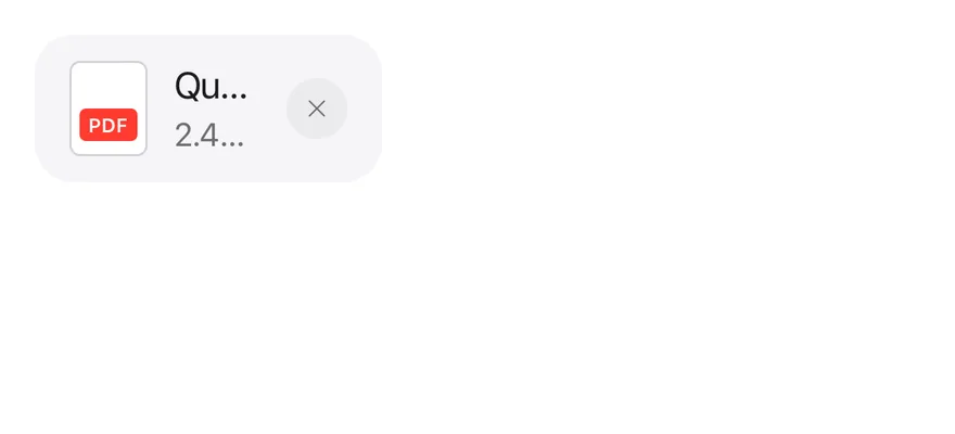
```tsx
import { XIcon } from "phosphor-react-native"
import { Attachment, AttachmentAction, AttachmentActions, AttachmentContent, AttachmentDescription, AttachmentLabel, AttachmentMedia, AttachmentTitle } from "@/components/ui/attachment"
import { Icon } from "@/components/ui/icon"
export function AttachmentExample() {
return (
pdf
Quarterly report.pdf
2.4 MB
)
}
```
```swift
import EsuissUI
import PhosphorSwift
import SwiftUI
struct AttachmentExample: View {
var body: some View {
Attachment {
AttachmentMedia(.document) { AttachmentLabel("pdf", tint: .danger) }
AttachmentContent {
AttachmentTitle("Quarterly report.pdf")
AttachmentDescription("2.4 MB")
}
AttachmentActions {
AttachmentAction("Remove", icon: Ph.x.bold) {}
}
}
}
}
```
```kotlin
import androidx.compose.foundation.layout.Row
import androidx.compose.runtime.Composable
import androidx.compose.ui.graphics.Color
import androidx.compose.ui.semantics.contentDescription
import com.adamglin.PhosphorIcons
import com.adamglin.phosphoricons.Regular
import com.adamglin.phosphoricons.regular.X
import com.esuiss.ui.components.Attachment
import com.esuiss.ui.components.AttachmentAction
import com.esuiss.ui.components.AttachmentActions
import com.esuiss.ui.components.AttachmentContent
import com.esuiss.ui.components.AttachmentDescription
import com.esuiss.ui.components.AttachmentLabel
import com.esuiss.ui.components.AttachmentMedia
import com.esuiss.ui.components.AttachmentMediaVariant
import com.esuiss.ui.components.AttachmentTitle
import com.esuiss.ui.components.Icon
import com.esuiss.ui.theme.EsuissTheme
@Composable
fun AttachmentDocument(extension: String, tone: Color) {
AttachmentMedia(variant = AttachmentMediaVariant.Document) {
AttachmentLabel(extension, background = tone)
}
}
@Composable
fun AttachmentIconAction(label: String, icon: androidx.compose.ui.graphics.vector.ImageVector = PhosphorIcons.Regular.X) {
AttachmentAction(onClick = {}, contentDescription = label) {
Icon(icon, contentDescription = null)
}
}
@Composable
fun AttachmentDefault() {
Row {
Attachment {
AttachmentDocument("pdf", EsuissTheme.colors.red)
AttachmentContent {
AttachmentTitle("Quarterly report.pdf")
AttachmentDescription("2.4 MB")
}
AttachmentActions { AttachmentIconAction("Remove") }
}
}
}
```
`Attachment` is a rounded `View` that lays out an `AttachmentMedia` thumbnail, an `AttachmentContent` column and `AttachmentActions`. It comes in `default`, `sm` and `xs` sizes and in `horizontal` or `vertical` orientation; the vertical layout makes a tile with the actions floating over the media.
The `state` prop reflects the upload lifecycle: `idle` draws a dashed border for an empty drop slot, `error` turns the description red, and `uploading`, `processing` and `done` are passed to the parts through context. Put several attachments in an `AttachmentGroup` to show them as one list with hairlines between rows.
## Installation
```bash title="Terminal"
npx @esuiss/uim@latest add attachment
```
```bash title="Terminal"
npx @esuiss/uim@latest add attachment --platform swift
```
```bash title="Terminal"
npx @esuiss/uim@latest add attachment --platform kotlin
```
The CLI also adds what it builds on: [Button](/docs/components/button), [Icon](/docs/components/icon), [Progress](/docs/components/progress), [Text](/docs/components/text).
### Manual
**Uniwind**
1. Install the dependencies:
```bash title="Terminal"
npx expo install cn
```
2. Add the pieces it builds on: [Button](/docs/components/button), [Icon](/docs/components/icon), [Progress](/docs/components/progress), [Text](/docs/components/text), and the primitives `components/primitives/progress.tsx`, `components/primitives/types.tsx`, `components/primitives/use-render.tsx`.
3. Copy the source into `components/ui/attachment.tsx`:
```tsx title="uniwind/components/ui/attachment.tsx"
import { cn } from "cn"
import * as React from "react"
import { Pressable, View, type ViewProps } from "react-native"
import * as ProgressPrimitive from "@/components/primitives/progress"
import type { RenderProp } from "@/components/primitives/types"
import { resolveClassName, useRender } from "@/components/primitives/use-render"
import { Button, buttonTextVariants } from "@/components/ui/button"
import { IconClassContext } from "@/components/ui/icon"
import {
ProgressIndicator,
ProgressTrack,
ProgressValue,
} from "@/components/ui/progress"
import { Text, TextClassContext } from "@/components/ui/text"
type AttachmentState = "idle" | "uploading" | "processing" | "error" | "done"
type AttachmentSize = "default" | "sm" | "xs"
type AttachmentOrientation = "horizontal" | "vertical"
type AttachmentContextValue = {
state: AttachmentState
size: AttachmentSize
orientation: AttachmentOrientation
grouped: boolean
}
const AttachmentContext = React.createContext({
state: "done",
size: "default",
orientation: "horizontal",
grouped: false,
})
const AttachmentGroupItemContext = React.createContext(null)
const AttachmentContentContext = React.createContext(false)
const SIZE: Record = {
default: "gap-3 px-4 py-3",
sm: "gap-2.5",
xs: "gap-1.5",
}
const SIZE_WITH_CONTENT: Record = {
default: "px-2.5 py-2",
sm: "px-2 py-1.5",
xs: "px-1.5 py-1",
}
const SIZE_WITH_MEDIA: Record = {
default: "p-2",
sm: "p-1.5",
xs: "p-1",
}
const SEPARATOR_START: Record = {
default: ["start-4", "start-16"],
sm: ["start-2", "start-12"],
xs: ["start-1.5", "start-9.5"],
}
const MEDIA_SIZE: Record = {
default: "h-11 w-9",
sm: "h-10 w-8",
xs: "h-8.5 w-7 rounded-sm",
}
const ACTION_SIZE: Record = {
default: ["size-7", 9],
sm: ["size-6", 11],
xs: ["size-5", 13],
}
function wrapText(children: React.ReactNode) {
const output: React.ReactNode[] = []
let run: (string | number)[] = []
const flush = () => {
if (run.length === 0) return
output.push({run.join("")})
run = []
}
for (const child of React.Children.toArray(children)) {
if (typeof child === "string" || typeof child === "number") {
run.push(child)
} else {
flush()
output.push(child)
}
}
flush()
return output
}
function containsType(children: React.ReactNode, type: unknown) {
let found = false
React.Children.forEach(children, (child) => {
if (React.isValidElement(child) && child.type === type) found = true
})
return found
}
function Attachment({
className,
state = "done",
size = "default",
orientation = "horizontal",
children,
...props
}: ViewProps & {
state?: AttachmentState
size?: AttachmentSize
orientation?: AttachmentOrientation
}) {
const groupIndex = React.useContext(AttachmentGroupItemContext)
const grouped = groupIndex !== null
const hasMedia = containsType(children, AttachmentMedia)
const hasContent = containsType(children, AttachmentContent)
const vertical = orientation === "vertical"
const context = React.useMemo(
() => ({ state, size, orientation, grouped }),
[state, size, orientation, grouped]
)
return (
{grouped && groupIndex > 0 ? (
) : null}
{children}
)
}
function AttachmentMedia({
className,
variant = "icon",
...props
}: ViewProps & { variant?: "icon" | "document" | "image" }) {
const { size, orientation } = React.useContext(AttachmentContext)
const vertical = orientation === "vertical"
return (
)
}
function AttachmentLabel({ className, children, ...props }: ViewProps) {
return (
{wrapText(children)}
)
}
function AttachmentContent({ className, children, ...props }: ViewProps) {
const { orientation } = React.useContext(AttachmentContext)
const progress = containsType(children, AttachmentProgress)
return (
{children}
)
}
function AttachmentTitle({
className,
numberOfLines = 1,
...props
}: React.ComponentProps) {
const { size } = React.useContext(AttachmentContext)
const progress = React.useContext(AttachmentContentContext)
return (
)
}
function AttachmentDescription({
className,
numberOfLines = 1,
...props
}: React.ComponentProps) {
const { size, state } = React.useContext(AttachmentContext)
return (
)
}
function AttachmentProgress({
className,
...props
}: Omit, "children">) {
return (
cn("relative mt-2 w-full", resolveClassName(className, state))
}
{...props}
>
)
}
function AttachmentActions({ className, ...props }: ViewProps) {
const { orientation } = React.useContext(AttachmentContext)
return (
)
}
function AttachmentAction({
className,
variant = "secondary",
size,
hitSlop,
children,
...props
}: React.ComponentProps) {
const { size: attachmentSize, orientation } =
React.useContext(AttachmentContext)
const isText = variant === "link"
const resolvedSize = size ?? (isText ? "sm" : "icon-xs")
const [actionSize, slop] = ACTION_SIZE[attachmentSize]
const vertical = orientation === "vertical"
const disabled = Boolean(props.disabled)
return (
)
}
function AttachmentTrigger({
className,
render,
...props
}: React.ComponentProps &
React.RefAttributes & {
render?: RenderProp, Record>
}) {
const { size, grouped } = React.useContext(AttachmentContext)
return useRender({
defaultComponent: Pressable,
render,
props: [
{
className: cn(
"absolute inset-0 z-10 active:bg-item-pressed",
grouped
? "rounded-none"
: size === "xs"
? "rounded-lg"
: "rounded-2xl",
className
),
role: "button",
},
props,
],
})
}
function AttachmentGroup({ className, children, ...props }: ViewProps) {
let index = 0
const items = React.Children.map(children, (child) => {
if (!React.isValidElement(child)) return child
const value = index
index += 1
return (
{child}
)
})
return (
{items}
)
}
export {
Attachment,
AttachmentAction,
AttachmentActions,
AttachmentContent,
AttachmentDescription,
AttachmentGroup,
AttachmentLabel,
AttachmentMedia,
AttachmentProgress,
AttachmentTitle,
AttachmentTrigger,
}
```
4. Update the import paths to match your project.
**NativeWind**
1. Install the dependencies:
```bash title="Terminal"
npx expo install cn
```
2. Add the pieces it builds on: [Button](/docs/components/button), [Icon](/docs/components/icon), [Progress](/docs/components/progress), [Text](/docs/components/text), and the primitives `components/primitives/progress.tsx`, `components/primitives/types.tsx`, `components/primitives/use-render.tsx`.
3. Copy the source into `components/ui/attachment.tsx`:
```tsx title="nativewind/components/ui/attachment.tsx"
import { cn } from "cn"
import * as React from "react"
import { Pressable, View, type ViewProps } from "react-native"
import * as ProgressPrimitive from "@/components/primitives/progress"
import type { RenderProp } from "@/components/primitives/types"
import { resolveClassName, useRender } from "@/components/primitives/use-render"
import { Button, buttonTextVariants } from "@/components/ui/button"
import { IconClassContext } from "@/components/ui/icon"
import {
ProgressIndicator,
ProgressTrack,
ProgressValue,
} from "@/components/ui/progress"
import { Text, TextClassContext } from "@/components/ui/text"
type AttachmentState = "idle" | "uploading" | "processing" | "error" | "done"
type AttachmentSize = "default" | "sm" | "xs"
type AttachmentOrientation = "horizontal" | "vertical"
type AttachmentContextValue = {
state: AttachmentState
size: AttachmentSize
orientation: AttachmentOrientation
grouped: boolean
}
const AttachmentContext = React.createContext({
state: "done",
size: "default",
orientation: "horizontal",
grouped: false,
})
const AttachmentGroupItemContext = React.createContext(null)
const AttachmentContentContext = React.createContext(false)
const SIZE: Record = {
default: "gap-3 px-4 py-3",
sm: "gap-2.5",
xs: "gap-1.5",
}
const SIZE_WITH_CONTENT: Record = {
default: "px-2.5 py-2",
sm: "px-2 py-1.5",
xs: "px-1.5 py-1",
}
const SIZE_WITH_MEDIA: Record = {
default: "p-2",
sm: "p-1.5",
xs: "p-1",
}
const SEPARATOR_START: Record = {
default: ["start-4", "start-16"],
sm: ["start-2", "start-12"],
xs: ["start-1.5", "start-[2.375rem]"],
}
const MEDIA_SIZE: Record = {
default: "h-11 w-9",
sm: "h-10 w-8",
xs: "h-[2.125rem] w-7 rounded-sm",
}
const ACTION_SIZE: Record = {
default: ["size-7", 9],
sm: ["size-6", 11],
xs: ["size-5", 13],
}
function wrapText(children: React.ReactNode) {
const output: React.ReactNode[] = []
let run: (string | number)[] = []
const flush = () => {
if (run.length === 0) return
output.push({run.join("")})
run = []
}
for (const child of React.Children.toArray(children)) {
if (typeof child === "string" || typeof child === "number") {
run.push(child)
} else {
flush()
output.push(child)
}
}
flush()
return output
}
function containsType(children: React.ReactNode, type: unknown) {
let found = false
React.Children.forEach(children, (child) => {
if (React.isValidElement(child) && child.type === type) found = true
})
return found
}
function Attachment({
className,
state = "done",
size = "default",
orientation = "horizontal",
children,
...props
}: ViewProps & {
state?: AttachmentState
size?: AttachmentSize
orientation?: AttachmentOrientation
}) {
const groupIndex = React.useContext(AttachmentGroupItemContext)
const grouped = groupIndex !== null
const hasMedia = containsType(children, AttachmentMedia)
const hasContent = containsType(children, AttachmentContent)
const vertical = orientation === "vertical"
const context = React.useMemo(
() => ({ state, size, orientation, grouped }),
[state, size, orientation, grouped]
)
return (
{grouped && groupIndex > 0 ? (
) : null}
{children}
)
}
function AttachmentMedia({
className,
variant = "icon",
...props
}: ViewProps & { variant?: "icon" | "document" | "image" }) {
const { size, orientation } = React.useContext(AttachmentContext)
const vertical = orientation === "vertical"
return (
)
}
function AttachmentLabel({ className, children, ...props }: ViewProps) {
return (
{wrapText(children)}
)
}
function AttachmentContent({ className, children, ...props }: ViewProps) {
const { orientation } = React.useContext(AttachmentContext)
const progress = containsType(children, AttachmentProgress)
return (
{children}
)
}
function AttachmentTitle({
className,
numberOfLines = 1,
...props
}: React.ComponentProps) {
const { size } = React.useContext(AttachmentContext)
const progress = React.useContext(AttachmentContentContext)
return (
)
}
function AttachmentDescription({
className,
numberOfLines = 1,
...props
}: React.ComponentProps) {
const { size, state } = React.useContext(AttachmentContext)
return (
)
}
function AttachmentProgress({
className,
...props
}: Omit, "children">) {
return (
cn("relative mt-2 w-full", resolveClassName(className, state))
}
{...props}
>
)
}
function AttachmentActions({ className, ...props }: ViewProps) {
const { orientation } = React.useContext(AttachmentContext)
return (
)
}
function AttachmentAction({
className,
variant = "secondary",
size,
hitSlop,
children,
...props
}: React.ComponentProps) {
const { size: attachmentSize, orientation } =
React.useContext(AttachmentContext)
const isText = variant === "link"
const resolvedSize = size ?? (isText ? "sm" : "icon-xs")
const [actionSize, slop] = ACTION_SIZE[attachmentSize]
const vertical = orientation === "vertical"
const disabled = Boolean(props.disabled)
return (
)
}
function AttachmentTrigger({
className,
render,
...props
}: React.ComponentProps &
React.RefAttributes & {
render?: RenderProp, Record>
}) {
const { size, grouped } = React.useContext(AttachmentContext)
return useRender({
defaultComponent: Pressable,
render,
props: [
{
className: cn(
"absolute inset-0 z-10 active:bg-item-pressed",
grouped
? "rounded-none"
: size === "xs"
? "rounded-lg"
: "rounded-2xl",
className
),
role: "button",
},
props,
],
})
}
function AttachmentGroup({ className, children, ...props }: ViewProps) {
let index = 0
const items = React.Children.map(children, (child) => {
if (!React.isValidElement(child)) return child
const value = index
index += 1
return (
{child}
)
})
return (
{items}
)
}
export {
Attachment,
AttachmentAction,
AttachmentActions,
AttachmentContent,
AttachmentDescription,
AttachmentGroup,
AttachmentLabel,
AttachmentMedia,
AttachmentProgress,
AttachmentTitle,
AttachmentTrigger,
}
```
4. Update the import paths to match your project.
**StyleSheet**
1. Add the pieces it builds on: [Button](/docs/components/button), [Icon](/docs/components/icon), [Progress](/docs/components/progress), [Text](/docs/components/text), and the primitives `components/primitives/progress.tsx`, `components/primitives/types.tsx`, `components/primitives/use-render.tsx`.
2. Copy the source into `components/ui/attachment.tsx`:
```tsx title="stylesheet/components/ui/attachment.tsx"
import * as React from "react"
import {
Pressable,
type StyleProp,
StyleSheet,
View,
type ViewProps,
type ViewStyle,
} from "react-native"
import * as ProgressPrimitive from "@/components/primitives/progress"
import type { RenderProp } from "@/components/primitives/types"
import { useRender } from "@/components/primitives/use-render"
import { Button, buttonTextStyle } from "@/components/ui/button"
import { IconSizeContext } from "@/components/ui/icon"
import {
ProgressIndicator,
ProgressTrack,
ProgressValue,
} from "@/components/ui/progress"
import { Text, TextStyleContext } from "@/components/ui/text"
import { fontSize, radius, useTheme } from "@/components/ui/theme"
type AttachmentState = "idle" | "uploading" | "processing" | "error" | "done"
type AttachmentSize = "default" | "sm" | "xs"
type AttachmentOrientation = "horizontal" | "vertical"
type AttachmentContextValue = {
state: AttachmentState
size: AttachmentSize
orientation: AttachmentOrientation
grouped: boolean
}
const AttachmentContext = React.createContext({
state: "done",
size: "default",
orientation: "horizontal",
grouped: false,
})
const AttachmentGroupItemContext = React.createContext(null)
const AttachmentContentContext = React.createContext(false)
const SIZE: Record = {
default: { gap: 12, paddingHorizontal: 16, paddingVertical: 12 },
sm: { gap: 10 },
xs: { gap: 6, borderRadius: radius.lg },
}
const SIZE_WITH_CONTENT: Record = {
default: { paddingHorizontal: 10, paddingVertical: 8 },
sm: { paddingHorizontal: 8, paddingVertical: 6 },
xs: { paddingHorizontal: 6, paddingVertical: 4 },
}
const SIZE_WITH_MEDIA: Record = {
default: { paddingHorizontal: 8, paddingVertical: 8 },
sm: { paddingHorizontal: 6, paddingVertical: 6 },
xs: { paddingHorizontal: 4, paddingVertical: 4 },
}
const SEPARATOR_START: Record = {
default: [16, 64],
sm: [8, 48],
xs: [6, 38],
}
const MEDIA_SIZE: Record = {
default: { height: 44, width: 36 },
sm: { height: 40, width: 32 },
xs: { height: 34, width: 28, borderRadius: radius.sm },
}
const ACTION_SIZE: Record = {
default: [28, 9],
sm: [24, 11],
xs: [20, 13],
}
const styles = StyleSheet.create({
root: {
position: "relative",
minWidth: 0,
maxWidth: "100%",
flexShrink: 0,
borderRadius: radius["2xl"],
},
horizontal: { minWidth: 160, flexDirection: "row", alignItems: "center" },
vertical: { flexDirection: "column" },
dashed: { borderWidth: 1, borderStyle: "dashed" },
separator: { position: "absolute", top: 0, end: 0, height: 1 },
media: {
position: "relative",
flexShrink: 0,
alignItems: "center",
justifyContent: "center",
overflow: "hidden",
borderRadius: radius.md,
},
mediaFramed: { borderRadius: radius.sm, borderWidth: 1 },
document: { justifyContent: "flex-end", paddingBottom: 6 },
square: { width: "100%", height: undefined, aspectRatio: 1 },
label: {
borderRadius: radius.xs,
paddingHorizontal: 4,
paddingVertical: 2,
},
labelText: {
fontSize: 9,
lineHeight: 11,
fontWeight: "600",
textTransform: "uppercase",
},
content: { minWidth: 0, maxWidth: "100%" },
progress: { position: "relative", marginTop: 8, width: "100%" },
progressValue: {
...fontSize.sm,
position: "absolute",
end: 0,
bottom: "100%",
marginBottom: 8,
},
track: { height: 4, borderRadius: radius.full },
indicator: { borderRadius: radius.full },
actions: {
position: "relative",
zIndex: 20,
flexShrink: 0,
flexDirection: "row",
alignItems: "center",
},
actionsVertical: { position: "absolute", top: 12, end: 12, gap: 4 },
trigger: {
position: "absolute",
top: 0,
right: 0,
bottom: 0,
left: 0,
zIndex: 10,
},
group: {
width: "100%",
minWidth: 0,
flexDirection: "column",
overflow: "hidden",
borderRadius: radius["2xl"],
},
})
function withAlpha(color: string, alpha: number) {
if (!color.startsWith("#") || color.length !== 7) return color
const r = Number.parseInt(color.slice(1, 3), 16)
const g = Number.parseInt(color.slice(3, 5), 16)
const b = Number.parseInt(color.slice(5, 7), 16)
return `rgba(${r}, ${g}, ${b}, ${alpha})`
}
function wrapText(children: React.ReactNode) {
const output: React.ReactNode[] = []
let run: (string | number)[] = []
const flush = () => {
if (run.length === 0) return
output.push({run.join("")})
run = []
}
for (const child of React.Children.toArray(children)) {
if (typeof child === "string" || typeof child === "number") {
run.push(child)
} else {
flush()
output.push(child)
}
}
flush()
return output
}
function containsType(children: React.ReactNode, type: unknown) {
let found = false
React.Children.forEach(children, (child) => {
if (React.isValidElement(child) && child.type === type) found = true
})
return found
}
function Attachment({
style,
state = "done",
size = "default",
orientation = "horizontal",
children,
...props
}: ViewProps & {
state?: AttachmentState
size?: AttachmentSize
orientation?: AttachmentOrientation
}) {
const { colors } = useTheme()
const groupIndex = React.useContext(AttachmentGroupItemContext)
const grouped = groupIndex !== null
const hasMedia = containsType(children, AttachmentMedia)
const hasContent = containsType(children, AttachmentContent)
const vertical = orientation === "vertical"
const context = React.useMemo(
() => ({ state, size, orientation, grouped }),
[state, size, orientation, grouped]
)
const padding =
vertical || size !== "default"
? hasContent
? SIZE_WITH_CONTENT[size]
: hasMedia
? SIZE_WITH_MEDIA[size]
: null
: null
return (
{grouped && groupIndex > 0 ? (
) : null}
{children}
)
}
function AttachmentMedia({
style,
variant = "icon",
...props
}: ViewProps & { variant?: "icon" | "document" | "image" }) {
const { colors } = useTheme()
const { size, orientation } = React.useContext(AttachmentContext)
const vertical = orientation === "vertical"
return (
)
}
function AttachmentLabel({ style, children, ...props }: ViewProps) {
const { colors } = useTheme()
return (
{wrapText(children)}
)
}
function AttachmentContent({ style, children, ...props }: ViewProps) {
const { orientation } = React.useContext(AttachmentContext)
const progress = containsType(children, AttachmentProgress)
return (
{children}
)
}
function AttachmentTitle({
style,
numberOfLines = 1,
...props
}: React.ComponentProps) {
const { size } = React.useContext(AttachmentContext)
const progress = React.useContext(AttachmentContentContext)
return (
)
}
function AttachmentDescription({
style,
numberOfLines = 1,
...props
}: React.ComponentProps) {
const { colors } = useTheme()
const { size, state } = React.useContext(AttachmentContext)
return (
)
}
function AttachmentProgress({
style,
...props
}: Omit, "children">) {
const { colors } = useTheme()
return (
[
styles.progress,
typeof style === "function" ? style(state) : style,
]}
{...props}
>
)
}
function AttachmentActions({ style, ...props }: ViewProps) {
const { orientation } = React.useContext(AttachmentContext)
return (
)
}
function AttachmentAction({
style,
variant = "secondary",
size,
hitSlop,
children,
...props
}: Omit, "style"> & {
style?: StyleProp
}) {
const { colors } = useTheme()
const { size: attachmentSize, orientation } =
React.useContext(AttachmentContext)
const isText = variant === "link"
const resolvedSize = size ?? (isText ? "sm" : "icon-xs")
const [actionSize, slop] = ACTION_SIZE[attachmentSize]
const vertical = orientation === "vertical"
const disabled = Boolean(props.disabled)
const textStyle = buttonTextStyle(variant, resolvedSize, colors, disabled)
return (
)
}
function AttachmentTrigger({
style,
render,
...props
}: Omit, "style"> &
React.RefAttributes & {
style?: StyleProp
render?: RenderProp, Record>
}) {
const { colors } = useTheme()
const { size, grouped } = React.useContext(AttachmentContext)
const borderRadius = grouped ? 0 : size === "xs" ? radius.lg : radius["2xl"]
return useRender({
defaultComponent: Pressable,
render,
props: [
{
style: ({ pressed }: { pressed: boolean }) => [
styles.trigger,
{ borderRadius },
pressed && { backgroundColor: colors.itemPressed },
style,
],
role: "button",
},
props,
],
})
}
function AttachmentGroup({ style, children, ...props }: ViewProps) {
const { colors } = useTheme()
let index = 0
const items = React.Children.map(children, (child) => {
if (!React.isValidElement(child)) return child
const value = index
index += 1
return (
{child}
)
})
return (
{items}
)
}
export {
Attachment,
AttachmentAction,
AttachmentActions,
AttachmentContent,
AttachmentDescription,
AttachmentGroup,
AttachmentLabel,
AttachmentMedia,
AttachmentProgress,
AttachmentTitle,
AttachmentTrigger,
}
```
3. Update the import paths to match your project.
**SwiftUI**
1. Target iOS 17 or later.
2. Add the Swift package to your app:
```swift title="Package.swift"
.package(url: "https://github.com/phosphor-icons/swift", from: "2.1.0")
```
3. Copy the theme files every view uses:
```swift title="swift/Theme/Theme.swift"
import SwiftUI
import UIKit
struct RGBA: Sendable {
let red: CGFloat
let green: CGFloat
let blue: CGFloat
let alpha: CGFloat
init(_ hex: UInt32, _ alpha: CGFloat = 1) {
red = CGFloat((hex >> 16) & 0xFF) / 255
green = CGFloat((hex >> 8) & 0xFF) / 255
blue = CGFloat(hex & 0xFF) / 255
self.alpha = alpha
}
var uiColor: UIColor {
UIColor(red: red, green: green, blue: blue, alpha: alpha)
}
}
extension Color {
static func adaptive(light: RGBA, dark: RGBA) -> Color {
let lightColor = light.uiColor
let darkColor = dark.uiColor
return Color(uiColor: UIColor { traits in
traits.userInterfaceStyle == .dark ? darkColor : lightColor
})
}
}
public struct TextStyle: Sendable, Hashable {
public let size: CGFloat
public let lineHeight: CGFloat
public let letterSpacing: CGFloat
public init(size: CGFloat, lineHeight: CGFloat, letterSpacing: CGFloat) {
self.size = size
self.lineHeight = lineHeight
self.letterSpacing = letterSpacing
}
public func font(weight: Font.Weight = .regular) -> Font {
.system(size: size, weight: weight)
}
public var lineSpacing: CGFloat {
max(0, lineHeight - UIFont.systemFont(ofSize: size).lineHeight)
}
}
extension Hashable where Self == Font {
public static func textStyle(_ style: TextStyle, weight: Font.Weight = .regular) -> Font {
style.font(weight: weight)
}
}
private struct TextStyleModifier: ViewModifier {
let style: TextStyle
let weight: Font.Weight
func body(content: Content) -> some View {
content
.font(style.font(weight: weight))
.tracking(style.letterSpacing)
.lineSpacing(style.lineSpacing)
.padding(.vertical, style.lineSpacing / 2)
}
}
extension View {
public func textStyle(_ style: TextStyle, weight: Font.Weight = .regular) -> some View {
modifier(TextStyleModifier(style: style, weight: weight))
}
}
public struct Shadow: Sendable, Hashable {
public let color: Color
public let radius: CGFloat
public let x: CGFloat
public let y: CGFloat
public init(color: Color, radius: CGFloat, x: CGFloat = 0, y: CGFloat = 0) {
self.color = color
self.radius = radius
self.x = x
self.y = y
}
}
extension View {
public func shadow(_ shadow: Shadow) -> some View {
self.shadow(color: shadow.color, radius: shadow.radius, x: shadow.x, y: shadow.y)
}
}
```
```swift title="swift/Theme/Tokens.swift"
import SwiftUI
extension Color {
public static let surface = Color.adaptive(light: .init(0xFFFFFF), dark: .init(0x000000))
public static let surfaceSecondary = Color.adaptive(light: .init(0xF5F5F7), dark: .init(0x161617))
public static let surfaceTertiary = Color.adaptive(light: .init(0xE8E8ED), dark: .init(0x2C2C2E))
public static let surfaceRaised = Color.adaptive(light: .init(0xFFFFFF), dark: .init(0x1D1D1F))
public static let label = Color.adaptive(light: .init(0x1D1D1F), dark: .init(0xF5F5F7))
public static let labelSecondary = Color.adaptive(light: .init(0x6E6E73), dark: .init(0xA1A1A6))
public static let labelTertiary = Color.adaptive(light: .init(0x86868B), dark: .init(0x86868B))
public static let labelQuaternary = Color.adaptive(light: .init(0xD2D2D7), dark: .init(0x424245))
public static let control = Color.adaptive(light: .init(0x000000, 0.04), dark: .init(0xFFFFFF, 0.1))
public static let controlPressed = Color.adaptive(light: .init(0x000000, 0.12), dark: .init(0xFFFFFF, 0.22))
public static let controlSelected = Color.adaptive(light: .init(0x1D1D1F), dark: .init(0xF5F5F7))
public static let controlDisabled = Color.adaptive(light: .init(0x000000, 0.03), dark: .init(0xFFFFFF, 0.05))
public static let onControlSelected = Color.adaptive(light: .init(0xFFFFFF), dark: .init(0x000000))
public static let itemPressed = Color.adaptive(light: .init(0x000000, 0.08), dark: .init(0xFFFFFF, 0.12))
public static let itemSelected = Color.adaptive(light: .init(0x000000, 0.06), dark: .init(0xFFFFFF, 0.1))
public static let separator = Color.adaptive(light: .init(0xD2D2D7), dark: .init(0x424245))
public static let separatorStrong = Color.adaptive(light: .init(0x86868B), dark: .init(0x6E6E73))
public static let accent = Color.adaptive(light: .init(0x0071E3), dark: .init(0x0071E3))
public static let accentPressed = Color.adaptive(light: .init(0x005BB8), dark: .init(0x004D9E))
public static let accentSelected = Color.adaptive(light: .init(0x0071E3), dark: .init(0x0071E3))
public static let accentDisabled = Color.adaptive(light: .init(0x0071E3, 0.4), dark: .init(0x0071E3, 0.4))
public static let onAccent = Color.adaptive(light: .init(0xFFFFFF), dark: .init(0xFFFFFF))
public static let accentSurface = Color.adaptive(light: .init(0x0071E3, 0.09), dark: .init(0x0071E3, 0.18))
public static let accentSurfacePressed = Color.adaptive(light: .init(0x0071E3, 0.18), dark: .init(0x0071E3, 0.3))
public static let link = Color.adaptive(light: .init(0x0066CC), dark: .init(0x2997FF))
public static let focus = Color.adaptive(light: .init(0x0071E3), dark: .init(0x0071E3))
public static let scrim = Color.adaptive(light: .init(0x000000, 0.48), dark: .init(0x000000, 0.48))
public static let media = Color.adaptive(light: .init(0x000000), dark: .init(0x000000))
public static let onMedia = Color.adaptive(light: .init(0xFFFFFF), dark: .init(0xFFFFFF))
public static let danger = Color.adaptive(light: .init(0xD0000A), dark: .init(0xFF5447))
public static let dangerSurface = Color.adaptive(light: .init(0xD70015, 0.08), dark: .init(0xFF453A, 0.2))
public static let dangerSurfacePressed = Color.adaptive(light: .init(0xD70015, 0.16), dark: .init(0xFF453A, 0.36))
public static let success = Color.adaptive(light: .init(0x008009), dark: .init(0x30D158))
public static let successSurface = Color.adaptive(light: .init(0xEFFAF1), dark: .init(0x30D158, 0.16))
public static let warning = Color.adaptive(light: .init(0xB64400), dark: .init(0xFF9F0A))
public static let warningSurface = Color.adaptive(light: .init(0xFFF5EA), dark: .init(0xFF9F0A, 0.16))
}
public enum Radius {
public static let xs: CGFloat = 3
public static let sm: CGFloat = 5
public static let md: CGFloat = 8
public static let lg: CGFloat = 10
public static let xl: CGFloat = 12
public static let xl2: CGFloat = 18
public static let xl3: CGFloat = 28
public static let full: CGFloat = 9999
}
extension TextStyle {
public static let xs3 = TextStyle(size: 11, lineHeight: 13, letterSpacing: 0.066)
public static let xs2 = TextStyle(size: 12, lineHeight: 16, letterSpacing: 0)
public static let xs = TextStyle(size: 13, lineHeight: 18, letterSpacing: -0.078)
public static let sm = TextStyle(size: 15, lineHeight: 20, letterSpacing: -0.24)
public static let md = TextStyle(size: 16, lineHeight: 21, letterSpacing: -0.32)
public static let base = TextStyle(size: 17, lineHeight: 22, letterSpacing: -0.442)
public static let lg = TextStyle(size: 20, lineHeight: 25, letterSpacing: -0.46)
public static let xl = TextStyle(size: 22, lineHeight: 28, letterSpacing: -0.264)
public static let xl2 = TextStyle(size: 28, lineHeight: 34, letterSpacing: 0.392)
public static let xl3 = TextStyle(size: 34, lineHeight: 41, letterSpacing: 0.408)
public static let allCases: [TextStyle] = [.xs3, .xs2, .xs, .sm, .md, .base, .lg, .xl, .xl2, .xl3]
}
extension Shadow {
public static let md = Shadow(color: .black.opacity(0.08), radius: 6, x: 2, y: 4)
public static let lg = Shadow(color: .black.opacity(0.12), radius: 12, y: 4)
}
```
4. Copy the source and every file it uses:
```swift title="swift/Components/Attachment.swift"
import SwiftUI
public enum AttachmentState: CaseIterable, Sendable {
case idle, uploading, processing, error, done
}
public enum AttachmentSize: CaseIterable, Sendable {
case `default`, sm, xs
}
public enum AttachmentOrientation: CaseIterable, Sendable {
case horizontal, vertical
}
public enum AttachmentMediaVariant: CaseIterable, Sendable {
case icon, document, image
}
struct AttachmentContext: Sendable {
var state: AttachmentState = .done
var size: AttachmentSize = .default
var orientation: AttachmentOrientation = .horizontal
var radius: CGFloat = Radius.xl2
}
enum AttachmentRole: Sendable {
case other, media, content, actions, trigger
}
struct AttachmentRoleKey: LayoutValueKey {
static let defaultValue = AttachmentRole.other
}
struct AttachmentParts: Equatable {
var media = false
var content = false
var progress = false
}
struct AttachmentPartsKey: PreferenceKey {
static var defaultValue: AttachmentParts { AttachmentParts() }
static func reduce(value: inout AttachmentParts, nextValue: () -> AttachmentParts) {
let next = nextValue()
value.media = value.media || next.media
value.content = value.content || next.content
value.progress = value.progress || next.progress
}
}
struct AttachmentGroupRow {
let bounds: Anchor
let inset: CGFloat
}
struct AttachmentGroupRowKey: PreferenceKey {
static var defaultValue: [AttachmentGroupRow] { [] }
static func reduce(value: inout [AttachmentGroupRow], nextValue: () -> [AttachmentGroupRow]) {
value.append(contentsOf: nextValue())
}
}
public struct Attachment: View {
public typealias Size = AttachmentSize
public typealias Orientation = AttachmentOrientation
let state: AttachmentState
let size: Size
let orientation: Orientation
let block: Bool
let content: Content
@State private var parts = AttachmentParts()
@Environment(\.attachmentGrouped) private var grouped
public init(
state: AttachmentState = .done,
size: Size = .default,
orientation: Orientation = .horizontal,
block: Bool = false,
@ViewBuilder content: () -> Content
) {
self.state = state
self.size = size
self.orientation = orientation
self.block = block
self.content = content()
}
public var body: some View {
let vertical = orientation == .vertical
let radius = grouped ? 0 : (size == .xs ? Radius.lg : Radius.xl2)
let shape = RoundedRectangle(cornerRadius: radius, style: .continuous)
let insets = insets
let fill = grouped || (block && !vertical)
AttachmentLayout(orientation: orientation, spacing: spacing, insets: insets, fill: fill) {
content
}
.padding(insets)
.frame(width: vertical ? (parts.content ? 120 : 96) : nil)
.frame(minWidth: vertical ? nil : 160, alignment: .leading)
.background {
if !grouped {
shape.fill(Color.surfaceSecondary)
}
}
.overlay {
if state == .idle && !grouped {
shape.strokeBorder(Color.separator, style: StrokeStyle(lineWidth: 1, dash: [4, 3]))
}
}
.scaledFont(size == .default ? .sm : .xs)
.foregroundStyle(Color.label)
.environment(
\.attachment,
AttachmentContext(state: state, size: size, orientation: orientation, radius: radius)
)
.onPreferenceChange(AttachmentPartsKey.self) { parts = $0 }
.transformPreference(AttachmentPartsKey.self) { $0 = AttachmentParts() }
.anchorPreference(key: AttachmentGroupRowKey.self, value: .bounds) { anchor in
grouped ? [AttachmentGroupRow(bounds: anchor, inset: separatorInset)] : []
}
.accessibilityElement(children: .contain)
}
private var spacing: CGFloat {
switch size {
case .default: orientation == .vertical ? 8 : 12
case .sm: 10
case .xs: 6
}
}
private var insets: EdgeInsets {
func edges(_ horizontal: CGFloat, _ vertical: CGFloat) -> EdgeInsets {
EdgeInsets(top: vertical, leading: horizontal, bottom: vertical, trailing: horizontal)
}
switch size {
case .default:
if orientation == .vertical {
return parts.content ? edges(10, 8) : parts.media ? edges(8, 8) : edges(16, 12)
}
return edges(16, 12)
case .sm:
return parts.content ? edges(8, 6) : parts.media ? edges(6, 6) : edges(0, 0)
case .xs:
return parts.content ? edges(6, 4) : parts.media ? edges(4, 4) : edges(0, 0)
}
}
private var separatorInset: CGFloat {
switch size {
case .default: parts.media ? 64 : 16
case .sm: parts.media ? 48 : 8
case .xs: parts.media ? 38 : 6
}
}
}
struct AttachmentLayout: Layout {
let orientation: AttachmentOrientation
let spacing: CGFloat
let insets: EdgeInsets
let fill: Bool
private struct Frames {
var size: CGSize
var frames: [CGRect]
}
private func arrange(_ proposal: ProposedViewSize, subviews: Subviews) -> Frames {
orientation == .vertical ? vertical(proposal, subviews: subviews) : horizontal(proposal, subviews: subviews)
}
private func horizontal(_ proposal: ProposedViewSize, subviews: Subviews) -> Frames {
let flow = subviews.filter { $0[AttachmentRoleKey.self] != .trigger && !floating($0) }
var fixed: CGFloat = 0
var flexible: [LayoutSubview] = []
var ideal: CGFloat = 0
for subview in flow {
if subview[AttachmentRoleKey.self] == .content || subview[AttachmentRoleKey.self] == .other {
flexible.append(subview)
ideal += subview.sizeThatFits(.unspecified).width
} else {
fixed += subview.sizeThatFits(.unspecified).width
}
}
let gaps = spacing * CGFloat(max(flow.count - 1, 0))
let minimum = max(0, 160 - insets.leading - insets.trailing)
var width: CGFloat
if let available = proposal.width, available.isFinite {
width = fill ? available : min(available, max(minimum, fixed + gaps + ideal))
} else {
width = max(minimum, fixed + gaps + ideal)
}
let share = flexible.isEmpty ? 0 : max(0, width - fixed - gaps) / CGFloat(flexible.count)
var sizes: [CGSize] = []
var height: CGFloat = 0
for subview in flow {
let role = subview[AttachmentRoleKey.self]
let size = role == .content || role == .other
? subview.sizeThatFits(ProposedViewSize(width: share, height: nil))
: subview.sizeThatFits(.unspecified)
sizes.append(CGSize(width: role == .content || role == .other ? share : size.width, height: size.height))
height = max(height, size.height)
}
if flexible.isEmpty {
width = max(minimum, fixed + gaps)
if fill, let available = proposal.width, available.isFinite { width = available }
}
var frames: [CGRect] = []
var x: CGFloat = 0
var index = 0
for subview in subviews {
if subview[AttachmentRoleKey.self] == .trigger || floating(subview) {
frames.append(.zero)
continue
}
let size = sizes[index]
frames.append(CGRect(x: x, y: (height - size.height) / 2, width: size.width, height: size.height))
x += size.width + spacing
index += 1
}
return Frames(size: CGSize(width: width, height: height), frames: frames)
}
private func vertical(_ proposal: ProposedViewSize, subviews: Subviews) -> Frames {
let width = proposal.width.flatMap { $0.isFinite ? $0 : nil } ?? 80
var frames: [CGRect] = []
var y: CGFloat = 0
var count = 0
for subview in subviews {
if subview[AttachmentRoleKey.self] == .trigger || floating(subview) {
frames.append(.zero)
continue
}
if count > 0 { y += spacing }
let size = subview.sizeThatFits(ProposedViewSize(width: width, height: nil))
frames.append(CGRect(x: 0, y: y, width: width, height: size.height))
y += size.height
count += 1
}
return Frames(size: CGSize(width: width, height: y), frames: frames)
}
private func floating(_ subview: LayoutSubview) -> Bool {
orientation == .vertical && subview[AttachmentRoleKey.self] == .actions
}
func sizeThatFits(proposal: ProposedViewSize, subviews: Subviews, cache: inout ()) -> CGSize {
arrange(proposal, subviews: subviews).size
}
func placeSubviews(in bounds: CGRect, proposal: ProposedViewSize, subviews: Subviews, cache: inout ()) {
let arranged = arrange(ProposedViewSize(width: bounds.width, height: bounds.height), subviews: subviews)
let outer = CGRect(
x: bounds.minX - insets.leading,
y: bounds.minY - insets.top,
width: bounds.width + insets.leading + insets.trailing,
height: bounds.height + insets.top + insets.bottom
)
for (index, subview) in subviews.enumerated() {
if subview[AttachmentRoleKey.self] == .trigger {
subview.place(at: outer.origin, proposal: ProposedViewSize(outer.size))
continue
}
if floating(subview) {
let size = subview.sizeThatFits(.unspecified)
subview.place(at: CGPoint(x: outer.maxX - 12 - size.width, y: outer.minY + 12), proposal: ProposedViewSize(size))
continue
}
let frame = arranged.frames[index]
subview.place(
at: CGPoint(x: bounds.minX + frame.minX, y: bounds.minY + frame.minY),
proposal: ProposedViewSize(frame.size)
)
}
}
}
public struct AttachmentMedia: View {
public typealias Variant = AttachmentMediaVariant
let variant: Variant
let content: Content
@Environment(\.attachment) private var attachment
public init(_ variant: Variant = .icon, @ViewBuilder content: () -> Content) {
self.variant = variant
self.content = content()
}
public var body: some View {
let vertical = attachment.orientation == .vertical
let radius = attachment.size == .xs || variant != .image ? Radius.sm : Radius.md
let shape = RoundedRectangle(cornerRadius: radius, style: .continuous)
let square = vertical && variant != .document
Group {
if variant == .document {
content
.frame(maxWidth: .infinity, maxHeight: .infinity, alignment: .bottom)
.padding(.bottom, 6)
} else {
content
.frame(maxWidth: .infinity, maxHeight: .infinity)
}
}
.foregroundStyle(Color.labelSecondary)
.environment(\.attachmentIconSize, iconSize)
.frame(width: vertical ? nil : width, height: square ? nil : height)
.frame(maxWidth: vertical ? .infinity : nil)
.aspectRatio(square ? 1 : nil, contentMode: .fit)
.background(variant == .image ? Color.surfaceSecondary : Color.surface)
.clipShape(shape)
.overlay {
if variant != .image {
shape.strokeBorder(Color.separator, lineWidth: 1)
}
}
.layoutValue(key: AttachmentRoleKey.self, value: .media)
.preference(key: AttachmentPartsKey.self, value: AttachmentParts(media: true))
}
private var width: CGFloat {
switch attachment.size {
case .default: 36
case .sm: 32
case .xs: 28
}
}
private var height: CGFloat {
switch attachment.size {
case .default: 44
case .sm: 40
case .xs: 34
}
}
private var iconSize: CGFloat {
if attachment.orientation == .vertical { return 24 }
return attachment.size == .xs ? 14 : 16
}
}
extension AttachmentMedia where Content == AttachmentIcon {
public init(icon: Image) {
self.init(.icon) { AttachmentIcon(icon) }
}
}
extension AttachmentMedia where Content == AttachmentImage {
public init(image: Image) {
self.init(.image) { AttachmentImage(image) }
}
public init(url: URL?) {
self.init(.image) { AttachmentImage(url: url) }
}
}
public struct AttachmentIcon: View {
let image: Image
@Environment(\.attachmentIconSize) private var size
public init(_ image: Image) {
self.image = image
}
public var body: some View {
image
.resizable()
.scaledToFit()
.frame(width: size, height: size)
.accessibilityHidden(true)
}
}
public struct AttachmentImage: View {
let source: AvatarImage.Source
public init(_ image: Image) {
source = .image(image)
}
public init(url: URL?) {
source = .url(url)
}
public var body: some View {
Color.clear
.overlay {
switch source {
case .image(let image):
image.resizable().scaledToFill()
case .url(let url):
AsyncImage(url: url) { phase in
if let image = phase.image {
image.resizable().scaledToFill()
} else {
Color.clear
}
}
}
}
.clipped()
}
}
public struct AttachmentLabel: View {
let text: Text
let tint: Color
@ScaledMetric(relativeTo: .caption2) private var fontSize: CGFloat = 9
public init(_ text: LocalizedStringKey, tint: Color = .accent) {
self.text = Text(text)
self.tint = tint
}
public init(verbatim text: String, tint: Color = .accent) {
self.text = Text(verbatim: text)
self.tint = tint
}
public var body: some View {
text
.textCase(.uppercase)
.font(.system(size: fontSize, weight: .semibold))
.lineLimit(1)
.fixedSize()
.foregroundStyle(Color.onAccent)
.padding(.horizontal, 4)
.padding(.vertical, 2)
.background(tint, in: RoundedRectangle(cornerRadius: Radius.xs, style: .continuous))
}
}
public struct AttachmentContent: View {
let content: Content
@State private var progress = false
@Environment(\.attachment) private var attachment
public init(@ViewBuilder content: () -> Content) {
self.content = content()
}
public var body: some View {
VStack(alignment: .leading, spacing: 0) {
content
}
.frame(maxWidth: .infinity, alignment: .leading)
.padding(.horizontal, attachment.orientation == .vertical ? 4 : 0)
.environment(\.attachmentHasProgress, progress)
.onPreferenceChange(AttachmentPartsKey.self) { progress = $0.progress }
.transformPreference(AttachmentPartsKey.self) { $0 = AttachmentParts(content: true) }
.layoutValue(key: AttachmentRoleKey.self, value: .content)
}
}
public struct AttachmentTitle: View {
let text: Text
@Environment(\.attachment) private var attachment
@Environment(\.attachmentHasProgress) private var progress
public init(_ text: LocalizedStringKey) {
self.text = Text(text)
}
public init(verbatim text: String) {
self.text = Text(verbatim: text)
}
public var body: some View {
text
.scaledFont(attachment.size == .default ? .base : .xs, weight: attachment.size == .default ? .regular : .semibold)
.lineLimit(1)
.truncationMode(.middle)
.foregroundStyle(Color.label)
.padding(.trailing, progress ? 48 : 0)
.frame(maxWidth: .infinity, alignment: .leading)
}
}
public struct AttachmentDescription: View {
let text: Text
@Environment(\.attachment) private var attachment
public init(_ text: LocalizedStringKey) {
self.text = Text(text)
}
public init(verbatim text: String) {
self.text = Text(verbatim: text)
}
public var body: some View {
text
.scaledFont(attachment.size == .default ? .sm : .xs)
.lineLimit(1)
.foregroundStyle(attachment.state == .error ? Color.danger : .labelSecondary)
.padding(.top, 2)
.frame(maxWidth: .infinity, alignment: .leading)
}
}
public struct AttachmentProgress: View {
let value: Double
let total: Double
let label: Text
public init(value: Double, total: Double = 100, label: LocalizedStringKey = "Uploading") {
self.value = value
self.total = total
self.label = Text(label)
}
public var body: some View {
ProgressView(value: min(max(value, 0), total), total: total) {
label
}
.progressViewStyle(AttachmentProgressStyle())
.padding(.top, 8)
.preference(key: AttachmentPartsKey.self, value: AttachmentParts(progress: true))
}
}
private struct AttachmentProgressStyle: ProgressViewStyle {
func makeBody(configuration: Configuration) -> some View {
AttachmentProgressBar(fraction: configuration.fractionCompleted ?? 0)
}
}
private struct AttachmentProgressBar: View {
let fraction: Double
@Environment(\.accessibilityReduceMotion) private var reduceMotion
var body: some View {
let fraction = min(max(fraction, 0), 1)
Capsule()
.fill(Color.label.opacity(0.1))
.frame(height: 4)
.overlay(alignment: .leading) {
GeometryReader { proxy in
Capsule()
.fill(Color.accent)
.frame(width: proxy.size.width * fraction)
.animation(reduceMotion ? nil : .spring(response: 0.4, dampingFraction: 1), value: fraction)
}
}
.overlay(alignment: .topTrailing) {
Text(fraction, format: .percent.precision(.fractionLength(0)))
.scaledFont(.sm)
.monospacedDigit()
.foregroundStyle(Color.labelSecondary)
.fixedSize()
.alignmentGuide(.top) { $0[.bottom] + 8 }
.accessibilityHidden(true)
}
.accessibilityElement()
.accessibilityValue(Text(fraction, format: .percent.precision(.fractionLength(0))))
}
}
public struct AttachmentActions: View {
let content: Content
@Environment(\.attachment) private var attachment
public init(@ViewBuilder content: () -> Content) {
self.content = content()
}
public var body: some View {
HStack(spacing: attachment.orientation == .vertical ? 4 : 0) {
content
}
.zIndex(2)
.layoutValue(key: AttachmentRoleKey.self, value: .actions)
}
}
public struct AttachmentAction: View {
let variant: VariantButtonStyle.Variant
let action: () -> Void
let label: Label
@Environment(\.attachment) private var attachment
public init(
variant: VariantButtonStyle.Variant = .secondary,
action: @escaping () -> Void,
@ViewBuilder label: () -> Label
) {
self.variant = variant
self.action = action
self.label = label()
}
public var body: some View {
if variant == .link {
Button(action: action) {
label
}
.buttonStyle(VariantButtonStyle(.link, size: .sm, metrics: ButtonMetrics(horizontalPadding: 0, spacing: 4, iconSize: 16, textStyle: .base)))
} else {
let dimension = dimension
let reach = max(0, (44 - dimension) / 2)
Button(action: action) {
label
}
.buttonStyle(AttachmentActionStyle(variant: variant, dimension: dimension, overlay: attachment.orientation == .vertical, iconSize: attachment.size == .xs ? 10 : 12))
.padding(reach)
.contentShape(Rectangle())
.padding(-reach)
}
}
private var dimension: CGFloat {
switch attachment.size {
case .default: 28
case .sm: 24
case .xs: 20
}
}
}
extension AttachmentAction where Label == AttachmentActionIcon {
public init(
_ title: LocalizedStringKey,
icon: Image,
variant: VariantButtonStyle.Variant = .secondary,
action: @escaping () -> Void
) {
self.init(variant: variant, action: action) { AttachmentActionIcon(title, image: icon) }
}
}
extension AttachmentAction where Label == Text {
public init(
_ title: LocalizedStringKey,
variant: VariantButtonStyle.Variant = .link,
action: @escaping () -> Void
) {
self.init(variant: variant, action: action) { Text(title) }
}
}
public struct AttachmentActionIcon: View {
let title: Text
let image: Image
@Environment(\.attachmentActionIconSize) private var size
public init(_ title: LocalizedStringKey, image: Image) {
self.title = Text(title)
self.image = image
}
public var body: some View {
image
.resizable()
.scaledToFit()
.frame(width: size, height: size)
.accessibilityLabel(title)
}
}
private struct AttachmentActionStyle: ButtonStyle {
let variant: VariantButtonStyle.Variant
let dimension: CGFloat
let overlay: Bool
let iconSize: CGFloat
func makeBody(configuration: Configuration) -> some View {
AttachmentActionBody(
configuration: configuration,
variant: variant,
dimension: dimension,
overlay: overlay,
iconSize: iconSize
)
}
}
private struct AttachmentActionBody: View {
let configuration: ButtonStyleConfiguration
let variant: VariantButtonStyle.Variant
let dimension: CGFloat
let overlay: Bool
let iconSize: CGFloat
@Environment(\.isEnabled) private var isEnabled
var body: some View {
configuration.label
.environment(\.attachmentActionIconSize, iconSize)
.foregroundStyle(foreground)
.frame(width: dimension, height: dimension)
.background(background, in: Circle())
.overlay {
if variant == .outline && !overlay {
Circle().strokeBorder(Color.separator)
}
}
.contentShape(Circle())
.opacity(isEnabled ? 1 : 0.5)
}
private var pressed: Bool { configuration.isPressed }
private var foreground: Color {
if overlay { return .onAccent }
switch variant {
case .default: return .onAccent
case .destructive: return .danger
case .tinted, .plain: return .link
case .secondary, .outline, .ghost, .link: return pressed ? .label : .labelSecondary
}
}
private var background: Color {
if overlay { return .scrim }
switch variant {
case .default: return pressed ? .accentPressed : .accent
case .secondary: return pressed ? .controlPressed : .control
case .tinted: return pressed ? .accentSurfacePressed : .accentSurface
case .destructive: return pressed ? .dangerSurfacePressed : .dangerSurface
case .outline: return pressed ? .itemPressed : .surface
case .ghost, .plain, .link: return pressed ? .itemPressed : .clear
}
}
}
public struct AttachmentTrigger: View {
let label: Text
let action: () -> Void
@Environment(\.attachment) private var attachment
public init(_ label: LocalizedStringKey, action: @escaping () -> Void) {
self.label = Text(label)
self.action = action
}
public var body: some View {
Button(action: action) {
Color.clear
}
.buttonStyle(AttachmentTriggerStyle(radius: attachment.radius))
.accessibilityLabel(label)
.zIndex(1)
.layoutValue(key: AttachmentRoleKey.self, value: .trigger)
}
}
private struct AttachmentTriggerStyle: ButtonStyle {
let radius: CGFloat
func makeBody(configuration: Configuration) -> some View {
let shape = RoundedRectangle(cornerRadius: radius, style: .continuous)
shape
.fill(configuration.isPressed ? Color.itemPressed : .clear)
.contentShape(shape)
}
}
public struct AttachmentGroup: View {
let content: Content
public init(@ViewBuilder content: () -> Content) {
self.content = content()
}
public var body: some View {
let shape = RoundedRectangle(cornerRadius: Radius.xl2, style: .continuous)
VStack(alignment: .leading, spacing: 0) {
content
}
.frame(maxWidth: .infinity, alignment: .leading)
.environment(\.attachmentGrouped, true)
.overlayPreferenceValue(AttachmentGroupRowKey.self) { rows in
GeometryReader { proxy in
let rects = rows.map { (proxy[$0.bounds], $0.inset) }.sorted { $0.0.minY < $1.0.minY }
ForEach(Array(rects.dropFirst().enumerated()), id: \.offset) { _, row in
Rectangle()
.fill(Color.separator)
.frame(width: max(row.0.width - row.1, 0), height: 1)
.offset(x: row.0.minX + row.1, y: row.0.minY)
}
}
.allowsHitTesting(false)
.accessibilityHidden(true)
}
.transformPreference(AttachmentGroupRowKey.self) { $0 = [] }
.background(Color.surfaceSecondary, in: shape)
.clipShape(shape)
.accessibilityElement(children: .contain)
}
}
extension EnvironmentValues {
@Entry var attachment = AttachmentContext()
@Entry var attachmentGrouped = false
@Entry var attachmentHasProgress = false
@Entry var attachmentIconSize: CGFloat = 16
@Entry var attachmentActionIconSize: CGFloat = 12
}
```
```swift title="swift/Components/Avatar.swift"
import SwiftUI
public enum AvatarSize: CaseIterable, Sendable {
case sm, `default`, lg, xl
var dimension: CGFloat {
switch self {
case .sm: 24
case .default: 32
case .lg: 40
case .xl: 64
}
}
var overlap: CGFloat {
self == .xl ? 16 : 8
}
var textStyle: TextStyle {
switch self {
case .sm: .xs3
case .default: .xs
case .lg: .md
case .xl: .xl2
}
}
var fallbackIcon: CGFloat {
switch self {
case .sm: 14
case .default: 20
case .lg: 24
case .xl: 40
}
}
var badge: CGFloat {
switch self {
case .sm: 12
case .default: 16
case .lg: 18
case .xl: 22
}
}
var badgeIcon: CGFloat {
switch self {
case .sm: 0
case .default: 8
case .lg: 10
case .xl: 12
}
}
var countIcon: CGFloat {
switch self {
case .sm: 12
case .default: 16
case .lg: 20
case .xl: 28
}
}
}
public struct Avatar: View {
public typealias Size = AvatarSize
let size: Size
let content: Content
@Environment(\.avatarGrouped) private var grouped
public init(size: Size = .default, @ViewBuilder content: () -> Content) {
self.size = size
self.content = content()
}
public var body: some View {
ZStack {
content
}
.padding(grouped ? 2 : 0)
.background {
if grouped {
Circle().fill(Color.surface)
}
}
.frame(width: size.dimension, height: size.dimension)
.environment(\.avatarSize, size)
.environment(\.avatarGrouped, false)
.accessibilityElement(children: .combine)
.accessibilityAddTraits(.isImage)
.layoutValue(key: AvatarOverlapKey.self, value: size.overlap)
}
}
extension Avatar {
public init(
url: URL?,
size: Size = .default,
@ViewBuilder fallback: () -> Fallback
) where Content == TupleView<(AvatarFallback, AvatarImage)> {
let fallback = fallback()
self.init(size: size) {
AvatarFallback { fallback }
AvatarImage(url: url)
}
}
public init(
url: URL?,
initials: String,
size: Size = .default
) where Content == TupleView<(AvatarFallback, AvatarImage)> {
self.init(size: size) {
AvatarFallback(initials)
AvatarImage(url: url)
}
}
}
public struct AvatarImage: View {
enum Source {
case url(URL?)
case image(Image)
}
let source: Source
public init(url: URL?) {
source = .url(url)
}
public init(_ image: Image) {
source = .image(image)
}
public var body: some View {
Group {
switch source {
case .image(let image):
image.resizable().scaledToFill()
case .url(let url):
AsyncImage(url: url) { phase in
if let image = phase.image {
image.resizable().scaledToFill()
} else {
Color.clear
}
}
}
}
.frame(maxWidth: .infinity, maxHeight: .infinity)
.clipShape(Circle())
}
}
public struct AvatarFallback: View {
let content: Content
@Environment(\.avatarSize) private var size
@Environment(\.colorScheme) private var colorScheme
public init(@ViewBuilder content: () -> Content) {
self.content = content()
}
public var body: some View {
content
.textCase(.uppercase)
.scaledFont(size.textStyle, weight: .semibold)
.lineLimit(1)
.minimumScaleFactor(0.5)
.foregroundStyle(Color.onAccent)
.environment(\.avatarIconSize, size.fallbackIcon)
.frame(maxWidth: .infinity, maxHeight: .infinity)
.background(Color.labelSecondary.opacity(colorScheme == .dark ? 0.6 : 1), in: Circle())
}
}
extension AvatarFallback where Content == Text {
public init(_ initials: String) {
self.init { Text(verbatim: initials) }
}
}
extension AvatarFallback where Content == AvatarIcon {
public init(icon: Image) {
self.init { AvatarIcon(icon) }
}
}
public struct AvatarIcon: View {
let image: Image
@Environment(\.avatarIconSize) private var size
public init(_ image: Image) {
self.image = image
}
public var body: some View {
image
.resizable()
.scaledToFit()
.frame(width: size, height: size)
}
}
public struct AvatarBadge: View {
let content: Content
@Environment(\.avatarSize) private var size
public init(@ViewBuilder content: () -> Content) {
self.content = content()
}
public var body: some View {
ZStack {
Circle().fill(Color.surface)
Circle().fill(Color.accent).padding(2)
if size != .sm {
content
.foregroundStyle(Color.onAccent)
.environment(\.avatarIconSize, size.badgeIcon)
}
}
.frame(width: size.badge, height: size.badge)
.offset(x: 2, y: 2)
.frame(maxWidth: .infinity, maxHeight: .infinity, alignment: .bottomTrailing)
}
}
extension AvatarBadge where Content == EmptyView {
public init() {
self.init { EmptyView() }
}
}
extension AvatarBadge where Content == AvatarIcon {
public init(icon: Image) {
self.init { AvatarIcon(icon) }
}
}
public struct AvatarGroup: View {
let content: Content
public init(@ViewBuilder content: () -> Content) {
self.content = content()
}
public var body: some View {
AvatarGroupLayout {
content
}
.environment(\.avatarGrouped, true)
.accessibilityElement(children: .contain)
}
}
public struct AvatarGroupCount: View {
let size: AvatarSize
let content: Content
public init(size: AvatarSize = .default, @ViewBuilder content: () -> Content) {
self.size = size
self.content = content()
}
public var body: some View {
content
.scaledFont(size.textStyle, weight: .semibold)
.lineLimit(1)
.minimumScaleFactor(0.5)
.foregroundStyle(Color.label)
.environment(\.avatarIconSize, size.countIcon)
.frame(maxWidth: .infinity, maxHeight: .infinity)
.background(Color.surfaceSecondary, in: Circle())
.padding(2)
.background(Color.surface, in: Circle())
.frame(width: size.dimension, height: size.dimension)
.environment(\.avatarGrouped, false)
.layoutValue(key: AvatarOverlapKey.self, value: size.overlap)
}
}
extension AvatarGroupCount where Content == Text {
public init(_ count: String, size: AvatarSize = .default) {
self.init(size: size) { Text(verbatim: count) }
}
}
struct AvatarOverlapKey: LayoutValueKey {
static let defaultValue: CGFloat = 8
}
struct AvatarGroupLayout: Layout {
func sizeThatFits(proposal: ProposedViewSize, subviews: Subviews, cache: inout ()) -> CGSize {
var width: CGFloat = 0
var height: CGFloat = 0
for (index, subview) in subviews.enumerated() {
let size = subview.sizeThatFits(.unspecified)
width += size.width - (index > 0 ? subview[AvatarOverlapKey.self] : 0)
height = max(height, size.height)
}
return CGSize(width: max(0, width), height: height)
}
func placeSubviews(in bounds: CGRect, proposal: ProposedViewSize, subviews: Subviews, cache: inout ()) {
var x = bounds.minX
for (index, subview) in subviews.enumerated() {
let size = subview.sizeThatFits(.unspecified)
if index > 0 {
x -= subview[AvatarOverlapKey.self]
}
subview.place(at: CGPoint(x: x, y: bounds.midY), anchor: .leading, proposal: ProposedViewSize(size))
x += size.width
}
}
}
extension EnvironmentValues {
@Entry var avatarSize: AvatarSize = .default
@Entry var avatarGrouped = false
@Entry var avatarIconSize: CGFloat = 20
}
```
```swift title="swift/Components/Button.swift"
import SwiftUI
public struct VariantButtonStyle: ButtonStyle {
public enum Variant: CaseIterable, Sendable {
case `default`, outline, secondary, tinted, ghost, plain, destructive, link
}
public enum Size: CaseIterable, Sendable {
case `default`, xs, sm, lg, xl, icon, iconXs, iconSm, iconLg, iconXl
var height: CGFloat {
switch self {
case .xs, .iconXs: 24
case .sm, .iconSm: 32
case .default, .icon: 36
case .lg, .iconLg: 44
case .xl, .iconXl: 56
}
}
var horizontalPadding: CGFloat {
switch self {
case .xs: 11
case .sm: 12
case .default: 16
case .lg: 22
case .xl: 31
case .icon, .iconXs, .iconSm, .iconLg, .iconXl: 0
}
}
var spacing: CGFloat {
switch self {
case .xs, .sm, .iconXs, .iconSm: 4
case .xl, .iconXl: 8
default: 6
}
}
var textStyle: TextStyle {
switch self {
case .xs, .iconXs: .xs2
case .lg, .xl: .base
default: .sm
}
}
public var iconSize: CGFloat {
switch self {
case .xs, .iconXs: 12
default: 16
}
}
var blockRadius: CGFloat {
switch self {
case .xs, .iconXs: Radius.sm
case .lg, .iconLg: Radius.lg
case .xl, .iconXl: Radius.xl
default: Radius.md
}
}
var isIcon: Bool {
switch self {
case .icon, .iconXs, .iconSm, .iconLg, .iconXl: true
default: false
}
}
}
let variant: Variant
let size: Size
let block: Bool
var metrics: ButtonMetrics?
public init(_ variant: Variant = .default, size: Size = .default, block: Bool = false) {
self.variant = variant
self.size = size
self.block = block
}
init(_ variant: Variant, size: Size, metrics: ButtonMetrics) {
self.variant = variant
self.size = size
self.block = false
self.metrics = metrics
}
public func makeBody(configuration: Configuration) -> some View {
StyledButton(configuration: configuration, variant: variant, size: size, block: block, metrics: metrics)
}
}
struct ButtonMetrics: Sendable {
var horizontalPadding: CGFloat
var spacing: CGFloat
var iconSize: CGFloat
var textStyle: TextStyle
}
private struct StyledButton: View {
let configuration: ButtonStyleConfiguration
let variant: VariantButtonStyle.Variant
let size: VariantButtonStyle.Size
let block: Bool
let metrics: ButtonMetrics?
@Environment(\.colorScheme) private var colorScheme
@Environment(\.isEnabled) private var isEnabled
@Environment(\.buttonGroup) private var group
var body: some View {
let joined = group != nil && variant != .ghost && variant != .plain
let rounded = RoundedRectangle(
cornerRadius: block ? size.blockRadius : Radius.full,
style: .continuous
)
let shape = joined ? AnyShape(Rectangle()) : AnyShape(rounded)
configuration.label
.labelStyle(ButtonLabelStyle(spacing: metrics?.spacing ?? size.spacing, iconSize: metrics?.iconSize ?? size.iconSize))
.font((metrics?.textStyle ?? size.textStyle).font())
.tracking((metrics?.textStyle ?? size.textStyle).letterSpacing)
.underline(variant == .link && pressed && isEnabled)
.lineLimit(1)
.foregroundStyle(foreground)
.padding(.horizontal, metrics?.horizontalPadding ?? size.horizontalPadding)
.frame(width: size.isIcon && !block ? size.height : nil, height: size.height)
.frame(maxWidth: block || group == .vertical ? .infinity : nil)
.background(background, in: shape)
.overlay {
if variant == .outline && !joined {
rounded.strokeBorder(Color.separator)
}
}
.contentShape(shape)
.anchorPreference(key: ButtonGroupFramesKey.self, value: .bounds) { anchor in
joined ? [ButtonGroupFrame(bounds: anchor, outlined: variant == .outline)] : []
}
}
private var isDark: Bool { colorScheme == .dark }
private var pressed: Bool { configuration.isPressed }
private var foreground: Color {
switch variant {
case .default:
.onAccent
case .outline, .secondary, .ghost:
isEnabled ? .label : .labelQuaternary
case .tinted, .plain:
isEnabled ? .link : .link.opacity(0.4)
case .destructive:
isEnabled ? .danger : .danger.opacity(0.4)
case .link:
isEnabled ? .link : .labelQuaternary
}
}
private var background: Color {
switch variant {
case .default:
!isEnabled ? .accentDisabled : pressed ? .accentPressed : .accent
case .outline:
isEnabled && pressed ? .itemPressed : isDark ? .clear : .surface
case .secondary:
!isEnabled ? .controlDisabled : pressed ? .controlPressed : .control
case .tinted:
isEnabled && pressed ? .accentSurfacePressed : .accentSurface
case .ghost:
isEnabled && pressed ? .itemPressed : .clear
case .plain:
isEnabled && pressed ? .itemPressed : .clear
case .destructive:
isEnabled && pressed ? .dangerSurfacePressed : .dangerSurface
case .link:
.clear
}
}
}
struct ButtonLabelStyle: LabelStyle {
let spacing: CGFloat
let iconSize: CGFloat
func makeBody(configuration: Configuration) -> some View {
HStack(spacing: spacing) {
configuration.icon
.frame(width: iconSize, height: iconSize)
configuration.title
}
}
}
extension ButtonStyle where Self == VariantButtonStyle {
public static func variant(
_ variant: VariantButtonStyle.Variant = .default,
size: VariantButtonStyle.Size = .default,
block: Bool = false
) -> VariantButtonStyle {
VariantButtonStyle(variant, size: size, block: block)
}
}
```
```swift title="swift/Components/ButtonGroup.swift"
import SwiftUI
extension EnvironmentValues {
@Entry var buttonGroup: Axis? = nil
@Entry var buttonGroupSize: CGSize = .zero
}
enum ButtonGroupSpace: Hashable {
case group
}
struct ButtonGroupFrame {
let bounds: Anchor
let outlined: Bool
}
struct ButtonGroupFramesKey: PreferenceKey {
static var defaultValue: [ButtonGroupFrame] { [] }
static func reduce(value: inout [ButtonGroupFrame], nextValue: () -> [ButtonGroupFrame]) {
value.append(contentsOf: nextValue())
}
}
struct ButtonGroupNestedKey: PreferenceKey {
static var defaultValue: Bool { false }
static func reduce(value: inout Bool, nextValue: () -> Bool) {
value = value || nextValue()
}
}
public struct ButtonGroup: View {
let orientation: Axis
let content: Content
@State private var nested = false
@State private var size: CGSize = .zero
public init(orientation: Axis = .horizontal, @ViewBuilder content: () -> Content) {
self.orientation = orientation
self.content = content()
}
public var body: some View {
let shape = orientation == .horizontal
? AnyShape(Capsule())
: AnyShape(RoundedRectangle(cornerRadius: Radius.xl2, style: .continuous))
stack
.coordinateSpace(.named(ButtonGroupSpace.group))
.onGeometryChange(for: CGSize.self) { $0.size } action: { size = $0 }
.environment(\.buttonGroup, nested ? nil : orientation)
.environment(\.buttonGroupSize, size)
.onPreferenceChange(ButtonGroupNestedKey.self) { nested = $0 }
.modifier(ButtonGroupClip(shape: nested ? nil : shape))
.overlayPreferenceValue(ButtonGroupFramesKey.self) { frames in
if !nested {
GeometryReader { proxy in
outline(frames.map { (proxy[$0.bounds], $0.outlined) }, shape: shape)
}
}
}
.transformPreference(ButtonGroupFramesKey.self) { $0 = [] }
.transformPreference(ButtonGroupNestedKey.self) { $0 = true }
.fixedSize(horizontal: orientation == .vertical, vertical: orientation == .horizontal)
.accessibilityElement(children: .contain)
}
@ViewBuilder private var stack: some View {
switch orientation {
case .horizontal:
HStack(spacing: nested ? 8 : 0) { content }
case .vertical:
VStack(spacing: nested ? 8 : 0) { content }
}
}
@ViewBuilder private func outline(_ frames: [(CGRect, Bool)], shape: AnyShape) -> some View {
if frames.contains(where: \.1) {
ZStack(alignment: .topLeading) {
shape
.stroke(Color.separator, lineWidth: 1)
.padding(0.5)
.mask {
Path { path in
for (rect, outlined) in frames where outlined {
path.addRect(rect)
}
}
}
ForEach(Array(frames.dropLast().enumerated()), id: \.offset) { _, frame in
if frame.1 {
divider(frame.0)
}
}
}
.clipShape(shape)
.allowsHitTesting(false)
}
}
private func divider(_ rect: CGRect) -> some View {
let horizontal = orientation == .horizontal
return Rectangle()
.fill(Color.separator)
.frame(width: horizontal ? 1 : rect.width, height: horizontal ? rect.height : 1)
.position(
x: horizontal ? rect.maxX - 0.5 : rect.midX,
y: horizontal ? rect.midY : rect.maxY - 0.5
)
}
}
struct ButtonGroupItem: View {
let radius: CGFloat
let content: (UnevenRoundedRectangle) -> Content
@State private var frame: CGRect = .zero
@Environment(\.buttonGroup) private var group
@Environment(\.buttonGroupSize) private var groupSize
init(radius: CGFloat, @ViewBuilder content: @escaping (UnevenRoundedRectangle) -> Content) {
self.radius = radius
self.content = content
}
var body: some View {
if let group {
content(shape(group))
.onGeometryChange(for: CGRect.self) { $0.frame(in: .named(ButtonGroupSpace.group)) } action: { frame = $0 }
} else {
content(UnevenRoundedRectangle(cornerRadii: RectangleCornerRadii(
topLeading: radius,
bottomLeading: radius,
bottomTrailing: radius,
topTrailing: radius
), style: .continuous))
}
}
private func shape(_ group: Axis) -> UnevenRoundedRectangle {
let horizontal = group == .horizontal
let first = horizontal ? frame.minX <= 0.5 : frame.minY <= 0.5
let last = horizontal
? frame.maxX >= groupSize.width - 0.5
: frame.maxY >= groupSize.height - 0.5
let round = horizontal ? frame.height / 2 : Radius.xl2
let start: CGFloat = first ? round : 0
let end: CGFloat = last ? round : 0
let radii = horizontal
? RectangleCornerRadii(topLeading: start, bottomLeading: start, bottomTrailing: end, topTrailing: end)
: RectangleCornerRadii(topLeading: start, bottomLeading: end, bottomTrailing: end, topTrailing: start)
return UnevenRoundedRectangle(cornerRadii: radii, style: .continuous)
}
}
private struct ButtonGroupClip: ViewModifier {
let shape: AnyShape?
func body(content: Content) -> some View {
if let shape {
content.clipShape(shape)
} else {
content
}
}
}
public struct ButtonGroupText: View {
let content: Content
@Environment(\.buttonGroup) private var group
public init(@ViewBuilder content: () -> Content) {
self.content = content()
}
public var body: some View {
let shape = group == nil ? AnyShape(Capsule()) : AnyShape(Rectangle())
HStack(spacing: 8) {
content
}
.labelStyle(ButtonLabelStyle(spacing: 8, iconSize: 16))
.scaledFont(.sm)
.lineLimit(1)
.foregroundStyle(Color.label)
.padding(.horizontal, 10)
.frame(minHeight: 36)
.frame(maxWidth: group == .vertical ? .infinity : nil, maxHeight: group == .horizontal ? .infinity : nil)
.background(Color.control, in: shape)
.anchorPreference(key: ButtonGroupFramesKey.self, value: .bounds) { anchor in
group == nil ? [] : [ButtonGroupFrame(bounds: anchor, outlined: false)]
}
}
}
extension ButtonGroupText where Content == Text {
public init(_ title: LocalizedStringKey) {
self.init { Text(title) }
}
public init(verbatim title: String) {
self.init { Text(verbatim: title) }
}
}
public struct ButtonGroupSeparator: View {
let orientation: Axis
public init(_ orientation: Axis = .vertical) {
self.orientation = orientation
}
public var body: some View {
let vertical = orientation == .vertical
Rectangle()
.fill(Color.label.opacity(0.2))
.frame(width: vertical ? 1 : nil, height: vertical ? nil : 1)
.padding(vertical ? .vertical : .horizontal, 9)
.frame(maxWidth: vertical ? nil : .infinity, maxHeight: vertical ? .infinity : nil)
.padding(vertical ? .trailing : .bottom, -1)
.zIndex(1)
.accessibilityHidden(true)
}
}
```
```swift title="swift/Components/Checkbox.swift"
import PhosphorSwift
import SwiftUI
extension Shadow {
static let control = Shadow(color: .black.opacity(0.08), radius: 0.5, y: 0.5)
static let thumb = Shadow(color: .black.opacity(0.12), radius: 1.5, y: 1)
}
struct SelectionIndicator: View {
let checked: Bool
let pressed: Bool
let cornerRadius: CGFloat
let mark: Mark
@Environment(\.isEnabled) private var isEnabled
@Environment(\.isInvalid) private var invalid
@Environment(\.colorScheme) private var colorScheme
init(checked: Bool, pressed: Bool, cornerRadius: CGFloat, @ViewBuilder mark: () -> Mark) {
self.checked = checked
self.pressed = pressed
self.cornerRadius = cornerRadius
self.mark = mark()
}
var body: some View {
let shape = RoundedRectangle(cornerRadius: cornerRadius, style: .continuous)
ZStack {
shape.fill(fill)
shape.strokeBorder(border, lineWidth: 1)
if checked {
mark
}
}
.frame(width: 16, height: 16)
.shadow(raised ? .control : Shadow(color: .clear, radius: 0))
}
private var isDark: Bool { colorScheme == .dark }
private var raised: Bool { !checked && isEnabled && !isDark }
private var fill: Color {
if checked {
return !isEnabled ? .accentDisabled : pressed ? .accentPressed : .accent
}
if !isEnabled { return .controlDisabled }
if isDark { return pressed ? .labelTertiary.opacity(0.6) : .labelQuaternary }
return pressed ? .control : .surface
}
private var border: Color {
if checked {
return !isEnabled ? .clear : pressed ? .accentPressed : .accent
}
if !isEnabled { return isDark ? .clear : .label.opacity(0.1) }
if invalid { return .danger }
return isDark ? .clear : .label.opacity(0.25)
}
}
struct PressReader: ButtonStyle {
let content: (Bool) -> Content
init(@ViewBuilder content: @escaping (Bool) -> Content) {
self.content = content
}
func makeBody(configuration: Configuration) -> some View {
content(configuration.isPressed)
}
}
public struct CheckboxStyle: ToggleStyle {
public init() {}
public func makeBody(configuration: Configuration) -> some View {
HapticButton(style: PressReader { pressed in
HStack(spacing: 12) {
SelectionIndicator(
checked: configuration.isOn || configuration.isMixed,
pressed: pressed,
cornerRadius: 4
) {
(configuration.isMixed ? Ph.minus.regular : Ph.check.regular)
.frame(width: 14, height: 14)
.foregroundStyle(Color.onAccent)
}
configuration.label
}
.contentShape(Rectangle().inset(by: -8))
}) {
configuration.isOn.toggle()
return true
}
.accessibilityElement(children: .combine)
.accessibilityRemoveTraits(.isButton)
.accessibilityAddTraits(.isToggle)
.accessibilityValue(
configuration.isMixed
? Text("Mixed")
: configuration.isOn ? Text("Checked") : Text("Unchecked")
)
}
}
extension ToggleStyle where Self == CheckboxStyle {
public static var checkbox: CheckboxStyle { CheckboxStyle() }
}
```
```swift title="swift/Components/Field.swift"
import SwiftUI
extension EnvironmentValues {
@Entry public var isInvalid = false
@Entry var fieldInset = false
@Entry var fieldGroupInset = false
@Entry var fieldSetInset = false
}
extension View {
public func invalid(_ isInvalid: Bool = true) -> some View {
environment(\.isInvalid, isInvalid)
}
}
public enum FieldOrientation: CaseIterable, Sendable {
case vertical, horizontal
}
public struct Field: View {
let orientation: FieldOrientation
let invalid: Bool?
let content: Content
@Environment(\.fieldGroupInset) private var inset
@Environment(\.isInvalid) private var inheritedInvalid
public init(
orientation: FieldOrientation = .vertical,
invalid: Bool? = nil,
@ViewBuilder content: () -> Content
) {
self.orientation = orientation
self.invalid = invalid
self.content = content()
}
public var body: some View {
Group {
switch orientation {
case .vertical:
VStack(alignment: .leading, spacing: 12) { content }
case .horizontal:
HStack(alignment: .center, spacing: 12) { content }
}
}
.frame(maxWidth: .infinity, alignment: .leading)
.padding(.horizontal, inset ? 16 : 0)
.padding(.vertical, inset ? 6 : 0)
.frame(minHeight: inset ? 44 : nil)
.overlay(alignment: .top) {
if inset {
Color.separator
.frame(height: 1)
.padding(.leading, 16)
.offset(y: -1)
}
}
.environment(\.fieldInset, inset)
.environment(\.fieldGroupInset, false)
.environment(\.isInvalid, invalid ?? inheritedInvalid)
}
}
public struct FieldContent: View {
let content: Content
public init(@ViewBuilder content: () -> Content) {
self.content = content()
}
public var body: some View {
VStack(alignment: .leading, spacing: 4) {
content
}
.frame(maxWidth: .infinity, alignment: .leading)
}
}
public struct FieldTitle: View {
let text: Text
@Environment(\.isEnabled) private var isEnabled
public init(_ title: LocalizedStringKey) {
text = Text(title)
}
public init(_ title: S) {
text = Text(title)
}
public var body: some View {
text
.scaledTextStyle(.base, weight: .semibold)
.foregroundStyle(isEnabled ? Color.label : .labelQuaternary)
}
}
public struct FieldDescription: View {
let text: Text
@Environment(\.fieldSetInset) private var inset
public init(_ description: LocalizedStringKey) {
text = Text(description)
}
public init(_ description: S) {
text = Text(description)
}
public var body: some View {
text
.scaledTextStyle(inset ? .xs : .sm)
.foregroundStyle(Color.labelSecondary)
.multilineTextAlignment(.leading)
.fixedSize(horizontal: false, vertical: true)
.padding(.leading, inset ? 16 : 0)
}
}
public struct FieldError: View {
let messages: [String]
let text: Text?
public init(_ message: LocalizedStringKey) {
messages = []
text = Text(message)
}
public init(errors: [String?]) {
var seen = Set()
messages = errors.compactMap { $0 }.filter { !$0.isEmpty && seen.insert($0).inserted }
text = nil
}
public var body: some View {
if let content {
content
.scaledTextStyle(.sm)
.foregroundStyle(Color.danger)
.multilineTextAlignment(.leading)
.fixedSize(horizontal: false, vertical: true)
}
}
private var content: Text? {
if let text { return text }
switch messages.count {
case 0: return nil
case 1: return Text(verbatim: messages[0])
default: return Text(verbatim: messages.map { "\u{2022} \($0)" }.joined(separator: "\n"))
}
}
}
public enum FieldGroupVariant: CaseIterable, Sendable {
case `default`, inset
}
public struct FieldGroup: View {
let variant: FieldGroupVariant
let content: Content
public init(_ variant: FieldGroupVariant = .default, @ViewBuilder content: () -> Content) {
self.variant = variant
self.content = content()
}
public var body: some View {
styled
.environment(\.fieldGroupInset, variant == .inset)
.environment(\.fieldSetInset, false)
.transformPreference(FieldSetInsetKey.self) { $0 = variant == .inset }
}
@ViewBuilder private var styled: some View {
let stack = VStack(alignment: .leading, spacing: variant == .inset ? 0 : 28) {
content
}
.frame(maxWidth: .infinity, alignment: .leading)
if variant == .inset {
let shape = RoundedRectangle(cornerRadius: Radius.xl2, style: .continuous)
stack
.background(Color.surfaceSecondary, in: shape)
.clipShape(shape)
} else {
stack
}
}
}
struct FieldSetInsetKey: PreferenceKey {
static let defaultValue = false
static func reduce(value: inout Bool, nextValue: () -> Bool) {
value = value || nextValue()
}
}
public struct FieldSet: View {
let content: Content
@State private var inset = false
public init(@ViewBuilder content: () -> Content) {
self.content = content()
}
public var body: some View {
VStack(alignment: .leading, spacing: inset ? 8 : 24) {
content
}
.frame(maxWidth: .infinity, alignment: .leading)
.environment(\.fieldSetInset, inset)
.onPreferenceChange(FieldSetInsetKey.self) { inset = $0 }
.transformPreference(FieldSetInsetKey.self) { $0 = false }
.accessibilityElement(children: .contain)
}
}
public struct FieldLegend: View {
public enum Variant: CaseIterable, Sendable {
case legend, label
}
let text: Text
let variant: Variant
@Environment(\.fieldSetInset) private var inset
@Environment(\.isEnabled) private var isEnabled
public init(_ title: LocalizedStringKey, variant: Variant = .legend) {
text = Text(title)
self.variant = variant
}
public init(_ title: S, variant: Variant = .legend) {
text = Text(title)
self.variant = variant
}
public var body: some View {
Group {
if inset {
text
.textCase(.uppercase)
.scaledTextStyle(.xs)
.foregroundStyle(isEnabled ? Color.labelSecondary : .labelQuaternary)
.padding(.leading, 16)
} else {
text
.scaledTextStyle(.base, weight: .semibold)
.foregroundStyle(isEnabled ? Color.label : .labelQuaternary)
.padding(.bottom, 12)
}
}
.accessibilityAddTraits(variant == .legend ? .isHeader : [])
}
}
public struct FieldSeparator: View {
let content: Content
public init(@ViewBuilder content: () -> Content) {
self.content = content()
}
public var body: some View {
ZStack {
Separator()
content
.scaledTextStyle(.sm)
.foregroundStyle(Color.labelSecondary)
.padding(.horizontal, 8)
.background(Color.surface)
}
.frame(minHeight: 20)
.padding(.vertical, -8)
}
}
extension FieldSeparator where Content == EmptyView {
public init() {
self.init { EmptyView() }
}
}
extension FieldSeparator where Content == Text {
public init(_ title: LocalizedStringKey) {
self.init { Text(title) }
}
}
```
```swift title="swift/Components/Haptics.swift"
import SwiftUI
extension EnvironmentValues {
@Entry public var hapticsEnabled = true
}
extension View {
public func haptics(_ enabled: Bool) -> some View {
environment(\.hapticsEnabled, enabled)
}
func hapticFeedback(_ feedback: SensoryFeedback, trigger: Trigger) -> some View {
modifier(HapticFeedbackModifier(feedback: feedback, trigger: trigger) { _, _ in true })
}
func hapticFeedback(
_ feedback: SensoryFeedback,
trigger: Trigger,
condition: @escaping (Trigger, Trigger) -> Bool
) -> some View {
modifier(HapticFeedbackModifier(feedback: feedback, trigger: trigger, condition: condition))
}
}
private struct HapticFeedbackModifier: ViewModifier {
let feedback: SensoryFeedback
let trigger: Trigger
let condition: (Trigger, Trigger) -> Bool
@Environment(\.hapticsEnabled) private var enabled
func body(content: Content) -> some View {
let enabled = enabled
let condition = condition
content.sensoryFeedback(feedback, trigger: trigger) { old, new in
enabled && condition(old, new)
}
}
}
enum HapticMoments {
static func step(_ value: Double, bounds: ClosedRange, step: Double?) -> Int? {
guard let step, step > 0 else { return nil }
return Int(((value - bounds.lowerBound) / step).rounded())
}
static func lifted(_ old: Value?, _ new: Value?) -> Bool {
new != nil && old != new
}
static func crossed(_ old: Value?, _ new: Value?) -> Bool {
old == nil && new != nil
}
static func moved(_ old: Int?, _ new: Int?) -> Bool {
guard let old, let new else { return false }
return old != new
}
}
struct HapticButton: View {
let feedback: SensoryFeedback
let action: () -> Bool
let style: Style
@State private var count = 0
init(_ feedback: SensoryFeedback = .selection, style: Style, action: @escaping () -> Bool) {
self.feedback = feedback
self.style = style
self.action = action
}
var body: some View {
Button {
if action() { count += 1 }
} label: {
EmptyView()
}
.buttonStyle(style)
.hapticFeedback(feedback, trigger: count)
}
}
```
```swift title="swift/Components/Separator.swift"
import SwiftUI
public struct Separator: View {
let orientation: Axis
public init(_ orientation: Axis = .horizontal) {
self.orientation = orientation
}
public var body: some View {
Rectangle()
.fill(Color.separator)
.frame(width: orientation == .vertical ? 1 : nil, height: orientation == .horizontal ? 1 : nil)
.frame(maxWidth: orientation == .horizontal ? .infinity : nil, maxHeight: orientation == .vertical ? .infinity : nil)
.accessibilityHidden(true)
}
}
```
```swift title="swift/Components/TextVariant.swift"
import SwiftUI
public enum TextVariant: CaseIterable, Sendable {
case `default`, h1, h2, h3, h4, p, blockquote, code, lead, large, small, muted
var style: TextStyle {
switch self {
case .h1: .xl3
case .h2: .xl2
case .h3: .xl
case .h4, .lead, .large: .lg
case .code, .small, .muted: .sm
default: .base
}
}
var weight: Font.Weight {
switch self {
case .h1, .h2: .bold
case .h3, .h4, .large, .code: .semibold
case .small: .medium
default: .regular
}
}
var color: Color {
switch self {
case .lead, .muted: .labelSecondary
default: .label
}
}
var isHeading: Bool {
switch self {
case .h1, .h2, .h3, .h4: true
default: false
}
}
}
private struct TextVariantModifier: ViewModifier {
let variant: TextVariant
func body(content: Content) -> some View {
switch variant {
case .blockquote:
styled(content)
.italic()
.padding(.leading, 12)
.overlay(alignment: .leading) {
Rectangle().fill(Color.separator).frame(width: 2)
}
.padding(.top, 16)
case .code:
styled(content)
.monospaced()
.padding(.horizontal, 4)
.padding(.vertical, 2)
.background(Color.surfaceSecondary, in: RoundedRectangle(cornerRadius: Radius.sm, style: .continuous))
case .p:
styled(content).padding(.top, 12)
default:
styled(content)
}
}
private func styled(_ content: Content) -> some View {
content
.scaledTextStyle(variant.style, weight: variant.weight)
.foregroundStyle(variant.color)
.accessibilityAddTraits(variant.isHeading ? .isHeader : [])
}
}
extension View {
public func textVariant(_ variant: TextVariant) -> some View {
modifier(TextVariantModifier(variant: variant))
}
}
private struct ScaledTextStyleModifier: ViewModifier {
let style: TextStyle
let weight: Font.Weight
@ScaledMetric(relativeTo: .body) private var scale: CGFloat = 1
func body(content: Content) -> some View {
let size = style.size * scale
let lineSpacing = max(0, style.lineHeight * scale - UIFont.systemFont(ofSize: size).lineHeight)
content
.font(.system(size: size, weight: weight))
.tracking(style.letterSpacing)
.lineSpacing(lineSpacing)
.padding(.vertical, lineSpacing / 2)
}
}
extension View {
func scaledTextStyle(_ style: TextStyle, weight: Font.Weight = .regular) -> some View {
modifier(ScaledTextStyleModifier(style: style, weight: weight))
}
func scaledFont(_ style: TextStyle, weight: Font.Weight = .regular) -> some View {
modifier(ScaledFontModifier(style: style, weight: weight))
}
}
private struct ScaledFontModifier: ViewModifier {
let style: TextStyle
let weight: Font.Weight
@ScaledMetric(relativeTo: .body) private var scale: CGFloat = 1
func body(content: Content) -> some View {
content
.font(.system(size: style.size * scale, weight: weight))
.tracking(style.letterSpacing)
}
}
```
5. Add the files to your app target.
**Jetpack Compose**
1. Set `minSdk` to 24 or higher and add the dependencies:
```kotlin title="build.gradle.kts"
implementation(platform("androidx.compose:compose-bom:2026.09.00"))
implementation("androidx.compose.foundation:foundation")
implementation("androidx.compose.ui:ui")
```
2. Copy the theme files every view uses:
```kt title="kotlin/theme/Theme.kt"
package com.esuiss.ui.theme
import androidx.compose.foundation.isSystemInDarkTheme
import androidx.compose.runtime.Composable
import androidx.compose.runtime.CompositionLocalProvider
import androidx.compose.runtime.Immutable
import androidx.compose.runtime.staticCompositionLocalOf
import androidx.compose.ui.Modifier
import androidx.compose.ui.draw.dropShadow
import androidx.compose.ui.graphics.Color
import androidx.compose.ui.graphics.Shape
import androidx.compose.ui.graphics.shadow.Shadow as DropShadow
import androidx.compose.ui.text.TextStyle
import androidx.compose.ui.text.style.LineHeightStyle
import androidx.compose.ui.unit.Dp
import androidx.compose.ui.unit.DpOffset
import androidx.compose.ui.unit.em
import androidx.compose.ui.unit.sp
internal fun textStyle(size: Double, lineHeight: Double, letterSpacing: Double) = TextStyle(
fontSize = size.sp,
lineHeight = lineHeight.sp,
letterSpacing = letterSpacing.em,
lineHeightStyle = LineHeightStyle(
alignment = LineHeightStyle.Alignment.Center,
trim = LineHeightStyle.Trim.None,
),
)
@Immutable
data class Shadow(
val offsetX: Dp,
val offsetY: Dp,
val blur: Dp,
val color: Color,
)
fun Modifier.shadow(shadow: Shadow, shape: Shape): Modifier = dropShadow(
shape,
DropShadow(
radius = shadow.blur,
color = shadow.color,
offset = DpOffset(shadow.offsetX, shadow.offsetY),
),
)
val LocalColors = staticCompositionLocalOf { LightColors }
object EsuissTheme {
val colors: Colors
@Composable get() = LocalColors.current
val typography: Typography
get() = Typography
val radius: Radius
get() = Radius
val shadows: Shadows
get() = Shadows
}
@Composable
fun EsuissTheme(
darkTheme: Boolean = isSystemInDarkTheme(),
content: @Composable () -> Unit,
) {
CompositionLocalProvider(
LocalColors provides if (darkTheme) DarkColors else LightColors,
content = content,
)
}
```
```kt title="kotlin/theme/Tokens.kt"
package com.esuiss.ui.theme
import androidx.compose.runtime.Immutable
import androidx.compose.ui.graphics.Color
import androidx.compose.ui.unit.dp
@Immutable
data class Colors(
val surface: Color,
val surfaceSecondary: Color,
val surfaceTertiary: Color,
val surfaceRaised: Color,
val label: Color,
val labelSecondary: Color,
val labelTertiary: Color,
val labelQuaternary: Color,
val control: Color,
val controlPressed: Color,
val controlSelected: Color,
val controlDisabled: Color,
val onControlSelected: Color,
val itemPressed: Color,
val itemSelected: Color,
val separator: Color,
val separatorStrong: Color,
val accent: Color,
val accentPressed: Color,
val accentSelected: Color,
val accentDisabled: Color,
val onAccent: Color,
val accentSurface: Color,
val accentSurfacePressed: Color,
val link: Color,
val focus: Color,
val scrim: Color,
val media: Color,
val onMedia: Color,
val danger: Color,
val dangerSurface: Color,
val dangerSurfacePressed: Color,
val success: Color,
val successSurface: Color,
val warning: Color,
val warningSurface: Color,
val blue: Color,
val green: Color,
val orange: Color,
val red: Color,
val yellow: Color,
val purple: Color,
val pink: Color,
val indigo: Color,
val teal: Color,
val mint: Color,
val cyan: Color,
val brown: Color,
val gray: Color,
val isDark: Boolean,
)
val LightColors = Colors(
surface = Color(0xFFFFFFFF),
surfaceSecondary = Color(0xFFF5F5F7),
surfaceTertiary = Color(0xFFE8E8ED),
surfaceRaised = Color(0xFFFFFFFF),
label = Color(0xFF1D1D1F),
labelSecondary = Color(0xFF6E6E73),
labelTertiary = Color(0xFF86868B),
labelQuaternary = Color(0xFFD2D2D7),
control = Color(0xFF000000).copy(alpha = 0.04f),
controlPressed = Color(0xFF000000).copy(alpha = 0.12f),
controlSelected = Color(0xFF1D1D1F),
controlDisabled = Color(0xFF000000).copy(alpha = 0.03f),
onControlSelected = Color(0xFFFFFFFF),
itemPressed = Color(0xFF000000).copy(alpha = 0.08f),
itemSelected = Color(0xFF000000).copy(alpha = 0.06f),
separator = Color(0xFFD2D2D7),
separatorStrong = Color(0xFF86868B),
accent = Color(0xFF0071E3),
accentPressed = Color(0xFF005BB8),
accentSelected = Color(0xFF0071E3),
accentDisabled = Color(0xFF0071E3).copy(alpha = 0.4f),
onAccent = Color(0xFFFFFFFF),
accentSurface = Color(0xFF0071E3).copy(alpha = 0.09f),
accentSurfacePressed = Color(0xFF0071E3).copy(alpha = 0.18f),
link = Color(0xFF0066CC),
focus = Color(0xFF0071E3),
scrim = Color(0xFF000000).copy(alpha = 0.48f),
media = Color(0xFF000000),
onMedia = Color(0xFFFFFFFF),
danger = Color(0xFFD0000A),
dangerSurface = Color(0xFFD70015).copy(alpha = 0.08f),
dangerSurfacePressed = Color(0xFFD70015).copy(alpha = 0.16f),
success = Color(0xFF008009),
successSurface = Color(0xFFEFFAF1),
warning = Color(0xFFB64400),
warningSurface = Color(0xFFFFF5EA),
blue = Color(0xFF007AFF),
green = Color(0xFF34C759),
orange = Color(0xFFFF9500),
red = Color(0xFFFF3B30),
yellow = Color(0xFFFFCC00),
purple = Color(0xFFAF52DE),
pink = Color(0xFFFF2D55),
indigo = Color(0xFF5856D6),
teal = Color(0xFF30B0C7),
mint = Color(0xFF00C7BE),
cyan = Color(0xFF32ADE6),
brown = Color(0xFFA2845E),
gray = Color(0xFF8E8E93),
isDark = false,
)
val DarkColors = Colors(
surface = Color(0xFF000000),
surfaceSecondary = Color(0xFF161617),
surfaceTertiary = Color(0xFF2C2C2E),
surfaceRaised = Color(0xFF1D1D1F),
label = Color(0xFFF5F5F7),
labelSecondary = Color(0xFFA1A1A6),
labelTertiary = Color(0xFF86868B),
labelQuaternary = Color(0xFF424245),
control = Color(0xFFFFFFFF).copy(alpha = 0.1f),
controlPressed = Color(0xFFFFFFFF).copy(alpha = 0.22f),
controlSelected = Color(0xFFF5F5F7),
controlDisabled = Color(0xFFFFFFFF).copy(alpha = 0.05f),
onControlSelected = Color(0xFF000000),
itemPressed = Color(0xFFFFFFFF).copy(alpha = 0.12f),
itemSelected = Color(0xFFFFFFFF).copy(alpha = 0.1f),
separator = Color(0xFF424245),
separatorStrong = Color(0xFF6E6E73),
accent = Color(0xFF0071E3),
accentPressed = Color(0xFF004D9E),
accentSelected = Color(0xFF0071E3),
accentDisabled = Color(0xFF0071E3).copy(alpha = 0.4f),
onAccent = Color(0xFFFFFFFF),
accentSurface = Color(0xFF0071E3).copy(alpha = 0.18f),
accentSurfacePressed = Color(0xFF0071E3).copy(alpha = 0.3f),
link = Color(0xFF2997FF),
focus = Color(0xFF0071E3),
scrim = Color(0xFF000000).copy(alpha = 0.48f),
media = Color(0xFF000000),
onMedia = Color(0xFFFFFFFF),
danger = Color(0xFFFF5447),
dangerSurface = Color(0xFFFF453A).copy(alpha = 0.2f),
dangerSurfacePressed = Color(0xFFFF453A).copy(alpha = 0.36f),
success = Color(0xFF30D158),
successSurface = Color(0xFF30D158).copy(alpha = 0.16f),
warning = Color(0xFFFF9F0A),
warningSurface = Color(0xFFFF9F0A).copy(alpha = 0.16f),
blue = Color(0xFF0A84FF),
green = Color(0xFF30D158),
orange = Color(0xFFFF9F0A),
red = Color(0xFFFF453A),
yellow = Color(0xFFFFD60A),
purple = Color(0xFFBF5AF2),
pink = Color(0xFFFF375F),
indigo = Color(0xFF5E5CE6),
teal = Color(0xFF40C8E0),
mint = Color(0xFF66D4CF),
cyan = Color(0xFF64D2FF),
brown = Color(0xFFAC8E68),
gray = Color(0xFF8E8E93),
isDark = true,
)
object Radius {
val xs = 3.dp
val sm = 5.dp
val md = 8.dp
val lg = 10.dp
val xl = 12.dp
val xl2 = 18.dp
val xl3 = 28.dp
val full = 9999.dp
}
object Typography {
val xs3 = textStyle(11.0, 13.0, 0.006)
val xs2 = textStyle(12.0, 16.0, 0.0)
val xs = textStyle(13.0, 18.0, -0.006)
val sm = textStyle(15.0, 20.0, -0.016)
val md = textStyle(16.0, 21.0, -0.02)
val base = textStyle(17.0, 22.0, -0.026)
val lg = textStyle(20.0, 25.0, -0.023)
val xl = textStyle(22.0, 28.0, -0.012)
val xl2 = textStyle(28.0, 34.0, 0.014)
val xl3 = textStyle(34.0, 41.0, 0.012)
val all = listOf(xs3, xs2, xs, sm, md, base, lg, xl, xl2, xl3)
}
object Shadows {
val md = Shadow(2.dp, 4.dp, 12.dp, Color.Black.copy(alpha = 0.08f))
val lg = Shadow(0.dp, 4.dp, 24.dp, Color.Black.copy(alpha = 0.12f))
}
```
3. Copy the source and every file it uses:
```kt title="kotlin/components/Attachment.kt"
package com.esuiss.ui.components
import androidx.compose.animation.core.Spring
import androidx.compose.animation.core.animateFloatAsState
import androidx.compose.animation.core.spring
import androidx.compose.foundation.Image
import androidx.compose.foundation.background
import androidx.compose.foundation.border
import androidx.compose.foundation.clickable
import androidx.compose.foundation.interaction.MutableInteractionSource
import androidx.compose.foundation.interaction.collectIsPressedAsState
import androidx.compose.foundation.layout.Arrangement
import androidx.compose.foundation.layout.Box
import androidx.compose.foundation.layout.BoxScope
import androidx.compose.foundation.layout.Column
import androidx.compose.foundation.layout.ColumnScope
import androidx.compose.foundation.layout.Row
import androidx.compose.foundation.layout.RowScope
import androidx.compose.foundation.layout.aspectRatio
import androidx.compose.foundation.layout.fillMaxHeight
import androidx.compose.foundation.layout.fillMaxSize
import androidx.compose.foundation.layout.fillMaxWidth
import androidx.compose.foundation.layout.height
import androidx.compose.foundation.layout.padding
import androidx.compose.foundation.layout.size
import androidx.compose.foundation.layout.width
import androidx.compose.foundation.shape.CircleShape
import androidx.compose.foundation.shape.RoundedCornerShape
import androidx.compose.foundation.text.BasicText
import androidx.compose.runtime.Composable
import androidx.compose.runtime.CompositionLocalProvider
import androidx.compose.runtime.DisposableEffect
import androidx.compose.runtime.Stable
import androidx.compose.runtime.getValue
import androidx.compose.runtime.mutableIntStateOf
import androidx.compose.runtime.mutableStateOf
import androidx.compose.runtime.remember
import androidx.compose.runtime.setValue
import androidx.compose.runtime.staticCompositionLocalOf
import androidx.compose.ui.Alignment
import androidx.compose.ui.Modifier
import androidx.compose.ui.draw.clip
import androidx.compose.ui.draw.drawWithContent
import androidx.compose.ui.geometry.CornerRadius
import androidx.compose.ui.geometry.Offset
import androidx.compose.ui.geometry.Size
import androidx.compose.ui.graphics.Color
import androidx.compose.ui.graphics.PathEffect
import androidx.compose.ui.graphics.RectangleShape
import androidx.compose.ui.graphics.drawscope.Stroke
import androidx.compose.ui.graphics.lerp
import androidx.compose.ui.graphics.painter.Painter
import androidx.compose.ui.layout.ContentScale
import androidx.compose.ui.layout.Layout
import androidx.compose.ui.layout.layoutId
import androidx.compose.ui.semantics.ProgressBarRangeInfo
import androidx.compose.ui.semantics.Role
import androidx.compose.ui.semantics.contentDescription
import androidx.compose.ui.semantics.progressBarRangeInfo
import androidx.compose.ui.semantics.semantics
import androidx.compose.ui.text.TextStyle
import androidx.compose.ui.text.font.FontWeight
import androidx.compose.ui.text.style.TextOverflow
import androidx.compose.ui.unit.Constraints
import androidx.compose.ui.unit.constrainHeight
import androidx.compose.ui.unit.constrainWidth
import androidx.compose.ui.unit.Dp
import androidx.compose.ui.unit.LayoutDirection
import androidx.compose.ui.unit.dp
import androidx.compose.ui.unit.sp
import com.esuiss.ui.theme.Colors
import com.esuiss.ui.theme.EsuissTheme
import com.esuiss.ui.theme.Radius
import com.esuiss.ui.theme.Typography
import kotlin.math.roundToInt
enum class AttachmentState { Idle, Uploading, Processing, Error, Done }
enum class AttachmentSize { Default, Sm, Xs }
enum class AttachmentOrientation { Horizontal, Vertical }
enum class AttachmentMediaVariant { Icon, Document, Image }
private enum class AttachmentSlot { Content, Actions }
@Stable
private class AttachmentInfo(
val state: AttachmentState,
val size: AttachmentSize,
val orientation: AttachmentOrientation,
) {
var media by mutableIntStateOf(0)
var contents by mutableIntStateOf(0)
var progress by mutableIntStateOf(0)
var first by mutableStateOf(true)
}
private class AttachmentGroupMarker
private val LocalAttachment = staticCompositionLocalOf { null }
private val LocalAttachmentGroup = staticCompositionLocalOf { null }
private val AttachmentInfo?.vertical: Boolean
get() = this?.orientation == AttachmentOrientation.Vertical
private val AttachmentInfo?.sizeOrDefault: AttachmentSize
get() = this?.size ?: AttachmentSize.Default
@Composable
private fun Register(info: AttachmentInfo?, field: (AttachmentInfo, Int) -> Unit) {
if (info == null) return
DisposableEffect(info) {
field(info, 1)
onDispose { field(info, -1) }
}
}
@Composable
fun Attachment(
modifier: Modifier = Modifier,
state: AttachmentState = AttachmentState.Done,
size: AttachmentSize = AttachmentSize.Default,
orientation: AttachmentOrientation = AttachmentOrientation.Horizontal,
onClick: (() -> Unit)? = null,
onClickLabel: String? = null,
content: @Composable () -> Unit,
) {
val colors = EsuissTheme.colors
val grouped = LocalAttachmentGroup.current != null
val info = remember(state, size, orientation) { AttachmentInfo(state, size, orientation) }
val interaction = remember { MutableInteractionSource() }
val pressed by interaction.collectIsPressedAsState()
val vertical = orientation == AttachmentOrientation.Vertical
val hasMedia = info.media > 0
val hasContent = info.contents > 0
val shape = when {
grouped -> RectangleShape
size == AttachmentSize.Xs -> RoundedCornerShape(Radius.lg)
else -> RoundedCornerShape(Radius.xl2)
}
val background = if (pressed) lerp(colors.surfaceSecondary, colors.label, 0.05f) else colors.surfaceSecondary
val padding = attachmentPadding(size, vertical, hasMedia, hasContent)
val gap = when (size) {
AttachmentSize.Default -> if (vertical) 8.dp else 12.dp
AttachmentSize.Sm -> 10.dp
AttachmentSize.Xs -> 6.dp
}
val sizing = when {
grouped -> Modifier.fillMaxWidth()
vertical -> Modifier.width(if (hasContent) 120.dp else 96.dp)
else -> Modifier
}
val separatorStart = when (size) {
AttachmentSize.Default -> if (hasMedia) 64.dp else 16.dp
AttachmentSize.Sm -> if (hasMedia) 48.dp else 8.dp
AttachmentSize.Xs -> if (hasMedia) 38.dp else 6.dp
}
CompositionLocalProvider(
LocalAttachment provides info,
LocalAttachmentGroup provides null,
LocalContentStyle provides (if (size == AttachmentSize.Default) Typography.sm else Typography.xs).copy(color = colors.label),
LocalContentColor provides colors.label,
) {
Layout(
content = content,
modifier = modifier
.layoutId(info)
.then(sizing)
.clip(shape)
.background(background, shape)
.then(
if (state == AttachmentState.Idle && !grouped) {
Modifier.drawWithContent {
drawContent()
val stroke = 1.dp.toPx()
val radius = if (size == AttachmentSize.Xs) Radius.lg.toPx() else Radius.xl2.toPx()
drawRoundRect(
color = colors.separator,
topLeft = Offset(stroke / 2, stroke / 2),
size = Size(this.size.width - stroke, this.size.height - stroke),
cornerRadius = CornerRadius(radius),
style = Stroke(stroke, pathEffect = PathEffect.dashPathEffect(floatArrayOf(4.dp.toPx(), 3.dp.toPx()))),
)
}
} else {
Modifier
},
)
.then(
if (grouped) {
Modifier.drawWithContent {
drawContent()
if (!info.first) {
val inset = separatorStart.toPx()
val rtl = layoutDirection == LayoutDirection.Rtl
drawRect(
color = colors.separator,
topLeft = Offset(if (rtl) 0f else inset, 0f),
size = Size(this.size.width - inset, 1.dp.toPx()),
)
}
}
} else {
Modifier
},
)
.then(
if (onClick != null) {
Modifier.clickable(
interactionSource = interaction,
indication = null,
onClickLabel = onClickLabel,
role = Role.Button,
onClick = onClick,
)
} else {
Modifier
},
),
) { measurables, constraints ->
val start = padding.start.roundToPx()
val top = padding.top.roundToPx()
val space = gap.roundToPx()
if (vertical) {
val inner = if (constraints.hasBoundedWidth) (constraints.maxWidth - start * 2).coerceAtLeast(0) else Constraints.Infinity
val flow = measurables.filter { it.layoutId != AttachmentSlot.Actions }
.map {
it.measure(
if (inner == Constraints.Infinity) Constraints() else Constraints(minWidth = inner, maxWidth = inner),
)
}
val actions = measurables.filter { it.layoutId == AttachmentSlot.Actions }.map { it.measure(Constraints()) }
val width = constraints.constrainWidth(
if (inner == Constraints.Infinity) (flow.maxOfOrNull { it.width } ?: 0) + start * 2 else constraints.maxWidth,
)
val height = flow.sumOf { it.height } + space * (flow.size - 1).coerceAtLeast(0) + top * 2
layout(width, constraints.constrainHeight(height)) {
var y = top
flow.forEach {
it.placeRelative(start, y)
y += it.height + space
}
val edge = 12.dp.roundToPx()
actions.forEach { it.placeRelative(width - edge - it.width, edge, 1f) }
}
} else {
val minWidth = if (grouped) 0 else 160.dp.roundToPx()
val maxInner = if (constraints.hasBoundedWidth) constraints.maxWidth - start * 2 else Constraints.Infinity
val fixed = measurables.filter { it.layoutId != AttachmentSlot.Content }
.associateWith { it.measure(Constraints(maxWidth = maxInner.coerceAtLeast(0))) }
val flexible = measurables.filter { it.layoutId == AttachmentSlot.Content }
val used = fixed.values.sumOf { it.width } + space * (measurables.size - 1).coerceAtLeast(0)
val natural = flexible.associateWith { it.maxIntrinsicWidth(constraints.maxHeight) }
val available = if (maxInner == Constraints.Infinity) Constraints.Infinity else (maxInner - used).coerceAtLeast(0)
val stretch = grouped || constraints.minWidth > 0
val contentWidth = flexible.associateWith { measurable ->
val share = if (available == Constraints.Infinity) Constraints.Infinity else available / flexible.size
when {
share == Constraints.Infinity -> natural.getValue(measurable)
stretch -> share
else -> natural.getValue(measurable).coerceAtMost(share)
}
}
var innerWidth = used + contentWidth.values.sum()
val floor = (minWidth.coerceAtMost(if (constraints.hasBoundedWidth) constraints.maxWidth else minWidth) - start * 2).coerceAtLeast(0)
val extra = (floor - innerWidth).coerceAtLeast(0)
val measured = flexible.associateWith {
val w = contentWidth.getValue(it) + if (flexible.isNotEmpty()) extra / flexible.size else 0
it.measure(Constraints(minWidth = w, maxWidth = w))
}
innerWidth += if (flexible.isNotEmpty()) extra else 0
val placeables = measurables.map { fixed[it] ?: measured.getValue(it) }
val width = constraints.constrainWidth(
if (grouped && constraints.hasBoundedWidth) constraints.maxWidth else maxOf(innerWidth, floor) + start * 2,
)
val innerHeight = placeables.maxOfOrNull { it.height } ?: 0
layout(width, constraints.constrainHeight(innerHeight + top * 2)) {
var x = start
placeables.forEach {
it.placeRelative(x, top + (innerHeight - it.height) / 2)
x += it.width + space
}
}
}
}
}
}
private class AttachmentPadding(val start: Dp, val top: Dp)
private fun attachmentPadding(size: AttachmentSize, vertical: Boolean, media: Boolean, content: Boolean): AttachmentPadding =
when (size) {
AttachmentSize.Default -> when {
!vertical -> AttachmentPadding(16.dp, 12.dp)
media -> AttachmentPadding(8.dp, 8.dp)
content -> AttachmentPadding(10.dp, 8.dp)
else -> AttachmentPadding(16.dp, 12.dp)
}
AttachmentSize.Sm -> when {
media -> AttachmentPadding(6.dp, 6.dp)
content -> AttachmentPadding(8.dp, 6.dp)
else -> AttachmentPadding(0.dp, 0.dp)
}
AttachmentSize.Xs -> when {
media -> AttachmentPadding(4.dp, 4.dp)
content -> AttachmentPadding(6.dp, 4.dp)
else -> AttachmentPadding(0.dp, 0.dp)
}
}
@Composable
fun AttachmentGroup(
modifier: Modifier = Modifier,
content: @Composable () -> Unit,
) {
val colors = EsuissTheme.colors
val shape = RoundedCornerShape(Radius.xl2)
val marker = remember { AttachmentGroupMarker() }
CompositionLocalProvider(LocalAttachmentGroup provides marker) {
Layout(
content = content,
modifier = modifier
.fillMaxWidth()
.clip(shape)
.background(colors.surfaceSecondary, shape),
) { measurables, constraints ->
val width = constraints.maxWidth
val placeables = measurables.map { it.measure(Constraints(minWidth = width, maxWidth = width)) }
measurables.forEachIndexed { index, measurable ->
(measurable.layoutId as? AttachmentInfo)?.first = index == 0
}
layout(width, constraints.constrainHeight(placeables.sumOf { it.height })) {
var y = 0
placeables.forEach {
it.placeRelative(0, y)
y += it.height
}
}
}
}
}
@Composable
fun AttachmentMedia(
modifier: Modifier = Modifier,
variant: AttachmentMediaVariant = AttachmentMediaVariant.Icon,
content: @Composable BoxScope.() -> Unit,
) {
val colors = EsuissTheme.colors
val info = LocalAttachment.current
Register(info) { target, delta -> target.media += delta }
val size = info.sizeOrDefault
val vertical = info.vertical
val radius = when {
variant != AttachmentMediaVariant.Image || size == AttachmentSize.Xs -> Radius.sm
else -> Radius.md
}
val shape = RoundedCornerShape(radius)
val bordered = variant != AttachmentMediaVariant.Image
val sizing = if (vertical) {
if (variant == AttachmentMediaVariant.Document) Modifier.fillMaxWidth().height(44.dp) else Modifier.fillMaxWidth().aspectRatio(1f)
} else {
when (size) {
AttachmentSize.Default -> Modifier.size(36.dp, 44.dp)
AttachmentSize.Sm -> Modifier.size(32.dp, 40.dp)
AttachmentSize.Xs -> Modifier.size(28.dp, 34.dp)
}
}
val iconSize = when {
vertical -> 24.dp
size == AttachmentSize.Xs -> 14.dp
else -> 16.dp
}
Box(
modifier = modifier
.then(sizing)
.clip(shape)
.background(if (bordered) colors.surface else colors.surfaceSecondary, shape)
.then(if (bordered) Modifier.border(1.dp, colors.separator, shape) else Modifier)
.then(if (variant == AttachmentMediaVariant.Document) Modifier.padding(bottom = 6.dp) else Modifier),
contentAlignment = if (variant == AttachmentMediaVariant.Document) Alignment.BottomCenter else Alignment.Center,
) {
CompositionLocalProvider(
LocalContentColor provides if (variant == AttachmentMediaVariant.Icon) colors.labelSecondary else colors.label,
LocalIconSize provides iconSize,
) {
content()
}
}
}
@Composable
fun AttachmentMedia(
image: Painter,
contentDescription: String?,
modifier: Modifier = Modifier,
) {
AttachmentMedia(modifier, AttachmentMediaVariant.Image) {
Image(
painter = image,
contentDescription = contentDescription,
modifier = Modifier.fillMaxSize(),
contentScale = ContentScale.Crop,
)
}
}
@Composable
fun AttachmentLabel(
text: String,
modifier: Modifier = Modifier,
background: Color = EsuissTheme.colors.accent,
) {
val colors = EsuissTheme.colors
BasicText(
text.uppercase(),
modifier = modifier
.background(background, RoundedCornerShape(Radius.xs))
.padding(horizontal = 4.dp, vertical = 2.dp),
style = TextStyle(fontSize = 9.sp, lineHeight = 9.sp, fontWeight = FontWeight.SemiBold, color = colors.onAccent),
maxLines = 1,
)
}
@Composable
fun AttachmentContent(
modifier: Modifier = Modifier,
content: @Composable ColumnScope.() -> Unit,
) {
val info = LocalAttachment.current
Register(info) { target, delta -> target.contents += delta }
Column(
modifier = modifier
.layoutId(AttachmentSlot.Content)
.then(if (info.vertical) Modifier.padding(horizontal = 4.dp) else Modifier),
content = content,
)
}
@Composable
fun AttachmentTitle(text: String, modifier: Modifier = Modifier) {
val colors = EsuissTheme.colors
val info = LocalAttachment.current
val size = info.sizeOrDefault
val style = when (size) {
AttachmentSize.Default -> Typography.base
else -> Typography.xs.copy(fontWeight = FontWeight.SemiBold)
}
BasicText(
text,
modifier = modifier.padding(end = if ((info?.progress ?: 0) > 0) 48.dp else 0.dp),
style = style.copy(color = colors.label),
maxLines = 1,
overflow = TextOverflow.Ellipsis,
)
}
@Composable
fun AttachmentDescription(text: String, modifier: Modifier = Modifier) {
val colors = EsuissTheme.colors
val info = LocalAttachment.current
val style = if (info.sizeOrDefault == AttachmentSize.Default) Typography.sm else Typography.xs
BasicText(
text,
modifier = modifier.padding(top = 2.dp),
style = style.copy(color = if (info?.state == AttachmentState.Error) colors.danger else colors.labelSecondary),
maxLines = 1,
overflow = TextOverflow.Ellipsis,
)
}
@Composable
fun AttachmentProgress(
value: Float,
modifier: Modifier = Modifier,
max: Float = 100f,
contentDescription: String? = null,
) {
val colors = EsuissTheme.colors
val info = LocalAttachment.current
Register(info) { target, delta -> target.progress += delta }
val fraction = if (max <= 0f) 0f else (value / max).coerceIn(0f, 1f)
val animated by animateFloatAsState(
targetValue = fraction,
animationSpec = spring(dampingRatio = Spring.DampingRatioNoBouncy, stiffness = 200f),
label = "attachment-progress",
)
Layout(
content = {
BasicText(
"${(fraction * 100).roundToInt()}%",
style = Typography.sm.copy(color = colors.labelSecondary, fontFeatureSettings = "tnum"),
maxLines = 1,
)
Box(
Modifier
.fillMaxWidth()
.height(4.dp)
.clip(CircleShape)
.background(colors.label.copy(alpha = 0.1f)),
) {
Box(
Modifier
.fillMaxHeight()
.fillMaxWidth(animated)
.background(colors.accent, CircleShape),
)
}
},
modifier = modifier
.fillMaxWidth()
.padding(top = 8.dp)
.semantics(mergeDescendants = true) {
progressBarRangeInfo = ProgressBarRangeInfo(value.coerceIn(0f, max), 0f..max)
if (contentDescription != null) this.contentDescription = contentDescription
},
) { measurables, constraints ->
val label = measurables[0].measure(Constraints())
val track = measurables[1].measure(constraints.copy(minHeight = 0))
layout(track.width, track.height) {
track.placeRelative(0, 0)
label.placeRelative(track.width - label.width, -label.height - 8.dp.roundToPx())
}
}
}
@Composable
fun AttachmentActions(
modifier: Modifier = Modifier,
content: @Composable RowScope.() -> Unit,
) {
val info = LocalAttachment.current
Row(
modifier = modifier.layoutId(AttachmentSlot.Actions),
horizontalArrangement = Arrangement.spacedBy(if (info.vertical) 4.dp else 0.dp),
verticalAlignment = Alignment.CenterVertically,
content = content,
)
}
@Composable
fun AttachmentAction(
onClick: () -> Unit,
contentDescription: String?,
modifier: Modifier = Modifier,
variant: ButtonVariant = ButtonVariant.Secondary,
enabled: Boolean = true,
content: @Composable () -> Unit,
) {
val colors = EsuissTheme.colors
val info = LocalAttachment.current
val interaction = remember { MutableInteractionSource() }
val pressed by interaction.collectIsPressedAsState()
val size = info.sizeOrDefault
val vertical = info.vertical
val diameter = when (size) {
AttachmentSize.Default -> 28.dp
AttachmentSize.Sm -> 24.dp
AttachmentSize.Xs -> 20.dp
}
val background = when {
vertical -> if (pressed) colors.scrim.copy(alpha = 0.6f) else colors.scrim
else -> attachmentActionBackground(variant, colors, pressed)
}
val foreground = when {
vertical || variant == ButtonVariant.Default -> colors.onAccent
variant == ButtonVariant.Destructive -> colors.danger
pressed -> colors.label
else -> colors.labelSecondary
}
Box(
modifier = modifier
.size(diameter)
.clip(CircleShape)
.background(background, CircleShape)
.clickable(
interactionSource = interaction,
indication = null,
enabled = enabled,
role = Role.Button,
onClick = onClick,
)
.then(if (contentDescription != null) Modifier.semantics { this.contentDescription = contentDescription } else Modifier),
contentAlignment = Alignment.Center,
) {
CompositionLocalProvider(
LocalContentColor provides foreground,
LocalIconSize provides if (size == AttachmentSize.Xs) 10.dp else 12.dp,
) {
content()
}
}
}
@Composable
fun AttachmentAction(
text: String,
onClick: () -> Unit,
modifier: Modifier = Modifier,
enabled: Boolean = true,
) {
val colors = EsuissTheme.colors
val interaction = remember { MutableInteractionSource() }
val pressed by interaction.collectIsPressedAsState()
BasicText(
text,
modifier = modifier.clickable(
interactionSource = interaction,
indication = null,
enabled = enabled,
role = Role.Button,
onClick = onClick,
),
style = Typography.base.copy(
color = when {
!enabled -> colors.labelQuaternary
pressed -> colors.link.copy(alpha = 0.7f)
else -> colors.link
},
),
maxLines = 1,
)
}
private fun attachmentActionBackground(variant: ButtonVariant, colors: Colors, pressed: Boolean): Color = when (variant) {
ButtonVariant.Default -> if (pressed) colors.accentPressed else colors.accent
ButtonVariant.Destructive -> if (pressed) colors.dangerSurfacePressed else colors.dangerSurface
ButtonVariant.Outline -> if (pressed) colors.controlPressed else colors.surface
ButtonVariant.Ghost, ButtonVariant.Plain, ButtonVariant.Link -> if (pressed) colors.controlPressed else Color.Transparent
else -> if (pressed) colors.controlPressed else colors.control
}
```
```kt title="kotlin/components/Button.kt"
package com.esuiss.ui.components
import androidx.compose.foundation.background
import androidx.compose.foundation.border
import androidx.compose.foundation.clickable
import androidx.compose.foundation.interaction.MutableInteractionSource
import androidx.compose.foundation.interaction.collectIsPressedAsState
import androidx.compose.foundation.layout.Arrangement
import androidx.compose.foundation.layout.Row
import androidx.compose.foundation.layout.RowScope
import androidx.compose.foundation.layout.fillMaxWidth
import androidx.compose.foundation.layout.height
import androidx.compose.foundation.layout.padding
import androidx.compose.foundation.layout.size
import androidx.compose.foundation.shape.CircleShape
import androidx.compose.foundation.shape.RoundedCornerShape
import androidx.compose.foundation.text.BasicText
import androidx.compose.runtime.Composable
import androidx.compose.runtime.CompositionLocalProvider
import androidx.compose.runtime.getValue
import androidx.compose.runtime.remember
import androidx.compose.ui.Alignment
import androidx.compose.ui.Modifier
import androidx.compose.ui.draw.clip
import androidx.compose.ui.graphics.Color
import androidx.compose.ui.semantics.Role
import androidx.compose.ui.text.TextStyle
import androidx.compose.ui.text.style.TextDecoration
import androidx.compose.ui.unit.Dp
import androidx.compose.ui.unit.dp
import com.esuiss.ui.theme.Colors
import com.esuiss.ui.theme.EsuissTheme
import com.esuiss.ui.theme.Radius
import com.esuiss.ui.theme.Typography
enum class ButtonVariant { Default, Outline, Secondary, Tinted, Ghost, Plain, Destructive, Link }
enum class ButtonSize(
val height: Dp,
val horizontalPadding: Dp,
val spacing: Dp,
val iconSize: Dp,
val blockRadius: Dp,
val isIcon: Boolean,
) {
Default(36.dp, 16.dp, 6.dp, 16.dp, Radius.md, false),
Xs(24.dp, 11.dp, 4.dp, 12.dp, Radius.sm, false),
Sm(32.dp, 12.dp, 4.dp, 16.dp, Radius.md, false),
Lg(44.dp, 22.dp, 6.dp, 16.dp, Radius.lg, false),
Xl(56.dp, 31.dp, 8.dp, 16.dp, Radius.xl, false),
Icon(36.dp, 0.dp, 6.dp, 16.dp, Radius.md, true),
IconXs(24.dp, 0.dp, 4.dp, 12.dp, Radius.sm, true),
IconSm(32.dp, 0.dp, 4.dp, 16.dp, Radius.md, true),
IconLg(44.dp, 0.dp, 6.dp, 16.dp, Radius.lg, true),
IconXl(56.dp, 0.dp, 8.dp, 16.dp, Radius.xl, true),
;
val textStyle: TextStyle
get() = when (this) {
Xs, IconXs -> Typography.xs2
Lg, Xl -> Typography.base
else -> Typography.sm
}
}
@Composable
fun Button(
onClick: () -> Unit,
modifier: Modifier = Modifier,
variant: ButtonVariant = ButtonVariant.Default,
size: ButtonSize = ButtonSize.Default,
block: Boolean = false,
enabled: Boolean = true,
content: @Composable RowScope.() -> Unit,
) {
val colors = EsuissTheme.colors
val interaction = remember { MutableInteractionSource() }
val pressed by interaction.collectIsPressedAsState()
val foreground = buttonForeground(variant, colors, enabled)
val group = LocalButtonGroup.current?.takeIf { variant != ButtonVariant.Ghost && variant != ButtonVariant.Plain }
RegisterButtonGroupOutline(group, variant == ButtonVariant.Outline)
val shape = group.itemShape(if (block) RoundedCornerShape(size.blockRadius) else CircleShape)
val sizing = when {
block -> Modifier.fillMaxWidth().height(size.height)
size.isIcon -> Modifier.size(size.height)
else -> Modifier.height(size.height)
}
Row(
modifier = modifier
.then(sizing)
.clip(shape)
.background(buttonBackground(variant, colors, pressed && enabled, enabled), shape)
.then(
when {
variant != ButtonVariant.Outline -> Modifier
group != null -> Modifier.buttonGroupEdge(group, colors.separator)
else -> Modifier.border(1.dp, colors.separator, shape)
},
)
.clickable(
interactionSource = interaction,
indication = null,
enabled = enabled,
role = Role.Button,
onClick = onClick,
)
.padding(horizontal = size.horizontalPadding),
horizontalArrangement = Arrangement.spacedBy(size.spacing, Alignment.CenterHorizontally),
verticalAlignment = Alignment.CenterVertically,
) {
CompositionLocalProvider(
LocalButtonGroup provides null,
LocalContentStyle provides size.textStyle.copy(
color = foreground,
textDecoration = if (variant == ButtonVariant.Link && pressed && enabled) {
TextDecoration.Underline
} else {
null
},
),
LocalContentColor provides foreground,
LocalIconSize provides size.iconSize,
) {
content()
}
}
}
@Composable
fun Button(
text: String,
onClick: () -> Unit,
modifier: Modifier = Modifier,
variant: ButtonVariant = ButtonVariant.Default,
size: ButtonSize = ButtonSize.Default,
block: Boolean = false,
enabled: Boolean = true,
) {
Button(onClick, modifier, variant, size, block, enabled) {
BasicText(text, style = LocalContentStyle.current, maxLines = 1)
}
}
private fun buttonForeground(variant: ButtonVariant, colors: Colors, enabled: Boolean): Color =
when (variant) {
ButtonVariant.Default -> colors.onAccent
ButtonVariant.Outline, ButtonVariant.Secondary, ButtonVariant.Ghost ->
if (enabled) colors.label else colors.labelQuaternary
ButtonVariant.Tinted, ButtonVariant.Plain ->
if (enabled) colors.link else colors.link.copy(alpha = 0.4f)
ButtonVariant.Destructive ->
if (enabled) colors.danger else colors.danger.copy(alpha = 0.4f)
ButtonVariant.Link -> if (enabled) colors.link else colors.labelQuaternary
}
private fun buttonBackground(variant: ButtonVariant, colors: Colors, pressed: Boolean, enabled: Boolean): Color =
when (variant) {
ButtonVariant.Default -> when {
!enabled -> colors.accentDisabled
pressed -> colors.accentPressed
else -> colors.accent
}
ButtonVariant.Outline -> when {
pressed -> colors.itemPressed
colors.isDark -> Color.Transparent
else -> colors.surface
}
ButtonVariant.Secondary -> when {
!enabled -> colors.controlDisabled
pressed -> colors.controlPressed
else -> colors.control
}
ButtonVariant.Tinted -> if (pressed) colors.accentSurfacePressed else colors.accentSurface
ButtonVariant.Ghost -> if (pressed) colors.itemPressed else Color.Transparent
ButtonVariant.Plain -> if (pressed) colors.itemPressed else Color.Transparent
ButtonVariant.Destructive -> if (pressed) colors.dangerSurfacePressed else colors.dangerSurface
ButtonVariant.Link -> Color.Transparent
}
```
```kt title="kotlin/components/ButtonGroup.kt"
package com.esuiss.ui.components
import androidx.compose.foundation.background
import androidx.compose.foundation.gestures.Orientation
import androidx.compose.foundation.layout.Arrangement
import androidx.compose.foundation.layout.Box
import androidx.compose.foundation.layout.Row
import androidx.compose.foundation.layout.RowScope
import androidx.compose.foundation.layout.padding
import androidx.compose.foundation.shape.CircleShape
import androidx.compose.foundation.shape.CornerSize
import androidx.compose.foundation.shape.RoundedCornerShape
import androidx.compose.runtime.Composable
import androidx.compose.runtime.CompositionLocalProvider
import androidx.compose.runtime.DisposableEffect
import androidx.compose.runtime.Immutable
import androidx.compose.runtime.Stable
import androidx.compose.runtime.compositionLocalOf
import androidx.compose.runtime.getValue
import androidx.compose.runtime.mutableIntStateOf
import androidx.compose.runtime.remember
import androidx.compose.runtime.setValue
import androidx.compose.ui.Alignment
import androidx.compose.ui.Modifier
import androidx.compose.ui.draw.clip
import androidx.compose.ui.draw.drawBehind
import androidx.compose.ui.draw.drawWithContent
import androidx.compose.ui.geometry.Offset
import androidx.compose.ui.geometry.Size
import androidx.compose.ui.graphics.Color
import androidx.compose.ui.graphics.RectangleShape
import androidx.compose.ui.graphics.Shape
import androidx.compose.ui.graphics.drawOutline
import androidx.compose.ui.graphics.drawscope.Stroke
import androidx.compose.ui.graphics.drawscope.translate
import androidx.compose.ui.graphics.takeOrElse
import androidx.compose.ui.layout.Layout
import androidx.compose.ui.layout.Placeable
import androidx.compose.ui.layout.layout
import androidx.compose.ui.layout.layoutId
import androidx.compose.ui.layout.onPlaced
import androidx.compose.ui.platform.LocalLayoutDirection
import androidx.compose.ui.semantics.isTraversalGroup
import androidx.compose.ui.semantics.semantics
import androidx.compose.ui.unit.Constraints
import androidx.compose.ui.unit.LayoutDirection
import androidx.compose.ui.unit.constrainHeight
import androidx.compose.ui.unit.constrainWidth
import androidx.compose.ui.unit.dp
import com.esuiss.ui.theme.EsuissTheme
import com.esuiss.ui.theme.Radius
import com.esuiss.ui.theme.Typography
enum class ButtonGroupOrientation { Horizontal, Vertical }
@Stable
internal class ButtonGroupState(val orientation: ButtonGroupOrientation) {
var nested by mutableIntStateOf(0)
var outlined by mutableIntStateOf(0)
}
internal val LocalButtonGroup = compositionLocalOf { null }
internal object ButtonGroupFill
private object ButtonGroupDivider
internal fun ButtonGroupState?.itemShape(default: Shape): Shape = if (this == null) default else RectangleShape
@Immutable
internal class ButtonGroupItem(val shape: Shape, val modifier: Modifier)
@Composable
internal fun rememberButtonGroupItem(group: ButtonGroupState?, default: Shape): ButtonGroupItem {
var edges by remember { mutableIntStateOf(0) }
val horizontal = group?.orientation != ButtonGroupOrientation.Vertical
val rtl = LocalLayoutDirection.current == LayoutDirection.Rtl
val shape = remember(edges, horizontal) {
val round = if (horizontal) CornerSize(50) else CornerSize(Radius.xl2)
val square = CornerSize(0)
val start = if (edges and 1 != 0) round else square
val end = if (edges and 2 != 0) round else square
if (horizontal) {
RoundedCornerShape(topStart = start, topEnd = end, bottomEnd = end, bottomStart = start)
} else {
RoundedCornerShape(topStart = start, topEnd = start, bottomEnd = end, bottomStart = end)
}
}
if (group == null || group.nested > 0) return ButtonGroupItem(default, Modifier)
return ButtonGroupItem(
shape = shape,
modifier = Modifier.onPlaced { coordinates ->
val parent = coordinates.parentLayoutCoordinates ?: return@onPlaced
val bounds = parent.localBoundingBoxOf(coordinates, clipBounds = false)
val first: Boolean
val last: Boolean
if (horizontal) {
val left = bounds.left <= 0.5f
val right = bounds.right >= parent.size.width - 0.5f
first = if (rtl) right else left
last = if (rtl) left else right
} else {
first = bounds.top <= 0.5f
last = bounds.bottom >= parent.size.height - 0.5f
}
edges = (if (first) 1 else 0) or (if (last) 2 else 0)
},
)
}
internal fun Modifier.buttonGroupEdge(group: ButtonGroupState?, color: Color): Modifier {
if (group == null) return this
return drawBehind {
val stroke = 1.dp.toPx()
if (group.orientation == ButtonGroupOrientation.Horizontal) {
val x = if (layoutDirection == LayoutDirection.Rtl) 0f else size.width - stroke
drawRect(color, Offset(x, 0f), Size(stroke, size.height))
} else {
drawRect(color, Offset(0f, size.height - stroke), Size(size.width, stroke))
}
}
}
@Composable
internal fun RegisterButtonGroupOutline(group: ButtonGroupState?, outlined: Boolean) {
DisposableEffect(group, outlined) {
if (group != null && outlined) group.outlined += 1
onDispose {
if (group != null && outlined) group.outlined -= 1
}
}
}
@Composable
fun ButtonGroup(
modifier: Modifier = Modifier,
orientation: ButtonGroupOrientation = ButtonGroupOrientation.Horizontal,
content: @Composable () -> Unit,
) {
val parent = LocalButtonGroup.current
DisposableEffect(parent) {
parent?.let { it.nested += 1 }
onDispose { parent?.let { it.nested -= 1 } }
}
val state = remember(orientation) { ButtonGroupState(orientation) }
val colors = EsuissTheme.colors
val joined = state.nested == 0
val horizontal = orientation == ButtonGroupOrientation.Horizontal
val shape = if (horizontal) CircleShape else RoundedCornerShape(Radius.xl2)
val outline = colors.separator
Layout(
content = {
CompositionLocalProvider(LocalButtonGroup provides state, content = content)
},
modifier = modifier
.semantics { isTraversalGroup = true }
.then(
if (joined) {
Modifier
.clip(shape)
.drawWithContent {
drawContent()
if (state.outlined > 0) {
val stroke = 1.dp.toPx()
val inset = stroke / 2
val path = shape.createOutline(
Size(size.width - stroke, size.height - stroke),
layoutDirection,
this,
)
translate(inset, inset) {
drawOutline(path, outline, style = Stroke(stroke))
}
}
}
} else {
Modifier
},
),
) { measurables, constraints ->
val gap = if (joined) 0 else 8.dp.roundToPx()
val items = measurables.filter { it.layoutId != ButtonGroupDivider }
if (horizontal) {
val height = if (constraints.hasFixedHeight) {
constraints.maxHeight
} else {
constraints.constrainHeight(items.maxOfOrNull { it.maxIntrinsicHeight(Constraints.Infinity) } ?: 0)
}
val fills = measurables.count { it.layoutId == ButtonGroupFill }
val placeables = arrayOfNulls(measurables.size)
var used = 0
measurables.forEachIndexed { index, measurable ->
if (measurable.layoutId != ButtonGroupFill) {
val placeable = measurable.measure(Constraints(minHeight = height, maxHeight = height))
placeables[index] = placeable
used += placeable.width
}
}
val gaps = gap * (items.size - 1).coerceAtLeast(0)
val remaining = if (constraints.hasBoundedWidth) {
(constraints.maxWidth - used - gaps).coerceAtLeast(0)
} else {
0
}
measurables.forEachIndexed { index, measurable ->
if (measurable.layoutId == ButtonGroupFill) {
val placeable = if (constraints.hasBoundedWidth) {
val width = remaining / fills
measurable.measure(Constraints(width, width, height, height))
} else {
measurable.measure(Constraints(minHeight = height, maxHeight = height))
}
placeables[index] = placeable
used += placeable.width
}
}
val width = constraints.constrainWidth(used + gaps)
layout(width, height) {
var x = 0
measurables.forEachIndexed { index, measurable ->
val placeable = placeables[index] ?: return@forEachIndexed
val divider = measurable.layoutId == ButtonGroupDivider
placeable.placeRelative(x, 0, zIndex = if (divider) 1f else 0f)
if (!divider) x += placeable.width + gap
}
}
} else {
val width = if (constraints.hasFixedWidth) {
constraints.maxWidth
} else {
constraints.constrainWidth(items.maxOfOrNull { it.maxIntrinsicWidth(Constraints.Infinity) } ?: 0)
}
val placeables = measurables.map { it.measure(Constraints(minWidth = width, maxWidth = width)) }
val gaps = gap * (items.size - 1).coerceAtLeast(0)
val height = constraints.constrainHeight(
placeables.filterIndexed { index, _ -> measurables[index].layoutId != ButtonGroupDivider }.sumOf { it.height } + gaps,
)
layout(width, height) {
var y = 0
measurables.forEachIndexed { index, measurable ->
val divider = measurable.layoutId == ButtonGroupDivider
placeables[index].placeRelative(0, y, zIndex = if (divider) 1f else 0f)
if (!divider) y += placeables[index].height + gap
}
}
}
}
}
@Composable
fun ButtonGroupText(
modifier: Modifier = Modifier,
content: @Composable RowScope.() -> Unit,
) {
val colors = EsuissTheme.colors
val shape = LocalButtonGroup.current.itemShape(CircleShape)
Row(
modifier = modifier
.clip(shape)
.background(colors.control, shape)
.padding(horizontal = 10.dp),
horizontalArrangement = Arrangement.spacedBy(8.dp),
verticalAlignment = Alignment.CenterVertically,
) {
CompositionLocalProvider(
LocalButtonGroup provides null,
LocalContentStyle provides Typography.sm.copy(color = colors.label),
LocalContentColor provides colors.label,
LocalIconSize provides 16.dp,
) {
content()
}
}
}
@Composable
fun ButtonGroupSeparator(
modifier: Modifier = Modifier,
orientation: Orientation = Orientation.Vertical,
color: Color = Color.Unspecified,
) {
val line = color.takeOrElse { EsuissTheme.colors.label.copy(alpha = 0.2f) }
Box(
modifier = modifier
.layoutId(ButtonGroupDivider)
.then(
if (orientation == Orientation.Vertical) {
Modifier.layout { measurable, constraints ->
val placeable = measurable.measure(constraints.copy(minWidth = 0, maxWidth = 0))
layout(0, placeable.height) { placeable.place(0, 0) }
}
} else {
Modifier.layout { measurable, constraints ->
val placeable = measurable.measure(constraints.copy(minHeight = 0, maxHeight = 0))
layout(placeable.width, 0) { placeable.place(0, 0) }
}
},
)
.drawBehind {
val stroke = 1.dp.toPx()
val inset = 9.dp.toPx()
if (orientation == Orientation.Vertical) {
val x = if (layoutDirection == LayoutDirection.Rtl) -stroke else 0f
drawRect(line, Offset(x, inset), Size(stroke, (size.height - inset * 2).coerceAtLeast(0f)))
} else {
drawRect(line, Offset(inset, 0f), Size((size.width - inset * 2).coerceAtLeast(0f), stroke))
}
},
)
}
```
```kt title="kotlin/components/Content.kt"
package com.esuiss.ui.components
import androidx.compose.runtime.compositionLocalOf
import androidx.compose.ui.graphics.Color
import androidx.compose.ui.text.TextStyle
import androidx.compose.ui.unit.Dp
import androidx.compose.ui.unit.dp
val LocalContentStyle = compositionLocalOf { TextStyle.Default }
val LocalContentColor = compositionLocalOf { Color.Unspecified }
val LocalIconSize = compositionLocalOf { 20.dp }
```
```kt title="kotlin/components/Icon.kt"
package com.esuiss.ui.components
import androidx.compose.foundation.Image
import androidx.compose.foundation.layout.size
import androidx.compose.runtime.Composable
import androidx.compose.ui.Modifier
import androidx.compose.ui.graphics.Color
import androidx.compose.ui.graphics.ColorFilter
import androidx.compose.ui.graphics.takeOrElse
import androidx.compose.ui.graphics.vector.ImageVector
import androidx.compose.ui.unit.Dp
import com.esuiss.ui.theme.EsuissTheme
@Composable
fun Icon(
imageVector: ImageVector,
contentDescription: String?,
modifier: Modifier = Modifier,
size: Dp = LocalIconSize.current,
tint: Color = LocalContentColor.current.takeOrElse { EsuissTheme.colors.label },
) {
Image(
imageVector = imageVector,
contentDescription = contentDescription,
modifier = modifier.size(size),
colorFilter = ColorFilter.tint(tint),
)
}
```
4. Update the `com.esuiss.ui` package names to match your project.
## Usage
```tsx
import { Attachment, AttachmentMedia, AttachmentLabel, AttachmentContent, AttachmentTitle, AttachmentDescription, AttachmentProgress, AttachmentActions, AttachmentAction, AttachmentTrigger, AttachmentGroup } from "@/components/ui/attachment"
```
```tsx
pdf
Quarterly report.pdf
2.4 MB
```
`AttachmentMedia` has three variants: `icon` for a glyph, `document` for a page shape (pair it with `AttachmentLabel` to show a file extension), and `image` for a thumbnail. Put `AttachmentTitle` and `AttachmentDescription` in `AttachmentContent`, and add `AttachmentProgress` with a `value` while uploading.
`AttachmentAction` is a `Button` that defaults to the `secondary` variant and a small icon size scaled to the attachment, with an enlarged hit area. Use `variant="link"` for a text action.
To make the whole card pressable, add an `AttachmentTrigger`; it covers the card while actions stay pressable above it.
## Examples
### Sizes
The `default`, `sm` and `xs` sizes.
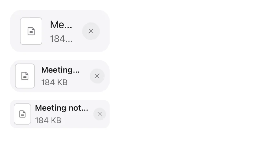
```tsx
import { FileTextIcon, XIcon } from "phosphor-react-native"
import { View } from "react-native"
import { Attachment, AttachmentAction, AttachmentActions, AttachmentContent, AttachmentDescription, AttachmentMedia, AttachmentTitle } from "@/components/ui/attachment"
import { Icon } from "@/components/ui/icon"
export function AttachmentSizesExample() {
return (
{(["default", "sm", "xs"] as const).map((size) => (
Meeting notes.docx
184 KB
))}
)
}
```
```swift
import EsuissUI
import PhosphorSwift
import SwiftUI
struct AttachmentSizesExample: View {
var body: some View {
VStack(alignment: .leading, spacing: 12) {
ForEach(AttachmentSize.allCases, id: \.self) { size in
Attachment(size: size) {
AttachmentMedia(icon: Ph.fileText.regular)
AttachmentContent {
AttachmentTitle("Meeting notes.docx")
AttachmentDescription("184 KB")
}
AttachmentActions {
AttachmentAction("Remove", icon: Ph.x.bold) {}
}
}
}
}
}
}
```
```kotlin
import androidx.compose.foundation.layout.Arrangement
import androidx.compose.foundation.layout.Column
import androidx.compose.runtime.Composable
import androidx.compose.ui.semantics.contentDescription
import androidx.compose.ui.unit.dp
import com.adamglin.PhosphorIcons
import com.adamglin.phosphoricons.Regular
import com.adamglin.phosphoricons.regular.FileText
import com.adamglin.phosphoricons.regular.X
import com.esuiss.ui.components.Attachment
import com.esuiss.ui.components.AttachmentAction
import com.esuiss.ui.components.AttachmentActions
import com.esuiss.ui.components.AttachmentContent
import com.esuiss.ui.components.AttachmentDescription
import com.esuiss.ui.components.AttachmentMedia
import com.esuiss.ui.components.AttachmentSize
import com.esuiss.ui.components.AttachmentTitle
import com.esuiss.ui.components.Icon
@Composable
fun AttachmentIconAction(label: String, icon: androidx.compose.ui.graphics.vector.ImageVector = PhosphorIcons.Regular.X) {
AttachmentAction(onClick = {}, contentDescription = label) {
Icon(icon, contentDescription = null)
}
}
@Composable
fun AttachmentSizes() {
Column(verticalArrangement = Arrangement.spacedBy(12.dp)) {
AttachmentSize.entries.forEach { size ->
Attachment(size = size) {
AttachmentMedia { Icon(PhosphorIcons.Regular.FileText, contentDescription = null) }
AttachmentContent {
AttachmentTitle("Meeting notes.docx")
AttachmentDescription("184 KB")
}
AttachmentActions { AttachmentIconAction("Remove") }
}
}
}
}
```
### States
The `idle`, uploading, processing, error and done states.
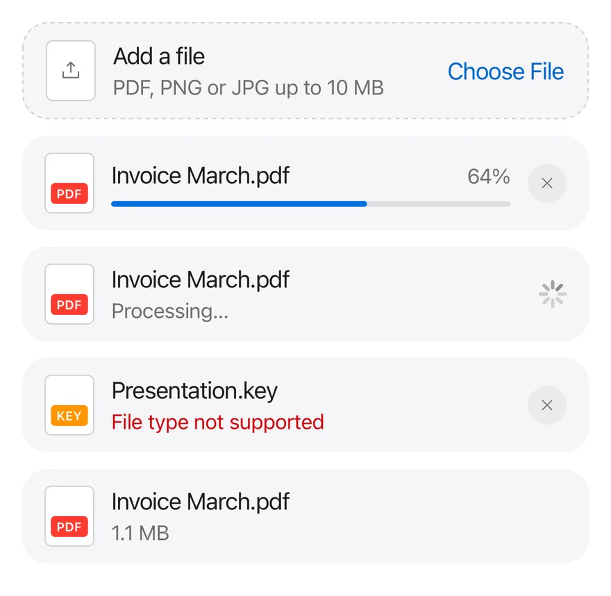
```tsx
import { UploadSimpleIcon, XIcon } from "phosphor-react-native"
import { View } from "react-native"
import { Attachment, AttachmentAction, AttachmentActions, AttachmentContent, AttachmentDescription, AttachmentLabel, AttachmentMedia, AttachmentProgress, AttachmentTitle } from "@/components/ui/attachment"
import { Icon } from "@/components/ui/icon"
import { Spinner } from "@/components/ui/spinner"
export function AttachmentStatesExample() {
return (
Add a file
PDF, PNG or JPG up to 10 MB
Choose File
pdf
Invoice March.pdf
pdf
Invoice March.pdf
Processing…
key
Presentation.key
File type not supported
pdf
Invoice March.pdf
1.1 MB
)
}
```
```swift
import EsuissUI
import PhosphorSwift
import SwiftUI
struct AttachmentStatesExample: View {
var body: some View {
VStack(spacing: 12) {
Attachment(state: .idle, block: true) {
AttachmentMedia(icon: Ph.uploadSimple.regular)
AttachmentContent {
AttachmentTitle("Add a file")
AttachmentDescription("PDF, PNG or JPG up to 10 MB")
}
AttachmentActions {
AttachmentAction("Choose File") {}
}
}
Attachment(state: .uploading, block: true) {
AttachmentMedia(.document) { AttachmentLabel("pdf", tint: .danger) }
AttachmentContent {
AttachmentTitle("Invoice March.pdf")
AttachmentProgress(value: 64, label: "Uploading")
}
AttachmentActions {
AttachmentAction("Cancel upload", icon: Ph.x.bold) {}
}
}
Attachment(state: .processing, block: true) {
AttachmentMedia(.document) { AttachmentLabel("pdf", tint: .danger) }
AttachmentContent {
AttachmentTitle("Invoice March.pdf")
AttachmentDescription("Processing…")
}
AttachmentActions {
Spinner(dimension: 20)
}
}
Attachment(state: .error, block: true) {
AttachmentMedia(.document) { AttachmentLabel("key", tint: .warning) }
AttachmentContent {
AttachmentTitle("Presentation.key")
AttachmentDescription("File type not supported")
}
AttachmentActions {
AttachmentAction("Remove", icon: Ph.x.bold) {}
}
}
Attachment(state: .done, block: true) {
AttachmentMedia(.document) { AttachmentLabel("pdf", tint: .danger) }
AttachmentContent {
AttachmentTitle("Invoice March.pdf")
AttachmentDescription("1.1 MB")
}
}
}
}
}
```
```kotlin
import androidx.compose.foundation.layout.Arrangement
import androidx.compose.foundation.layout.Column
import androidx.compose.foundation.layout.fillMaxWidth
import androidx.compose.runtime.Composable
import androidx.compose.ui.Modifier
import androidx.compose.ui.graphics.Color
import androidx.compose.ui.semantics.contentDescription
import androidx.compose.ui.unit.dp
import com.adamglin.PhosphorIcons
import com.adamglin.phosphoricons.Regular
import com.adamglin.phosphoricons.regular.UploadSimple
import com.adamglin.phosphoricons.regular.X
import com.esuiss.ui.components.Attachment
import com.esuiss.ui.components.AttachmentAction
import com.esuiss.ui.components.AttachmentActions
import com.esuiss.ui.components.AttachmentContent
import com.esuiss.ui.components.AttachmentDescription
import com.esuiss.ui.components.AttachmentLabel
import com.esuiss.ui.components.AttachmentMedia
import com.esuiss.ui.components.AttachmentMediaVariant
import com.esuiss.ui.components.AttachmentProgress
import com.esuiss.ui.components.AttachmentState
import com.esuiss.ui.components.AttachmentTitle
import com.esuiss.ui.components.Icon
import com.esuiss.ui.components.Spinner
import com.esuiss.ui.theme.EsuissTheme
@Composable
fun AttachmentDocument(extension: String, tone: Color) {
AttachmentMedia(variant = AttachmentMediaVariant.Document) {
AttachmentLabel(extension, background = tone)
}
}
@Composable
fun AttachmentIconAction(label: String, icon: androidx.compose.ui.graphics.vector.ImageVector = PhosphorIcons.Regular.X) {
AttachmentAction(onClick = {}, contentDescription = label) {
Icon(icon, contentDescription = null)
}
}
@Composable
fun AttachmentStates() {
val colors = EsuissTheme.colors
val fill = Modifier.fillMaxWidth()
Column(Modifier.fillMaxWidth(), verticalArrangement = Arrangement.spacedBy(12.dp)) {
Attachment(fill, state = AttachmentState.Idle) {
AttachmentMedia { Icon(PhosphorIcons.Regular.UploadSimple, contentDescription = null) }
AttachmentContent {
AttachmentTitle("Add a file")
AttachmentDescription("PDF, PNG or JPG up to 10 MB")
}
AttachmentActions { AttachmentAction("Choose File", onClick = {}) }
}
Attachment(fill, state = AttachmentState.Uploading) {
AttachmentDocument("pdf", colors.red)
AttachmentContent {
AttachmentTitle("Invoice March.pdf")
AttachmentProgress(64f, contentDescription = "Uploading")
}
AttachmentActions { AttachmentIconAction("Cancel upload") }
}
Attachment(fill, state = AttachmentState.Processing) {
AttachmentDocument("pdf", colors.red)
AttachmentContent {
AttachmentTitle("Invoice March.pdf")
AttachmentDescription("Processing…")
}
AttachmentActions { Spinner(size = 20.dp) }
}
Attachment(fill, state = AttachmentState.Error) {
AttachmentDocument("key", colors.orange)
AttachmentContent {
AttachmentTitle("Presentation.key")
AttachmentDescription("File type not supported")
}
AttachmentActions { AttachmentIconAction("Remove") }
}
Attachment(fill, state = AttachmentState.Done) {
AttachmentDocument("pdf", colors.red)
AttachmentContent {
AttachmentTitle("Invoice March.pdf")
AttachmentDescription("1.1 MB")
}
}
}
}
```
### Image
An image thumbnail with the `image` media variant.
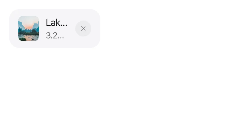
```tsx
import { XIcon } from "phosphor-react-native"
import { Image as NativeImage } from "react-native"
import { Attachment, AttachmentAction, AttachmentActions, AttachmentContent, AttachmentDescription, AttachmentMedia, AttachmentTitle } from "@/components/ui/attachment"
import { Icon } from "@/components/ui/icon"
const imageUrl =
"https://images.unsplash.com/photo-1506744038136-46273834b3fb?w=400&q=80"
function Thumbnail() {
return (
)
}
export function AttachmentImageExample() {
return (
Lake.jpg
3.2 MB
)
}
```
```swift
import EsuissUI
import PhosphorSwift
import SwiftUI
struct AttachmentImageExample: View {
var body: some View {
Attachment {
AttachmentThumbnail()
AttachmentContent {
AttachmentTitle("Lake.jpg")
AttachmentDescription("3.2 MB")
}
AttachmentActions {
AttachmentAction("Remove", icon: Ph.x.bold) {}
}
}
}
}
struct AttachmentThumbnail: View {
var body: some View {
AttachmentMedia(url: URL(string: "https://images.unsplash.com/photo-1506744038136-46273834b3fb?w=400&q=80"))
.accessibilityLabel(Text("Mountain lake"))
}
}
```
```kotlin
import androidx.compose.foundation.layout.Row
import androidx.compose.runtime.Composable
import androidx.compose.runtime.remember
import androidx.compose.ui.graphics.Brush
import androidx.compose.ui.graphics.painter.BrushPainter
import androidx.compose.ui.graphics.painter.Painter
import androidx.compose.ui.semantics.contentDescription
import com.adamglin.PhosphorIcons
import com.adamglin.phosphoricons.Regular
import com.adamglin.phosphoricons.regular.X
import com.esuiss.ui.components.Attachment
import com.esuiss.ui.components.AttachmentAction
import com.esuiss.ui.components.AttachmentActions
import com.esuiss.ui.components.AttachmentContent
import com.esuiss.ui.components.AttachmentDescription
import com.esuiss.ui.components.AttachmentMedia
import com.esuiss.ui.components.AttachmentTitle
import com.esuiss.ui.components.Icon
import com.esuiss.ui.theme.EsuissTheme
@Composable
fun attachmentPhoto(): Painter {
val colors = EsuissTheme.colors
return remember(colors) { BrushPainter(Brush.linearGradient(listOf(colors.teal, colors.blue, colors.indigo))) }
}
@Composable
fun AttachmentIconAction(label: String, icon: androidx.compose.ui.graphics.vector.ImageVector = PhosphorIcons.Regular.X) {
AttachmentAction(onClick = {}, contentDescription = label) {
Icon(icon, contentDescription = null)
}
}
@Composable
fun AttachmentImage() {
val photo = attachmentPhoto()
Row {
Attachment {
AttachmentMedia(photo, contentDescription = "Mountain lake")
AttachmentContent {
AttachmentTitle("Lake.jpg")
AttachmentDescription("3.2 MB")
}
AttachmentActions { AttachmentIconAction("Remove") }
}
}
}
```
### Vertical
Tiles with `orientation="vertical"`.
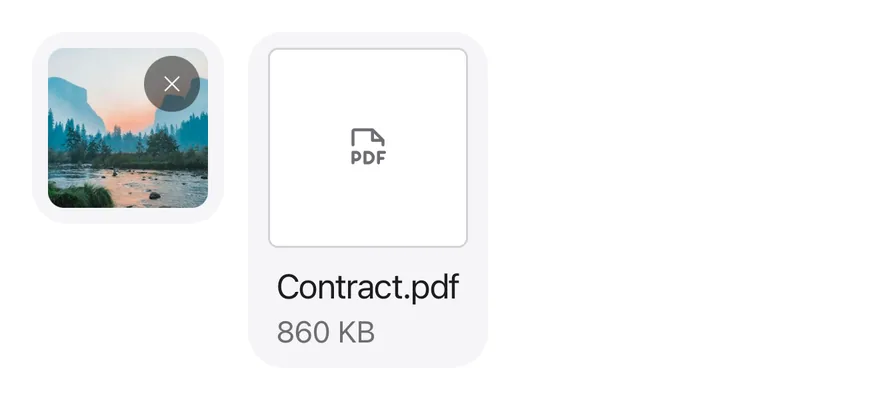
```tsx
import { FilePdfIcon, XIcon } from "phosphor-react-native"
import { Image as NativeImage, View } from "react-native"
import { Attachment, AttachmentAction, AttachmentActions, AttachmentContent, AttachmentDescription, AttachmentMedia, AttachmentTitle } from "@/components/ui/attachment"
import { Icon } from "@/components/ui/icon"
const imageUrl =
"https://images.unsplash.com/photo-1506744038136-46273834b3fb?w=400&q=80"
function Thumbnail() {
return (
)
}
export function AttachmentVerticalExample() {
return (
Contract.pdf
860 KB
)
}
```
```swift
import EsuissUI
import PhosphorSwift
import SwiftUI
struct AttachmentVerticalExample: View {
var body: some View {
HStack(alignment: .top, spacing: 12) {
Attachment(orientation: .vertical) {
AttachmentThumbnail()
AttachmentActions {
AttachmentAction("Remove", icon: Ph.x.bold) {}
}
}
Attachment(orientation: .vertical) {
AttachmentMedia(icon: Ph.filePdf.regular)
AttachmentContent {
AttachmentTitle("Contract.pdf")
AttachmentDescription("860 KB")
}
}
}
}
}
struct AttachmentThumbnail: View {
var body: some View {
AttachmentMedia(url: URL(string: "https://images.unsplash.com/photo-1506744038136-46273834b3fb?w=400&q=80"))
.accessibilityLabel(Text("Mountain lake"))
}
}
```
```kotlin
import androidx.compose.foundation.layout.Arrangement
import androidx.compose.foundation.layout.Row
import androidx.compose.runtime.Composable
import androidx.compose.runtime.remember
import androidx.compose.ui.Alignment
import androidx.compose.ui.graphics.Brush
import androidx.compose.ui.graphics.painter.BrushPainter
import androidx.compose.ui.graphics.painter.Painter
import androidx.compose.ui.semantics.contentDescription
import androidx.compose.ui.unit.dp
import com.adamglin.PhosphorIcons
import com.adamglin.phosphoricons.Regular
import com.adamglin.phosphoricons.regular.FilePdf
import com.adamglin.phosphoricons.regular.X
import com.esuiss.ui.components.Attachment
import com.esuiss.ui.components.AttachmentAction
import com.esuiss.ui.components.AttachmentActions
import com.esuiss.ui.components.AttachmentContent
import com.esuiss.ui.components.AttachmentDescription
import com.esuiss.ui.components.AttachmentMedia
import com.esuiss.ui.components.AttachmentOrientation
import com.esuiss.ui.components.AttachmentTitle
import com.esuiss.ui.components.Icon
import com.esuiss.ui.theme.EsuissTheme
@Composable
fun attachmentPhoto(): Painter {
val colors = EsuissTheme.colors
return remember(colors) { BrushPainter(Brush.linearGradient(listOf(colors.teal, colors.blue, colors.indigo))) }
}
@Composable
fun AttachmentIconAction(label: String, icon: androidx.compose.ui.graphics.vector.ImageVector = PhosphorIcons.Regular.X) {
AttachmentAction(onClick = {}, contentDescription = label) {
Icon(icon, contentDescription = null)
}
}
@Composable
fun AttachmentVertical() {
val photo = attachmentPhoto()
Row(horizontalArrangement = Arrangement.spacedBy(12.dp), verticalAlignment = Alignment.Top) {
Attachment(orientation = AttachmentOrientation.Vertical) {
AttachmentMedia(photo, contentDescription = "Mountain lake")
AttachmentActions { AttachmentIconAction("Remove") }
}
Attachment(orientation = AttachmentOrientation.Vertical) {
AttachmentMedia { Icon(PhosphorIcons.Regular.FilePdf, contentDescription = null) }
AttachmentContent {
AttachmentTitle("Contract.pdf")
AttachmentDescription("860 KB")
}
}
}
}
```
### Pressable
A card made pressable with `AttachmentTrigger`.
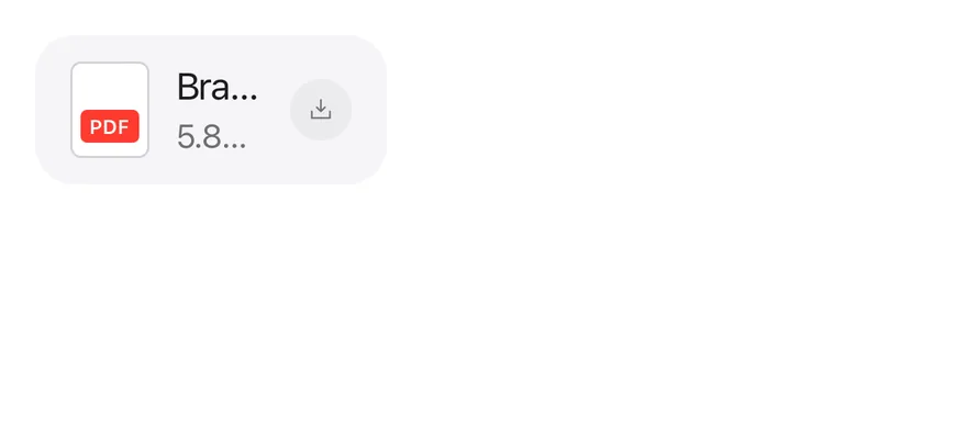
```tsx
import { DownloadSimpleIcon } from "phosphor-react-native"
import { Attachment, AttachmentAction, AttachmentActions, AttachmentContent, AttachmentDescription, AttachmentLabel, AttachmentMedia, AttachmentTitle, AttachmentTrigger } from "@/components/ui/attachment"
import { Icon } from "@/components/ui/icon"
export function AttachmentPressableExample() {
return (
{}}
/>
pdf
Brand guidelines.pdf
5.8 MB
)
}
```
```swift
import EsuissUI
import PhosphorSwift
import SwiftUI
struct AttachmentPressableExample: View {
var body: some View {
Attachment {
AttachmentTrigger("Open Brand guidelines.pdf") {}
AttachmentMedia(.document) { AttachmentLabel("pdf", tint: .danger) }
AttachmentContent {
AttachmentTitle("Brand guidelines.pdf")
AttachmentDescription("5.8 MB")
}
AttachmentActions {
AttachmentAction("Download", icon: Ph.downloadSimple.bold) {}
}
}
}
}
```
```kotlin
import androidx.compose.foundation.layout.Row
import androidx.compose.runtime.Composable
import androidx.compose.ui.graphics.Color
import androidx.compose.ui.semantics.contentDescription
import com.adamglin.PhosphorIcons
import com.adamglin.phosphoricons.Regular
import com.adamglin.phosphoricons.regular.DownloadSimple
import com.adamglin.phosphoricons.regular.X
import com.esuiss.ui.components.Attachment
import com.esuiss.ui.components.AttachmentAction
import com.esuiss.ui.components.AttachmentActions
import com.esuiss.ui.components.AttachmentContent
import com.esuiss.ui.components.AttachmentDescription
import com.esuiss.ui.components.AttachmentLabel
import com.esuiss.ui.components.AttachmentMedia
import com.esuiss.ui.components.AttachmentMediaVariant
import com.esuiss.ui.components.AttachmentTitle
import com.esuiss.ui.components.Icon
import com.esuiss.ui.theme.EsuissTheme
@Composable
fun AttachmentDocument(extension: String, tone: Color) {
AttachmentMedia(variant = AttachmentMediaVariant.Document) {
AttachmentLabel(extension, background = tone)
}
}
@Composable
fun AttachmentIconAction(label: String, icon: androidx.compose.ui.graphics.vector.ImageVector = PhosphorIcons.Regular.X) {
AttachmentAction(onClick = {}, contentDescription = label) {
Icon(icon, contentDescription = null)
}
}
@Composable
fun AttachmentPressable() {
Row {
Attachment(onClick = {}, onClickLabel = "Open Brand guidelines.pdf") {
AttachmentDocument("pdf", EsuissTheme.colors.red)
AttachmentContent {
AttachmentTitle("Brand guidelines.pdf")
AttachmentDescription("5.8 MB")
}
AttachmentActions { AttachmentIconAction("Download", PhosphorIcons.Regular.DownloadSimple) }
}
}
}
```
### Group
Several attachments in an `AttachmentGroup`, one of them uploading.
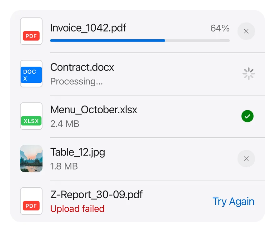
```tsx
import { CheckCircleIcon, XIcon } from "phosphor-react-native"
import { Image as NativeImage, View } from "react-native"
import { Attachment, AttachmentAction, AttachmentActions, AttachmentContent, AttachmentDescription, AttachmentGroup, AttachmentLabel, AttachmentMedia, AttachmentProgress, AttachmentTitle } from "@/components/ui/attachment"
import { Icon } from "@/components/ui/icon"
import { Spinner } from "@/components/ui/spinner"
const imageUrl =
"https://images.unsplash.com/photo-1506744038136-46273834b3fb?w=400&q=80"
function Thumbnail() {
return (
)
}
export function AttachmentGroupExample() {
return (
pdf
Invoice_1042.pdf
docx
Contract.docx
Processing…
xlsx
Menu_October.xlsx
2.4 MB
Table_12.jpg
1.8 MB
pdf
Z-Report_30-09.pdf
Upload failed
Try Again
)
}
```
```swift
import EsuissUI
import PhosphorSwift
import SwiftUI
struct AttachmentGroupExample: View {
var body: some View {
AttachmentGroup {
Attachment(state: .uploading) {
AttachmentMedia(.document) { AttachmentLabel("pdf", tint: .danger) }
AttachmentContent {
AttachmentTitle("Invoice_1042.pdf")
AttachmentProgress(value: 64, label: "Uploading")
}
AttachmentActions {
AttachmentAction("Cancel upload", icon: Ph.x.bold) {}
}
}
Attachment(state: .processing) {
AttachmentMedia(.document) { AttachmentLabel("docx", tint: .accent) }
AttachmentContent {
AttachmentTitle("Contract.docx")
AttachmentDescription("Processing…")
}
AttachmentActions {
Spinner(dimension: 20)
}
}
Attachment {
AttachmentMedia(.document) { AttachmentLabel("xlsx", tint: .success) }
AttachmentContent {
AttachmentTitle("Menu_October.xlsx")
AttachmentDescription("2.4 MB")
}
AttachmentActions {
Ph.checkCircle.fill
.frame(width: 24, height: 24)
.foregroundStyle(Color.success)
.accessibilityElement()
.accessibilityLabel(Text("Uploaded"))
}
}
Attachment {
AttachmentThumbnail()
AttachmentContent {
AttachmentTitle("Table_12.jpg")
AttachmentDescription("1.8 MB")
}
AttachmentActions {
AttachmentAction("Remove", icon: Ph.x.bold) {}
}
}
Attachment(state: .error) {
AttachmentMedia(.document) { AttachmentLabel("pdf", tint: .danger) }
AttachmentContent {
AttachmentTitle("Z-Report_30-09.pdf")
AttachmentDescription("Upload failed")
}
AttachmentActions {
AttachmentAction("Try Again") {}
}
}
}
}
}
struct AttachmentThumbnail: View {
var body: some View {
AttachmentMedia(url: URL(string: "https://images.unsplash.com/photo-1506744038136-46273834b3fb?w=400&q=80"))
.accessibilityLabel(Text("Mountain lake"))
}
}
```
```kotlin
import androidx.compose.foundation.layout.Box
import androidx.compose.runtime.Composable
import androidx.compose.runtime.remember
import androidx.compose.ui.Modifier
import androidx.compose.ui.graphics.Brush
import androidx.compose.ui.graphics.Color
import androidx.compose.ui.graphics.painter.BrushPainter
import androidx.compose.ui.graphics.painter.Painter
import androidx.compose.ui.semantics.clearAndSetSemantics
import androidx.compose.ui.semantics.contentDescription
import androidx.compose.ui.unit.dp
import com.adamglin.PhosphorIcons
import com.adamglin.phosphoricons.Fill
import com.adamglin.phosphoricons.Regular
import com.adamglin.phosphoricons.fill.CheckCircle
import com.adamglin.phosphoricons.regular.X
import com.esuiss.ui.components.Attachment
import com.esuiss.ui.components.AttachmentAction
import com.esuiss.ui.components.AttachmentActions
import com.esuiss.ui.components.AttachmentContent
import com.esuiss.ui.components.AttachmentDescription
import com.esuiss.ui.components.AttachmentGroup
import com.esuiss.ui.components.AttachmentLabel
import com.esuiss.ui.components.AttachmentMedia
import com.esuiss.ui.components.AttachmentMediaVariant
import com.esuiss.ui.components.AttachmentProgress
import com.esuiss.ui.components.AttachmentState
import com.esuiss.ui.components.AttachmentTitle
import com.esuiss.ui.components.Icon
import com.esuiss.ui.components.Spinner
import com.esuiss.ui.theme.EsuissTheme
@Composable
fun attachmentPhoto(): Painter {
val colors = EsuissTheme.colors
return remember(colors) { BrushPainter(Brush.linearGradient(listOf(colors.teal, colors.blue, colors.indigo))) }
}
@Composable
fun AttachmentDocument(extension: String, tone: Color) {
AttachmentMedia(variant = AttachmentMediaVariant.Document) {
AttachmentLabel(extension, background = tone)
}
}
@Composable
fun AttachmentIconAction(label: String, icon: androidx.compose.ui.graphics.vector.ImageVector = PhosphorIcons.Regular.X) {
AttachmentAction(onClick = {}, contentDescription = label) {
Icon(icon, contentDescription = null)
}
}
@Composable
fun AttachmentGroupStory() {
val colors = EsuissTheme.colors
val photo = attachmentPhoto()
AttachmentGroup {
Attachment(state = AttachmentState.Uploading) {
AttachmentDocument("pdf", colors.red)
AttachmentContent {
AttachmentTitle("Invoice_1042.pdf")
AttachmentProgress(64f, contentDescription = "Uploading")
}
AttachmentActions { AttachmentIconAction("Cancel upload") }
}
Attachment(state = AttachmentState.Processing) {
AttachmentDocument("docx", colors.blue)
AttachmentContent {
AttachmentTitle("Contract.docx")
AttachmentDescription("Processing…")
}
AttachmentActions { Spinner(size = 20.dp) }
}
Attachment {
AttachmentDocument("xlsx", colors.green)
AttachmentContent {
AttachmentTitle("Menu_October.xlsx")
AttachmentDescription("2.4 MB")
}
AttachmentActions {
Box(Modifier.clearAndSetSemantics { contentDescription = "Uploaded" }) {
Icon(PhosphorIcons.Fill.CheckCircle, contentDescription = null, size = 24.dp, tint = colors.success)
}
}
}
Attachment {
AttachmentMedia(photo, contentDescription = "Mountain lake")
AttachmentContent {
AttachmentTitle("Table_12.jpg")
AttachmentDescription("1.8 MB")
}
AttachmentActions { AttachmentIconAction("Remove") }
}
Attachment(state = AttachmentState.Error) {
AttachmentDocument("pdf", colors.red)
AttachmentContent {
AttachmentTitle("Z-Report_30-09.pdf")
AttachmentDescription("Upload failed")
}
AttachmentActions { AttachmentAction("Try Again", onClick = {}) }
}
}
}
```
### File types
Document media with colored extension labels.
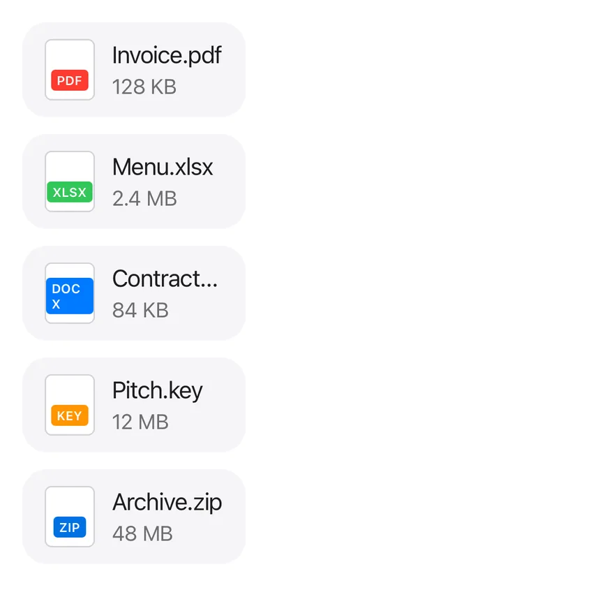
```tsx
import { View } from "react-native"
import { Attachment, AttachmentContent, AttachmentDescription, AttachmentLabel, AttachmentMedia, AttachmentTitle } from "@/components/ui/attachment"
export function AttachmentFileTypesExample() {
return (
{[
{
name: "Invoice.pdf",
meta: "128 KB",
extension: "pdf",
tone: "bg-red",
},
{
name: "Menu.xlsx",
meta: "2.4 MB",
extension: "xlsx",
tone: "bg-green",
},
{
name: "Contract.docx",
meta: "84 KB",
extension: "docx",
tone: "bg-blue",
},
{
name: "Pitch.key",
meta: "12 MB",
extension: "key",
tone: "bg-orange",
},
{ name: "Archive.zip", meta: "48 MB", extension: "zip", tone: "" },
].map((file) => (
{file.extension}
{file.name}
{file.meta}
))}
)
}
```
```swift
import EsuissUI
import SwiftUI
struct AttachmentFileTypesExample: View {
var body: some View {
VStack(alignment: .leading, spacing: 12) {
ForEach(AttachmentFile.all, id: \.name) { file in
Attachment {
AttachmentMedia(.document) { AttachmentLabel(verbatim: file.ext, tint: file.tint) }
AttachmentContent {
AttachmentTitle(verbatim: file.name)
AttachmentDescription(verbatim: file.meta)
}
}
}
}
}
}
struct AttachmentFile {
let name: String
let meta: String
let ext: String
let tint: Color
static let all: [AttachmentFile] = [
AttachmentFile(name: "Invoice.pdf", meta: "128 KB", ext: "pdf", tint: .danger),
AttachmentFile(name: "Menu.xlsx", meta: "2.4 MB", ext: "xlsx", tint: .success),
AttachmentFile(name: "Contract.docx", meta: "84 KB", ext: "docx", tint: .accent),
AttachmentFile(name: "Pitch.key", meta: "12 MB", ext: "key", tint: .warning),
AttachmentFile(name: "Archive.zip", meta: "48 MB", ext: "zip", tint: .accent),
]
}
let all: [AttachmentFile] = [
AttachmentFile(name: "Invoice.pdf", meta: "128 KB", ext: "pdf", tint: .danger),
AttachmentFile(name: "Menu.xlsx", meta: "2.4 MB", ext: "xlsx", tint: .success),
AttachmentFile(name: "Contract.docx", meta: "84 KB", ext: "docx", tint: .accent),
AttachmentFile(name: "Pitch.key", meta: "12 MB", ext: "key", tint: .warning),
AttachmentFile(name: "Archive.zip", meta: "48 MB", ext: "zip", tint: .accent),
]
```
```kotlin
import androidx.compose.foundation.layout.Arrangement
import androidx.compose.foundation.layout.Column
import androidx.compose.runtime.Composable
import androidx.compose.ui.graphics.Color
import androidx.compose.ui.unit.dp
import com.esuiss.ui.components.Attachment
import com.esuiss.ui.components.AttachmentContent
import com.esuiss.ui.components.AttachmentDescription
import com.esuiss.ui.components.AttachmentLabel
import com.esuiss.ui.components.AttachmentMedia
import com.esuiss.ui.components.AttachmentMediaVariant
import com.esuiss.ui.components.AttachmentTitle
import com.esuiss.ui.theme.EsuissTheme
@Composable
fun AttachmentDocument(extension: String, tone: Color) {
AttachmentMedia(variant = AttachmentMediaVariant.Document) {
AttachmentLabel(extension, background = tone)
}
}
class AttachmentFile(val name: String, val meta: String, val extension: String, val tone: @Composable () -> Color)
val attachmentFiles = listOf(
AttachmentFile("Invoice.pdf", "128 KB", "pdf") { EsuissTheme.colors.red },
AttachmentFile("Menu.xlsx", "2.4 MB", "xlsx") { EsuissTheme.colors.green },
AttachmentFile("Contract.docx", "84 KB", "docx") { EsuissTheme.colors.blue },
AttachmentFile("Pitch.key", "12 MB", "key") { EsuissTheme.colors.orange },
AttachmentFile("Archive.zip", "48 MB", "zip") { EsuissTheme.colors.accent },
)
@Composable
fun AttachmentFileTypes() {
Column(verticalArrangement = Arrangement.spacedBy(12.dp)) {
attachmentFiles.forEach { file ->
Attachment {
AttachmentDocument(file.extension, file.tone())
AttachmentContent {
AttachmentTitle(file.name)
AttachmentDescription(file.meta)
}
}
}
}
}
```
## API Reference
### Attachment
Card that provides state, size and orientation to its parts.
### AttachmentMedia
Thumbnail area for an icon, document shape or image.
### AttachmentLabel
Small uppercase tag, such as a file extension.
### AttachmentContent
Column for the title, description and progress.
### AttachmentTitle
File name, one line by default.
### AttachmentDescription
Secondary details, red in the `error` state.
### AttachmentProgress
Progress bar with a percentage value.
### AttachmentActions
Row of actions; floats over the media in vertical layout.
### AttachmentAction
Small button sized to the attachment.
### AttachmentTrigger
Pressable overlay that makes the whole card pressable.
### AttachmentGroup
List container that joins attachments with separators.
## Accessibility
- `AttachmentProgress` has the `progressbar` role with its value exposed.
- `AttachmentTrigger` has the `button` role; give it an `accessibilityLabel` such as "Open Invoice.pdf".
- Icon-only actions need an `accessibilityLabel`.
## Notes
- Uses `bg-surface-secondary`, `border-separator`, `bg-accent` and `text-danger` tokens; light and dark follow the system appearance.
- Separators and action positions use start and end offsets, so they flip in right-to-left layouts.