# Radial Chart Interactive
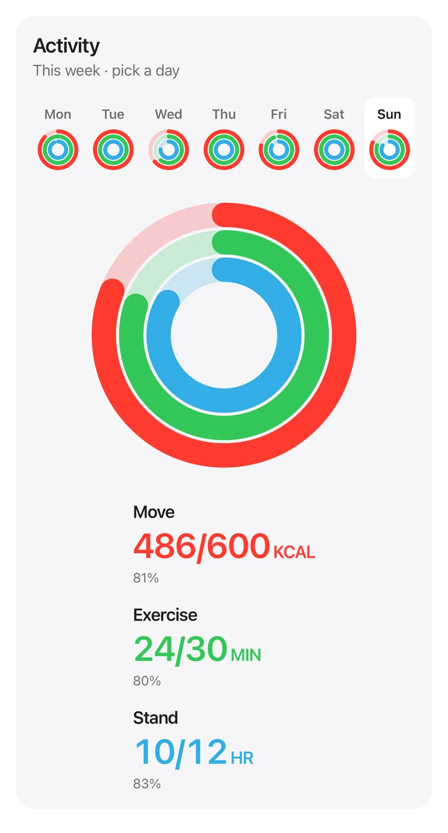
Activity rings for each day of the week, with a day picker and per-ring totals against goals.
Radial Chart Interactive is an open-source mobile chart from suiss/uim, drawn with react-native-svg for React Native and Expo, with SwiftUI and Jetpack Compose versions built from the same design tokens. The @esuiss/uim CLI copies its source into your project, so you own the code.
Source: https://uim.suiss.app/docs/charts/radial-chart-interactive
```tsx title="uniwind/components/charts/radial-chart-interactive.tsx"
import { cn } from "cn"
import * as React from "react"
import { View } from "react-native"
import Svg, { Circle, G } from "react-native-svg"
import { Card, CardContent, CardHeader } from "@/components/ui/card"
import { type ChartColor, ChartPalette } from "@/components/ui/chart"
import { Text } from "@/components/ui/text"
import { ToggleGroup, ToggleGroupItem } from "@/components/ui/toggle-group"
type Ring = "move" | "exercise" | "stand"
const RINGS: {
key: Ring
label: string
unit: string
goal: number
color: ChartColor
text: string
}[] = [
{
key: "move",
label: "Move",
unit: "kcal",
goal: 600,
color: "red",
text: "text-red",
},
{
key: "exercise",
label: "Exercise",
unit: "min",
goal: 30,
color: "green",
text: "text-green",
},
{
key: "stand",
label: "Stand",
unit: "hr",
goal: 12,
color: "cyan",
text: "text-cyan",
},
]
const WEEK = [
{ day: "Monday", values: [520, 34, 11] },
{ day: "Tuesday", values: [610, 42, 12] },
{ day: "Wednesday", values: [380, 18, 9] },
{ day: "Thursday", values: [640, 45, 12] },
{ day: "Friday", values: [470, 28, 10] },
{ day: "Saturday", values: [720, 62, 12] },
{ day: "Sunday", values: [486, 24, 10] },
]
const NO_ACTIVITY = RINGS.map(() => 0)
function Rings({
values,
size,
bar,
}: {
values: number[]
size: number
bar: number
}) {
return (
ring.color)}>
{(palette) => (
)}
)
}
export function RadialChartInteractive() {
const [selected, setSelected] = React.useState(6)
const values = WEEK[selected]?.values ?? NO_ACTIVITY
return (
Activity
This week · pick a day
{
if (value[0] !== undefined) setSelected(Number(value[0]))
}}
accessibilityLabel="Day"
className="w-full self-stretch"
>
{WEEK.map((entry, index) => (
cn(
"h-auto min-w-0 flex-1 shrink flex-col gap-1.5 rounded-xl px-0 py-2",
state.pressed && "bg-surface active:bg-surface"
)
}
>
{entry.day.slice(0, 3)}
))}
{RINGS.map((ring, index) => {
const percent = Math.round(
((values[index] ?? 0) / ring.goal) * 100
)
return (
{ring.label}
{`${Math.round(values[index] ?? 0)}/${ring.goal}`}
{ring.unit}
{`${percent}%${percent >= 100 ? " · goal met" : ""}`}
)
})}
)
}
```
```swift title="swift/Charts/RadialChartInteractive.swift"
import SwiftUI
private let rings: [(key: String, label: String, unit: String, goal: Double, color: Color)] = [
("move", "Move", "kcal", 600, .red),
("exercise", "Exercise", "min", 30, .green),
("stand", "Stand", "hr", 12, .cyan),
]
private let week: [(day: String, values: [Double])] = [
("Monday", [520, 34, 11]),
("Tuesday", [610, 42, 12]),
("Wednesday", [380, 18, 9]),
("Thursday", [640, 45, 12]),
("Friday", [470, 28, 10]),
("Saturday", [720, 62, 12]),
("Sunday", [486, 24, 10]),
]
private struct Rings: View {
let values: [Double]
let size: CGFloat
let bar: CGFloat
var body: some View {
ZStack {
ForEach(rings.indices, id: \.self) { index in
let ring = rings[index]
let radius = size / 2 - bar / 2 - CGFloat(index) * (bar + max(1, bar * 0.12))
let progress = max(0, min(1, (values[index]) / ring.goal))
Circle()
.stroke(ring.color.opacity(0.22), lineWidth: bar)
.frame(width: radius * 2, height: radius * 2)
Circle()
.trim(from: 0, to: progress)
.stroke(ring.color, style: StrokeStyle(lineWidth: bar, lineCap: .round))
.rotationEffect(.degrees(-90))
.frame(width: radius * 2, height: radius * 2)
.opacity(progress > 0.001 ? 1 : 0)
}
}
.frame(width: size, height: size)
.accessibilityHidden(true)
}
}
public struct RadialChartInteractive: View {
@State private var selected = 6
@State private var values: [Double] = [0, 0, 0]
@Environment(\.colorScheme) private var colorScheme
@Environment(\.accessibilityReduceMotion) private var reduceMotion
public init() {}
init(selected: Int, filled: Bool) {
_selected = State(initialValue: selected)
_values = State(initialValue: filled ? week[selected].values : [0, 0, 0])
}
public var body: some View {
let target = week[selected].values
Card(.filled, size: .sm) {
VStack(alignment: .leading, spacing: 2) {
Text("Activity")
.textStyle(.lg, weight: .semibold)
Text("This week · pick a day")
.textStyle(.sm)
.foregroundStyle(Color.labelSecondary)
}
.padding(.horizontal, 16)
CardContent {
VStack(spacing: 24) {
HStack(spacing: 4) {
ForEach(week.indices, id: \.self) { index in
day(index)
}
}
.hapticFeedback(.selection, trigger: selected)
.accessibilityElement(children: .contain)
.accessibilityLabel("Day")
ViewThatFits(in: .horizontal) {
HStack(spacing: 32) {
Rings(values: values, size: 260, bar: 24)
stats(target)
}
VStack(spacing: 24) {
Rings(values: values, size: 260, bar: 24)
stats(target)
}
}
.frame(maxWidth: .infinity)
}
}
}
.onAppear { fill(target) }
.onChange(of: selected) { _, _ in fill(week[selected].values) }
}
private func fill(_ target: [Double]) {
guard values != target else { return }
withAnimation(reduceMotion ? nil : .timingCurve(0.65, 0, 0.35, 1, duration: 0.75)) {
values = target
}
}
private func day(_ index: Int) -> some View {
let active = index == selected
return Button {
selected = index
} label: {
VStack(spacing: 6) {
Text(verbatim: String(week[index].day.prefix(3)))
.textStyle(.xs, weight: .semibold)
.foregroundStyle(active ? Color.label : .labelSecondary)
Rings(values: week[index].values, size: 40, bar: 4)
}
.padding(.vertical, 8)
.frame(maxWidth: .infinity)
.background(active ? Color.surface : .clear, in: RoundedRectangle(cornerRadius: Radius.xl, style: .continuous))
.contentShape(RoundedRectangle(cornerRadius: Radius.xl, style: .continuous))
}
.buttonStyle(.plain)
.accessibilityLabel(Text(LocalizedStringKey(week[index].day)))
.accessibilityAddTraits(active ? .isSelected : [])
}
private func stats(_ target: [Double]) -> some View {
VStack(alignment: .leading, spacing: 16) {
ForEach(rings.indices, id: \.self) { index in
let ring = rings[index]
let percent = Int((target[index] / ring.goal * 100).rounded())
VStack(alignment: .leading, spacing: 2) {
Text(LocalizedStringKey(ring.label))
.textStyle(.base, weight: .semibold)
HStack(alignment: .firstTextBaseline, spacing: 2) {
Text(verbatim: "\(Int(target[index]))/\(Int(ring.goal))")
.textStyle(.xl3, weight: .semibold)
.monospacedDigit()
.contentTransition(.numericText(value: target[index]))
Text(LocalizedStringKey(ring.unit.uppercased()))
.textStyle(.base, weight: .semibold)
}
.foregroundStyle(tint(ring.color))
Text(verbatim: "\(percent)%\(percent >= 100 ? " · goal met" : "")")
.textStyle(.xs)
.foregroundStyle(Color.labelSecondary)
}
.accessibilityElement(children: .combine)
}
}
.frame(minWidth: 176, alignment: .leading)
.animation(reduceMotion ? nil : .default, value: selected)
}
private func tint(_ color: Color) -> Color {
guard colorScheme != .dark else { return color }
if #available(iOS 18, *) {
return color.mix(with: .label, by: 0.45)
}
return color
}
}
```
```kt title="kotlin/charts/RadialChartInteractive.kt"
package com.esuiss.ui.charts
import androidx.compose.animation.core.Animatable
import androidx.compose.animation.core.CubicBezierEasing
import androidx.compose.animation.core.tween
import androidx.compose.foundation.background
import androidx.compose.foundation.layout.Arrangement
import androidx.compose.foundation.layout.BoxWithConstraints
import androidx.compose.foundation.layout.Column
import androidx.compose.foundation.layout.Row
import androidx.compose.foundation.layout.fillMaxWidth
import androidx.compose.foundation.layout.padding
import androidx.compose.foundation.layout.widthIn
import androidx.compose.foundation.selection.selectable
import androidx.compose.foundation.selection.selectableGroup
import androidx.compose.foundation.shape.RoundedCornerShape
import androidx.compose.foundation.text.BasicText
import androidx.compose.runtime.Composable
import androidx.compose.runtime.LaunchedEffect
import androidx.compose.runtime.getValue
import androidx.compose.runtime.mutableIntStateOf
import androidx.compose.runtime.remember
import androidx.compose.runtime.setValue
import androidx.compose.foundation.interaction.MutableInteractionSource
import androidx.compose.ui.Alignment
import androidx.compose.ui.Modifier
import androidx.compose.ui.draw.clip
import androidx.compose.ui.graphics.Color
import androidx.compose.ui.graphics.lerp
import androidx.compose.ui.semantics.LiveRegionMode
import androidx.compose.ui.semantics.Role
import androidx.compose.ui.semantics.clearAndSetSemantics
import androidx.compose.ui.semantics.contentDescription
import androidx.compose.ui.semantics.liveRegion
import androidx.compose.ui.semantics.semantics
import androidx.compose.ui.text.font.FontWeight
import androidx.compose.ui.unit.dp
import com.esuiss.ui.components.Card
import com.esuiss.ui.components.CardContent
import com.esuiss.ui.components.CardSize
import com.esuiss.ui.components.CardVariant
import com.esuiss.ui.components.formReducedMotion
import com.esuiss.ui.components.rememberHaptics
import com.esuiss.ui.theme.Colors
import com.esuiss.ui.theme.EsuissTheme
import com.esuiss.ui.theme.Radius
import com.esuiss.ui.theme.Typography
import kotlin.math.roundToInt
import kotlinx.coroutines.launch
private class RadialInteractiveActivityRing(val label: String, val unit: String, val goal: Double, val color: Colors.() -> Color)
private val activityRings = listOf(
RadialInteractiveActivityRing("Move", "kcal", 600.0) { red },
RadialInteractiveActivityRing("Exercise", "min", 30.0) { green },
RadialInteractiveActivityRing("Stand", "hr", 12.0) { cyan },
)
private class RadialInteractiveActivityDay(val day: String, val values: List)
private val week = listOf(
RadialInteractiveActivityDay("Monday", listOf(520.0, 34.0, 11.0)),
RadialInteractiveActivityDay("Tuesday", listOf(610.0, 42.0, 12.0)),
RadialInteractiveActivityDay("Wednesday", listOf(380.0, 18.0, 9.0)),
RadialInteractiveActivityDay("Thursday", listOf(640.0, 45.0, 12.0)),
RadialInteractiveActivityDay("Friday", listOf(470.0, 28.0, 10.0)),
RadialInteractiveActivityDay("Saturday", listOf(720.0, 62.0, 12.0)),
RadialInteractiveActivityDay("Sunday", listOf(486.0, 24.0, 10.0)),
)
private val FillEasing = CubicBezierEasing(0.65f, 0f, 0.35f, 1f)
@Composable
private fun Rings(values: List, size: Int, bar: Int, modifier: Modifier = Modifier) {
val colors = EsuissTheme.colors
RingsCanvas(
values = activityRings.mapIndexed { index, ring -> (values[index] / ring.goal).toFloat() },
colors = activityRings.map { it.color(colors) },
size = size.dp,
bar = bar.dp,
gap = maxOf(1f, bar * 0.12f).dp,
modifier = modifier.clearAndSetSemantics {},
)
}
@Composable
fun RadialChartInteractive(modifier: Modifier = Modifier) {
val colors = EsuissTheme.colors
val reduced = formReducedMotion()
val haptics = rememberHaptics()
var selected by remember { mutableIntStateOf(6) }
val target = week[selected].values
val animated = remember { activityRings.map { Animatable(0f) } }
LaunchedEffect(selected) {
animated.forEachIndexed { index, value ->
launch {
if (reduced) value.snapTo(target[index].toFloat()) else value.animateTo(target[index].toFloat(), tween(750, easing = FillEasing))
}
}
}
val values = animated.map { it.value.toDouble() }
Card(modifier, variant = CardVariant.Filled, size = CardSize.Sm) {
CardContent {
Column(verticalArrangement = Arrangement.spacedBy(2.dp)) {
BasicText("Activity", style = Typography.lg.copy(color = colors.label, fontWeight = FontWeight.SemiBold))
BasicText("This week · pick a day", style = Typography.sm.copy(color = colors.labelSecondary))
}
}
CardContent(Modifier.padding(top = 20.dp)) {
Column(verticalArrangement = Arrangement.spacedBy(24.dp)) {
Row(
Modifier
.fillMaxWidth()
.selectableGroup()
.semantics { contentDescription = "Day" },
horizontalArrangement = Arrangement.spacedBy(4.dp),
) {
week.forEachIndexed { index, day ->
val active = index == selected
val shape = RoundedCornerShape(Radius.xl)
Column(
Modifier
.weight(1f)
.clip(shape)
.background(if (active) colors.surface else Color.Transparent, shape)
.selectable(
selected = active,
interactionSource = remember { MutableInteractionSource() },
indication = null,
role = Role.Tab,
) {
if (!active) haptics.selection()
selected = index
}
.semantics { contentDescription = day.day }
.padding(vertical = 8.dp),
horizontalAlignment = Alignment.CenterHorizontally,
verticalArrangement = Arrangement.spacedBy(6.dp),
) {
BasicText(
day.day.take(3),
Modifier.clearAndSetSemantics {},
style = Typography.xs.copy(
color = if (active) colors.label else colors.labelSecondary,
fontWeight = FontWeight.SemiBold,
),
)
Rings(day.values, size = 40, bar = 4)
}
}
}
BoxWithConstraints(Modifier.fillMaxWidth()) {
if (maxWidth >= 468.dp) {
Row(
Modifier.align(Alignment.Center),
horizontalArrangement = Arrangement.spacedBy(32.dp),
verticalAlignment = Alignment.CenterVertically,
) {
Rings(values, size = 260, bar = 24)
RingStats(values, target)
}
} else {
Column(
Modifier.fillMaxWidth(),
horizontalAlignment = Alignment.CenterHorizontally,
verticalArrangement = Arrangement.spacedBy(24.dp),
) {
Rings(values, size = 260, bar = 24)
RingStats(values, target)
}
}
}
}
}
}
}
@Composable
private fun RingStats(values: List, target: List) {
val colors = EsuissTheme.colors
Column(
Modifier
.widthIn(min = 176.dp)
.semantics { liveRegion = LiveRegionMode.Polite },
verticalArrangement = Arrangement.spacedBy(16.dp),
) {
activityRings.forEachIndexed { index, ring ->
val percent = (target[index] / ring.goal * 100).roundToInt()
val color = ring.color(colors)
val tint = if (colors.isDark) color else lerp(color, colors.label, 0.45f)
Column(Modifier.semantics(mergeDescendants = true) {}, verticalArrangement = Arrangement.spacedBy(2.dp)) {
BasicText(ring.label, style = Typography.base.copy(color = colors.label, fontWeight = FontWeight.SemiBold))
Row(horizontalArrangement = Arrangement.spacedBy(2.dp)) {
BasicText(
"${values[index].roundToInt()}/${ring.goal.roundToInt()}",
Modifier.alignByBaseline(),
style = Typography.xl3.copy(color = tint, fontWeight = FontWeight.SemiBold, fontFeatureSettings = "tnum"),
)
BasicText(
ring.unit.uppercase(),
Modifier.alignByBaseline(),
style = Typography.base.copy(color = tint, fontWeight = FontWeight.SemiBold),
)
}
BasicText(
"$percent%${if (percent >= 100) " · goal met" else ""}",
style = Typography.xs.copy(color = colors.labelSecondary),
)
}
}
}
}
```
A `Card` with a `ToggleGroup` of seven days, each showing small rings, above a large ring view and per-ring totals. The rings are drawn with `Svg` circles colored through `ChartPalette`; `RINGS` sets each label, unit, goal and color, and `WEEK` holds three values per day. Picking a day updates the large rings and the totals, which show the value, goal and percentage, with a note when a goal is met.
## Installation
```bash title="Terminal"
npx @esuiss/uim@latest add radial-chart-interactive
```
```bash title="Terminal"
npx @esuiss/uim@latest add radial-chart-interactive --platform swift
```
```bash title="Terminal"
npx @esuiss/uim@latest add radial-chart-interactive --platform kotlin
```
The CLI also adds what it builds on: [Card](/docs/components/card), [Chart](/docs/components/chart), [Text](/docs/components/text), [Toggle Group](/docs/components/toggle-group).
### Manual
**Uniwind**
1. Install the dependencies:
```bash title="Terminal"
npx expo install cn react-native-svg
```
2. Add the pieces it builds on: [Card](/docs/components/card), [Chart](/docs/components/chart), [Text](/docs/components/text), [Toggle Group](/docs/components/toggle-group).
3. Copy the source into `components/charts/radial-chart-interactive.tsx`:
```tsx title="uniwind/components/charts/radial-chart-interactive.tsx"
import { cn } from "cn"
import * as React from "react"
import { View } from "react-native"
import Svg, { Circle, G } from "react-native-svg"
import { Card, CardContent, CardHeader } from "@/components/ui/card"
import { type ChartColor, ChartPalette } from "@/components/ui/chart"
import { Text } from "@/components/ui/text"
import { ToggleGroup, ToggleGroupItem } from "@/components/ui/toggle-group"
type Ring = "move" | "exercise" | "stand"
const RINGS: {
key: Ring
label: string
unit: string
goal: number
color: ChartColor
text: string
}[] = [
{
key: "move",
label: "Move",
unit: "kcal",
goal: 600,
color: "red",
text: "text-red",
},
{
key: "exercise",
label: "Exercise",
unit: "min",
goal: 30,
color: "green",
text: "text-green",
},
{
key: "stand",
label: "Stand",
unit: "hr",
goal: 12,
color: "cyan",
text: "text-cyan",
},
]
const WEEK = [
{ day: "Monday", values: [520, 34, 11] },
{ day: "Tuesday", values: [610, 42, 12] },
{ day: "Wednesday", values: [380, 18, 9] },
{ day: "Thursday", values: [640, 45, 12] },
{ day: "Friday", values: [470, 28, 10] },
{ day: "Saturday", values: [720, 62, 12] },
{ day: "Sunday", values: [486, 24, 10] },
]
const NO_ACTIVITY = RINGS.map(() => 0)
function Rings({
values,
size,
bar,
}: {
values: number[]
size: number
bar: number
}) {
return (
ring.color)}>
{(palette) => (
)}
)
}
export function RadialChartInteractive() {
const [selected, setSelected] = React.useState(6)
const values = WEEK[selected]?.values ?? NO_ACTIVITY
return (
Activity
This week · pick a day
{
if (value[0] !== undefined) setSelected(Number(value[0]))
}}
accessibilityLabel="Day"
className="w-full self-stretch"
>
{WEEK.map((entry, index) => (
cn(
"h-auto min-w-0 flex-1 shrink flex-col gap-1.5 rounded-xl px-0 py-2",
state.pressed && "bg-surface active:bg-surface"
)
}
>
{entry.day.slice(0, 3)}
))}
{RINGS.map((ring, index) => {
const percent = Math.round(
((values[index] ?? 0) / ring.goal) * 100
)
return (
{ring.label}
{`${Math.round(values[index] ?? 0)}/${ring.goal}`}
{ring.unit}
{`${percent}%${percent >= 100 ? " · goal met" : ""}`}
)
})}
)
}
```
4. Update the import paths to match your project.
**NativeWind**
1. Install the dependencies:
```bash title="Terminal"
npx expo install cn react-native-svg
```
2. Add the pieces it builds on: [Card](/docs/components/card), [Chart](/docs/components/chart), [Text](/docs/components/text), [Toggle Group](/docs/components/toggle-group).
3. Copy the source into `components/charts/radial-chart-interactive.tsx`:
```tsx title="nativewind/components/charts/radial-chart-interactive.tsx"
import { cn } from "cn"
import * as React from "react"
import { View } from "react-native"
import Svg, { Circle, G } from "react-native-svg"
import { Card, CardContent, CardHeader } from "@/components/ui/card"
import { type ChartColor, ChartPalette } from "@/components/ui/chart"
import { Text } from "@/components/ui/text"
import { ToggleGroup, ToggleGroupItem } from "@/components/ui/toggle-group"
type Ring = "move" | "exercise" | "stand"
const RINGS: {
key: Ring
label: string
unit: string
goal: number
color: ChartColor
text: string
}[] = [
{
key: "move",
label: "Move",
unit: "kcal",
goal: 600,
color: "red",
text: "text-red",
},
{
key: "exercise",
label: "Exercise",
unit: "min",
goal: 30,
color: "green",
text: "text-green",
},
{
key: "stand",
label: "Stand",
unit: "hr",
goal: 12,
color: "cyan",
text: "text-cyan",
},
]
const WEEK = [
{ day: "Monday", values: [520, 34, 11] },
{ day: "Tuesday", values: [610, 42, 12] },
{ day: "Wednesday", values: [380, 18, 9] },
{ day: "Thursday", values: [640, 45, 12] },
{ day: "Friday", values: [470, 28, 10] },
{ day: "Saturday", values: [720, 62, 12] },
{ day: "Sunday", values: [486, 24, 10] },
]
const NO_ACTIVITY = RINGS.map(() => 0)
function Rings({
values,
size,
bar,
}: {
values: number[]
size: number
bar: number
}) {
return (
ring.color)}>
{(palette) => (
)}
)
}
export function RadialChartInteractive() {
const [selected, setSelected] = React.useState(6)
const values = WEEK[selected]?.values ?? NO_ACTIVITY
return (
Activity
This week · pick a day
{
if (value[0] !== undefined) setSelected(Number(value[0]))
}}
accessibilityLabel="Day"
className="w-full self-stretch"
>
{WEEK.map((entry, index) => (
cn(
"h-auto min-w-0 flex-1 shrink flex-col gap-1.5 rounded-xl px-0 py-2",
state.pressed && "bg-surface active:bg-surface"
)
}
>
{entry.day.slice(0, 3)}
))}
{RINGS.map((ring, index) => {
const percent = Math.round(
((values[index] ?? 0) / ring.goal) * 100
)
return (
{ring.label}
{`${Math.round(values[index] ?? 0)}/${ring.goal}`}
{ring.unit}
{`${percent}%${percent >= 100 ? " · goal met" : ""}`}
)
})}
)
}
```
4. Update the import paths to match your project.
**StyleSheet**
1. Install the dependencies:
```bash title="Terminal"
npx expo install react-native-svg
```
2. Add the pieces it builds on: [Card](/docs/components/card), [Chart](/docs/components/chart), [Text](/docs/components/text), [Toggle Group](/docs/components/toggle-group).
3. Copy the source into `components/charts/radial-chart-interactive.tsx`:
```tsx title="stylesheet/components/charts/radial-chart-interactive.tsx"
import * as React from "react"
import { StyleSheet, View } from "react-native"
import Svg, { Circle, G } from "react-native-svg"
import { Card, CardContent, CardHeader } from "@/components/ui/card"
import { type ChartColor, ChartPalette } from "@/components/ui/chart"
import { Text } from "@/components/ui/text"
import { fontSize, type ThemeColors, useTheme } from "@/components/ui/theme"
import { ToggleGroup, ToggleGroupItem } from "@/components/ui/toggle-group"
type Ring = "move" | "exercise" | "stand"
const RINGS: {
key: Ring
label: string
unit: string
goal: number
color: ChartColor & keyof ThemeColors
}[] = [
{
key: "move",
label: "Move",
unit: "kcal",
goal: 600,
color: "red",
},
{
key: "exercise",
label: "Exercise",
unit: "min",
goal: 30,
color: "green",
},
{
key: "stand",
label: "Stand",
unit: "hr",
goal: 12,
color: "cyan",
},
]
const WEEK = [
{ day: "Monday", values: [520, 34, 11] },
{ day: "Tuesday", values: [610, 42, 12] },
{ day: "Wednesday", values: [380, 18, 9] },
{ day: "Thursday", values: [640, 45, 12] },
{ day: "Friday", values: [470, 28, 10] },
{ day: "Saturday", values: [720, 62, 12] },
{ day: "Sunday", values: [486, 24, 10] },
]
const NO_ACTIVITY = RINGS.map(() => 0)
const styles = StyleSheet.create({
header: { gap: 2 },
title: { ...fontSize.lg, fontWeight: "600" },
caption: { ...fontSize.sm },
content: { gap: 24 },
days: { width: "100%", alignSelf: "stretch" },
day: {
height: "auto",
minWidth: 0,
flex: 1,
flexShrink: 1,
flexDirection: "column",
gap: 6,
borderRadius: 12,
paddingHorizontal: 0,
paddingVertical: 8,
},
dayLabel: { ...fontSize.xs, fontWeight: "600" },
summary: {
flexDirection: "row",
flexWrap: "wrap",
alignItems: "center",
justifyContent: "center",
gap: 32,
},
rings: { minWidth: 176, gap: 16 },
ring: { gap: 2 },
ringLabel: { ...fontSize.base, fontWeight: "600" },
reading: { flexDirection: "row", alignItems: "baseline", gap: 2 },
value: {
...fontSize["3xl"],
fontWeight: "600",
letterSpacing: -0.75,
fontVariant: ["tabular-nums"],
},
unit: { ...fontSize.base, fontWeight: "600", textTransform: "uppercase" },
percent: { ...fontSize.xs },
})
function Rings({
values,
size,
bar,
}: {
values: number[]
size: number
bar: number
}) {
return (
ring.color)}>
{(palette) => (
)}
)
}
export function RadialChartInteractive() {
const { colors } = useTheme()
const [selected, setSelected] = React.useState(6)
const values = WEEK[selected]?.values ?? NO_ACTIVITY
return (
Activity
This week · pick a day
{
if (value[0] !== undefined) setSelected(Number(value[0]))
}}
accessibilityLabel="Day"
style={styles.days}
>
{WEEK.map((entry, index) => (
[
styles.day,
state.pressed && { backgroundColor: colors.surface },
]}
>
{entry.day.slice(0, 3)}
))}
{RINGS.map((ring, index) => {
const percent = Math.round(
((values[index] ?? 0) / ring.goal) * 100
)
return (
{ring.label}
{`${Math.round(values[index] ?? 0)}/${ring.goal}`}
{ring.unit}
{`${percent}%${percent >= 100 ? " · goal met" : ""}`}
)
})}
)
}
```
4. Update the import paths to match your project.
**SwiftUI**
1. Target iOS 17 or later.
2. Copy the theme files every view uses:
```swift title="swift/Theme/Theme.swift"
import SwiftUI
import UIKit
struct RGBA: Sendable {
let red: CGFloat
let green: CGFloat
let blue: CGFloat
let alpha: CGFloat
init(_ hex: UInt32, _ alpha: CGFloat = 1) {
red = CGFloat((hex >> 16) & 0xFF) / 255
green = CGFloat((hex >> 8) & 0xFF) / 255
blue = CGFloat(hex & 0xFF) / 255
self.alpha = alpha
}
var uiColor: UIColor {
UIColor(red: red, green: green, blue: blue, alpha: alpha)
}
}
extension Color {
static func adaptive(light: RGBA, dark: RGBA) -> Color {
let lightColor = light.uiColor
let darkColor = dark.uiColor
return Color(uiColor: UIColor { traits in
traits.userInterfaceStyle == .dark ? darkColor : lightColor
})
}
}
public struct TextStyle: Sendable, Hashable {
public let size: CGFloat
public let lineHeight: CGFloat
public let letterSpacing: CGFloat
public init(size: CGFloat, lineHeight: CGFloat, letterSpacing: CGFloat) {
self.size = size
self.lineHeight = lineHeight
self.letterSpacing = letterSpacing
}
public func font(weight: Font.Weight = .regular) -> Font {
.system(size: size, weight: weight)
}
public var lineSpacing: CGFloat {
max(0, lineHeight - UIFont.systemFont(ofSize: size).lineHeight)
}
}
extension Hashable where Self == Font {
public static func textStyle(_ style: TextStyle, weight: Font.Weight = .regular) -> Font {
style.font(weight: weight)
}
}
private struct TextStyleModifier: ViewModifier {
let style: TextStyle
let weight: Font.Weight
func body(content: Content) -> some View {
content
.font(style.font(weight: weight))
.tracking(style.letterSpacing)
.lineSpacing(style.lineSpacing)
.padding(.vertical, style.lineSpacing / 2)
}
}
extension View {
public func textStyle(_ style: TextStyle, weight: Font.Weight = .regular) -> some View {
modifier(TextStyleModifier(style: style, weight: weight))
}
}
public struct Shadow: Sendable, Hashable {
public let color: Color
public let radius: CGFloat
public let x: CGFloat
public let y: CGFloat
public init(color: Color, radius: CGFloat, x: CGFloat = 0, y: CGFloat = 0) {
self.color = color
self.radius = radius
self.x = x
self.y = y
}
}
extension View {
public func shadow(_ shadow: Shadow) -> some View {
self.shadow(color: shadow.color, radius: shadow.radius, x: shadow.x, y: shadow.y)
}
}
```
```swift title="swift/Theme/Tokens.swift"
import SwiftUI
extension Color {
public static let surface = Color.adaptive(light: .init(0xFFFFFF), dark: .init(0x000000))
public static let surfaceSecondary = Color.adaptive(light: .init(0xF5F5F7), dark: .init(0x161617))
public static let surfaceTertiary = Color.adaptive(light: .init(0xE8E8ED), dark: .init(0x2C2C2E))
public static let surfaceRaised = Color.adaptive(light: .init(0xFFFFFF), dark: .init(0x1D1D1F))
public static let label = Color.adaptive(light: .init(0x1D1D1F), dark: .init(0xF5F5F7))
public static let labelSecondary = Color.adaptive(light: .init(0x6E6E73), dark: .init(0xA1A1A6))
public static let labelTertiary = Color.adaptive(light: .init(0x86868B), dark: .init(0x86868B))
public static let labelQuaternary = Color.adaptive(light: .init(0xD2D2D7), dark: .init(0x424245))
public static let control = Color.adaptive(light: .init(0x000000, 0.04), dark: .init(0xFFFFFF, 0.1))
public static let controlPressed = Color.adaptive(light: .init(0x000000, 0.12), dark: .init(0xFFFFFF, 0.22))
public static let controlSelected = Color.adaptive(light: .init(0x1D1D1F), dark: .init(0xF5F5F7))
public static let controlDisabled = Color.adaptive(light: .init(0x000000, 0.03), dark: .init(0xFFFFFF, 0.05))
public static let onControlSelected = Color.adaptive(light: .init(0xFFFFFF), dark: .init(0x000000))
public static let itemPressed = Color.adaptive(light: .init(0x000000, 0.08), dark: .init(0xFFFFFF, 0.12))
public static let itemSelected = Color.adaptive(light: .init(0x000000, 0.06), dark: .init(0xFFFFFF, 0.1))
public static let separator = Color.adaptive(light: .init(0xD2D2D7), dark: .init(0x424245))
public static let separatorStrong = Color.adaptive(light: .init(0x86868B), dark: .init(0x6E6E73))
public static let accent = Color.adaptive(light: .init(0x0071E3), dark: .init(0x0071E3))
public static let accentPressed = Color.adaptive(light: .init(0x005BB8), dark: .init(0x004D9E))
public static let accentSelected = Color.adaptive(light: .init(0x0071E3), dark: .init(0x0071E3))
public static let accentDisabled = Color.adaptive(light: .init(0x0071E3, 0.4), dark: .init(0x0071E3, 0.4))
public static let onAccent = Color.adaptive(light: .init(0xFFFFFF), dark: .init(0xFFFFFF))
public static let accentSurface = Color.adaptive(light: .init(0x0071E3, 0.09), dark: .init(0x0071E3, 0.18))
public static let accentSurfacePressed = Color.adaptive(light: .init(0x0071E3, 0.18), dark: .init(0x0071E3, 0.3))
public static let link = Color.adaptive(light: .init(0x0066CC), dark: .init(0x2997FF))
public static let focus = Color.adaptive(light: .init(0x0071E3), dark: .init(0x0071E3))
public static let scrim = Color.adaptive(light: .init(0x000000, 0.48), dark: .init(0x000000, 0.48))
public static let media = Color.adaptive(light: .init(0x000000), dark: .init(0x000000))
public static let onMedia = Color.adaptive(light: .init(0xFFFFFF), dark: .init(0xFFFFFF))
public static let danger = Color.adaptive(light: .init(0xD0000A), dark: .init(0xFF5447))
public static let dangerSurface = Color.adaptive(light: .init(0xD70015, 0.08), dark: .init(0xFF453A, 0.2))
public static let dangerSurfacePressed = Color.adaptive(light: .init(0xD70015, 0.16), dark: .init(0xFF453A, 0.36))
public static let success = Color.adaptive(light: .init(0x008009), dark: .init(0x30D158))
public static let successSurface = Color.adaptive(light: .init(0xEFFAF1), dark: .init(0x30D158, 0.16))
public static let warning = Color.adaptive(light: .init(0xB64400), dark: .init(0xFF9F0A))
public static let warningSurface = Color.adaptive(light: .init(0xFFF5EA), dark: .init(0xFF9F0A, 0.16))
}
public enum Radius {
public static let xs: CGFloat = 3
public static let sm: CGFloat = 5
public static let md: CGFloat = 8
public static let lg: CGFloat = 10
public static let xl: CGFloat = 12
public static let xl2: CGFloat = 18
public static let xl3: CGFloat = 28
public static let full: CGFloat = 9999
}
extension TextStyle {
public static let xs3 = TextStyle(size: 11, lineHeight: 13, letterSpacing: 0.066)
public static let xs2 = TextStyle(size: 12, lineHeight: 16, letterSpacing: 0)
public static let xs = TextStyle(size: 13, lineHeight: 18, letterSpacing: -0.078)
public static let sm = TextStyle(size: 15, lineHeight: 20, letterSpacing: -0.24)
public static let md = TextStyle(size: 16, lineHeight: 21, letterSpacing: -0.32)
public static let base = TextStyle(size: 17, lineHeight: 22, letterSpacing: -0.442)
public static let lg = TextStyle(size: 20, lineHeight: 25, letterSpacing: -0.46)
public static let xl = TextStyle(size: 22, lineHeight: 28, letterSpacing: -0.264)
public static let xl2 = TextStyle(size: 28, lineHeight: 34, letterSpacing: 0.392)
public static let xl3 = TextStyle(size: 34, lineHeight: 41, letterSpacing: 0.408)
public static let allCases: [TextStyle] = [.xs3, .xs2, .xs, .sm, .md, .base, .lg, .xl, .xl2, .xl3]
}
extension Shadow {
public static let md = Shadow(color: .black.opacity(0.08), radius: 6, x: 2, y: 4)
public static let lg = Shadow(color: .black.opacity(0.12), radius: 12, y: 4)
}
```
3. Copy the source and every file it uses:
```swift title="swift/Charts/RadialChartInteractive.swift"
import SwiftUI
private let rings: [(key: String, label: String, unit: String, goal: Double, color: Color)] = [
("move", "Move", "kcal", 600, .red),
("exercise", "Exercise", "min", 30, .green),
("stand", "Stand", "hr", 12, .cyan),
]
private let week: [(day: String, values: [Double])] = [
("Monday", [520, 34, 11]),
("Tuesday", [610, 42, 12]),
("Wednesday", [380, 18, 9]),
("Thursday", [640, 45, 12]),
("Friday", [470, 28, 10]),
("Saturday", [720, 62, 12]),
("Sunday", [486, 24, 10]),
]
private struct Rings: View {
let values: [Double]
let size: CGFloat
let bar: CGFloat
var body: some View {
ZStack {
ForEach(rings.indices, id: \.self) { index in
let ring = rings[index]
let radius = size / 2 - bar / 2 - CGFloat(index) * (bar + max(1, bar * 0.12))
let progress = max(0, min(1, (values[index]) / ring.goal))
Circle()
.stroke(ring.color.opacity(0.22), lineWidth: bar)
.frame(width: radius * 2, height: radius * 2)
Circle()
.trim(from: 0, to: progress)
.stroke(ring.color, style: StrokeStyle(lineWidth: bar, lineCap: .round))
.rotationEffect(.degrees(-90))
.frame(width: radius * 2, height: radius * 2)
.opacity(progress > 0.001 ? 1 : 0)
}
}
.frame(width: size, height: size)
.accessibilityHidden(true)
}
}
public struct RadialChartInteractive: View {
@State private var selected = 6
@State private var values: [Double] = [0, 0, 0]
@Environment(\.colorScheme) private var colorScheme
@Environment(\.accessibilityReduceMotion) private var reduceMotion
public init() {}
init(selected: Int, filled: Bool) {
_selected = State(initialValue: selected)
_values = State(initialValue: filled ? week[selected].values : [0, 0, 0])
}
public var body: some View {
let target = week[selected].values
Card(.filled, size: .sm) {
VStack(alignment: .leading, spacing: 2) {
Text("Activity")
.textStyle(.lg, weight: .semibold)
Text("This week · pick a day")
.textStyle(.sm)
.foregroundStyle(Color.labelSecondary)
}
.padding(.horizontal, 16)
CardContent {
VStack(spacing: 24) {
HStack(spacing: 4) {
ForEach(week.indices, id: \.self) { index in
day(index)
}
}
.hapticFeedback(.selection, trigger: selected)
.accessibilityElement(children: .contain)
.accessibilityLabel("Day")
ViewThatFits(in: .horizontal) {
HStack(spacing: 32) {
Rings(values: values, size: 260, bar: 24)
stats(target)
}
VStack(spacing: 24) {
Rings(values: values, size: 260, bar: 24)
stats(target)
}
}
.frame(maxWidth: .infinity)
}
}
}
.onAppear { fill(target) }
.onChange(of: selected) { _, _ in fill(week[selected].values) }
}
private func fill(_ target: [Double]) {
guard values != target else { return }
withAnimation(reduceMotion ? nil : .timingCurve(0.65, 0, 0.35, 1, duration: 0.75)) {
values = target
}
}
private func day(_ index: Int) -> some View {
let active = index == selected
return Button {
selected = index
} label: {
VStack(spacing: 6) {
Text(verbatim: String(week[index].day.prefix(3)))
.textStyle(.xs, weight: .semibold)
.foregroundStyle(active ? Color.label : .labelSecondary)
Rings(values: week[index].values, size: 40, bar: 4)
}
.padding(.vertical, 8)
.frame(maxWidth: .infinity)
.background(active ? Color.surface : .clear, in: RoundedRectangle(cornerRadius: Radius.xl, style: .continuous))
.contentShape(RoundedRectangle(cornerRadius: Radius.xl, style: .continuous))
}
.buttonStyle(.plain)
.accessibilityLabel(Text(LocalizedStringKey(week[index].day)))
.accessibilityAddTraits(active ? .isSelected : [])
}
private func stats(_ target: [Double]) -> some View {
VStack(alignment: .leading, spacing: 16) {
ForEach(rings.indices, id: \.self) { index in
let ring = rings[index]
let percent = Int((target[index] / ring.goal * 100).rounded())
VStack(alignment: .leading, spacing: 2) {
Text(LocalizedStringKey(ring.label))
.textStyle(.base, weight: .semibold)
HStack(alignment: .firstTextBaseline, spacing: 2) {
Text(verbatim: "\(Int(target[index]))/\(Int(ring.goal))")
.textStyle(.xl3, weight: .semibold)
.monospacedDigit()
.contentTransition(.numericText(value: target[index]))
Text(LocalizedStringKey(ring.unit.uppercased()))
.textStyle(.base, weight: .semibold)
}
.foregroundStyle(tint(ring.color))
Text(verbatim: "\(percent)%\(percent >= 100 ? " · goal met" : "")")
.textStyle(.xs)
.foregroundStyle(Color.labelSecondary)
}
.accessibilityElement(children: .combine)
}
}
.frame(minWidth: 176, alignment: .leading)
.animation(reduceMotion ? nil : .default, value: selected)
}
private func tint(_ color: Color) -> Color {
guard colorScheme != .dark else { return color }
if #available(iOS 18, *) {
return color.mix(with: .label, by: 0.45)
}
return color
}
}
```
```swift title="swift/Components/Card.swift"
import SwiftUI
public struct Card: View {
public enum Variant: CaseIterable, Sendable {
case `default`, filled
}
public enum Size: CaseIterable, Sendable {
case `default`, sm
var spacing: CGFloat {
switch self {
case .default: 24
case .sm: 16
}
}
}
let variant: Variant
let size: Size
let content: Content
@Environment(\.colorScheme) private var colorScheme
public init(
_ variant: Variant = .default,
size: Size = .default,
@ViewBuilder content: () -> Content
) {
self.variant = variant
self.size = size
self.content = content()
}
public var body: some View {
let shape = RoundedRectangle(cornerRadius: Radius.xl2, style: .continuous)
VStack(alignment: .leading, spacing: size.spacing) {
content
}
.padding(.vertical, size.spacing)
.frame(maxWidth: .infinity, alignment: .leading)
.environment(\.cardSpacing, size.spacing)
.font(TextStyle.base.font())
.tracking(TextStyle.base.letterSpacing)
.foregroundStyle(Color.label)
.background(variant == .filled ? Color.surfaceSecondary : .surfaceRaised, in: shape)
.clipShape(shape)
.overlay {
if variant == .default {
shape.strokeBorder(Color.label.opacity(colorScheme == .dark ? 0.1 : 0.05))
}
}
.shadow(variant == .default ? .md : Shadow(color: .clear, radius: 0))
}
}
extension EnvironmentValues {
@Entry var cardSpacing: CGFloat = 24
}
public struct CardHeader: View {
let title: LocalizedStringKey
let description: LocalizedStringKey?
let action: Action
@Environment(\.cardSpacing) private var spacing
public init(
_ title: LocalizedStringKey,
description: LocalizedStringKey? = nil,
@ViewBuilder action: () -> Action
) {
self.title = title
self.description = description
self.action = action()
}
public var body: some View {
HStack(alignment: .top, spacing: 6) {
VStack(alignment: .leading, spacing: 6) {
CardTitle(title)
if let description {
CardDescription(description)
}
}
.frame(maxWidth: .infinity, alignment: .leading)
action
}
.padding(.horizontal, spacing)
}
}
extension CardHeader where Action == EmptyView {
public init(_ title: LocalizedStringKey, description: LocalizedStringKey? = nil) {
self.init(title, description: description) { EmptyView() }
}
}
public struct CardTitle: View {
let title: LocalizedStringKey
public init(_ title: LocalizedStringKey) {
self.title = title
}
public var body: some View {
Text(title)
.textStyle(.base, weight: .semibold)
.foregroundStyle(Color.label)
}
}
public struct CardDescription: View {
let text: LocalizedStringKey
public init(_ text: LocalizedStringKey) {
self.text = text
}
public var body: some View {
Text(text)
.textStyle(.sm)
.foregroundStyle(Color.labelSecondary)
}
}
public struct CardContent: View {
let content: Content
@Environment(\.cardSpacing) private var spacing
public init(@ViewBuilder content: () -> Content) {
self.content = content()
}
public var body: some View {
VStack(alignment: .leading, spacing: 0) {
content
}
.frame(maxWidth: .infinity, alignment: .leading)
.padding(.horizontal, spacing)
}
}
public struct CardFooter: View {
let content: Content
@Environment(\.cardSpacing) private var spacing
public init(@ViewBuilder content: () -> Content) {
self.content = content()
}
public var body: some View {
HStack(spacing: 0) {
content
}
.frame(maxWidth: .infinity, alignment: .leading)
.padding(.horizontal, spacing)
}
}
```
```swift title="swift/Components/Haptics.swift"
import SwiftUI
extension EnvironmentValues {
@Entry public var hapticsEnabled = true
}
extension View {
public func haptics(_ enabled: Bool) -> some View {
environment(\.hapticsEnabled, enabled)
}
func hapticFeedback(_ feedback: SensoryFeedback, trigger: Trigger) -> some View {
modifier(HapticFeedbackModifier(feedback: feedback, trigger: trigger) { _, _ in true })
}
func hapticFeedback(
_ feedback: SensoryFeedback,
trigger: Trigger,
condition: @escaping (Trigger, Trigger) -> Bool
) -> some View {
modifier(HapticFeedbackModifier(feedback: feedback, trigger: trigger, condition: condition))
}
}
private struct HapticFeedbackModifier: ViewModifier {
let feedback: SensoryFeedback
let trigger: Trigger
let condition: (Trigger, Trigger) -> Bool
@Environment(\.hapticsEnabled) private var enabled
func body(content: Content) -> some View {
let enabled = enabled
let condition = condition
content.sensoryFeedback(feedback, trigger: trigger) { old, new in
enabled && condition(old, new)
}
}
}
enum HapticMoments {
static func step(_ value: Double, bounds: ClosedRange, step: Double?) -> Int? {
guard let step, step > 0 else { return nil }
return Int(((value - bounds.lowerBound) / step).rounded())
}
static func lifted(_ old: Value?, _ new: Value?) -> Bool {
new != nil && old != new
}
static func crossed(_ old: Value?, _ new: Value?) -> Bool {
old == nil && new != nil
}
static func moved(_ old: Int?, _ new: Int?) -> Bool {
guard let old, let new else { return false }
return old != new
}
}
struct HapticButton: View {
let feedback: SensoryFeedback
let action: () -> Bool
let style: Style
@State private var count = 0
init(_ feedback: SensoryFeedback = .selection, style: Style, action: @escaping () -> Bool) {
self.feedback = feedback
self.style = style
self.action = action
}
var body: some View {
Button {
if action() { count += 1 }
} label: {
EmptyView()
}
.buttonStyle(style)
.hapticFeedback(feedback, trigger: count)
}
}
```
4. Add the files to your app target.
**Jetpack Compose**
1. Set `minSdk` to 24 or higher and add the dependencies:
```kotlin title="build.gradle.kts"
implementation(platform("androidx.compose:compose-bom:2026.09.00"))
implementation("androidx.compose.foundation:foundation")
implementation("androidx.compose.ui:ui")
```
2. Copy the theme files every view uses:
```kt title="kotlin/theme/Theme.kt"
package com.esuiss.ui.theme
import androidx.compose.foundation.isSystemInDarkTheme
import androidx.compose.runtime.Composable
import androidx.compose.runtime.CompositionLocalProvider
import androidx.compose.runtime.Immutable
import androidx.compose.runtime.staticCompositionLocalOf
import androidx.compose.ui.Modifier
import androidx.compose.ui.draw.dropShadow
import androidx.compose.ui.graphics.Color
import androidx.compose.ui.graphics.Shape
import androidx.compose.ui.graphics.shadow.Shadow as DropShadow
import androidx.compose.ui.text.TextStyle
import androidx.compose.ui.text.style.LineHeightStyle
import androidx.compose.ui.unit.Dp
import androidx.compose.ui.unit.DpOffset
import androidx.compose.ui.unit.em
import androidx.compose.ui.unit.sp
internal fun textStyle(size: Double, lineHeight: Double, letterSpacing: Double) = TextStyle(
fontSize = size.sp,
lineHeight = lineHeight.sp,
letterSpacing = letterSpacing.em,
lineHeightStyle = LineHeightStyle(
alignment = LineHeightStyle.Alignment.Center,
trim = LineHeightStyle.Trim.None,
),
)
@Immutable
data class Shadow(
val offsetX: Dp,
val offsetY: Dp,
val blur: Dp,
val color: Color,
)
fun Modifier.shadow(shadow: Shadow, shape: Shape): Modifier = dropShadow(
shape,
DropShadow(
radius = shadow.blur,
color = shadow.color,
offset = DpOffset(shadow.offsetX, shadow.offsetY),
),
)
val LocalColors = staticCompositionLocalOf { LightColors }
object EsuissTheme {
val colors: Colors
@Composable get() = LocalColors.current
val typography: Typography
get() = Typography
val radius: Radius
get() = Radius
val shadows: Shadows
get() = Shadows
}
@Composable
fun EsuissTheme(
darkTheme: Boolean = isSystemInDarkTheme(),
content: @Composable () -> Unit,
) {
CompositionLocalProvider(
LocalColors provides if (darkTheme) DarkColors else LightColors,
content = content,
)
}
```
```kt title="kotlin/theme/Tokens.kt"
package com.esuiss.ui.theme
import androidx.compose.runtime.Immutable
import androidx.compose.ui.graphics.Color
import androidx.compose.ui.unit.dp
@Immutable
data class Colors(
val surface: Color,
val surfaceSecondary: Color,
val surfaceTertiary: Color,
val surfaceRaised: Color,
val label: Color,
val labelSecondary: Color,
val labelTertiary: Color,
val labelQuaternary: Color,
val control: Color,
val controlPressed: Color,
val controlSelected: Color,
val controlDisabled: Color,
val onControlSelected: Color,
val itemPressed: Color,
val itemSelected: Color,
val separator: Color,
val separatorStrong: Color,
val accent: Color,
val accentPressed: Color,
val accentSelected: Color,
val accentDisabled: Color,
val onAccent: Color,
val accentSurface: Color,
val accentSurfacePressed: Color,
val link: Color,
val focus: Color,
val scrim: Color,
val media: Color,
val onMedia: Color,
val danger: Color,
val dangerSurface: Color,
val dangerSurfacePressed: Color,
val success: Color,
val successSurface: Color,
val warning: Color,
val warningSurface: Color,
val blue: Color,
val green: Color,
val orange: Color,
val red: Color,
val yellow: Color,
val purple: Color,
val pink: Color,
val indigo: Color,
val teal: Color,
val mint: Color,
val cyan: Color,
val brown: Color,
val gray: Color,
val isDark: Boolean,
)
val LightColors = Colors(
surface = Color(0xFFFFFFFF),
surfaceSecondary = Color(0xFFF5F5F7),
surfaceTertiary = Color(0xFFE8E8ED),
surfaceRaised = Color(0xFFFFFFFF),
label = Color(0xFF1D1D1F),
labelSecondary = Color(0xFF6E6E73),
labelTertiary = Color(0xFF86868B),
labelQuaternary = Color(0xFFD2D2D7),
control = Color(0xFF000000).copy(alpha = 0.04f),
controlPressed = Color(0xFF000000).copy(alpha = 0.12f),
controlSelected = Color(0xFF1D1D1F),
controlDisabled = Color(0xFF000000).copy(alpha = 0.03f),
onControlSelected = Color(0xFFFFFFFF),
itemPressed = Color(0xFF000000).copy(alpha = 0.08f),
itemSelected = Color(0xFF000000).copy(alpha = 0.06f),
separator = Color(0xFFD2D2D7),
separatorStrong = Color(0xFF86868B),
accent = Color(0xFF0071E3),
accentPressed = Color(0xFF005BB8),
accentSelected = Color(0xFF0071E3),
accentDisabled = Color(0xFF0071E3).copy(alpha = 0.4f),
onAccent = Color(0xFFFFFFFF),
accentSurface = Color(0xFF0071E3).copy(alpha = 0.09f),
accentSurfacePressed = Color(0xFF0071E3).copy(alpha = 0.18f),
link = Color(0xFF0066CC),
focus = Color(0xFF0071E3),
scrim = Color(0xFF000000).copy(alpha = 0.48f),
media = Color(0xFF000000),
onMedia = Color(0xFFFFFFFF),
danger = Color(0xFFD0000A),
dangerSurface = Color(0xFFD70015).copy(alpha = 0.08f),
dangerSurfacePressed = Color(0xFFD70015).copy(alpha = 0.16f),
success = Color(0xFF008009),
successSurface = Color(0xFFEFFAF1),
warning = Color(0xFFB64400),
warningSurface = Color(0xFFFFF5EA),
blue = Color(0xFF007AFF),
green = Color(0xFF34C759),
orange = Color(0xFFFF9500),
red = Color(0xFFFF3B30),
yellow = Color(0xFFFFCC00),
purple = Color(0xFFAF52DE),
pink = Color(0xFFFF2D55),
indigo = Color(0xFF5856D6),
teal = Color(0xFF30B0C7),
mint = Color(0xFF00C7BE),
cyan = Color(0xFF32ADE6),
brown = Color(0xFFA2845E),
gray = Color(0xFF8E8E93),
isDark = false,
)
val DarkColors = Colors(
surface = Color(0xFF000000),
surfaceSecondary = Color(0xFF161617),
surfaceTertiary = Color(0xFF2C2C2E),
surfaceRaised = Color(0xFF1D1D1F),
label = Color(0xFFF5F5F7),
labelSecondary = Color(0xFFA1A1A6),
labelTertiary = Color(0xFF86868B),
labelQuaternary = Color(0xFF424245),
control = Color(0xFFFFFFFF).copy(alpha = 0.1f),
controlPressed = Color(0xFFFFFFFF).copy(alpha = 0.22f),
controlSelected = Color(0xFFF5F5F7),
controlDisabled = Color(0xFFFFFFFF).copy(alpha = 0.05f),
onControlSelected = Color(0xFF000000),
itemPressed = Color(0xFFFFFFFF).copy(alpha = 0.12f),
itemSelected = Color(0xFFFFFFFF).copy(alpha = 0.1f),
separator = Color(0xFF424245),
separatorStrong = Color(0xFF6E6E73),
accent = Color(0xFF0071E3),
accentPressed = Color(0xFF004D9E),
accentSelected = Color(0xFF0071E3),
accentDisabled = Color(0xFF0071E3).copy(alpha = 0.4f),
onAccent = Color(0xFFFFFFFF),
accentSurface = Color(0xFF0071E3).copy(alpha = 0.18f),
accentSurfacePressed = Color(0xFF0071E3).copy(alpha = 0.3f),
link = Color(0xFF2997FF),
focus = Color(0xFF0071E3),
scrim = Color(0xFF000000).copy(alpha = 0.48f),
media = Color(0xFF000000),
onMedia = Color(0xFFFFFFFF),
danger = Color(0xFFFF5447),
dangerSurface = Color(0xFFFF453A).copy(alpha = 0.2f),
dangerSurfacePressed = Color(0xFFFF453A).copy(alpha = 0.36f),
success = Color(0xFF30D158),
successSurface = Color(0xFF30D158).copy(alpha = 0.16f),
warning = Color(0xFFFF9F0A),
warningSurface = Color(0xFFFF9F0A).copy(alpha = 0.16f),
blue = Color(0xFF0A84FF),
green = Color(0xFF30D158),
orange = Color(0xFFFF9F0A),
red = Color(0xFFFF453A),
yellow = Color(0xFFFFD60A),
purple = Color(0xFFBF5AF2),
pink = Color(0xFFFF375F),
indigo = Color(0xFF5E5CE6),
teal = Color(0xFF40C8E0),
mint = Color(0xFF66D4CF),
cyan = Color(0xFF64D2FF),
brown = Color(0xFFAC8E68),
gray = Color(0xFF8E8E93),
isDark = true,
)
object Radius {
val xs = 3.dp
val sm = 5.dp
val md = 8.dp
val lg = 10.dp
val xl = 12.dp
val xl2 = 18.dp
val xl3 = 28.dp
val full = 9999.dp
}
object Typography {
val xs3 = textStyle(11.0, 13.0, 0.006)
val xs2 = textStyle(12.0, 16.0, 0.0)
val xs = textStyle(13.0, 18.0, -0.006)
val sm = textStyle(15.0, 20.0, -0.016)
val md = textStyle(16.0, 21.0, -0.02)
val base = textStyle(17.0, 22.0, -0.026)
val lg = textStyle(20.0, 25.0, -0.023)
val xl = textStyle(22.0, 28.0, -0.012)
val xl2 = textStyle(28.0, 34.0, 0.014)
val xl3 = textStyle(34.0, 41.0, 0.012)
val all = listOf(xs3, xs2, xs, sm, md, base, lg, xl, xl2, xl3)
}
object Shadows {
val md = Shadow(2.dp, 4.dp, 12.dp, Color.Black.copy(alpha = 0.08f))
val lg = Shadow(0.dp, 4.dp, 24.dp, Color.Black.copy(alpha = 0.12f))
}
```
3. Copy the source and every file it uses:
```kt title="kotlin/charts/RadialChartInteractive.kt"
package com.esuiss.ui.charts
import androidx.compose.animation.core.Animatable
import androidx.compose.animation.core.CubicBezierEasing
import androidx.compose.animation.core.tween
import androidx.compose.foundation.background
import androidx.compose.foundation.layout.Arrangement
import androidx.compose.foundation.layout.BoxWithConstraints
import androidx.compose.foundation.layout.Column
import androidx.compose.foundation.layout.Row
import androidx.compose.foundation.layout.fillMaxWidth
import androidx.compose.foundation.layout.padding
import androidx.compose.foundation.layout.widthIn
import androidx.compose.foundation.selection.selectable
import androidx.compose.foundation.selection.selectableGroup
import androidx.compose.foundation.shape.RoundedCornerShape
import androidx.compose.foundation.text.BasicText
import androidx.compose.runtime.Composable
import androidx.compose.runtime.LaunchedEffect
import androidx.compose.runtime.getValue
import androidx.compose.runtime.mutableIntStateOf
import androidx.compose.runtime.remember
import androidx.compose.runtime.setValue
import androidx.compose.foundation.interaction.MutableInteractionSource
import androidx.compose.ui.Alignment
import androidx.compose.ui.Modifier
import androidx.compose.ui.draw.clip
import androidx.compose.ui.graphics.Color
import androidx.compose.ui.graphics.lerp
import androidx.compose.ui.semantics.LiveRegionMode
import androidx.compose.ui.semantics.Role
import androidx.compose.ui.semantics.clearAndSetSemantics
import androidx.compose.ui.semantics.contentDescription
import androidx.compose.ui.semantics.liveRegion
import androidx.compose.ui.semantics.semantics
import androidx.compose.ui.text.font.FontWeight
import androidx.compose.ui.unit.dp
import com.esuiss.ui.components.Card
import com.esuiss.ui.components.CardContent
import com.esuiss.ui.components.CardSize
import com.esuiss.ui.components.CardVariant
import com.esuiss.ui.components.formReducedMotion
import com.esuiss.ui.components.rememberHaptics
import com.esuiss.ui.theme.Colors
import com.esuiss.ui.theme.EsuissTheme
import com.esuiss.ui.theme.Radius
import com.esuiss.ui.theme.Typography
import kotlin.math.roundToInt
import kotlinx.coroutines.launch
private class RadialInteractiveActivityRing(val label: String, val unit: String, val goal: Double, val color: Colors.() -> Color)
private val activityRings = listOf(
RadialInteractiveActivityRing("Move", "kcal", 600.0) { red },
RadialInteractiveActivityRing("Exercise", "min", 30.0) { green },
RadialInteractiveActivityRing("Stand", "hr", 12.0) { cyan },
)
private class RadialInteractiveActivityDay(val day: String, val values: List)
private val week = listOf(
RadialInteractiveActivityDay("Monday", listOf(520.0, 34.0, 11.0)),
RadialInteractiveActivityDay("Tuesday", listOf(610.0, 42.0, 12.0)),
RadialInteractiveActivityDay("Wednesday", listOf(380.0, 18.0, 9.0)),
RadialInteractiveActivityDay("Thursday", listOf(640.0, 45.0, 12.0)),
RadialInteractiveActivityDay("Friday", listOf(470.0, 28.0, 10.0)),
RadialInteractiveActivityDay("Saturday", listOf(720.0, 62.0, 12.0)),
RadialInteractiveActivityDay("Sunday", listOf(486.0, 24.0, 10.0)),
)
private val FillEasing = CubicBezierEasing(0.65f, 0f, 0.35f, 1f)
@Composable
private fun Rings(values: List, size: Int, bar: Int, modifier: Modifier = Modifier) {
val colors = EsuissTheme.colors
RingsCanvas(
values = activityRings.mapIndexed { index, ring -> (values[index] / ring.goal).toFloat() },
colors = activityRings.map { it.color(colors) },
size = size.dp,
bar = bar.dp,
gap = maxOf(1f, bar * 0.12f).dp,
modifier = modifier.clearAndSetSemantics {},
)
}
@Composable
fun RadialChartInteractive(modifier: Modifier = Modifier) {
val colors = EsuissTheme.colors
val reduced = formReducedMotion()
val haptics = rememberHaptics()
var selected by remember { mutableIntStateOf(6) }
val target = week[selected].values
val animated = remember { activityRings.map { Animatable(0f) } }
LaunchedEffect(selected) {
animated.forEachIndexed { index, value ->
launch {
if (reduced) value.snapTo(target[index].toFloat()) else value.animateTo(target[index].toFloat(), tween(750, easing = FillEasing))
}
}
}
val values = animated.map { it.value.toDouble() }
Card(modifier, variant = CardVariant.Filled, size = CardSize.Sm) {
CardContent {
Column(verticalArrangement = Arrangement.spacedBy(2.dp)) {
BasicText("Activity", style = Typography.lg.copy(color = colors.label, fontWeight = FontWeight.SemiBold))
BasicText("This week · pick a day", style = Typography.sm.copy(color = colors.labelSecondary))
}
}
CardContent(Modifier.padding(top = 20.dp)) {
Column(verticalArrangement = Arrangement.spacedBy(24.dp)) {
Row(
Modifier
.fillMaxWidth()
.selectableGroup()
.semantics { contentDescription = "Day" },
horizontalArrangement = Arrangement.spacedBy(4.dp),
) {
week.forEachIndexed { index, day ->
val active = index == selected
val shape = RoundedCornerShape(Radius.xl)
Column(
Modifier
.weight(1f)
.clip(shape)
.background(if (active) colors.surface else Color.Transparent, shape)
.selectable(
selected = active,
interactionSource = remember { MutableInteractionSource() },
indication = null,
role = Role.Tab,
) {
if (!active) haptics.selection()
selected = index
}
.semantics { contentDescription = day.day }
.padding(vertical = 8.dp),
horizontalAlignment = Alignment.CenterHorizontally,
verticalArrangement = Arrangement.spacedBy(6.dp),
) {
BasicText(
day.day.take(3),
Modifier.clearAndSetSemantics {},
style = Typography.xs.copy(
color = if (active) colors.label else colors.labelSecondary,
fontWeight = FontWeight.SemiBold,
),
)
Rings(day.values, size = 40, bar = 4)
}
}
}
BoxWithConstraints(Modifier.fillMaxWidth()) {
if (maxWidth >= 468.dp) {
Row(
Modifier.align(Alignment.Center),
horizontalArrangement = Arrangement.spacedBy(32.dp),
verticalAlignment = Alignment.CenterVertically,
) {
Rings(values, size = 260, bar = 24)
RingStats(values, target)
}
} else {
Column(
Modifier.fillMaxWidth(),
horizontalAlignment = Alignment.CenterHorizontally,
verticalArrangement = Arrangement.spacedBy(24.dp),
) {
Rings(values, size = 260, bar = 24)
RingStats(values, target)
}
}
}
}
}
}
}
@Composable
private fun RingStats(values: List, target: List) {
val colors = EsuissTheme.colors
Column(
Modifier
.widthIn(min = 176.dp)
.semantics { liveRegion = LiveRegionMode.Polite },
verticalArrangement = Arrangement.spacedBy(16.dp),
) {
activityRings.forEachIndexed { index, ring ->
val percent = (target[index] / ring.goal * 100).roundToInt()
val color = ring.color(colors)
val tint = if (colors.isDark) color else lerp(color, colors.label, 0.45f)
Column(Modifier.semantics(mergeDescendants = true) {}, verticalArrangement = Arrangement.spacedBy(2.dp)) {
BasicText(ring.label, style = Typography.base.copy(color = colors.label, fontWeight = FontWeight.SemiBold))
Row(horizontalArrangement = Arrangement.spacedBy(2.dp)) {
BasicText(
"${values[index].roundToInt()}/${ring.goal.roundToInt()}",
Modifier.alignByBaseline(),
style = Typography.xl3.copy(color = tint, fontWeight = FontWeight.SemiBold, fontFeatureSettings = "tnum"),
)
BasicText(
ring.unit.uppercase(),
Modifier.alignByBaseline(),
style = Typography.base.copy(color = tint, fontWeight = FontWeight.SemiBold),
)
}
BasicText(
"$percent%${if (percent >= 100) " · goal met" else ""}",
style = Typography.xs.copy(color = colors.labelSecondary),
)
}
}
}
}
```
```kt title="kotlin/charts/RadialChartRings.kt"
package com.esuiss.ui.charts
import androidx.compose.foundation.Canvas
import androidx.compose.foundation.layout.Box
import androidx.compose.foundation.layout.fillMaxWidth
import androidx.compose.foundation.layout.size
import androidx.compose.runtime.Composable
import androidx.compose.ui.Alignment
import androidx.compose.ui.Modifier
import androidx.compose.ui.geometry.Offset
import androidx.compose.ui.geometry.Size
import androidx.compose.ui.graphics.Color
import androidx.compose.ui.graphics.StrokeCap
import androidx.compose.ui.graphics.drawscope.DrawScope
import androidx.compose.ui.graphics.drawscope.Stroke
import androidx.compose.ui.semantics.clearAndSetSemantics
import androidx.compose.ui.semantics.contentDescription
import androidx.compose.ui.unit.Dp
import androidx.compose.ui.unit.dp
import com.esuiss.ui.components.Card
import com.esuiss.ui.components.CardContent
import com.esuiss.ui.components.CardHeader
import com.esuiss.ui.components.CardSize
import com.esuiss.ui.components.CardVariant
import com.esuiss.ui.theme.Colors
import com.esuiss.ui.theme.EsuissTheme
import kotlin.math.min
private class RadialRingsRing(val label: String, val value: Double, val goal: Double, val color: Colors.() -> Color)
private val rings = listOf(
RadialRingsRing("Move", 720.0, 600.0) { red },
RadialRingsRing("Exercise", 62.0, 30.0) { green },
RadialRingsRing("Stand", 12.0, 12.0) { cyan },
)
internal fun DrawScope.drawActivityRing(color: Color, radius: Float, bar: Float, progress: Float) {
val center = Offset(size.width / 2, size.height / 2)
val topLeft = Offset(center.x - radius, center.y - radius)
val arc = Size(radius * 2, radius * 2)
drawCircle(color.copy(alpha = color.alpha * 0.22f), radius, center, style = Stroke(bar))
if (progress > 0.001f) {
drawArc(color, -90f, 360f * progress, false, topLeft, arc, style = Stroke(bar, cap = StrokeCap.Round))
}
}
@Composable
fun RadialChartRings(modifier: Modifier = Modifier) {
val colors = EsuissTheme.colors
Card(modifier, variant = CardVariant.Filled, size = CardSize.Sm) {
CardHeader("Activity rings", description = "Move, exercise and stand")
CardContent {
Box(Modifier.fillMaxWidth(), contentAlignment = Alignment.Center) {
RingsCanvas(
values = rings.map { min(1.0, it.value / it.goal).toFloat() },
colors = rings.map { it.color(colors) },
size = 200.dp,
bar = 16.dp,
gap = 2.dp,
modifier = Modifier.clearAndSetSemantics {
contentDescription = rings.joinToString(", ") { "${it.label} ${it.value.toInt()} of ${it.goal.toInt()}" }
},
)
}
}
}
}
@Composable
internal fun RingsCanvas(values: List, colors: List, size: Dp, bar: Dp, gap: Dp, modifier: Modifier = Modifier) {
Canvas(modifier.size(size)) {
val stroke = bar.toPx()
values.forEachIndexed { index, progress ->
val radius = this.size.width / 2 - stroke / 2 - index * (stroke + gap.toPx())
drawActivityRing(colors[index], radius, stroke, progress.coerceIn(0f, 1f))
}
}
}
```
```kt title="kotlin/components/Card.kt"
package com.esuiss.ui.components
import androidx.compose.foundation.background
import androidx.compose.foundation.border
import androidx.compose.foundation.layout.Arrangement
import androidx.compose.foundation.layout.Column
import androidx.compose.foundation.layout.ColumnScope
import androidx.compose.foundation.layout.Row
import androidx.compose.foundation.layout.RowScope
import androidx.compose.foundation.layout.fillMaxWidth
import androidx.compose.foundation.layout.padding
import androidx.compose.foundation.shape.RoundedCornerShape
import androidx.compose.foundation.text.BasicText
import androidx.compose.runtime.Composable
import androidx.compose.runtime.CompositionLocalProvider
import androidx.compose.runtime.compositionLocalOf
import androidx.compose.ui.Alignment
import androidx.compose.ui.Modifier
import androidx.compose.ui.draw.clip
import androidx.compose.ui.text.font.FontWeight
import androidx.compose.ui.unit.Dp
import androidx.compose.ui.unit.dp
import com.esuiss.ui.theme.EsuissTheme
import com.esuiss.ui.theme.Radius
import com.esuiss.ui.theme.Shadows
import com.esuiss.ui.theme.Typography
import com.esuiss.ui.theme.shadow
enum class CardVariant { Default, Filled }
enum class CardSize(val spacing: Dp) {
Default(24.dp),
Sm(16.dp),
}
private val LocalCardSpacing = compositionLocalOf { 24.dp }
@Composable
fun Card(
modifier: Modifier = Modifier,
variant: CardVariant = CardVariant.Default,
size: CardSize = CardSize.Default,
content: @Composable ColumnScope.() -> Unit,
) {
val colors = EsuissTheme.colors
val shape = RoundedCornerShape(Radius.xl2)
val filled = variant == CardVariant.Filled
Column(
modifier = modifier
.fillMaxWidth()
.then(if (filled) Modifier else Modifier.shadow(Shadows.md, shape))
.clip(shape)
.background(if (filled) colors.surfaceSecondary else colors.surfaceRaised, shape)
.then(
if (filled) {
Modifier
} else {
Modifier.border(1.dp, colors.label.copy(alpha = if (colors.isDark) 0.1f else 0.05f), shape)
},
)
.padding(vertical = size.spacing),
verticalArrangement = Arrangement.spacedBy(size.spacing),
) {
CompositionLocalProvider(
LocalCardSpacing provides size.spacing,
LocalContentStyle provides Typography.base.copy(color = colors.label),
LocalContentColor provides colors.label,
) {
content()
}
}
}
@Composable
fun CardHeader(
title: String,
modifier: Modifier = Modifier,
description: String? = null,
action: (@Composable () -> Unit)? = null,
) {
Row(
modifier = modifier
.fillMaxWidth()
.padding(horizontal = LocalCardSpacing.current),
horizontalArrangement = Arrangement.spacedBy(6.dp),
verticalAlignment = Alignment.Top,
) {
Column(modifier = Modifier.weight(1f), verticalArrangement = Arrangement.spacedBy(6.dp)) {
CardTitle(title)
if (description != null) {
CardDescription(description)
}
}
action?.invoke()
}
}
@Composable
fun CardTitle(text: String, modifier: Modifier = Modifier) {
BasicText(
text,
modifier = modifier,
style = Typography.base.copy(color = EsuissTheme.colors.label, fontWeight = FontWeight.SemiBold),
)
}
@Composable
fun CardDescription(text: String, modifier: Modifier = Modifier) {
BasicText(
text,
modifier = modifier,
style = Typography.sm.copy(color = EsuissTheme.colors.labelSecondary),
)
}
@Composable
fun CardContent(
modifier: Modifier = Modifier,
content: @Composable ColumnScope.() -> Unit,
) {
Column(
modifier = modifier
.fillMaxWidth()
.padding(horizontal = LocalCardSpacing.current),
content = content,
)
}
@Composable
fun CardFooter(
modifier: Modifier = Modifier,
content: @Composable RowScope.() -> Unit,
) {
Row(
modifier = modifier
.fillMaxWidth()
.padding(horizontal = LocalCardSpacing.current),
verticalAlignment = Alignment.CenterVertically,
content = content,
)
}
```
```kt title="kotlin/components/Content.kt"
package com.esuiss.ui.components
import androidx.compose.runtime.compositionLocalOf
import androidx.compose.ui.graphics.Color
import androidx.compose.ui.text.TextStyle
import androidx.compose.ui.unit.Dp
import androidx.compose.ui.unit.dp
val LocalContentStyle = compositionLocalOf { TextStyle.Default }
val LocalContentColor = compositionLocalOf { Color.Unspecified }
val LocalIconSize = compositionLocalOf { 20.dp }
```
```kt title="kotlin/components/FormSupport.kt"
package com.esuiss.ui.components
import android.provider.Settings
import androidx.compose.animation.core.CubicBezierEasing
import androidx.compose.foundation.background
import androidx.compose.foundation.border
import androidx.compose.foundation.gestures.Orientation
import androidx.compose.foundation.text.selection.TextSelectionColors
import androidx.compose.runtime.Composable
import androidx.compose.runtime.mutableStateOf
import androidx.compose.runtime.remember
import androidx.compose.ui.Modifier
import androidx.compose.ui.draw.clip
import androidx.compose.ui.draw.drawWithContent
import androidx.compose.ui.geometry.Offset
import androidx.compose.ui.geometry.Size
import androidx.compose.ui.graphics.Color
import androidx.compose.ui.graphics.Shape
import androidx.compose.ui.layout.Layout
import androidx.compose.ui.layout.layout
import androidx.compose.ui.platform.LocalContext
import androidx.compose.ui.unit.Constraints
import androidx.compose.ui.unit.Dp
import androidx.compose.ui.unit.LayoutDirection
import androidx.compose.ui.unit.constrainHeight
import androidx.compose.ui.unit.constrainWidth
import androidx.compose.ui.unit.dp
import com.esuiss.ui.theme.Colors
import com.esuiss.ui.theme.Shadow
internal val FormShadowXs = Shadow(0.dp, 1.dp, 2.dp, Color.Black.copy(alpha = 0.05f))
internal val FormShadowSm = Shadow(0.dp, 1.dp, 3.dp, Color.Black.copy(alpha = 0.1f))
internal val FormEasing = CubicBezierEasing(0.32f, 0.72f, 0f, 1f)
internal fun Modifier.formTouchTarget(): Modifier = layout { measurable, constraints ->
val minimum = 48.dp.roundToPx()
val placeable = measurable.measure(constraints)
val width = constraints.constrainWidth(maxOf(placeable.width, minimum))
val height = constraints.constrainHeight(maxOf(placeable.height, minimum))
layout(width, height) {
placeable.place((width - placeable.width) / 2, (height - placeable.height) / 2)
}
}
@Composable
internal fun formReducedMotion(): Boolean {
val context = LocalContext.current
return remember(context) {
Settings.Global.getFloat(context.contentResolver, Settings.Global.ANIMATOR_DURATION_SCALE, 1f) == 0f
}
}
internal fun formSelectionColors(colors: Colors) = TextSelectionColors(
handleColor = colors.accent,
backgroundColor = colors.accent.copy(alpha = 0.3f),
)
internal fun Modifier.formInputSurface(
colors: Colors,
shape: Shape,
focused: Boolean,
invalid: Boolean,
enabled: Boolean,
): Modifier {
val background = when {
!enabled -> colors.controlDisabled
invalid -> colors.danger.copy(alpha = if (colors.isDark) 0.1f else 0.05f)
else -> colors.control
}
val border = when {
invalid -> colors.danger
focused -> colors.focus
else -> Color.Transparent
}
return clip(shape).background(background, shape).border(1.dp, border, shape)
}
@Composable
internal fun FormDividedStack(
orientation: Orientation,
dividerColor: Color,
modifier: Modifier = Modifier,
dividerInsetStart: Dp = 0.dp,
content: @Composable () -> Unit,
) {
val boundaries = remember { mutableStateOf(IntArray(0)) }
val vertical = orientation == Orientation.Vertical
Layout(
content = content,
modifier = modifier.drawWithContent {
drawContent()
val stroke = 1.dp.toPx()
val inset = dividerInsetStart.toPx()
boundaries.value.forEach { position ->
if (vertical) {
val start = if (layoutDirection == LayoutDirection.Rtl) 0f else inset
drawRect(dividerColor, Offset(start, position.toFloat()), Size(size.width - inset, stroke))
} else {
val x = if (layoutDirection == LayoutDirection.Rtl) size.width - position - stroke else position.toFloat()
drawRect(dividerColor, Offset(x, 0f), Size(stroke, size.height))
}
}
},
) { measurables, constraints ->
if (vertical) {
val width = if (constraints.hasFixedWidth) {
constraints.maxWidth
} else {
constraints.constrainWidth(measurables.maxOfOrNull { it.maxIntrinsicWidth(Constraints.Infinity) } ?: 0)
}
val placeables = measurables.map {
it.measure(Constraints(minWidth = width, maxWidth = width))
}
val offsets = IntArray(placeables.size)
var y = 0
placeables.forEachIndexed { index, placeable ->
offsets[index] = y
y += placeable.height
}
val next = offsets.drop(1).toIntArray()
if (!next.contentEquals(boundaries.value)) boundaries.value = next
layout(width, constraints.constrainHeight(y)) {
placeables.forEachIndexed { index, placeable -> placeable.placeRelative(0, offsets[index]) }
}
} else {
val height = if (constraints.hasFixedHeight) {
constraints.maxHeight
} else {
constraints.constrainHeight(measurables.maxOfOrNull { it.maxIntrinsicHeight(Constraints.Infinity) } ?: 0)
}
val placeables = measurables.map {
it.measure(Constraints(minHeight = height, maxHeight = height))
}
val offsets = IntArray(placeables.size)
var x = 0
placeables.forEachIndexed { index, placeable ->
offsets[index] = x
x += placeable.width
}
val next = offsets.drop(1).toIntArray()
if (!next.contentEquals(boundaries.value)) boundaries.value = next
layout(constraints.constrainWidth(x), height) {
placeables.forEachIndexed { index, placeable -> placeable.placeRelative(offsets[index], 0) }
}
}
}
}
```
```kt title="kotlin/components/Haptics.kt"
package com.esuiss.ui.components
import androidx.compose.runtime.Composable
import androidx.compose.runtime.CompositionLocalProvider
import androidx.compose.runtime.remember
import androidx.compose.runtime.staticCompositionLocalOf
import androidx.compose.ui.hapticfeedback.HapticFeedback
import androidx.compose.ui.hapticfeedback.HapticFeedbackType
import androidx.compose.ui.platform.LocalHapticFeedback
val LocalHapticsEnabled = staticCompositionLocalOf { true }
@Composable
fun ProvideHaptics(enabled: Boolean, content: @Composable () -> Unit) {
CompositionLocalProvider(LocalHapticsEnabled provides enabled, content = content)
}
internal class Haptics(private val feedback: HapticFeedback, private val enabled: Boolean) {
fun perform(type: HapticFeedbackType) {
if (enabled) feedback.performHapticFeedback(type)
}
fun toggle(on: Boolean) = perform(if (on) HapticFeedbackType.ToggleOn else HapticFeedbackType.ToggleOff)
fun selection() = perform(HapticFeedbackType.SegmentTick)
}
@Composable
internal fun rememberHaptics(): Haptics {
val feedback = LocalHapticFeedback.current
val enabled = LocalHapticsEnabled.current
return remember(feedback, enabled) { Haptics(feedback, enabled) }
}
```
4. Update the `com.esuiss.ui` package names to match your project.
## Usage
```tsx
import { RadialChartInteractive } from "@/components/charts/radial-chart-interactive"
```
```tsx
```
Replace `WEEK` with your daily values and adjust the goals, units and colors in `RINGS`. The component takes no props.