# Users Detail
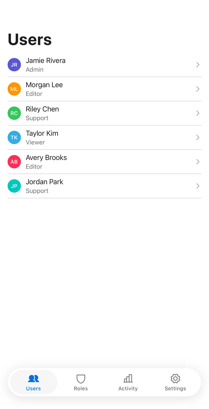
A user directory with a list beside a detail pane showing profile, sessions and security for the selected user.
Users Detail is an open-source mobile screen from suiss/uim for React Native and Expo, with SwiftUI and Jetpack Compose versions built from the same design tokens. The @esuiss/uim CLI copies its source into your project, so you own the code.
Source: https://uim.suiss.app/docs/blocks/users-detail
```tsx title="uniwind/components/blocks/users-detail.tsx"
import {
ChartBarIcon,
DesktopIcon,
DeviceMobileIcon,
GearIcon,
GlobeIcon,
type Icon as PhosphorIcon,
ShieldIcon,
UsersIcon,
} from "phosphor-react-native"
import * as React from "react"
import { useWindowDimensions, View } from "react-native"
import { FadeInDown, ReduceMotion } from "react-native-reanimated"
import { Picker, PickerItem } from "@/components/patterns/picker"
import {
SplitView,
SplitViewDetail,
SplitViewItem,
SplitViewList,
} from "@/components/patterns/split-view"
import { AnimatedView } from "@/components/ui/animated-view"
import { Avatar, AvatarFallback } from "@/components/ui/avatar"
import { Button } from "@/components/ui/button"
import { Icon } from "@/components/ui/icon"
import {
Item,
ItemActions,
ItemContent,
ItemDescription,
ItemGroup,
ItemMedia,
ItemSeparator,
ItemTitle,
} from "@/components/ui/item"
import { Screen } from "@/components/ui/screen"
import { Switch } from "@/components/ui/switch"
import { TabBar, TabBarItem, TabBarList } from "@/components/ui/tab-bar"
import { Text } from "@/components/ui/text"
import { ToggleGroup, ToggleGroupItem } from "@/components/ui/toggle-group"
const SECTIONS: { value: string; label: string; icon: PhosphorIcon }[] = [
{ value: "users", label: "Users", icon: UsersIcon },
{ value: "roles", label: "Roles", icon: ShieldIcon },
{ value: "log", label: "Activity", icon: ChartBarIcon },
{ value: "settings", label: "Settings", icon: GearIcon },
]
const ROLES = ["Admin", "Editor", "Support", "Viewer"]
const TABS = ["Profile", "Sessions", "Security"]
type User = {
name: string
email: string
role: string
status: string
tint: string
}
const USERS: User[] = [
{
name: "Jamie Rivera",
email: "jamie@company.com",
role: "Admin",
status: "Active",
tint: "bg-indigo dark:bg-indigo",
},
{
name: "Morgan Lee",
email: "morgan@company.com",
role: "Editor",
status: "Active",
tint: "bg-orange dark:bg-orange",
},
{
name: "Riley Chen",
email: "riley@company.com",
role: "Support",
status: "Active",
tint: "bg-green dark:bg-green",
},
{
name: "Taylor Kim",
email: "taylor@company.com",
role: "Viewer",
status: "Suspended",
tint: "bg-cyan dark:bg-cyan",
},
{
name: "Avery Brooks",
email: "avery@company.com",
role: "Editor",
status: "Invited",
tint: "bg-pink dark:bg-pink",
},
{
name: "Jordan Park",
email: "jordan@company.com",
role: "Support",
status: "Active",
tint: "bg-mint dark:bg-mint",
},
]
type Session = {
device: string
place: string
time: string
icon: PhosphorIcon
}
const INITIAL_SESSIONS: Session[] = [
{
device: "Book Pro · Browser",
place: "San Francisco, US",
time: "Now",
icon: DesktopIcon,
},
{
device: "Phone Pro · App",
place: "San Francisco, US",
time: "2 hr ago",
icon: DeviceMobileIcon,
},
{
device: "Desktop · Browser",
place: "Seattle, US",
time: "3 days ago",
icon: GlobeIcon,
},
]
const SECURITY = [
{ label: "Two-factor authentication", initial: true },
{ label: "Require passkey", initial: false },
{ label: "Sign-in alerts", initial: true },
]
const initials = (name: string) =>
name
.split(" ")
.map((part) => part[0])
.join("")
function AdminTabBar({
value,
onValueChange,
}: {
value: string
onValueChange: (value: string) => void
}) {
return (
onValueChange(next)}>
{SECTIONS.map((section) => (
{section.label}
))}
)
}
function OtherSection({ value, home }: { value: string; home: string }) {
const label = SECTIONS.find((section) => section.value === value)?.label
return (
{label}
{`This section isn't part of the sample. Choose ${home}.`}
)
}
function UserAvatar({
user,
size,
className,
}: {
user: User
size: "sm" | "xl"
className?: string
}) {
return (
{initials(user.name)}
)
}
function SecurityToggle({
label,
initial,
onChange,
}: {
label: string
initial: boolean
onChange: (enabled: boolean) => void
}) {
const [on, setOn] = React.useState(initial)
const id = `users-detail-${label.toLowerCase().replaceAll(" ", "-")}`
return (
-
{label}
{
setOn(value)
onChange(value)
}}
accessibilityLabelledBy={id}
/>
)
}
function ValueRow({ label, value }: { label: string; value: string }) {
return (
-
{label}
{value}
)
}
function UsersDetail({
onRoleChange,
onSignOut,
onSignOutAll,
onSecurityChange,
onSendPasswordReset,
onNavigate,
}: {
onRoleChange?: (email: string, role: string) => void
onSignOut?: (device: string) => void
onSignOutAll?: () => void
onSecurityChange?: (email: string, setting: string, enabled: boolean) => void
onSendPasswordReset?: (email: string) => void
onNavigate?: (section: string) => void
}) {
const { width } = useWindowDimensions()
const wide = width >= 768
const [section, setSection] = React.useState("users")
const [selected, setSelected] = React.useState(0)
const [tab, setTab] = React.useState("Profile")
const [overrides, setOverrides] = React.useState>({})
const [sessions, setSessions] = React.useState(INITIAL_SESSIONS)
const user = USERS[selected] ?? USERS[0]
if (!user) return null
const role = overrides[selected] ?? user.role
return (
{section === "users" ? (
{wide ? (
Users
) : null}
{USERS.map((item, index) => {
const active = wide && index === selected
return (
{
setSelected(index)
setTab("Profile")
}}
className={active ? "bg-accent py-1.5" : "py-1.5"}
>
{item.name}
{overrides[index] ?? item.role}
)
})}
{user.name}
{`${user.email} · ${role}`}
{
if (value[0]) setTab(value[0])
}}
accessibilityLabel="Section"
>
{TABS.map((item) => (
{item}
))}
{tab === "Profile" ? (
{[
["Full name", user.name],
["Email", user.email],
["Department", "Product"],
["Joined", "March 12, 2024"],
].map(([label = "", value = ""]) => (
))}
-
Role
{
onRoleChange?.(user.email, value)
setOverrides((current) => ({
...current,
[selected]: value,
}))
}}
accessibilityLabel="Role"
className="bg-transparent px-1"
>
{ROLES.map((item) => (
{item}
))}
) : null}
{tab === "Sessions" ? (
<>
{sessions.map((session, index) => (
{index > 0 ? (
) : null}
-
{session.device}
{`${session.place} · ${session.time}`}
{index === 0 ? (
This device
) : (
)}
))}
{sessions.length > 1 ? (
) : null}
) : null}
{tab === "Security" ? (
<>
{SECURITY.map((setting, index) => (
{index > 0 ? : null}
onSecurityChange?.(
user.email,
setting.label,
enabled
)
}
/>
))}
) : null}
) : (
)}
{
setSection(value)
onNavigate?.(value)
}}
/>
)
}
export { UsersDetail }
```
```swift title="swift/Blocks/UsersDetail.swift"
import PhosphorSwift
import SwiftUI
public struct UsersDetail: View {
struct User: Identifiable {
let name: String
let email: String
let role: String
let status: String
let tint: Color
var id: String { email }
}
struct Session: Identifiable, Equatable {
let device: String
let place: String
let time: String
let icon: Image
var id: String { device }
}
static let roles = ["Admin", "Editor", "Support", "Viewer"]
static let tabs = ["Profile", "Sessions", "Security"]
static var users: [User] {
[
User(name: "Jamie Rivera", email: "jamie@company.com", role: "Admin", status: "Active", tint: .indigo),
User(name: "Morgan Lee", email: "morgan@company.com", role: "Editor", status: "Active", tint: .orange),
User(name: "Riley Chen", email: "riley@company.com", role: "Support", status: "Active", tint: .green),
User(name: "Taylor Kim", email: "taylor@company.com", role: "Viewer", status: "Suspended", tint: .blue),
User(name: "Avery Brooks", email: "avery@company.com", role: "Editor", status: "Invited", tint: .pink),
User(name: "Jordan Park", email: "jordan@company.com", role: "Support", status: "Active", tint: .mint),
]
}
static var initialSessions: [Session] {
[
Session(device: "Book Pro · Browser", place: "San Francisco, US", time: "Now", icon: Ph.desktop.bold),
Session(device: "Phone Pro · App", place: "San Francisco, US", time: "2 hr ago", icon: Ph.deviceMobile.bold),
Session(device: "Desktop · Browser", place: "Seattle, US", time: "3 days ago", icon: Ph.globe.bold),
]
}
static let security: [(label: LocalizedStringKey, key: String, initial: Bool)] = [
("Two-factor authentication", "twoFactor", true),
("Require passkey", "passkey", false),
("Sign-in alerts", "alerts", true),
]
private var onNavigate: ((String) -> Void)?
private var onRoleChange: ((String, String) -> Void)?
private var onSignOut: ((String) -> Void)?
private var onSignOutAll: (() -> Void)?
private var onSecurityChange: ((String, String, Bool) -> Void)?
private var onSendPasswordReset: ((String) -> Void)?
@State private var selected: Int
@State private var tab: String?
@State private var overrides: [Int: String] = [:]
@State private var sessions: [Session]
@State private var settings: [Int: [String: Bool]] = [:]
@State private var column: SplitViewColumn
@Environment(\.accessibilityReduceMotion) private var reduceMotion
public init(
onRoleChange: ((_ user: String, _ role: String) -> Void)? = nil,
onSignOut: ((_ device: String) -> Void)? = nil,
onSignOutAll: (() -> Void)? = nil,
onSecurityChange: ((_ user: String, _ setting: String, _ enabled: Bool) -> Void)? = nil,
onSendPasswordReset: ((_ user: String) -> Void)? = nil,
onNavigate: ((_ section: String) -> Void)? = nil
) {
self.init(selected: 0)
self.onRoleChange = onRoleChange
self.onSignOut = onSignOut
self.onSignOutAll = onSignOutAll
self.onNavigate = onNavigate
self.onSecurityChange = onSecurityChange
self.onSendPasswordReset = onSendPasswordReset
}
init(selected: Int, tab: String = "Profile", column: SplitViewColumn = .list) {
_selected = State(initialValue: selected)
_tab = State(initialValue: tab)
_column = State(initialValue: column)
_sessions = State(initialValue: Self.initialSessions)
}
private var animation: Animation? {
reduceMotion ? nil : .timingCurve(0.32, 0.72, 0, 1, duration: 0.45)
}
private func role(_ index: Int) -> String {
overrides[index] ?? Self.users[index].role
}
public var body: some View {
UsersDetailShell(home: "users", onNavigate: onNavigate) {
page
}
}
@ViewBuilder private var page: some View {
let user = Self.users[selected]
Screen {
SplitView(column: $column) {
SplitViewList("Users") {
VStack(alignment: .leading, spacing: 0) {
UsersDetailHeading()
ForEach(Array(Self.users.enumerated()), id: \.element.id) { index, item in
SplitViewItem(isActive: index == selected, action: {
selected = index
tab = "Profile"
}) {
HStack(spacing: 10) {
UsersDetailAvatar(user: item, size: 32)
VStack(alignment: .leading, spacing: 0) {
Text(verbatim: item.name)
.scaledFont(.sm)
Text(LocalizedStringKey(role(index)))
.scaledFont(.xs)
.foregroundStyle(Color.labelSecondary)
}
}
.accessibilityElement(children: .combine)
}
}
}
}
SplitViewDetail {
detail(user)
.id(selected)
.transition(.opacity.combined(with: .offset(y: 8)))
}
}
}
}
private func detail(_ user: User) -> some View {
let current = tab ?? "Profile"
return VStack(alignment: .leading, spacing: 20) {
HStack(spacing: 14) {
UsersDetailAvatar(user: user, size: 64)
VStack(alignment: .leading, spacing: 2) {
Text(verbatim: user.name)
.scaledTextStyle(.xl2, weight: .bold)
.accessibilityAddTraits(.isHeader)
Text(verbatim: "\(user.email) · \(role(selected))")
.scaledFont(.sm)
.foregroundStyle(Color.labelSecondary)
}
}
.padding(.top, 8)
ToggleGroup(
selection: Binding(
get: { tab },
set: { value in
guard let value else { return }
withAnimation(animation) { tab = value }
}
),
size: .sm,
spacing: 0
) {
ForEach(Self.tabs, id: \.self) { item in
ToggleGroupItem(LocalizedStringKey(item), value: item)
.frame(maxWidth: .infinity)
}
}
.accessibilityLabel(Text("Section"))
Group {
switch current {
case "Sessions": sessionsTab(user)
case "Security": securityTab(user)
default: profileTab(user)
}
}
.id(current)
.transition(.opacity.combined(with: .offset(y: 6)))
}
.foregroundStyle(Color.label)
}
private func profileTab(_ user: User) -> some View {
let rows: [(LocalizedStringKey, String)] = [
("Full name", user.name),
("Email", user.email),
("Department", "Product"),
("Joined", "March 12, 2024"),
]
let index = selected
let binding = Binding(
get: { role(index) },
set: { value in
guard let value, value != role(index) else { return }
onRoleChange?(user.email, value)
overrides[index] = value
}
)
return ItemGroup(.inset) {
ForEach(Array(rows.enumerated()), id: \.offset) { _, row in
Item(size: .sm) {
ItemContent {
ItemTitle { Text(row.0).fontWeight(.regular) }
}
ItemActions {
Text(verbatim: row.1)
.foregroundStyle(Color.labelSecondary)
.lineLimit(1)
}
}
.accessibilityElement(children: .combine)
ItemSeparator()
}
Item(size: .sm) {
ItemContent {
ItemTitle { Text("Role").fontWeight(.regular) }
}
ItemActions {
OptionPicker(selection: binding, size: .sm) {
ForEach(Self.roles, id: \.self) { item in
OptionPickerItem(LocalizedStringKey(item), value: item)
}
}
.fixedSize()
.accessibilityLabel(Text("Role"))
}
}
ItemSeparator()
Item(size: .sm) {
ItemContent {
ItemTitle { Text("Status").fontWeight(.regular) }
}
ItemActions {
Text(LocalizedStringKey(user.status))
.foregroundStyle(Color.labelSecondary)
}
}
.accessibilityElement(children: .combine)
}
}
private func sessionsTab(_ user: User) -> some View {
VStack(alignment: .leading, spacing: 12) {
ItemGroup(.inset) {
ForEach(Array(sessions.enumerated()), id: \.element.id) { index, session in
if index > 0 {
ItemSeparator().padding(.leading, 44)
}
Item(size: .sm) {
ItemMedia {
session.icon
.frame(width: 16, height: 16)
.foregroundStyle(Color.onAccent)
.frame(width: 30, height: 30)
.background(Color.gray, in: RoundedRectangle(cornerRadius: 7, style: .continuous))
}
ItemContent {
ItemTitle { Text(verbatim: session.device).fontWeight(.regular) }
ItemDescription(verbatim: "\(session.place) · \(session.time)")
}
ItemActions {
if index == 0 {
Text("This device")
.scaledFont(.sm)
} else {
Button("Sign Out") {
onSignOut?(session.device)
withAnimation(animation) { sessions.removeAll { $0.device == session.device } }
}
.buttonStyle(.variant(.secondary, size: .sm))
}
}
}
.transition(.opacity)
}
}
if sessions.count > 1 {
Button("Sign Out All Other Sessions") {
onSignOutAll?()
withAnimation(animation) { sessions = Array(sessions.prefix(1)) }
}
.buttonStyle(.variant(.destructive, size: .sm))
}
}
}
private func securityTab(_ user: User) -> some View {
let index = selected
return VStack(alignment: .leading, spacing: 12) {
ItemGroup(.inset) {
ForEach(Array(Self.security.enumerated()), id: \.offset) { position, item in
if position > 0 {
ItemSeparator()
}
Item(size: .sm) {
ItemContent {
ItemTitle { Text(item.label).fontWeight(.regular) }
}
ItemActions {
Toggle(isOn: Binding(
get: { settings[index]?[item.key] ?? item.initial },
set: { value in
onSecurityChange?(user.email, item.key, value)
settings[index, default: [:]][item.key] = value
}
)) {
Text(item.label)
}
.labelsHidden()
.toggleStyle(SwitchStyle())
.accessibilityLabel(Text(item.label))
}
}
}
}
Button("Send Password Reset Link") {
onSendPasswordReset?(user.email)
}
.buttonStyle(.variant(.destructive, size: .sm))
}
}
}
private struct UsersDetailAvatar: View {
let user: UsersDetail.User
let size: CGFloat
var body: some View {
Text(verbatim: user.name.split(separator: " ").compactMap(\.first).map(String.init).joined())
.font(.system(size: size * 0.38, weight: .semibold))
.foregroundStyle(Color.onAccent)
.frame(width: size, height: size)
.background(user.tint, in: Circle())
.accessibilityHidden(true)
}
}
private struct UsersDetailHeading: View {
@Environment(\.splitView) private var splitView
var body: some View {
if splitView?.wide ?? false {
Text("Users")
.scaledFont(.sm, weight: .semibold)
.foregroundStyle(Color.labelSecondary)
.padding(.horizontal, 4)
.padding(.vertical, 8)
.accessibilityAddTraits(.isHeader)
}
}
}
private struct UsersDetailShell: View {
let home: String
let onNavigate: ((String) -> Void)?
let content: Content
@State private var tab: String
init(home: String, onNavigate: ((String) -> Void)?, @ViewBuilder content: () -> Content) {
self.home = home
self.onNavigate = onNavigate
self.content = content()
_tab = State(initialValue: home)
}
private static var sections: [(value: String, label: LocalizedStringKey, icon: Image, active: Image)] {
[
("users", "Users", Ph.users.regular, Ph.users.fill),
("roles", "Roles", Ph.shield.regular, Ph.shield.fill),
("log", "Activity", Ph.chartBar.regular, Ph.chartBar.fill),
("settings", "Settings", Ph.gear.regular, Ph.gear.fill),
]
}
var body: some View {
let selection = Binding(
get: { tab },
set: { value in
guard value != tab else { return }
onNavigate?(value)
tab = value
}
)
Screen {
ZStack {
content
.opacity(tab == home ? 1 : 0)
.allowsHitTesting(tab == home)
.accessibilityHidden(tab != home)
if tab != home {
Empty {
EmptyHeader {
EmptyDescription("This section isn't part of the sample. Choose \(Text(Self.sections.first { $0.value == home }?.label ?? "")).")
}
}
.background(Color.surface)
}
}
.frame(maxHeight: .infinity)
TabBar(selection: selection) {
ForEach(Self.sections, id: \.value) { section in
TabBarItem(section.label, value: section.value, icon: section.icon, activeIcon: section.active)
}
}
}
}
}
```
```kt title="kotlin/blocks/UsersDetail.kt"
package com.esuiss.ui.blocks
import androidx.compose.animation.core.Animatable
import androidx.compose.animation.core.CubicBezierEasing
import androidx.compose.animation.core.tween
import androidx.compose.foundation.background
import androidx.compose.foundation.layout.Arrangement
import androidx.compose.foundation.layout.Box
import androidx.compose.foundation.layout.Column
import androidx.compose.foundation.layout.Row
import androidx.compose.foundation.layout.fillMaxSize
import androidx.compose.foundation.layout.fillMaxWidth
import androidx.compose.foundation.layout.padding
import androidx.compose.foundation.layout.size
import androidx.compose.foundation.shape.CircleShape
import androidx.compose.foundation.shape.RoundedCornerShape
import androidx.compose.foundation.text.BasicText
import androidx.compose.runtime.Composable
import androidx.compose.runtime.LaunchedEffect
import androidx.compose.runtime.getValue
import androidx.compose.runtime.key
import androidx.compose.runtime.mutableStateListOf
import androidx.compose.runtime.mutableStateMapOf
import androidx.compose.runtime.mutableStateOf
import androidx.compose.runtime.remember
import androidx.compose.runtime.saveable.rememberSaveable
import androidx.compose.runtime.setValue
import androidx.compose.ui.Alignment
import androidx.compose.ui.Modifier
import androidx.compose.ui.graphics.Color
import androidx.compose.ui.graphics.graphicsLayer
import androidx.compose.ui.graphics.vector.ImageVector
import androidx.compose.ui.semantics.contentDescription
import androidx.compose.ui.semantics.heading
import androidx.compose.ui.semantics.semantics
import androidx.compose.ui.text.font.FontWeight
import androidx.compose.ui.text.style.TextAlign
import androidx.compose.ui.text.style.TextOverflow
import androidx.compose.ui.unit.Dp
import androidx.compose.ui.unit.dp
import androidx.compose.ui.unit.sp
import com.adamglin.PhosphorIcons
import com.adamglin.phosphoricons.Bold
import com.adamglin.phosphoricons.Fill
import com.adamglin.phosphoricons.Regular
import com.adamglin.phosphoricons.bold.Desktop
import com.adamglin.phosphoricons.bold.DeviceMobile
import com.adamglin.phosphoricons.bold.Globe
import com.adamglin.phosphoricons.fill.ChartBar as FillChartBar
import com.adamglin.phosphoricons.fill.Gear as FillGear
import com.adamglin.phosphoricons.fill.Shield as FillShield
import com.adamglin.phosphoricons.fill.Users as FillUsers
import com.adamglin.phosphoricons.regular.ChartBar
import com.adamglin.phosphoricons.regular.Gear
import com.adamglin.phosphoricons.regular.Shield
import com.adamglin.phosphoricons.regular.Users
import com.esuiss.ui.components.Button
import com.esuiss.ui.components.ButtonSize
import com.esuiss.ui.components.ButtonVariant
import com.esuiss.ui.components.Icon
import com.esuiss.ui.components.Item
import com.esuiss.ui.components.ItemActions
import com.esuiss.ui.components.ItemContent
import com.esuiss.ui.components.ItemGroup
import com.esuiss.ui.components.ItemGroupVariant
import com.esuiss.ui.components.ItemMedia
import com.esuiss.ui.components.ItemSeparator
import com.esuiss.ui.components.ItemSize
import com.esuiss.ui.components.ItemTitle
import com.esuiss.ui.components.Screen
import com.esuiss.ui.components.ScreenEdge
import com.esuiss.ui.components.SelectSize
import com.esuiss.ui.components.Switch
import com.esuiss.ui.components.TabBar
import com.esuiss.ui.components.TabBarItem
import com.esuiss.ui.components.ToggleGroup
import com.esuiss.ui.components.ToggleGroupItem
import com.esuiss.ui.components.ToggleSize
import com.esuiss.ui.patterns.Picker
import com.esuiss.ui.patterns.PickerItemData
import com.esuiss.ui.patterns.SplitView
import com.esuiss.ui.patterns.SplitViewColumn
import com.esuiss.ui.patterns.SplitViewItem
import com.esuiss.ui.theme.Colors
import com.esuiss.ui.theme.EsuissTheme
import com.esuiss.ui.theme.Typography
private val DetailRevealEasing = CubicBezierEasing(0.32f, 0.72f, 0f, 1f)
private class DetailUser(val name: String, val email: String, val role: String, val status: String, val hue: Int)
private val DetailUsers = listOf(
DetailUser("Jamie Rivera", "jamie@company.com", "Admin", "Active", 250),
DetailUser("Morgan Lee", "morgan@company.com", "Editor", "Active", 30),
DetailUser("Riley Chen", "riley@company.com", "Support", "Active", 150),
DetailUser("Taylor Kim", "taylor@company.com", "Viewer", "Suspended", 200),
DetailUser("Avery Brooks", "avery@company.com", "Editor", "Invited", 330),
DetailUser("Jordan Park", "jordan@company.com", "Support", "Active", 100),
)
private val DetailRoles = listOf("Admin", "Editor", "Support", "Viewer").map { PickerItemData(it, it) }
private class DetailSession(val device: String, val place: String, val time: String, val icon: ImageVector)
private fun detailSessions() = listOf(
DetailSession("Book Pro · Browser", "San Francisco, US", "Now", PhosphorIcons.Bold.Desktop),
DetailSession("Phone Pro · App", "San Francisco, US", "2 hr ago", PhosphorIcons.Bold.DeviceMobile),
DetailSession("Desktop · Browser", "Seattle, US", "3 days ago", PhosphorIcons.Bold.Globe),
)
private val DetailSecurity = listOf(
"Two-factor authentication" to true,
"Require passkey" to false,
"Sign-in alerts" to true,
)
private fun detailTint(colors: Colors, hue: Int): Color = when (hue) {
250 -> colors.indigo
30 -> colors.orange
150 -> colors.green
200 -> colors.blue
330 -> colors.pink
else -> colors.teal
}
@Composable
fun UsersDetail(
modifier: Modifier = Modifier,
onRoleChange: (email: String, role: String) -> Unit = { _, _ -> },
onSignOut: (device: String) -> Unit = {},
onSignOutAll: () -> Unit = {},
onSecurityChange: (email: String, setting: String, enabled: Boolean) -> Unit = { _, _, _ -> },
onSendPasswordReset: (email: String) -> Unit = {},
onNavigate: (section: String) -> Unit = {},
) {
val colors = EsuissTheme.colors
var selected by rememberSaveable { mutableStateOf(0) }
var tab by rememberSaveable { mutableStateOf("Profile") }
var column by rememberSaveable { mutableStateOf(SplitViewColumn.List) }
val overrides = remember { mutableStateMapOf() }
val security = remember { mutableStateMapOf() }
val sessions = remember { mutableStateListOf().apply { addAll(detailSessions()) } }
val user = DetailUsers[selected]
val role = overrides[selected] ?: user.role
Screen(modifier, edges = setOf(ScreenEdge.Top, ScreenEdge.Left, ScreenEdge.Right)) {
AdminTabs("users", onNavigate) {
SplitView(column = column, onColumnChange = { column = it }) {
SplitViewList(title = "Users") {
DetailUsers.forEachIndexed { index, item ->
SplitViewItem(
isActive = index == selected,
onClick = {
selected = index
tab = "Profile"
},
) {
Row(horizontalArrangement = Arrangement.spacedBy(10.dp), verticalAlignment = Alignment.CenterVertically) {
DetailAvatar(item, 28.dp)
Column {
BasicText(item.name, style = Typography.sm.copy(color = colors.label))
BasicText(overrides[index] ?: item.role, style = Typography.xs.copy(color = colors.labelSecondary))
}
}
}
}
}
SplitViewDetail {
key(selected) {
DetailAppear {
Column(
modifier = Modifier.padding(top = 8.dp),
verticalArrangement = Arrangement.spacedBy(20.dp),
) {
Row(horizontalArrangement = Arrangement.spacedBy(14.dp), verticalAlignment = Alignment.CenterVertically) {
DetailAvatar(user, 64.dp)
Column(verticalArrangement = Arrangement.spacedBy(2.dp)) {
BasicText(
user.name,
modifier = Modifier.semantics { heading() },
style = Typography.xl.copy(color = colors.label, fontWeight = FontWeight.Bold),
)
BasicText("${user.email} · $role", style = Typography.sm.copy(color = colors.labelSecondary))
}
}
ToggleGroup(
value = tab,
onValueChange = { if (it != null) tab = it },
modifier = Modifier.semantics { contentDescription = "Section" },
size = ToggleSize.Sm,
spacing = 0,
) {
listOf("Profile", "Sessions", "Security").forEach { ToggleGroupItem(it, it) }
}
key(tab) {
DetailAppear {
Column(verticalArrangement = Arrangement.spacedBy(12.dp)) {
when (tab) {
"Profile" -> DetailProfile(user, role) { value ->
onRoleChange(user.email, value)
overrides[selected] = value
}
"Sessions" -> DetailSessions(
sessions = sessions,
onSignOut = { session ->
onSignOut(session.device)
sessions.remove(session)
},
onSignOutAll = {
onSignOutAll()
while (sessions.size > 1) sessions.removeAt(sessions.lastIndex)
},
)
else -> {
ItemGroup(variant = ItemGroupVariant.Inset) {
DetailSecurity.forEachIndexed { index, (label, initial) ->
if (index > 0) ItemSeparator()
val keyName = "$selected-$label"
DetailRow(label) {
Switch(
checked = security[keyName] ?: initial,
onCheckedChange = {
onSecurityChange(user.email, label, it)
security[keyName] = it
},
modifier = Modifier.semantics { contentDescription = label },
)
}
}
}
Button(
text = "Send Password Reset Link",
onClick = { onSendPasswordReset(user.email) },
size = ButtonSize.Sm,
variant = ButtonVariant.Destructive,
)
}
}
}
}
}
}
}
}
}
}
}
}
}
@Composable
private fun DetailAppear(content: @Composable () -> Unit) {
val appear = remember { Animatable(0f) }
LaunchedEffect(Unit) { appear.animateTo(1f, tween(800, easing = DetailRevealEasing)) }
Box(
Modifier.graphicsLayer {
alpha = appear.value
translationY = (1f - appear.value) * 8.dp.toPx()
},
) {
content()
}
}
@Composable
private fun DetailAvatar(user: DetailUser, size: Dp) {
val colors = EsuissTheme.colors
Box(
Modifier
.size(size)
.background(detailTint(colors, user.hue), CircleShape),
contentAlignment = Alignment.Center,
) {
BasicText(
user.name.split(" ").mapNotNull { it.firstOrNull() }.joinToString(""),
style = Typography.xs.copy(color = colors.onMedia, fontWeight = FontWeight.Medium, fontSize = (size.value * 0.38f).sp),
)
}
}
@Composable
private fun DetailRow(title: String, action: @Composable () -> Unit) {
Item(size = ItemSize.Sm, role = null) {
ItemContent {
ItemTitle {
BasicText(
title,
style = Typography.base.copy(color = EsuissTheme.colors.label),
maxLines = 1,
overflow = TextOverflow.Ellipsis,
)
}
}
ItemActions { action() }
}
}
@Composable
private fun DetailProfile(user: DetailUser, role: String, onRole: (String) -> Unit) {
val colors = EsuissTheme.colors
ItemGroup(variant = ItemGroupVariant.Inset) {
listOf(
"Full name" to user.name,
"Email" to user.email,
"Department" to "Product",
"Joined" to "March 12, 2024",
).forEach { (label, value) ->
DetailRow(label) { BasicText(value, style = Typography.base.copy(color = colors.labelSecondary), maxLines = 1) }
ItemSeparator()
}
DetailRow("Role") {
Picker(
value = role,
onValueChange = onRole,
modifier = Modifier.semantics { contentDescription = "Role" },
items = DetailRoles,
size = SelectSize.Sm,
)
}
ItemSeparator()
DetailRow("Status") { BasicText(user.status, style = Typography.base.copy(color = colors.labelSecondary)) }
}
}
@Composable
private fun DetailSessions(
sessions: List,
onSignOut: (DetailSession) -> Unit,
onSignOutAll: () -> Unit,
) {
val colors = EsuissTheme.colors
ItemGroup(variant = ItemGroupVariant.Inset) {
sessions.forEachIndexed { index, session ->
key(session.device) {
if (index > 0) ItemSeparator(Modifier.padding(start = 40.dp))
Item(size = ItemSize.Sm, role = null) {
ItemMedia {
Box(
Modifier
.size(30.dp)
.background(colors.gray, RoundedCornerShape(7.dp)),
contentAlignment = Alignment.Center,
) {
Icon(session.icon, contentDescription = null, size = 16.dp, tint = colors.onMedia)
}
}
ItemContent {
BasicText(
session.device,
style = Typography.base.copy(color = colors.label),
maxLines = 1,
overflow = TextOverflow.Ellipsis,
)
BasicText(
"${session.place} · ${session.time}",
style = Typography.xs.copy(color = colors.labelSecondary),
maxLines = 1,
overflow = TextOverflow.Ellipsis,
)
}
ItemActions {
if (index == 0) {
BasicText("This device", style = Typography.sm.copy(color = colors.label))
} else {
Button(text = "Sign Out", onClick = { onSignOut(session) }, size = ButtonSize.Sm, variant = ButtonVariant.Secondary)
}
}
}
}
}
}
if (sessions.size > 1) {
Button(
text = "Sign Out All Other Sessions",
onClick = onSignOutAll,
size = ButtonSize.Sm,
variant = ButtonVariant.Destructive,
)
}
}
private val AdminSections = listOf("users" to "Users", "roles" to "Roles", "log" to "Activity", "settings" to "Settings")
@Composable
private fun AdminTabs(home: String, onNavigate: (String) -> Unit, content: @Composable () -> Unit) {
val colors = EsuissTheme.colors
var tab by rememberSaveable { mutableStateOf(home) }
Column(Modifier.fillMaxSize()) {
Box(
Modifier
.weight(1f)
.fillMaxWidth(),
) {
if (tab == home) {
content()
} else {
BasicText(
"This section isn't part of the sample. Choose ${AdminSections.first { it.first == home }.second}.",
modifier = Modifier
.align(Alignment.Center)
.padding(32.dp),
style = Typography.base.copy(color = colors.labelSecondary, textAlign = TextAlign.Center),
)
}
}
TabBar(
value = tab,
onValueChange = {
onNavigate(it)
tab = it
},
) {
TabBarItem("users", "Users", PhosphorIcons.Regular.Users, selectedIcon = PhosphorIcons.Fill.FillUsers)
TabBarItem("roles", "Roles", PhosphorIcons.Regular.Shield, selectedIcon = PhosphorIcons.Fill.FillShield)
TabBarItem("log", "Activity", PhosphorIcons.Regular.ChartBar, selectedIcon = PhosphorIcons.Fill.FillChartBar)
TabBarItem("settings", "Settings", PhosphorIcons.Regular.Gear, selectedIcon = PhosphorIcons.Fill.FillGear)
}
}
}
```
A `SplitView` lists users with an `Avatar` and status, and the detail pane shows the selected user's header and a `ToggleGroup` for Profile, Sessions and Security. Profile lists details with a role `Picker`, Sessions lets you sign out one device or all others, and Security has `Switch` rows and a password reset `Button`. The admin `TabBar` switches sections.
## Installation
```bash title="Terminal"
npx @esuiss/uim@latest add users-detail
```
```bash title="Terminal"
npx @esuiss/uim@latest add users-detail --platform swift
```
```bash title="Terminal"
npx @esuiss/uim@latest add users-detail --platform kotlin
```
The CLI also adds what it builds on: [Avatar](/docs/components/avatar), [Button](/docs/components/button), [Icon](/docs/components/icon), [Item](/docs/components/item), [Picker](/docs/patterns/picker), [Screen](/docs/components/screen), [Split View](/docs/patterns/split-view), [Switch](/docs/components/switch), [Tab Bar](/docs/components/tab-bar), [Text](/docs/components/text), [Toggle Group](/docs/components/toggle-group).
### Manual
**Uniwind**
1. Install the dependencies:
```bash title="Terminal"
npx expo install phosphor-react-native react-native-reanimated react-native-svg react-native-worklets
```
2. Add the pieces it builds on: [Avatar](/docs/components/avatar), [Button](/docs/components/button), [Icon](/docs/components/icon), [Item](/docs/components/item), [Picker](/docs/patterns/picker), [Screen](/docs/components/screen), [Split View](/docs/patterns/split-view), [Switch](/docs/components/switch), [Tab Bar](/docs/components/tab-bar), [Text](/docs/components/text), [Toggle Group](/docs/components/toggle-group).
3. Copy the source into `components/blocks/users-detail.tsx`:
```tsx title="uniwind/components/blocks/users-detail.tsx"
import {
ChartBarIcon,
DesktopIcon,
DeviceMobileIcon,
GearIcon,
GlobeIcon,
type Icon as PhosphorIcon,
ShieldIcon,
UsersIcon,
} from "phosphor-react-native"
import * as React from "react"
import { useWindowDimensions, View } from "react-native"
import { FadeInDown, ReduceMotion } from "react-native-reanimated"
import { Picker, PickerItem } from "@/components/patterns/picker"
import {
SplitView,
SplitViewDetail,
SplitViewItem,
SplitViewList,
} from "@/components/patterns/split-view"
import { AnimatedView } from "@/components/ui/animated-view"
import { Avatar, AvatarFallback } from "@/components/ui/avatar"
import { Button } from "@/components/ui/button"
import { Icon } from "@/components/ui/icon"
import {
Item,
ItemActions,
ItemContent,
ItemDescription,
ItemGroup,
ItemMedia,
ItemSeparator,
ItemTitle,
} from "@/components/ui/item"
import { Screen } from "@/components/ui/screen"
import { Switch } from "@/components/ui/switch"
import { TabBar, TabBarItem, TabBarList } from "@/components/ui/tab-bar"
import { Text } from "@/components/ui/text"
import { ToggleGroup, ToggleGroupItem } from "@/components/ui/toggle-group"
const SECTIONS: { value: string; label: string; icon: PhosphorIcon }[] = [
{ value: "users", label: "Users", icon: UsersIcon },
{ value: "roles", label: "Roles", icon: ShieldIcon },
{ value: "log", label: "Activity", icon: ChartBarIcon },
{ value: "settings", label: "Settings", icon: GearIcon },
]
const ROLES = ["Admin", "Editor", "Support", "Viewer"]
const TABS = ["Profile", "Sessions", "Security"]
type User = {
name: string
email: string
role: string
status: string
tint: string
}
const USERS: User[] = [
{
name: "Jamie Rivera",
email: "jamie@company.com",
role: "Admin",
status: "Active",
tint: "bg-indigo dark:bg-indigo",
},
{
name: "Morgan Lee",
email: "morgan@company.com",
role: "Editor",
status: "Active",
tint: "bg-orange dark:bg-orange",
},
{
name: "Riley Chen",
email: "riley@company.com",
role: "Support",
status: "Active",
tint: "bg-green dark:bg-green",
},
{
name: "Taylor Kim",
email: "taylor@company.com",
role: "Viewer",
status: "Suspended",
tint: "bg-cyan dark:bg-cyan",
},
{
name: "Avery Brooks",
email: "avery@company.com",
role: "Editor",
status: "Invited",
tint: "bg-pink dark:bg-pink",
},
{
name: "Jordan Park",
email: "jordan@company.com",
role: "Support",
status: "Active",
tint: "bg-mint dark:bg-mint",
},
]
type Session = {
device: string
place: string
time: string
icon: PhosphorIcon
}
const INITIAL_SESSIONS: Session[] = [
{
device: "Book Pro · Browser",
place: "San Francisco, US",
time: "Now",
icon: DesktopIcon,
},
{
device: "Phone Pro · App",
place: "San Francisco, US",
time: "2 hr ago",
icon: DeviceMobileIcon,
},
{
device: "Desktop · Browser",
place: "Seattle, US",
time: "3 days ago",
icon: GlobeIcon,
},
]
const SECURITY = [
{ label: "Two-factor authentication", initial: true },
{ label: "Require passkey", initial: false },
{ label: "Sign-in alerts", initial: true },
]
const initials = (name: string) =>
name
.split(" ")
.map((part) => part[0])
.join("")
function AdminTabBar({
value,
onValueChange,
}: {
value: string
onValueChange: (value: string) => void
}) {
return (
onValueChange(next)}>
{SECTIONS.map((section) => (
{section.label}
))}
)
}
function OtherSection({ value, home }: { value: string; home: string }) {
const label = SECTIONS.find((section) => section.value === value)?.label
return (
{label}
{`This section isn't part of the sample. Choose ${home}.`}
)
}
function UserAvatar({
user,
size,
className,
}: {
user: User
size: "sm" | "xl"
className?: string
}) {
return (
{initials(user.name)}
)
}
function SecurityToggle({
label,
initial,
onChange,
}: {
label: string
initial: boolean
onChange: (enabled: boolean) => void
}) {
const [on, setOn] = React.useState(initial)
const id = `users-detail-${label.toLowerCase().replaceAll(" ", "-")}`
return (
-
{label}
{
setOn(value)
onChange(value)
}}
accessibilityLabelledBy={id}
/>
)
}
function ValueRow({ label, value }: { label: string; value: string }) {
return (
-
{label}
{value}
)
}
function UsersDetail({
onRoleChange,
onSignOut,
onSignOutAll,
onSecurityChange,
onSendPasswordReset,
onNavigate,
}: {
onRoleChange?: (email: string, role: string) => void
onSignOut?: (device: string) => void
onSignOutAll?: () => void
onSecurityChange?: (email: string, setting: string, enabled: boolean) => void
onSendPasswordReset?: (email: string) => void
onNavigate?: (section: string) => void
}) {
const { width } = useWindowDimensions()
const wide = width >= 768
const [section, setSection] = React.useState("users")
const [selected, setSelected] = React.useState(0)
const [tab, setTab] = React.useState("Profile")
const [overrides, setOverrides] = React.useState>({})
const [sessions, setSessions] = React.useState(INITIAL_SESSIONS)
const user = USERS[selected] ?? USERS[0]
if (!user) return null
const role = overrides[selected] ?? user.role
return (
{section === "users" ? (
{wide ? (
Users
) : null}
{USERS.map((item, index) => {
const active = wide && index === selected
return (
{
setSelected(index)
setTab("Profile")
}}
className={active ? "bg-accent py-1.5" : "py-1.5"}
>
{item.name}
{overrides[index] ?? item.role}
)
})}
{user.name}
{`${user.email} · ${role}`}
{
if (value[0]) setTab(value[0])
}}
accessibilityLabel="Section"
>
{TABS.map((item) => (
{item}
))}
{tab === "Profile" ? (
{[
["Full name", user.name],
["Email", user.email],
["Department", "Product"],
["Joined", "March 12, 2024"],
].map(([label = "", value = ""]) => (
))}
-
Role
{
onRoleChange?.(user.email, value)
setOverrides((current) => ({
...current,
[selected]: value,
}))
}}
accessibilityLabel="Role"
className="bg-transparent px-1"
>
{ROLES.map((item) => (
{item}
))}
) : null}
{tab === "Sessions" ? (
<>
{sessions.map((session, index) => (
{index > 0 ? (
) : null}
-
{session.device}
{`${session.place} · ${session.time}`}
{index === 0 ? (
This device
) : (
)}
))}
{sessions.length > 1 ? (
) : null}
) : null}
{tab === "Security" ? (
<>
{SECURITY.map((setting, index) => (
{index > 0 ? : null}
onSecurityChange?.(
user.email,
setting.label,
enabled
)
}
/>
))}
) : null}
) : (
)}
{
setSection(value)
onNavigate?.(value)
}}
/>
)
}
export { UsersDetail }
```
4. Update the import paths to match your project.
**NativeWind**
1. Install the dependencies:
```bash title="Terminal"
npx expo install phosphor-react-native react-native-reanimated react-native-svg react-native-worklets
```
2. Add the pieces it builds on: [Avatar](/docs/components/avatar), [Button](/docs/components/button), [Icon](/docs/components/icon), [Item](/docs/components/item), [Picker](/docs/patterns/picker), [Screen](/docs/components/screen), [Split View](/docs/patterns/split-view), [Switch](/docs/components/switch), [Tab Bar](/docs/components/tab-bar), [Text](/docs/components/text), [Toggle Group](/docs/components/toggle-group).
3. Copy the source into `components/blocks/users-detail.tsx`:
```tsx title="nativewind/components/blocks/users-detail.tsx"
import {
ChartBarIcon,
DesktopIcon,
DeviceMobileIcon,
GearIcon,
GlobeIcon,
type Icon as PhosphorIcon,
ShieldIcon,
UsersIcon,
} from "phosphor-react-native"
import * as React from "react"
import { useWindowDimensions, View } from "react-native"
import { FadeInDown, ReduceMotion } from "react-native-reanimated"
import { Picker, PickerItem } from "@/components/patterns/picker"
import {
SplitView,
SplitViewDetail,
SplitViewItem,
SplitViewList,
} from "@/components/patterns/split-view"
import { AnimatedView } from "@/components/ui/animated-view"
import { Avatar, AvatarFallback } from "@/components/ui/avatar"
import { Button } from "@/components/ui/button"
import { Icon } from "@/components/ui/icon"
import {
Item,
ItemActions,
ItemContent,
ItemDescription,
ItemGroup,
ItemMedia,
ItemSeparator,
ItemTitle,
} from "@/components/ui/item"
import { Screen } from "@/components/ui/screen"
import { Switch } from "@/components/ui/switch"
import { TabBar, TabBarItem, TabBarList } from "@/components/ui/tab-bar"
import { Text } from "@/components/ui/text"
import { ToggleGroup, ToggleGroupItem } from "@/components/ui/toggle-group"
const SECTIONS: { value: string; label: string; icon: PhosphorIcon }[] = [
{ value: "users", label: "Users", icon: UsersIcon },
{ value: "roles", label: "Roles", icon: ShieldIcon },
{ value: "log", label: "Activity", icon: ChartBarIcon },
{ value: "settings", label: "Settings", icon: GearIcon },
]
const ROLES = ["Admin", "Editor", "Support", "Viewer"]
const TABS = ["Profile", "Sessions", "Security"]
type User = {
name: string
email: string
role: string
status: string
tint: string
}
const USERS: User[] = [
{
name: "Jamie Rivera",
email: "jamie@company.com",
role: "Admin",
status: "Active",
tint: "bg-indigo dark:bg-indigo",
},
{
name: "Morgan Lee",
email: "morgan@company.com",
role: "Editor",
status: "Active",
tint: "bg-orange dark:bg-orange",
},
{
name: "Riley Chen",
email: "riley@company.com",
role: "Support",
status: "Active",
tint: "bg-green dark:bg-green",
},
{
name: "Taylor Kim",
email: "taylor@company.com",
role: "Viewer",
status: "Suspended",
tint: "bg-cyan dark:bg-cyan",
},
{
name: "Avery Brooks",
email: "avery@company.com",
role: "Editor",
status: "Invited",
tint: "bg-pink dark:bg-pink",
},
{
name: "Jordan Park",
email: "jordan@company.com",
role: "Support",
status: "Active",
tint: "bg-mint dark:bg-mint",
},
]
type Session = {
device: string
place: string
time: string
icon: PhosphorIcon
}
const INITIAL_SESSIONS: Session[] = [
{
device: "Book Pro · Browser",
place: "San Francisco, US",
time: "Now",
icon: DesktopIcon,
},
{
device: "Phone Pro · App",
place: "San Francisco, US",
time: "2 hr ago",
icon: DeviceMobileIcon,
},
{
device: "Desktop · Browser",
place: "Seattle, US",
time: "3 days ago",
icon: GlobeIcon,
},
]
const SECURITY = [
{ label: "Two-factor authentication", initial: true },
{ label: "Require passkey", initial: false },
{ label: "Sign-in alerts", initial: true },
]
const initials = (name: string) =>
name
.split(" ")
.map((part) => part[0])
.join("")
function AdminTabBar({
value,
onValueChange,
}: {
value: string
onValueChange: (value: string) => void
}) {
return (
onValueChange(next)}>
{SECTIONS.map((section) => (
{section.label}
))}
)
}
function OtherSection({ value, home }: { value: string; home: string }) {
const label = SECTIONS.find((section) => section.value === value)?.label
return (
{label}
{`This section isn't part of the sample. Choose ${home}.`}
)
}
function UserAvatar({
user,
size,
className,
}: {
user: User
size: "sm" | "xl"
className?: string
}) {
return (
{initials(user.name)}
)
}
function SecurityToggle({
label,
initial,
onChange,
}: {
label: string
initial: boolean
onChange: (enabled: boolean) => void
}) {
const [on, setOn] = React.useState(initial)
const id = `users-detail-${label.toLowerCase().replaceAll(" ", "-")}`
return (
-
{label}
{
setOn(value)
onChange(value)
}}
accessibilityLabelledBy={id}
/>
)
}
function ValueRow({ label, value }: { label: string; value: string }) {
return (
-
{label}
{value}
)
}
function UsersDetail({
onRoleChange,
onSignOut,
onSignOutAll,
onSecurityChange,
onSendPasswordReset,
onNavigate,
}: {
onRoleChange?: (email: string, role: string) => void
onSignOut?: (device: string) => void
onSignOutAll?: () => void
onSecurityChange?: (email: string, setting: string, enabled: boolean) => void
onSendPasswordReset?: (email: string) => void
onNavigate?: (section: string) => void
}) {
const { width } = useWindowDimensions()
const wide = width >= 768
const [section, setSection] = React.useState("users")
const [selected, setSelected] = React.useState(0)
const [tab, setTab] = React.useState("Profile")
const [overrides, setOverrides] = React.useState>({})
const [sessions, setSessions] = React.useState(INITIAL_SESSIONS)
const user = USERS[selected] ?? USERS[0]
if (!user) return null
const role = overrides[selected] ?? user.role
return (
{section === "users" ? (
{wide ? (
Users
) : null}
{USERS.map((item, index) => {
const active = wide && index === selected
return (
{
setSelected(index)
setTab("Profile")
}}
className={active ? "bg-accent py-1.5" : "py-1.5"}
>
{item.name}
{overrides[index] ?? item.role}
)
})}
{user.name}
{`${user.email} · ${role}`}
{
if (value[0]) setTab(value[0])
}}
accessibilityLabel="Section"
>
{TABS.map((item) => (
{item}
))}
{tab === "Profile" ? (
{[
["Full name", user.name],
["Email", user.email],
["Department", "Product"],
["Joined", "March 12, 2024"],
].map(([label = "", value = ""]) => (
))}
-
Role
{
onRoleChange?.(user.email, value)
setOverrides((current) => ({
...current,
[selected]: value,
}))
}}
accessibilityLabel="Role"
className="bg-transparent px-1"
>
{ROLES.map((item) => (
{item}
))}
) : null}
{tab === "Sessions" ? (
<>
{sessions.map((session, index) => (
{index > 0 ? (
) : null}
-
{session.device}
{`${session.place} · ${session.time}`}
{index === 0 ? (
This device
) : (
)}
))}
{sessions.length > 1 ? (
) : null}
) : null}
{tab === "Security" ? (
<>
{SECURITY.map((setting, index) => (
{index > 0 ? : null}
onSecurityChange?.(
user.email,
setting.label,
enabled
)
}
/>
))}
) : null}
) : (
)}
{
setSection(value)
onNavigate?.(value)
}}
/>
)
}
export { UsersDetail }
```
4. Update the import paths to match your project.
**StyleSheet**
1. Install the dependencies:
```bash title="Terminal"
npx expo install phosphor-react-native react-native-reanimated react-native-svg react-native-worklets
```
2. Add the pieces it builds on: [Avatar](/docs/components/avatar), [Button](/docs/components/button), [Icon](/docs/components/icon), [Item](/docs/components/item), [Picker](/docs/patterns/picker), [Screen](/docs/components/screen), [Split View](/docs/patterns/split-view), [Switch](/docs/components/switch), [Tab Bar](/docs/components/tab-bar), [Text](/docs/components/text), [Toggle Group](/docs/components/toggle-group).
3. Copy the source into `components/blocks/users-detail.tsx`:
```tsx title="stylesheet/components/blocks/users-detail.tsx"
import {
ChartBarIcon,
DesktopIcon,
DeviceMobileIcon,
GearIcon,
GlobeIcon,
type Icon as PhosphorIcon,
ShieldIcon,
UsersIcon,
} from "phosphor-react-native"
import * as React from "react"
import { StyleSheet, useWindowDimensions, View } from "react-native"
import { FadeInDown, ReduceMotion } from "react-native-reanimated"
import { Picker, PickerItem } from "@/components/patterns/picker"
import {
SplitView,
SplitViewDetail,
SplitViewItem,
SplitViewList,
} from "@/components/patterns/split-view"
import { AnimatedView } from "@/components/ui/animated-view"
import { Avatar, AvatarFallback } from "@/components/ui/avatar"
import { Button } from "@/components/ui/button"
import { Icon } from "@/components/ui/icon"
import {
Item,
ItemActions,
ItemContent,
ItemDescription,
ItemGroup,
ItemMedia,
ItemSeparator,
ItemTitle,
} from "@/components/ui/item"
import { Screen } from "@/components/ui/screen"
import { Switch } from "@/components/ui/switch"
import { TabBar, TabBarItem, TabBarList } from "@/components/ui/tab-bar"
import { Text } from "@/components/ui/text"
import { fontSize, type ThemeColors, useTheme } from "@/components/ui/theme"
import { ToggleGroup, ToggleGroupItem } from "@/components/ui/toggle-group"
const SECTIONS: { value: string; label: string; icon: PhosphorIcon }[] = [
{ value: "users", label: "Users", icon: UsersIcon },
{ value: "roles", label: "Roles", icon: ShieldIcon },
{ value: "log", label: "Activity", icon: ChartBarIcon },
{ value: "settings", label: "Settings", icon: GearIcon },
]
const ROLES = ["Admin", "Editor", "Support", "Viewer"]
const TABS = ["Profile", "Sessions", "Security"]
type Tint = keyof ThemeColors
type User = {
name: string
email: string
role: string
status: string
tint: Tint
}
const USERS: User[] = [
{
name: "Jamie Rivera",
email: "jamie@company.com",
role: "Admin",
status: "Active",
tint: "indigo",
},
{
name: "Morgan Lee",
email: "morgan@company.com",
role: "Editor",
status: "Active",
tint: "orange",
},
{
name: "Riley Chen",
email: "riley@company.com",
role: "Support",
status: "Active",
tint: "green",
},
{
name: "Taylor Kim",
email: "taylor@company.com",
role: "Viewer",
status: "Suspended",
tint: "cyan",
},
{
name: "Avery Brooks",
email: "avery@company.com",
role: "Editor",
status: "Invited",
tint: "pink",
},
{
name: "Jordan Park",
email: "jordan@company.com",
role: "Support",
status: "Active",
tint: "mint",
},
]
type Session = {
device: string
place: string
time: string
icon: PhosphorIcon
}
const INITIAL_SESSIONS: Session[] = [
{
device: "Book Pro · Browser",
place: "San Francisco, US",
time: "Now",
icon: DesktopIcon,
},
{
device: "Phone Pro · App",
place: "San Francisco, US",
time: "2 hr ago",
icon: DeviceMobileIcon,
},
{
device: "Desktop · Browser",
place: "Seattle, US",
time: "3 days ago",
icon: GlobeIcon,
},
]
const SECURITY = [
{ label: "Two-factor authentication", initial: true },
{ label: "Require passkey", initial: false },
{ label: "Sign-in alerts", initial: true },
]
const styles = StyleSheet.create({
other: { flex: 1, gap: 8, paddingHorizontal: 16, paddingTop: 52 },
otherTitle: { ...fontSize["3xl"], fontWeight: "700" },
wideRoot: { margin: 16 },
listWide: { gap: 2, paddingHorizontal: 16, paddingTop: 20 },
compact: { paddingHorizontal: 16, paddingBottom: 32 },
detailWide: { padding: 24 },
listHeading: {
...fontSize.sm,
paddingHorizontal: 4,
paddingBottom: 8,
fontWeight: "600",
},
listItem: { paddingVertical: 6 },
listRow: { flexDirection: "row", alignItems: "center", gap: 10 },
listText: { minWidth: 0, flex: 1 },
smallAvatar: { width: 28, height: 28 },
detail: { gap: 20 },
profile: { flexDirection: "row", alignItems: "center", gap: 14 },
profileText: { minWidth: 0, flex: 1, gap: 2 },
name: { ...fontSize["2xl"], fontWeight: "700" },
tab: { paddingHorizontal: 16 },
panel: { gap: 12 },
regular: { fontWeight: "400" },
shrink: { flexShrink: 1 },
picker: { backgroundColor: "transparent", paddingHorizontal: 4 },
sessionSeparator: { marginStart: 60 },
sessionMedia: { width: 30, height: 30, borderRadius: 7 },
tight: { gap: 0 },
start: { alignSelf: "flex-start" },
})
const initials = (name: string) =>
name
.split(" ")
.map((part) => part[0])
.join("")
function AdminTabBar({
value,
onValueChange,
}: {
value: string
onValueChange: (value: string) => void
}) {
return (
onValueChange(next)}>
{SECTIONS.map((section) => (
{section.label}
))}
)
}
function OtherSection({ value, home }: { value: string; home: string }) {
const { colors } = useTheme()
const label = SECTIONS.find((section) => section.value === value)?.label
return (
{label}
{`This section isn't part of the sample. Choose ${home}.`}
)
}
function UserAvatar({
user,
size,
style,
}: {
user: User
size: "sm" | "xl"
style?: React.ComponentProps["style"]
}) {
const { colors } = useTheme()
return (
{initials(user.name)}
)
}
function SecurityToggle({
label,
initial,
onChange,
}: {
label: string
initial: boolean
onChange: (enabled: boolean) => void
}) {
const [on, setOn] = React.useState(initial)
const id = `users-detail-${label.toLowerCase().replaceAll(" ", "-")}`
return (
-
{label}
{
setOn(value)
onChange(value)
}}
accessibilityLabelledBy={id}
/>
)
}
function ValueRow({ label, value }: { label: string; value: string }) {
return (
-
{label}
{value}
)
}
function UsersDetail({
onRoleChange,
onSignOut,
onSignOutAll,
onSecurityChange,
onSendPasswordReset,
onNavigate,
}: {
onRoleChange?: (email: string, role: string) => void
onSignOut?: (device: string) => void
onSignOutAll?: () => void
onSecurityChange?: (email: string, setting: string, enabled: boolean) => void
onSendPasswordReset?: (email: string) => void
onNavigate?: (section: string) => void
}) {
const { colors } = useTheme()
const { width } = useWindowDimensions()
const wide = width >= 768
const [section, setSection] = React.useState("users")
const [selected, setSelected] = React.useState(0)
const [tab, setTab] = React.useState("Profile")
const [overrides, setOverrides] = React.useState>({})
const [sessions, setSessions] = React.useState(INITIAL_SESSIONS)
const user = USERS[selected] ?? USERS[0]
if (!user) return null
const role = overrides[selected] ?? user.role
return (
{section === "users" ? (
{wide ? (
Users
) : null}
{USERS.map((item, index) => {
const active = wide && index === selected
return (
{
setSelected(index)
setTab("Profile")
}}
style={
active
? { paddingVertical: 6, backgroundColor: colors.accent }
: styles.listItem
}
>
{item.name}
{overrides[index] ?? item.role}
)
})}
{user.name}
{`${user.email} · ${role}`}
{
if (value[0]) setTab(value[0])
}}
accessibilityLabel="Section"
>
{TABS.map((item) => (
{item}
))}
{tab === "Profile" ? (
{[
["Full name", user.name],
["Email", user.email],
["Department", "Product"],
["Joined", "March 12, 2024"],
].map(([label = "", value = ""]) => (
))}
-
Role
{
onRoleChange?.(user.email, value)
setOverrides((current) => ({
...current,
[selected]: value,
}))
}}
accessibilityLabel="Role"
style={styles.picker}
>
{ROLES.map((item) => (
{item}
))}
) : null}
{tab === "Sessions" ? (
<>
{sessions.map((session, index) => (
{index > 0 ? (
) : null}
-
{session.device}
{`${session.place} · ${session.time}`}
{index === 0 ? (
This device
) : (
)}
))}
{sessions.length > 1 ? (
) : null}
) : null}
{tab === "Security" ? (
<>
{SECURITY.map((setting, index) => (
{index > 0 ? : null}
onSecurityChange?.(
user.email,
setting.label,
enabled
)
}
/>
))}
) : null}
) : (
)}
{
setSection(value)
onNavigate?.(value)
}}
/>
)
}
export { UsersDetail }
```
4. Update the import paths to match your project.
**SwiftUI**
1. Target iOS 17 or later.
2. Add the Swift package to your app:
```swift title="Package.swift"
.package(url: "https://github.com/phosphor-icons/swift", from: "2.1.0")
```
3. Copy the theme files every view uses:
```swift title="swift/Theme/Theme.swift"
import SwiftUI
import UIKit
struct RGBA: Sendable {
let red: CGFloat
let green: CGFloat
let blue: CGFloat
let alpha: CGFloat
init(_ hex: UInt32, _ alpha: CGFloat = 1) {
red = CGFloat((hex >> 16) & 0xFF) / 255
green = CGFloat((hex >> 8) & 0xFF) / 255
blue = CGFloat(hex & 0xFF) / 255
self.alpha = alpha
}
var uiColor: UIColor {
UIColor(red: red, green: green, blue: blue, alpha: alpha)
}
}
extension Color {
static func adaptive(light: RGBA, dark: RGBA) -> Color {
let lightColor = light.uiColor
let darkColor = dark.uiColor
return Color(uiColor: UIColor { traits in
traits.userInterfaceStyle == .dark ? darkColor : lightColor
})
}
}
public struct TextStyle: Sendable, Hashable {
public let size: CGFloat
public let lineHeight: CGFloat
public let letterSpacing: CGFloat
public init(size: CGFloat, lineHeight: CGFloat, letterSpacing: CGFloat) {
self.size = size
self.lineHeight = lineHeight
self.letterSpacing = letterSpacing
}
public func font(weight: Font.Weight = .regular) -> Font {
.system(size: size, weight: weight)
}
public var lineSpacing: CGFloat {
max(0, lineHeight - UIFont.systemFont(ofSize: size).lineHeight)
}
}
extension Hashable where Self == Font {
public static func textStyle(_ style: TextStyle, weight: Font.Weight = .regular) -> Font {
style.font(weight: weight)
}
}
private struct TextStyleModifier: ViewModifier {
let style: TextStyle
let weight: Font.Weight
func body(content: Content) -> some View {
content
.font(style.font(weight: weight))
.tracking(style.letterSpacing)
.lineSpacing(style.lineSpacing)
.padding(.vertical, style.lineSpacing / 2)
}
}
extension View {
public func textStyle(_ style: TextStyle, weight: Font.Weight = .regular) -> some View {
modifier(TextStyleModifier(style: style, weight: weight))
}
}
public struct Shadow: Sendable, Hashable {
public let color: Color
public let radius: CGFloat
public let x: CGFloat
public let y: CGFloat
public init(color: Color, radius: CGFloat, x: CGFloat = 0, y: CGFloat = 0) {
self.color = color
self.radius = radius
self.x = x
self.y = y
}
}
extension View {
public func shadow(_ shadow: Shadow) -> some View {
self.shadow(color: shadow.color, radius: shadow.radius, x: shadow.x, y: shadow.y)
}
}
```
```swift title="swift/Theme/Tokens.swift"
import SwiftUI
extension Color {
public static let surface = Color.adaptive(light: .init(0xFFFFFF), dark: .init(0x000000))
public static let surfaceSecondary = Color.adaptive(light: .init(0xF5F5F7), dark: .init(0x161617))
public static let surfaceTertiary = Color.adaptive(light: .init(0xE8E8ED), dark: .init(0x2C2C2E))
public static let surfaceRaised = Color.adaptive(light: .init(0xFFFFFF), dark: .init(0x1D1D1F))
public static let label = Color.adaptive(light: .init(0x1D1D1F), dark: .init(0xF5F5F7))
public static let labelSecondary = Color.adaptive(light: .init(0x6E6E73), dark: .init(0xA1A1A6))
public static let labelTertiary = Color.adaptive(light: .init(0x86868B), dark: .init(0x86868B))
public static let labelQuaternary = Color.adaptive(light: .init(0xD2D2D7), dark: .init(0x424245))
public static let control = Color.adaptive(light: .init(0x000000, 0.04), dark: .init(0xFFFFFF, 0.1))
public static let controlPressed = Color.adaptive(light: .init(0x000000, 0.12), dark: .init(0xFFFFFF, 0.22))
public static let controlSelected = Color.adaptive(light: .init(0x1D1D1F), dark: .init(0xF5F5F7))
public static let controlDisabled = Color.adaptive(light: .init(0x000000, 0.03), dark: .init(0xFFFFFF, 0.05))
public static let onControlSelected = Color.adaptive(light: .init(0xFFFFFF), dark: .init(0x000000))
public static let itemPressed = Color.adaptive(light: .init(0x000000, 0.08), dark: .init(0xFFFFFF, 0.12))
public static let itemSelected = Color.adaptive(light: .init(0x000000, 0.06), dark: .init(0xFFFFFF, 0.1))
public static let separator = Color.adaptive(light: .init(0xD2D2D7), dark: .init(0x424245))
public static let separatorStrong = Color.adaptive(light: .init(0x86868B), dark: .init(0x6E6E73))
public static let accent = Color.adaptive(light: .init(0x0071E3), dark: .init(0x0071E3))
public static let accentPressed = Color.adaptive(light: .init(0x005BB8), dark: .init(0x004D9E))
public static let accentSelected = Color.adaptive(light: .init(0x0071E3), dark: .init(0x0071E3))
public static let accentDisabled = Color.adaptive(light: .init(0x0071E3, 0.4), dark: .init(0x0071E3, 0.4))
public static let onAccent = Color.adaptive(light: .init(0xFFFFFF), dark: .init(0xFFFFFF))
public static let accentSurface = Color.adaptive(light: .init(0x0071E3, 0.09), dark: .init(0x0071E3, 0.18))
public static let accentSurfacePressed = Color.adaptive(light: .init(0x0071E3, 0.18), dark: .init(0x0071E3, 0.3))
public static let link = Color.adaptive(light: .init(0x0066CC), dark: .init(0x2997FF))
public static let focus = Color.adaptive(light: .init(0x0071E3), dark: .init(0x0071E3))
public static let scrim = Color.adaptive(light: .init(0x000000, 0.48), dark: .init(0x000000, 0.48))
public static let media = Color.adaptive(light: .init(0x000000), dark: .init(0x000000))
public static let onMedia = Color.adaptive(light: .init(0xFFFFFF), dark: .init(0xFFFFFF))
public static let danger = Color.adaptive(light: .init(0xD0000A), dark: .init(0xFF5447))
public static let dangerSurface = Color.adaptive(light: .init(0xD70015, 0.08), dark: .init(0xFF453A, 0.2))
public static let dangerSurfacePressed = Color.adaptive(light: .init(0xD70015, 0.16), dark: .init(0xFF453A, 0.36))
public static let success = Color.adaptive(light: .init(0x008009), dark: .init(0x30D158))
public static let successSurface = Color.adaptive(light: .init(0xEFFAF1), dark: .init(0x30D158, 0.16))
public static let warning = Color.adaptive(light: .init(0xB64400), dark: .init(0xFF9F0A))
public static let warningSurface = Color.adaptive(light: .init(0xFFF5EA), dark: .init(0xFF9F0A, 0.16))
}
public enum Radius {
public static let xs: CGFloat = 3
public static let sm: CGFloat = 5
public static let md: CGFloat = 8
public static let lg: CGFloat = 10
public static let xl: CGFloat = 12
public static let xl2: CGFloat = 18
public static let xl3: CGFloat = 28
public static let full: CGFloat = 9999
}
extension TextStyle {
public static let xs3 = TextStyle(size: 11, lineHeight: 13, letterSpacing: 0.066)
public static let xs2 = TextStyle(size: 12, lineHeight: 16, letterSpacing: 0)
public static let xs = TextStyle(size: 13, lineHeight: 18, letterSpacing: -0.078)
public static let sm = TextStyle(size: 15, lineHeight: 20, letterSpacing: -0.24)
public static let md = TextStyle(size: 16, lineHeight: 21, letterSpacing: -0.32)
public static let base = TextStyle(size: 17, lineHeight: 22, letterSpacing: -0.442)
public static let lg = TextStyle(size: 20, lineHeight: 25, letterSpacing: -0.46)
public static let xl = TextStyle(size: 22, lineHeight: 28, letterSpacing: -0.264)
public static let xl2 = TextStyle(size: 28, lineHeight: 34, letterSpacing: 0.392)
public static let xl3 = TextStyle(size: 34, lineHeight: 41, letterSpacing: 0.408)
public static let allCases: [TextStyle] = [.xs3, .xs2, .xs, .sm, .md, .base, .lg, .xl, .xl2, .xl3]
}
extension Shadow {
public static let md = Shadow(color: .black.opacity(0.08), radius: 6, x: 2, y: 4)
public static let lg = Shadow(color: .black.opacity(0.12), radius: 12, y: 4)
}
```
4. Copy the source and every file it uses:
```swift title="swift/Blocks/UsersDetail.swift"
import PhosphorSwift
import SwiftUI
public struct UsersDetail: View {
struct User: Identifiable {
let name: String
let email: String
let role: String
let status: String
let tint: Color
var id: String { email }
}
struct Session: Identifiable, Equatable {
let device: String
let place: String
let time: String
let icon: Image
var id: String { device }
}
static let roles = ["Admin", "Editor", "Support", "Viewer"]
static let tabs = ["Profile", "Sessions", "Security"]
static var users: [User] {
[
User(name: "Jamie Rivera", email: "jamie@company.com", role: "Admin", status: "Active", tint: .indigo),
User(name: "Morgan Lee", email: "morgan@company.com", role: "Editor", status: "Active", tint: .orange),
User(name: "Riley Chen", email: "riley@company.com", role: "Support", status: "Active", tint: .green),
User(name: "Taylor Kim", email: "taylor@company.com", role: "Viewer", status: "Suspended", tint: .blue),
User(name: "Avery Brooks", email: "avery@company.com", role: "Editor", status: "Invited", tint: .pink),
User(name: "Jordan Park", email: "jordan@company.com", role: "Support", status: "Active", tint: .mint),
]
}
static var initialSessions: [Session] {
[
Session(device: "Book Pro · Browser", place: "San Francisco, US", time: "Now", icon: Ph.desktop.bold),
Session(device: "Phone Pro · App", place: "San Francisco, US", time: "2 hr ago", icon: Ph.deviceMobile.bold),
Session(device: "Desktop · Browser", place: "Seattle, US", time: "3 days ago", icon: Ph.globe.bold),
]
}
static let security: [(label: LocalizedStringKey, key: String, initial: Bool)] = [
("Two-factor authentication", "twoFactor", true),
("Require passkey", "passkey", false),
("Sign-in alerts", "alerts", true),
]
private var onNavigate: ((String) -> Void)?
private var onRoleChange: ((String, String) -> Void)?
private var onSignOut: ((String) -> Void)?
private var onSignOutAll: (() -> Void)?
private var onSecurityChange: ((String, String, Bool) -> Void)?
private var onSendPasswordReset: ((String) -> Void)?
@State private var selected: Int
@State private var tab: String?
@State private var overrides: [Int: String] = [:]
@State private var sessions: [Session]
@State private var settings: [Int: [String: Bool]] = [:]
@State private var column: SplitViewColumn
@Environment(\.accessibilityReduceMotion) private var reduceMotion
public init(
onRoleChange: ((_ user: String, _ role: String) -> Void)? = nil,
onSignOut: ((_ device: String) -> Void)? = nil,
onSignOutAll: (() -> Void)? = nil,
onSecurityChange: ((_ user: String, _ setting: String, _ enabled: Bool) -> Void)? = nil,
onSendPasswordReset: ((_ user: String) -> Void)? = nil,
onNavigate: ((_ section: String) -> Void)? = nil
) {
self.init(selected: 0)
self.onRoleChange = onRoleChange
self.onSignOut = onSignOut
self.onSignOutAll = onSignOutAll
self.onNavigate = onNavigate
self.onSecurityChange = onSecurityChange
self.onSendPasswordReset = onSendPasswordReset
}
init(selected: Int, tab: String = "Profile", column: SplitViewColumn = .list) {
_selected = State(initialValue: selected)
_tab = State(initialValue: tab)
_column = State(initialValue: column)
_sessions = State(initialValue: Self.initialSessions)
}
private var animation: Animation? {
reduceMotion ? nil : .timingCurve(0.32, 0.72, 0, 1, duration: 0.45)
}
private func role(_ index: Int) -> String {
overrides[index] ?? Self.users[index].role
}
public var body: some View {
UsersDetailShell(home: "users", onNavigate: onNavigate) {
page
}
}
@ViewBuilder private var page: some View {
let user = Self.users[selected]
Screen {
SplitView(column: $column) {
SplitViewList("Users") {
VStack(alignment: .leading, spacing: 0) {
UsersDetailHeading()
ForEach(Array(Self.users.enumerated()), id: \.element.id) { index, item in
SplitViewItem(isActive: index == selected, action: {
selected = index
tab = "Profile"
}) {
HStack(spacing: 10) {
UsersDetailAvatar(user: item, size: 32)
VStack(alignment: .leading, spacing: 0) {
Text(verbatim: item.name)
.scaledFont(.sm)
Text(LocalizedStringKey(role(index)))
.scaledFont(.xs)
.foregroundStyle(Color.labelSecondary)
}
}
.accessibilityElement(children: .combine)
}
}
}
}
SplitViewDetail {
detail(user)
.id(selected)
.transition(.opacity.combined(with: .offset(y: 8)))
}
}
}
}
private func detail(_ user: User) -> some View {
let current = tab ?? "Profile"
return VStack(alignment: .leading, spacing: 20) {
HStack(spacing: 14) {
UsersDetailAvatar(user: user, size: 64)
VStack(alignment: .leading, spacing: 2) {
Text(verbatim: user.name)
.scaledTextStyle(.xl2, weight: .bold)
.accessibilityAddTraits(.isHeader)
Text(verbatim: "\(user.email) · \(role(selected))")
.scaledFont(.sm)
.foregroundStyle(Color.labelSecondary)
}
}
.padding(.top, 8)
ToggleGroup(
selection: Binding(
get: { tab },
set: { value in
guard let value else { return }
withAnimation(animation) { tab = value }
}
),
size: .sm,
spacing: 0
) {
ForEach(Self.tabs, id: \.self) { item in
ToggleGroupItem(LocalizedStringKey(item), value: item)
.frame(maxWidth: .infinity)
}
}
.accessibilityLabel(Text("Section"))
Group {
switch current {
case "Sessions": sessionsTab(user)
case "Security": securityTab(user)
default: profileTab(user)
}
}
.id(current)
.transition(.opacity.combined(with: .offset(y: 6)))
}
.foregroundStyle(Color.label)
}
private func profileTab(_ user: User) -> some View {
let rows: [(LocalizedStringKey, String)] = [
("Full name", user.name),
("Email", user.email),
("Department", "Product"),
("Joined", "March 12, 2024"),
]
let index = selected
let binding = Binding(
get: { role(index) },
set: { value in
guard let value, value != role(index) else { return }
onRoleChange?(user.email, value)
overrides[index] = value
}
)
return ItemGroup(.inset) {
ForEach(Array(rows.enumerated()), id: \.offset) { _, row in
Item(size: .sm) {
ItemContent {
ItemTitle { Text(row.0).fontWeight(.regular) }
}
ItemActions {
Text(verbatim: row.1)
.foregroundStyle(Color.labelSecondary)
.lineLimit(1)
}
}
.accessibilityElement(children: .combine)
ItemSeparator()
}
Item(size: .sm) {
ItemContent {
ItemTitle { Text("Role").fontWeight(.regular) }
}
ItemActions {
OptionPicker(selection: binding, size: .sm) {
ForEach(Self.roles, id: \.self) { item in
OptionPickerItem(LocalizedStringKey(item), value: item)
}
}
.fixedSize()
.accessibilityLabel(Text("Role"))
}
}
ItemSeparator()
Item(size: .sm) {
ItemContent {
ItemTitle { Text("Status").fontWeight(.regular) }
}
ItemActions {
Text(LocalizedStringKey(user.status))
.foregroundStyle(Color.labelSecondary)
}
}
.accessibilityElement(children: .combine)
}
}
private func sessionsTab(_ user: User) -> some View {
VStack(alignment: .leading, spacing: 12) {
ItemGroup(.inset) {
ForEach(Array(sessions.enumerated()), id: \.element.id) { index, session in
if index > 0 {
ItemSeparator().padding(.leading, 44)
}
Item(size: .sm) {
ItemMedia {
session.icon
.frame(width: 16, height: 16)
.foregroundStyle(Color.onAccent)
.frame(width: 30, height: 30)
.background(Color.gray, in: RoundedRectangle(cornerRadius: 7, style: .continuous))
}
ItemContent {
ItemTitle { Text(verbatim: session.device).fontWeight(.regular) }
ItemDescription(verbatim: "\(session.place) · \(session.time)")
}
ItemActions {
if index == 0 {
Text("This device")
.scaledFont(.sm)
} else {
Button("Sign Out") {
onSignOut?(session.device)
withAnimation(animation) { sessions.removeAll { $0.device == session.device } }
}
.buttonStyle(.variant(.secondary, size: .sm))
}
}
}
.transition(.opacity)
}
}
if sessions.count > 1 {
Button("Sign Out All Other Sessions") {
onSignOutAll?()
withAnimation(animation) { sessions = Array(sessions.prefix(1)) }
}
.buttonStyle(.variant(.destructive, size: .sm))
}
}
}
private func securityTab(_ user: User) -> some View {
let index = selected
return VStack(alignment: .leading, spacing: 12) {
ItemGroup(.inset) {
ForEach(Array(Self.security.enumerated()), id: \.offset) { position, item in
if position > 0 {
ItemSeparator()
}
Item(size: .sm) {
ItemContent {
ItemTitle { Text(item.label).fontWeight(.regular) }
}
ItemActions {
Toggle(isOn: Binding(
get: { settings[index]?[item.key] ?? item.initial },
set: { value in
onSecurityChange?(user.email, item.key, value)
settings[index, default: [:]][item.key] = value
}
)) {
Text(item.label)
}
.labelsHidden()
.toggleStyle(SwitchStyle())
.accessibilityLabel(Text(item.label))
}
}
}
}
Button("Send Password Reset Link") {
onSendPasswordReset?(user.email)
}
.buttonStyle(.variant(.destructive, size: .sm))
}
}
}
private struct UsersDetailAvatar: View {
let user: UsersDetail.User
let size: CGFloat
var body: some View {
Text(verbatim: user.name.split(separator: " ").compactMap(\.first).map(String.init).joined())
.font(.system(size: size * 0.38, weight: .semibold))
.foregroundStyle(Color.onAccent)
.frame(width: size, height: size)
.background(user.tint, in: Circle())
.accessibilityHidden(true)
}
}
private struct UsersDetailHeading: View {
@Environment(\.splitView) private var splitView
var body: some View {
if splitView?.wide ?? false {
Text("Users")
.scaledFont(.sm, weight: .semibold)
.foregroundStyle(Color.labelSecondary)
.padding(.horizontal, 4)
.padding(.vertical, 8)
.accessibilityAddTraits(.isHeader)
}
}
}
private struct UsersDetailShell: View {
let home: String
let onNavigate: ((String) -> Void)?
let content: Content
@State private var tab: String
init(home: String, onNavigate: ((String) -> Void)?, @ViewBuilder content: () -> Content) {
self.home = home
self.onNavigate = onNavigate
self.content = content()
_tab = State(initialValue: home)
}
private static var sections: [(value: String, label: LocalizedStringKey, icon: Image, active: Image)] {
[
("users", "Users", Ph.users.regular, Ph.users.fill),
("roles", "Roles", Ph.shield.regular, Ph.shield.fill),
("log", "Activity", Ph.chartBar.regular, Ph.chartBar.fill),
("settings", "Settings", Ph.gear.regular, Ph.gear.fill),
]
}
var body: some View {
let selection = Binding(
get: { tab },
set: { value in
guard value != tab else { return }
onNavigate?(value)
tab = value
}
)
Screen {
ZStack {
content
.opacity(tab == home ? 1 : 0)
.allowsHitTesting(tab == home)
.accessibilityHidden(tab != home)
if tab != home {
Empty {
EmptyHeader {
EmptyDescription("This section isn't part of the sample. Choose \(Text(Self.sections.first { $0.value == home }?.label ?? "")).")
}
}
.background(Color.surface)
}
}
.frame(maxHeight: .infinity)
TabBar(selection: selection) {
ForEach(Self.sections, id: \.value) { section in
TabBarItem(section.label, value: section.value, icon: section.icon, activeIcon: section.active)
}
}
}
}
}
```
```swift title="swift/Components/Button.swift"
import SwiftUI
public struct VariantButtonStyle: ButtonStyle {
public enum Variant: CaseIterable, Sendable {
case `default`, outline, secondary, tinted, ghost, plain, destructive, link
}
public enum Size: CaseIterable, Sendable {
case `default`, xs, sm, lg, xl, icon, iconXs, iconSm, iconLg, iconXl
var height: CGFloat {
switch self {
case .xs, .iconXs: 24
case .sm, .iconSm: 32
case .default, .icon: 36
case .lg, .iconLg: 44
case .xl, .iconXl: 56
}
}
var horizontalPadding: CGFloat {
switch self {
case .xs: 11
case .sm: 12
case .default: 16
case .lg: 22
case .xl: 31
case .icon, .iconXs, .iconSm, .iconLg, .iconXl: 0
}
}
var spacing: CGFloat {
switch self {
case .xs, .sm, .iconXs, .iconSm: 4
case .xl, .iconXl: 8
default: 6
}
}
var textStyle: TextStyle {
switch self {
case .xs, .iconXs: .xs2
case .lg, .xl: .base
default: .sm
}
}
public var iconSize: CGFloat {
switch self {
case .xs, .iconXs: 12
default: 16
}
}
var blockRadius: CGFloat {
switch self {
case .xs, .iconXs: Radius.sm
case .lg, .iconLg: Radius.lg
case .xl, .iconXl: Radius.xl
default: Radius.md
}
}
var isIcon: Bool {
switch self {
case .icon, .iconXs, .iconSm, .iconLg, .iconXl: true
default: false
}
}
}
let variant: Variant
let size: Size
let block: Bool
var metrics: ButtonMetrics?
public init(_ variant: Variant = .default, size: Size = .default, block: Bool = false) {
self.variant = variant
self.size = size
self.block = block
}
init(_ variant: Variant, size: Size, metrics: ButtonMetrics) {
self.variant = variant
self.size = size
self.block = false
self.metrics = metrics
}
public func makeBody(configuration: Configuration) -> some View {
StyledButton(configuration: configuration, variant: variant, size: size, block: block, metrics: metrics)
}
}
struct ButtonMetrics: Sendable {
var horizontalPadding: CGFloat
var spacing: CGFloat
var iconSize: CGFloat
var textStyle: TextStyle
}
private struct StyledButton: View {
let configuration: ButtonStyleConfiguration
let variant: VariantButtonStyle.Variant
let size: VariantButtonStyle.Size
let block: Bool
let metrics: ButtonMetrics?
@Environment(\.colorScheme) private var colorScheme
@Environment(\.isEnabled) private var isEnabled
@Environment(\.buttonGroup) private var group
var body: some View {
let joined = group != nil && variant != .ghost && variant != .plain
let rounded = RoundedRectangle(
cornerRadius: block ? size.blockRadius : Radius.full,
style: .continuous
)
let shape = joined ? AnyShape(Rectangle()) : AnyShape(rounded)
configuration.label
.labelStyle(ButtonLabelStyle(spacing: metrics?.spacing ?? size.spacing, iconSize: metrics?.iconSize ?? size.iconSize))
.font((metrics?.textStyle ?? size.textStyle).font())
.tracking((metrics?.textStyle ?? size.textStyle).letterSpacing)
.underline(variant == .link && pressed && isEnabled)
.lineLimit(1)
.foregroundStyle(foreground)
.padding(.horizontal, metrics?.horizontalPadding ?? size.horizontalPadding)
.frame(width: size.isIcon && !block ? size.height : nil, height: size.height)
.frame(maxWidth: block || group == .vertical ? .infinity : nil)
.background(background, in: shape)
.overlay {
if variant == .outline && !joined {
rounded.strokeBorder(Color.separator)
}
}
.contentShape(shape)
.anchorPreference(key: ButtonGroupFramesKey.self, value: .bounds) { anchor in
joined ? [ButtonGroupFrame(bounds: anchor, outlined: variant == .outline)] : []
}
}
private var isDark: Bool { colorScheme == .dark }
private var pressed: Bool { configuration.isPressed }
private var foreground: Color {
switch variant {
case .default:
.onAccent
case .outline, .secondary, .ghost:
isEnabled ? .label : .labelQuaternary
case .tinted, .plain:
isEnabled ? .link : .link.opacity(0.4)
case .destructive:
isEnabled ? .danger : .danger.opacity(0.4)
case .link:
isEnabled ? .link : .labelQuaternary
}
}
private var background: Color {
switch variant {
case .default:
!isEnabled ? .accentDisabled : pressed ? .accentPressed : .accent
case .outline:
isEnabled && pressed ? .itemPressed : isDark ? .clear : .surface
case .secondary:
!isEnabled ? .controlDisabled : pressed ? .controlPressed : .control
case .tinted:
isEnabled && pressed ? .accentSurfacePressed : .accentSurface
case .ghost:
isEnabled && pressed ? .itemPressed : .clear
case .plain:
isEnabled && pressed ? .itemPressed : .clear
case .destructive:
isEnabled && pressed ? .dangerSurfacePressed : .dangerSurface
case .link:
.clear
}
}
}
struct ButtonLabelStyle: LabelStyle {
let spacing: CGFloat
let iconSize: CGFloat
func makeBody(configuration: Configuration) -> some View {
HStack(spacing: spacing) {
configuration.icon
.frame(width: iconSize, height: iconSize)
configuration.title
}
}
}
extension ButtonStyle where Self == VariantButtonStyle {
public static func variant(
_ variant: VariantButtonStyle.Variant = .default,
size: VariantButtonStyle.Size = .default,
block: Bool = false
) -> VariantButtonStyle {
VariantButtonStyle(variant, size: size, block: block)
}
}
```
```swift title="swift/Components/ButtonGroup.swift"
import SwiftUI
extension EnvironmentValues {
@Entry var buttonGroup: Axis? = nil
@Entry var buttonGroupSize: CGSize = .zero
}
enum ButtonGroupSpace: Hashable {
case group
}
struct ButtonGroupFrame {
let bounds: Anchor
let outlined: Bool
}
struct ButtonGroupFramesKey: PreferenceKey {
static var defaultValue: [ButtonGroupFrame] { [] }
static func reduce(value: inout [ButtonGroupFrame], nextValue: () -> [ButtonGroupFrame]) {
value.append(contentsOf: nextValue())
}
}
struct ButtonGroupNestedKey: PreferenceKey {
static var defaultValue: Bool { false }
static func reduce(value: inout Bool, nextValue: () -> Bool) {
value = value || nextValue()
}
}
public struct ButtonGroup: View {
let orientation: Axis
let content: Content
@State private var nested = false
@State private var size: CGSize = .zero
public init(orientation: Axis = .horizontal, @ViewBuilder content: () -> Content) {
self.orientation = orientation
self.content = content()
}
public var body: some View {
let shape = orientation == .horizontal
? AnyShape(Capsule())
: AnyShape(RoundedRectangle(cornerRadius: Radius.xl2, style: .continuous))
stack
.coordinateSpace(.named(ButtonGroupSpace.group))
.onGeometryChange(for: CGSize.self) { $0.size } action: { size = $0 }
.environment(\.buttonGroup, nested ? nil : orientation)
.environment(\.buttonGroupSize, size)
.onPreferenceChange(ButtonGroupNestedKey.self) { nested = $0 }
.modifier(ButtonGroupClip(shape: nested ? nil : shape))
.overlayPreferenceValue(ButtonGroupFramesKey.self) { frames in
if !nested {
GeometryReader { proxy in
outline(frames.map { (proxy[$0.bounds], $0.outlined) }, shape: shape)
}
}
}
.transformPreference(ButtonGroupFramesKey.self) { $0 = [] }
.transformPreference(ButtonGroupNestedKey.self) { $0 = true }
.fixedSize(horizontal: orientation == .vertical, vertical: orientation == .horizontal)
.accessibilityElement(children: .contain)
}
@ViewBuilder private var stack: some View {
switch orientation {
case .horizontal:
HStack(spacing: nested ? 8 : 0) { content }
case .vertical:
VStack(spacing: nested ? 8 : 0) { content }
}
}
@ViewBuilder private func outline(_ frames: [(CGRect, Bool)], shape: AnyShape) -> some View {
if frames.contains(where: \.1) {
ZStack(alignment: .topLeading) {
shape
.stroke(Color.separator, lineWidth: 1)
.padding(0.5)
.mask {
Path { path in
for (rect, outlined) in frames where outlined {
path.addRect(rect)
}
}
}
ForEach(Array(frames.dropLast().enumerated()), id: \.offset) { _, frame in
if frame.1 {
divider(frame.0)
}
}
}
.clipShape(shape)
.allowsHitTesting(false)
}
}
private func divider(_ rect: CGRect) -> some View {
let horizontal = orientation == .horizontal
return Rectangle()
.fill(Color.separator)
.frame(width: horizontal ? 1 : rect.width, height: horizontal ? rect.height : 1)
.position(
x: horizontal ? rect.maxX - 0.5 : rect.midX,
y: horizontal ? rect.midY : rect.maxY - 0.5
)
}
}
struct ButtonGroupItem: View {
let radius: CGFloat
let content: (UnevenRoundedRectangle) -> Content
@State private var frame: CGRect = .zero
@Environment(\.buttonGroup) private var group
@Environment(\.buttonGroupSize) private var groupSize
init(radius: CGFloat, @ViewBuilder content: @escaping (UnevenRoundedRectangle) -> Content) {
self.radius = radius
self.content = content
}
var body: some View {
if let group {
content(shape(group))
.onGeometryChange(for: CGRect.self) { $0.frame(in: .named(ButtonGroupSpace.group)) } action: { frame = $0 }
} else {
content(UnevenRoundedRectangle(cornerRadii: RectangleCornerRadii(
topLeading: radius,
bottomLeading: radius,
bottomTrailing: radius,
topTrailing: radius
), style: .continuous))
}
}
private func shape(_ group: Axis) -> UnevenRoundedRectangle {
let horizontal = group == .horizontal
let first = horizontal ? frame.minX <= 0.5 : frame.minY <= 0.5
let last = horizontal
? frame.maxX >= groupSize.width - 0.5
: frame.maxY >= groupSize.height - 0.5
let round = horizontal ? frame.height / 2 : Radius.xl2
let start: CGFloat = first ? round : 0
let end: CGFloat = last ? round : 0
let radii = horizontal
? RectangleCornerRadii(topLeading: start, bottomLeading: start, bottomTrailing: end, topTrailing: end)
: RectangleCornerRadii(topLeading: start, bottomLeading: end, bottomTrailing: end, topTrailing: start)
return UnevenRoundedRectangle(cornerRadii: radii, style: .continuous)
}
}
private struct ButtonGroupClip: ViewModifier {
let shape: AnyShape?
func body(content: Content) -> some View {
if let shape {
content.clipShape(shape)
} else {
content
}
}
}
public struct ButtonGroupText: View {
let content: Content
@Environment(\.buttonGroup) private var group
public init(@ViewBuilder content: () -> Content) {
self.content = content()
}
public var body: some View {
let shape = group == nil ? AnyShape(Capsule()) : AnyShape(Rectangle())
HStack(spacing: 8) {
content
}
.labelStyle(ButtonLabelStyle(spacing: 8, iconSize: 16))
.scaledFont(.sm)
.lineLimit(1)
.foregroundStyle(Color.label)
.padding(.horizontal, 10)
.frame(minHeight: 36)
.frame(maxWidth: group == .vertical ? .infinity : nil, maxHeight: group == .horizontal ? .infinity : nil)
.background(Color.control, in: shape)
.anchorPreference(key: ButtonGroupFramesKey.self, value: .bounds) { anchor in
group == nil ? [] : [ButtonGroupFrame(bounds: anchor, outlined: false)]
}
}
}
extension ButtonGroupText where Content == Text {
public init(_ title: LocalizedStringKey) {
self.init { Text(title) }
}
public init(verbatim title: String) {
self.init { Text(verbatim: title) }
}
}
public struct ButtonGroupSeparator: View {
let orientation: Axis
public init(_ orientation: Axis = .vertical) {
self.orientation = orientation
}
public var body: some View {
let vertical = orientation == .vertical
Rectangle()
.fill(Color.label.opacity(0.2))
.frame(width: vertical ? 1 : nil, height: vertical ? nil : 1)
.padding(vertical ? .vertical : .horizontal, 9)
.frame(maxWidth: vertical ? nil : .infinity, maxHeight: vertical ? .infinity : nil)
.padding(vertical ? .trailing : .bottom, -1)
.zIndex(1)
.accessibilityHidden(true)
}
}
```
```swift title="swift/Components/Checkbox.swift"
import PhosphorSwift
import SwiftUI
extension Shadow {
static let control = Shadow(color: .black.opacity(0.08), radius: 0.5, y: 0.5)
static let thumb = Shadow(color: .black.opacity(0.12), radius: 1.5, y: 1)
}
struct SelectionIndicator: View {
let checked: Bool
let pressed: Bool
let cornerRadius: CGFloat
let mark: Mark
@Environment(\.isEnabled) private var isEnabled
@Environment(\.isInvalid) private var invalid
@Environment(\.colorScheme) private var colorScheme
init(checked: Bool, pressed: Bool, cornerRadius: CGFloat, @ViewBuilder mark: () -> Mark) {
self.checked = checked
self.pressed = pressed
self.cornerRadius = cornerRadius
self.mark = mark()
}
var body: some View {
let shape = RoundedRectangle(cornerRadius: cornerRadius, style: .continuous)
ZStack {
shape.fill(fill)
shape.strokeBorder(border, lineWidth: 1)
if checked {
mark
}
}
.frame(width: 16, height: 16)
.shadow(raised ? .control : Shadow(color: .clear, radius: 0))
}
private var isDark: Bool { colorScheme == .dark }
private var raised: Bool { !checked && isEnabled && !isDark }
private var fill: Color {
if checked {
return !isEnabled ? .accentDisabled : pressed ? .accentPressed : .accent
}
if !isEnabled { return .controlDisabled }
if isDark { return pressed ? .labelTertiary.opacity(0.6) : .labelQuaternary }
return pressed ? .control : .surface
}
private var border: Color {
if checked {
return !isEnabled ? .clear : pressed ? .accentPressed : .accent
}
if !isEnabled { return isDark ? .clear : .label.opacity(0.1) }
if invalid { return .danger }
return isDark ? .clear : .label.opacity(0.25)
}
}
struct PressReader: ButtonStyle {
let content: (Bool) -> Content
init(@ViewBuilder content: @escaping (Bool) -> Content) {
self.content = content
}
func makeBody(configuration: Configuration) -> some View {
content(configuration.isPressed)
}
}
public struct CheckboxStyle: ToggleStyle {
public init() {}
public func makeBody(configuration: Configuration) -> some View {
HapticButton(style: PressReader { pressed in
HStack(spacing: 12) {
SelectionIndicator(
checked: configuration.isOn || configuration.isMixed,
pressed: pressed,
cornerRadius: 4
) {
(configuration.isMixed ? Ph.minus.regular : Ph.check.regular)
.frame(width: 14, height: 14)
.foregroundStyle(Color.onAccent)
}
configuration.label
}
.contentShape(Rectangle().inset(by: -8))
}) {
configuration.isOn.toggle()
return true
}
.accessibilityElement(children: .combine)
.accessibilityRemoveTraits(.isButton)
.accessibilityAddTraits(.isToggle)
.accessibilityValue(
configuration.isMixed
? Text("Mixed")
: configuration.isOn ? Text("Checked") : Text("Unchecked")
)
}
}
extension ToggleStyle where Self == CheckboxStyle {
public static var checkbox: CheckboxStyle { CheckboxStyle() }
}
```
```swift title="swift/Components/DropdownMenu.swift"
import PhosphorSwift
import SwiftUI
enum MenuPresentation: Sendable {
case system, popup
}
extension EnvironmentValues {
@Entry var menuPresentation: MenuPresentation = .system
@Entry var menuRadio = MenuRadioContext()
}
struct MenuRadioContext: @unchecked Sendable {
var selected: AnyHashable?
var select: @MainActor @Sendable (AnyHashable) -> Void = { _ in }
}
public struct DropdownMenu: View {
let side: Edge
let align: PopupAlignment
let sideOffset: CGFloat
let alignOffset: CGFloat
let external: Binding?
let content: () -> Content
let label: Label
@State private var local = false
public init(
isPresented: Binding? = nil,
side: Edge = .bottom,
align: PopupAlignment = .start,
sideOffset: CGFloat = 4,
alignOffset: CGFloat = 0,
@ViewBuilder content: @escaping () -> Content,
@ViewBuilder label: () -> Label
) {
self.external = isPresented
self.side = side
self.align = align
self.sideOffset = sideOffset
self.alignOffset = alignOffset
self.content = content
self.label = label()
}
public var body: some View {
let binding = external ?? $local
Button {
binding.wrappedValue = true
} label: {
label
}
.accessibilityHint(Text("Opens a menu"))
.anchoredPopup(
isPresented: binding,
side: side,
align: align,
sideOffset: sideOffset,
alignOffset: alignOffset,
minWidth: 192
) {
MenuPanel(content: content)
}
}
}
extension DropdownMenu where Label == Text {
public init(
_ title: LocalizedStringKey,
isPresented: Binding? = nil,
side: Edge = .bottom,
align: PopupAlignment = .start,
@ViewBuilder content: @escaping () -> Content
) {
self.init(isPresented: isPresented, side: side, align: align, content: content) { Text(title) }
}
}
struct MenuPanel: View {
@ViewBuilder let content: () -> Content
var body: some View {
let stack = VStack(alignment: .leading, spacing: 0) {
content()
}
.padding(6)
ViewThatFits(in: .vertical) {
stack
ScrollView { stack }
}
.font(TextStyle.base.font())
.tracking(TextStyle.base.letterSpacing)
.foregroundStyle(Color.label)
.environment(\.menuPresentation, .popup)
.popupSurface(radius: Radius.xl)
.accessibilityElement(children: .contain)
}
}
struct MenuRowStyle: ButtonStyle {
var destructive = false
var inset = false
var trailing: CGFloat = 12
var selected = false
@Environment(\.isEnabled) private var isEnabled
func makeBody(configuration: Configuration) -> some View {
configuration.label
.labelStyle(ButtonLabelStyle(spacing: 10, iconSize: 16))
.lineLimit(1)
.foregroundStyle(!isEnabled ? Color.labelQuaternary : destructive ? .danger : .label)
.padding(.leading, inset ? 38 : 12)
.padding(.trailing, trailing)
.padding(.vertical, 8)
.frame(maxWidth: .infinity, alignment: .leading)
.background(background(pressed: configuration.isPressed), in: RoundedRectangle(cornerRadius: Radius.md, style: .continuous))
.contentShape(Rectangle())
}
private func background(pressed: Bool) -> Color {
if pressed && isEnabled {
return destructive ? .dangerSurfacePressed : .itemPressed
}
return selected ? .itemSelected : .clear
}
}
private struct MenuCheckmark: View {
let visible: Bool
var body: some View {
Ph.check.regular
.frame(width: 16, height: 16)
.opacity(visible ? 1 : 0)
.padding(.trailing, 8)
.accessibilityHidden(true)
}
}
public struct DropdownMenuItem: View {
public enum Variant: CaseIterable, Sendable {
case `default`, destructive
}
let variant: Variant
let inset: Bool
let action: () -> Void
let label: Label
@Environment(\.menuPresentation) private var presentation
@Environment(\.overlayDismiss) private var dismiss
public init(
variant: Variant = .default,
inset: Bool = false,
action: @escaping () -> Void,
@ViewBuilder label: () -> Label
) {
self.variant = variant
self.inset = inset
self.action = action
self.label = label()
}
public var body: some View {
if presentation == .system {
Button(role: variant == .destructive ? .destructive : nil, action: action) {
label
}
} else {
Button {
action()
dismiss?()
} label: {
HStack(spacing: 10) {
label
}
}
.buttonStyle(MenuRowStyle(destructive: variant == .destructive, inset: inset))
}
}
}
extension DropdownMenuItem where Label == Text {
public init(
_ title: LocalizedStringKey,
variant: Variant = .default,
inset: Bool = false,
action: @escaping () -> Void
) {
self.init(variant: variant, inset: inset, action: action) { Text(title) }
}
}
extension DropdownMenuItem where Label == SwiftUI.Label {
public init(
_ title: LocalizedStringKey,
icon: Image,
variant: Variant = .default,
action: @escaping () -> Void
) {
self.init(variant: variant, action: action) {
SwiftUI.Label { Text(title) } icon: { icon }
}
}
}
public struct DropdownMenuCheckboxItem: View {
let isOn: Binding
let inset: Bool
let label: Label
@Environment(\.menuPresentation) private var presentation
public init(isOn: Binding, inset: Bool = false, @ViewBuilder label: () -> Label) {
self.isOn = isOn
self.inset = inset
self.label = label()
}
public var body: some View {
if presentation == .system {
Toggle(isOn: isOn) { label }
} else {
Button {
isOn.wrappedValue.toggle()
} label: {
label
}
.buttonStyle(MenuRowStyle(inset: inset, trailing: 32))
.overlay(alignment: .trailing) { MenuCheckmark(visible: isOn.wrappedValue) }
.accessibilityAddTraits(isOn.wrappedValue ? [.isToggle, .isSelected] : .isToggle)
}
}
}
extension DropdownMenuCheckboxItem where Label == Text {
public init(_ title: LocalizedStringKey, isOn: Binding, inset: Bool = false) {
self.init(isOn: isOn, inset: inset) { Text(title) }
}
}
public struct DropdownMenuRadioGroup: View {
let selection: Binding
let content: Content
public init(selection: Binding, @ViewBuilder content: () -> Content) {
self.selection = Binding(
get: { AnyHashable(selection.wrappedValue) },
set: { value in
if let value = value.base as? Value { selection.wrappedValue = value }
}
)
self.content = content()
}
public var body: some View {
let binding = selection
content
.environment(
\.menuRadio,
MenuRadioContext(selected: binding.wrappedValue, select: { binding.wrappedValue = $0 })
)
}
}
public struct DropdownMenuRadioItem: View {
let value: AnyHashable
let inset: Bool
let label: Label
@Environment(\.menuPresentation) private var presentation
@Environment(\.menuRadio) private var radio
public init(value: Value, inset: Bool = false, @ViewBuilder label: () -> Label) {
self.value = AnyHashable(value)
self.inset = inset
self.label = label()
}
public var body: some View {
let selected = radio.selected == value
if presentation == .system {
let radio = radio
let value = value
Toggle(isOn: Binding(get: { selected }, set: { if $0 { radio.select(value) } })) { label }
} else {
Button {
radio.select(value)
} label: {
label
}
.buttonStyle(MenuRowStyle(inset: inset, trailing: 32))
.overlay(alignment: .trailing) { MenuCheckmark(visible: selected) }
.accessibilityAddTraits(selected ? .isSelected : [])
}
}
}
extension DropdownMenuRadioItem where Label == Text {
public init(_ title: LocalizedStringKey, value: Value, inset: Bool = false) {
self.init(value: value, inset: inset) { Text(title) }
}
}
public struct DropdownMenuLabel: View {
let title: LocalizedStringKey
let inset: Bool
@Environment(\.menuPresentation) private var presentation
public init(_ title: LocalizedStringKey, inset: Bool = false) {
self.title = title
self.inset = inset
}
public var body: some View {
if presentation == .system {
Text(title)
} else {
Text(title)
.font(TextStyle.xs.font(weight: .semibold))
.tracking(TextStyle.xs.letterSpacing)
.foregroundStyle(Color.labelSecondary)
.padding(.leading, inset ? 38 : 12)
.padding(.trailing, 12)
.padding(.vertical, 10)
.frame(maxWidth: .infinity, alignment: .leading)
.accessibilityAddTraits(.isHeader)
}
}
}
public struct DropdownMenuGroup: View {
let content: Content
@Environment(\.menuPresentation) private var presentation
public init(@ViewBuilder content: () -> Content) {
self.content = content()
}
public var body: some View {
if presentation == .system {
Section { content }
} else {
VStack(alignment: .leading, spacing: 0) { content }
}
}
}
public struct DropdownMenuSeparator: View {
@Environment(\.menuPresentation) private var presentation
public init() {}
public var body: some View {
if presentation == .system {
Divider()
} else {
Rectangle()
.fill(Color.separator.opacity(0.5))
.frame(height: 1)
.padding(.vertical, 6)
.padding(.horizontal, -6)
.accessibilityHidden(true)
}
}
}
public struct DropdownMenuSub: View {
let inset: Bool
let content: Content
let label: Label
@State private var open = false
@Environment(\.menuPresentation) private var presentation
@Environment(\.accessibilityReduceMotion) private var reduceMotion
public init(inset: Bool = false, @ViewBuilder content: () -> Content, @ViewBuilder label: () -> Label) {
self.inset = inset
self.content = content()
self.label = label()
}
public var body: some View {
if presentation == .system {
Menu { content } label: { label }
} else {
VStack(alignment: .leading, spacing: 0) {
Button {
withAnimation(reduceMotion ? nil : .easeInOut(duration: 0.2)) { open.toggle() }
} label: {
HStack(spacing: 8) {
label
Spacer(minLength: 16)
Ph.caretRight.regular
.frame(width: 16, height: 16)
.rotationEffect(.degrees(open ? 90 : 0))
}
}
.buttonStyle(MenuRowStyle(inset: inset, selected: open))
.accessibilityValue(Text(open ? "Expanded" : "Collapsed"))
if open {
VStack(alignment: .leading, spacing: 0) { content }
.padding(.leading, 12)
.transition(.opacity)
}
}
}
}
}
extension DropdownMenuSub where Label == Text {
public init(_ title: LocalizedStringKey, inset: Bool = false, @ViewBuilder content: () -> Content) {
self.init(inset: inset, content: content) { Text(title) }
}
}
extension DropdownMenuSub where Label == SwiftUI.Label {
public init(_ title: LocalizedStringKey, icon: Image, @ViewBuilder content: () -> Content) {
self.init(content: content) {
SwiftUI.Label { Text(title) } icon: { icon }
}
}
}
```
```swift title="swift/Components/Empty.swift"
import SwiftUI
public struct Empty: View {
let content: Content
public init(@ViewBuilder content: () -> Content) {
self.content = content()
}
public var body: some View {
VStack(spacing: 16) {
content
}
.multilineTextAlignment(.center)
.padding(48)
.frame(maxWidth: .infinity, maxHeight: .infinity)
.accessibilityElement(children: .contain)
}
}
public struct EmptyHeader: View {
let content: Content
public init(@ViewBuilder content: () -> Content) {
self.content = content()
}
public var body: some View {
VStack(spacing: 8) {
content
}
.frame(maxWidth: 384)
}
}
public enum EmptyMediaVariant: CaseIterable, Sendable {
case `default`, icon
}
public struct EmptyMedia: View {
let variant: EmptyMediaVariant
let content: Content
public init(_ variant: EmptyMediaVariant = .default, @ViewBuilder content: () -> Content) {
self.variant = variant
self.content = content()
}
public var body: some View {
Group {
switch variant {
case .default:
content
case .icon:
content
.frame(width: 20, height: 20)
.foregroundStyle(Color.label)
.frame(width: 40, height: 40)
.background(Color.surfaceSecondary, in: RoundedRectangle(cornerRadius: Radius.lg, style: .continuous))
}
}
.padding(.bottom, 8)
.accessibilityHidden(true)
}
}
public struct EmptyTitle: View {
let text: Text
public init(_ title: LocalizedStringKey) {
text = Text(title)
}
public init(verbatim title: String) {
text = Text(verbatim: title)
}
public var body: some View {
text
.scaledTextStyle(.lg, weight: .semibold)
.foregroundStyle(Color.label)
.fixedSize(horizontal: false, vertical: true)
.accessibilityAddTraits(.isHeader)
}
}
public struct EmptyDescription: View {
let text: Text
public init(_ description: LocalizedStringKey) {
text = Text(description)
}
public init(verbatim description: String) {
text = Text(verbatim: description)
}
public var body: some View {
text
.scaledTextStyle(TextStyle(size: TextStyle.sm.size, lineHeight: 24, letterSpacing: TextStyle.sm.letterSpacing))
.foregroundStyle(Color.labelSecondary)
.tint(Color.link)
.fixedSize(horizontal: false, vertical: true)
}
}
public struct EmptyContent: View {
let content: Content
public init(@ViewBuilder content: () -> Content) {
self.content = content()
}
public var body: some View {
VStack(spacing: 16) {
content
}
.scaledFont(.base)
.foregroundStyle(Color.label)
.frame(maxWidth: 384)
}
}
```
```swift title="swift/Components/Field.swift"
import SwiftUI
extension EnvironmentValues {
@Entry public var isInvalid = false
@Entry var fieldInset = false
@Entry var fieldGroupInset = false
@Entry var fieldSetInset = false
}
extension View {
public func invalid(_ isInvalid: Bool = true) -> some View {
environment(\.isInvalid, isInvalid)
}
}
public enum FieldOrientation: CaseIterable, Sendable {
case vertical, horizontal
}
public struct Field: View {
let orientation: FieldOrientation
let invalid: Bool?
let content: Content
@Environment(\.fieldGroupInset) private var inset
@Environment(\.isInvalid) private var inheritedInvalid
public init(
orientation: FieldOrientation = .vertical,
invalid: Bool? = nil,
@ViewBuilder content: () -> Content
) {
self.orientation = orientation
self.invalid = invalid
self.content = content()
}
public var body: some View {
Group {
switch orientation {
case .vertical:
VStack(alignment: .leading, spacing: 12) { content }
case .horizontal:
HStack(alignment: .center, spacing: 12) { content }
}
}
.frame(maxWidth: .infinity, alignment: .leading)
.padding(.horizontal, inset ? 16 : 0)
.padding(.vertical, inset ? 6 : 0)
.frame(minHeight: inset ? 44 : nil)
.overlay(alignment: .top) {
if inset {
Color.separator
.frame(height: 1)
.padding(.leading, 16)
.offset(y: -1)
}
}
.environment(\.fieldInset, inset)
.environment(\.fieldGroupInset, false)
.environment(\.isInvalid, invalid ?? inheritedInvalid)
}
}
public struct FieldContent: View {
let content: Content
public init(@ViewBuilder content: () -> Content) {
self.content = content()
}
public var body: some View {
VStack(alignment: .leading, spacing: 4) {
content
}
.frame(maxWidth: .infinity, alignment: .leading)
}
}
public struct FieldTitle: View {
let text: Text
@Environment(\.isEnabled) private var isEnabled
public init(_ title: LocalizedStringKey) {
text = Text(title)
}
public init(_ title: S) {
text = Text(title)
}
public var body: some View {
text
.scaledTextStyle(.base, weight: .semibold)
.foregroundStyle(isEnabled ? Color.label : .labelQuaternary)
}
}
public struct FieldDescription: View {
let text: Text
@Environment(\.fieldSetInset) private var inset
public init(_ description: LocalizedStringKey) {
text = Text(description)
}
public init(_ description: S) {
text = Text(description)
}
public var body: some View {
text
.scaledTextStyle(inset ? .xs : .sm)
.foregroundStyle(Color.labelSecondary)
.multilineTextAlignment(.leading)
.fixedSize(horizontal: false, vertical: true)
.padding(.leading, inset ? 16 : 0)
}
}
public struct FieldError: View {
let messages: [String]
let text: Text?
public init(_ message: LocalizedStringKey) {
messages = []
text = Text(message)
}
public init(errors: [String?]) {
var seen = Set()
messages = errors.compactMap { $0 }.filter { !$0.isEmpty && seen.insert($0).inserted }
text = nil
}
public var body: some View {
if let content {
content
.scaledTextStyle(.sm)
.foregroundStyle(Color.danger)
.multilineTextAlignment(.leading)
.fixedSize(horizontal: false, vertical: true)
}
}
private var content: Text? {
if let text { return text }
switch messages.count {
case 0: return nil
case 1: return Text(verbatim: messages[0])
default: return Text(verbatim: messages.map { "\u{2022} \($0)" }.joined(separator: "\n"))
}
}
}
public enum FieldGroupVariant: CaseIterable, Sendable {
case `default`, inset
}
public struct FieldGroup: View {
let variant: FieldGroupVariant
let content: Content
public init(_ variant: FieldGroupVariant = .default, @ViewBuilder content: () -> Content) {
self.variant = variant
self.content = content()
}
public var body: some View {
styled
.environment(\.fieldGroupInset, variant == .inset)
.environment(\.fieldSetInset, false)
.transformPreference(FieldSetInsetKey.self) { $0 = variant == .inset }
}
@ViewBuilder private var styled: some View {
let stack = VStack(alignment: .leading, spacing: variant == .inset ? 0 : 28) {
content
}
.frame(maxWidth: .infinity, alignment: .leading)
if variant == .inset {
let shape = RoundedRectangle(cornerRadius: Radius.xl2, style: .continuous)
stack
.background(Color.surfaceSecondary, in: shape)
.clipShape(shape)
} else {
stack
}
}
}
struct FieldSetInsetKey: PreferenceKey {
static let defaultValue = false
static func reduce(value: inout Bool, nextValue: () -> Bool) {
value = value || nextValue()
}
}
public struct FieldSet: View {
let content: Content
@State private var inset = false
public init(@ViewBuilder content: () -> Content) {
self.content = content()
}
public var body: some View {
VStack(alignment: .leading, spacing: inset ? 8 : 24) {
content
}
.frame(maxWidth: .infinity, alignment: .leading)
.environment(\.fieldSetInset, inset)
.onPreferenceChange(FieldSetInsetKey.self) { inset = $0 }
.transformPreference(FieldSetInsetKey.self) { $0 = false }
.accessibilityElement(children: .contain)
}
}
public struct FieldLegend: View {
public enum Variant: CaseIterable, Sendable {
case legend, label
}
let text: Text
let variant: Variant
@Environment(\.fieldSetInset) private var inset
@Environment(\.isEnabled) private var isEnabled
public init(_ title: LocalizedStringKey, variant: Variant = .legend) {
text = Text(title)
self.variant = variant
}
public init(_ title: S, variant: Variant = .legend) {
text = Text(title)
self.variant = variant
}
public var body: some View {
Group {
if inset {
text
.textCase(.uppercase)
.scaledTextStyle(.xs)
.foregroundStyle(isEnabled ? Color.labelSecondary : .labelQuaternary)
.padding(.leading, 16)
} else {
text
.scaledTextStyle(.base, weight: .semibold)
.foregroundStyle(isEnabled ? Color.label : .labelQuaternary)
.padding(.bottom, 12)
}
}
.accessibilityAddTraits(variant == .legend ? .isHeader : [])
}
}
public struct FieldSeparator: View {
let content: Content
public init(@ViewBuilder content: () -> Content) {
self.content = content()
}
public var body: some View {
ZStack {
Separator()
content
.scaledTextStyle(.sm)
.foregroundStyle(Color.labelSecondary)
.padding(.horizontal, 8)
.background(Color.surface)
}
.frame(minHeight: 20)
.padding(.vertical, -8)
}
}
extension FieldSeparator where Content == EmptyView {
public init() {
self.init { EmptyView() }
}
}
extension FieldSeparator where Content == Text {
public init(_ title: LocalizedStringKey) {
self.init { Text(title) }
}
}
```
```swift title="swift/Components/Haptics.swift"
import SwiftUI
extension EnvironmentValues {
@Entry public var hapticsEnabled = true
}
extension View {
public func haptics(_ enabled: Bool) -> some View {
environment(\.hapticsEnabled, enabled)
}
func hapticFeedback(_ feedback: SensoryFeedback, trigger: Trigger) -> some View {
modifier(HapticFeedbackModifier(feedback: feedback, trigger: trigger) { _, _ in true })
}
func hapticFeedback(
_ feedback: SensoryFeedback,
trigger: Trigger,
condition: @escaping (Trigger, Trigger) -> Bool
) -> some View {
modifier(HapticFeedbackModifier(feedback: feedback, trigger: trigger, condition: condition))
}
}
private struct HapticFeedbackModifier: ViewModifier {
let feedback: SensoryFeedback
let trigger: Trigger
let condition: (Trigger, Trigger) -> Bool
@Environment(\.hapticsEnabled) private var enabled
func body(content: Content) -> some View {
let enabled = enabled
let condition = condition
content.sensoryFeedback(feedback, trigger: trigger) { old, new in
enabled && condition(old, new)
}
}
}
enum HapticMoments {
static func step(_ value: Double, bounds: ClosedRange, step: Double?) -> Int? {
guard let step, step > 0 else { return nil }
return Int(((value - bounds.lowerBound) / step).rounded())
}
static func lifted(_ old: Value?, _ new: Value?) -> Bool {
new != nil && old != new
}
static func crossed(_ old: Value?, _ new: Value?) -> Bool {
old == nil && new != nil
}
static func moved(_ old: Int?, _ new: Int?) -> Bool {
guard let old, let new else { return false }
return old != new
}
}
struct HapticButton: View {
let feedback: SensoryFeedback
let action: () -> Bool
let style: Style
@State private var count = 0
init(_ feedback: SensoryFeedback = .selection, style: Style, action: @escaping () -> Bool) {
self.feedback = feedback
self.style = style
self.action = action
}
var body: some View {
Button {
if action() { count += 1 }
} label: {
EmptyView()
}
.buttonStyle(style)
.hapticFeedback(feedback, trigger: count)
}
}
```
```swift title="swift/Components/Item.swift"
import SwiftUI
public enum ItemVariant: CaseIterable, Sendable {
case `default`, outline, muted
}
public enum ItemSize: CaseIterable, Sendable {
case `default`, sm, xs
var horizontalPadding: CGFloat {
switch self {
case .default: 16
case .sm: 14
case .xs: 12
}
}
var verticalPadding: CGFloat {
switch self {
case .default: 14
case .sm: 12
case .xs: 10
}
}
var gap: CGFloat {
self == .xs ? 10 : 14
}
var groupGap: CGFloat {
switch self {
case .default: 16
case .sm: 10
case .xs: 8
}
}
var mediaImage: CGFloat {
switch self {
case .default: 40
case .sm: 32
case .xs: 24
}
}
}
public enum ItemGroupVariant: CaseIterable, Sendable {
case `default`, inset
}
extension EnvironmentValues {
@Entry var itemSize: ItemSize = .default
@Entry var itemGroupInset = false
@Entry var itemHasDescription = false
}
struct ItemGapKey: PreferenceKey {
static var defaultValue: CGFloat? { nil }
static func reduce(value: inout CGFloat?, nextValue: () -> CGFloat?) {
guard let next = nextValue() else { return }
value = min(value ?? next, next)
}
}
struct ItemDescriptionKey: PreferenceKey {
static var defaultValue: Bool { false }
static func reduce(value: inout Bool, nextValue: () -> Bool) {
value = value || nextValue()
}
}
enum ItemSlot: Sendable {
case media, content, actions, fullRow, other
}
struct ItemSlotKey: LayoutValueKey {
static let defaultValue = ItemSlot.other
}
public struct ItemGroup: View {
let variant: ItemGroupVariant
let content: Content
@State private var gap: CGFloat?
public init(_ variant: ItemGroupVariant = .default, @ViewBuilder content: () -> Content) {
self.variant = variant
self.content = content()
}
public var body: some View {
let inset = variant == .inset
let shape = RoundedRectangle(cornerRadius: Radius.xl2, style: .continuous)
VStack(alignment: .leading, spacing: inset ? 0 : gap ?? ItemSize.default.groupGap) {
content
}
.frame(maxWidth: .infinity, alignment: .leading)
.environment(\.itemGroupInset, inset)
.onPreferenceChange(ItemGapKey.self) { gap = $0 }
.transformPreference(ItemGapKey.self) { $0 = nil }
.background(inset ? Color.surfaceSecondary : .clear, in: shape)
.clipShape(inset ? AnyShape(shape) : AnyShape(Rectangle()))
.accessibilityElement(children: .contain)
}
}
public struct ItemSeparator: View {
@Environment(\.itemGroupInset) private var inset
public init() {}
public var body: some View {
Separator()
.padding(.vertical, inset ? 0 : 8)
.padding(.leading, inset ? 16 : 0)
}
}
public struct Item: View {
let variant: ItemVariant
let size: ItemSize
let action: (() -> Void)?
let content: Content
@State private var hasDescription = false
@Environment(\.itemGroupInset) private var inset
public init(
_ variant: ItemVariant = .default,
size: ItemSize = .default,
action: (() -> Void)? = nil,
@ViewBuilder content: () -> Content
) {
self.variant = variant
self.size = size
self.action = action
self.content = content()
}
public var body: some View {
Group {
if let action {
Button(action: action) {
surface
}
.buttonStyle(ItemButtonStyle(variant: variant, inset: inset))
} else {
surface.background(ItemBackground(variant: variant, inset: inset, pressed: false))
}
}
.preference(key: ItemGapKey.self, value: size.groupGap)
}
private var surface: some View {
ItemLayout(gap: size.gap, topAlignMedia: hasDescription) {
content
}
.scaledFont(.base)
.foregroundStyle(Color.label)
.padding(.horizontal, size.horizontalPadding)
.padding(.vertical, size.verticalPadding)
.frame(maxWidth: .infinity, alignment: .leading)
.environment(\.itemSize, size)
.environment(\.itemHasDescription, hasDescription)
.onPreferenceChange(ItemDescriptionKey.self) { hasDescription = $0 }
.contentShape(Rectangle())
}
}
private struct ItemBackground: View {
let variant: ItemVariant
let inset: Bool
let pressed: Bool
var body: some View {
let shape = RoundedRectangle(cornerRadius: inset ? 0 : Radius.xl, style: .continuous)
ZStack {
shape.fill(variant == .muted ? Color.surfaceSecondary.opacity(0.5) : .clear)
if pressed {
shape.fill(Color.itemPressed)
}
if variant == .outline {
shape.strokeBorder(Color.separator)
}
}
}
}
private struct ItemButtonStyle: ButtonStyle {
let variant: ItemVariant
let inset: Bool
@Environment(\.isEnabled) private var isEnabled
func makeBody(configuration: Configuration) -> some View {
configuration.label
.background(ItemBackground(variant: variant, inset: inset, pressed: configuration.isPressed && isEnabled))
.opacity(isEnabled ? 1 : 0.5)
}
}
struct ItemLayout: Layout {
var gap: CGFloat
var topAlignMedia: Bool
private struct Line {
var indices: [Int]
var full: Bool
}
private func lines(_ subviews: Subviews) -> [Line] {
var result: [Line] = []
var current: [Int] = []
for index in subviews.indices {
if subviews[index][ItemSlotKey.self] == .fullRow {
if !current.isEmpty { result.append(Line(indices: current, full: false)) }
current = []
result.append(Line(indices: [index], full: true))
} else {
current.append(index)
}
}
if !current.isEmpty { result.append(Line(indices: current, full: false)) }
return result
}
private func widths(_ line: Line, subviews: Subviews, width: CGFloat?) -> [CGFloat] {
if line.full {
return [width ?? subviews[line.indices[0]].sizeThatFits(.unspecified).width]
}
let spacing = gap * CGFloat(max(line.indices.count - 1, 0))
let flexible = line.indices.first { subviews[$0][ItemSlotKey.self] == .content }
var fixed: [Int: CGFloat] = [:]
for index in line.indices where index != flexible {
fixed[index] = subviews[index].sizeThatFits(.unspecified).width
}
let used = fixed.values.reduce(0, +) + spacing
return line.indices.map { index in
if index == flexible {
if let width { return max(width - used, 0) }
return subviews[index].sizeThatFits(.unspecified).width
}
return fixed[index] ?? 0
}
}
func sizeThatFits(proposal: ProposedViewSize, subviews: Subviews, cache: inout ()) -> CGSize {
var height: CGFloat = 0
var widest: CGFloat = 0
let all = lines(subviews)
for (position, line) in all.enumerated() {
let sizes = widths(line, subviews: subviews, width: proposal.width)
var lineHeight: CGFloat = 0
for (index, width) in zip(line.indices, sizes) {
lineHeight = max(lineHeight, subviews[index].sizeThatFits(ProposedViewSize(width: width, height: nil)).height)
}
let spacing = gap * CGFloat(max(line.indices.count - 1, 0))
widest = max(widest, sizes.reduce(0, +) + (line.full ? 0 : spacing))
height += lineHeight + (position > 0 ? gap : 0)
}
return CGSize(width: proposal.width ?? widest, height: height)
}
func placeSubviews(in bounds: CGRect, proposal: ProposedViewSize, subviews: Subviews, cache: inout ()) {
var y = bounds.minY
for line in lines(subviews) {
let sizes = widths(line, subviews: subviews, width: bounds.width)
var heights: [CGFloat] = []
for (index, width) in zip(line.indices, sizes) {
heights.append(subviews[index].sizeThatFits(ProposedViewSize(width: width, height: nil)).height)
}
let lineHeight = heights.max() ?? 0
var x = bounds.minX
for (offset, index) in line.indices.enumerated() {
let width = sizes[offset]
let height = heights[offset]
let top = topAlignMedia && subviews[index][ItemSlotKey.self] == .media
let originY = top ? y + 2 : y + (lineHeight - height) / 2
subviews[index].place(
at: CGPoint(x: x, y: originY),
anchor: .topLeading,
proposal: ProposedViewSize(width: width, height: height)
)
x += width + gap
}
y += lineHeight + gap
}
}
}
public enum ItemMediaVariant: CaseIterable, Sendable {
case `default`, icon, image
}
public struct ItemMedia: View {
let variant: ItemMediaVariant
let content: Content
@Environment(\.itemSize) private var size
public init(_ variant: ItemMediaVariant = .default, @ViewBuilder content: () -> Content) {
self.variant = variant
self.content = content()
}
public var body: some View {
Group {
switch variant {
case .default:
HStack(spacing: 8) { content }
case .icon:
content.frame(width: 16, height: 16)
case .image:
content
.scaledToFill()
.frame(width: size.mediaImage, height: size.mediaImage)
.clipShape(RoundedRectangle(cornerRadius: size == .xs ? Radius.sm : Radius.md, style: .continuous))
}
}
.accessibilityHidden(variant != .default)
.layoutValue(key: ItemSlotKey.self, value: .media)
}
}
public struct ItemContent: View {
let content: Content
@Environment(\.itemSize) private var size
public init(@ViewBuilder content: () -> Content) {
self.content = content()
}
public var body: some View {
VStack(alignment: .leading, spacing: size == .xs ? 2 : 4) {
content
}
.frame(maxWidth: .infinity, alignment: .leading)
.layoutValue(key: ItemSlotKey.self, value: .content)
}
}
public struct ItemTitle: View {
let content: Content
public init(@ViewBuilder content: () -> Content) {
self.content = content()
}
public var body: some View {
HStack(spacing: 8) {
content
}
.scaledTextStyle(.base, weight: .semibold)
.foregroundStyle(Color.label)
.lineLimit(1)
.accessibilityElement(children: .combine)
}
}
extension ItemTitle where Content == Text {
public init(_ title: LocalizedStringKey) {
self.init { Text(title) }
}
public init(verbatim title: String) {
self.init { Text(verbatim: title) }
}
}
public struct ItemDescription: View {
let text: Text
public init(_ description: LocalizedStringKey) {
text = Text(description)
}
public init(verbatim description: String) {
text = Text(verbatim: description)
}
public var body: some View {
text
.scaledTextStyle(.sm)
.foregroundStyle(Color.labelSecondary)
.multilineTextAlignment(.leading)
.lineLimit(2)
.fixedSize(horizontal: false, vertical: true)
.preference(key: ItemDescriptionKey.self, value: true)
}
}
public struct ItemActions: View {
let content: Content
public init(@ViewBuilder content: () -> Content) {
self.content = content()
}
public var body: some View {
HStack(spacing: 8) {
content
}
.fixedSize()
.layoutValue(key: ItemSlotKey.self, value: .actions)
}
}
public struct ItemHeader: View {
let content: Content
public init(@ViewBuilder content: () -> Content) {
self.content = content()
}
public var body: some View {
SpaceBetween(spacing: 8) {
content
}
.frame(maxWidth: .infinity)
.layoutValue(key: ItemSlotKey.self, value: .fullRow)
}
}
public struct ItemFooter: View {
let content: Content
public init(@ViewBuilder content: () -> Content) {
self.content = content()
}
public var body: some View {
SpaceBetween(spacing: 8) {
content
}
.frame(maxWidth: .infinity)
.layoutValue(key: ItemSlotKey.self, value: .fullRow)
}
}
struct SpaceBetween: Layout {
var spacing: CGFloat
func sizeThatFits(proposal: ProposedViewSize, subviews: Subviews, cache: inout ()) -> CGSize {
let sizes = subviews.map { $0.sizeThatFits(.unspecified) }
let natural = sizes.reduce(0) { $0 + $1.width } + spacing * CGFloat(max(subviews.count - 1, 0))
return CGSize(width: proposal.width ?? natural, height: sizes.map(\.height).max() ?? 0)
}
func placeSubviews(in bounds: CGRect, proposal: ProposedViewSize, subviews: Subviews, cache: inout ()) {
let sizes = subviews.map { $0.sizeThatFits(.unspecified) }
let total = sizes.reduce(0) { $0 + $1.width }
let gaps = CGFloat(max(subviews.count - 1, 0))
let gap = subviews.count > 1 ? max(spacing, (bounds.width - total) / gaps) : 0
var x = bounds.minX
for (index, view) in subviews.enumerated() {
let size = sizes[index]
view.place(
at: CGPoint(x: x, y: bounds.midY - size.height / 2),
anchor: .topLeading,
proposal: ProposedViewSize(size)
)
x += size.width + gap
}
}
}
```
```swift title="swift/Components/KeyboardScrollView.swift"
import SwiftUI
import UIKit
public struct KeyboardScrollView: View {
let showsIndicators: Bool
let content: Content
public init(showsIndicators: Bool = true, @ViewBuilder content: () -> Content) {
self.showsIndicators = showsIndicators
self.content = content()
}
public var body: some View {
ScrollView(.vertical, showsIndicators: showsIndicators) {
content
.frame(maxWidth: .infinity, alignment: .topLeading)
.background {
Color.clear
.contentShape(Rectangle())
.onTapGesture { KeyboardScrollView.dismissKeyboard() }
}
}
.scrollDismissesKeyboard(.interactively)
}
@MainActor
static func dismissKeyboard() {
UIApplication.shared.sendAction(#selector(UIResponder.resignFirstResponder), to: nil, from: nil, for: nil)
}
}
```
```swift title="swift/Components/Overlay.swift"
import PhosphorSwift
import Observation
import SwiftUI
public enum PopupAlignment: Sendable, CaseIterable {
case start, center, end
}
struct OverlayDismiss: Sendable {
let action: @MainActor @Sendable () -> Void
@MainActor func callAsFunction() {
action()
}
}
extension EnvironmentValues {
@Entry var overlayDismiss: OverlayDismiss? = nil
}
private var instantTransaction: Transaction {
var transaction = Transaction()
transaction.disablesAnimations = true
return transaction
}
struct CoverPresenter: ViewModifier {
@Binding var isPresented: Bool
var enter: Animation = .easeOut(duration: 0.15)
var exit: Animation = .easeIn(duration: 0.1)
@ViewBuilder let cover: (Bool) -> Cover
@State private var presented = false
@State private var visible = false
func body(content: Content) -> some View {
let binding = $isPresented
content
.fullScreenCover(isPresented: coverBinding) {
cover(visible)
.environment(\.overlayDismiss, OverlayDismiss { binding.wrappedValue = false })
.presentationBackground(.clear)
.onAppear {
withAnimation(enter) { visible = true }
}
}
.onChange(of: isPresented, initial: true) { _, value in
if value {
withTransaction(instantTransaction) { presented = true }
} else if presented {
withAnimation(exit) {
visible = false
} completion: {
withTransaction(instantTransaction) { presented = false }
}
}
}
}
private var coverBinding: Binding {
Binding(
get: { presented },
set: { value in
presented = value
if !value {
visible = false
isPresented = false
}
}
)
}
}
struct PopupLayout: Layout {
var anchor: CGRect
var side: Edge
var align: PopupAlignment
var sideOffset: CGFloat
var alignOffset: CGFloat
var matchWidth: Bool
var minWidth: CGFloat
var maxHeight: CGFloat
var margin: CGFloat = 8
func sizeThatFits(proposal: ProposedViewSize, subviews: Subviews, cache: inout ()) -> CGSize {
proposal.replacingUnspecifiedDimensions()
}
func placeSubviews(in bounds: CGRect, proposal: ProposedViewSize, subviews: Subviews, cache: inout ()) {
guard let view = subviews.first else { return }
let anchor = anchor.offsetBy(dx: bounds.minX, dy: bounds.minY)
let maxWidth = max(0, bounds.width - margin * 2)
var width: CGFloat
if matchWidth {
width = max(anchor.width, minWidth)
} else {
width = max(view.sizeThatFits(ProposedViewSize(width: nil, height: nil)).width, minWidth)
}
width = min(width, maxWidth)
let natural = view.sizeThatFits(ProposedViewSize(width: width, height: nil))
let vertical = side == .top || side == .bottom
let before = vertical
? anchor.minY - sideOffset - bounds.minY - margin
: anchor.minX - sideOffset - bounds.minX - margin
let after = vertical
? bounds.maxY - margin - anchor.maxY - sideOffset
: bounds.maxX - margin - anchor.maxX - sideOffset
let extent = vertical ? natural.height : natural.width
var resolved = side
switch side {
case .bottom where extent > after && before > after: resolved = .top
case .top where extent > before && after > before: resolved = .bottom
case .trailing where extent > after && before > after: resolved = .leading
case .leading where extent > before && after > before: resolved = .trailing
default: break
}
var height = natural.height
let space: CGFloat
switch resolved {
case .top, .leading: space = before
case .bottom, .trailing: space = after
}
if vertical {
height = min(height, maxHeight, max(space, 0))
} else {
height = min(height, maxHeight, bounds.height - margin * 2)
width = min(width, max(space, 0))
}
var x: CGFloat
var y: CGFloat
if vertical {
switch align {
case .start: x = anchor.minX + alignOffset
case .center: x = anchor.midX - width / 2 + alignOffset
case .end: x = anchor.maxX - width - alignOffset
}
y = resolved == .bottom ? anchor.maxY + sideOffset : anchor.minY - sideOffset - height
} else {
switch align {
case .start: y = anchor.minY + alignOffset
case .center: y = anchor.midY - height / 2 + alignOffset
case .end: y = anchor.maxY - height - alignOffset
}
x = resolved == .trailing ? anchor.maxX + sideOffset : anchor.minX - sideOffset - width
}
x = min(max(x, bounds.minX + margin), bounds.maxX - margin - width)
y = min(max(y, bounds.minY + margin), bounds.maxY - margin - height)
view.place(
at: CGPoint(x: x, y: y),
anchor: .topLeading,
proposal: ProposedViewSize(width: width, height: height)
)
}
}
struct PopupPresenter: ViewModifier {
@Binding var isPresented: Bool
var side: Edge = .bottom
var align: PopupAlignment = .start
var sideOffset: CGFloat = 4
var alignOffset: CGFloat = 0
var matchWidth = false
var minWidth: CGFloat = 0
var maxHeight: CGFloat = .infinity
@ViewBuilder let popup: () -> Popup
@State private var anchor = PopupAnchor()
func body(content: Content) -> some View {
content
.onGeometryChange(for: CGRect.self) { proxy in
proxy.frame(in: .global)
} action: { frame in
anchor.frame = frame
}
.modifier(
CoverPresenter(isPresented: $isPresented) { visible in
PopupCanvas(
anchor: anchor,
side: side,
align: align,
sideOffset: sideOffset,
alignOffset: alignOffset,
matchWidth: matchWidth,
minWidth: minWidth,
maxHeight: maxHeight,
visible: visible,
popup: popup
)
}
)
}
}
@Observable
final class PopupAnchor {
var frame: CGRect = .zero
}
struct PopupCanvas: View {
let anchor: PopupAnchor
let side: Edge
let align: PopupAlignment
let sideOffset: CGFloat
let alignOffset: CGFloat
let matchWidth: Bool
let minWidth: CGFloat
let maxHeight: CGFloat
let visible: Bool
@ViewBuilder let popup: () -> Popup
@Environment(\.overlayDismiss) private var dismiss
@Environment(\.accessibilityReduceMotion) private var reduceMotion
var body: some View {
GeometryReader { proxy in
let origin = proxy.frame(in: .global).origin
PopupLayout(
anchor: anchor.frame.offsetBy(dx: -origin.x, dy: -origin.y),
side: side,
align: align,
sideOffset: sideOffset,
alignOffset: alignOffset,
matchWidth: matchWidth,
minWidth: minWidth,
maxHeight: maxHeight
) {
popup()
.accessibilityAddTraits(.isModal)
.scaleEffect(visible || reduceMotion ? 1 : 0.96, anchor: scaleAnchor)
.opacity(visible ? 1 : 0)
}
}
.background {
Color.clear
.contentShape(Rectangle())
.ignoresSafeArea()
.onTapGesture { dismiss?() }
.accessibilityHidden(true)
}
.accessibilityAction(.escape) { dismiss?() }
}
private var scaleAnchor: UnitPoint {
switch side {
case .top: .bottom
case .bottom: .top
case .leading: .trailing
case .trailing: .leading
}
}
}
extension View {
func anchoredPopup(
isPresented: Binding,
side: Edge = .bottom,
align: PopupAlignment = .start,
sideOffset: CGFloat = 4,
alignOffset: CGFloat = 0,
matchWidth: Bool = false,
minWidth: CGFloat = 0,
maxHeight: CGFloat = .infinity,
@ViewBuilder popup: @escaping () -> Popup
) -> some View {
modifier(
PopupPresenter(
isPresented: isPresented,
side: side,
align: align,
sideOffset: sideOffset,
alignOffset: alignOffset,
matchWidth: matchWidth,
minWidth: minWidth,
maxHeight: maxHeight,
popup: popup
)
)
}
func popupSurface(radius: CGFloat = Radius.xl, shadow: Shadow = .lg) -> some View {
modifier(PopupSurface(radius: radius, shadow: shadow))
}
}
struct PopupSurface: ViewModifier {
let radius: CGFloat
let shadow: Shadow
@Environment(\.colorScheme) private var colorScheme
func body(content: Content) -> some View {
let shape = RoundedRectangle(cornerRadius: radius, style: .continuous)
content
.clipShape(shape)
.background {
shape
.fill(Color.surfaceRaised)
.shadow(shadow)
}
.overlay {
shape.strokeBorder(Color.label.opacity(colorScheme == .dark ? 0.1 : 0.05))
}
}
}
struct OverlayCloseButton: View {
let label: LocalizedStringKey?
@Environment(\.overlayDismiss) private var dismiss
var body: some View {
if let label {
Button {
dismiss?()
} label: {
Text(label).font(TextStyle.base.font())
}
.buttonStyle(.variant(.plain, size: .sm))
} else {
Button {
dismiss?()
} label: {
Ph.x.regular
.frame(width: 16, height: 16)
.foregroundStyle(Color.label)
}
.buttonStyle(CloseIconButtonStyle())
.accessibilityLabel(Text("Close"))
}
}
}
private struct CloseIconButtonStyle: ButtonStyle {
func makeBody(configuration: Configuration) -> some View {
configuration.label
.frame(width: 32, height: 32)
.background(configuration.isPressed ? Color.separator : .surfaceTertiary, in: Circle())
.contentShape(Circle().inset(by: -8))
}
}
struct ReversedVStack: Layout {
var spacing: CGFloat
func sizeThatFits(proposal: ProposedViewSize, subviews: Subviews, cache: inout ()) -> CGSize {
let width = proposal.width
var height: CGFloat = 0
var widest: CGFloat = 0
for view in subviews {
let size = view.sizeThatFits(ProposedViewSize(width: width, height: nil))
height += size.height
widest = max(widest, size.width)
}
height += spacing * CGFloat(max(subviews.count - 1, 0))
return CGSize(width: width ?? widest, height: height)
}
func placeSubviews(in bounds: CGRect, proposal: ProposedViewSize, subviews: Subviews, cache: inout ()) {
var y = bounds.minY
for view in subviews.reversed() {
let size = view.sizeThatFits(ProposedViewSize(width: bounds.width, height: nil))
view.place(
at: CGPoint(x: bounds.minX, y: y),
anchor: .topLeading,
proposal: ProposedViewSize(width: bounds.width, height: size.height)
)
y += size.height + spacing
}
}
}
struct ScrimLayer: View {
let visible: Bool
var dismissible = true
@Environment(\.overlayDismiss) private var dismiss
var body: some View {
Color.scrim
.ignoresSafeArea()
.opacity(visible ? 1 : 0)
.contentShape(Rectangle())
.onTapGesture {
if dismissible { dismiss?() }
}
.accessibilityHidden(true)
}
}
```
```swift title="swift/Components/Screen.swift"
import SwiftUI
extension EnvironmentValues {
@Entry var screenBackground: Color = .surface
}
public struct Screen: View {
public enum Background: CaseIterable, Sendable {
case surface, surfaceSecondary
var color: Color {
switch self {
case .surface: .surface
case .surfaceSecondary: .surfaceSecondary
}
}
}
let edges: Edge.Set
let background: Background
let content: Content
public init(
edges: Edge.Set = .all,
background: Background = .surface,
@ViewBuilder content: () -> Content
) {
self.edges = edges
self.background = background
self.content = content()
}
public var body: some View {
VStack(spacing: 0) {
content
}
.frame(maxWidth: .infinity, maxHeight: .infinity, alignment: .top)
.ignoresSafeArea(.container, edges: Edge.Set.all.subtracting(edges))
.foregroundStyle(Color.label)
.background(background.color.ignoresSafeArea())
.environment(\.screenBackground, background.color)
}
}
public struct ScreenContent: View {
let scroll: Bool
let padded: Bool
let content: Content
public init(scroll: Bool = true, padded: Bool = true, @ViewBuilder content: () -> Content) {
self.scroll = scroll
self.padded = padded
self.content = content()
}
public var body: some View {
if scroll {
KeyboardScrollView {
stack
}
} else {
stack
.frame(maxHeight: .infinity, alignment: .top)
}
}
private var stack: some View {
VStack(alignment: .leading, spacing: 16) {
content
}
.padding(padded ? 16 : 0)
.frame(maxWidth: .infinity, alignment: .leading)
}
}
```
```swift title="swift/Components/Select.swift"
import PhosphorSwift
import SwiftUI
struct SelectContext: @unchecked Sendable {
var selected: AnyHashable?
var registering = false
var select: @MainActor @Sendable (AnyHashable) -> Void = { _ in }
}
extension EnvironmentValues {
@Entry var select = SelectContext()
}
struct SelectLabelsKey: PreferenceKey {
static var defaultValue: [AnyHashable: Text] { [:] }
static func reduce(value: inout [AnyHashable: Text], nextValue: () -> [AnyHashable: Text]) {
value.merge(nextValue()) { current, _ in current }
}
}
public enum SelectSize: CaseIterable, Sendable {
case `default`, sm
}
public struct SelectField: View {
public typealias Size = SelectSize
let selection: Binding
let placeholder: LocalizedStringKey
let size: Size
let content: () -> Content
@State private var open = false
@State private var labels: [AnyHashable: Text] = [:]
@Environment(\.isEnabled) private var isEnabled
@Environment(\.isInvalid) private var invalid
@Environment(\.colorScheme) private var colorScheme
public init(
selection: Binding,
placeholder: LocalizedStringKey = "Select",
size: Size = .default,
@ViewBuilder content: @escaping () -> Content
) {
self.selection = selection
self.placeholder = placeholder
self.size = size
self.content = content
}
public var body: some View {
let binding = selection
let current = binding.wrappedValue.map { AnyHashable($0) }
let valueText = current.flatMap { labels[$0] }
let context = SelectContext(
selected: current,
select: { value in
if let value = value.base as? Value { binding.wrappedValue = value }
}
)
ButtonGroupItem(radius: size == .sm ? Radius.md : Radius.lg) { shape in
Button {
open = true
} label: {
HStack(spacing: 6) {
(valueText ?? Text(placeholder))
.font(TextStyle.base.font())
.tracking(TextStyle.base.letterSpacing)
.lineLimit(1)
.foregroundStyle(!isEnabled ? Color.labelQuaternary : valueText == nil ? .labelSecondary : .label)
.frame(maxWidth: .infinity, alignment: .leading)
Ph.caretUpDown.regular
.frame(width: 16, height: 16)
.foregroundStyle(Color.labelSecondary)
.accessibilityHidden(true)
}
.padding(.horizontal, 12)
.frame(height: size == .sm ? 36 : 44)
.background(background, in: shape)
.overlay {
if invalid {
shape.strokeBorder(Color.danger)
}
}
.contentShape(shape)
}
.buttonStyle(SelectTriggerStyle())
}
.accessibilityHint(Text("Shows options"))
.background {
VStack(spacing: 0) { content() }
.environment(\.select, SelectContext(registering: true))
.hidden()
.frame(width: 0, height: 0)
.clipped()
.accessibilityHidden(true)
.allowsHitTesting(false)
}
.onPreferenceChange(SelectLabelsKey.self) { value in
labels = value
}
.anchoredPopup(
isPresented: $open,
side: .bottom,
align: .center,
matchWidth: true,
minWidth: 144
) {
SelectPanel(content: content)
.environment(\.select, context)
}
}
private var background: Color {
if !isEnabled { return .controlDisabled }
if invalid { return .danger.opacity(colorScheme == .dark ? 0.1 : 0.05) }
return .control
}
}
private struct SelectTriggerStyle: ButtonStyle {
func makeBody(configuration: Configuration) -> some View {
configuration.label.opacity(configuration.isPressed ? 0.8 : 1)
}
}
struct SelectPanel: View {
@ViewBuilder let content: () -> Content
var body: some View {
let stack = VStack(alignment: .leading, spacing: 0) {
content()
}
.padding(6)
ViewThatFits(in: .vertical) {
stack
ScrollView { stack }
}
.font(TextStyle.base.font())
.tracking(TextStyle.base.letterSpacing)
.foregroundStyle(Color.label)
.popupSurface(radius: Radius.xl)
.accessibilityElement(children: .contain)
}
}
public struct SelectItem: View {
let value: AnyHashable
let title: Text
@Environment(\.select) private var select
@Environment(\.overlayDismiss) private var dismiss
public init(_ title: LocalizedStringKey, value: Value) {
self.value = AnyHashable(value)
self.title = Text(title)
}
public init(verbatim title: String, value: Value) {
self.value = AnyHashable(value)
self.title = Text(verbatim: title)
}
public var body: some View {
if select.registering {
Color.clear
.frame(width: 0, height: 0)
.preference(key: SelectLabelsKey.self, value: [value: title])
} else {
let selected = select.selected == value
Button {
select.select(value)
dismiss?()
} label: {
title
}
.buttonStyle(MenuRowStyle(trailing: 32))
.overlay(alignment: .trailing) {
if selected {
Ph.check.regular
.frame(width: 16, height: 16)
.foregroundStyle(Color.link)
.padding(.trailing, 8)
.accessibilityHidden(true)
}
}
.accessibilityAddTraits(selected ? .isSelected : [])
}
}
}
public struct SelectGroup: View {
let content: Content
@Environment(\.select) private var select
public init(@ViewBuilder content: () -> Content) {
self.content = content()
}
public var body: some View {
VStack(alignment: .leading, spacing: 0) { content }
}
}
public struct SelectLabel: View {
let title: LocalizedStringKey
@Environment(\.select) private var select
public init(_ title: LocalizedStringKey) {
self.title = title
}
public var body: some View {
if !select.registering {
Text(title)
.font(TextStyle.xs.font(weight: .semibold))
.tracking(TextStyle.xs.letterSpacing)
.foregroundStyle(Color.labelSecondary)
.padding(.horizontal, 12)
.padding(.vertical, 10)
.frame(maxWidth: .infinity, alignment: .leading)
.accessibilityAddTraits(.isHeader)
}
}
}
public struct SelectSeparator: View {
@Environment(\.select) private var select
public init() {}
public var body: some View {
if !select.registering {
Rectangle()
.fill(Color.separator)
.frame(height: 1)
.padding(.vertical, 6)
.padding(.horizontal, -6)
.accessibilityHidden(true)
}
}
}
```
```swift title="swift/Components/Separator.swift"
import SwiftUI
public struct Separator: View {
let orientation: Axis
public init(_ orientation: Axis = .horizontal) {
self.orientation = orientation
}
public var body: some View {
Rectangle()
.fill(Color.separator)
.frame(width: orientation == .vertical ? 1 : nil, height: orientation == .horizontal ? 1 : nil)
.frame(maxWidth: orientation == .horizontal ? .infinity : nil, maxHeight: orientation == .vertical ? .infinity : nil)
.accessibilityHidden(true)
}
}
```
```swift title="swift/Components/Switch.swift"
import SwiftUI
public struct SwitchStyle: ToggleStyle {
public enum Size: CaseIterable, Sendable {
case `default`, sm
var track: CGSize {
switch self {
case .default: CGSize(width: 52, height: 24)
case .sm: CGSize(width: 44, height: 20)
}
}
var thumbHeight: CGFloat {
switch self {
case .default: 20
case .sm: 16
}
}
func thumbWidth(pressed: Bool) -> CGFloat {
switch self {
case .default: pressed ? 36 : 32
case .sm: pressed ? 30 : 26
}
}
func travel(pressed: Bool) -> CGFloat {
switch self {
case .default: pressed ? 12 : 16
case .sm: pressed ? 10 : 14
}
}
}
let size: Size
public init(size: Size = .default) {
self.size = size
}
public func makeBody(configuration: Configuration) -> some View {
HapticButton(style: PressReader { pressed in
HStack(spacing: 12) {
SwitchTrack(isOn: configuration.isOn, pressed: pressed, size: size)
SwitchLabel(label: configuration.label)
}
.contentShape(Rectangle().inset(by: -8))
}) {
configuration.isOn.toggle()
return true
}
.accessibilityElement(children: .combine)
.accessibilityRemoveTraits(.isButton)
.accessibilityAddTraits(.isToggle)
.accessibilityValue(configuration.isOn ? Text("On") : Text("Off"))
}
}
private struct SwitchLabel: View {
let label: Label
var body: some View {
if #available(iOS 18, *) {
SwitchLabelVisibility(label: label)
} else {
label
}
}
}
@available(iOS 18, *)
private struct SwitchLabelVisibility: View {
let label: Label
@Environment(\.labelsVisibility) private var visibility
var body: some View {
if visibility != .hidden {
label
}
}
}
private struct SwitchTrack: View {
let isOn: Bool
let pressed: Bool
let size: SwitchStyle.Size
@Environment(\.isEnabled) private var isEnabled
@Environment(\.isInvalid) private var invalid
@Environment(\.colorScheme) private var colorScheme
@Environment(\.accessibilityReduceMotion) private var reduceMotion
var body: some View {
let squeezed = pressed && isEnabled
ZStack(alignment: .leading) {
Capsule().fill(fill)
Capsule().strokeBorder(border, lineWidth: 2)
Capsule()
.fill(colorScheme == .dark ? Color.label : .surface)
.frame(width: size.thumbWidth(pressed: squeezed), height: size.thumbHeight)
.shadow(.thumb)
.offset(x: 2 + (isOn ? size.travel(pressed: squeezed) : 0))
}
.frame(width: size.track.width, height: size.track.height)
.animation(reduceMotion ? nil : .timingCurve(0.32, 0.72, 0, 1, duration: 0.2), value: isOn)
.animation(reduceMotion ? nil : .timingCurve(0.32, 0.72, 0, 1, duration: 0.2), value: squeezed)
}
private var fill: Color {
if isOn { return isEnabled ? .accent : .accentDisabled }
return isEnabled ? .labelQuaternary : .controlDisabled
}
private var border: Color {
if invalid && isEnabled { return .danger }
return isOn && isEnabled ? .accent : .clear
}
}
extension ToggleStyle where Self == SwitchStyle {
public static func `switch`(size: SwitchStyle.Size) -> SwitchStyle {
SwitchStyle(size: size)
}
}
```
```swift title="swift/Components/TabBar.swift"
import SwiftUI
public enum TabBarBadge: Equatable, Sendable, ExpressibleByIntegerLiteral, ExpressibleByStringLiteral {
case dot
case count(Int)
case text(String)
public init(integerLiteral value: Int) {
self = .count(value)
}
public init(stringLiteral value: String) {
self = .text(value)
}
var label: String? {
switch self {
case .dot: nil
case .count(let value): value > 99 ? "99+" : "\(value)"
case .text(let value): value
}
}
var isVisible: Bool {
switch self {
case .dot: true
case .count(let value): value > 0
case .text(let value): !value.isEmpty
}
}
}
struct TabBarContext: @unchecked Sendable {
var selected: AnyHashable?
var namespace: Namespace.ID?
var select: @MainActor @Sendable (AnyHashable) -> Void = { _ in }
}
extension EnvironmentValues {
@Entry var tabBar = TabBarContext()
}
public struct TabBar: View {
let selection: Binding
let content: Content
@Namespace private var namespace
@State private var bottomInset: CGFloat = 0
@Environment(\.colorScheme) private var colorScheme
@Environment(\.accessibilityReduceMotion) private var reduceMotion
public init(
selection: Binding,
@ViewBuilder content: () -> Content
) {
self.selection = Binding(
get: { AnyHashable(selection.wrappedValue) },
set: { value in
if let value = value.base as? Value {
selection.wrappedValue = value
}
}
)
self.content = content()
}
public var body: some View {
let binding = selection
let context = TabBarContext(selected: binding.wrappedValue, namespace: namespace) { value in
if binding.wrappedValue != value { binding.wrappedValue = value }
}
HStack(alignment: .top, spacing: 0) {
content
}
.padding(4)
.background {
Capsule()
.fill(Color.surfaceRaised)
.shadow(.lg)
}
.overlay {
Capsule().strokeBorder(Color.label.opacity(colorScheme == .dark ? 0.1 : 0.05))
}
.animation(reduceMotion ? nil : .spring(duration: 0.3, bounce: 0.15), value: binding.wrappedValue)
.padding(.horizontal, 16)
.padding(.top, 8)
.padding(.bottom, max(12, bottomInset - 8))
.frame(maxWidth: .infinity)
.ignoresSafeArea(.container, edges: .bottom)
.background {
Color.clear
.onGeometryChange(for: CGFloat.self) { $0.safeAreaInsets.bottom.rounded() } action: { bottomInset = $0 }
}
.environment(\.tabBar, context)
.hapticFeedback(.selection, trigger: binding.wrappedValue)
.accessibilityElement(children: .contain)
.accessibilityAddTraits(.isTabBar)
}
}
public struct TabBarItem: View {
let value: AnyHashable
let title: Text
let icon: Image
let activeIcon: Image?
let badge: TabBarBadge?
@Environment(\.tabBar) private var tabBar
@Environment(\.isEnabled) private var isEnabled
public init(
_ title: LocalizedStringKey,
value: Value,
icon: Image,
activeIcon: Image? = nil,
badge: TabBarBadge? = nil
) {
self.value = AnyHashable(value)
self.title = Text(title)
self.icon = icon
self.activeIcon = activeIcon
self.badge = badge
}
public init(
verbatim title: String,
value: Value,
icon: Image,
activeIcon: Image? = nil,
badge: TabBarBadge? = nil
) {
self.value = AnyHashable(value)
self.title = Text(verbatim: title)
self.icon = icon
self.activeIcon = activeIcon
self.badge = badge
}
public var body: some View {
let active = tabBar.selected == value
Button {
tabBar.select(value)
} label: {
VStack(spacing: 2) {
(active ? activeIcon ?? icon : icon)
.resizable()
.scaledToFit()
.frame(width: 24, height: 24)
.overlay(alignment: .topLeading) {
if let badge, badge.isVisible {
TabBarBadgeView(badge: badge)
.offset(x: badge.label == nil ? 16 : 14, y: badge.label == nil ? -1 : -6)
}
}
title
.scaledFont(.xs3, weight: .medium)
.lineLimit(1)
}
.foregroundStyle(!isEnabled ? Color.labelQuaternary : active ? .accent : .labelSecondary)
.padding(.vertical, 6)
.frame(maxWidth: .infinity)
.contentShape(Capsule())
}
.buttonStyle(TabBarItemStyle())
.background {
if active, let namespace = tabBar.namespace {
Capsule()
.fill(Color.control)
.matchedGeometryEffect(id: "active", in: namespace)
}
}
.accessibilityElement(children: .ignore)
.accessibilityLabel(title)
.accessibilityValue(badgeValue)
.accessibilityAddTraits(active ? [.isSelected, .isButton] : .isButton)
}
private var badgeValue: Text {
guard let badge, badge.isVisible else { return Text(verbatim: "") }
switch badge {
case .dot: return Text("New")
case .count(let value): return Text("\(value) new")
case .text(let value): return Text(verbatim: value)
}
}
}
private struct TabBarItemStyle: ButtonStyle {
func makeBody(configuration: Configuration) -> some View {
configuration.label
.background(configuration.isPressed ? Color.itemPressed : .clear, in: Capsule())
}
}
private struct TabBarBadgeView: View {
let badge: TabBarBadge
var body: some View {
Group {
if let label = badge.label {
Text(verbatim: label)
.font(TextStyle.xs3.font(weight: .semibold))
.monospacedDigit()
.foregroundStyle(Color.onAccent)
.padding(.horizontal, 5)
.frame(minWidth: 18, minHeight: 18)
.background(Color.danger, in: Capsule())
} else {
Circle()
.fill(Color.danger)
.frame(width: 10, height: 10)
}
}
.background(Capsule().fill(Color.surfaceRaised).padding(-2))
.fixedSize()
.accessibilityHidden(true)
}
}
```
```swift title="swift/Components/Tabs.swift"
import SwiftUI
public struct Tabs: View {
let selection: Binding
let orientation: Axis
let content: Content
@Environment(\.accessibilityReduceMotion) private var reduceMotion
public init(
selection: Binding,
orientation: Axis = .horizontal,
@ViewBuilder content: () -> Content
) {
self.selection = Binding(
get: { AnyHashable(selection.wrappedValue) },
set: { value in
if let value = value.base as? Value {
selection.wrappedValue = value
}
}
)
self.orientation = orientation
self.content = content()
}
public var body: some View {
let binding = selection
let animation: Animation? = reduceMotion ? nil : .timingCurve(0.32, 0.72, 0, 1, duration: 0.3)
let context = TabsContext(
selected: binding.wrappedValue,
orientation: orientation,
select: { value in
withAnimation(animation) { binding.wrappedValue = value }
}
)
Group {
if orientation == .vertical {
HStack(alignment: .top, spacing: 8) { content }
} else {
VStack(alignment: .leading, spacing: 8) { content }
}
}
.environment(\.tabs, context)
}
}
struct TabsContext: @unchecked Sendable {
var selected: AnyHashable?
var orientation: Axis = .horizontal
var select: @MainActor @Sendable (AnyHashable) -> Void = { _ in }
}
extension EnvironmentValues {
@Entry var tabs = TabsContext()
@Entry var tabsListVariant: TabsListVariant = .default
@Entry var tabsIndicator: Namespace.ID? = nil
}
public enum TabsListVariant: CaseIterable, Sendable {
case `default`, line
}
public struct TabsList: View {
public typealias Variant = TabsListVariant
let variant: Variant
let content: Content
@Namespace private var namespace
@Environment(\.tabs) private var tabs
public init(variant: Variant = .default, @ViewBuilder content: () -> Content) {
self.variant = variant
self.content = content()
}
public var body: some View {
let vertical = tabs.orientation == .vertical
Group {
if vertical {
VStack(alignment: .leading, spacing: 4) { content }
.fixedSize(horizontal: true, vertical: false)
} else {
HStack(spacing: 4) { content }
.frame(height: variant == .line ? 32 : 36)
}
}
.padding(variant == .line ? 2 : 4)
.padding(variant == .line && !vertical ? .bottom : [], 5)
.padding(variant == .line && vertical ? .trailing : [], 5)
.background {
if variant == .default {
RoundedRectangle(cornerRadius: Radius.xl, style: .continuous).fill(Color.control)
}
}
.environment(\.tabsListVariant, variant)
.environment(\.tabsIndicator, namespace)
.accessibilityElement(children: .contain)
}
}
public struct TabsTrigger: View {
let value: AnyHashable
let label: Label
@Environment(\.tabs) private var tabs
@Environment(\.tabsListVariant) private var variant
@Environment(\.tabsIndicator) private var namespace
@Environment(\.isEnabled) private var isEnabled
@Environment(\.colorScheme) private var colorScheme
public init(value: Value, @ViewBuilder label: () -> Label) {
self.value = AnyHashable(value)
self.label = label()
}
public var body: some View {
let active = tabs.selected == value
let vertical = tabs.orientation == .vertical
Button {
tabs.select(value)
} label: {
label
.labelStyle(ButtonLabelStyle(spacing: 8, iconSize: 16))
.font(TextStyle.sm.font())
.tracking(TextStyle.sm.letterSpacing)
.lineLimit(1)
.foregroundStyle(!isEnabled ? Color.labelQuaternary : active ? .label : .labelSecondary)
.padding(.horizontal, 12)
.padding(.vertical, 4)
.frame(maxWidth: vertical ? .infinity : nil, alignment: vertical ? .leading : .center)
.frame(height: vertical ? 36 : nil)
.frame(maxHeight: vertical ? nil : .infinity)
.contentShape(Rectangle())
}
.buttonStyle(TabsTriggerStyle())
.background(alignment: vertical ? .trailing : .bottom) {
if active, let namespace {
indicator
.matchedGeometryEffect(id: "indicator", in: namespace)
}
}
.accessibilityAddTraits(active ? .isSelected : [])
}
@ViewBuilder private var indicator: some View {
let vertical = tabs.orientation == .vertical
if variant == .line {
Rectangle()
.fill(Color.label)
.frame(width: vertical ? 2 : nil, height: vertical ? nil : 2)
.offset(x: vertical ? 4 : 0, y: vertical ? 0 : 5)
} else {
RoundedRectangle(cornerRadius: Radius.md, style: .continuous)
.fill(colorScheme == .dark ? Color.labelQuaternary : .surfaceRaised)
.shadow(color: .black.opacity(colorScheme == .dark ? 0 : 0.08), radius: 1.5, y: 1)
}
}
}
extension TabsTrigger where Label == Text {
public init(_ title: LocalizedStringKey, value: Value) {
self.init(value: value) { Text(title) }
}
}
private struct TabsTriggerStyle: ButtonStyle {
func makeBody(configuration: Configuration) -> some View {
configuration.label
.opacity(configuration.isPressed ? 0.7 : 1)
}
}
public struct TabsContent: View {
let value: AnyHashable
let content: Content
@Environment(\.tabs) private var tabs
public init(value: Value, @ViewBuilder content: () -> Content) {
self.value = AnyHashable(value)
self.content = content()
}
public var body: some View {
if tabs.selected == value {
content
.frame(maxWidth: .infinity, alignment: .topLeading)
}
}
}
```
```swift title="swift/Components/TextVariant.swift"
import SwiftUI
public enum TextVariant: CaseIterable, Sendable {
case `default`, h1, h2, h3, h4, p, blockquote, code, lead, large, small, muted
var style: TextStyle {
switch self {
case .h1: .xl3
case .h2: .xl2
case .h3: .xl
case .h4, .lead, .large: .lg
case .code, .small, .muted: .sm
default: .base
}
}
var weight: Font.Weight {
switch self {
case .h1, .h2: .bold
case .h3, .h4, .large, .code: .semibold
case .small: .medium
default: .regular
}
}
var color: Color {
switch self {
case .lead, .muted: .labelSecondary
default: .label
}
}
var isHeading: Bool {
switch self {
case .h1, .h2, .h3, .h4: true
default: false
}
}
}
private struct TextVariantModifier: ViewModifier {
let variant: TextVariant
func body(content: Content) -> some View {
switch variant {
case .blockquote:
styled(content)
.italic()
.padding(.leading, 12)
.overlay(alignment: .leading) {
Rectangle().fill(Color.separator).frame(width: 2)
}
.padding(.top, 16)
case .code:
styled(content)
.monospaced()
.padding(.horizontal, 4)
.padding(.vertical, 2)
.background(Color.surfaceSecondary, in: RoundedRectangle(cornerRadius: Radius.sm, style: .continuous))
case .p:
styled(content).padding(.top, 12)
default:
styled(content)
}
}
private func styled(_ content: Content) -> some View {
content
.scaledTextStyle(variant.style, weight: variant.weight)
.foregroundStyle(variant.color)
.accessibilityAddTraits(variant.isHeading ? .isHeader : [])
}
}
extension View {
public func textVariant(_ variant: TextVariant) -> some View {
modifier(TextVariantModifier(variant: variant))
}
}
private struct ScaledTextStyleModifier: ViewModifier {
let style: TextStyle
let weight: Font.Weight
@ScaledMetric(relativeTo: .body) private var scale: CGFloat = 1
func body(content: Content) -> some View {
let size = style.size * scale
let lineSpacing = max(0, style.lineHeight * scale - UIFont.systemFont(ofSize: size).lineHeight)
content
.font(.system(size: size, weight: weight))
.tracking(style.letterSpacing)
.lineSpacing(lineSpacing)
.padding(.vertical, lineSpacing / 2)
}
}
extension View {
func scaledTextStyle(_ style: TextStyle, weight: Font.Weight = .regular) -> some View {
modifier(ScaledTextStyleModifier(style: style, weight: weight))
}
func scaledFont(_ style: TextStyle, weight: Font.Weight = .regular) -> some View {
modifier(ScaledFontModifier(style: style, weight: weight))
}
}
private struct ScaledFontModifier: ViewModifier {
let style: TextStyle
let weight: Font.Weight
@ScaledMetric(relativeTo: .body) private var scale: CGFloat = 1
func body(content: Content) -> some View {
content
.font(.system(size: style.size * scale, weight: weight))
.tracking(style.letterSpacing)
}
}
```
```swift title="swift/Components/Toggle.swift"
import SwiftUI
public enum ToggleVariant: CaseIterable, Sendable {
case `default`, outline
}
public enum ToggleSize: CaseIterable, Sendable {
case `default`, sm, lg
var height: CGFloat {
switch self {
case .default: 36
case .sm: 32
case .lg: 40
}
}
var horizontalPadding: CGFloat {
self == .lg ? 16 : 12
}
}
public struct VariantToggleStyle: ToggleStyle {
let variant: ToggleVariant
let size: ToggleSize
public init(_ variant: ToggleVariant = .default, size: ToggleSize = .default) {
self.variant = variant
self.size = size
}
public func makeBody(configuration: Configuration) -> some View {
HapticButton(style: PressReader { pressed in
ToggleSurface(isOn: configuration.isOn, pressed: pressed, variant: variant, size: size) {
configuration.label
}
}) {
configuration.isOn.toggle()
return true
}
.accessibilityAddTraits(configuration.isOn ? .isSelected : [])
}
}
extension ToggleStyle where Self == VariantToggleStyle {
public static func variant(_ variant: ToggleVariant = .default, size: ToggleSize = .default) -> VariantToggleStyle {
VariantToggleStyle(variant, size: size)
}
}
struct ToggleSurface: View {
let isOn: Bool
let pressed: Bool
let variant: ToggleVariant
let size: ToggleSize
var shape = AnyShape(RoundedRectangle(cornerRadius: Radius.lg, style: .continuous))
var bordered = true
let content: Content
@Environment(\.isEnabled) private var isEnabled
@Environment(\.accessibilityReduceMotion) private var reduceMotion
init(
isOn: Bool,
pressed: Bool,
variant: ToggleVariant,
size: ToggleSize,
shape: AnyShape? = nil,
bordered: Bool = true,
@ViewBuilder content: () -> Content
) {
self.isOn = isOn
self.pressed = pressed
self.variant = variant
self.size = size
if let shape { self.shape = shape }
self.bordered = bordered
self.content = content()
}
var body: some View {
content
.labelStyle(ButtonLabelStyle(spacing: 4, iconSize: 16))
.scaledFont(.sm)
.lineLimit(1)
.foregroundStyle(foreground)
.padding(.horizontal, size.horizontalPadding)
.frame(minWidth: size.height, minHeight: size.height)
.background(background, in: shape)
.overlay {
if variant == .outline && bordered {
shape.stroke(Color.separator, lineWidth: 1).padding(0.5)
}
}
.contentShape(shape)
.scaleEffect(pressed && isEnabled && !reduceMotion ? 0.96 : 1)
.animation(reduceMotion ? nil : .easeOut(duration: 0.15), value: pressed)
}
private var foreground: Color {
if !isEnabled { return .labelQuaternary }
return isOn ? .link : .label
}
private var background: Color {
if !isEnabled { return isOn ? .controlDisabled : .clear }
if isOn { return pressed ? .itemPressed : .itemSelected }
return pressed ? .itemPressed : .clear
}
}
```
```swift title="swift/Components/ToggleGroup.swift"
import SwiftUI
struct ToggleGroupContext {
var variant: ToggleVariant
var size: ToggleSize
var spacing: Int
var orientation: Axis
var namespace: Namespace.ID
var multiple: Bool
var isSelected: (AnyHashable) -> Bool
var toggle: (AnyHashable) -> Void
var segmented: Bool { spacing == 0 && variant == .default }
var attached: Bool { spacing == 0 && variant == .outline }
}
extension EnvironmentValues {
@Entry var toggleGroup: ToggleGroupContext?
}
public struct ToggleGroup: View {
let variant: ToggleVariant
let size: ToggleSize
let spacing: Int
let orientation: Axis
let multiple: Bool
let isSelected: (Value) -> Bool
let toggle: (Value) -> Void
let content: Content
@Namespace private var namespace
@Environment(\.accessibilityReduceMotion) private var reduceMotion
public init(
selection: Binding,
variant: ToggleVariant = .default,
size: ToggleSize = .default,
spacing: Int = 2,
orientation: Axis = .horizontal,
@ViewBuilder content: () -> Content
) {
self.variant = variant
self.size = size
self.spacing = spacing
self.orientation = orientation
multiple = false
isSelected = { selection.wrappedValue == $0 }
toggle = { value in
selection.wrappedValue = selection.wrappedValue == value ? nil : value
}
self.content = content()
}
public init(
selection: Binding>,
variant: ToggleVariant = .default,
size: ToggleSize = .default,
spacing: Int = 2,
orientation: Axis = .horizontal,
@ViewBuilder content: () -> Content
) {
self.variant = variant
self.size = size
self.spacing = spacing
self.orientation = orientation
multiple = true
isSelected = { selection.wrappedValue.contains($0) }
toggle = { value in
if selection.wrappedValue.contains(value) {
selection.wrappedValue.remove(value)
} else {
selection.wrappedValue.insert(value)
}
}
self.content = content()
}
public var body: some View {
let context = ToggleGroupContext(
variant: variant,
size: size,
spacing: spacing,
orientation: orientation,
namespace: namespace,
multiple: multiple,
isSelected: { value in (value.base as? Value).map(isSelected) ?? false },
toggle: { value in
guard let value = value.base as? Value else { return }
if reduceMotion {
toggle(value)
} else {
withAnimation(.timingCurve(0.32, 0.72, 0, 1, duration: 0.3)) { toggle(value) }
}
}
)
container
.environment(\.toggleGroup, context)
.accessibilityElement(children: .contain)
}
private var segmented: Bool { spacing == 0 && variant == .default }
private var attached: Bool { spacing == 0 && variant == .outline }
private var gap: CGFloat {
segmented ? 4 : CGFloat(spacing) * 4
}
@ViewBuilder private var stack: some View {
switch orientation {
case .horizontal:
HStack(spacing: gap) { content }
case .vertical:
VStack(alignment: .leading, spacing: gap) { content }
}
}
@ViewBuilder private var container: some View {
if segmented {
let shape = RoundedRectangle(cornerRadius: Radius.xl, style: .continuous)
stack
.padding(4)
.background(Color.control, in: shape)
} else if attached {
let shape = RoundedRectangle(cornerRadius: orientation == .vertical ? Radius.xl : Radius.lg, style: .continuous)
stack
.padding(1)
.clipShape(shape)
.overlay {
shape.stroke(Color.separator, lineWidth: 1).padding(0.5)
}
} else {
stack
}
}
}
public struct ToggleGroupItem: View {
let value: Value
let label: Label
@Environment(\.toggleGroup) private var group
@Environment(\.isEnabled) private var isEnabled
@Environment(\.colorScheme) private var colorScheme
public init(value: Value, @ViewBuilder label: () -> Label) {
self.value = value
self.label = label()
}
public var body: some View {
let isOn = group?.isSelected(AnyHashable(value)) ?? false
HapticButton(style: PressReader { pressed in
item(isOn: isOn, pressed: pressed)
}) {
guard let group else { return false }
group.toggle(AnyHashable(value))
return true
}
.accessibilityAddTraits(isOn ? .isSelected : [])
}
@ViewBuilder private func item(isOn: Bool, pressed: Bool) -> some View {
let variant = group?.variant ?? .default
let size = group?.size ?? .default
if let group, group.segmented {
let shape = RoundedRectangle(cornerRadius: Radius.md, style: .continuous)
label
.labelStyle(ButtonLabelStyle(spacing: 4, iconSize: 16))
.scaledFont(.sm)
.lineLimit(1)
.foregroundStyle(!isEnabled ? Color.labelQuaternary : isOn ? .label : .labelSecondary)
.padding(.horizontal, 12)
.frame(minWidth: size.height, minHeight: size.height)
.frame(maxWidth: group.orientation == .vertical ? .infinity : nil)
.background {
if isOn {
if isEnabled {
shape
.fill(colorScheme == .dark ? Color.labelQuaternary : .surfaceRaised)
.shadow(.thumb)
.matchedGeometryEffect(id: group.multiple ? AnyHashable(value) : AnyHashable("indicator"), in: group.namespace)
} else {
shape.fill(Color.controlDisabled)
}
}
}
.contentShape(shape)
} else if let group, group.attached {
ToggleSurface(
isOn: isOn,
pressed: pressed,
variant: variant,
size: size,
shape: AnyShape(Rectangle()),
bordered: false
) {
label
}
.frame(maxWidth: group.orientation == .vertical ? .infinity : nil)
.overlay(alignment: group.orientation == .vertical ? .top : .leading) {
if group.orientation == .vertical {
Color.separator.frame(height: 1).offset(y: -1)
} else {
Color.separator.frame(width: 1).offset(x: -1)
}
}
} else {
ToggleSurface(isOn: isOn, pressed: pressed, variant: variant, size: size) {
label
}
.frame(maxWidth: group?.orientation == .vertical ? .infinity : nil)
}
}
}
extension ToggleGroupItem where Label == Text {
public init(_ title: LocalizedStringKey, value: Value) {
self.init(value: value) { Text(title) }
}
}
```
```swift title="swift/Patterns/Adaptive.swift"
import SwiftUI
extension EnvironmentValues {
@Entry var patternCompact: Bool? = nil
}
@propertyWrapper
struct CompactLayout: DynamicProperty {
@Environment(\.patternCompact) private var forced
@Environment(\.horizontalSizeClass) private var sizeClass
init() {}
var wrappedValue: Bool {
forced ?? (sizeClass != .regular)
}
}
extension Binding where Value == Bool {
func gated(_ enabled: Bool) -> Binding {
Binding(
get: { enabled && wrappedValue },
set: { wrappedValue = $0 }
)
}
}
```
```swift title="swift/Patterns/OptionPicker.swift"
import PhosphorSwift
import SwiftUI
extension EnvironmentValues {
@Entry var optionPickerNative = false
}
public struct OptionPicker: View {
public typealias Size = SelectSize
let selection: Binding
let placeholder: LocalizedStringKey
let size: Size
let content: () -> Content
@State private var labels: [AnyHashable: Text] = [:]
@CompactLayout private var compact
@Environment(\.isEnabled) private var isEnabled
@Environment(\.isInvalid) private var invalid
@Environment(\.colorScheme) private var colorScheme
public init(
selection: Binding,
placeholder: LocalizedStringKey = "Select",
size: Size = .default,
@ViewBuilder content: @escaping () -> Content
) {
self.selection = selection
self.placeholder = placeholder
self.size = size
self.content = content
}
public var body: some View {
if compact {
native
} else {
SelectField(selection: selection, placeholder: placeholder, size: size, content: content)
}
}
private var native: some View {
let binding = selection
let erased = Binding(
get: { binding.wrappedValue.map { AnyHashable($0) } },
set: { value in binding.wrappedValue = value?.base as? Value }
)
let valueText = binding.wrappedValue.flatMap { labels[AnyHashable($0)] }
let shape = RoundedRectangle(cornerRadius: size == .sm ? Radius.md : Radius.lg, style: .continuous)
return Menu {
Picker(selection: erased) {
content().environment(\.optionPickerNative, true)
} label: {
Text(placeholder)
}
.pickerStyle(.inline)
} label: {
HStack(spacing: 6) {
(valueText ?? Text(placeholder))
.scaledFont(.base)
.lineLimit(1)
.foregroundStyle(!isEnabled ? Color.labelQuaternary : valueText == nil ? .labelSecondary : .label)
.frame(maxWidth: .infinity, alignment: .leading)
Ph.caretUpDown.regular
.frame(width: 16, height: 16)
.foregroundStyle(Color.labelSecondary)
.accessibilityHidden(true)
}
.padding(.horizontal, 12)
.frame(minHeight: size == .sm ? 36 : 44)
.background(background, in: shape)
.overlay {
if invalid {
shape.strokeBorder(Color.danger)
}
}
.contentShape(shape)
}
.tint(Color.label)
.accessibilityLabel(valueText ?? Text(placeholder))
.accessibilityHint(Text("Shows options"))
.background {
VStack(spacing: 0) { content() }
.environment(\.select, SelectContext(registering: true))
.hidden()
.frame(width: 0, height: 0)
.clipped()
.accessibilityHidden(true)
.allowsHitTesting(false)
}
.onPreferenceChange(SelectLabelsKey.self) { value in
labels = value
}
}
private var background: Color {
if !isEnabled { return .controlDisabled }
if invalid { return .danger.opacity(colorScheme == .dark ? 0.1 : 0.05) }
return .control
}
}
public struct OptionPickerItem: View {
let tag: AnyHashable
let title: Text
let item: SelectItem
@Environment(\.optionPickerNative) private var native
public init(_ title: LocalizedStringKey, value: Value) {
tag = AnyHashable(value)
self.title = Text(title)
item = SelectItem(title, value: value)
}
public init(verbatim title: String, value: Value) {
tag = AnyHashable(value)
self.title = Text(verbatim: title)
item = SelectItem(verbatim: title, value: value)
}
public var body: some View {
if native {
title.tag(Optional(tag))
} else {
item
}
}
}
public struct OptionPickerGroup: View {
let label: LocalizedStringKey?
let content: Content
@Environment(\.optionPickerNative) private var native
public init(_ label: LocalizedStringKey? = nil, @ViewBuilder content: () -> Content) {
self.label = label
self.content = content()
}
public var body: some View {
if native {
if let label {
Section(label) { content }
} else {
Section { content }
}
} else {
SelectGroup {
if let label {
SelectLabel(label)
}
content
}
}
}
}
public struct OptionPickerSeparator: View {
@Environment(\.optionPickerNative) private var native
public init() {}
public var body: some View {
if !native {
SelectSeparator()
}
}
}
```
```swift title="swift/Patterns/SplitView.swift"
import PhosphorSwift
import SwiftUI
public enum SplitViewColumn: CaseIterable, Sendable {
case sidebar, list, detail
var next: SplitViewColumn {
switch self {
case .sidebar: .list
case .list, .detail: .detail
}
}
var previous: SplitViewColumn? {
switch self {
case .sidebar: nil
case .list: .sidebar
case .detail: .list
}
}
var order: Int {
switch self {
case .sidebar: 0
case .list: 1
case .detail: 2
}
}
var weight: CGFloat {
switch self {
case .sidebar: 20
case .list: 32
case .detail: 48
}
}
}
enum SplitViewMath {
static let wideWidth: CGFloat = 768
static func isWide(_ width: CGFloat) -> Bool {
width >= wideWidth
}
static func backColumn(for kind: SplitViewColumn, present: [SplitViewColumn]) -> SplitViewColumn? {
guard let previous = kind.previous else { return nil }
return present.contains(previous) ? previous : nil
}
static func widths(total: CGFloat, present: [SplitViewColumn]) -> [SplitViewColumn: CGFloat] {
let available = max(0, total - CGFloat(max(present.count - 1, 0)))
let sum = present.reduce(0) { $0 + $1.weight }
guard sum > 0 else { return [:] }
var result: [SplitViewColumn: CGFloat] = [:]
for column in present {
result[column] = (available * column.weight / sum).rounded(.down)
}
return result
}
}
struct SplitViewColumnKey: LayoutValueKey {
static let defaultValue: SplitViewColumn? = nil
}
struct SplitViewColumnsLayout: Layout {
func sizeThatFits(proposal: ProposedViewSize, subviews: Subviews, cache: inout ()) -> CGSize {
let width = proposal.width ?? SplitViewMath.wideWidth
if let height = proposal.height { return CGSize(width: width, height: height) }
let widths = columnWidths(total: width, subviews: subviews)
let height = zip(subviews, widths).map { $0.sizeThatFits(ProposedViewSize(width: $1, height: nil)).height }.max() ?? 0
return CGSize(width: width, height: height)
}
func placeSubviews(in bounds: CGRect, proposal: ProposedViewSize, subviews: Subviews, cache: inout ()) {
let widths = columnWidths(total: bounds.width, subviews: subviews)
var x = bounds.minX
for (subview, width) in zip(subviews, widths) {
subview.place(
at: CGPoint(x: x, y: bounds.minY),
anchor: .topLeading,
proposal: ProposedViewSize(width: width, height: bounds.height)
)
x += width + 1
}
}
private func columnWidths(total: CGFloat, subviews: Subviews) -> [CGFloat] {
let kinds = subviews.map { $0[SplitViewColumnKey.self] ?? .detail }
let widths = SplitViewMath.widths(total: total, present: kinds)
var result = kinds.map { widths[$0] ?? 0 }
if !result.isEmpty {
let used = result.dropLast().reduce(0, +) + CGFloat(result.count - 1)
result[result.count - 1] = max(0, total - used)
}
return result
}
}
struct SplitViewPaneInfo: Equatable {
let kind: SplitViewColumn
let title: Text?
}
struct SplitViewPanesKey: PreferenceKey {
static var defaultValue: [SplitViewPaneInfo] { [] }
static func reduce(value: inout [SplitViewPaneInfo], nextValue: () -> [SplitViewPaneInfo]) {
value.append(contentsOf: nextValue())
}
}
struct SplitViewContext: @unchecked Sendable {
var wide = false
var column: SplitViewColumn = .list
var panes: [SplitViewPaneInfo] = []
var forward = true
var select: @MainActor @Sendable (SplitViewColumn) -> Void = { _ in }
func title(_ kind: SplitViewColumn) -> Text? {
panes.first { $0.kind == kind }?.title
}
}
extension EnvironmentValues {
@Entry var splitView: SplitViewContext? = nil
@Entry var splitViewColumn: SplitViewColumn = .list
}
public struct SplitView: View {
let external: Binding?
let content: Content
@State private var local: SplitViewColumn
@State private var width: CGFloat = 0
@State private var panes: [SplitViewPaneInfo] = []
@State private var forward = true
@Environment(\.accessibilityReduceMotion) private var reduceMotion
public init(column: Binding, @ViewBuilder content: () -> Content) {
self.external = column
self._local = State(initialValue: column.wrappedValue)
self.content = content()
}
public init(defaultColumn: SplitViewColumn = .list, @ViewBuilder content: () -> Content) {
self.external = nil
self._local = State(initialValue: defaultColumn)
self.content = content()
}
public var body: some View {
let binding = external ?? $local
let current = binding.wrappedValue
let wide = SplitViewMath.isWide(width)
let animation: Animation? = reduceMotion ? nil : .timingCurve(0.32, 0.72, 0, 1, duration: 0.35)
let context = SplitViewContext(
wide: wide,
column: current,
panes: panes,
forward: forward,
select: { next in
guard next != binding.wrappedValue else { return }
forward = next.order > binding.wrappedValue.order
if wide {
binding.wrappedValue = next
} else {
withAnimation(animation) { binding.wrappedValue = next }
}
}
)
Group {
if wide {
SplitViewColumnsLayout { content }
} else {
ZStack(alignment: .topLeading) { content }
}
}
.frame(maxWidth: .infinity, maxHeight: .infinity, alignment: .topLeading)
.clipped()
.environment(\.splitView, context)
.onGeometryChange(for: CGFloat.self) { $0.size.width } action: { width = $0 }
.onPreferenceChange(SplitViewPanesKey.self) { value in panes = value }
}
}
struct SplitViewPane: View {
let kind: SplitViewColumn
let title: Text?
let content: Content
@Environment(\.splitView) private var splitView
@Environment(\.layoutDirection) private var layoutDirection
var body: some View {
let context = splitView ?? SplitViewContext()
Group {
if context.wide {
pane(context)
.frame(maxHeight: .infinity, alignment: .top)
.overlay(alignment: .leading) {
if context.panes.first?.kind != kind {
Color.separator.frame(width: 1).offset(x: -1)
}
}
.layoutValue(key: SplitViewColumnKey.self, value: kind)
} else if context.column == kind {
pane(context)
.frame(maxWidth: .infinity, maxHeight: .infinity, alignment: .top)
.transition(
.asymmetric(
insertion: .move(edge: context.forward ? .trailing : .leading),
removal: .move(edge: context.forward ? .leading : .trailing)
)
)
} else {
Color.clear
.frame(width: 0, height: 0)
.accessibilityHidden(true)
}
}
.preference(key: SplitViewPanesKey.self, value: [SplitViewPaneInfo(kind: kind, title: title)])
}
private func pane(_ context: SplitViewContext) -> some View {
let back = context.wide ? nil : SplitViewMath.backColumn(for: kind, present: context.panes.map(\.kind))
return ScrollView {
VStack(alignment: .leading, spacing: 0) {
if let back {
Button {
context.select(back)
} label: {
HStack(spacing: 2) {
Ph.caretLeft.bold
.frame(width: 18, height: 18)
.flipsForRightToLeftLayoutDirection(true)
if let title = context.title(back) {
title.lineLimit(1)
} else {
Text("Back")
}
}
.scaledFont(.base)
.foregroundStyle(Color.link)
.frame(minHeight: 44)
.contentShape(Rectangle())
}
.buttonStyle(SplitViewBackStyle())
.padding(.leading, -6)
}
if let title {
heading(title, wide: context.wide)
}
VStack(alignment: .leading, spacing: 0) {
content
}
.padding(.top, context.wide ? 0 : -1)
.clipped()
.environment(\.splitViewColumn, kind)
}
.padding(padding(wide: context.wide))
.frame(maxWidth: .infinity, alignment: .leading)
}
}
@ViewBuilder
private func heading(_ title: Text, wide: Bool) -> some View {
if !wide {
title
.scaledFont(.xl3, weight: .bold)
.foregroundStyle(Color.label)
.padding(.bottom, 8)
.accessibilityAddTraits(.isHeader)
} else {
switch kind {
case .sidebar:
title
.scaledFont(.xs, weight: .semibold)
.foregroundStyle(Color.labelSecondary)
.padding(.horizontal, 12)
.padding(.top, 12)
.padding(.bottom, 8)
.accessibilityAddTraits(.isHeader)
case .list:
title
.frame(width: 0, height: 0)
.opacity(0)
.accessibilityAddTraits(.isHeader)
case .detail:
title
.scaledFont(.xl, weight: .semibold)
.foregroundStyle(Color.label)
.padding(.bottom, 4)
.accessibilityAddTraits(.isHeader)
}
}
}
private func padding(wide: Bool) -> EdgeInsets {
guard wide else { return EdgeInsets(top: 0, leading: 16, bottom: 16, trailing: 16) }
switch kind {
case .sidebar: return EdgeInsets(top: 4, leading: 12, bottom: 12, trailing: 12)
case .list: return EdgeInsets(top: 12, leading: 12, bottom: 12, trailing: 12)
case .detail: return EdgeInsets(top: 32, leading: 32, bottom: 32, trailing: 32)
}
}
}
private struct SplitViewBackStyle: ButtonStyle {
func makeBody(configuration: Configuration) -> some View {
configuration.label.opacity(configuration.isPressed ? 0.6 : 1)
}
}
public struct SplitViewSidebar: View {
let title: Text?
let content: Content
public init(_ title: LocalizedStringKey? = nil, @ViewBuilder content: () -> Content) {
self.title = title.map { Text($0) }
self.content = content()
}
public init(verbatim title: String, @ViewBuilder content: () -> Content) {
self.title = Text(verbatim: title)
self.content = content()
}
public var body: some View {
SplitViewPane(kind: .sidebar, title: title, content: content)
}
}
public struct SplitViewList: View {
let title: Text?
let content: Content
public init(_ title: LocalizedStringKey? = nil, @ViewBuilder content: () -> Content) {
self.title = title.map { Text($0) }
self.content = content()
}
public init(verbatim title: String, @ViewBuilder content: () -> Content) {
self.title = Text(verbatim: title)
self.content = content()
}
public var body: some View {
SplitViewPane(kind: .list, title: title, content: content)
}
}
public struct SplitViewDetail: View {
let title: Text?
let content: Content
public init(_ title: LocalizedStringKey? = nil, @ViewBuilder content: () -> Content) {
self.title = title.map { Text($0) }
self.content = content()
}
public init(verbatim title: String, @ViewBuilder content: () -> Content) {
self.title = Text(verbatim: title)
self.content = content()
}
public var body: some View {
SplitViewPane(kind: .detail, title: title, content: content)
}
}
public struct SplitViewItem: View {
let isActive: Bool
let action: (() -> Void)?
let label: Label
@Environment(\.splitView) private var splitView
@Environment(\.splitViewColumn) private var kind
public init(isActive: Bool = false, action: (() -> Void)? = nil, @ViewBuilder label: () -> Label) {
self.isActive = isActive
self.action = action
self.label = label()
}
public var body: some View {
let wide = splitView?.wide ?? false
Button {
action?()
splitView?.select(kind.next)
} label: {
HStack(spacing: 12) {
VStack(alignment: .leading, spacing: 2) {
label
}
.scaledFont(.base)
.frame(maxWidth: .infinity, alignment: .leading)
if !wide && kind != .detail {
Ph.caretRight.regular
.frame(width: 16, height: 16)
.foregroundStyle(Color.labelTertiary)
.flipsForRightToLeftLayoutDirection(true)
.accessibilityHidden(true)
}
}
}
.buttonStyle(SplitViewItemStyle(wide: wide, kind: kind, active: isActive))
.accessibilityAddTraits(isActive ? .isSelected : [])
}
}
private struct SplitViewItemStyle: ButtonStyle {
let wide: Bool
let kind: SplitViewColumn
let active: Bool
@Environment(\.isEnabled) private var isEnabled
func makeBody(configuration: Configuration) -> some View {
let pressed = configuration.isPressed && isEnabled
if wide {
let shape = RoundedRectangle(cornerRadius: kind == .list ? Radius.xl : Radius.lg, style: .continuous)
configuration.label
.foregroundStyle(isEnabled ? Color.label : .labelQuaternary)
.padding(.horizontal, 12)
.padding(.vertical, kind == .list ? 12 : 8)
.frame(maxWidth: .infinity, alignment: .leading)
.background(pressed ? Color.itemPressed : active ? .itemSelected : .clear, in: shape)
.contentShape(shape)
} else {
configuration.label
.foregroundStyle(isEnabled ? Color.label : .labelQuaternary)
.padding(.vertical, 12)
.frame(maxWidth: .infinity, minHeight: 44, alignment: .leading)
.background(pressed ? Color.itemPressed : .clear)
.overlay(alignment: .top) {
Color.separator.frame(height: 1)
}
.contentShape(Rectangle())
}
}
}
```
5. Add the files to your app target.
**Jetpack Compose**
1. Set `minSdk` to 24 or higher and add the dependencies:
```kotlin title="build.gradle.kts"
implementation(platform("androidx.compose:compose-bom:2026.09.00"))
implementation("androidx.compose.foundation:foundation")
implementation("androidx.compose.ui:ui")
implementation("com.adamglin:phosphor-icon-android:1.0.0")
```
2. Copy the theme files every view uses:
```kt title="kotlin/theme/Theme.kt"
package com.esuiss.ui.theme
import androidx.compose.foundation.isSystemInDarkTheme
import androidx.compose.runtime.Composable
import androidx.compose.runtime.CompositionLocalProvider
import androidx.compose.runtime.Immutable
import androidx.compose.runtime.staticCompositionLocalOf
import androidx.compose.ui.Modifier
import androidx.compose.ui.draw.dropShadow
import androidx.compose.ui.graphics.Color
import androidx.compose.ui.graphics.Shape
import androidx.compose.ui.graphics.shadow.Shadow as DropShadow
import androidx.compose.ui.text.TextStyle
import androidx.compose.ui.text.style.LineHeightStyle
import androidx.compose.ui.unit.Dp
import androidx.compose.ui.unit.DpOffset
import androidx.compose.ui.unit.em
import androidx.compose.ui.unit.sp
internal fun textStyle(size: Double, lineHeight: Double, letterSpacing: Double) = TextStyle(
fontSize = size.sp,
lineHeight = lineHeight.sp,
letterSpacing = letterSpacing.em,
lineHeightStyle = LineHeightStyle(
alignment = LineHeightStyle.Alignment.Center,
trim = LineHeightStyle.Trim.None,
),
)
@Immutable
data class Shadow(
val offsetX: Dp,
val offsetY: Dp,
val blur: Dp,
val color: Color,
)
fun Modifier.shadow(shadow: Shadow, shape: Shape): Modifier = dropShadow(
shape,
DropShadow(
radius = shadow.blur,
color = shadow.color,
offset = DpOffset(shadow.offsetX, shadow.offsetY),
),
)
val LocalColors = staticCompositionLocalOf { LightColors }
object EsuissTheme {
val colors: Colors
@Composable get() = LocalColors.current
val typography: Typography
get() = Typography
val radius: Radius
get() = Radius
val shadows: Shadows
get() = Shadows
}
@Composable
fun EsuissTheme(
darkTheme: Boolean = isSystemInDarkTheme(),
content: @Composable () -> Unit,
) {
CompositionLocalProvider(
LocalColors provides if (darkTheme) DarkColors else LightColors,
content = content,
)
}
```
```kt title="kotlin/theme/Tokens.kt"
package com.esuiss.ui.theme
import androidx.compose.runtime.Immutable
import androidx.compose.ui.graphics.Color
import androidx.compose.ui.unit.dp
@Immutable
data class Colors(
val surface: Color,
val surfaceSecondary: Color,
val surfaceTertiary: Color,
val surfaceRaised: Color,
val label: Color,
val labelSecondary: Color,
val labelTertiary: Color,
val labelQuaternary: Color,
val control: Color,
val controlPressed: Color,
val controlSelected: Color,
val controlDisabled: Color,
val onControlSelected: Color,
val itemPressed: Color,
val itemSelected: Color,
val separator: Color,
val separatorStrong: Color,
val accent: Color,
val accentPressed: Color,
val accentSelected: Color,
val accentDisabled: Color,
val onAccent: Color,
val accentSurface: Color,
val accentSurfacePressed: Color,
val link: Color,
val focus: Color,
val scrim: Color,
val media: Color,
val onMedia: Color,
val danger: Color,
val dangerSurface: Color,
val dangerSurfacePressed: Color,
val success: Color,
val successSurface: Color,
val warning: Color,
val warningSurface: Color,
val blue: Color,
val green: Color,
val orange: Color,
val red: Color,
val yellow: Color,
val purple: Color,
val pink: Color,
val indigo: Color,
val teal: Color,
val mint: Color,
val cyan: Color,
val brown: Color,
val gray: Color,
val isDark: Boolean,
)
val LightColors = Colors(
surface = Color(0xFFFFFFFF),
surfaceSecondary = Color(0xFFF5F5F7),
surfaceTertiary = Color(0xFFE8E8ED),
surfaceRaised = Color(0xFFFFFFFF),
label = Color(0xFF1D1D1F),
labelSecondary = Color(0xFF6E6E73),
labelTertiary = Color(0xFF86868B),
labelQuaternary = Color(0xFFD2D2D7),
control = Color(0xFF000000).copy(alpha = 0.04f),
controlPressed = Color(0xFF000000).copy(alpha = 0.12f),
controlSelected = Color(0xFF1D1D1F),
controlDisabled = Color(0xFF000000).copy(alpha = 0.03f),
onControlSelected = Color(0xFFFFFFFF),
itemPressed = Color(0xFF000000).copy(alpha = 0.08f),
itemSelected = Color(0xFF000000).copy(alpha = 0.06f),
separator = Color(0xFFD2D2D7),
separatorStrong = Color(0xFF86868B),
accent = Color(0xFF0071E3),
accentPressed = Color(0xFF005BB8),
accentSelected = Color(0xFF0071E3),
accentDisabled = Color(0xFF0071E3).copy(alpha = 0.4f),
onAccent = Color(0xFFFFFFFF),
accentSurface = Color(0xFF0071E3).copy(alpha = 0.09f),
accentSurfacePressed = Color(0xFF0071E3).copy(alpha = 0.18f),
link = Color(0xFF0066CC),
focus = Color(0xFF0071E3),
scrim = Color(0xFF000000).copy(alpha = 0.48f),
media = Color(0xFF000000),
onMedia = Color(0xFFFFFFFF),
danger = Color(0xFFD0000A),
dangerSurface = Color(0xFFD70015).copy(alpha = 0.08f),
dangerSurfacePressed = Color(0xFFD70015).copy(alpha = 0.16f),
success = Color(0xFF008009),
successSurface = Color(0xFFEFFAF1),
warning = Color(0xFFB64400),
warningSurface = Color(0xFFFFF5EA),
blue = Color(0xFF007AFF),
green = Color(0xFF34C759),
orange = Color(0xFFFF9500),
red = Color(0xFFFF3B30),
yellow = Color(0xFFFFCC00),
purple = Color(0xFFAF52DE),
pink = Color(0xFFFF2D55),
indigo = Color(0xFF5856D6),
teal = Color(0xFF30B0C7),
mint = Color(0xFF00C7BE),
cyan = Color(0xFF32ADE6),
brown = Color(0xFFA2845E),
gray = Color(0xFF8E8E93),
isDark = false,
)
val DarkColors = Colors(
surface = Color(0xFF000000),
surfaceSecondary = Color(0xFF161617),
surfaceTertiary = Color(0xFF2C2C2E),
surfaceRaised = Color(0xFF1D1D1F),
label = Color(0xFFF5F5F7),
labelSecondary = Color(0xFFA1A1A6),
labelTertiary = Color(0xFF86868B),
labelQuaternary = Color(0xFF424245),
control = Color(0xFFFFFFFF).copy(alpha = 0.1f),
controlPressed = Color(0xFFFFFFFF).copy(alpha = 0.22f),
controlSelected = Color(0xFFF5F5F7),
controlDisabled = Color(0xFFFFFFFF).copy(alpha = 0.05f),
onControlSelected = Color(0xFF000000),
itemPressed = Color(0xFFFFFFFF).copy(alpha = 0.12f),
itemSelected = Color(0xFFFFFFFF).copy(alpha = 0.1f),
separator = Color(0xFF424245),
separatorStrong = Color(0xFF6E6E73),
accent = Color(0xFF0071E3),
accentPressed = Color(0xFF004D9E),
accentSelected = Color(0xFF0071E3),
accentDisabled = Color(0xFF0071E3).copy(alpha = 0.4f),
onAccent = Color(0xFFFFFFFF),
accentSurface = Color(0xFF0071E3).copy(alpha = 0.18f),
accentSurfacePressed = Color(0xFF0071E3).copy(alpha = 0.3f),
link = Color(0xFF2997FF),
focus = Color(0xFF0071E3),
scrim = Color(0xFF000000).copy(alpha = 0.48f),
media = Color(0xFF000000),
onMedia = Color(0xFFFFFFFF),
danger = Color(0xFFFF5447),
dangerSurface = Color(0xFFFF453A).copy(alpha = 0.2f),
dangerSurfacePressed = Color(0xFFFF453A).copy(alpha = 0.36f),
success = Color(0xFF30D158),
successSurface = Color(0xFF30D158).copy(alpha = 0.16f),
warning = Color(0xFFFF9F0A),
warningSurface = Color(0xFFFF9F0A).copy(alpha = 0.16f),
blue = Color(0xFF0A84FF),
green = Color(0xFF30D158),
orange = Color(0xFFFF9F0A),
red = Color(0xFFFF453A),
yellow = Color(0xFFFFD60A),
purple = Color(0xFFBF5AF2),
pink = Color(0xFFFF375F),
indigo = Color(0xFF5E5CE6),
teal = Color(0xFF40C8E0),
mint = Color(0xFF66D4CF),
cyan = Color(0xFF64D2FF),
brown = Color(0xFFAC8E68),
gray = Color(0xFF8E8E93),
isDark = true,
)
object Radius {
val xs = 3.dp
val sm = 5.dp
val md = 8.dp
val lg = 10.dp
val xl = 12.dp
val xl2 = 18.dp
val xl3 = 28.dp
val full = 9999.dp
}
object Typography {
val xs3 = textStyle(11.0, 13.0, 0.006)
val xs2 = textStyle(12.0, 16.0, 0.0)
val xs = textStyle(13.0, 18.0, -0.006)
val sm = textStyle(15.0, 20.0, -0.016)
val md = textStyle(16.0, 21.0, -0.02)
val base = textStyle(17.0, 22.0, -0.026)
val lg = textStyle(20.0, 25.0, -0.023)
val xl = textStyle(22.0, 28.0, -0.012)
val xl2 = textStyle(28.0, 34.0, 0.014)
val xl3 = textStyle(34.0, 41.0, 0.012)
val all = listOf(xs3, xs2, xs, sm, md, base, lg, xl, xl2, xl3)
}
object Shadows {
val md = Shadow(2.dp, 4.dp, 12.dp, Color.Black.copy(alpha = 0.08f))
val lg = Shadow(0.dp, 4.dp, 24.dp, Color.Black.copy(alpha = 0.12f))
}
```
3. Copy the source and every file it uses:
```kt title="kotlin/blocks/UsersDetail.kt"
package com.esuiss.ui.blocks
import androidx.compose.animation.core.Animatable
import androidx.compose.animation.core.CubicBezierEasing
import androidx.compose.animation.core.tween
import androidx.compose.foundation.background
import androidx.compose.foundation.layout.Arrangement
import androidx.compose.foundation.layout.Box
import androidx.compose.foundation.layout.Column
import androidx.compose.foundation.layout.Row
import androidx.compose.foundation.layout.fillMaxSize
import androidx.compose.foundation.layout.fillMaxWidth
import androidx.compose.foundation.layout.padding
import androidx.compose.foundation.layout.size
import androidx.compose.foundation.shape.CircleShape
import androidx.compose.foundation.shape.RoundedCornerShape
import androidx.compose.foundation.text.BasicText
import androidx.compose.runtime.Composable
import androidx.compose.runtime.LaunchedEffect
import androidx.compose.runtime.getValue
import androidx.compose.runtime.key
import androidx.compose.runtime.mutableStateListOf
import androidx.compose.runtime.mutableStateMapOf
import androidx.compose.runtime.mutableStateOf
import androidx.compose.runtime.remember
import androidx.compose.runtime.saveable.rememberSaveable
import androidx.compose.runtime.setValue
import androidx.compose.ui.Alignment
import androidx.compose.ui.Modifier
import androidx.compose.ui.graphics.Color
import androidx.compose.ui.graphics.graphicsLayer
import androidx.compose.ui.graphics.vector.ImageVector
import androidx.compose.ui.semantics.contentDescription
import androidx.compose.ui.semantics.heading
import androidx.compose.ui.semantics.semantics
import androidx.compose.ui.text.font.FontWeight
import androidx.compose.ui.text.style.TextAlign
import androidx.compose.ui.text.style.TextOverflow
import androidx.compose.ui.unit.Dp
import androidx.compose.ui.unit.dp
import androidx.compose.ui.unit.sp
import com.adamglin.PhosphorIcons
import com.adamglin.phosphoricons.Bold
import com.adamglin.phosphoricons.Fill
import com.adamglin.phosphoricons.Regular
import com.adamglin.phosphoricons.bold.Desktop
import com.adamglin.phosphoricons.bold.DeviceMobile
import com.adamglin.phosphoricons.bold.Globe
import com.adamglin.phosphoricons.fill.ChartBar as FillChartBar
import com.adamglin.phosphoricons.fill.Gear as FillGear
import com.adamglin.phosphoricons.fill.Shield as FillShield
import com.adamglin.phosphoricons.fill.Users as FillUsers
import com.adamglin.phosphoricons.regular.ChartBar
import com.adamglin.phosphoricons.regular.Gear
import com.adamglin.phosphoricons.regular.Shield
import com.adamglin.phosphoricons.regular.Users
import com.esuiss.ui.components.Button
import com.esuiss.ui.components.ButtonSize
import com.esuiss.ui.components.ButtonVariant
import com.esuiss.ui.components.Icon
import com.esuiss.ui.components.Item
import com.esuiss.ui.components.ItemActions
import com.esuiss.ui.components.ItemContent
import com.esuiss.ui.components.ItemGroup
import com.esuiss.ui.components.ItemGroupVariant
import com.esuiss.ui.components.ItemMedia
import com.esuiss.ui.components.ItemSeparator
import com.esuiss.ui.components.ItemSize
import com.esuiss.ui.components.ItemTitle
import com.esuiss.ui.components.Screen
import com.esuiss.ui.components.ScreenEdge
import com.esuiss.ui.components.SelectSize
import com.esuiss.ui.components.Switch
import com.esuiss.ui.components.TabBar
import com.esuiss.ui.components.TabBarItem
import com.esuiss.ui.components.ToggleGroup
import com.esuiss.ui.components.ToggleGroupItem
import com.esuiss.ui.components.ToggleSize
import com.esuiss.ui.patterns.Picker
import com.esuiss.ui.patterns.PickerItemData
import com.esuiss.ui.patterns.SplitView
import com.esuiss.ui.patterns.SplitViewColumn
import com.esuiss.ui.patterns.SplitViewItem
import com.esuiss.ui.theme.Colors
import com.esuiss.ui.theme.EsuissTheme
import com.esuiss.ui.theme.Typography
private val DetailRevealEasing = CubicBezierEasing(0.32f, 0.72f, 0f, 1f)
private class DetailUser(val name: String, val email: String, val role: String, val status: String, val hue: Int)
private val DetailUsers = listOf(
DetailUser("Jamie Rivera", "jamie@company.com", "Admin", "Active", 250),
DetailUser("Morgan Lee", "morgan@company.com", "Editor", "Active", 30),
DetailUser("Riley Chen", "riley@company.com", "Support", "Active", 150),
DetailUser("Taylor Kim", "taylor@company.com", "Viewer", "Suspended", 200),
DetailUser("Avery Brooks", "avery@company.com", "Editor", "Invited", 330),
DetailUser("Jordan Park", "jordan@company.com", "Support", "Active", 100),
)
private val DetailRoles = listOf("Admin", "Editor", "Support", "Viewer").map { PickerItemData(it, it) }
private class DetailSession(val device: String, val place: String, val time: String, val icon: ImageVector)
private fun detailSessions() = listOf(
DetailSession("Book Pro · Browser", "San Francisco, US", "Now", PhosphorIcons.Bold.Desktop),
DetailSession("Phone Pro · App", "San Francisco, US", "2 hr ago", PhosphorIcons.Bold.DeviceMobile),
DetailSession("Desktop · Browser", "Seattle, US", "3 days ago", PhosphorIcons.Bold.Globe),
)
private val DetailSecurity = listOf(
"Two-factor authentication" to true,
"Require passkey" to false,
"Sign-in alerts" to true,
)
private fun detailTint(colors: Colors, hue: Int): Color = when (hue) {
250 -> colors.indigo
30 -> colors.orange
150 -> colors.green
200 -> colors.blue
330 -> colors.pink
else -> colors.teal
}
@Composable
fun UsersDetail(
modifier: Modifier = Modifier,
onRoleChange: (email: String, role: String) -> Unit = { _, _ -> },
onSignOut: (device: String) -> Unit = {},
onSignOutAll: () -> Unit = {},
onSecurityChange: (email: String, setting: String, enabled: Boolean) -> Unit = { _, _, _ -> },
onSendPasswordReset: (email: String) -> Unit = {},
onNavigate: (section: String) -> Unit = {},
) {
val colors = EsuissTheme.colors
var selected by rememberSaveable { mutableStateOf(0) }
var tab by rememberSaveable { mutableStateOf("Profile") }
var column by rememberSaveable { mutableStateOf(SplitViewColumn.List) }
val overrides = remember { mutableStateMapOf() }
val security = remember { mutableStateMapOf() }
val sessions = remember { mutableStateListOf().apply { addAll(detailSessions()) } }
val user = DetailUsers[selected]
val role = overrides[selected] ?: user.role
Screen(modifier, edges = setOf(ScreenEdge.Top, ScreenEdge.Left, ScreenEdge.Right)) {
AdminTabs("users", onNavigate) {
SplitView(column = column, onColumnChange = { column = it }) {
SplitViewList(title = "Users") {
DetailUsers.forEachIndexed { index, item ->
SplitViewItem(
isActive = index == selected,
onClick = {
selected = index
tab = "Profile"
},
) {
Row(horizontalArrangement = Arrangement.spacedBy(10.dp), verticalAlignment = Alignment.CenterVertically) {
DetailAvatar(item, 28.dp)
Column {
BasicText(item.name, style = Typography.sm.copy(color = colors.label))
BasicText(overrides[index] ?: item.role, style = Typography.xs.copy(color = colors.labelSecondary))
}
}
}
}
}
SplitViewDetail {
key(selected) {
DetailAppear {
Column(
modifier = Modifier.padding(top = 8.dp),
verticalArrangement = Arrangement.spacedBy(20.dp),
) {
Row(horizontalArrangement = Arrangement.spacedBy(14.dp), verticalAlignment = Alignment.CenterVertically) {
DetailAvatar(user, 64.dp)
Column(verticalArrangement = Arrangement.spacedBy(2.dp)) {
BasicText(
user.name,
modifier = Modifier.semantics { heading() },
style = Typography.xl.copy(color = colors.label, fontWeight = FontWeight.Bold),
)
BasicText("${user.email} · $role", style = Typography.sm.copy(color = colors.labelSecondary))
}
}
ToggleGroup(
value = tab,
onValueChange = { if (it != null) tab = it },
modifier = Modifier.semantics { contentDescription = "Section" },
size = ToggleSize.Sm,
spacing = 0,
) {
listOf("Profile", "Sessions", "Security").forEach { ToggleGroupItem(it, it) }
}
key(tab) {
DetailAppear {
Column(verticalArrangement = Arrangement.spacedBy(12.dp)) {
when (tab) {
"Profile" -> DetailProfile(user, role) { value ->
onRoleChange(user.email, value)
overrides[selected] = value
}
"Sessions" -> DetailSessions(
sessions = sessions,
onSignOut = { session ->
onSignOut(session.device)
sessions.remove(session)
},
onSignOutAll = {
onSignOutAll()
while (sessions.size > 1) sessions.removeAt(sessions.lastIndex)
},
)
else -> {
ItemGroup(variant = ItemGroupVariant.Inset) {
DetailSecurity.forEachIndexed { index, (label, initial) ->
if (index > 0) ItemSeparator()
val keyName = "$selected-$label"
DetailRow(label) {
Switch(
checked = security[keyName] ?: initial,
onCheckedChange = {
onSecurityChange(user.email, label, it)
security[keyName] = it
},
modifier = Modifier.semantics { contentDescription = label },
)
}
}
}
Button(
text = "Send Password Reset Link",
onClick = { onSendPasswordReset(user.email) },
size = ButtonSize.Sm,
variant = ButtonVariant.Destructive,
)
}
}
}
}
}
}
}
}
}
}
}
}
}
@Composable
private fun DetailAppear(content: @Composable () -> Unit) {
val appear = remember { Animatable(0f) }
LaunchedEffect(Unit) { appear.animateTo(1f, tween(800, easing = DetailRevealEasing)) }
Box(
Modifier.graphicsLayer {
alpha = appear.value
translationY = (1f - appear.value) * 8.dp.toPx()
},
) {
content()
}
}
@Composable
private fun DetailAvatar(user: DetailUser, size: Dp) {
val colors = EsuissTheme.colors
Box(
Modifier
.size(size)
.background(detailTint(colors, user.hue), CircleShape),
contentAlignment = Alignment.Center,
) {
BasicText(
user.name.split(" ").mapNotNull { it.firstOrNull() }.joinToString(""),
style = Typography.xs.copy(color = colors.onMedia, fontWeight = FontWeight.Medium, fontSize = (size.value * 0.38f).sp),
)
}
}
@Composable
private fun DetailRow(title: String, action: @Composable () -> Unit) {
Item(size = ItemSize.Sm, role = null) {
ItemContent {
ItemTitle {
BasicText(
title,
style = Typography.base.copy(color = EsuissTheme.colors.label),
maxLines = 1,
overflow = TextOverflow.Ellipsis,
)
}
}
ItemActions { action() }
}
}
@Composable
private fun DetailProfile(user: DetailUser, role: String, onRole: (String) -> Unit) {
val colors = EsuissTheme.colors
ItemGroup(variant = ItemGroupVariant.Inset) {
listOf(
"Full name" to user.name,
"Email" to user.email,
"Department" to "Product",
"Joined" to "March 12, 2024",
).forEach { (label, value) ->
DetailRow(label) { BasicText(value, style = Typography.base.copy(color = colors.labelSecondary), maxLines = 1) }
ItemSeparator()
}
DetailRow("Role") {
Picker(
value = role,
onValueChange = onRole,
modifier = Modifier.semantics { contentDescription = "Role" },
items = DetailRoles,
size = SelectSize.Sm,
)
}
ItemSeparator()
DetailRow("Status") { BasicText(user.status, style = Typography.base.copy(color = colors.labelSecondary)) }
}
}
@Composable
private fun DetailSessions(
sessions: List,
onSignOut: (DetailSession) -> Unit,
onSignOutAll: () -> Unit,
) {
val colors = EsuissTheme.colors
ItemGroup(variant = ItemGroupVariant.Inset) {
sessions.forEachIndexed { index, session ->
key(session.device) {
if (index > 0) ItemSeparator(Modifier.padding(start = 40.dp))
Item(size = ItemSize.Sm, role = null) {
ItemMedia {
Box(
Modifier
.size(30.dp)
.background(colors.gray, RoundedCornerShape(7.dp)),
contentAlignment = Alignment.Center,
) {
Icon(session.icon, contentDescription = null, size = 16.dp, tint = colors.onMedia)
}
}
ItemContent {
BasicText(
session.device,
style = Typography.base.copy(color = colors.label),
maxLines = 1,
overflow = TextOverflow.Ellipsis,
)
BasicText(
"${session.place} · ${session.time}",
style = Typography.xs.copy(color = colors.labelSecondary),
maxLines = 1,
overflow = TextOverflow.Ellipsis,
)
}
ItemActions {
if (index == 0) {
BasicText("This device", style = Typography.sm.copy(color = colors.label))
} else {
Button(text = "Sign Out", onClick = { onSignOut(session) }, size = ButtonSize.Sm, variant = ButtonVariant.Secondary)
}
}
}
}
}
}
if (sessions.size > 1) {
Button(
text = "Sign Out All Other Sessions",
onClick = onSignOutAll,
size = ButtonSize.Sm,
variant = ButtonVariant.Destructive,
)
}
}
private val AdminSections = listOf("users" to "Users", "roles" to "Roles", "log" to "Activity", "settings" to "Settings")
@Composable
private fun AdminTabs(home: String, onNavigate: (String) -> Unit, content: @Composable () -> Unit) {
val colors = EsuissTheme.colors
var tab by rememberSaveable { mutableStateOf(home) }
Column(Modifier.fillMaxSize()) {
Box(
Modifier
.weight(1f)
.fillMaxWidth(),
) {
if (tab == home) {
content()
} else {
BasicText(
"This section isn't part of the sample. Choose ${AdminSections.first { it.first == home }.second}.",
modifier = Modifier
.align(Alignment.Center)
.padding(32.dp),
style = Typography.base.copy(color = colors.labelSecondary, textAlign = TextAlign.Center),
)
}
}
TabBar(
value = tab,
onValueChange = {
onNavigate(it)
tab = it
},
) {
TabBarItem("users", "Users", PhosphorIcons.Regular.Users, selectedIcon = PhosphorIcons.Fill.FillUsers)
TabBarItem("roles", "Roles", PhosphorIcons.Regular.Shield, selectedIcon = PhosphorIcons.Fill.FillShield)
TabBarItem("log", "Activity", PhosphorIcons.Regular.ChartBar, selectedIcon = PhosphorIcons.Fill.FillChartBar)
TabBarItem("settings", "Settings", PhosphorIcons.Regular.Gear, selectedIcon = PhosphorIcons.Fill.FillGear)
}
}
}
```
```kt title="kotlin/components/Button.kt"
package com.esuiss.ui.components
import androidx.compose.foundation.background
import androidx.compose.foundation.border
import androidx.compose.foundation.clickable
import androidx.compose.foundation.interaction.MutableInteractionSource
import androidx.compose.foundation.interaction.collectIsPressedAsState
import androidx.compose.foundation.layout.Arrangement
import androidx.compose.foundation.layout.Row
import androidx.compose.foundation.layout.RowScope
import androidx.compose.foundation.layout.fillMaxWidth
import androidx.compose.foundation.layout.height
import androidx.compose.foundation.layout.padding
import androidx.compose.foundation.layout.size
import androidx.compose.foundation.shape.CircleShape
import androidx.compose.foundation.shape.RoundedCornerShape
import androidx.compose.foundation.text.BasicText
import androidx.compose.runtime.Composable
import androidx.compose.runtime.CompositionLocalProvider
import androidx.compose.runtime.getValue
import androidx.compose.runtime.remember
import androidx.compose.ui.Alignment
import androidx.compose.ui.Modifier
import androidx.compose.ui.draw.clip
import androidx.compose.ui.graphics.Color
import androidx.compose.ui.semantics.Role
import androidx.compose.ui.text.TextStyle
import androidx.compose.ui.text.style.TextDecoration
import androidx.compose.ui.unit.Dp
import androidx.compose.ui.unit.dp
import com.esuiss.ui.theme.Colors
import com.esuiss.ui.theme.EsuissTheme
import com.esuiss.ui.theme.Radius
import com.esuiss.ui.theme.Typography
enum class ButtonVariant { Default, Outline, Secondary, Tinted, Ghost, Plain, Destructive, Link }
enum class ButtonSize(
val height: Dp,
val horizontalPadding: Dp,
val spacing: Dp,
val iconSize: Dp,
val blockRadius: Dp,
val isIcon: Boolean,
) {
Default(36.dp, 16.dp, 6.dp, 16.dp, Radius.md, false),
Xs(24.dp, 11.dp, 4.dp, 12.dp, Radius.sm, false),
Sm(32.dp, 12.dp, 4.dp, 16.dp, Radius.md, false),
Lg(44.dp, 22.dp, 6.dp, 16.dp, Radius.lg, false),
Xl(56.dp, 31.dp, 8.dp, 16.dp, Radius.xl, false),
Icon(36.dp, 0.dp, 6.dp, 16.dp, Radius.md, true),
IconXs(24.dp, 0.dp, 4.dp, 12.dp, Radius.sm, true),
IconSm(32.dp, 0.dp, 4.dp, 16.dp, Radius.md, true),
IconLg(44.dp, 0.dp, 6.dp, 16.dp, Radius.lg, true),
IconXl(56.dp, 0.dp, 8.dp, 16.dp, Radius.xl, true),
;
val textStyle: TextStyle
get() = when (this) {
Xs, IconXs -> Typography.xs2
Lg, Xl -> Typography.base
else -> Typography.sm
}
}
@Composable
fun Button(
onClick: () -> Unit,
modifier: Modifier = Modifier,
variant: ButtonVariant = ButtonVariant.Default,
size: ButtonSize = ButtonSize.Default,
block: Boolean = false,
enabled: Boolean = true,
content: @Composable RowScope.() -> Unit,
) {
val colors = EsuissTheme.colors
val interaction = remember { MutableInteractionSource() }
val pressed by interaction.collectIsPressedAsState()
val foreground = buttonForeground(variant, colors, enabled)
val group = LocalButtonGroup.current?.takeIf { variant != ButtonVariant.Ghost && variant != ButtonVariant.Plain }
RegisterButtonGroupOutline(group, variant == ButtonVariant.Outline)
val shape = group.itemShape(if (block) RoundedCornerShape(size.blockRadius) else CircleShape)
val sizing = when {
block -> Modifier.fillMaxWidth().height(size.height)
size.isIcon -> Modifier.size(size.height)
else -> Modifier.height(size.height)
}
Row(
modifier = modifier
.then(sizing)
.clip(shape)
.background(buttonBackground(variant, colors, pressed && enabled, enabled), shape)
.then(
when {
variant != ButtonVariant.Outline -> Modifier
group != null -> Modifier.buttonGroupEdge(group, colors.separator)
else -> Modifier.border(1.dp, colors.separator, shape)
},
)
.clickable(
interactionSource = interaction,
indication = null,
enabled = enabled,
role = Role.Button,
onClick = onClick,
)
.padding(horizontal = size.horizontalPadding),
horizontalArrangement = Arrangement.spacedBy(size.spacing, Alignment.CenterHorizontally),
verticalAlignment = Alignment.CenterVertically,
) {
CompositionLocalProvider(
LocalButtonGroup provides null,
LocalContentStyle provides size.textStyle.copy(
color = foreground,
textDecoration = if (variant == ButtonVariant.Link && pressed && enabled) {
TextDecoration.Underline
} else {
null
},
),
LocalContentColor provides foreground,
LocalIconSize provides size.iconSize,
) {
content()
}
}
}
@Composable
fun Button(
text: String,
onClick: () -> Unit,
modifier: Modifier = Modifier,
variant: ButtonVariant = ButtonVariant.Default,
size: ButtonSize = ButtonSize.Default,
block: Boolean = false,
enabled: Boolean = true,
) {
Button(onClick, modifier, variant, size, block, enabled) {
BasicText(text, style = LocalContentStyle.current, maxLines = 1)
}
}
private fun buttonForeground(variant: ButtonVariant, colors: Colors, enabled: Boolean): Color =
when (variant) {
ButtonVariant.Default -> colors.onAccent
ButtonVariant.Outline, ButtonVariant.Secondary, ButtonVariant.Ghost ->
if (enabled) colors.label else colors.labelQuaternary
ButtonVariant.Tinted, ButtonVariant.Plain ->
if (enabled) colors.link else colors.link.copy(alpha = 0.4f)
ButtonVariant.Destructive ->
if (enabled) colors.danger else colors.danger.copy(alpha = 0.4f)
ButtonVariant.Link -> if (enabled) colors.link else colors.labelQuaternary
}
private fun buttonBackground(variant: ButtonVariant, colors: Colors, pressed: Boolean, enabled: Boolean): Color =
when (variant) {
ButtonVariant.Default -> when {
!enabled -> colors.accentDisabled
pressed -> colors.accentPressed
else -> colors.accent
}
ButtonVariant.Outline -> when {
pressed -> colors.itemPressed
colors.isDark -> Color.Transparent
else -> colors.surface
}
ButtonVariant.Secondary -> when {
!enabled -> colors.controlDisabled
pressed -> colors.controlPressed
else -> colors.control
}
ButtonVariant.Tinted -> if (pressed) colors.accentSurfacePressed else colors.accentSurface
ButtonVariant.Ghost -> if (pressed) colors.itemPressed else Color.Transparent
ButtonVariant.Plain -> if (pressed) colors.itemPressed else Color.Transparent
ButtonVariant.Destructive -> if (pressed) colors.dangerSurfacePressed else colors.dangerSurface
ButtonVariant.Link -> Color.Transparent
}
```
```kt title="kotlin/components/ButtonGroup.kt"
package com.esuiss.ui.components
import androidx.compose.foundation.background
import androidx.compose.foundation.gestures.Orientation
import androidx.compose.foundation.layout.Arrangement
import androidx.compose.foundation.layout.Box
import androidx.compose.foundation.layout.Row
import androidx.compose.foundation.layout.RowScope
import androidx.compose.foundation.layout.padding
import androidx.compose.foundation.shape.CircleShape
import androidx.compose.foundation.shape.CornerSize
import androidx.compose.foundation.shape.RoundedCornerShape
import androidx.compose.runtime.Composable
import androidx.compose.runtime.CompositionLocalProvider
import androidx.compose.runtime.DisposableEffect
import androidx.compose.runtime.Immutable
import androidx.compose.runtime.Stable
import androidx.compose.runtime.compositionLocalOf
import androidx.compose.runtime.getValue
import androidx.compose.runtime.mutableIntStateOf
import androidx.compose.runtime.remember
import androidx.compose.runtime.setValue
import androidx.compose.ui.Alignment
import androidx.compose.ui.Modifier
import androidx.compose.ui.draw.clip
import androidx.compose.ui.draw.drawBehind
import androidx.compose.ui.draw.drawWithContent
import androidx.compose.ui.geometry.Offset
import androidx.compose.ui.geometry.Size
import androidx.compose.ui.graphics.Color
import androidx.compose.ui.graphics.RectangleShape
import androidx.compose.ui.graphics.Shape
import androidx.compose.ui.graphics.drawOutline
import androidx.compose.ui.graphics.drawscope.Stroke
import androidx.compose.ui.graphics.drawscope.translate
import androidx.compose.ui.graphics.takeOrElse
import androidx.compose.ui.layout.Layout
import androidx.compose.ui.layout.Placeable
import androidx.compose.ui.layout.layout
import androidx.compose.ui.layout.layoutId
import androidx.compose.ui.layout.onPlaced
import androidx.compose.ui.platform.LocalLayoutDirection
import androidx.compose.ui.semantics.isTraversalGroup
import androidx.compose.ui.semantics.semantics
import androidx.compose.ui.unit.Constraints
import androidx.compose.ui.unit.LayoutDirection
import androidx.compose.ui.unit.constrainHeight
import androidx.compose.ui.unit.constrainWidth
import androidx.compose.ui.unit.dp
import com.esuiss.ui.theme.EsuissTheme
import com.esuiss.ui.theme.Radius
import com.esuiss.ui.theme.Typography
enum class ButtonGroupOrientation { Horizontal, Vertical }
@Stable
internal class ButtonGroupState(val orientation: ButtonGroupOrientation) {
var nested by mutableIntStateOf(0)
var outlined by mutableIntStateOf(0)
}
internal val LocalButtonGroup = compositionLocalOf { null }
internal object ButtonGroupFill
private object ButtonGroupDivider
internal fun ButtonGroupState?.itemShape(default: Shape): Shape = if (this == null) default else RectangleShape
@Immutable
internal class ButtonGroupItem(val shape: Shape, val modifier: Modifier)
@Composable
internal fun rememberButtonGroupItem(group: ButtonGroupState?, default: Shape): ButtonGroupItem {
var edges by remember { mutableIntStateOf(0) }
val horizontal = group?.orientation != ButtonGroupOrientation.Vertical
val rtl = LocalLayoutDirection.current == LayoutDirection.Rtl
val shape = remember(edges, horizontal) {
val round = if (horizontal) CornerSize(50) else CornerSize(Radius.xl2)
val square = CornerSize(0)
val start = if (edges and 1 != 0) round else square
val end = if (edges and 2 != 0) round else square
if (horizontal) {
RoundedCornerShape(topStart = start, topEnd = end, bottomEnd = end, bottomStart = start)
} else {
RoundedCornerShape(topStart = start, topEnd = start, bottomEnd = end, bottomStart = end)
}
}
if (group == null || group.nested > 0) return ButtonGroupItem(default, Modifier)
return ButtonGroupItem(
shape = shape,
modifier = Modifier.onPlaced { coordinates ->
val parent = coordinates.parentLayoutCoordinates ?: return@onPlaced
val bounds = parent.localBoundingBoxOf(coordinates, clipBounds = false)
val first: Boolean
val last: Boolean
if (horizontal) {
val left = bounds.left <= 0.5f
val right = bounds.right >= parent.size.width - 0.5f
first = if (rtl) right else left
last = if (rtl) left else right
} else {
first = bounds.top <= 0.5f
last = bounds.bottom >= parent.size.height - 0.5f
}
edges = (if (first) 1 else 0) or (if (last) 2 else 0)
},
)
}
internal fun Modifier.buttonGroupEdge(group: ButtonGroupState?, color: Color): Modifier {
if (group == null) return this
return drawBehind {
val stroke = 1.dp.toPx()
if (group.orientation == ButtonGroupOrientation.Horizontal) {
val x = if (layoutDirection == LayoutDirection.Rtl) 0f else size.width - stroke
drawRect(color, Offset(x, 0f), Size(stroke, size.height))
} else {
drawRect(color, Offset(0f, size.height - stroke), Size(size.width, stroke))
}
}
}
@Composable
internal fun RegisterButtonGroupOutline(group: ButtonGroupState?, outlined: Boolean) {
DisposableEffect(group, outlined) {
if (group != null && outlined) group.outlined += 1
onDispose {
if (group != null && outlined) group.outlined -= 1
}
}
}
@Composable
fun ButtonGroup(
modifier: Modifier = Modifier,
orientation: ButtonGroupOrientation = ButtonGroupOrientation.Horizontal,
content: @Composable () -> Unit,
) {
val parent = LocalButtonGroup.current
DisposableEffect(parent) {
parent?.let { it.nested += 1 }
onDispose { parent?.let { it.nested -= 1 } }
}
val state = remember(orientation) { ButtonGroupState(orientation) }
val colors = EsuissTheme.colors
val joined = state.nested == 0
val horizontal = orientation == ButtonGroupOrientation.Horizontal
val shape = if (horizontal) CircleShape else RoundedCornerShape(Radius.xl2)
val outline = colors.separator
Layout(
content = {
CompositionLocalProvider(LocalButtonGroup provides state, content = content)
},
modifier = modifier
.semantics { isTraversalGroup = true }
.then(
if (joined) {
Modifier
.clip(shape)
.drawWithContent {
drawContent()
if (state.outlined > 0) {
val stroke = 1.dp.toPx()
val inset = stroke / 2
val path = shape.createOutline(
Size(size.width - stroke, size.height - stroke),
layoutDirection,
this,
)
translate(inset, inset) {
drawOutline(path, outline, style = Stroke(stroke))
}
}
}
} else {
Modifier
},
),
) { measurables, constraints ->
val gap = if (joined) 0 else 8.dp.roundToPx()
val items = measurables.filter { it.layoutId != ButtonGroupDivider }
if (horizontal) {
val height = if (constraints.hasFixedHeight) {
constraints.maxHeight
} else {
constraints.constrainHeight(items.maxOfOrNull { it.maxIntrinsicHeight(Constraints.Infinity) } ?: 0)
}
val fills = measurables.count { it.layoutId == ButtonGroupFill }
val placeables = arrayOfNulls(measurables.size)
var used = 0
measurables.forEachIndexed { index, measurable ->
if (measurable.layoutId != ButtonGroupFill) {
val placeable = measurable.measure(Constraints(minHeight = height, maxHeight = height))
placeables[index] = placeable
used += placeable.width
}
}
val gaps = gap * (items.size - 1).coerceAtLeast(0)
val remaining = if (constraints.hasBoundedWidth) {
(constraints.maxWidth - used - gaps).coerceAtLeast(0)
} else {
0
}
measurables.forEachIndexed { index, measurable ->
if (measurable.layoutId == ButtonGroupFill) {
val placeable = if (constraints.hasBoundedWidth) {
val width = remaining / fills
measurable.measure(Constraints(width, width, height, height))
} else {
measurable.measure(Constraints(minHeight = height, maxHeight = height))
}
placeables[index] = placeable
used += placeable.width
}
}
val width = constraints.constrainWidth(used + gaps)
layout(width, height) {
var x = 0
measurables.forEachIndexed { index, measurable ->
val placeable = placeables[index] ?: return@forEachIndexed
val divider = measurable.layoutId == ButtonGroupDivider
placeable.placeRelative(x, 0, zIndex = if (divider) 1f else 0f)
if (!divider) x += placeable.width + gap
}
}
} else {
val width = if (constraints.hasFixedWidth) {
constraints.maxWidth
} else {
constraints.constrainWidth(items.maxOfOrNull { it.maxIntrinsicWidth(Constraints.Infinity) } ?: 0)
}
val placeables = measurables.map { it.measure(Constraints(minWidth = width, maxWidth = width)) }
val gaps = gap * (items.size - 1).coerceAtLeast(0)
val height = constraints.constrainHeight(
placeables.filterIndexed { index, _ -> measurables[index].layoutId != ButtonGroupDivider }.sumOf { it.height } + gaps,
)
layout(width, height) {
var y = 0
measurables.forEachIndexed { index, measurable ->
val divider = measurable.layoutId == ButtonGroupDivider
placeables[index].placeRelative(0, y, zIndex = if (divider) 1f else 0f)
if (!divider) y += placeables[index].height + gap
}
}
}
}
}
@Composable
fun ButtonGroupText(
modifier: Modifier = Modifier,
content: @Composable RowScope.() -> Unit,
) {
val colors = EsuissTheme.colors
val shape = LocalButtonGroup.current.itemShape(CircleShape)
Row(
modifier = modifier
.clip(shape)
.background(colors.control, shape)
.padding(horizontal = 10.dp),
horizontalArrangement = Arrangement.spacedBy(8.dp),
verticalAlignment = Alignment.CenterVertically,
) {
CompositionLocalProvider(
LocalButtonGroup provides null,
LocalContentStyle provides Typography.sm.copy(color = colors.label),
LocalContentColor provides colors.label,
LocalIconSize provides 16.dp,
) {
content()
}
}
}
@Composable
fun ButtonGroupSeparator(
modifier: Modifier = Modifier,
orientation: Orientation = Orientation.Vertical,
color: Color = Color.Unspecified,
) {
val line = color.takeOrElse { EsuissTheme.colors.label.copy(alpha = 0.2f) }
Box(
modifier = modifier
.layoutId(ButtonGroupDivider)
.then(
if (orientation == Orientation.Vertical) {
Modifier.layout { measurable, constraints ->
val placeable = measurable.measure(constraints.copy(minWidth = 0, maxWidth = 0))
layout(0, placeable.height) { placeable.place(0, 0) }
}
} else {
Modifier.layout { measurable, constraints ->
val placeable = measurable.measure(constraints.copy(minHeight = 0, maxHeight = 0))
layout(placeable.width, 0) { placeable.place(0, 0) }
}
},
)
.drawBehind {
val stroke = 1.dp.toPx()
val inset = 9.dp.toPx()
if (orientation == Orientation.Vertical) {
val x = if (layoutDirection == LayoutDirection.Rtl) -stroke else 0f
drawRect(line, Offset(x, inset), Size(stroke, (size.height - inset * 2).coerceAtLeast(0f)))
} else {
drawRect(line, Offset(inset, 0f), Size((size.width - inset * 2).coerceAtLeast(0f), stroke))
}
},
)
}
```
```kt title="kotlin/components/Checkbox.kt"
package com.esuiss.ui.components
import androidx.compose.foundation.background
import androidx.compose.foundation.border
import androidx.compose.foundation.interaction.MutableInteractionSource
import androidx.compose.foundation.interaction.collectIsPressedAsState
import androidx.compose.foundation.layout.Box
import androidx.compose.foundation.layout.size
import androidx.compose.foundation.selection.triStateToggleable
import androidx.compose.foundation.shape.RoundedCornerShape
import androidx.compose.runtime.Composable
import androidx.compose.runtime.getValue
import androidx.compose.runtime.remember
import androidx.compose.ui.Alignment
import androidx.compose.ui.Modifier
import androidx.compose.ui.graphics.Color
import androidx.compose.ui.semantics.Role
import androidx.compose.ui.semantics.error
import androidx.compose.ui.semantics.semantics
import androidx.compose.ui.state.ToggleableState
import androidx.compose.ui.unit.dp
import com.adamglin.PhosphorIcons
import com.adamglin.phosphoricons.Regular
import com.adamglin.phosphoricons.regular.Check
import com.adamglin.phosphoricons.regular.Minus
import com.esuiss.ui.theme.Colors
import com.esuiss.ui.theme.EsuissTheme
import com.esuiss.ui.theme.shadow
@Composable
fun Checkbox(
checked: Boolean,
onCheckedChange: ((Boolean) -> Unit)?,
modifier: Modifier = Modifier,
enabled: Boolean = LocalFieldState.current.enabled,
invalid: Boolean = LocalFieldState.current.invalid,
interactionSource: MutableInteractionSource? = null,
) {
TriStateCheckbox(
state = ToggleableState(checked),
onClick = onCheckedChange?.let { { it(!checked) } },
modifier = modifier,
enabled = enabled,
invalid = invalid,
interactionSource = interactionSource,
)
}
@Composable
fun TriStateCheckbox(
state: ToggleableState,
onClick: (() -> Unit)?,
modifier: Modifier = Modifier,
enabled: Boolean = LocalFieldState.current.enabled,
invalid: Boolean = LocalFieldState.current.invalid,
interactionSource: MutableInteractionSource? = null,
) {
val colors = EsuissTheme.colors
val haptics = rememberHaptics()
val source = interactionSource ?: remember { MutableInteractionSource() }
val pressed by source.collectIsPressedAsState()
val on = state != ToggleableState.Off
val shape = RoundedCornerShape(4.dp)
val look = selectionControlLook(colors, on, enabled, invalid, pressed)
val toggle = if (onClick != null) {
Modifier
.triStateToggleable(
state = state,
interactionSource = source,
indication = null,
enabled = enabled,
role = Role.Checkbox,
onClick = {
haptics.toggle(state != ToggleableState.On)
onClick()
},
)
.formTouchTarget()
} else {
Modifier
}
Box(
modifier = modifier
.then(toggle)
.then(if (invalid) Modifier.semantics { error("Invalid") } else Modifier)
.size(16.dp)
.then(if (look.shadow) Modifier.shadow(FormShadowXs, shape) else Modifier)
.background(look.background, shape)
.border(1.dp, look.border, shape),
contentAlignment = Alignment.Center,
) {
if (on) {
Icon(
if (state == ToggleableState.Indeterminate) PhosphorIcons.Regular.Minus else PhosphorIcons.Regular.Check,
contentDescription = null,
size = 14.dp,
tint = colors.onAccent,
)
}
}
}
internal class SelectionControlLook(val background: Color, val border: Color, val shadow: Boolean)
internal fun selectionControlLook(
colors: Colors,
on: Boolean,
enabled: Boolean,
invalid: Boolean,
pressed: Boolean,
): SelectionControlLook = when {
on && !enabled -> SelectionControlLook(colors.accentDisabled, Color.Transparent, false)
on -> {
val color = if (pressed) colors.accentPressed else colors.accent
SelectionControlLook(color, color, false)
}
!enabled -> SelectionControlLook(
colors.controlDisabled,
if (colors.isDark) Color.Transparent else colors.label.copy(alpha = 0.1f),
false,
)
colors.isDark -> SelectionControlLook(
colors.labelQuaternary,
if (invalid) colors.danger else Color.Transparent,
false,
)
else -> SelectionControlLook(
if (pressed) colors.control else colors.surface,
if (invalid) colors.danger else colors.label.copy(alpha = 0.25f),
true,
)
}
```
```kt title="kotlin/components/Content.kt"
package com.esuiss.ui.components
import androidx.compose.runtime.compositionLocalOf
import androidx.compose.ui.graphics.Color
import androidx.compose.ui.text.TextStyle
import androidx.compose.ui.unit.Dp
import androidx.compose.ui.unit.dp
val LocalContentStyle = compositionLocalOf { TextStyle.Default }
val LocalContentColor = compositionLocalOf { Color.Unspecified }
val LocalIconSize = compositionLocalOf { 20.dp }
```
```kt title="kotlin/components/Field.kt"
package com.esuiss.ui.components
import androidx.compose.foundation.background
import androidx.compose.foundation.gestures.Orientation
import androidx.compose.foundation.layout.Arrangement
import androidx.compose.foundation.layout.Box
import androidx.compose.foundation.layout.Column
import androidx.compose.foundation.layout.ColumnScope
import androidx.compose.foundation.layout.LayoutScopeMarker
import androidx.compose.foundation.layout.Row
import androidx.compose.foundation.layout.RowScope
import androidx.compose.foundation.layout.fillMaxWidth
import androidx.compose.foundation.layout.heightIn
import androidx.compose.foundation.layout.padding
import androidx.compose.foundation.shape.RoundedCornerShape
import androidx.compose.foundation.text.BasicText
import androidx.compose.runtime.Composable
import androidx.compose.runtime.CompositionLocalProvider
import androidx.compose.runtime.Immutable
import androidx.compose.runtime.remember
import androidx.compose.runtime.staticCompositionLocalOf
import androidx.compose.ui.Alignment
import androidx.compose.ui.Modifier
import androidx.compose.ui.draw.clip
import androidx.compose.ui.layout.layout
import androidx.compose.ui.platform.LocalConfiguration
import androidx.compose.ui.semantics.LiveRegionMode
import androidx.compose.ui.semantics.heading
import androidx.compose.ui.semantics.liveRegion
import androidx.compose.ui.semantics.semantics
import androidx.compose.ui.text.font.FontWeight
import androidx.compose.ui.unit.dp
import com.esuiss.ui.theme.EsuissTheme
import com.esuiss.ui.theme.Radius
import com.esuiss.ui.theme.Typography
enum class FieldOrientation { Vertical, Horizontal, Responsive }
enum class FieldGroupVariant { Default, Inset }
enum class FieldLegendVariant { Legend, Label }
@Immutable
internal class FieldState(val enabled: Boolean, val invalid: Boolean)
internal val LocalFieldState = staticCompositionLocalOf { FieldState(enabled = true, invalid = false) }
private val LocalFieldSetInset = staticCompositionLocalOf { false }
private val LocalFieldGroupVariant = staticCompositionLocalOf { null }
private val LocalFieldInset = staticCompositionLocalOf { false }
@LayoutScopeMarker
@Immutable
interface FieldScope {
fun Modifier.weight(weight: Float): Modifier
}
private class RowFieldScope(private val scope: RowScope) : FieldScope {
override fun Modifier.weight(weight: Float): Modifier = with(scope) { this@weight.weight(weight, true) }
}
private object ColumnFieldScope : FieldScope {
override fun Modifier.weight(weight: Float): Modifier = this
}
@Composable
fun FieldSet(
modifier: Modifier = Modifier,
variant: FieldGroupVariant = FieldGroupVariant.Default,
enabled: Boolean = true,
content: @Composable ColumnScope.() -> Unit,
) {
val inset = variant == FieldGroupVariant.Inset
CompositionLocalProvider(
LocalFieldSetInset provides inset,
LocalFieldState provides FieldState(enabled, LocalFieldState.current.invalid),
) {
Column(
modifier = modifier.fillMaxWidth(),
verticalArrangement = Arrangement.spacedBy(if (inset) 8.dp else 24.dp),
content = content,
)
}
}
@Composable
fun FieldLegend(
text: String,
modifier: Modifier = Modifier,
variant: FieldLegendVariant = FieldLegendVariant.Legend,
) {
val colors = EsuissTheme.colors
val inset = LocalFieldSetInset.current
val enabled = LocalFieldState.current.enabled
val style = if (inset) {
Typography.xs.copy(color = if (enabled) colors.labelSecondary else colors.labelQuaternary)
} else {
Typography.base.copy(color = if (enabled) colors.label else colors.labelQuaternary, fontWeight = FontWeight.SemiBold)
}
BasicText(
text = if (inset) text.uppercase() else text,
modifier = modifier
.then(if (variant == FieldLegendVariant.Legend) Modifier.semantics { heading() } else Modifier)
.padding(start = if (inset) 16.dp else 0.dp, bottom = if (inset) 0.dp else 12.dp),
style = style,
)
}
@Composable
fun FieldGroup(
modifier: Modifier = Modifier,
variant: FieldGroupVariant = FieldGroupVariant.Default,
content: @Composable () -> Unit,
) {
val colors = EsuissTheme.colors
CompositionLocalProvider(
LocalFieldSetInset provides false,
LocalFieldGroupVariant provides variant,
) {
if (variant == FieldGroupVariant.Inset) {
FormDividedStack(
orientation = Orientation.Vertical,
dividerColor = colors.separator,
modifier = modifier
.fillMaxWidth()
.clip(RoundedCornerShape(Radius.xl2))
.background(colors.surfaceSecondary),
dividerInsetStart = 16.dp,
content = content,
)
} else {
Column(
modifier = modifier.fillMaxWidth(),
verticalArrangement = Arrangement.spacedBy(28.dp),
) {
content()
}
}
}
}
@Composable
fun Field(
modifier: Modifier = Modifier,
orientation: FieldOrientation = FieldOrientation.Vertical,
enabled: Boolean = LocalFieldState.current.enabled,
invalid: Boolean = false,
content: @Composable FieldScope.() -> Unit,
) {
val inset = LocalFieldGroupVariant.current == FieldGroupVariant.Inset
val horizontal = when (orientation) {
FieldOrientation.Vertical -> false
FieldOrientation.Horizontal -> true
FieldOrientation.Responsive -> LocalConfiguration.current.screenWidthDp >= 768
}
val sizing = modifier
.fillMaxWidth()
.then(if (inset) Modifier.heightIn(min = 44.dp).padding(horizontal = 16.dp, vertical = 6.dp) else Modifier)
CompositionLocalProvider(
LocalFieldGroupVariant provides null,
LocalFieldInset provides inset,
LocalFieldState provides FieldState(enabled, invalid),
) {
if (horizontal) {
Row(
modifier = sizing,
horizontalArrangement = Arrangement.spacedBy(12.dp),
verticalAlignment = Alignment.CenterVertically,
) {
val scope = remember(this) { RowFieldScope(this) }
scope.content()
}
} else {
Column(
modifier = sizing,
verticalArrangement = Arrangement.spacedBy(12.dp, Alignment.CenterVertically),
) {
ColumnFieldScope.content()
}
}
}
}
@Composable
fun FieldScope.FieldContent(
modifier: Modifier = Modifier,
content: @Composable ColumnScope.() -> Unit,
) {
Column(
modifier = modifier.weight(1f),
verticalArrangement = Arrangement.spacedBy(4.dp),
content = content,
)
}
@Composable
fun FieldLabel(text: String, modifier: Modifier = Modifier) {
val colors = EsuissTheme.colors
val enabled = LocalFieldState.current.enabled
BasicText(
text = text,
modifier = modifier,
style = Typography.base.copy(
color = if (enabled) colors.label else colors.labelQuaternary,
fontWeight = if (LocalFieldInset.current) FontWeight.Normal else FontWeight.SemiBold,
),
)
}
@Composable
fun FieldTitle(text: String, modifier: Modifier = Modifier) {
val colors = EsuissTheme.colors
val enabled = LocalFieldState.current.enabled
BasicText(
text = text,
modifier = modifier,
style = Typography.base.copy(
color = if (enabled) colors.label else colors.labelQuaternary,
fontWeight = FontWeight.SemiBold,
),
)
}
@Composable
fun FieldDescription(text: String, modifier: Modifier = Modifier) {
val colors = EsuissTheme.colors
val inset = LocalFieldSetInset.current
BasicText(
text = text,
modifier = modifier.padding(start = if (inset) 16.dp else 0.dp),
style = (if (inset) Typography.xs else Typography.sm).copy(color = colors.labelSecondary),
)
}
@Composable
fun FieldSeparator(
modifier: Modifier = Modifier,
text: String? = null,
) {
val colors = EsuissTheme.colors
Box(
modifier = modifier
.fillMaxWidth()
.layout { measurable, constraints ->
val placeable = measurable.measure(constraints)
val overlap = 8.dp.roundToPx()
val height = (placeable.height - overlap * 2).coerceAtLeast(0)
layout(placeable.width, height) { placeable.place(0, -overlap) }
}
.heightIn(min = 20.dp),
contentAlignment = Alignment.Center,
) {
Separator()
if (text != null) {
BasicText(
text = text,
modifier = Modifier.background(colors.surface).padding(horizontal = 8.dp),
style = Typography.sm.copy(color = colors.labelSecondary),
)
}
}
}
@Composable
fun FieldError(text: String?, modifier: Modifier = Modifier) {
if (text.isNullOrEmpty()) return
BasicText(
text = text,
modifier = modifier.semantics { liveRegion = LiveRegionMode.Polite },
style = Typography.sm.copy(color = EsuissTheme.colors.danger),
)
}
@Composable
fun FieldError(errors: List, modifier: Modifier = Modifier) {
val messages = errors.filterNotNull().filter { it.isNotEmpty() }.distinct()
val text = when (messages.size) {
0 -> null
1 -> messages[0]
else -> messages.joinToString("\n") { "• $it" }
}
FieldError(text, modifier)
}
```
```kt title="kotlin/components/FormSupport.kt"
package com.esuiss.ui.components
import android.provider.Settings
import androidx.compose.animation.core.CubicBezierEasing
import androidx.compose.foundation.background
import androidx.compose.foundation.border
import androidx.compose.foundation.gestures.Orientation
import androidx.compose.foundation.text.selection.TextSelectionColors
import androidx.compose.runtime.Composable
import androidx.compose.runtime.mutableStateOf
import androidx.compose.runtime.remember
import androidx.compose.ui.Modifier
import androidx.compose.ui.draw.clip
import androidx.compose.ui.draw.drawWithContent
import androidx.compose.ui.geometry.Offset
import androidx.compose.ui.geometry.Size
import androidx.compose.ui.graphics.Color
import androidx.compose.ui.graphics.Shape
import androidx.compose.ui.layout.Layout
import androidx.compose.ui.layout.layout
import androidx.compose.ui.platform.LocalContext
import androidx.compose.ui.unit.Constraints
import androidx.compose.ui.unit.Dp
import androidx.compose.ui.unit.LayoutDirection
import androidx.compose.ui.unit.constrainHeight
import androidx.compose.ui.unit.constrainWidth
import androidx.compose.ui.unit.dp
import com.esuiss.ui.theme.Colors
import com.esuiss.ui.theme.Shadow
internal val FormShadowXs = Shadow(0.dp, 1.dp, 2.dp, Color.Black.copy(alpha = 0.05f))
internal val FormShadowSm = Shadow(0.dp, 1.dp, 3.dp, Color.Black.copy(alpha = 0.1f))
internal val FormEasing = CubicBezierEasing(0.32f, 0.72f, 0f, 1f)
internal fun Modifier.formTouchTarget(): Modifier = layout { measurable, constraints ->
val minimum = 48.dp.roundToPx()
val placeable = measurable.measure(constraints)
val width = constraints.constrainWidth(maxOf(placeable.width, minimum))
val height = constraints.constrainHeight(maxOf(placeable.height, minimum))
layout(width, height) {
placeable.place((width - placeable.width) / 2, (height - placeable.height) / 2)
}
}
@Composable
internal fun formReducedMotion(): Boolean {
val context = LocalContext.current
return remember(context) {
Settings.Global.getFloat(context.contentResolver, Settings.Global.ANIMATOR_DURATION_SCALE, 1f) == 0f
}
}
internal fun formSelectionColors(colors: Colors) = TextSelectionColors(
handleColor = colors.accent,
backgroundColor = colors.accent.copy(alpha = 0.3f),
)
internal fun Modifier.formInputSurface(
colors: Colors,
shape: Shape,
focused: Boolean,
invalid: Boolean,
enabled: Boolean,
): Modifier {
val background = when {
!enabled -> colors.controlDisabled
invalid -> colors.danger.copy(alpha = if (colors.isDark) 0.1f else 0.05f)
else -> colors.control
}
val border = when {
invalid -> colors.danger
focused -> colors.focus
else -> Color.Transparent
}
return clip(shape).background(background, shape).border(1.dp, border, shape)
}
@Composable
internal fun FormDividedStack(
orientation: Orientation,
dividerColor: Color,
modifier: Modifier = Modifier,
dividerInsetStart: Dp = 0.dp,
content: @Composable () -> Unit,
) {
val boundaries = remember { mutableStateOf(IntArray(0)) }
val vertical = orientation == Orientation.Vertical
Layout(
content = content,
modifier = modifier.drawWithContent {
drawContent()
val stroke = 1.dp.toPx()
val inset = dividerInsetStart.toPx()
boundaries.value.forEach { position ->
if (vertical) {
val start = if (layoutDirection == LayoutDirection.Rtl) 0f else inset
drawRect(dividerColor, Offset(start, position.toFloat()), Size(size.width - inset, stroke))
} else {
val x = if (layoutDirection == LayoutDirection.Rtl) size.width - position - stroke else position.toFloat()
drawRect(dividerColor, Offset(x, 0f), Size(stroke, size.height))
}
}
},
) { measurables, constraints ->
if (vertical) {
val width = if (constraints.hasFixedWidth) {
constraints.maxWidth
} else {
constraints.constrainWidth(measurables.maxOfOrNull { it.maxIntrinsicWidth(Constraints.Infinity) } ?: 0)
}
val placeables = measurables.map {
it.measure(Constraints(minWidth = width, maxWidth = width))
}
val offsets = IntArray(placeables.size)
var y = 0
placeables.forEachIndexed { index, placeable ->
offsets[index] = y
y += placeable.height
}
val next = offsets.drop(1).toIntArray()
if (!next.contentEquals(boundaries.value)) boundaries.value = next
layout(width, constraints.constrainHeight(y)) {
placeables.forEachIndexed { index, placeable -> placeable.placeRelative(0, offsets[index]) }
}
} else {
val height = if (constraints.hasFixedHeight) {
constraints.maxHeight
} else {
constraints.constrainHeight(measurables.maxOfOrNull { it.maxIntrinsicHeight(Constraints.Infinity) } ?: 0)
}
val placeables = measurables.map {
it.measure(Constraints(minHeight = height, maxHeight = height))
}
val offsets = IntArray(placeables.size)
var x = 0
placeables.forEachIndexed { index, placeable ->
offsets[index] = x
x += placeable.width
}
val next = offsets.drop(1).toIntArray()
if (!next.contentEquals(boundaries.value)) boundaries.value = next
layout(constraints.constrainWidth(x), height) {
placeables.forEachIndexed { index, placeable -> placeable.placeRelative(offsets[index], 0) }
}
}
}
}
```
```kt title="kotlin/components/Haptics.kt"
package com.esuiss.ui.components
import androidx.compose.runtime.Composable
import androidx.compose.runtime.CompositionLocalProvider
import androidx.compose.runtime.remember
import androidx.compose.runtime.staticCompositionLocalOf
import androidx.compose.ui.hapticfeedback.HapticFeedback
import androidx.compose.ui.hapticfeedback.HapticFeedbackType
import androidx.compose.ui.platform.LocalHapticFeedback
val LocalHapticsEnabled = staticCompositionLocalOf { true }
@Composable
fun ProvideHaptics(enabled: Boolean, content: @Composable () -> Unit) {
CompositionLocalProvider(LocalHapticsEnabled provides enabled, content = content)
}
internal class Haptics(private val feedback: HapticFeedback, private val enabled: Boolean) {
fun perform(type: HapticFeedbackType) {
if (enabled) feedback.performHapticFeedback(type)
}
fun toggle(on: Boolean) = perform(if (on) HapticFeedbackType.ToggleOn else HapticFeedbackType.ToggleOff)
fun selection() = perform(HapticFeedbackType.SegmentTick)
}
@Composable
internal fun rememberHaptics(): Haptics {
val feedback = LocalHapticFeedback.current
val enabled = LocalHapticsEnabled.current
return remember(feedback, enabled) { Haptics(feedback, enabled) }
}
```
```kt title="kotlin/components/Header.kt"
package com.esuiss.ui.components
import androidx.compose.animation.core.animate
import androidx.compose.animation.core.animateFloatAsState
import androidx.compose.animation.core.tween
import androidx.compose.foundation.clickable
import androidx.compose.foundation.interaction.MutableInteractionSource
import androidx.compose.foundation.interaction.collectIsPressedAsState
import androidx.compose.foundation.layout.Arrangement
import androidx.compose.foundation.layout.Column
import androidx.compose.foundation.layout.Row
import androidx.compose.foundation.layout.RowScope
import androidx.compose.foundation.layout.height
import androidx.compose.foundation.layout.padding
import androidx.compose.foundation.text.BasicText
import androidx.compose.runtime.Composable
import androidx.compose.runtime.CompositionLocalProvider
import androidx.compose.runtime.Stable
import androidx.compose.runtime.getValue
import androidx.compose.runtime.mutableFloatStateOf
import androidx.compose.runtime.remember
import androidx.compose.runtime.setValue
import androidx.compose.runtime.staticCompositionLocalOf
import androidx.compose.ui.Alignment
import androidx.compose.ui.Modifier
import androidx.compose.ui.draw.clipToBounds
import androidx.compose.ui.draw.drawWithContent
import androidx.compose.ui.geometry.Offset
import androidx.compose.ui.geometry.Size
import androidx.compose.ui.graphics.graphicsLayer
import androidx.compose.ui.input.nestedscroll.NestedScrollConnection
import androidx.compose.ui.input.nestedscroll.NestedScrollSource
import androidx.compose.ui.layout.Layout
import androidx.compose.ui.layout.layoutId
import androidx.compose.ui.semantics.Role
import androidx.compose.ui.semantics.heading
import androidx.compose.ui.semantics.semantics
import androidx.compose.ui.text.font.FontWeight
import androidx.compose.ui.text.style.TextAlign
import androidx.compose.ui.text.style.TextOverflow
import androidx.compose.ui.unit.Constraints
import androidx.compose.ui.unit.Velocity
import androidx.compose.ui.unit.dp
import com.adamglin.PhosphorIcons
import com.adamglin.phosphoricons.Regular
import com.adamglin.phosphoricons.regular.CaretLeft
import com.esuiss.ui.theme.EsuissTheme
import com.esuiss.ui.theme.Typography
private val HeaderBarHeight = 44.dp
private enum class HeaderSlot { Back, Start, End, Title, LargeTitle }
enum class HeaderActionsSide { Leading, Trailing }
@Stable
class HeaderState {
internal var range by mutableFloatStateOf(0f)
internal var offset by mutableFloatStateOf(0f)
val collapsedFraction: Float
get() = if (range <= 0f) 1f else (offset / range).coerceIn(0f, 1f)
val nestedScrollConnection: NestedScrollConnection = object : NestedScrollConnection {
override fun onPreScroll(available: Offset, source: NestedScrollSource): Offset {
if (available.y >= 0f || range <= 0f) return Offset.Zero
val next = (offset - available.y).coerceAtMost(range)
val used = next - offset
offset = next
return Offset(0f, -used)
}
override fun onPostScroll(consumed: Offset, available: Offset, source: NestedScrollSource): Offset {
if (available.y <= 0f || range <= 0f) return Offset.Zero
val next = (offset - available.y).coerceAtLeast(0f)
val used = offset - next
offset = next
return Offset(0f, used)
}
override suspend fun onPostFling(consumed: Velocity, available: Velocity): Velocity {
settle()
return Velocity.Zero
}
}
internal suspend fun settle() {
if (range <= 0f || offset <= 0f || offset >= range) return
val target = if (offset < range / 2f) 0f else range
animate(offset, target, animationSpec = tween(250)) { value, _ -> offset = value }
}
}
@Composable
fun rememberHeaderState(): HeaderState = remember { HeaderState() }
private val LocalHeaderState = staticCompositionLocalOf { null }
@Composable
fun Header(
modifier: Modifier = Modifier,
state: HeaderState = rememberHeaderState(),
content: @Composable () -> Unit,
) {
val colors = EsuissTheme.colors
val collapsed = state.range > 0f && state.offset >= state.range
val separator by animateFloatAsState(if (state.range <= 0f || collapsed) 1f else 0f, tween(150), label = "separator")
CompositionLocalProvider(LocalHeaderState provides state) {
Layout(
content = content,
modifier = modifier
.clipToBounds()
.drawWithContent {
drawContent()
val stroke = 1.dp.toPx()
drawRect(colors.separator.copy(alpha = colors.separator.alpha * separator), Offset(0f, size.height - stroke), Size(size.width, stroke))
},
) { measurables, constraints ->
val width = constraints.maxWidth
val bar = HeaderBarHeight.roundToPx()
val inset = 8.dp.roundToPx()
val loose = Constraints(maxWidth = width, maxHeight = bar)
val back = measurables.firstOrNull { it.layoutId == HeaderSlot.Back }?.measure(loose)
val start = measurables.firstOrNull { it.layoutId == HeaderSlot.Start }?.measure(loose)
val end = measurables.firstOrNull { it.layoutId == HeaderSlot.End }?.measure(loose)
val leading = (back?.width ?: 0) + (start?.width ?: 0)
val side = maxOf(leading, end?.width ?: 0) + inset
val titleWidth = (width - side * 2).coerceAtLeast(0)
val title = measurables.firstOrNull { it.layoutId == HeaderSlot.Title }
?.measure(Constraints(maxWidth = titleWidth, maxHeight = bar))
val large = measurables.firstOrNull { it.layoutId == HeaderSlot.LargeTitle }
?.measure(Constraints(minWidth = width, maxWidth = width))
val range = (large?.height ?: 0).toFloat()
if (state.range != range) state.range = range
val offset = state.offset.coerceIn(0f, range).toInt()
val height = bar + (large?.height ?: 0) - offset
layout(width, height) {
var x = inset
back?.let {
it.placeRelative(x, (bar - it.height) / 2)
x += it.width
}
start?.placeRelative(x, (bar - (start.height)) / 2)
end?.let { it.placeRelative(width - inset - it.width, (bar - it.height) / 2) }
title?.placeRelative((width - title.width) / 2, (bar - title.height) / 2)
large?.placeRelative(0, bar - offset)
}
}
}
}
@Composable
fun HeaderTitle(
text: String,
modifier: Modifier = Modifier,
subtitle: String? = null,
) {
val colors = EsuissTheme.colors
val state = LocalHeaderState.current
Column(
modifier = modifier
.layoutId(HeaderSlot.Title)
.graphicsLayer {
val fraction = state?.collapsedFraction ?: 1f
alpha = if (state == null || state.range <= 0f) 1f else ((fraction - 0.6f) / 0.4f).coerceIn(0f, 1f)
}
.semantics { heading() },
horizontalAlignment = Alignment.CenterHorizontally,
) {
BasicText(
text,
style = Typography.base.copy(color = colors.label, fontWeight = FontWeight.SemiBold, textAlign = TextAlign.Center),
maxLines = 1,
overflow = TextOverflow.Ellipsis,
)
if (subtitle != null) {
BasicText(
subtitle,
style = Typography.xs2.copy(color = colors.labelSecondary, textAlign = TextAlign.Center),
maxLines = 1,
overflow = TextOverflow.Ellipsis,
)
}
}
}
@Composable
fun HeaderLargeTitle(
text: String,
modifier: Modifier = Modifier,
subtitle: String? = null,
) {
val colors = EsuissTheme.colors
val state = LocalHeaderState.current
Column(
modifier = modifier
.layoutId(HeaderSlot.LargeTitle)
.graphicsLayer {
val fraction = state?.collapsedFraction ?: 0f
alpha = (1f - fraction * 1.4f).coerceIn(0f, 1f)
}
.padding(start = 16.dp, end = 16.dp, top = 4.dp, bottom = 8.dp),
verticalArrangement = Arrangement.spacedBy(2.dp),
) {
BasicText(
text,
modifier = Modifier.semantics { heading() },
style = Typography.xl3.copy(color = colors.label, fontWeight = FontWeight.Bold),
maxLines = 2,
overflow = TextOverflow.Ellipsis,
)
if (subtitle != null) {
BasicText(subtitle, style = Typography.sm.copy(color = colors.labelSecondary))
}
}
}
@Composable
fun HeaderBack(
onClick: () -> Unit,
modifier: Modifier = Modifier,
text: String? = "Back",
contentDescription: String = text ?: "Back",
) {
val colors = EsuissTheme.colors
val interaction = remember { MutableInteractionSource() }
val pressed by interaction.collectIsPressedAsState()
Row(
modifier = modifier
.layoutId(HeaderSlot.Back)
.height(HeaderBarHeight)
.clickable(
interactionSource = interaction,
indication = null,
role = Role.Button,
onClickLabel = contentDescription,
onClick = onClick,
)
.graphicsLayer { alpha = if (pressed) 0.4f else 1f }
.padding(end = 8.dp),
horizontalArrangement = Arrangement.spacedBy(2.dp),
verticalAlignment = Alignment.CenterVertically,
) {
Icon(PhosphorIcons.Regular.CaretLeft, contentDescription = if (text == null) contentDescription else null, size = 24.dp, tint = colors.link)
if (text != null) {
BasicText(text, style = Typography.base.copy(color = colors.link), maxLines = 1)
}
}
}
@Composable
fun HeaderActions(
modifier: Modifier = Modifier,
side: HeaderActionsSide = HeaderActionsSide.Trailing,
content: @Composable RowScope.() -> Unit,
) {
Row(
modifier = modifier.layoutId(if (side == HeaderActionsSide.Leading) HeaderSlot.Start else HeaderSlot.End),
horizontalArrangement = Arrangement.spacedBy(4.dp),
verticalAlignment = Alignment.CenterVertically,
content = content,
)
}
```
```kt title="kotlin/components/Icon.kt"
package com.esuiss.ui.components
import androidx.compose.foundation.Image
import androidx.compose.foundation.layout.size
import androidx.compose.runtime.Composable
import androidx.compose.ui.Modifier
import androidx.compose.ui.graphics.Color
import androidx.compose.ui.graphics.ColorFilter
import androidx.compose.ui.graphics.takeOrElse
import androidx.compose.ui.graphics.vector.ImageVector
import androidx.compose.ui.unit.Dp
import com.esuiss.ui.theme.EsuissTheme
@Composable
fun Icon(
imageVector: ImageVector,
contentDescription: String?,
modifier: Modifier = Modifier,
size: Dp = LocalIconSize.current,
tint: Color = LocalContentColor.current.takeOrElse { EsuissTheme.colors.label },
) {
Image(
imageVector = imageVector,
contentDescription = contentDescription,
modifier = modifier.size(size),
colorFilter = ColorFilter.tint(tint),
)
}
```
```kt title="kotlin/components/Item.kt"
package com.esuiss.ui.components
import androidx.compose.foundation.background
import androidx.compose.foundation.border
import androidx.compose.foundation.combinedClickable
import androidx.compose.foundation.interaction.MutableInteractionSource
import androidx.compose.foundation.interaction.collectIsPressedAsState
import androidx.compose.foundation.layout.Arrangement
import androidx.compose.foundation.layout.Box
import androidx.compose.foundation.layout.BoxScope
import androidx.compose.foundation.layout.Column
import androidx.compose.foundation.layout.ColumnScope
import androidx.compose.foundation.layout.PaddingValues
import androidx.compose.foundation.layout.Row
import androidx.compose.foundation.layout.RowScope
import androidx.compose.foundation.layout.fillMaxWidth
import androidx.compose.foundation.layout.height
import androidx.compose.foundation.layout.heightIn
import androidx.compose.foundation.layout.padding
import androidx.compose.foundation.layout.size
import androidx.compose.foundation.shape.RoundedCornerShape
import androidx.compose.foundation.text.BasicText
import androidx.compose.runtime.Composable
import androidx.compose.runtime.CompositionLocalProvider
import androidx.compose.runtime.DisposableEffect
import androidx.compose.runtime.Stable
import androidx.compose.runtime.getValue
import androidx.compose.runtime.mutableIntStateOf
import androidx.compose.runtime.remember
import androidx.compose.runtime.setValue
import androidx.compose.runtime.staticCompositionLocalOf
import androidx.compose.ui.Alignment
import androidx.compose.ui.Modifier
import androidx.compose.ui.draw.clip
import androidx.compose.ui.graphics.Color
import androidx.compose.ui.graphics.RectangleShape
import androidx.compose.ui.graphics.Shape
import androidx.compose.ui.layout.Layout
import androidx.compose.ui.layout.Measurable
import androidx.compose.ui.layout.Placeable
import androidx.compose.ui.layout.layoutId
import androidx.compose.ui.semantics.Role
import androidx.compose.ui.semantics.isTraversalGroup
import androidx.compose.ui.semantics.selected
import androidx.compose.ui.semantics.semantics
import androidx.compose.ui.text.font.FontWeight
import androidx.compose.ui.text.style.TextOverflow
import androidx.compose.ui.unit.Constraints
import androidx.compose.ui.unit.Dp
import androidx.compose.ui.unit.dp
import com.esuiss.ui.theme.EsuissTheme
import com.esuiss.ui.theme.Radius
import com.esuiss.ui.theme.Typography
enum class ItemVariant { Default, Outline, Muted }
enum class ItemSize(
internal val horizontalPadding: Dp,
internal val verticalPadding: Dp,
internal val gap: Dp,
internal val contentGap: Dp,
internal val imageSize: Dp,
) {
Default(16.dp, 14.dp, 14.dp, 4.dp, 40.dp),
Sm(14.dp, 12.dp, 14.dp, 4.dp, 32.dp),
Xs(12.dp, 10.dp, 10.dp, 2.dp, 24.dp),
}
enum class ItemGroupVariant { Default, Inset }
enum class ItemMediaVariant { Default, Icon, Image }
private enum class ItemSlot { Media, Content, Actions, Header, Footer }
@Stable
private class ItemState(val size: ItemSize) {
var descriptions by mutableIntStateOf(0)
}
private val LocalItemState = staticCompositionLocalOf { null }
internal val LocalItemGroupVariant = staticCompositionLocalOf { null }
@Composable
fun ItemGroup(
modifier: Modifier = Modifier,
variant: ItemGroupVariant = ItemGroupVariant.Default,
content: @Composable ColumnScope.() -> Unit,
) {
val colors = EsuissTheme.colors
val inset = variant == ItemGroupVariant.Inset
val shape = RoundedCornerShape(Radius.xl2)
Column(
modifier = modifier
.fillMaxWidth()
.then(if (inset) Modifier.clip(shape).background(colors.surfaceSecondary, shape) else Modifier)
.semantics { isTraversalGroup = true },
verticalArrangement = if (inset) Arrangement.Top else Arrangement.spacedBy(16.dp),
) {
CompositionLocalProvider(LocalItemGroupVariant provides variant) {
content()
}
}
}
@Composable
fun ItemSeparator(modifier: Modifier = Modifier) {
val inset = LocalItemGroupVariant.current == ItemGroupVariant.Inset
Box(
modifier = modifier
.fillMaxWidth()
.padding(start = if (inset) 16.dp else 0.dp)
.padding(vertical = if (inset) 0.dp else 8.dp)
.height(1.dp)
.background(EsuissTheme.colors.separator),
)
}
@Composable
fun Item(
modifier: Modifier = Modifier,
variant: ItemVariant = ItemVariant.Default,
size: ItemSize = ItemSize.Default,
onClick: (() -> Unit)? = null,
onLongClick: (() -> Unit)? = null,
enabled: Boolean = true,
selected: Boolean? = null,
role: Role? = Role.Button,
onClickLabel: String? = null,
content: @Composable () -> Unit,
) {
val inset = LocalItemGroupVariant.current == ItemGroupVariant.Inset
val shape = if (inset) RectangleShape else RoundedCornerShape(Radius.xl)
ItemFrame(
modifier = modifier,
variant = variant,
size = size,
shape = shape,
padding = PaddingValues(horizontal = size.horizontalPadding, vertical = size.verticalPadding),
onClick = onClick,
onLongClick = onLongClick,
enabled = enabled,
selected = selected,
role = role,
onClickLabel = onClickLabel,
content = content,
)
}
@Composable
internal fun ItemFrame(
modifier: Modifier,
variant: ItemVariant,
size: ItemSize,
shape: Shape,
padding: PaddingValues,
onClick: (() -> Unit)?,
onLongClick: (() -> Unit)?,
enabled: Boolean,
selected: Boolean?,
role: Role?,
onClickLabel: String?,
minHeight: Dp = 0.dp,
gap: Dp = size.gap,
content: @Composable () -> Unit,
) {
val colors = EsuissTheme.colors
val interaction = remember { MutableInteractionSource() }
val pressed by interaction.collectIsPressedAsState()
val state = remember(size) { ItemState(size) }
val interactive = onClick != null || onLongClick != null
val background = when {
pressed && enabled && interactive -> colors.itemPressed
selected == true -> colors.itemSelected
variant == ItemVariant.Muted -> colors.surfaceSecondary.copy(alpha = colors.surfaceSecondary.alpha * 0.5f)
else -> Color.Transparent
}
val foreground = if (enabled) colors.label else colors.labelQuaternary
val behaviour = if (interactive) {
Modifier
.heightIn(min = maxOf(minHeight, 48.dp))
.combinedClickable(
interactionSource = interaction,
indication = null,
enabled = enabled,
onClickLabel = onClickLabel,
role = role,
onLongClick = onLongClick,
onClick = onClick ?: {},
)
} else {
Modifier
.heightIn(min = minHeight)
.semantics(mergeDescendants = true) {}
}
Box(
modifier = modifier
.fillMaxWidth()
.clip(shape)
.background(background, shape)
.then(if (variant == ItemVariant.Outline) Modifier.border(1.dp, colors.separator, shape) else Modifier)
.then(if (selected != null) Modifier.semantics { this.selected = selected } else Modifier)
.then(behaviour)
.padding(padding),
contentAlignment = Alignment.CenterStart,
) {
CompositionLocalProvider(
LocalItemState provides state,
LocalContentStyle provides Typography.base.copy(color = foreground),
LocalContentColor provides foreground,
LocalIconSize provides 16.dp,
) {
ItemLayout(gap, state.descriptions > 0, content)
}
}
}
@Composable
private fun ItemLayout(gap: Dp, mediaAtTop: Boolean, content: @Composable () -> Unit) {
Layout(content = content, modifier = Modifier.fillMaxWidth()) { measurables, constraints ->
val gapPx = gap.roundToPx()
val nudge = if (mediaAtTop) 2.dp.roundToPx() else 0
val lines = mutableListOf>()
var current = mutableListOf()
measurables.forEach { measurable ->
val slot = measurable.layoutId
if (slot == ItemSlot.Header || slot == ItemSlot.Footer) {
if (current.isNotEmpty()) lines += current
lines += listOf(measurable)
current = mutableListOf()
} else {
current += measurable
}
}
if (current.isNotEmpty()) lines += current
val bounded = constraints.hasBoundedWidth
val available = if (bounded) constraints.maxWidth else Constraints.Infinity
val measured = lines.map { line ->
val placeables = arrayOfNulls(line.size)
val flexIndex = line.indexOfFirst { it.layoutId == ItemSlot.Content }
var used = gapPx * (line.size - 1).coerceAtLeast(0)
line.forEachIndexed { index, measurable ->
if (index == flexIndex) return@forEachIndexed
val full = measurable.layoutId == ItemSlot.Header || measurable.layoutId == ItemSlot.Footer
val childConstraints = when {
full && bounded -> Constraints(minWidth = available, maxWidth = available)
bounded -> Constraints(maxWidth = (available - used).coerceAtLeast(0))
else -> Constraints()
}
val placeable = measurable.measure(childConstraints)
placeables[index] = placeable
used += placeable.width
}
if (flexIndex >= 0) {
val remaining = (available - used).coerceAtLeast(0)
placeables[flexIndex] = line[flexIndex].measure(
if (bounded) Constraints(minWidth = remaining, maxWidth = remaining) else Constraints(),
)
}
placeables.requireNoNulls().toList()
}
val width = if (bounded) {
constraints.maxWidth
} else {
measured.maxOfOrNull { line -> line.sumOf { it.width } + gapPx * (line.size - 1).coerceAtLeast(0) } ?: 0
}
val lineHeights = measured.mapIndexed { lineIndex, line ->
line.mapIndexed { index, placeable ->
val isMedia = lines[lineIndex][index].layoutId == ItemSlot.Media
placeable.height + if (isMedia) nudge else 0
}.maxOrNull() ?: 0
}
val height = (lineHeights.sum() + gapPx * (measured.size - 1).coerceAtLeast(0))
.coerceIn(constraints.minHeight, constraints.maxHeight)
layout(width, height) {
var y = 0
measured.forEachIndexed { lineIndex, line ->
val lineHeight = lineHeights[lineIndex]
var x = 0
line.forEachIndexed { index, placeable ->
val isMedia = lines[lineIndex][index].layoutId == ItemSlot.Media
val top = if (isMedia && mediaAtTop) nudge else (lineHeight - placeable.height) / 2
placeable.placeRelative(x, y + top)
x += placeable.width + gapPx
}
y += lineHeight + gapPx
}
}
}
}
@Composable
fun ItemMedia(
modifier: Modifier = Modifier,
variant: ItemMediaVariant = ItemMediaVariant.Default,
content: @Composable BoxScope.() -> Unit,
) {
val size = LocalItemState.current?.size ?: ItemSize.Default
val sizing = when (variant) {
ItemMediaVariant.Image -> {
val shape = RoundedCornerShape(if (size == ItemSize.Xs) Radius.sm else Radius.md)
Modifier.size(size.imageSize).clip(shape)
}
else -> Modifier
}
Box(
modifier = modifier.layoutId(ItemSlot.Media).then(sizing),
contentAlignment = Alignment.Center,
) {
CompositionLocalProvider(LocalIconSize provides if (variant == ItemMediaVariant.Icon) 16.dp else LocalIconSize.current) {
content()
}
}
}
@Composable
fun ItemContent(
modifier: Modifier = Modifier,
content: @Composable ColumnScope.() -> Unit,
) {
val size = LocalItemState.current?.size ?: ItemSize.Default
Column(
modifier = modifier.layoutId(ItemSlot.Content),
verticalArrangement = Arrangement.spacedBy(size.contentGap),
content = content,
)
}
@Composable
fun ItemTitle(
modifier: Modifier = Modifier,
content: @Composable RowScope.() -> Unit,
) {
val color = LocalContentColor.current
Row(
modifier = modifier,
horizontalArrangement = Arrangement.spacedBy(8.dp),
verticalAlignment = Alignment.CenterVertically,
) {
CompositionLocalProvider(
LocalContentStyle provides Typography.base.copy(color = color, fontWeight = FontWeight.SemiBold),
) {
content()
}
}
}
@Composable
fun ItemTitle(text: String, modifier: Modifier = Modifier) {
val color = LocalContentColor.current
BasicText(
text,
modifier = modifier,
style = Typography.base.copy(color = color, fontWeight = FontWeight.SemiBold),
maxLines = 1,
overflow = TextOverflow.Ellipsis,
)
}
@Composable
fun ItemDescription(text: String, modifier: Modifier = Modifier) {
val state = LocalItemState.current
if (state != null) {
DisposableEffect(state) {
state.descriptions += 1
onDispose { state.descriptions -= 1 }
}
}
BasicText(
text,
modifier = modifier,
style = Typography.sm.copy(color = EsuissTheme.colors.labelSecondary),
maxLines = 2,
overflow = TextOverflow.Ellipsis,
)
}
@Composable
fun ItemActions(
modifier: Modifier = Modifier,
content: @Composable RowScope.() -> Unit,
) {
Row(
modifier = modifier.layoutId(ItemSlot.Actions),
horizontalArrangement = Arrangement.spacedBy(8.dp),
verticalAlignment = Alignment.CenterVertically,
content = content,
)
}
@Composable
fun ItemHeader(
modifier: Modifier = Modifier,
content: @Composable RowScope.() -> Unit,
) {
Row(
modifier = modifier.layoutId(ItemSlot.Header),
horizontalArrangement = Arrangement.SpaceBetween,
verticalAlignment = Alignment.CenterVertically,
content = content,
)
}
@Composable
fun ItemFooter(
modifier: Modifier = Modifier,
content: @Composable RowScope.() -> Unit,
) {
Row(
modifier = modifier.layoutId(ItemSlot.Footer),
horizontalArrangement = Arrangement.SpaceBetween,
verticalAlignment = Alignment.CenterVertically,
content = content,
)
}
```
```kt title="kotlin/components/Label.kt"
package com.esuiss.ui.components
import androidx.compose.foundation.layout.Arrangement
import androidx.compose.foundation.layout.Row
import androidx.compose.foundation.layout.RowScope
import androidx.compose.foundation.text.BasicText
import androidx.compose.runtime.Composable
import androidx.compose.runtime.CompositionLocalProvider
import androidx.compose.ui.Alignment
import androidx.compose.ui.Modifier
import androidx.compose.ui.text.font.FontWeight
import androidx.compose.ui.unit.dp
import com.esuiss.ui.theme.EsuissTheme
import com.esuiss.ui.theme.Typography
@Composable
fun Label(
modifier: Modifier = Modifier,
enabled: Boolean = true,
content: @Composable RowScope.() -> Unit,
) {
val colors = EsuissTheme.colors
val color = if (enabled) colors.label else colors.labelQuaternary
Row(
modifier = modifier,
horizontalArrangement = Arrangement.spacedBy(8.dp),
verticalAlignment = Alignment.CenterVertically,
) {
CompositionLocalProvider(
LocalContentStyle provides Typography.base.copy(color = color, fontWeight = FontWeight.SemiBold),
LocalContentColor provides color,
) {
content()
}
}
}
@Composable
fun Label(
text: String,
modifier: Modifier = Modifier,
enabled: Boolean = true,
) {
Label(modifier, enabled) {
BasicText(text, style = LocalContentStyle.current)
}
}
```
```kt title="kotlin/components/Overlay.kt"
package com.esuiss.ui.components
import android.os.Build
import android.view.Window
import android.view.WindowManager
import androidx.compose.animation.AnimatedVisibility
import androidx.compose.animation.AnimatedVisibilityScope
import androidx.compose.animation.EnterExitState
import androidx.compose.animation.core.MutableTransitionState
import androidx.compose.animation.core.animateFloat
import androidx.compose.animation.core.tween
import androidx.compose.animation.fadeIn
import androidx.compose.animation.fadeOut
import androidx.compose.animation.scaleIn
import androidx.compose.animation.scaleOut
import androidx.compose.animation.slideIn
import androidx.compose.foundation.background
import androidx.compose.foundation.border
import androidx.compose.foundation.clickable
import androidx.compose.foundation.gestures.awaitEachGesture
import androidx.compose.foundation.gestures.awaitFirstDown
import androidx.compose.foundation.gestures.detectTapGestures
import androidx.compose.foundation.interaction.MutableInteractionSource
import androidx.compose.foundation.interaction.collectIsPressedAsState
import androidx.compose.foundation.layout.Box
import androidx.compose.foundation.layout.WindowInsets
import androidx.compose.foundation.layout.fillMaxSize
import androidx.compose.foundation.layout.ime
import androidx.compose.foundation.layout.padding
import androidx.compose.foundation.layout.size
import androidx.compose.foundation.shape.CircleShape
import androidx.compose.foundation.text.BasicText
import androidx.compose.runtime.Composable
import androidx.compose.runtime.CompositionLocalProvider
import androidx.compose.runtime.SideEffect
import androidx.compose.runtime.Stable
import androidx.compose.runtime.getValue
import androidx.compose.runtime.mutableIntStateOf
import androidx.compose.runtime.mutableStateOf
import androidx.compose.runtime.remember
import androidx.compose.runtime.rememberUpdatedState
import androidx.compose.runtime.setValue
import androidx.compose.runtime.staticCompositionLocalOf
import androidx.compose.ui.Alignment
import androidx.compose.ui.Modifier
import androidx.compose.ui.draw.clip
import androidx.compose.ui.geometry.Offset
import androidx.compose.ui.graphics.CompositingStrategy
import androidx.compose.ui.graphics.Shape
import androidx.compose.ui.graphics.TransformOrigin
import androidx.compose.ui.graphics.graphicsLayer
import androidx.compose.ui.input.pointer.PointerEventPass
import androidx.compose.ui.input.pointer.pointerInput
import androidx.compose.ui.platform.LocalDensity
import androidx.compose.ui.platform.LocalView
import androidx.compose.ui.platform.LocalWindowInfo
import androidx.compose.ui.semantics.Role
import androidx.compose.ui.semantics.contentDescription
import androidx.compose.ui.semantics.heading
import androidx.compose.ui.semantics.semantics
import androidx.compose.ui.text.TextStyle
import androidx.compose.ui.text.font.FontWeight
import androidx.compose.ui.text.style.TextAlign
import androidx.compose.ui.unit.Dp
import androidx.compose.ui.unit.IntOffset
import androidx.compose.ui.unit.IntRect
import androidx.compose.ui.unit.IntSize
import androidx.compose.ui.unit.LayoutDirection
import androidx.compose.ui.unit.dp
import androidx.compose.ui.window.Dialog as WindowDialog
import androidx.compose.ui.window.DialogProperties
import androidx.compose.ui.window.DialogWindowProvider
import androidx.compose.ui.window.Popup
import androidx.compose.ui.window.PopupPositionProvider
import androidx.compose.ui.window.PopupProperties
import com.adamglin.PhosphorIcons
import com.adamglin.phosphoricons.Regular
import com.adamglin.phosphoricons.regular.X
import com.esuiss.ui.theme.Colors
import com.esuiss.ui.theme.EsuissTheme
import com.esuiss.ui.theme.Shadow
import com.esuiss.ui.theme.Shadows
import com.esuiss.ui.theme.Typography
import com.esuiss.ui.theme.shadow
import kotlin.math.max
import kotlin.math.min
enum class PopupSide { Top, Bottom, Left, Right }
enum class PopupAlign { Start, Center, End }
internal val PopupInset = 16.dp
internal val PopupMargin = 8.dp
@Stable
internal class PopupPlacement {
var anchorWidth by mutableIntStateOf(0)
}
internal class AnchoredPositionProvider(
private val side: PopupSide,
private val align: PopupAlign,
private val sideOffset: Int,
private val alignOffset: Int,
private val inset: Int,
private val margin: Int,
private val bottomLimit: Int,
private val point: IntOffset?,
private val placement: PopupPlacement,
) : PopupPositionProvider {
override fun calculatePosition(
anchorBounds: IntRect,
windowSize: IntSize,
layoutDirection: LayoutDirection,
popupContentSize: IntSize,
): IntOffset {
val anchor = if (point != null) {
val x = anchorBounds.left + point.x
val y = anchorBounds.top + point.y
IntRect(x, y, x, y)
} else {
anchorBounds
}
val width = (popupContentSize.width - inset * 2).coerceAtLeast(0)
val height = (popupContentSize.height - inset * 2).coerceAtLeast(0)
val left = margin
val top = margin
val right = windowSize.width - margin
val bottom = min(windowSize.height, bottomLimit) - margin
fun space(candidate: PopupSide): Int = when (candidate) {
PopupSide.Bottom -> bottom - anchor.bottom - sideOffset
PopupSide.Top -> anchor.top - sideOffset - top
PopupSide.Right -> right - anchor.right - sideOffset
PopupSide.Left -> anchor.left - sideOffset - left
}
val opposite = when (side) {
PopupSide.Bottom -> PopupSide.Top
PopupSide.Top -> PopupSide.Bottom
PopupSide.Left -> PopupSide.Right
PopupSide.Right -> PopupSide.Left
}
val vertical = side == PopupSide.Top || side == PopupSide.Bottom
val needed = if (vertical) height else width
val resolved = if (space(side) >= needed || space(side) >= space(opposite)) side else opposite
val rtl = layoutDirection == LayoutDirection.Rtl
var x: Int
var y: Int
if (vertical) {
x = when (align) {
PopupAlign.Start -> if (rtl) anchor.right - width else anchor.left
PopupAlign.Center -> anchor.left + (anchor.width - width) / 2
PopupAlign.End -> if (rtl) anchor.left else anchor.right - width
} + if (rtl) -alignOffset else alignOffset
y = if (resolved == PopupSide.Bottom) anchor.bottom + sideOffset else anchor.top - sideOffset - height
} else {
y = when (align) {
PopupAlign.Start -> anchor.top
PopupAlign.Center -> anchor.top + (anchor.height - height) / 2
PopupAlign.End -> anchor.bottom - height
} + alignOffset
x = if (resolved == PopupSide.Right) anchor.right + sideOffset else anchor.left - sideOffset - width
}
x = x.coerceIn(left, max(left, right - width))
y = y.coerceIn(top, max(top, bottom - height))
placement.anchorWidth = anchorBounds.width
return IntOffset(x - inset, y - inset)
}
}
private fun transformOrigin(side: PopupSide): TransformOrigin = when (side) {
PopupSide.Bottom -> TransformOrigin(0.5f, 0f)
PopupSide.Top -> TransformOrigin(0.5f, 1f)
PopupSide.Left -> TransformOrigin(1f, 0.5f)
PopupSide.Right -> TransformOrigin(0f, 0.5f)
}
@Composable
internal fun AnchoredPopup(
expanded: Boolean,
onDismissRequest: () -> Unit,
side: PopupSide = PopupSide.Bottom,
align: PopupAlign = PopupAlign.Center,
sideOffset: Dp = 4.dp,
alignOffset: Dp = 0.dp,
focusable: Boolean = true,
point: IntOffset? = null,
enterMillis: Int = 150,
exitMillis: Int = 100,
content: @Composable (PopupPlacement) -> Unit,
) {
val transition = remember { MutableTransitionState(false) }
transition.targetState = expanded
if (!transition.currentState && !transition.targetState) return
val density = LocalDensity.current
val imeBottom = WindowInsets.ime.getBottom(density)
val containerHeight = LocalWindowInfo.current.containerSize.height
val bottomLimit = if (containerHeight > 0) containerHeight - imeBottom else Int.MAX_VALUE
val placement = remember { PopupPlacement() }
val provider = remember(side, align, sideOffset, alignOffset, point, bottomLimit, density) {
with(density) {
AnchoredPositionProvider(
side = side,
align = align,
sideOffset = sideOffset.roundToPx(),
alignOffset = alignOffset.roundToPx(),
inset = PopupInset.roundToPx(),
margin = PopupMargin.roundToPx(),
bottomLimit = bottomLimit,
point = point,
placement = placement,
)
}
}
val currentExpanded by rememberUpdatedState(expanded)
val dismiss by rememberUpdatedState(onDismissRequest)
val properties = PopupProperties(
focusable = focusable,
dismissOnBackPress = true,
dismissOnClickOutside = true,
)
val slide = with(density) { 8.dp.roundToPx() }
val origin = transformOrigin(side)
Popup(
popupPositionProvider = provider,
onDismissRequest = { if (currentExpanded) dismiss() },
properties = properties,
) {
Box(
modifier = Modifier
.pointerInput(Unit) {
val insetPx = PopupInset.toPx()
detectTapGestures { position ->
val inside = position.x >= insetPx && position.y >= insetPx &&
position.x <= size.width - insetPx && position.y <= size.height - insetPx
if (!inside && currentExpanded) dismiss()
}
}
.padding(PopupInset),
) {
AnimatedVisibility(
visibleState = transition,
enter = scaleIn(tween(enterMillis), initialScale = 0.95f, transformOrigin = origin) +
slideIn(tween(enterMillis)) {
when (side) {
PopupSide.Bottom -> IntOffset(0, -slide)
PopupSide.Top -> IntOffset(0, slide)
PopupSide.Left -> IntOffset(slide, 0)
PopupSide.Right -> IntOffset(-slide, 0)
}
},
exit = scaleOut(tween(exitMillis), targetScale = 0.95f, transformOrigin = origin),
) {
Box(fadeWithShadow(enterMillis, exitMillis)) {
CompositionLocalProvider(LocalButtonGroup provides null) {
content(placement)
}
}
}
}
}
}
@Composable
internal fun ModalWindow(
visible: Boolean,
onDismissRequest: () -> Unit,
dismissOnBackPress: Boolean,
paneTitle: String?,
content: @Composable () -> Unit,
) {
if (!visible) return
WindowDialog(
onDismissRequest = onDismissRequest,
properties = DialogProperties(
dismissOnBackPress = dismissOnBackPress,
dismissOnClickOutside = false,
usePlatformDefaultWidth = false,
decorFitsSystemWindows = false,
windowTitle = paneTitle.orEmpty(),
),
) {
val window = (LocalView.current.parent as? DialogWindowProvider)?.window
SideEffect {
window?.apply {
setDimAmount(0f)
clearFlags(WindowManager.LayoutParams.FLAG_DIM_BEHIND)
setLayout(WindowManager.LayoutParams.MATCH_PARENT, WindowManager.LayoutParams.MATCH_PARENT)
val params = attributes
if (Build.VERSION.SDK_INT >= Build.VERSION_CODES.R) {
params.fitInsetsTypes = 0
params.fitInsetsSides = 0
params.layoutInDisplayCutoutMode = WindowManager.LayoutParams.LAYOUT_IN_DISPLAY_CUTOUT_MODE_ALWAYS
} else if (Build.VERSION.SDK_INT >= Build.VERSION_CODES.P) {
params.layoutInDisplayCutoutMode = WindowManager.LayoutParams.LAYOUT_IN_DISPLAY_CUTOUT_MODE_SHORT_EDGES
}
attributes = params
addFlags(WindowManager.LayoutParams.FLAG_DRAWS_SYSTEM_BAR_BACKGROUNDS)
clearSystemBarColors()
}
}
CompositionLocalProvider(LocalButtonGroup provides null, content = content)
}
}
@Suppress("DEPRECATION")
private fun Window.clearSystemBarColors() {
statusBarColor = android.graphics.Color.TRANSPARENT
navigationBarColor = android.graphics.Color.TRANSPARENT
if (Build.VERSION.SDK_INT >= Build.VERSION_CODES.Q) {
isStatusBarContrastEnforced = false
isNavigationBarContrastEnforced = false
}
}
@Composable
internal fun AnimatedVisibilityScope.fadeWithShadow(enterMillis: Int, exitMillis: Int): Modifier {
val alpha by transition.animateFloat(
transitionSpec = { tween(if (targetState == EnterExitState.Visible) enterMillis else exitMillis) },
label = "alpha",
) { if (it == EnterExitState.Visible) 1f else 0f }
return Modifier.graphicsLayer {
this.alpha = alpha
compositingStrategy = CompositingStrategy.ModulateAlpha
}
}
@Composable
internal fun Scrim(
transition: MutableTransitionState,
enterMillis: Int,
exitMillis: Int,
onClick: (() -> Unit)?,
) {
val color = EsuissTheme.colors.scrim
val click by rememberUpdatedState(onClick)
AnimatedVisibility(
visibleState = transition,
enter = fadeIn(tween(enterMillis)),
exit = fadeOut(tween(exitMillis)),
) {
Box(
modifier = Modifier
.fillMaxSize()
.background(color)
.pointerInput(Unit) { detectTapGestures { click?.invoke() } },
)
}
}
@Stable
internal class PaneTitleState {
var value by mutableStateOf(null)
}
internal val LocalPaneTitle = staticCompositionLocalOf { null }
@Composable
internal fun RegisterPaneTitle(text: String) {
val state = LocalPaneTitle.current
SideEffect { state?.value = text }
}
internal fun Modifier.raisedSurface(colors: Colors, shape: Shape, shadow: Shadow = Shadows.lg): Modifier =
this
.shadow(shadow, shape)
.clip(shape)
.background(colors.surfaceRaised, shape)
.border(1.dp, colors.label.copy(alpha = if (colors.isDark) 0.1f else 0.05f), shape)
internal fun titleStyle(colors: Colors, style: TextStyle = Typography.base, centered: Boolean = false): TextStyle =
style.copy(
color = colors.label,
fontWeight = FontWeight.SemiBold,
textAlign = if (centered) TextAlign.Center else TextAlign.Unspecified,
)
internal fun descriptionStyle(colors: Colors, centered: Boolean = false): TextStyle =
Typography.sm.copy(
color = colors.labelSecondary,
textAlign = if (centered) TextAlign.Center else TextAlign.Unspecified,
)
@Composable
internal fun OverlayTitle(text: String, modifier: Modifier, style: TextStyle) {
RegisterPaneTitle(text)
BasicText(text, modifier = modifier.semantics { heading() }, style = style)
}
@Composable
internal fun OverlayCloseButton(
onClick: () -> Unit,
label: String?,
modifier: Modifier = Modifier,
) {
val colors = EsuissTheme.colors
if (label != null) {
Button(onClick = onClick, modifier = modifier, variant = ButtonVariant.Plain, size = ButtonSize.Sm) {
BasicText(label, style = Typography.base.copy(color = LocalContentColor.current), maxLines = 1)
}
return
}
val interaction = remember { MutableInteractionSource() }
val pressed by interaction.collectIsPressedAsState()
Box(
modifier = modifier
.size(44.dp)
.clip(CircleShape)
.clickable(interactionSource = interaction, indication = null, role = Role.Button, onClick = onClick)
.semantics { contentDescription = "Close" },
contentAlignment = Alignment.Center,
) {
Box(
modifier = Modifier
.size(32.dp)
.background(if (pressed) colors.separator else colors.surfaceTertiary, CircleShape),
contentAlignment = Alignment.Center,
) {
Icon(PhosphorIcons.Regular.X, contentDescription = null, size = 16.dp, tint = colors.label)
}
}
}
@Composable
internal fun rememberLongPressModifier(enabled: Boolean, onLongPress: (Offset) -> Unit): Modifier {
val callback by rememberUpdatedState(onLongPress)
if (!enabled) return Modifier
return Modifier.pointerInput(Unit) {
awaitEachGesture {
val down = awaitFirstDown(requireUnconsumed = false, pass = PointerEventPass.Initial)
val released = withTimeoutOrNull(viewConfiguration.longPressTimeoutMillis) {
while (true) {
val event = awaitPointerEvent(PointerEventPass.Initial)
val change = event.changes.firstOrNull { it.id == down.id }
if (change == null || !change.pressed) break
if ((change.position - down.position).getDistance() > viewConfiguration.touchSlop) break
}
true
}
if (released == null) {
callback(down.position)
while (true) {
val event = awaitPointerEvent(PointerEventPass.Initial)
event.changes.forEach { it.consume() }
if (event.changes.none { it.pressed }) break
}
}
}
}
}
```
```kt title="kotlin/components/Screen.kt"
package com.esuiss.ui.components
import android.app.Activity
import android.content.Context
import android.content.ContextWrapper
import android.os.Build
import android.view.View
import android.view.Window
import android.view.WindowInsetsController
import androidx.compose.foundation.background
import androidx.compose.foundation.layout.Arrangement
import androidx.compose.foundation.layout.Box
import androidx.compose.foundation.layout.BoxScope
import androidx.compose.foundation.layout.Column
import androidx.compose.foundation.layout.ExperimentalLayoutApi
import androidx.compose.foundation.layout.ColumnScope
import androidx.compose.foundation.layout.PaddingValues
import androidx.compose.foundation.layout.WindowInsets
import androidx.compose.foundation.layout.WindowInsetsSides
import androidx.compose.foundation.layout.displayCutout
import androidx.compose.foundation.layout.fillMaxSize
import androidx.compose.foundation.layout.fillMaxWidth
import androidx.compose.foundation.layout.only
import androidx.compose.foundation.layout.padding
import androidx.compose.foundation.layout.statusBarsIgnoringVisibility
import androidx.compose.foundation.layout.systemBars
import androidx.compose.foundation.layout.union
import androidx.compose.foundation.layout.windowInsetsPadding
import androidx.compose.foundation.rememberScrollState
import androidx.compose.foundation.verticalScroll
import androidx.compose.runtime.Composable
import androidx.compose.runtime.CompositionLocalProvider
import androidx.compose.runtime.SideEffect
import androidx.compose.runtime.Stable
import androidx.compose.runtime.getValue
import androidx.compose.runtime.mutableIntStateOf
import androidx.compose.runtime.remember
import androidx.compose.runtime.setValue
import androidx.compose.runtime.staticCompositionLocalOf
import androidx.compose.ui.Modifier
import androidx.compose.ui.platform.LocalView
import androidx.compose.ui.unit.dp
import com.esuiss.ui.theme.EsuissTheme
import com.esuiss.ui.theme.Typography
@Stable
internal class KeyboardAccessoryInset {
var height by mutableIntStateOf(0)
}
internal val LocalKeyboardAccessory = staticCompositionLocalOf { null }
enum class ScreenEdge { Top, Bottom, Left, Right }
enum class ScreenVariant { Default, Secondary }
private val AllScreenEdges = setOf(ScreenEdge.Top, ScreenEdge.Bottom, ScreenEdge.Left, ScreenEdge.Right)
private fun Set.sides(): WindowInsetsSides? = map {
when (it) {
ScreenEdge.Top -> WindowInsetsSides.Top
ScreenEdge.Bottom -> WindowInsetsSides.Bottom
ScreenEdge.Left -> WindowInsetsSides.Left
ScreenEdge.Right -> WindowInsetsSides.Right
}
}.reduceOrNull { sides, side -> sides + side }
internal tailrec fun Context.findActivity(): Activity? = when (this) {
is Activity -> this
is ContextWrapper -> baseContext.findActivity()
else -> null
}
@Suppress("DEPRECATION")
private fun Window.applyLightBars(light: Boolean) {
if (Build.VERSION.SDK_INT >= Build.VERSION_CODES.R) {
val mask = WindowInsetsController.APPEARANCE_LIGHT_STATUS_BARS or WindowInsetsController.APPEARANCE_LIGHT_NAVIGATION_BARS
insetsController?.setSystemBarsAppearance(if (light) mask else 0, mask)
return
}
var flags = decorView.systemUiVisibility
flags = if (light) flags or View.SYSTEM_UI_FLAG_LIGHT_STATUS_BAR else flags and View.SYSTEM_UI_FLAG_LIGHT_STATUS_BAR.inv()
if (Build.VERSION.SDK_INT >= Build.VERSION_CODES.O) {
flags = if (light) flags or View.SYSTEM_UI_FLAG_LIGHT_NAVIGATION_BAR else flags and View.SYSTEM_UI_FLAG_LIGHT_NAVIGATION_BAR.inv()
}
if (decorView.systemUiVisibility != flags) decorView.systemUiVisibility = flags
}
@OptIn(ExperimentalLayoutApi::class)
@Composable
fun Screen(
modifier: Modifier = Modifier,
edges: Set = AllScreenEdges,
variant: ScreenVariant = ScreenVariant.Default,
content: @Composable BoxScope.() -> Unit,
) {
val colors = EsuissTheme.colors
val view = LocalView.current
val light = !colors.isDark
SideEffect {
if (!view.isInEditMode) view.context.findActivity()?.window?.applyLightBars(light)
}
val sides = edges.sides()
val accessory = remember { KeyboardAccessoryInset() }
val fill = when (variant) {
ScreenVariant.Default -> colors.surface
ScreenVariant.Secondary -> colors.surfaceSecondary
}
Box(
modifier = modifier
.fillMaxSize()
.background(fill)
.then(
if (sides != null) {
Modifier.windowInsetsPadding(WindowInsets.systemBars.union(WindowInsets.displayCutout).union(WindowInsets.statusBarsIgnoringVisibility).only(sides))
} else {
Modifier
},
),
) {
CompositionLocalProvider(
LocalKeyboardAccessory provides accessory,
LocalContentStyle provides Typography.base.copy(color = colors.label),
LocalContentColor provides colors.label,
) {
content()
}
}
}
@Composable
fun ScreenContent(
modifier: Modifier = Modifier,
scrollable: Boolean = false,
contentPadding: PaddingValues = PaddingValues(16.dp),
verticalArrangement: Arrangement.Vertical = Arrangement.spacedBy(16.dp),
content: @Composable ColumnScope.() -> Unit,
) {
Column(
modifier = modifier
.fillMaxWidth()
.then(if (scrollable) Modifier.verticalScroll(rememberScrollState()) else Modifier)
.padding(contentPadding),
verticalArrangement = verticalArrangement,
content = content,
)
}
```
```kt title="kotlin/components/Select.kt"
package com.esuiss.ui.components
import androidx.compose.foundation.background
import androidx.compose.foundation.border
import androidx.compose.foundation.clickable
import androidx.compose.foundation.interaction.MutableInteractionSource
import androidx.compose.foundation.interaction.collectIsPressedAsState
import androidx.compose.foundation.layout.Arrangement
import androidx.compose.foundation.layout.Box
import androidx.compose.foundation.layout.Column
import androidx.compose.foundation.layout.ColumnScope
import androidx.compose.foundation.layout.IntrinsicSize
import androidx.compose.foundation.layout.Row
import androidx.compose.foundation.layout.fillMaxWidth
import androidx.compose.foundation.layout.height
import androidx.compose.foundation.layout.heightIn
import androidx.compose.foundation.layout.padding
import androidx.compose.foundation.layout.width
import androidx.compose.foundation.rememberScrollState
import androidx.compose.foundation.selection.selectable
import androidx.compose.foundation.shape.RoundedCornerShape
import androidx.compose.foundation.text.BasicText
import androidx.compose.foundation.verticalScroll
import androidx.compose.runtime.Composable
import androidx.compose.runtime.CompositionLocalProvider
import androidx.compose.runtime.DisposableEffect
import androidx.compose.runtime.Immutable
import androidx.compose.runtime.getValue
import androidx.compose.runtime.mutableStateMapOf
import androidx.compose.runtime.mutableStateOf
import androidx.compose.runtime.remember
import androidx.compose.runtime.setValue
import androidx.compose.runtime.snapshots.SnapshotStateMap
import androidx.compose.runtime.staticCompositionLocalOf
import androidx.compose.ui.Alignment
import androidx.compose.ui.Modifier
import androidx.compose.ui.draw.clip
import androidx.compose.ui.graphics.Color
import androidx.compose.ui.layout.Layout
import androidx.compose.ui.platform.LocalDensity
import androidx.compose.ui.semantics.Role
import androidx.compose.ui.semantics.heading
import androidx.compose.ui.semantics.semantics
import androidx.compose.ui.semantics.stateDescription
import androidx.compose.ui.text.font.FontWeight
import androidx.compose.ui.text.style.TextOverflow
import androidx.compose.ui.unit.Dp
import androidx.compose.ui.unit.dp
import androidx.compose.ui.unit.max
import com.adamglin.PhosphorIcons
import com.adamglin.phosphoricons.Regular
import com.adamglin.phosphoricons.regular.CaretUpDown
import com.adamglin.phosphoricons.regular.Check
import com.esuiss.ui.theme.Colors
import com.esuiss.ui.theme.EsuissTheme
import com.esuiss.ui.theme.Radius
import com.esuiss.ui.theme.Typography
enum class SelectSize(val height: Dp, val radius: Dp) {
Default(44.dp, Radius.lg),
Sm(36.dp, Radius.md),
}
@Immutable
class SelectOption(val value: String, val label: String, val enabled: Boolean = true)
@Immutable
private data class SelectContext(val value: String?, val onSelect: (String) -> Unit)
private val LocalSelect = staticCompositionLocalOf { SelectContext(null) {} }
private val LocalSelectLabels = staticCompositionLocalOf?> { null }
internal fun controlBackground(colors: Colors, invalid: Boolean, enabled: Boolean): Color = when {
!enabled -> colors.controlDisabled
invalid -> colors.danger.copy(alpha = if (colors.isDark) 0.1f else 0.05f)
else -> colors.control
}
@Composable
fun Select(
value: String?,
onValueChange: (String) -> Unit,
options: List,
modifier: Modifier = Modifier,
placeholder: String = "",
size: SelectSize = SelectSize.Default,
invalid: Boolean? = null,
enabled: Boolean = true,
side: PopupSide = PopupSide.Bottom,
align: PopupAlign = PopupAlign.Center,
sideOffset: Dp = 4.dp,
) {
Select(
value = value,
onValueChange = onValueChange,
displayValue = options.firstOrNull { it.value == value }?.label,
modifier = modifier,
placeholder = placeholder,
size = size,
invalid = invalid,
enabled = enabled,
side = side,
align = align,
sideOffset = sideOffset,
) {
SelectGroup {
options.forEach { SelectItem(it.value, it.label, enabled = it.enabled) }
}
}
}
@Composable
fun Select(
value: String?,
onValueChange: (String) -> Unit,
displayValue: String?,
modifier: Modifier = Modifier,
placeholder: String = "",
size: SelectSize = SelectSize.Default,
invalid: Boolean? = null,
enabled: Boolean = true,
side: PopupSide = PopupSide.Bottom,
align: PopupAlign = PopupAlign.Center,
sideOffset: Dp = 4.dp,
content: @Composable ColumnScope.() -> Unit,
) {
val colors = EsuissTheme.colors
val field = LocalFieldState.current
val isInvalid = invalid ?: field.invalid
val isEnabled = enabled && field.enabled
var expanded by remember { mutableStateOf(false) }
val item = rememberButtonGroupItem(LocalButtonGroup.current, RoundedCornerShape(size.radius))
val shape = item.shape
val labels = remember { mutableStateMapOf() }
val text = displayValue ?: value?.let { labels[it] ?: it }
val foreground = when {
!isEnabled -> colors.labelQuaternary
text == null -> colors.labelSecondary
else -> colors.label
}
Box(modifier = modifier.then(item.modifier), propagateMinConstraints = true) {
if (displayValue == null) {
Layout(
content = {
CompositionLocalProvider(LocalSelectLabels provides labels) { Column(content = content) }
},
) { _, _ -> layout(0, 0) {} }
}
Row(
modifier = Modifier
.width(IntrinsicSize.Max)
.height(size.height)
.clip(shape)
.background(controlBackground(colors, isInvalid, isEnabled), shape)
.border(1.dp, if (isInvalid) colors.danger else Color.Transparent, shape)
.semantics { stateDescription = if (expanded) "Expanded" else "Collapsed" }
.clickable(
interactionSource = remember { MutableInteractionSource() },
indication = null,
enabled = isEnabled,
role = Role.DropdownList,
onClick = { expanded = !expanded },
)
.padding(horizontal = 12.dp),
horizontalArrangement = Arrangement.spacedBy(6.dp),
verticalAlignment = Alignment.CenterVertically,
) {
BasicText(
text ?: placeholder,
modifier = Modifier.weight(1f),
style = Typography.base.copy(color = foreground),
maxLines = 1,
overflow = TextOverflow.Ellipsis,
)
Icon(PhosphorIcons.Regular.CaretUpDown, contentDescription = null, size = 16.dp, tint = colors.labelSecondary)
}
AnchoredPopup(
expanded = expanded,
onDismissRequest = { expanded = false },
side = side,
align = align,
sideOffset = sideOffset,
) { placement ->
val anchorWidth = with(LocalDensity.current) { placement.anchorWidth.toDp() }
CompositionLocalProvider(
LocalSelect provides SelectContext(value) {
onValueChange(it)
expanded = false
},
LocalContentStyle provides Typography.base.copy(color = colors.label),
LocalContentColor provides colors.label,
) {
Column(
modifier = Modifier
.width(max(anchorWidth, 144.dp))
.raisedSurface(colors, RoundedCornerShape(Radius.xl))
.verticalScroll(rememberScrollState()),
content = content,
)
}
}
}
}
@Composable
fun SelectGroup(
modifier: Modifier = Modifier,
content: @Composable ColumnScope.() -> Unit,
) {
Column(modifier = modifier.fillMaxWidth().padding(6.dp), content = content)
}
@Composable
fun SelectLabel(text: String, modifier: Modifier = Modifier) {
BasicText(
text,
modifier = modifier
.fillMaxWidth()
.semantics { heading() }
.padding(horizontal = 12.dp, vertical = 10.dp),
style = Typography.xs.copy(color = EsuissTheme.colors.labelSecondary, fontWeight = FontWeight.SemiBold),
)
}
@Composable
fun SelectItem(
value: String,
text: String,
modifier: Modifier = Modifier,
enabled: Boolean = true,
) {
val labels = LocalSelectLabels.current
if (labels != null) {
DisposableEffect(labels, value, text) {
labels[value] = text
onDispose { labels.remove(value) }
}
return
}
val colors = EsuissTheme.colors
val select = LocalSelect.current
val selected = select.value == value
val interaction = remember { MutableInteractionSource() }
val pressed by interaction.collectIsPressedAsState()
val shape = RoundedCornerShape(Radius.md)
Box(
modifier = modifier
.fillMaxWidth()
.heightIn(min = 44.dp)
.clip(shape)
.background(if (pressed && enabled) colors.itemPressed else Color.Transparent, shape)
.selectable(
selected = selected,
interactionSource = interaction,
indication = null,
enabled = enabled,
role = Role.RadioButton,
onClick = { select.onSelect(value) },
)
.padding(start = 12.dp, end = 8.dp),
contentAlignment = Alignment.CenterStart,
) {
BasicText(
text,
modifier = Modifier.padding(end = 24.dp, top = 8.dp, bottom = 8.dp),
style = Typography.base.copy(color = if (enabled) colors.label else colors.labelQuaternary),
maxLines = 1,
overflow = TextOverflow.Ellipsis,
)
if (selected) {
Icon(
PhosphorIcons.Regular.Check,
contentDescription = null,
modifier = Modifier.align(Alignment.CenterEnd),
size = 16.dp,
tint = colors.link,
)
}
}
}
@Composable
fun SelectSeparator(modifier: Modifier = Modifier) {
Box(
modifier = modifier
.padding(vertical = 6.dp)
.fillMaxWidth()
.height(1.dp)
.background(EsuissTheme.colors.separator),
)
}
```
```kt title="kotlin/components/Separator.kt"
package com.esuiss.ui.components
import androidx.compose.foundation.background
import androidx.compose.foundation.gestures.Orientation
import androidx.compose.foundation.layout.Box
import androidx.compose.foundation.layout.fillMaxHeight
import androidx.compose.foundation.layout.fillMaxWidth
import androidx.compose.foundation.layout.height
import androidx.compose.foundation.layout.width
import androidx.compose.runtime.Composable
import androidx.compose.ui.Modifier
import androidx.compose.ui.unit.dp
import com.esuiss.ui.theme.EsuissTheme
@Composable
fun Separator(
modifier: Modifier = Modifier,
orientation: Orientation = Orientation.Horizontal,
) {
val sizing = if (orientation == Orientation.Horizontal) {
Modifier.fillMaxWidth().height(1.dp)
} else {
Modifier.fillMaxHeight().width(1.dp)
}
Box(modifier.then(sizing).background(EsuissTheme.colors.separator))
}
```
```kt title="kotlin/components/Switch.kt"
package com.esuiss.ui.components
import androidx.compose.animation.core.animateDpAsState
import androidx.compose.animation.core.tween
import androidx.compose.foundation.background
import androidx.compose.foundation.border
import androidx.compose.foundation.interaction.MutableInteractionSource
import androidx.compose.foundation.interaction.collectIsPressedAsState
import androidx.compose.foundation.layout.Box
import androidx.compose.foundation.layout.offset
import androidx.compose.foundation.layout.padding
import androidx.compose.foundation.layout.size
import androidx.compose.foundation.selection.toggleable
import androidx.compose.foundation.shape.CircleShape
import androidx.compose.runtime.Composable
import androidx.compose.runtime.getValue
import androidx.compose.runtime.remember
import androidx.compose.ui.Alignment
import androidx.compose.ui.Modifier
import androidx.compose.ui.graphics.Color
import androidx.compose.ui.semantics.Role
import androidx.compose.ui.semantics.error
import androidx.compose.ui.semantics.semantics
import androidx.compose.ui.unit.Dp
import androidx.compose.ui.unit.dp
import com.esuiss.ui.theme.EsuissTheme
import com.esuiss.ui.theme.shadow
enum class SwitchSize(
internal val width: Dp,
internal val height: Dp,
internal val thumbHeight: Dp,
internal val thumbWidth: Dp,
internal val pressedThumbWidth: Dp,
internal val travel: Dp,
internal val pressedTravel: Dp,
) {
Default(52.dp, 24.dp, 20.dp, 32.dp, 36.dp, 16.dp, 12.dp),
Sm(44.dp, 20.dp, 16.dp, 26.dp, 30.dp, 14.dp, 10.dp),
}
@Composable
fun Switch(
checked: Boolean,
onCheckedChange: ((Boolean) -> Unit)?,
modifier: Modifier = Modifier,
size: SwitchSize = SwitchSize.Default,
enabled: Boolean = LocalFieldState.current.enabled,
invalid: Boolean = LocalFieldState.current.invalid,
interactionSource: MutableInteractionSource? = null,
) {
val colors = EsuissTheme.colors
val haptics = rememberHaptics()
val source = interactionSource ?: remember { MutableInteractionSource() }
val pressed by source.collectIsPressedAsState()
val squeezed = pressed && enabled && onCheckedChange != null
val spec = tween(200, easing = FormEasing)
val thumbWidth by animateDpAsState(if (squeezed) size.pressedThumbWidth else size.thumbWidth, spec, label = "thumb")
val travel by animateDpAsState(
when {
!checked -> 0.dp
squeezed -> size.pressedTravel
else -> size.travel
},
spec,
label = "travel",
)
val track = when {
checked && !enabled -> colors.accentDisabled
checked -> colors.accent
!enabled -> colors.controlDisabled
else -> colors.labelQuaternary
}
val border = when {
invalid && enabled -> colors.danger
checked && enabled -> colors.accent
else -> Color.Transparent
}
val toggle = if (onCheckedChange != null) {
Modifier
.toggleable(
value = checked,
interactionSource = source,
indication = null,
enabled = enabled,
role = Role.Switch,
onValueChange = {
haptics.toggle(it)
onCheckedChange(it)
},
)
.formTouchTarget()
} else {
Modifier
}
Box(
modifier = modifier
.then(toggle)
.then(if (invalid) Modifier.semantics { error("Invalid") } else Modifier)
.size(size.width, size.height)
.background(track, CircleShape)
.border(2.dp, border, CircleShape)
.padding(2.dp),
contentAlignment = Alignment.CenterStart,
) {
Box(
Modifier
.offset(x = travel)
.size(thumbWidth, size.thumbHeight)
.shadow(FormShadowSm, CircleShape)
.background(if (colors.isDark) colors.label else colors.surface, CircleShape),
)
}
}
```
```kt title="kotlin/components/TabBar.kt"
package com.esuiss.ui.components
import androidx.compose.animation.core.Animatable
import androidx.compose.animation.core.Spring
import androidx.compose.animation.core.spring
import androidx.compose.foundation.background
import androidx.compose.foundation.border
import androidx.compose.foundation.interaction.MutableInteractionSource
import androidx.compose.foundation.interaction.collectIsPressedAsState
import androidx.compose.foundation.layout.Arrangement
import androidx.compose.foundation.layout.Box
import androidx.compose.foundation.layout.Column
import androidx.compose.foundation.layout.Row
import androidx.compose.foundation.layout.RowScope
import androidx.compose.foundation.layout.WindowInsets
import androidx.compose.foundation.layout.WindowInsetsSides
import androidx.compose.foundation.layout.exclude
import androidx.compose.foundation.layout.fillMaxWidth
import androidx.compose.foundation.layout.heightIn
import androidx.compose.foundation.layout.offset
import androidx.compose.foundation.layout.onConsumedWindowInsetsChanged
import androidx.compose.foundation.layout.only
import androidx.compose.foundation.layout.padding
import androidx.compose.foundation.layout.safeDrawing
import androidx.compose.foundation.layout.size
import androidx.compose.foundation.layout.widthIn
import androidx.compose.foundation.layout.windowInsetsPadding
import androidx.compose.foundation.selection.selectable
import androidx.compose.foundation.selection.selectableGroup
import androidx.compose.foundation.shape.CircleShape
import androidx.compose.foundation.text.BasicText
import androidx.compose.runtime.Composable
import androidx.compose.runtime.CompositionLocalProvider
import androidx.compose.runtime.Immutable
import androidx.compose.runtime.LaunchedEffect
import androidx.compose.runtime.DisposableEffect
import androidx.compose.runtime.getValue
import androidx.compose.runtime.mutableStateOf
import androidx.compose.runtime.remember
import androidx.compose.runtime.setValue
import androidx.compose.runtime.Stable
import androidx.compose.runtime.mutableStateMapOf
import androidx.compose.runtime.staticCompositionLocalOf
import androidx.compose.ui.Alignment
import androidx.compose.ui.Modifier
import androidx.compose.ui.draw.clip
import androidx.compose.ui.draw.drawBehind
import androidx.compose.ui.geometry.CornerRadius
import androidx.compose.ui.geometry.Offset
import androidx.compose.ui.geometry.Size
import androidx.compose.ui.graphics.vector.ImageVector
import androidx.compose.ui.layout.onPlaced
import androidx.compose.ui.layout.positionInParent
import androidx.compose.ui.platform.LocalDensity
import androidx.compose.ui.semantics.Role
import androidx.compose.ui.text.font.FontWeight
import androidx.compose.ui.text.style.TextAlign
import androidx.compose.ui.text.style.TextOverflow
import androidx.compose.ui.unit.coerceAtLeast
import androidx.compose.ui.unit.dp
import com.esuiss.ui.theme.EsuissTheme
import com.esuiss.ui.theme.Typography
import kotlinx.coroutines.launch
@Immutable
private class TabBarIndicator(val x: Float, val y: Float, val width: Float, val height: Float)
@Stable
private class TabBarLayout {
val items = mutableStateMapOf()
}
@Immutable
private class TabBarContext(
val value: String,
val onValueChange: (String) -> Unit,
val layout: TabBarLayout,
)
private val LocalTabBar = staticCompositionLocalOf { null }
@Composable
fun TabBar(
value: String,
onValueChange: (String) -> Unit,
modifier: Modifier = Modifier,
content: @Composable RowScope.() -> Unit,
) {
val colors = EsuissTheme.colors
val density = LocalDensity.current
var consumed by remember { mutableStateOf(WindowInsets(0, 0, 0, 0)) }
val remaining = with(density) { WindowInsets.safeDrawing.exclude(consumed).getBottom(density).toDp() }
val bottom = (remaining - 8.dp).coerceAtLeast(12.dp)
val layout = remember { TabBarLayout() }
val x = remember { Animatable(0f) }
val width = remember { Animatable(0f) }
var placed by remember { mutableStateOf(false) }
val target = layout.items[value]
LaunchedEffect(target?.x, target?.width) {
if (target == null) return@LaunchedEffect
if (!placed) {
x.snapTo(target.x)
width.snapTo(target.width)
placed = true
return@LaunchedEffect
}
val motion = spring(dampingRatio = 0.85f, stiffness = Spring.StiffnessMediumLow)
launch { x.animateTo(target.x, motion) }
launch { width.animateTo(target.width, motion) }
}
CompositionLocalProvider(LocalTabBar provides TabBarContext(value, onValueChange, layout)) {
Column(
modifier = modifier
.fillMaxWidth()
.onConsumedWindowInsetsChanged { consumed = it }
.windowInsetsPadding(WindowInsets.safeDrawing.only(WindowInsetsSides.Horizontal))
.padding(start = 16.dp, end = 16.dp, top = 8.dp, bottom = bottom),
) {
Row(
modifier = Modifier
.fillMaxWidth()
.raisedSurface(colors, CircleShape)
.padding(4.dp)
.drawBehind {
val current = layout.items[value]
if (placed && current != null) {
drawRoundRect(
color = colors.control,
topLeft = Offset(x.value, current.y),
size = Size(width.value, current.height),
cornerRadius = CornerRadius(current.height / 2f),
)
}
}
.selectableGroup(),
verticalAlignment = Alignment.CenterVertically,
content = content,
)
}
}
}
@Composable
fun RowScope.TabBarItem(
value: String,
label: String,
icon: ImageVector,
modifier: Modifier = Modifier,
selectedIcon: ImageVector? = null,
badge: String? = null,
enabled: Boolean = true,
) {
val context = checkNotNull(LocalTabBar.current) { "TabBarItem must be used within a TabBar" }
val colors = EsuissTheme.colors
val haptics = rememberHaptics()
val selected = context.value == value
val interaction = remember { MutableInteractionSource() }
val pressed by interaction.collectIsPressedAsState()
val foreground = when {
!enabled -> colors.labelQuaternary
selected -> colors.accent
else -> colors.labelSecondary
}
DisposableEffect(context.layout, value) {
onDispose { context.layout.items.remove(value) }
}
Column(
modifier = modifier
.weight(1f)
.onPlaced { coordinates ->
val position = coordinates.positionInParent()
val next = TabBarIndicator(position.x, position.y, coordinates.size.width.toFloat(), coordinates.size.height.toFloat())
val previous = context.layout.items[value]
if (previous == null || previous.x != next.x || previous.y != next.y || previous.width != next.width || previous.height != next.height) {
context.layout.items[value] = next
}
}
.clip(CircleShape)
.then(if (pressed) Modifier.background(colors.itemPressed, CircleShape) else Modifier)
.selectable(
selected = selected,
interactionSource = interaction,
indication = null,
enabled = enabled,
role = Role.Tab,
) {
if (!selected) haptics.selection()
context.onValueChange(value)
}
.padding(vertical = 6.dp),
horizontalAlignment = Alignment.CenterHorizontally,
verticalArrangement = Arrangement.spacedBy(2.dp, Alignment.CenterVertically),
) {
Box {
Icon(if (selected && selectedIcon != null) selectedIcon else icon, contentDescription = null, size = 24.dp, tint = foreground)
if (badge != null) TabBarBadge(badge, Modifier.align(Alignment.TopStart).offset(x = if (badge.isEmpty()) 18.dp else 14.dp, y = (-4).dp))
}
BasicText(
label,
style = Typography.xs3.copy(color = foreground, fontWeight = FontWeight.Medium, textAlign = TextAlign.Center),
maxLines = 1,
overflow = TextOverflow.Ellipsis,
)
}
}
@Composable
private fun TabBarBadge(text: String, modifier: Modifier) {
val colors = EsuissTheme.colors
if (text.isEmpty()) {
Box(
modifier = modifier
.size(10.dp)
.clip(CircleShape)
.background(colors.danger, CircleShape)
.border(2.dp, colors.surfaceRaised, CircleShape),
)
return
}
Box(
modifier = modifier
.heightIn(min = 18.dp)
.widthIn(min = 18.dp)
.clip(CircleShape)
.background(colors.danger, CircleShape)
.border(2.dp, colors.surfaceRaised, CircleShape)
.padding(horizontal = 5.dp),
contentAlignment = Alignment.Center,
) {
BasicText(
text,
style = Typography.xs3.copy(color = colors.onAccent, fontWeight = FontWeight.SemiBold, textAlign = TextAlign.Center),
maxLines = 1,
)
}
}
```
```kt title="kotlin/components/Toggle.kt"
package com.esuiss.ui.components
import androidx.compose.animation.core.animateFloatAsState
import androidx.compose.animation.core.tween
import androidx.compose.foundation.background
import androidx.compose.foundation.border
import androidx.compose.foundation.interaction.MutableInteractionSource
import androidx.compose.foundation.interaction.collectIsPressedAsState
import androidx.compose.foundation.layout.Arrangement
import androidx.compose.foundation.layout.Row
import androidx.compose.foundation.layout.RowScope
import androidx.compose.foundation.layout.defaultMinSize
import androidx.compose.foundation.layout.height
import androidx.compose.foundation.layout.padding
import androidx.compose.foundation.selection.selectable
import androidx.compose.foundation.selection.toggleable
import androidx.compose.foundation.shape.RoundedCornerShape
import androidx.compose.foundation.text.BasicText
import androidx.compose.runtime.Composable
import androidx.compose.runtime.CompositionLocalProvider
import androidx.compose.runtime.getValue
import androidx.compose.runtime.remember
import androidx.compose.ui.Alignment
import androidx.compose.ui.Modifier
import androidx.compose.ui.draw.clip
import androidx.compose.ui.graphics.Color
import androidx.compose.ui.graphics.Shape
import androidx.compose.ui.graphics.graphicsLayer
import androidx.compose.ui.semantics.Role
import androidx.compose.ui.unit.Dp
import androidx.compose.ui.unit.dp
import com.esuiss.ui.theme.Colors
import com.esuiss.ui.theme.EsuissTheme
import com.esuiss.ui.theme.Radius
import com.esuiss.ui.theme.Typography
enum class ToggleVariant { Default, Outline }
enum class ToggleSize(internal val height: Dp, internal val horizontalPadding: Dp) {
Default(36.dp, 12.dp),
Sm(32.dp, 12.dp),
Lg(40.dp, 16.dp),
}
@Composable
fun Toggle(
pressed: Boolean,
onPressedChange: (Boolean) -> Unit,
modifier: Modifier = Modifier,
variant: ToggleVariant = ToggleVariant.Default,
size: ToggleSize = ToggleSize.Default,
enabled: Boolean = true,
interactionSource: MutableInteractionSource? = null,
content: @Composable RowScope.() -> Unit,
) {
val source = interactionSource ?: remember { MutableInteractionSource() }
val touching by source.collectIsPressedAsState()
val colors = EsuissTheme.colors
val haptics = rememberHaptics()
ToggleSurface(
modifier = modifier.toggleSemantics(pressed, enabled, source, multiple = true) {
haptics.toggle(!pressed)
onPressedChange(!pressed)
},
size = size,
shape = RoundedCornerShape(Radius.lg),
outlined = variant == ToggleVariant.Outline,
background = toggleBackground(colors, pressed, enabled, touching),
foreground = toggleForeground(colors, pressed, enabled),
scaled = touching && enabled,
content = content,
)
}
@Composable
fun Toggle(
text: String,
pressed: Boolean,
onPressedChange: (Boolean) -> Unit,
modifier: Modifier = Modifier,
variant: ToggleVariant = ToggleVariant.Default,
size: ToggleSize = ToggleSize.Default,
enabled: Boolean = true,
) {
Toggle(pressed, onPressedChange, modifier, variant, size, enabled) {
BasicText(text, style = LocalContentStyle.current, maxLines = 1)
}
}
internal fun toggleBackground(colors: Colors, on: Boolean, enabled: Boolean, touching: Boolean): Color = when {
!enabled -> if (on) colors.controlDisabled else Color.Transparent
on -> if (touching) colors.itemPressed else colors.itemSelected
touching -> colors.itemPressed
else -> Color.Transparent
}
internal fun toggleForeground(colors: Colors, on: Boolean, enabled: Boolean): Color = when {
!enabled -> colors.labelQuaternary
on -> colors.link
else -> colors.label
}
@Composable
internal fun ToggleSurface(
modifier: Modifier,
size: ToggleSize,
shape: Shape,
outlined: Boolean,
background: Color,
foreground: Color,
scaled: Boolean,
horizontalPadding: Dp = size.horizontalPadding,
content: @Composable RowScope.() -> Unit,
) {
val colors = EsuissTheme.colors
val scale by animateFloatAsState(if (scaled) 0.96f else 1f, tween(150), label = "toggle")
Row(
modifier = modifier
.graphicsLayer {
scaleX = scale
scaleY = scale
}
.height(size.height)
.defaultMinSize(minWidth = size.height)
.clip(shape)
.background(background, shape)
.then(if (outlined) Modifier.border(1.dp, colors.separator, shape) else Modifier)
.padding(horizontal = horizontalPadding),
horizontalArrangement = Arrangement.spacedBy(4.dp, Alignment.CenterHorizontally),
verticalAlignment = Alignment.CenterVertically,
) {
CompositionLocalProvider(
LocalContentStyle provides Typography.sm.copy(color = foreground),
LocalContentColor provides foreground,
LocalIconSize provides 16.dp,
) {
content()
}
}
}
internal fun Modifier.toggleSemantics(
on: Boolean,
enabled: Boolean,
source: MutableInteractionSource,
multiple: Boolean,
onClick: () -> Unit,
): Modifier = if (multiple) {
toggleable(
value = on,
interactionSource = source,
indication = null,
enabled = enabled,
role = Role.Checkbox,
onValueChange = { onClick() },
)
} else {
selectable(
selected = on,
interactionSource = source,
indication = null,
enabled = enabled,
role = Role.RadioButton,
onClick = onClick,
)
}
```
```kt title="kotlin/components/ToggleGroup.kt"
package com.esuiss.ui.components
import androidx.compose.animation.core.Animatable
import androidx.compose.animation.core.CubicBezierEasing
import androidx.compose.animation.core.tween
import androidx.compose.foundation.background
import androidx.compose.foundation.border
import androidx.compose.foundation.gestures.Orientation
import androidx.compose.foundation.interaction.MutableInteractionSource
import androidx.compose.foundation.interaction.collectIsPressedAsState
import androidx.compose.foundation.layout.Arrangement
import androidx.compose.foundation.layout.Box
import androidx.compose.foundation.layout.Column
import androidx.compose.foundation.layout.IntrinsicSize
import androidx.compose.foundation.layout.Row
import androidx.compose.foundation.layout.RowScope
import androidx.compose.foundation.layout.fillMaxWidth
import androidx.compose.foundation.layout.offset
import androidx.compose.foundation.layout.padding
import androidx.compose.foundation.layout.size
import androidx.compose.foundation.layout.width
import androidx.compose.foundation.selection.selectableGroup
import androidx.compose.foundation.shape.RoundedCornerShape
import androidx.compose.foundation.text.BasicText
import androidx.compose.runtime.Composable
import androidx.compose.runtime.CompositionLocalProvider
import androidx.compose.runtime.DisposableEffect
import androidx.compose.runtime.LaunchedEffect
import androidx.compose.runtime.SideEffect
import androidx.compose.runtime.getValue
import androidx.compose.runtime.mutableStateMapOf
import androidx.compose.runtime.remember
import androidx.compose.runtime.staticCompositionLocalOf
import androidx.compose.ui.Alignment
import androidx.compose.ui.Modifier
import androidx.compose.ui.draw.clip
import androidx.compose.ui.geometry.Rect
import androidx.compose.ui.graphics.Color
import androidx.compose.ui.graphics.RectangleShape
import androidx.compose.ui.layout.boundsInParent
import androidx.compose.ui.layout.onPlaced
import androidx.compose.ui.platform.LocalDensity
import androidx.compose.ui.unit.Dp
import androidx.compose.ui.unit.IntOffset
import androidx.compose.ui.unit.dp
import com.esuiss.ui.theme.EsuissTheme
import com.esuiss.ui.theme.Radius
import com.esuiss.ui.theme.shadow
import kotlin.math.roundToInt
import kotlinx.coroutines.launch
private val IndicatorEasing = CubicBezierEasing(0.32f, 0.72f, 0f, 1f)
private class ToggleGroupIndicator {
val bounds = mutableStateMapOf()
val active = mutableStateMapOf()
}
private class ToggleGroupState(
val isSelected: (String) -> Boolean,
val toggle: (String) -> Unit,
val variant: ToggleVariant,
val size: ToggleSize,
val spacing: Int,
val orientation: Orientation,
val enabled: Boolean,
val multiple: Boolean,
val selected: String? = null,
val indicator: ToggleGroupIndicator? = null,
) {
val segmented: Boolean get() = spacing == 0 && variant == ToggleVariant.Default
val attached: Boolean get() = spacing == 0 && variant == ToggleVariant.Outline
}
private val LocalToggleGroupState = staticCompositionLocalOf { null }
@Composable
fun ToggleGroup(
value: String?,
onValueChange: (String?) -> Unit,
modifier: Modifier = Modifier,
variant: ToggleVariant = ToggleVariant.Default,
size: ToggleSize = ToggleSize.Default,
spacing: Int = 2,
orientation: Orientation = Orientation.Horizontal,
enabled: Boolean = true,
content: @Composable () -> Unit,
) {
val indicator = remember { ToggleGroupIndicator() }
val state = ToggleGroupState(
isSelected = { it == value },
toggle = { onValueChange(if (it == value) null else it) },
variant = variant,
size = size,
spacing = spacing,
orientation = orientation,
enabled = enabled,
multiple = false,
selected = value,
indicator = if (spacing == 0 && variant == ToggleVariant.Default) indicator else null,
)
ToggleGroupLayout(state, modifier, content)
}
@Composable
fun ToggleGroup(
values: Set,
onValuesChange: (Set) -> Unit,
modifier: Modifier = Modifier,
variant: ToggleVariant = ToggleVariant.Default,
size: ToggleSize = ToggleSize.Default,
spacing: Int = 2,
orientation: Orientation = Orientation.Horizontal,
enabled: Boolean = true,
content: @Composable () -> Unit,
) {
val state = ToggleGroupState(
isSelected = { it in values },
toggle = { onValuesChange(if (it in values) values - it else values + it) },
variant = variant,
size = size,
spacing = spacing,
orientation = orientation,
enabled = enabled,
multiple = true,
)
ToggleGroupLayout(state, modifier, content)
}
@Composable
private fun ToggleGroupLayout(
state: ToggleGroupState,
modifier: Modifier,
content: @Composable () -> Unit,
) {
val colors = EsuissTheme.colors
val vertical = state.orientation == Orientation.Vertical
val base = modifier.then(if (state.multiple) Modifier else Modifier.selectableGroup())
CompositionLocalProvider(LocalToggleGroupState provides state) {
if (state.attached) {
val shape = RoundedCornerShape(if (vertical) Radius.xl else Radius.lg)
FormDividedStack(
orientation = state.orientation,
dividerColor = colors.separator,
modifier = base.clip(shape).border(1.dp, colors.separator, shape),
content = content,
)
} else {
val gap = if (state.segmented) 4.dp else (state.spacing * 4).dp
val container = if (state.segmented) {
val shape = RoundedCornerShape(Radius.xl)
base.clip(shape).background(colors.control, shape).padding(4.dp)
} else {
base
}
val indicator = state.indicator
if (indicator != null) {
Box(modifier = if (vertical) container.width(IntrinsicSize.Max) else container) {
if (state.enabled) ToggleGroupIndicatorLayer(indicator, state.selected)
ToggleGroupStack(vertical, gap, if (vertical) Modifier.fillMaxWidth() else Modifier, content)
}
} else {
ToggleGroupStack(vertical, gap, if (vertical) container.width(IntrinsicSize.Max) else container, content)
}
}
}
}
@Composable
private fun ToggleGroupStack(
vertical: Boolean,
gap: Dp,
modifier: Modifier,
content: @Composable () -> Unit,
) {
if (vertical) {
Column(
modifier = modifier,
verticalArrangement = Arrangement.spacedBy(gap),
) {
content()
}
} else {
Row(
modifier = modifier,
horizontalArrangement = Arrangement.spacedBy(gap),
verticalAlignment = Alignment.CenterVertically,
) {
content()
}
}
}
@Composable
private fun ToggleGroupIndicatorLayer(indicator: ToggleGroupIndicator, selected: String?) {
val colors = EsuissTheme.colors
val density = LocalDensity.current
val reduced = formReducedMotion()
val target = selected?.takeIf { indicator.active[it] != false }?.let { indicator.bounds[it] } ?: return
val left = remember { Animatable(target.left) }
val top = remember { Animatable(target.top) }
val width = remember { Animatable(target.width) }
val height = remember { Animatable(target.height) }
LaunchedEffect(target) {
if (reduced) {
left.snapTo(target.left)
top.snapTo(target.top)
width.snapTo(target.width)
height.snapTo(target.height)
} else {
val spec = tween(300, easing = IndicatorEasing)
launch { left.animateTo(target.left, spec) }
launch { top.animateTo(target.top, spec) }
launch { width.animateTo(target.width, spec) }
launch { height.animateTo(target.height, spec) }
}
}
val shape = RoundedCornerShape(Radius.md)
Box(
modifier = Modifier
.offset { IntOffset(left.value.roundToInt(), top.value.roundToInt()) }
.size(with(density) { width.value.toDp() }, with(density) { height.value.toDp() })
.shadow(FormShadowSm, shape)
.background(if (colors.isDark) colors.labelQuaternary else colors.surfaceRaised, shape),
)
}
@Composable
fun ToggleGroupItem(
value: String,
modifier: Modifier = Modifier,
enabled: Boolean = true,
interactionSource: MutableInteractionSource? = null,
content: @Composable RowScope.() -> Unit,
) {
val colors = EsuissTheme.colors
val group = LocalToggleGroupState.current ?: return
val source = interactionSource ?: remember { MutableInteractionSource() }
val touching by source.collectIsPressedAsState()
val haptics = rememberHaptics()
val on = group.isSelected(value)
val active = enabled && group.enabled
val fill = if (group.orientation == Orientation.Vertical) Modifier.fillMaxWidth() else Modifier
val semantics = modifier
.then(fill)
.toggleSemantics(on, active, source, group.multiple) {
if (group.multiple) haptics.toggle(!on) else haptics.selection()
group.toggle(value)
}
val indicator = group.indicator
if (indicator != null) {
SideEffect { indicator.active[value] = active }
DisposableEffect(indicator, value) {
onDispose {
indicator.bounds.remove(value)
indicator.active.remove(value)
}
}
}
val sliding = indicator != null && on && active
when {
group.segmented -> {
val shape = RoundedCornerShape(Radius.md)
val background = when {
!on || sliding -> Color.Transparent
!active -> colors.controlDisabled
colors.isDark -> colors.labelQuaternary
else -> colors.surfaceRaised
}
val foreground = when {
!active -> colors.labelQuaternary
on -> colors.label
else -> colors.labelSecondary
}
val placed = if (indicator != null) {
semantics.onPlaced { indicator.bounds[value] = it.boundsInParent() }
} else {
semantics
}
ToggleSurface(
modifier = placed.then(if (on && active && !sliding) Modifier.shadow(FormShadowSm, shape) else Modifier),
size = group.size,
shape = shape,
outlined = false,
background = background,
foreground = foreground,
scaled = false,
horizontalPadding = 12.dp,
content = content,
)
}
else -> ToggleSurface(
modifier = semantics,
size = group.size,
shape = if (group.attached) RectangleShape else RoundedCornerShape(Radius.lg),
outlined = !group.attached && group.variant == ToggleVariant.Outline,
background = toggleBackground(colors, on, active, touching),
foreground = toggleForeground(colors, on, active),
scaled = touching && active,
content = content,
)
}
}
@Composable
fun ToggleGroupItem(
text: String,
value: String,
modifier: Modifier = Modifier,
enabled: Boolean = true,
) {
ToggleGroupItem(value, modifier, enabled) {
BasicText(text, style = LocalContentStyle.current, maxLines = 1)
}
}
```
```kt title="kotlin/patterns/Picker.kt"
package com.esuiss.ui.patterns
import androidx.compose.foundation.layout.ColumnScope
import androidx.compose.runtime.Composable
import androidx.compose.runtime.Immutable
import androidx.compose.ui.Modifier
import com.esuiss.ui.components.Select
import com.esuiss.ui.components.SelectGroup
import com.esuiss.ui.components.SelectItem
import com.esuiss.ui.components.SelectLabel
import com.esuiss.ui.components.SelectSeparator
import com.esuiss.ui.components.SelectSize
@Immutable
class PickerItemData(
val value: String,
val label: String,
val enabled: Boolean = true,
)
@Composable
fun Picker(
value: String?,
onValueChange: (String) -> Unit,
modifier: Modifier = Modifier,
items: List = emptyList(),
placeholder: String = "",
size: SelectSize = SelectSize.Default,
enabled: Boolean = true,
invalid: Boolean? = null,
content: (@Composable ColumnScope.() -> Unit)? = null,
) {
Select(
value = value,
onValueChange = onValueChange,
displayValue = items.firstOrNull { it.value == value }?.label,
modifier = modifier,
placeholder = placeholder,
size = size,
invalid = invalid,
enabled = enabled,
) {
if (content != null) {
content()
} else {
SelectGroup {
items.forEach { PickerItem(it.value, it.label, enabled = it.enabled) }
}
}
}
}
@Composable
fun PickerGroup(
label: String? = null,
modifier: Modifier = Modifier,
content: @Composable ColumnScope.() -> Unit,
) {
SelectGroup(modifier) {
if (label != null) SelectLabel(label)
content()
}
}
@Composable
fun PickerItem(
value: String,
text: String,
modifier: Modifier = Modifier,
enabled: Boolean = true,
) {
SelectItem(value, text, modifier, enabled)
}
@Composable
fun PickerSeparator() {
SelectSeparator()
}
```
```kt title="kotlin/patterns/SplitView.kt"
package com.esuiss.ui.patterns
import androidx.compose.animation.AnimatedContent
import androidx.compose.animation.core.tween
import androidx.compose.animation.fadeIn
import androidx.compose.animation.fadeOut
import androidx.compose.animation.slideInHorizontally
import androidx.compose.animation.slideOutHorizontally
import androidx.compose.animation.togetherWith
import androidx.compose.foundation.background
import androidx.compose.foundation.clickable
import androidx.compose.foundation.interaction.MutableInteractionSource
import androidx.compose.foundation.interaction.collectIsPressedAsState
import androidx.compose.foundation.layout.Arrangement
import androidx.compose.foundation.layout.Box
import androidx.compose.foundation.layout.BoxWithConstraints
import androidx.compose.foundation.layout.Column
import androidx.compose.foundation.layout.ColumnScope
import androidx.compose.foundation.layout.PaddingValues
import androidx.compose.foundation.layout.Row
import androidx.compose.foundation.layout.fillMaxHeight
import androidx.compose.foundation.layout.fillMaxSize
import androidx.compose.foundation.layout.fillMaxWidth
import androidx.compose.foundation.layout.heightIn
import androidx.compose.foundation.layout.padding
import androidx.compose.foundation.layout.width
import androidx.compose.foundation.rememberScrollState
import androidx.compose.foundation.shape.RoundedCornerShape
import androidx.compose.foundation.text.BasicText
import androidx.compose.foundation.verticalScroll
import androidx.compose.runtime.Composable
import androidx.compose.runtime.CompositionLocalProvider
import androidx.compose.runtime.Immutable
import androidx.compose.runtime.DisposableEffect
import androidx.compose.runtime.getValue
import androidx.compose.runtime.mutableFloatStateOf
import androidx.compose.runtime.mutableStateMapOf
import androidx.compose.runtime.mutableStateOf
import androidx.compose.runtime.remember
import androidx.compose.runtime.saveable.rememberSaveable
import androidx.compose.runtime.setValue
import androidx.compose.runtime.staticCompositionLocalOf
import androidx.compose.ui.Alignment
import androidx.compose.ui.Modifier
import androidx.compose.ui.draw.clip
import androidx.compose.ui.draw.drawBehind
import androidx.compose.ui.geometry.Offset
import androidx.compose.ui.geometry.Size
import androidx.compose.ui.graphics.Color
import androidx.compose.ui.layout.onPlaced
import androidx.compose.ui.layout.positionInRoot
import androidx.compose.ui.semantics.Role
import androidx.compose.ui.semantics.heading
import androidx.compose.ui.semantics.contentDescription
import androidx.compose.ui.semantics.semantics
import androidx.compose.ui.semantics.selected
import androidx.compose.ui.text.font.FontWeight
import androidx.compose.ui.unit.dp
import com.adamglin.PhosphorIcons
import com.adamglin.phosphoricons.Bold
import com.adamglin.phosphoricons.Regular
import com.adamglin.phosphoricons.bold.CaretLeft
import com.adamglin.phosphoricons.regular.CaretRight
import com.esuiss.ui.components.Icon
import com.esuiss.ui.components.LocalContentColor
import com.esuiss.ui.components.LocalContentStyle
import com.esuiss.ui.theme.EsuissTheme
import com.esuiss.ui.theme.Radius
import com.esuiss.ui.theme.Typography
import kotlin.math.abs
enum class SplitViewColumn { Sidebar, List, Detail }
private class SplitViewPane(
val kind: SplitViewColumn,
val title: String?,
val modifier: Modifier,
val content: @Composable ColumnScope.() -> Unit,
)
interface SplitViewScope {
fun SplitViewSidebar(title: String? = null, modifier: Modifier = Modifier, content: @Composable ColumnScope.() -> Unit)
fun SplitViewList(title: String? = null, modifier: Modifier = Modifier, content: @Composable ColumnScope.() -> Unit)
fun SplitViewDetail(title: String? = null, modifier: Modifier = Modifier, content: @Composable ColumnScope.() -> Unit)
}
private class SplitViewScopeImpl : SplitViewScope {
val panes = mutableListOf()
override fun SplitViewSidebar(title: String?, modifier: Modifier, content: @Composable ColumnScope.() -> Unit) {
panes += SplitViewPane(SplitViewColumn.Sidebar, title, modifier, content)
}
override fun SplitViewList(title: String?, modifier: Modifier, content: @Composable ColumnScope.() -> Unit) {
panes += SplitViewPane(SplitViewColumn.List, title, modifier, content)
}
override fun SplitViewDetail(title: String?, modifier: Modifier, content: @Composable ColumnScope.() -> Unit) {
panes += SplitViewPane(SplitViewColumn.Detail, title, modifier, content)
}
}
private class SplitViewItemEdges {
val edges = mutableStateMapOf>()
}
@Immutable
private class SplitViewContext(
val compact: Boolean,
val kind: SplitViewColumn,
val setColumn: (SplitViewColumn) -> Unit,
val items: SplitViewItemEdges = SplitViewItemEdges(),
)
private val LocalSplitView = staticCompositionLocalOf { null }
private fun next(kind: SplitViewColumn): SplitViewColumn = when (kind) {
SplitViewColumn.Sidebar -> SplitViewColumn.List
SplitViewColumn.List, SplitViewColumn.Detail -> SplitViewColumn.Detail
}
private fun previous(kind: SplitViewColumn): SplitViewColumn? = when (kind) {
SplitViewColumn.Sidebar -> null
SplitViewColumn.List -> SplitViewColumn.Sidebar
SplitViewColumn.Detail -> SplitViewColumn.List
}
private val WideBreakpoint = 768.dp
@Composable
fun SplitView(
modifier: Modifier = Modifier,
column: SplitViewColumn? = null,
defaultColumn: SplitViewColumn = SplitViewColumn.List,
onColumnChange: (SplitViewColumn) -> Unit = {},
content: SplitViewScope.() -> Unit,
) {
val panes = SplitViewScopeImpl().apply(content).panes.toList()
var uncontrolled by rememberSaveable { mutableStateOf(defaultColumn) }
val current = column ?: uncontrolled
val setColumn: (SplitViewColumn) -> Unit = { nextColumn ->
if (column == null) uncontrolled = nextColumn
onColumnChange(nextColumn)
}
val titles = panes.associate { it.kind to it.title }
BoxWithConstraints(modifier = modifier) {
if (maxWidth >= WideBreakpoint) {
WideSplitView(panes, setColumn)
} else {
AnimatedContent(
targetState = current,
transitionSpec = {
val forward = targetState.ordinal > initialState.ordinal
(slideInHorizontally(tween(300)) { if (forward) it / 3 else -it / 3 } + fadeIn(tween(300))) togetherWith
(slideOutHorizontally(tween(300)) { if (forward) -it / 3 else it / 3 } + fadeOut(tween(200)))
},
label = "splitView",
) { shown ->
val pane = panes.firstOrNull { it.kind == shown }
if (pane != null) {
val back = previous(pane.kind)?.takeIf { target ->
panes.any { it.kind == target } && !(target == SplitViewColumn.Sidebar && titles[target] == null)
}
CompactPane(pane, back, back?.let { titles[it] }, setColumn)
}
}
}
}
}
@Composable
private fun CompactPane(
pane: SplitViewPane,
back: SplitViewColumn?,
backTitle: String?,
setColumn: (SplitViewColumn) -> Unit,
) {
val colors = EsuissTheme.colors
CompositionLocalProvider(
LocalSplitView provides SplitViewContext(compact = true, kind = pane.kind, setColumn = setColumn, items = remember { SplitViewItemEdges() }),
LocalContentStyle provides Typography.base.copy(color = colors.label),
LocalContentColor provides colors.label,
) {
Column(
modifier = pane.modifier
.fillMaxSize()
.verticalScroll(rememberScrollState())
.padding(PaddingValues(horizontal = 16.dp, vertical = 8.dp)),
) {
if (back != null) {
val interaction = remember { MutableInteractionSource() }
val pressed by interaction.collectIsPressedAsState()
val tint = if (pressed) colors.link.copy(alpha = 0.6f) else colors.link
Row(
modifier = Modifier
.heightIn(min = 44.dp)
.clickable(interactionSource = interaction, indication = null, role = Role.Button) { setColumn(back) },
verticalAlignment = Alignment.CenterVertically,
horizontalArrangement = Arrangement.spacedBy(2.dp),
) {
Icon(PhosphorIcons.Bold.CaretLeft, contentDescription = if (backTitle == null) "Back" else null, size = 18.dp, tint = tint)
if (backTitle != null) BasicText(backTitle, style = Typography.base.copy(color = tint))
}
}
if (pane.title != null) {
BasicText(
pane.title,
modifier = Modifier.padding(bottom = 8.dp).semantics { heading() },
style = Typography.xl2.copy(color = colors.label, fontWeight = FontWeight.Bold),
)
}
pane.content(this)
}
}
}
@Composable
private fun WideSplitView(panes: List, setColumn: (SplitViewColumn) -> Unit) {
val colors = EsuissTheme.colors
val weights = panes.map {
when (it.kind) {
SplitViewColumn.Sidebar -> 0.20f
SplitViewColumn.List -> 0.32f
SplitViewColumn.Detail -> 0.48f
}
}
Row(modifier = Modifier.fillMaxSize()) {
panes.forEachIndexed { index, pane ->
if (index > 0) Box(modifier = Modifier.width(1.dp).fillMaxHeight().background(colors.separator))
CompositionLocalProvider(
LocalSplitView provides SplitViewContext(compact = false, kind = pane.kind, setColumn = setColumn),
LocalContentStyle provides Typography.base.copy(color = colors.label),
LocalContentColor provides colors.label,
) {
Column(
modifier = Modifier
.weight(weights[index])
.fillMaxHeight()
.verticalScroll(rememberScrollState())
.then(pane.modifier)
.padding(
when (pane.kind) {
SplitViewColumn.Sidebar -> PaddingValues(start = 12.dp, end = 12.dp, top = 4.dp, bottom = 12.dp)
SplitViewColumn.List -> PaddingValues(12.dp)
SplitViewColumn.Detail -> PaddingValues(32.dp)
},
),
) {
if (pane.title != null) {
when (pane.kind) {
SplitViewColumn.Sidebar -> BasicText(
pane.title,
modifier = Modifier.padding(start = 12.dp, end = 12.dp, top = 12.dp, bottom = 8.dp).semantics { heading() },
style = Typography.xs.copy(color = colors.labelSecondary, fontWeight = FontWeight.SemiBold),
)
SplitViewColumn.List -> Box(
modifier = Modifier.semantics {
heading()
contentDescription = pane.title
},
)
SplitViewColumn.Detail -> BasicText(
pane.title,
modifier = Modifier.padding(bottom = 4.dp).semantics { heading() },
style = Typography.xl2.copy(color = colors.label, fontWeight = FontWeight.SemiBold),
)
}
}
pane.content(this)
}
}
}
}
}
@Composable
fun SplitViewItem(
modifier: Modifier = Modifier,
isActive: Boolean = false,
onClick: () -> Unit = {},
content: @Composable ColumnScope.() -> Unit,
) {
val context = LocalSplitView.current ?: SplitViewContext(compact = true, kind = SplitViewColumn.List, setColumn = {})
val colors = EsuissTheme.colors
val interaction = remember { MutableInteractionSource() }
val pressed by interaction.collectIsPressedAsState()
val id = remember { Any() }
var top by remember { mutableFloatStateOf(Float.NaN) }
val click = {
onClick()
context.setColumn(next(context.kind))
}
if (context.compact) {
val separator = colors.separator
val edges = context.items.edges
DisposableEffect(edges) { onDispose { edges.remove(id) } }
val divided = edges.any { (key, edge) -> key !== id && abs(edge.second - top) < 1f }
Row(
modifier = modifier
.fillMaxWidth()
.heightIn(min = 44.dp)
.onPlaced {
val y = it.positionInRoot().y
top = y
edges[id] = y to y + it.size.height
}
.background(if (pressed) colors.itemPressed else Color.Transparent)
.drawBehind { if (divided) drawRect(separator, Offset.Zero, Size(size.width, 1.dp.toPx())) }
.clickable(interactionSource = interaction, indication = null, role = Role.Button, onClick = click)
.semantics { selected = isActive }
.padding(vertical = 12.dp),
horizontalArrangement = Arrangement.spacedBy(12.dp),
verticalAlignment = Alignment.CenterVertically,
) {
Column(modifier = Modifier.weight(1f), verticalArrangement = Arrangement.spacedBy(2.dp), content = content)
if (context.kind != SplitViewColumn.Detail) {
Icon(PhosphorIcons.Regular.CaretRight, contentDescription = null, size = 16.dp, tint = colors.labelTertiary)
}
}
} else {
val list = context.kind == SplitViewColumn.List
val shape = RoundedCornerShape(if (list) Radius.xl else Radius.lg)
Row(
modifier = modifier
.fillMaxWidth()
.clip(shape)
.background(
when {
pressed -> colors.itemPressed
isActive -> colors.surfaceSecondary
else -> Color.Transparent
},
shape,
)
.clickable(interactionSource = interaction, indication = null, role = Role.Button, onClick = click)
.semantics { selected = isActive }
.padding(horizontal = 12.dp, vertical = if (list) 12.dp else 8.dp),
horizontalArrangement = Arrangement.spacedBy(12.dp),
verticalAlignment = Alignment.CenterVertically,
) {
Column(modifier = Modifier.weight(1f), verticalArrangement = Arrangement.spacedBy(2.dp), content = content)
}
}
}
```
4. Update the `com.esuiss.ui` package names to match your project.
## Usage
```tsx
import { UsersDetail } from "@/components/blocks/users-detail"
```
```tsx
```
Replace `USERS`, `ROLES` and `INITIAL_SESSIONS` with your data. Use `onRoleChange`, `onSignOut`, `onSignOutAll`, `onSecurityChange`, `onSendPasswordReset` and `onNavigate` to call your API.