# Login Account
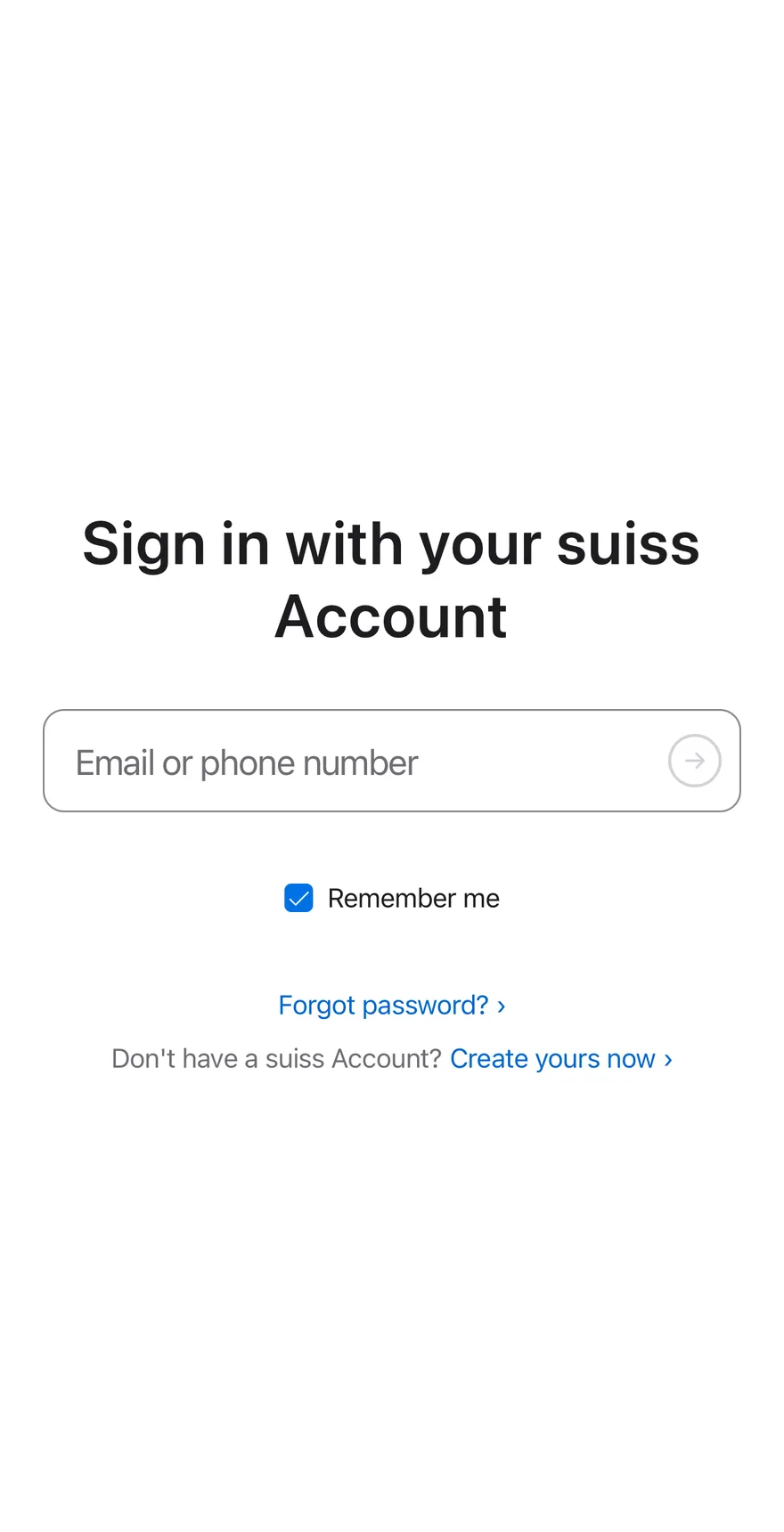
A two-step sign-in that asks for the email first, then reveals the password field, with inline errors.
Login Account is an open-source mobile screen from suiss/uim for React Native and Expo, with SwiftUI and Jetpack Compose versions built from the same design tokens. The @esuiss/uim CLI copies its source into your project, so you own the code.
Source: https://uim.suiss.app/docs/blocks/login-account
```tsx title="uniwind/components/blocks/login-account.tsx"
import { cn } from "cn"
import { ArrowRightIcon } from "phosphor-react-native"
import * as React from "react"
import { I18nManager, Pressable, type TextInput, View } from "react-native"
import {
FadeIn,
FadeInDown,
ReduceMotion,
useAnimatedStyle,
useSharedValue,
withSequence,
withTiming,
} from "react-native-reanimated"
import { AnimatedView } from "@/components/ui/animated-view"
import { Avatar, AvatarFallback } from "@/components/ui/avatar"
import { Button } from "@/components/ui/button"
import { Checkbox } from "@/components/ui/checkbox"
import { Icon } from "@/components/ui/icon"
import { Input } from "@/components/ui/input"
import { KeyboardScrollView } from "@/components/ui/keyboard-scroll-view"
import { Label } from "@/components/ui/label"
import { Screen } from "@/components/ui/screen"
import { Spinner } from "@/components/ui/spinner"
import { Text } from "@/components/ui/text"
const EMAIL = /.+@.+\..+/
const SHAKE = [-10, 9, -6, 4, 0]
const STEP = { duration: 70, reduceMotion: ReduceMotion.System }
function useShake() {
const offset = useSharedValue(0)
const style = useAnimatedStyle(() => ({
transform: [{ translateX: offset.value }],
}))
const shake = React.useCallback(() => {
offset.value = withSequence(...SHAKE.map((x) => withTiming(x, STEP)))
}, [offset])
return { style, shake }
}
function LinkText({
onPress,
className,
children,
}: {
onPress?: () => void
className?: string
children: React.ReactNode
}) {
return (
{children}
)
}
function SubmitArrow({
ready,
busy,
onPress,
}: {
ready: boolean
busy: boolean
onPress: () => void
}) {
return (
)
}
function LoginAccount({
onForgotPassword,
onCreateAccount,
onSubmit,
}: {
onForgotPassword?: () => void
onCreateAccount?: () => void
onSubmit?: (email: string, password: string) => void
}) {
const [step, setStep] = React.useState<"email" | "password">("email")
const [email, setEmail] = React.useState("")
const [password, setPassword] = React.useState("")
const [remember, setRemember] = React.useState(true)
const [error, setError] = React.useState("")
const [busy, setBusy] = React.useState(false)
const [signedIn, setSignedIn] = React.useState(false)
const passwordRef = React.useRef(null)
const { style: shakeStyle, shake } = useShake()
React.useEffect(() => {
if (!busy) return
const timer = setTimeout(() => {
setBusy(false)
setSignedIn(true)
}, 1200)
return () => clearTimeout(timer)
}, [busy])
React.useEffect(() => {
if (step !== "password") return
const timer = setTimeout(() => passwordRef.current?.focus(), 380)
return () => clearTimeout(timer)
}, [step])
const fail = (message: string) => {
setError(message)
shake()
}
const submit = () => {
if (step === "email") {
if (!EMAIL.test(email)) return fail("Enter a valid suiss Account.")
setError("")
setStep("password")
return
}
if (password.length < 4)
return fail("Your suiss Account or password was incorrect.")
setError("")
onSubmit?.(email, password)
setBusy(true)
}
if (signedIn) {
return (
{email[0]}
Hello.
{email}
{
setSignedIn(false)
setStep("email")
setPassword("")
}}
>
Sign out ›
)
}
return (
Sign in with your suiss Account
{
setEmail(value)
setError("")
if (step === "password") setStep("email")
}}
placeholder="Email or phone number"
accessibilityLabel="Email or phone number"
autoComplete="username"
textContentType="username"
keyboardType="email-address"
autoCapitalize="none"
autoCorrect={false}
returnKeyType="next"
submitBehavior="submit"
onSubmitEditing={submit}
className="h-14 flex-1 rounded-none border-transparent bg-transparent px-4 text-lg"
/>
{step === "email" ? (
) : null}
{step === "password" ? (
{
setPassword(value)
setError("")
}}
placeholder="Password"
accessibilityLabel="Password"
autoComplete="current-password"
textContentType="password"
secureTextEntry
returnKeyType="go"
submitBehavior="submit"
onSubmitEditing={submit}
className="h-14 flex-1 rounded-none border-transparent bg-transparent px-4 text-lg"
/>
) : null}
{error}
Forgot password? ›
Don't have a suiss Account?
Create yours now ›
)
}
export { LoginAccount }
```
```swift title="swift/Blocks/LoginAccount.swift"
import PhosphorSwift
import SwiftUI
public struct LoginAccount: View {
enum Step: Sendable {
case email, password
}
enum FocusField: Hashable {
case email, password
}
private var onForgotPassword: (() -> Void)?
private var onCreateAccount: (() -> Void)?
private var onSubmit: ((String, String) -> Void)?
@State private var step: Step
@State private var email: String
@State private var password: String
@State private var error: LocalizedStringKey?
@State private var busy: Bool
@State private var signedIn: Bool
@State private var remember = true
@State private var shakes = 0
@FocusState private var focus: FocusField?
@Environment(\.accessibilityReduceMotion) private var reduceMotion
public init(
onSubmit: ((String, String) -> Void)? = nil,
onForgotPassword: (() -> Void)? = nil,
onCreateAccount: (() -> Void)? = nil
) {
self.init(step: .email)
self.onSubmit = onSubmit
self.onForgotPassword = onForgotPassword
self.onCreateAccount = onCreateAccount
}
init(
step: Step,
email: String = "",
password: String = "",
error: LocalizedStringKey? = nil,
busy: Bool = false,
signedIn: Bool = false
) {
_step = State(initialValue: step)
_email = State(initialValue: email)
_password = State(initialValue: password)
_error = State(initialValue: error)
_busy = State(initialValue: busy)
_signedIn = State(initialValue: signedIn)
}
public var body: some View {
Screen {
if signedIn {
welcome
.transition(.opacity.combined(with: .offset(y: 18)))
} else {
form
}
}
.animation(reduceMotion ? nil : .timingCurve(0.32, 0.72, 0, 1, duration: 0.45), value: step)
.animation(reduceMotion ? nil : .timingCurve(0.32, 0.72, 0, 1, duration: 0.6), value: signedIn)
}
private var form: some View {
KeyboardScrollView {
VStack(spacing: 0) {
Text("Sign in with your suiss Account")
.scaledTextStyle(.xl2, weight: .bold)
.multilineTextAlignment(.center)
.fixedSize(horizontal: false, vertical: true)
.padding(.bottom, 32)
fields
.shake(trigger: shakes)
Text(error ?? "")
.scaledTextStyle(.xs)
.foregroundStyle(Color.danger)
.frame(minHeight: 22)
.padding(.top, 10)
.accessibilityHidden(error == nil)
Toggle(isOn: $remember) {
Text("Remember me")
.scaledFont(.sm)
.foregroundStyle(Color.label)
}
.toggleStyle(.checkbox)
.padding(.top, 6)
VStack(spacing: 10) {
Button("Forgot password? ›") { onForgotPassword?() }
.buttonStyle(LoginAccountLinkStyle())
ViewThatFits(in: .horizontal) {
HStack(spacing: 4) { createAccount }
VStack(spacing: 4) { createAccount }
}
}
.padding(.top, 40)
}
.frame(maxWidth: .infinity)
.padding(.horizontal, 24)
.padding(.top, 72)
.padding(.bottom, 24)
}
}
@ViewBuilder private var createAccount: some View {
Text("Don't have a suiss Account?")
.scaledFont(.sm)
.foregroundStyle(Color.labelSecondary)
Button("Create yours now ›") { onCreateAccount?() }
.buttonStyle(LoginAccountLinkStyle())
}
private var fields: some View {
let shape = RoundedRectangle(cornerRadius: Radius.xl, style: .continuous)
let invalid = error != nil
return VStack(spacing: 0) {
HStack(spacing: 0) {
TextField("Email or phone number", text: $email)
.textContentType(.username)
.keyboardType(.emailAddress)
.textInputAutocapitalization(.never)
.autocorrectionDisabled()
.submitLabel(.continue)
.focused($focus, equals: .email)
.onSubmit(submit)
.onChange(of: email) {
error = nil
if step == .password { step = .email }
}
.modifier(LoginAccountFieldText())
if step == .email {
LoginAccountArrow(ready: !email.isEmpty, busy: busy, action: submit)
}
}
if step == .password {
Color.separatorStrong.frame(height: 1)
HStack(spacing: 0) {
SecureField("Password", text: $password)
.textContentType(.password)
.submitLabel(.go)
.focused($focus, equals: .password)
.onSubmit(submit)
.onChange(of: password) { error = nil }
.modifier(LoginAccountFieldText())
LoginAccountArrow(ready: !password.isEmpty, busy: busy, action: submit)
}
.transition(.move(edge: .top).combined(with: .opacity))
}
}
.background(invalid ? Color.dangerSurface : .surface, in: shape)
.clipShape(shape)
.overlay {
shape.strokeBorder(invalid ? Color.danger : focus != nil ? .focus : .separatorStrong, lineWidth: 1)
}
.animation(.easeInOut(duration: 0.2), value: invalid)
}
private var welcome: some View {
VStack(spacing: 14) {
Avatar(size: .xl) {
Text(verbatim: String(email.prefix(1)).uppercased())
.scaledFont(.xl2, weight: .semibold)
.foregroundStyle(Color.label)
.frame(maxWidth: .infinity, maxHeight: .infinity)
.background(Color.surfaceSecondary, in: Circle())
}
Text("Hello.")
.scaledTextStyle(.xl3, weight: .bold)
Text(verbatim: email)
.scaledTextStyle(.lg)
.foregroundStyle(Color.labelSecondary)
Button("Sign out ›") {
signedIn = false
step = .email
password = ""
}
.buttonStyle(LoginAccountLinkStyle(style: .lg))
}
.multilineTextAlignment(.center)
.padding(24)
.frame(maxWidth: .infinity, maxHeight: .infinity)
}
private func submit() {
guard !busy else { return }
if step == .email {
guard email.wholeMatch(of: /.+@.+\..+/) != nil else {
return fail("Enter a valid suiss Account.")
}
error = nil
step = .password
focus = .password
return
}
guard password.count >= 4 else {
return fail("Your suiss Account or password was incorrect.")
}
error = nil
onSubmit?(email, password)
busy = true
focus = nil
Task {
try? await Task.sleep(for: .milliseconds(1200))
busy = false
signedIn = true
}
}
private func fail(_ message: LocalizedStringKey) {
error = message
shakes += 1
}
}
private struct LoginAccountFieldText: ViewModifier {
func body(content: Content) -> some View {
content
.scaledFont(.lg)
.foregroundStyle(Color.label)
.tint(Color.accent)
.padding(.horizontal, 16)
.frame(maxWidth: .infinity, minHeight: 56, alignment: .leading)
}
}
private struct LoginAccountArrow: View {
let ready: Bool
let busy: Bool
let action: () -> Void
var body: some View {
Button(action: action) {
Group {
if busy {
Spinner(.sm)
} else {
Ph.arrowRight.bold
.frame(width: 14, height: 14)
.flipsForRightToLeftLayoutDirection(true)
}
}
.foregroundStyle(Color.labelSecondary)
.frame(width: 30, height: 30)
.overlay {
Circle().strokeBorder(ready ? Color.labelSecondary : .labelQuaternary, lineWidth: 1.5)
}
.frame(width: 44, height: 44)
.contentShape(Rectangle())
}
.buttonStyle(.plain)
.disabled(!ready || busy)
.opacity(ready || busy ? 1 : 0.6)
.padding(.trailing, 6)
.accessibilityLabel(Text("Continue"))
}
}
private struct LoginAccountLinkStyle: ButtonStyle {
var style: TextStyle = .sm
func makeBody(configuration: Configuration) -> some View {
configuration.label
.scaledFont(style)
.foregroundStyle(Color.link)
.opacity(configuration.isPressed ? 0.5 : 1)
.frame(minHeight: 32)
.contentShape(Rectangle())
}
}
```
```kt title="kotlin/blocks/LoginAccount.kt"
package com.esuiss.ui.blocks
import androidx.compose.animation.AnimatedVisibility
import androidx.compose.animation.core.Animatable
import androidx.compose.animation.core.CubicBezierEasing
import androidx.compose.animation.core.keyframes
import androidx.compose.animation.core.tween
import androidx.compose.animation.expandVertically
import androidx.compose.animation.shrinkVertically
import androidx.compose.foundation.background
import androidx.compose.foundation.border
import androidx.compose.foundation.clickable
import androidx.compose.foundation.interaction.MutableInteractionSource
import androidx.compose.foundation.interaction.collectIsPressedAsState
import androidx.compose.foundation.layout.Arrangement
import androidx.compose.foundation.layout.Box
import androidx.compose.foundation.layout.BoxWithConstraints
import androidx.compose.foundation.layout.Column
import androidx.compose.foundation.layout.ColumnScope
import androidx.compose.foundation.layout.PaddingValues
import androidx.compose.foundation.layout.Row
import androidx.compose.foundation.layout.Spacer
import androidx.compose.foundation.layout.fillMaxSize
import androidx.compose.foundation.layout.fillMaxWidth
import androidx.compose.foundation.layout.height
import androidx.compose.foundation.layout.heightIn
import androidx.compose.foundation.layout.padding
import androidx.compose.foundation.layout.size
import androidx.compose.foundation.layout.widthIn
import androidx.compose.foundation.selection.toggleable
import androidx.compose.foundation.shape.CircleShape
import androidx.compose.foundation.shape.RoundedCornerShape
import androidx.compose.foundation.text.BasicText
import androidx.compose.foundation.text.BasicTextField
import androidx.compose.foundation.text.KeyboardActions
import androidx.compose.foundation.text.KeyboardOptions
import androidx.compose.runtime.Composable
import androidx.compose.runtime.LaunchedEffect
import androidx.compose.runtime.getValue
import androidx.compose.runtime.mutableStateOf
import androidx.compose.runtime.remember
import androidx.compose.runtime.rememberCoroutineScope
import androidx.compose.runtime.saveable.rememberSaveable
import androidx.compose.runtime.setValue
import androidx.compose.ui.Alignment
import androidx.compose.ui.Modifier
import androidx.compose.ui.draw.clip
import androidx.compose.ui.focus.FocusRequester
import androidx.compose.ui.focus.focusRequester
import androidx.compose.ui.graphics.SolidColor
import androidx.compose.ui.graphics.graphicsLayer
import androidx.compose.ui.semantics.LiveRegionMode
import androidx.compose.ui.semantics.Role
import androidx.compose.ui.semantics.contentDescription
import androidx.compose.ui.semantics.error
import androidx.compose.ui.semantics.heading
import androidx.compose.ui.semantics.liveRegion
import androidx.compose.ui.semantics.semantics
import androidx.compose.ui.text.font.FontWeight
import androidx.compose.ui.text.input.ImeAction
import androidx.compose.ui.text.input.KeyboardType
import androidx.compose.ui.text.input.PasswordVisualTransformation
import androidx.compose.ui.text.input.VisualTransformation
import androidx.compose.ui.text.style.TextAlign
import androidx.compose.ui.unit.dp
import com.adamglin.PhosphorIcons
import com.adamglin.phosphoricons.Bold
import com.adamglin.phosphoricons.bold.ArrowRight
import com.esuiss.ui.components.Avatar
import com.esuiss.ui.components.AvatarSize
import com.esuiss.ui.components.Checkbox
import com.esuiss.ui.components.Icon
import com.esuiss.ui.components.KeyboardScrollView
import com.esuiss.ui.components.Screen
import com.esuiss.ui.components.Spinner
import com.esuiss.ui.theme.EsuissTheme
import com.esuiss.ui.theme.Radius
import com.esuiss.ui.theme.Typography
import kotlinx.coroutines.delay
import kotlinx.coroutines.launch
private val EmailPattern = Regex(".+@.+\\..+")
private val RevealEasing = CubicBezierEasing(0.32f, 0.72f, 0f, 1f)
private enum class LoginStep { Email, Password }
@Composable
fun LoginAccount(
modifier: Modifier = Modifier,
onSubmit: (email: String, password: String) -> Unit = { _, _ -> },
onForgotPassword: () -> Unit = {},
onCreateAccount: () -> Unit = {},
) {
var step by rememberSaveable { mutableStateOf(LoginStep.Email) }
var email by rememberSaveable { mutableStateOf("") }
var password by remember { mutableStateOf("") }
var error by remember { mutableStateOf("") }
var busy by remember { mutableStateOf(false) }
var signedIn by rememberSaveable { mutableStateOf(false) }
var rememberMe by rememberSaveable { mutableStateOf(true) }
val shake = remember { Animatable(0f) }
val scope = rememberCoroutineScope()
val passwordFocus = remember { FocusRequester() }
fun fail(message: String) {
error = message
scope.launch {
shake.animateTo(
0f,
keyframes {
durationMillis = 420
0f at 0
-10f at 84
9f at 168
-6f at 252
4f at 336
},
)
}
}
fun submit() {
if (busy) return
if (step == LoginStep.Email) {
if (!EmailPattern.matches(email)) return fail("Enter a valid suiss Account.")
error = ""
step = LoginStep.Password
return
}
if (password.length < 4) return fail("Your suiss Account or password was incorrect.")
error = ""
onSubmit(email, password)
busy = true
}
LaunchedEffect(busy) {
if (!busy) return@LaunchedEffect
delay(1200)
busy = false
signedIn = true
}
LaunchedEffect(step) {
if (step != LoginStep.Password) return@LaunchedEffect
delay(380)
runCatching { passwordFocus.requestFocus() }
}
Screen(modifier) {
if (signedIn) {
Greeting(email) {
signedIn = false
step = LoginStep.Email
password = ""
}
return@Screen
}
CenteredScroll {
BasicText(
"Sign in with your suiss Account",
modifier = Modifier.semantics { heading() },
style = Typography.xl3.copy(
color = EsuissTheme.colors.label,
fontWeight = FontWeight.SemiBold,
textAlign = TextAlign.Center,
),
)
Spacer(Modifier.height(32.dp))
FieldStack(
invalid = error.isNotEmpty(),
modifier = Modifier.graphicsLayer { translationX = shake.value.dp.toPx() },
) {
Row(verticalAlignment = Alignment.CenterVertically) {
StackInput(
value = email,
onValueChange = {
email = it
error = ""
if (step == LoginStep.Password) step = LoginStep.Email
},
placeholder = "Email or phone number",
invalid = step == LoginStep.Email && error.isNotEmpty(),
keyboardType = KeyboardType.Email,
imeAction = ImeAction.Next,
onAction = ::submit,
modifier = Modifier.weight(1f),
)
if (step == LoginStep.Email) {
SubmitArrow(ready = email.isNotEmpty(), busy = busy, onClick = ::submit)
}
}
AnimatedVisibility(
visible = step == LoginStep.Password,
enter = expandVertically(tween(450, easing = RevealEasing)),
exit = shrinkVertically(tween(450, easing = RevealEasing)),
) {
Column {
Box(
Modifier
.fillMaxWidth()
.height(1.dp)
.background(EsuissTheme.colors.separatorStrong),
)
Row(verticalAlignment = Alignment.CenterVertically) {
StackInput(
value = password,
onValueChange = {
password = it
error = ""
},
placeholder = "Password",
invalid = step == LoginStep.Password && error.isNotEmpty(),
keyboardType = KeyboardType.Password,
imeAction = ImeAction.Go,
onAction = ::submit,
password = true,
modifier = Modifier
.weight(1f)
.focusRequester(passwordFocus),
)
SubmitArrow(ready = password.isNotEmpty(), busy = busy, onClick = ::submit)
}
}
}
}
BasicText(
error,
modifier = Modifier
.padding(top = 10.dp)
.heightIn(min = 22.dp)
.semantics { liveRegion = LiveRegionMode.Polite },
style = Typography.sm.copy(color = EsuissTheme.colors.danger, textAlign = TextAlign.Center),
)
RememberMe(rememberMe) { rememberMe = it }
Spacer(Modifier.height(40.dp))
Column(
horizontalAlignment = Alignment.CenterHorizontally,
verticalArrangement = Arrangement.spacedBy(10.dp),
) {
LinkText("Forgot password? ›", onForgotPassword)
BasicText(
"Don't have a suiss Account?",
style = Typography.sm.copy(color = EsuissTheme.colors.labelSecondary, textAlign = TextAlign.Center),
)
LinkText("Create yours now ›", onCreateAccount)
}
}
}
}
@Composable
private fun CenteredScroll(content: @Composable ColumnScope.() -> Unit) {
BoxWithConstraints(Modifier.fillMaxSize()) {
val height = maxHeight
KeyboardScrollView(modifier = Modifier.fillMaxSize()) {
Column(
modifier = Modifier
.fillMaxWidth()
.heightIn(min = height)
.padding(PaddingValues(24.dp)),
verticalArrangement = Arrangement.Center,
horizontalAlignment = Alignment.CenterHorizontally,
) {
Column(
modifier = Modifier.widthIn(max = 460.dp),
horizontalAlignment = Alignment.CenterHorizontally,
content = content,
)
}
}
}
}
@Composable
private fun FieldStack(
invalid: Boolean,
modifier: Modifier = Modifier,
content: @Composable ColumnScope.() -> Unit,
) {
val colors = EsuissTheme.colors
val shape = RoundedCornerShape(Radius.xl)
val fill = if (invalid) colors.danger.copy(alpha = if (colors.isDark) 0.1f else 0.05f) else colors.surface
Column(
modifier = modifier
.fillMaxWidth()
.clip(shape)
.background(fill, shape)
.border(1.dp, if (invalid) colors.danger else colors.separatorStrong, shape),
content = content,
)
}
@Composable
private fun StackInput(
value: String,
onValueChange: (String) -> Unit,
placeholder: String,
invalid: Boolean,
keyboardType: KeyboardType,
imeAction: ImeAction,
onAction: () -> Unit,
modifier: Modifier = Modifier,
password: Boolean = false,
) {
val colors = EsuissTheme.colors
val style = Typography.lg.copy(color = colors.label)
BasicTextField(
value = value,
onValueChange = onValueChange,
modifier = modifier
.height(56.dp)
.semantics {
contentDescription = placeholder
if (invalid) error("Invalid")
},
textStyle = style,
singleLine = true,
cursorBrush = SolidColor(colors.accent),
visualTransformation = if (password) PasswordVisualTransformation() else VisualTransformation.None,
keyboardOptions = KeyboardOptions(keyboardType = keyboardType, imeAction = imeAction),
keyboardActions = KeyboardActions(onNext = { onAction() }, onGo = { onAction() }),
decorationBox = { inner ->
Box(Modifier.padding(horizontal = 16.dp), contentAlignment = Alignment.CenterStart) {
if (value.isEmpty()) {
BasicText(placeholder, style = style.copy(color = colors.labelSecondary), maxLines = 1)
}
inner()
}
},
)
}
@Composable
private fun SubmitArrow(ready: Boolean, busy: Boolean, onClick: () -> Unit) {
val colors = EsuissTheme.colors
val enabled = ready && !busy
val interaction = remember { MutableInteractionSource() }
val pressed by interaction.collectIsPressedAsState()
Box(
modifier = Modifier
.padding(end = 10.dp)
.size(30.dp)
.graphicsLayer { alpha = if (pressed) 0.6f else 1f }
.border(1.5.dp, if (enabled || busy) colors.labelSecondary else colors.labelQuaternary, CircleShape)
.clickable(
interactionSource = interaction,
indication = null,
enabled = enabled,
role = Role.Button,
onClick = onClick,
)
.semantics { contentDescription = "Continue" },
contentAlignment = Alignment.Center,
) {
if (busy) {
Spinner(size = 14.dp, color = colors.labelSecondary)
} else {
Icon(
PhosphorIcons.Bold.ArrowRight,
contentDescription = null,
size = 14.dp,
tint = if (enabled) colors.labelSecondary else colors.labelQuaternary,
)
}
}
}
@Composable
private fun RememberMe(checked: Boolean, onCheckedChange: (Boolean) -> Unit) {
Row(
modifier = Modifier
.padding(top = 6.dp)
.heightIn(min = 44.dp)
.toggleable(
value = checked,
interactionSource = remember { MutableInteractionSource() },
indication = null,
role = Role.Checkbox,
onValueChange = onCheckedChange,
),
horizontalArrangement = Arrangement.spacedBy(8.dp),
verticalAlignment = Alignment.CenterVertically,
) {
Checkbox(checked = checked, onCheckedChange = null)
BasicText("Remember me", style = Typography.sm.copy(color = EsuissTheme.colors.label))
}
}
@Composable
private fun LinkText(text: String, onClick: () -> Unit, modifier: Modifier = Modifier) {
val interaction = remember { MutableInteractionSource() }
val pressed by interaction.collectIsPressedAsState()
BasicText(
text,
modifier = modifier
.graphicsLayer { alpha = if (pressed) 0.5f else 1f }
.clickable(interactionSource = interaction, indication = null, role = Role.Button, onClick = onClick)
.padding(vertical = 4.dp),
style = Typography.sm.copy(color = EsuissTheme.colors.link, textAlign = TextAlign.Center),
)
}
@Composable
private fun Greeting(email: String, onSignOut: () -> Unit) {
val colors = EsuissTheme.colors
val appear = remember { Animatable(0f) }
LaunchedEffect(Unit) { appear.animateTo(1f, tween(1000, easing = RevealEasing)) }
Column(
modifier = Modifier
.fillMaxSize()
.padding(24.dp)
.graphicsLayer {
alpha = appear.value
translationY = (1f - appear.value) * 18.dp.toPx()
},
verticalArrangement = Arrangement.spacedBy(14.dp, Alignment.CenterVertically),
horizontalAlignment = Alignment.CenterHorizontally,
) {
Avatar(
modifier = Modifier.size(80.dp),
size = AvatarSize.Xl,
fallback = {
Box(
Modifier
.fillMaxSize()
.background(colors.surfaceSecondary, CircleShape),
contentAlignment = Alignment.Center,
) {
BasicText(
email.take(1),
style = Typography.xl3.copy(color = colors.label),
)
}
},
)
BasicText(
"Hello.",
modifier = Modifier.semantics { heading() },
style = Typography.xl3.copy(color = colors.label, fontWeight = FontWeight.SemiBold),
)
BasicText(email, style = Typography.lg.copy(color = colors.labelSecondary, textAlign = TextAlign.Center))
LinkText("Sign out ›", onSignOut)
}
}
```
A sign-in screen inside a `KeyboardScrollView`. The email `Input` comes first; when the address looks valid, the password field appears below it and takes focus. Invalid input shakes the form and shows an error. It also has a Remember me `Checkbox` with a `Label`, a Forgot password link, a create account link, and a `Spinner` while signing in, followed by a welcome view with an `Avatar` and a Sign out link.
## Installation
```bash title="Terminal"
npx @esuiss/uim@latest add login-account
```
```bash title="Terminal"
npx @esuiss/uim@latest add login-account --platform swift
```
```bash title="Terminal"
npx @esuiss/uim@latest add login-account --platform kotlin
```
The CLI also adds what it builds on: [Avatar](/docs/components/avatar), [Button](/docs/components/button), [Checkbox](/docs/components/checkbox), [Icon](/docs/components/icon), [Input](/docs/components/input), [Keyboard Scroll View](/docs/components/keyboard-scroll-view), [Label](/docs/components/label), [Screen](/docs/components/screen), [Spinner](/docs/components/spinner), [Text](/docs/components/text).
### Manual
**Uniwind**
1. Install the dependencies:
```bash title="Terminal"
npx expo install cn phosphor-react-native react-native-reanimated react-native-svg react-native-worklets
```
2. Add the pieces it builds on: [Avatar](/docs/components/avatar), [Button](/docs/components/button), [Checkbox](/docs/components/checkbox), [Icon](/docs/components/icon), [Input](/docs/components/input), [Keyboard Scroll View](/docs/components/keyboard-scroll-view), [Label](/docs/components/label), [Screen](/docs/components/screen), [Spinner](/docs/components/spinner), [Text](/docs/components/text).
3. Copy the source into `components/blocks/login-account.tsx`:
```tsx title="uniwind/components/blocks/login-account.tsx"
import { cn } from "cn"
import { ArrowRightIcon } from "phosphor-react-native"
import * as React from "react"
import { I18nManager, Pressable, type TextInput, View } from "react-native"
import {
FadeIn,
FadeInDown,
ReduceMotion,
useAnimatedStyle,
useSharedValue,
withSequence,
withTiming,
} from "react-native-reanimated"
import { AnimatedView } from "@/components/ui/animated-view"
import { Avatar, AvatarFallback } from "@/components/ui/avatar"
import { Button } from "@/components/ui/button"
import { Checkbox } from "@/components/ui/checkbox"
import { Icon } from "@/components/ui/icon"
import { Input } from "@/components/ui/input"
import { KeyboardScrollView } from "@/components/ui/keyboard-scroll-view"
import { Label } from "@/components/ui/label"
import { Screen } from "@/components/ui/screen"
import { Spinner } from "@/components/ui/spinner"
import { Text } from "@/components/ui/text"
const EMAIL = /.+@.+\..+/
const SHAKE = [-10, 9, -6, 4, 0]
const STEP = { duration: 70, reduceMotion: ReduceMotion.System }
function useShake() {
const offset = useSharedValue(0)
const style = useAnimatedStyle(() => ({
transform: [{ translateX: offset.value }],
}))
const shake = React.useCallback(() => {
offset.value = withSequence(...SHAKE.map((x) => withTiming(x, STEP)))
}, [offset])
return { style, shake }
}
function LinkText({
onPress,
className,
children,
}: {
onPress?: () => void
className?: string
children: React.ReactNode
}) {
return (
{children}
)
}
function SubmitArrow({
ready,
busy,
onPress,
}: {
ready: boolean
busy: boolean
onPress: () => void
}) {
return (
)
}
function LoginAccount({
onForgotPassword,
onCreateAccount,
onSubmit,
}: {
onForgotPassword?: () => void
onCreateAccount?: () => void
onSubmit?: (email: string, password: string) => void
}) {
const [step, setStep] = React.useState<"email" | "password">("email")
const [email, setEmail] = React.useState("")
const [password, setPassword] = React.useState("")
const [remember, setRemember] = React.useState(true)
const [error, setError] = React.useState("")
const [busy, setBusy] = React.useState(false)
const [signedIn, setSignedIn] = React.useState(false)
const passwordRef = React.useRef(null)
const { style: shakeStyle, shake } = useShake()
React.useEffect(() => {
if (!busy) return
const timer = setTimeout(() => {
setBusy(false)
setSignedIn(true)
}, 1200)
return () => clearTimeout(timer)
}, [busy])
React.useEffect(() => {
if (step !== "password") return
const timer = setTimeout(() => passwordRef.current?.focus(), 380)
return () => clearTimeout(timer)
}, [step])
const fail = (message: string) => {
setError(message)
shake()
}
const submit = () => {
if (step === "email") {
if (!EMAIL.test(email)) return fail("Enter a valid suiss Account.")
setError("")
setStep("password")
return
}
if (password.length < 4)
return fail("Your suiss Account or password was incorrect.")
setError("")
onSubmit?.(email, password)
setBusy(true)
}
if (signedIn) {
return (
{email[0]}
Hello.
{email}
{
setSignedIn(false)
setStep("email")
setPassword("")
}}
>
Sign out ›
)
}
return (
Sign in with your suiss Account
{
setEmail(value)
setError("")
if (step === "password") setStep("email")
}}
placeholder="Email or phone number"
accessibilityLabel="Email or phone number"
autoComplete="username"
textContentType="username"
keyboardType="email-address"
autoCapitalize="none"
autoCorrect={false}
returnKeyType="next"
submitBehavior="submit"
onSubmitEditing={submit}
className="h-14 flex-1 rounded-none border-transparent bg-transparent px-4 text-lg"
/>
{step === "email" ? (
) : null}
{step === "password" ? (
{
setPassword(value)
setError("")
}}
placeholder="Password"
accessibilityLabel="Password"
autoComplete="current-password"
textContentType="password"
secureTextEntry
returnKeyType="go"
submitBehavior="submit"
onSubmitEditing={submit}
className="h-14 flex-1 rounded-none border-transparent bg-transparent px-4 text-lg"
/>
) : null}
{error}
Forgot password? ›
Don't have a suiss Account?
Create yours now ›
)
}
export { LoginAccount }
```
4. Update the import paths to match your project.
**NativeWind**
1. Install the dependencies:
```bash title="Terminal"
npx expo install cn phosphor-react-native react-native-reanimated react-native-svg react-native-worklets
```
2. Add the pieces it builds on: [Avatar](/docs/components/avatar), [Button](/docs/components/button), [Checkbox](/docs/components/checkbox), [Icon](/docs/components/icon), [Input](/docs/components/input), [Keyboard Scroll View](/docs/components/keyboard-scroll-view), [Label](/docs/components/label), [Screen](/docs/components/screen), [Spinner](/docs/components/spinner), [Text](/docs/components/text).
3. Copy the source into `components/blocks/login-account.tsx`:
```tsx title="nativewind/components/blocks/login-account.tsx"
import { cn } from "cn"
import { ArrowRightIcon } from "phosphor-react-native"
import * as React from "react"
import { I18nManager, Pressable, type TextInput, View } from "react-native"
import {
FadeIn,
FadeInDown,
ReduceMotion,
useAnimatedStyle,
useSharedValue,
withSequence,
withTiming,
} from "react-native-reanimated"
import { AnimatedView } from "@/components/ui/animated-view"
import { Avatar, AvatarFallback } from "@/components/ui/avatar"
import { Button } from "@/components/ui/button"
import { Checkbox } from "@/components/ui/checkbox"
import { Icon } from "@/components/ui/icon"
import { Input } from "@/components/ui/input"
import { KeyboardScrollView } from "@/components/ui/keyboard-scroll-view"
import { Label } from "@/components/ui/label"
import { Screen } from "@/components/ui/screen"
import { Spinner } from "@/components/ui/spinner"
import { Text } from "@/components/ui/text"
const EMAIL = /.+@.+\..+/
const SHAKE = [-10, 9, -6, 4, 0]
const STEP = { duration: 70, reduceMotion: ReduceMotion.System }
function useShake() {
const offset = useSharedValue(0)
const style = useAnimatedStyle(() => ({
transform: [{ translateX: offset.value }],
}))
const shake = React.useCallback(() => {
offset.value = withSequence(...SHAKE.map((x) => withTiming(x, STEP)))
}, [offset])
return { style, shake }
}
function LinkText({
onPress,
className,
children,
}: {
onPress?: () => void
className?: string
children: React.ReactNode
}) {
return (
{children}
)
}
function SubmitArrow({
ready,
busy,
onPress,
}: {
ready: boolean
busy: boolean
onPress: () => void
}) {
return (
)
}
function LoginAccount({
onForgotPassword,
onCreateAccount,
onSubmit,
}: {
onForgotPassword?: () => void
onCreateAccount?: () => void
onSubmit?: (email: string, password: string) => void
}) {
const [step, setStep] = React.useState<"email" | "password">("email")
const [email, setEmail] = React.useState("")
const [password, setPassword] = React.useState("")
const [remember, setRemember] = React.useState(true)
const [error, setError] = React.useState("")
const [busy, setBusy] = React.useState(false)
const [signedIn, setSignedIn] = React.useState(false)
const passwordRef = React.useRef(null)
const { style: shakeStyle, shake } = useShake()
React.useEffect(() => {
if (!busy) return
const timer = setTimeout(() => {
setBusy(false)
setSignedIn(true)
}, 1200)
return () => clearTimeout(timer)
}, [busy])
React.useEffect(() => {
if (step !== "password") return
const timer = setTimeout(() => passwordRef.current?.focus(), 380)
return () => clearTimeout(timer)
}, [step])
const fail = (message: string) => {
setError(message)
shake()
}
const submit = () => {
if (step === "email") {
if (!EMAIL.test(email)) return fail("Enter a valid suiss Account.")
setError("")
setStep("password")
return
}
if (password.length < 4)
return fail("Your suiss Account or password was incorrect.")
setError("")
onSubmit?.(email, password)
setBusy(true)
}
if (signedIn) {
return (
{email[0]}
Hello.
{email}
{
setSignedIn(false)
setStep("email")
setPassword("")
}}
>
Sign out ›
)
}
return (
Sign in with your suiss Account
{
setEmail(value)
setError("")
if (step === "password") setStep("email")
}}
placeholder="Email or phone number"
accessibilityLabel="Email or phone number"
autoComplete="username"
textContentType="username"
keyboardType="email-address"
autoCapitalize="none"
autoCorrect={false}
returnKeyType="next"
submitBehavior="submit"
onSubmitEditing={submit}
className="h-14 flex-1 rounded-none border-transparent bg-transparent px-4 text-lg"
/>
{step === "email" ? (
) : null}
{step === "password" ? (
{
setPassword(value)
setError("")
}}
placeholder="Password"
accessibilityLabel="Password"
autoComplete="current-password"
textContentType="password"
secureTextEntry
returnKeyType="go"
submitBehavior="submit"
onSubmitEditing={submit}
className="h-14 flex-1 rounded-none border-transparent bg-transparent px-4 text-lg"
/>
) : null}
{error}
Forgot password? ›
Don't have a suiss Account?
Create yours now ›
)
}
export { LoginAccount }
```
4. Update the import paths to match your project.
**StyleSheet**
1. Install the dependencies:
```bash title="Terminal"
npx expo install phosphor-react-native react-native-reanimated react-native-svg react-native-worklets
```
2. Add the pieces it builds on: [Avatar](/docs/components/avatar), [Button](/docs/components/button), [Checkbox](/docs/components/checkbox), [Icon](/docs/components/icon), [Input](/docs/components/input), [Keyboard Scroll View](/docs/components/keyboard-scroll-view), [Label](/docs/components/label), [Screen](/docs/components/screen), [Spinner](/docs/components/spinner), [Text](/docs/components/text).
3. Copy the source into `components/blocks/login-account.tsx`:
```tsx title="stylesheet/components/blocks/login-account.tsx"
import { ArrowRightIcon } from "phosphor-react-native"
import * as React from "react"
import {
I18nManager,
Pressable,
StyleSheet,
type TextInput,
type TextStyle,
View,
} from "react-native"
import {
FadeIn,
FadeInDown,
ReduceMotion,
useAnimatedStyle,
useSharedValue,
withSequence,
withTiming,
} from "react-native-reanimated"
import { AnimatedView } from "@/components/ui/animated-view"
import { Avatar, AvatarFallback } from "@/components/ui/avatar"
import { Button } from "@/components/ui/button"
import { Checkbox } from "@/components/ui/checkbox"
import { Icon } from "@/components/ui/icon"
import { Input } from "@/components/ui/input"
import { KeyboardScrollView } from "@/components/ui/keyboard-scroll-view"
import { Label } from "@/components/ui/label"
import { Screen } from "@/components/ui/screen"
import { Spinner } from "@/components/ui/spinner"
import { Text } from "@/components/ui/text"
import { fontSize, radius, useTheme } from "@/components/ui/theme"
const EMAIL = /.+@.+\..+/
const SHAKE = [-10, 9, -6, 4, 0]
const STEP = { duration: 70, reduceMotion: ReduceMotion.System }
function withAlpha(color: string, alpha: number) {
if (!color.startsWith("#") || color.length !== 7) return color
const r = Number.parseInt(color.slice(1, 3), 16)
const g = Number.parseInt(color.slice(3, 5), 16)
const b = Number.parseInt(color.slice(5, 7), 16)
return `rgba(${r}, ${g}, ${b}, ${alpha})`
}
const styles = StyleSheet.create({
center: {
flex: 1,
alignItems: "center",
justifyContent: "center",
padding: 24,
},
done: { alignItems: "center", gap: 14 },
scroll: {
flexGrow: 1,
justifyContent: "center",
paddingHorizontal: 24,
paddingVertical: 32,
},
form: { width: "100%", alignItems: "center" },
title: {
...fontSize["3xl"],
marginBottom: 32,
textAlign: "center",
fontWeight: "600",
},
fields: {
width: "100%",
overflow: "hidden",
borderRadius: radius.xl,
borderWidth: 1,
},
row: { flexDirection: "row", alignItems: "center" },
input: {
...fontSize.lg,
height: 56,
flex: 1,
borderRadius: 0,
borderColor: "transparent",
backgroundColor: "transparent",
paddingHorizontal: 16,
},
arrow: {
marginEnd: 10,
width: 30,
height: 30,
borderWidth: 1.5,
backgroundColor: "transparent",
},
error: {
...fontSize.sm,
marginTop: 10,
minHeight: 22,
textAlign: "center",
},
remember: {
marginTop: 6,
flexDirection: "row",
alignItems: "center",
gap: 8,
},
links: { marginTop: 40, alignItems: "center", gap: 10 },
wrap: {
flexDirection: "row",
flexWrap: "wrap",
justifyContent: "center",
columnGap: 4,
},
})
function useShake() {
const offset = useSharedValue(0)
const style = useAnimatedStyle(() => ({
transform: [{ translateX: offset.value }],
}))
const shake = React.useCallback(() => {
offset.value = withSequence(...SHAKE.map((x) => withTiming(x, STEP)))
}, [offset])
return { style, shake }
}
function LinkText({
onPress,
style,
children,
}: {
onPress?: () => void
style?: TextStyle
children: React.ReactNode
}) {
const { colors } = useTheme()
return (
pressed && { opacity: 0.6 }}
>
{children}
)
}
function SubmitArrow({
ready,
busy,
onPress,
}: {
ready: boolean
busy: boolean
onPress: () => void
}) {
const { colors } = useTheme()
return (
)
}
function LoginAccount({
onForgotPassword,
onCreateAccount,
onSubmit,
}: {
onForgotPassword?: () => void
onCreateAccount?: () => void
onSubmit?: (email: string, password: string) => void
}) {
const { colors, isDark } = useTheme()
const [step, setStep] = React.useState<"email" | "password">("email")
const [email, setEmail] = React.useState("")
const [password, setPassword] = React.useState("")
const [remember, setRemember] = React.useState(true)
const [error, setError] = React.useState("")
const [busy, setBusy] = React.useState(false)
const [signedIn, setSignedIn] = React.useState(false)
const passwordRef = React.useRef(null)
const { style: shakeStyle, shake } = useShake()
React.useEffect(() => {
if (!busy) return
const timer = setTimeout(() => {
setBusy(false)
setSignedIn(true)
}, 1200)
return () => clearTimeout(timer)
}, [busy])
React.useEffect(() => {
if (step !== "password") return
const timer = setTimeout(() => passwordRef.current?.focus(), 380)
return () => clearTimeout(timer)
}, [step])
const fail = (message: string) => {
setError(message)
shake()
}
const submit = () => {
if (step === "email") {
if (!EMAIL.test(email)) return fail("Enter a valid suiss Account.")
setError("")
setStep("password")
return
}
if (password.length < 4)
return fail("Your suiss Account or password was incorrect.")
setError("")
onSubmit?.(email, password)
setBusy(true)
}
if (signedIn) {
return (
{email[0]}
Hello.
{email}
{
setSignedIn(false)
setStep("email")
setPassword("")
}}
>
Sign out ›
)
}
return (
Sign in with your suiss Account
{
setEmail(value)
setError("")
if (step === "password") setStep("email")
}}
placeholder="Email or phone number"
accessibilityLabel="Email or phone number"
autoComplete="username"
textContentType="username"
keyboardType="email-address"
autoCapitalize="none"
autoCorrect={false}
returnKeyType="next"
submitBehavior="submit"
onSubmitEditing={submit}
style={styles.input}
/>
{step === "email" ? (
) : null}
{step === "password" ? (
{
setPassword(value)
setError("")
}}
placeholder="Password"
accessibilityLabel="Password"
autoComplete="current-password"
textContentType="password"
secureTextEntry
returnKeyType="go"
submitBehavior="submit"
onSubmitEditing={submit}
style={styles.input}
/>
) : null}
{error}
Forgot password? ›
Don't have a suiss Account?
Create yours now ›
)
}
export { LoginAccount }
```
4. Update the import paths to match your project.
**SwiftUI**
1. Target iOS 17 or later.
2. Add the Swift package to your app:
```swift title="Package.swift"
.package(url: "https://github.com/phosphor-icons/swift", from: "2.1.0")
```
3. Copy the theme files every view uses:
```swift title="swift/Theme/Theme.swift"
import SwiftUI
import UIKit
struct RGBA: Sendable {
let red: CGFloat
let green: CGFloat
let blue: CGFloat
let alpha: CGFloat
init(_ hex: UInt32, _ alpha: CGFloat = 1) {
red = CGFloat((hex >> 16) & 0xFF) / 255
green = CGFloat((hex >> 8) & 0xFF) / 255
blue = CGFloat(hex & 0xFF) / 255
self.alpha = alpha
}
var uiColor: UIColor {
UIColor(red: red, green: green, blue: blue, alpha: alpha)
}
}
extension Color {
static func adaptive(light: RGBA, dark: RGBA) -> Color {
let lightColor = light.uiColor
let darkColor = dark.uiColor
return Color(uiColor: UIColor { traits in
traits.userInterfaceStyle == .dark ? darkColor : lightColor
})
}
}
public struct TextStyle: Sendable, Hashable {
public let size: CGFloat
public let lineHeight: CGFloat
public let letterSpacing: CGFloat
public init(size: CGFloat, lineHeight: CGFloat, letterSpacing: CGFloat) {
self.size = size
self.lineHeight = lineHeight
self.letterSpacing = letterSpacing
}
public func font(weight: Font.Weight = .regular) -> Font {
.system(size: size, weight: weight)
}
public var lineSpacing: CGFloat {
max(0, lineHeight - UIFont.systemFont(ofSize: size).lineHeight)
}
}
extension Hashable where Self == Font {
public static func textStyle(_ style: TextStyle, weight: Font.Weight = .regular) -> Font {
style.font(weight: weight)
}
}
private struct TextStyleModifier: ViewModifier {
let style: TextStyle
let weight: Font.Weight
func body(content: Content) -> some View {
content
.font(style.font(weight: weight))
.tracking(style.letterSpacing)
.lineSpacing(style.lineSpacing)
.padding(.vertical, style.lineSpacing / 2)
}
}
extension View {
public func textStyle(_ style: TextStyle, weight: Font.Weight = .regular) -> some View {
modifier(TextStyleModifier(style: style, weight: weight))
}
}
public struct Shadow: Sendable, Hashable {
public let color: Color
public let radius: CGFloat
public let x: CGFloat
public let y: CGFloat
public init(color: Color, radius: CGFloat, x: CGFloat = 0, y: CGFloat = 0) {
self.color = color
self.radius = radius
self.x = x
self.y = y
}
}
extension View {
public func shadow(_ shadow: Shadow) -> some View {
self.shadow(color: shadow.color, radius: shadow.radius, x: shadow.x, y: shadow.y)
}
}
```
```swift title="swift/Theme/Tokens.swift"
import SwiftUI
extension Color {
public static let surface = Color.adaptive(light: .init(0xFFFFFF), dark: .init(0x000000))
public static let surfaceSecondary = Color.adaptive(light: .init(0xF5F5F7), dark: .init(0x161617))
public static let surfaceTertiary = Color.adaptive(light: .init(0xE8E8ED), dark: .init(0x2C2C2E))
public static let surfaceRaised = Color.adaptive(light: .init(0xFFFFFF), dark: .init(0x1D1D1F))
public static let label = Color.adaptive(light: .init(0x1D1D1F), dark: .init(0xF5F5F7))
public static let labelSecondary = Color.adaptive(light: .init(0x6E6E73), dark: .init(0xA1A1A6))
public static let labelTertiary = Color.adaptive(light: .init(0x86868B), dark: .init(0x86868B))
public static let labelQuaternary = Color.adaptive(light: .init(0xD2D2D7), dark: .init(0x424245))
public static let control = Color.adaptive(light: .init(0x000000, 0.04), dark: .init(0xFFFFFF, 0.1))
public static let controlPressed = Color.adaptive(light: .init(0x000000, 0.12), dark: .init(0xFFFFFF, 0.22))
public static let controlSelected = Color.adaptive(light: .init(0x1D1D1F), dark: .init(0xF5F5F7))
public static let controlDisabled = Color.adaptive(light: .init(0x000000, 0.03), dark: .init(0xFFFFFF, 0.05))
public static let onControlSelected = Color.adaptive(light: .init(0xFFFFFF), dark: .init(0x000000))
public static let itemPressed = Color.adaptive(light: .init(0x000000, 0.08), dark: .init(0xFFFFFF, 0.12))
public static let itemSelected = Color.adaptive(light: .init(0x000000, 0.06), dark: .init(0xFFFFFF, 0.1))
public static let separator = Color.adaptive(light: .init(0xD2D2D7), dark: .init(0x424245))
public static let separatorStrong = Color.adaptive(light: .init(0x86868B), dark: .init(0x6E6E73))
public static let accent = Color.adaptive(light: .init(0x0071E3), dark: .init(0x0071E3))
public static let accentPressed = Color.adaptive(light: .init(0x005BB8), dark: .init(0x004D9E))
public static let accentSelected = Color.adaptive(light: .init(0x0071E3), dark: .init(0x0071E3))
public static let accentDisabled = Color.adaptive(light: .init(0x0071E3, 0.4), dark: .init(0x0071E3, 0.4))
public static let onAccent = Color.adaptive(light: .init(0xFFFFFF), dark: .init(0xFFFFFF))
public static let accentSurface = Color.adaptive(light: .init(0x0071E3, 0.09), dark: .init(0x0071E3, 0.18))
public static let accentSurfacePressed = Color.adaptive(light: .init(0x0071E3, 0.18), dark: .init(0x0071E3, 0.3))
public static let link = Color.adaptive(light: .init(0x0066CC), dark: .init(0x2997FF))
public static let focus = Color.adaptive(light: .init(0x0071E3), dark: .init(0x0071E3))
public static let scrim = Color.adaptive(light: .init(0x000000, 0.48), dark: .init(0x000000, 0.48))
public static let media = Color.adaptive(light: .init(0x000000), dark: .init(0x000000))
public static let onMedia = Color.adaptive(light: .init(0xFFFFFF), dark: .init(0xFFFFFF))
public static let danger = Color.adaptive(light: .init(0xD0000A), dark: .init(0xFF5447))
public static let dangerSurface = Color.adaptive(light: .init(0xD70015, 0.08), dark: .init(0xFF453A, 0.2))
public static let dangerSurfacePressed = Color.adaptive(light: .init(0xD70015, 0.16), dark: .init(0xFF453A, 0.36))
public static let success = Color.adaptive(light: .init(0x008009), dark: .init(0x30D158))
public static let successSurface = Color.adaptive(light: .init(0xEFFAF1), dark: .init(0x30D158, 0.16))
public static let warning = Color.adaptive(light: .init(0xB64400), dark: .init(0xFF9F0A))
public static let warningSurface = Color.adaptive(light: .init(0xFFF5EA), dark: .init(0xFF9F0A, 0.16))
}
public enum Radius {
public static let xs: CGFloat = 3
public static let sm: CGFloat = 5
public static let md: CGFloat = 8
public static let lg: CGFloat = 10
public static let xl: CGFloat = 12
public static let xl2: CGFloat = 18
public static let xl3: CGFloat = 28
public static let full: CGFloat = 9999
}
extension TextStyle {
public static let xs3 = TextStyle(size: 11, lineHeight: 13, letterSpacing: 0.066)
public static let xs2 = TextStyle(size: 12, lineHeight: 16, letterSpacing: 0)
public static let xs = TextStyle(size: 13, lineHeight: 18, letterSpacing: -0.078)
public static let sm = TextStyle(size: 15, lineHeight: 20, letterSpacing: -0.24)
public static let md = TextStyle(size: 16, lineHeight: 21, letterSpacing: -0.32)
public static let base = TextStyle(size: 17, lineHeight: 22, letterSpacing: -0.442)
public static let lg = TextStyle(size: 20, lineHeight: 25, letterSpacing: -0.46)
public static let xl = TextStyle(size: 22, lineHeight: 28, letterSpacing: -0.264)
public static let xl2 = TextStyle(size: 28, lineHeight: 34, letterSpacing: 0.392)
public static let xl3 = TextStyle(size: 34, lineHeight: 41, letterSpacing: 0.408)
public static let allCases: [TextStyle] = [.xs3, .xs2, .xs, .sm, .md, .base, .lg, .xl, .xl2, .xl3]
}
extension Shadow {
public static let md = Shadow(color: .black.opacity(0.08), radius: 6, x: 2, y: 4)
public static let lg = Shadow(color: .black.opacity(0.12), radius: 12, y: 4)
}
```
4. Copy the source and every file it uses:
```swift title="swift/Blocks/LoginAccount.swift"
import PhosphorSwift
import SwiftUI
public struct LoginAccount: View {
enum Step: Sendable {
case email, password
}
enum FocusField: Hashable {
case email, password
}
private var onForgotPassword: (() -> Void)?
private var onCreateAccount: (() -> Void)?
private var onSubmit: ((String, String) -> Void)?
@State private var step: Step
@State private var email: String
@State private var password: String
@State private var error: LocalizedStringKey?
@State private var busy: Bool
@State private var signedIn: Bool
@State private var remember = true
@State private var shakes = 0
@FocusState private var focus: FocusField?
@Environment(\.accessibilityReduceMotion) private var reduceMotion
public init(
onSubmit: ((String, String) -> Void)? = nil,
onForgotPassword: (() -> Void)? = nil,
onCreateAccount: (() -> Void)? = nil
) {
self.init(step: .email)
self.onSubmit = onSubmit
self.onForgotPassword = onForgotPassword
self.onCreateAccount = onCreateAccount
}
init(
step: Step,
email: String = "",
password: String = "",
error: LocalizedStringKey? = nil,
busy: Bool = false,
signedIn: Bool = false
) {
_step = State(initialValue: step)
_email = State(initialValue: email)
_password = State(initialValue: password)
_error = State(initialValue: error)
_busy = State(initialValue: busy)
_signedIn = State(initialValue: signedIn)
}
public var body: some View {
Screen {
if signedIn {
welcome
.transition(.opacity.combined(with: .offset(y: 18)))
} else {
form
}
}
.animation(reduceMotion ? nil : .timingCurve(0.32, 0.72, 0, 1, duration: 0.45), value: step)
.animation(reduceMotion ? nil : .timingCurve(0.32, 0.72, 0, 1, duration: 0.6), value: signedIn)
}
private var form: some View {
KeyboardScrollView {
VStack(spacing: 0) {
Text("Sign in with your suiss Account")
.scaledTextStyle(.xl2, weight: .bold)
.multilineTextAlignment(.center)
.fixedSize(horizontal: false, vertical: true)
.padding(.bottom, 32)
fields
.shake(trigger: shakes)
Text(error ?? "")
.scaledTextStyle(.xs)
.foregroundStyle(Color.danger)
.frame(minHeight: 22)
.padding(.top, 10)
.accessibilityHidden(error == nil)
Toggle(isOn: $remember) {
Text("Remember me")
.scaledFont(.sm)
.foregroundStyle(Color.label)
}
.toggleStyle(.checkbox)
.padding(.top, 6)
VStack(spacing: 10) {
Button("Forgot password? ›") { onForgotPassword?() }
.buttonStyle(LoginAccountLinkStyle())
ViewThatFits(in: .horizontal) {
HStack(spacing: 4) { createAccount }
VStack(spacing: 4) { createAccount }
}
}
.padding(.top, 40)
}
.frame(maxWidth: .infinity)
.padding(.horizontal, 24)
.padding(.top, 72)
.padding(.bottom, 24)
}
}
@ViewBuilder private var createAccount: some View {
Text("Don't have a suiss Account?")
.scaledFont(.sm)
.foregroundStyle(Color.labelSecondary)
Button("Create yours now ›") { onCreateAccount?() }
.buttonStyle(LoginAccountLinkStyle())
}
private var fields: some View {
let shape = RoundedRectangle(cornerRadius: Radius.xl, style: .continuous)
let invalid = error != nil
return VStack(spacing: 0) {
HStack(spacing: 0) {
TextField("Email or phone number", text: $email)
.textContentType(.username)
.keyboardType(.emailAddress)
.textInputAutocapitalization(.never)
.autocorrectionDisabled()
.submitLabel(.continue)
.focused($focus, equals: .email)
.onSubmit(submit)
.onChange(of: email) {
error = nil
if step == .password { step = .email }
}
.modifier(LoginAccountFieldText())
if step == .email {
LoginAccountArrow(ready: !email.isEmpty, busy: busy, action: submit)
}
}
if step == .password {
Color.separatorStrong.frame(height: 1)
HStack(spacing: 0) {
SecureField("Password", text: $password)
.textContentType(.password)
.submitLabel(.go)
.focused($focus, equals: .password)
.onSubmit(submit)
.onChange(of: password) { error = nil }
.modifier(LoginAccountFieldText())
LoginAccountArrow(ready: !password.isEmpty, busy: busy, action: submit)
}
.transition(.move(edge: .top).combined(with: .opacity))
}
}
.background(invalid ? Color.dangerSurface : .surface, in: shape)
.clipShape(shape)
.overlay {
shape.strokeBorder(invalid ? Color.danger : focus != nil ? .focus : .separatorStrong, lineWidth: 1)
}
.animation(.easeInOut(duration: 0.2), value: invalid)
}
private var welcome: some View {
VStack(spacing: 14) {
Avatar(size: .xl) {
Text(verbatim: String(email.prefix(1)).uppercased())
.scaledFont(.xl2, weight: .semibold)
.foregroundStyle(Color.label)
.frame(maxWidth: .infinity, maxHeight: .infinity)
.background(Color.surfaceSecondary, in: Circle())
}
Text("Hello.")
.scaledTextStyle(.xl3, weight: .bold)
Text(verbatim: email)
.scaledTextStyle(.lg)
.foregroundStyle(Color.labelSecondary)
Button("Sign out ›") {
signedIn = false
step = .email
password = ""
}
.buttonStyle(LoginAccountLinkStyle(style: .lg))
}
.multilineTextAlignment(.center)
.padding(24)
.frame(maxWidth: .infinity, maxHeight: .infinity)
}
private func submit() {
guard !busy else { return }
if step == .email {
guard email.wholeMatch(of: /.+@.+\..+/) != nil else {
return fail("Enter a valid suiss Account.")
}
error = nil
step = .password
focus = .password
return
}
guard password.count >= 4 else {
return fail("Your suiss Account or password was incorrect.")
}
error = nil
onSubmit?(email, password)
busy = true
focus = nil
Task {
try? await Task.sleep(for: .milliseconds(1200))
busy = false
signedIn = true
}
}
private func fail(_ message: LocalizedStringKey) {
error = message
shakes += 1
}
}
private struct LoginAccountFieldText: ViewModifier {
func body(content: Content) -> some View {
content
.scaledFont(.lg)
.foregroundStyle(Color.label)
.tint(Color.accent)
.padding(.horizontal, 16)
.frame(maxWidth: .infinity, minHeight: 56, alignment: .leading)
}
}
private struct LoginAccountArrow: View {
let ready: Bool
let busy: Bool
let action: () -> Void
var body: some View {
Button(action: action) {
Group {
if busy {
Spinner(.sm)
} else {
Ph.arrowRight.bold
.frame(width: 14, height: 14)
.flipsForRightToLeftLayoutDirection(true)
}
}
.foregroundStyle(Color.labelSecondary)
.frame(width: 30, height: 30)
.overlay {
Circle().strokeBorder(ready ? Color.labelSecondary : .labelQuaternary, lineWidth: 1.5)
}
.frame(width: 44, height: 44)
.contentShape(Rectangle())
}
.buttonStyle(.plain)
.disabled(!ready || busy)
.opacity(ready || busy ? 1 : 0.6)
.padding(.trailing, 6)
.accessibilityLabel(Text("Continue"))
}
}
private struct LoginAccountLinkStyle: ButtonStyle {
var style: TextStyle = .sm
func makeBody(configuration: Configuration) -> some View {
configuration.label
.scaledFont(style)
.foregroundStyle(Color.link)
.opacity(configuration.isPressed ? 0.5 : 1)
.frame(minHeight: 32)
.contentShape(Rectangle())
}
}
```
```swift title="swift/Components/Avatar.swift"
import SwiftUI
public enum AvatarSize: CaseIterable, Sendable {
case sm, `default`, lg, xl
var dimension: CGFloat {
switch self {
case .sm: 24
case .default: 32
case .lg: 40
case .xl: 64
}
}
var overlap: CGFloat {
self == .xl ? 16 : 8
}
var textStyle: TextStyle {
switch self {
case .sm: .xs3
case .default: .xs
case .lg: .md
case .xl: .xl2
}
}
var fallbackIcon: CGFloat {
switch self {
case .sm: 14
case .default: 20
case .lg: 24
case .xl: 40
}
}
var badge: CGFloat {
switch self {
case .sm: 12
case .default: 16
case .lg: 18
case .xl: 22
}
}
var badgeIcon: CGFloat {
switch self {
case .sm: 0
case .default: 8
case .lg: 10
case .xl: 12
}
}
var countIcon: CGFloat {
switch self {
case .sm: 12
case .default: 16
case .lg: 20
case .xl: 28
}
}
}
public struct Avatar: View {
public typealias Size = AvatarSize
let size: Size
let content: Content
@Environment(\.avatarGrouped) private var grouped
public init(size: Size = .default, @ViewBuilder content: () -> Content) {
self.size = size
self.content = content()
}
public var body: some View {
ZStack {
content
}
.padding(grouped ? 2 : 0)
.background {
if grouped {
Circle().fill(Color.surface)
}
}
.frame(width: size.dimension, height: size.dimension)
.environment(\.avatarSize, size)
.environment(\.avatarGrouped, false)
.accessibilityElement(children: .combine)
.accessibilityAddTraits(.isImage)
.layoutValue(key: AvatarOverlapKey.self, value: size.overlap)
}
}
extension Avatar {
public init(
url: URL?,
size: Size = .default,
@ViewBuilder fallback: () -> Fallback
) where Content == TupleView<(AvatarFallback, AvatarImage)> {
let fallback = fallback()
self.init(size: size) {
AvatarFallback { fallback }
AvatarImage(url: url)
}
}
public init(
url: URL?,
initials: String,
size: Size = .default
) where Content == TupleView<(AvatarFallback, AvatarImage)> {
self.init(size: size) {
AvatarFallback(initials)
AvatarImage(url: url)
}
}
}
public struct AvatarImage: View {
enum Source {
case url(URL?)
case image(Image)
}
let source: Source
public init(url: URL?) {
source = .url(url)
}
public init(_ image: Image) {
source = .image(image)
}
public var body: some View {
Group {
switch source {
case .image(let image):
image.resizable().scaledToFill()
case .url(let url):
AsyncImage(url: url) { phase in
if let image = phase.image {
image.resizable().scaledToFill()
} else {
Color.clear
}
}
}
}
.frame(maxWidth: .infinity, maxHeight: .infinity)
.clipShape(Circle())
}
}
public struct AvatarFallback: View {
let content: Content
@Environment(\.avatarSize) private var size
@Environment(\.colorScheme) private var colorScheme
public init(@ViewBuilder content: () -> Content) {
self.content = content()
}
public var body: some View {
content
.textCase(.uppercase)
.scaledFont(size.textStyle, weight: .semibold)
.lineLimit(1)
.minimumScaleFactor(0.5)
.foregroundStyle(Color.onAccent)
.environment(\.avatarIconSize, size.fallbackIcon)
.frame(maxWidth: .infinity, maxHeight: .infinity)
.background(Color.labelSecondary.opacity(colorScheme == .dark ? 0.6 : 1), in: Circle())
}
}
extension AvatarFallback where Content == Text {
public init(_ initials: String) {
self.init { Text(verbatim: initials) }
}
}
extension AvatarFallback where Content == AvatarIcon {
public init(icon: Image) {
self.init { AvatarIcon(icon) }
}
}
public struct AvatarIcon: View {
let image: Image
@Environment(\.avatarIconSize) private var size
public init(_ image: Image) {
self.image = image
}
public var body: some View {
image
.resizable()
.scaledToFit()
.frame(width: size, height: size)
}
}
public struct AvatarBadge: View {
let content: Content
@Environment(\.avatarSize) private var size
public init(@ViewBuilder content: () -> Content) {
self.content = content()
}
public var body: some View {
ZStack {
Circle().fill(Color.surface)
Circle().fill(Color.accent).padding(2)
if size != .sm {
content
.foregroundStyle(Color.onAccent)
.environment(\.avatarIconSize, size.badgeIcon)
}
}
.frame(width: size.badge, height: size.badge)
.offset(x: 2, y: 2)
.frame(maxWidth: .infinity, maxHeight: .infinity, alignment: .bottomTrailing)
}
}
extension AvatarBadge where Content == EmptyView {
public init() {
self.init { EmptyView() }
}
}
extension AvatarBadge where Content == AvatarIcon {
public init(icon: Image) {
self.init { AvatarIcon(icon) }
}
}
public struct AvatarGroup: View {
let content: Content
public init(@ViewBuilder content: () -> Content) {
self.content = content()
}
public var body: some View {
AvatarGroupLayout {
content
}
.environment(\.avatarGrouped, true)
.accessibilityElement(children: .contain)
}
}
public struct AvatarGroupCount: View {
let size: AvatarSize
let content: Content
public init(size: AvatarSize = .default, @ViewBuilder content: () -> Content) {
self.size = size
self.content = content()
}
public var body: some View {
content
.scaledFont(size.textStyle, weight: .semibold)
.lineLimit(1)
.minimumScaleFactor(0.5)
.foregroundStyle(Color.label)
.environment(\.avatarIconSize, size.countIcon)
.frame(maxWidth: .infinity, maxHeight: .infinity)
.background(Color.surfaceSecondary, in: Circle())
.padding(2)
.background(Color.surface, in: Circle())
.frame(width: size.dimension, height: size.dimension)
.environment(\.avatarGrouped, false)
.layoutValue(key: AvatarOverlapKey.self, value: size.overlap)
}
}
extension AvatarGroupCount where Content == Text {
public init(_ count: String, size: AvatarSize = .default) {
self.init(size: size) { Text(verbatim: count) }
}
}
struct AvatarOverlapKey: LayoutValueKey {
static let defaultValue: CGFloat = 8
}
struct AvatarGroupLayout: Layout {
func sizeThatFits(proposal: ProposedViewSize, subviews: Subviews, cache: inout ()) -> CGSize {
var width: CGFloat = 0
var height: CGFloat = 0
for (index, subview) in subviews.enumerated() {
let size = subview.sizeThatFits(.unspecified)
width += size.width - (index > 0 ? subview[AvatarOverlapKey.self] : 0)
height = max(height, size.height)
}
return CGSize(width: max(0, width), height: height)
}
func placeSubviews(in bounds: CGRect, proposal: ProposedViewSize, subviews: Subviews, cache: inout ()) {
var x = bounds.minX
for (index, subview) in subviews.enumerated() {
let size = subview.sizeThatFits(.unspecified)
if index > 0 {
x -= subview[AvatarOverlapKey.self]
}
subview.place(at: CGPoint(x: x, y: bounds.midY), anchor: .leading, proposal: ProposedViewSize(size))
x += size.width
}
}
}
extension EnvironmentValues {
@Entry var avatarSize: AvatarSize = .default
@Entry var avatarGrouped = false
@Entry var avatarIconSize: CGFloat = 20
}
```
```swift title="swift/Components/Checkbox.swift"
import PhosphorSwift
import SwiftUI
extension Shadow {
static let control = Shadow(color: .black.opacity(0.08), radius: 0.5, y: 0.5)
static let thumb = Shadow(color: .black.opacity(0.12), radius: 1.5, y: 1)
}
struct SelectionIndicator: View {
let checked: Bool
let pressed: Bool
let cornerRadius: CGFloat
let mark: Mark
@Environment(\.isEnabled) private var isEnabled
@Environment(\.isInvalid) private var invalid
@Environment(\.colorScheme) private var colorScheme
init(checked: Bool, pressed: Bool, cornerRadius: CGFloat, @ViewBuilder mark: () -> Mark) {
self.checked = checked
self.pressed = pressed
self.cornerRadius = cornerRadius
self.mark = mark()
}
var body: some View {
let shape = RoundedRectangle(cornerRadius: cornerRadius, style: .continuous)
ZStack {
shape.fill(fill)
shape.strokeBorder(border, lineWidth: 1)
if checked {
mark
}
}
.frame(width: 16, height: 16)
.shadow(raised ? .control : Shadow(color: .clear, radius: 0))
}
private var isDark: Bool { colorScheme == .dark }
private var raised: Bool { !checked && isEnabled && !isDark }
private var fill: Color {
if checked {
return !isEnabled ? .accentDisabled : pressed ? .accentPressed : .accent
}
if !isEnabled { return .controlDisabled }
if isDark { return pressed ? .labelTertiary.opacity(0.6) : .labelQuaternary }
return pressed ? .control : .surface
}
private var border: Color {
if checked {
return !isEnabled ? .clear : pressed ? .accentPressed : .accent
}
if !isEnabled { return isDark ? .clear : .label.opacity(0.1) }
if invalid { return .danger }
return isDark ? .clear : .label.opacity(0.25)
}
}
struct PressReader: ButtonStyle {
let content: (Bool) -> Content
init(@ViewBuilder content: @escaping (Bool) -> Content) {
self.content = content
}
func makeBody(configuration: Configuration) -> some View {
content(configuration.isPressed)
}
}
public struct CheckboxStyle: ToggleStyle {
public init() {}
public func makeBody(configuration: Configuration) -> some View {
HapticButton(style: PressReader { pressed in
HStack(spacing: 12) {
SelectionIndicator(
checked: configuration.isOn || configuration.isMixed,
pressed: pressed,
cornerRadius: 4
) {
(configuration.isMixed ? Ph.minus.regular : Ph.check.regular)
.frame(width: 14, height: 14)
.foregroundStyle(Color.onAccent)
}
configuration.label
}
.contentShape(Rectangle().inset(by: -8))
}) {
configuration.isOn.toggle()
return true
}
.accessibilityElement(children: .combine)
.accessibilityRemoveTraits(.isButton)
.accessibilityAddTraits(.isToggle)
.accessibilityValue(
configuration.isMixed
? Text("Mixed")
: configuration.isOn ? Text("Checked") : Text("Unchecked")
)
}
}
extension ToggleStyle where Self == CheckboxStyle {
public static var checkbox: CheckboxStyle { CheckboxStyle() }
}
```
```swift title="swift/Components/Field.swift"
import SwiftUI
extension EnvironmentValues {
@Entry public var isInvalid = false
@Entry var fieldInset = false
@Entry var fieldGroupInset = false
@Entry var fieldSetInset = false
}
extension View {
public func invalid(_ isInvalid: Bool = true) -> some View {
environment(\.isInvalid, isInvalid)
}
}
public enum FieldOrientation: CaseIterable, Sendable {
case vertical, horizontal
}
public struct Field: View {
let orientation: FieldOrientation
let invalid: Bool?
let content: Content
@Environment(\.fieldGroupInset) private var inset
@Environment(\.isInvalid) private var inheritedInvalid
public init(
orientation: FieldOrientation = .vertical,
invalid: Bool? = nil,
@ViewBuilder content: () -> Content
) {
self.orientation = orientation
self.invalid = invalid
self.content = content()
}
public var body: some View {
Group {
switch orientation {
case .vertical:
VStack(alignment: .leading, spacing: 12) { content }
case .horizontal:
HStack(alignment: .center, spacing: 12) { content }
}
}
.frame(maxWidth: .infinity, alignment: .leading)
.padding(.horizontal, inset ? 16 : 0)
.padding(.vertical, inset ? 6 : 0)
.frame(minHeight: inset ? 44 : nil)
.overlay(alignment: .top) {
if inset {
Color.separator
.frame(height: 1)
.padding(.leading, 16)
.offset(y: -1)
}
}
.environment(\.fieldInset, inset)
.environment(\.fieldGroupInset, false)
.environment(\.isInvalid, invalid ?? inheritedInvalid)
}
}
public struct FieldContent: View {
let content: Content
public init(@ViewBuilder content: () -> Content) {
self.content = content()
}
public var body: some View {
VStack(alignment: .leading, spacing: 4) {
content
}
.frame(maxWidth: .infinity, alignment: .leading)
}
}
public struct FieldTitle: View {
let text: Text
@Environment(\.isEnabled) private var isEnabled
public init(_ title: LocalizedStringKey) {
text = Text(title)
}
public init(_ title: S) {
text = Text(title)
}
public var body: some View {
text
.scaledTextStyle(.base, weight: .semibold)
.foregroundStyle(isEnabled ? Color.label : .labelQuaternary)
}
}
public struct FieldDescription: View {
let text: Text
@Environment(\.fieldSetInset) private var inset
public init(_ description: LocalizedStringKey) {
text = Text(description)
}
public init(_ description: S) {
text = Text(description)
}
public var body: some View {
text
.scaledTextStyle(inset ? .xs : .sm)
.foregroundStyle(Color.labelSecondary)
.multilineTextAlignment(.leading)
.fixedSize(horizontal: false, vertical: true)
.padding(.leading, inset ? 16 : 0)
}
}
public struct FieldError: View {
let messages: [String]
let text: Text?
public init(_ message: LocalizedStringKey) {
messages = []
text = Text(message)
}
public init(errors: [String?]) {
var seen = Set()
messages = errors.compactMap { $0 }.filter { !$0.isEmpty && seen.insert($0).inserted }
text = nil
}
public var body: some View {
if let content {
content
.scaledTextStyle(.sm)
.foregroundStyle(Color.danger)
.multilineTextAlignment(.leading)
.fixedSize(horizontal: false, vertical: true)
}
}
private var content: Text? {
if let text { return text }
switch messages.count {
case 0: return nil
case 1: return Text(verbatim: messages[0])
default: return Text(verbatim: messages.map { "\u{2022} \($0)" }.joined(separator: "\n"))
}
}
}
public enum FieldGroupVariant: CaseIterable, Sendable {
case `default`, inset
}
public struct FieldGroup: View {
let variant: FieldGroupVariant
let content: Content
public init(_ variant: FieldGroupVariant = .default, @ViewBuilder content: () -> Content) {
self.variant = variant
self.content = content()
}
public var body: some View {
styled
.environment(\.fieldGroupInset, variant == .inset)
.environment(\.fieldSetInset, false)
.transformPreference(FieldSetInsetKey.self) { $0 = variant == .inset }
}
@ViewBuilder private var styled: some View {
let stack = VStack(alignment: .leading, spacing: variant == .inset ? 0 : 28) {
content
}
.frame(maxWidth: .infinity, alignment: .leading)
if variant == .inset {
let shape = RoundedRectangle(cornerRadius: Radius.xl2, style: .continuous)
stack
.background(Color.surfaceSecondary, in: shape)
.clipShape(shape)
} else {
stack
}
}
}
struct FieldSetInsetKey: PreferenceKey {
static let defaultValue = false
static func reduce(value: inout Bool, nextValue: () -> Bool) {
value = value || nextValue()
}
}
public struct FieldSet: View {
let content: Content
@State private var inset = false
public init(@ViewBuilder content: () -> Content) {
self.content = content()
}
public var body: some View {
VStack(alignment: .leading, spacing: inset ? 8 : 24) {
content
}
.frame(maxWidth: .infinity, alignment: .leading)
.environment(\.fieldSetInset, inset)
.onPreferenceChange(FieldSetInsetKey.self) { inset = $0 }
.transformPreference(FieldSetInsetKey.self) { $0 = false }
.accessibilityElement(children: .contain)
}
}
public struct FieldLegend: View {
public enum Variant: CaseIterable, Sendable {
case legend, label
}
let text: Text
let variant: Variant
@Environment(\.fieldSetInset) private var inset
@Environment(\.isEnabled) private var isEnabled
public init(_ title: LocalizedStringKey, variant: Variant = .legend) {
text = Text(title)
self.variant = variant
}
public init(_ title: S, variant: Variant = .legend) {
text = Text(title)
self.variant = variant
}
public var body: some View {
Group {
if inset {
text
.textCase(.uppercase)
.scaledTextStyle(.xs)
.foregroundStyle(isEnabled ? Color.labelSecondary : .labelQuaternary)
.padding(.leading, 16)
} else {
text
.scaledTextStyle(.base, weight: .semibold)
.foregroundStyle(isEnabled ? Color.label : .labelQuaternary)
.padding(.bottom, 12)
}
}
.accessibilityAddTraits(variant == .legend ? .isHeader : [])
}
}
public struct FieldSeparator: View {
let content: Content
public init(@ViewBuilder content: () -> Content) {
self.content = content()
}
public var body: some View {
ZStack {
Separator()
content
.scaledTextStyle(.sm)
.foregroundStyle(Color.labelSecondary)
.padding(.horizontal, 8)
.background(Color.surface)
}
.frame(minHeight: 20)
.padding(.vertical, -8)
}
}
extension FieldSeparator where Content == EmptyView {
public init() {
self.init { EmptyView() }
}
}
extension FieldSeparator where Content == Text {
public init(_ title: LocalizedStringKey) {
self.init { Text(title) }
}
}
```
```swift title="swift/Components/Haptics.swift"
import SwiftUI
extension EnvironmentValues {
@Entry public var hapticsEnabled = true
}
extension View {
public func haptics(_ enabled: Bool) -> some View {
environment(\.hapticsEnabled, enabled)
}
func hapticFeedback(_ feedback: SensoryFeedback, trigger: Trigger) -> some View {
modifier(HapticFeedbackModifier(feedback: feedback, trigger: trigger) { _, _ in true })
}
func hapticFeedback(
_ feedback: SensoryFeedback,
trigger: Trigger,
condition: @escaping (Trigger, Trigger) -> Bool
) -> some View {
modifier(HapticFeedbackModifier(feedback: feedback, trigger: trigger, condition: condition))
}
}
private struct HapticFeedbackModifier: ViewModifier {
let feedback: SensoryFeedback
let trigger: Trigger
let condition: (Trigger, Trigger) -> Bool
@Environment(\.hapticsEnabled) private var enabled
func body(content: Content) -> some View {
let enabled = enabled
let condition = condition
content.sensoryFeedback(feedback, trigger: trigger) { old, new in
enabled && condition(old, new)
}
}
}
enum HapticMoments {
static func step(_ value: Double, bounds: ClosedRange, step: Double?) -> Int? {
guard let step, step > 0 else { return nil }
return Int(((value - bounds.lowerBound) / step).rounded())
}
static func lifted(_ old: Value?, _ new: Value?) -> Bool {
new != nil && old != new
}
static func crossed(_ old: Value?, _ new: Value?) -> Bool {
old == nil && new != nil
}
static func moved(_ old: Int?, _ new: Int?) -> Bool {
guard let old, let new else { return false }
return old != new
}
}
struct HapticButton: View {
let feedback: SensoryFeedback
let action: () -> Bool
let style: Style
@State private var count = 0
init(_ feedback: SensoryFeedback = .selection, style: Style, action: @escaping () -> Bool) {
self.feedback = feedback
self.style = style
self.action = action
}
var body: some View {
Button {
if action() { count += 1 }
} label: {
EmptyView()
}
.buttonStyle(style)
.hapticFeedback(feedback, trigger: count)
}
}
```
```swift title="swift/Components/KeyboardScrollView.swift"
import SwiftUI
import UIKit
public struct KeyboardScrollView: View {
let showsIndicators: Bool
let content: Content
public init(showsIndicators: Bool = true, @ViewBuilder content: () -> Content) {
self.showsIndicators = showsIndicators
self.content = content()
}
public var body: some View {
ScrollView(.vertical, showsIndicators: showsIndicators) {
content
.frame(maxWidth: .infinity, alignment: .topLeading)
.background {
Color.clear
.contentShape(Rectangle())
.onTapGesture { KeyboardScrollView.dismissKeyboard() }
}
}
.scrollDismissesKeyboard(.interactively)
}
@MainActor
static func dismissKeyboard() {
UIApplication.shared.sendAction(#selector(UIResponder.resignFirstResponder), to: nil, from: nil, for: nil)
}
}
```
```swift title="swift/Components/Keypad.swift"
import PhosphorSwift
import SwiftUI
public enum KeypadKey: Hashable, Sendable {
case digit(Int)
case decimal
case delete
case biometric
}
public enum KeypadAccessory {
case none
case decimal(String, label: LocalizedStringKey = "Decimal separator")
case biometric(Image, label: LocalizedStringKey = "Use biometrics")
}
public struct Keypad: View {
let accessory: KeypadAccessory
let deleteLabel: LocalizedStringKey
let canDelete: Bool
let press: (KeypadKey) -> Bool
public init(
accessory: KeypadAccessory = .none,
deleteLabel: LocalizedStringKey = "Delete",
deleteDisabled: Bool = false,
onKeyPress: @escaping (KeypadKey) -> Void
) {
self.accessory = accessory
self.deleteLabel = deleteLabel
canDelete = !deleteDisabled
press = { key in
onKeyPress(key)
return true
}
}
init(
accessory: KeypadAccessory,
deleteLabel: LocalizedStringKey,
canDelete: Bool,
press: @escaping (KeypadKey) -> Bool
) {
self.accessory = accessory
self.deleteLabel = deleteLabel
self.canDelete = canDelete
self.press = press
}
@ScaledMetric(relativeTo: .title) private var scale: CGFloat = 1
public var body: some View {
let size = min(max(72 * scale, 64), 80)
VStack(spacing: 16) {
ForEach(0..<3) { row in
HStack(spacing: 24) {
ForEach(1..<4) { column in
digit(row * 3 + column, size: size)
}
}
}
HStack(spacing: 24) {
accessoryKey(size: size)
digit(0, size: size)
key(.delete, size: size, filled: false) {
Ph.backspace.regular
.resizable()
.frame(width: 28, height: 28)
}
.disabled(!canDelete)
.accessibilityLabel(Text(deleteLabel))
}
}
.accessibilityElement(children: .contain)
}
private func digit(_ value: Int, size: CGFloat) -> some View {
key(.digit(value), size: size, filled: true) {
Text(verbatim: "\(value)")
.scaledFont(.xl2)
.monospacedDigit()
}
.accessibilityLabel(Text(verbatim: "\(value)"))
}
@ViewBuilder
private func accessoryKey(size: CGFloat) -> some View {
switch accessory {
case .none:
Color.clear.frame(width: size, height: size)
.accessibilityHidden(true)
case .decimal(let separator, let label):
key(.decimal, size: size, filled: false) {
Text(verbatim: separator)
.scaledFont(.xl2)
}
.accessibilityLabel(Text(label))
case .biometric(let icon, let label):
key(.biometric, size: size, filled: false) {
icon
.resizable()
.frame(width: 28, height: 28)
}
.accessibilityLabel(Text(label))
}
}
private func key(
_ key: KeypadKey,
size: CGFloat,
filled: Bool,
@ViewBuilder label: @escaping () -> Label
) -> some View {
HapticButton(style: PressReader { pressed in
KeypadFace(pressed: pressed, filled: filled, size: size, label: label)
}) {
press(key)
}
}
}
private struct KeypadFace: View {
let pressed: Bool
let filled: Bool
let size: CGFloat
let label: () -> Label
@Environment(\.isEnabled) private var isEnabled
var body: some View {
label()
.foregroundStyle(isEnabled ? Color.label : .labelQuaternary)
.frame(width: size, height: size)
.background(fill, in: Circle())
.contentShape(Circle())
.animation(.easeOut(duration: 0.12), value: pressed)
}
private var fill: Color {
if pressed { return .controlPressed }
if !filled { return .clear }
return isEnabled ? .control : .controlDisabled
}
}
private struct ShakeModifier: ViewModifier {
let trigger: Int
@Environment(\.accessibilityReduceMotion) private var reduceMotion
func body(content: Content) -> some View {
let still = reduceMotion
content.keyframeAnimator(initialValue: CGFloat(0), trigger: trigger) { view, offset in
view.offset(x: still ? 0 : offset)
} keyframes: { _ in
KeyframeTrack {
LinearKeyframe(-8, duration: 0.08)
LinearKeyframe(7, duration: 0.08)
LinearKeyframe(-5, duration: 0.08)
LinearKeyframe(3, duration: 0.08)
LinearKeyframe(0, duration: 0.08, timingCurve: .easeOut)
}
}
}
}
extension View {
func shake(trigger: Int) -> some View {
modifier(ShakeModifier(trigger: trigger))
}
}
```
```swift title="swift/Components/Screen.swift"
import SwiftUI
extension EnvironmentValues {
@Entry var screenBackground: Color = .surface
}
public struct Screen: View {
public enum Background: CaseIterable, Sendable {
case surface, surfaceSecondary
var color: Color {
switch self {
case .surface: .surface
case .surfaceSecondary: .surfaceSecondary
}
}
}
let edges: Edge.Set
let background: Background
let content: Content
public init(
edges: Edge.Set = .all,
background: Background = .surface,
@ViewBuilder content: () -> Content
) {
self.edges = edges
self.background = background
self.content = content()
}
public var body: some View {
VStack(spacing: 0) {
content
}
.frame(maxWidth: .infinity, maxHeight: .infinity, alignment: .top)
.ignoresSafeArea(.container, edges: Edge.Set.all.subtracting(edges))
.foregroundStyle(Color.label)
.background(background.color.ignoresSafeArea())
.environment(\.screenBackground, background.color)
}
}
public struct ScreenContent: View {
let scroll: Bool
let padded: Bool
let content: Content
public init(scroll: Bool = true, padded: Bool = true, @ViewBuilder content: () -> Content) {
self.scroll = scroll
self.padded = padded
self.content = content()
}
public var body: some View {
if scroll {
KeyboardScrollView {
stack
}
} else {
stack
.frame(maxHeight: .infinity, alignment: .top)
}
}
private var stack: some View {
VStack(alignment: .leading, spacing: 16) {
content
}
.padding(padded ? 16 : 0)
.frame(maxWidth: .infinity, alignment: .leading)
}
}
```
```swift title="swift/Components/Separator.swift"
import SwiftUI
public struct Separator: View {
let orientation: Axis
public init(_ orientation: Axis = .horizontal) {
self.orientation = orientation
}
public var body: some View {
Rectangle()
.fill(Color.separator)
.frame(width: orientation == .vertical ? 1 : nil, height: orientation == .horizontal ? 1 : nil)
.frame(maxWidth: orientation == .horizontal ? .infinity : nil, maxHeight: orientation == .vertical ? .infinity : nil)
.accessibilityHidden(true)
}
}
```
```swift title="swift/Components/Spinner.swift"
import SwiftUI
public struct Spinner: View {
public enum Size: CaseIterable, Sendable {
case sm, `default`, lg, xl
public var value: CGFloat {
switch self {
case .sm: 12
case .default: 16
case .lg: 24
case .xl: 32
}
}
}
let dimension: CGFloat
let label: Text
public init(_ size: Size = .default, label: LocalizedStringKey = "Loading") {
dimension = size.value
self.label = Text(label)
}
public init(dimension: CGFloat, label: LocalizedStringKey = "Loading") {
self.dimension = dimension
self.label = Text(label)
}
public var body: some View {
TimelineView(.periodic(from: .now, by: 0.1)) { context in
let step = Int((context.date.timeIntervalSinceReferenceDate * 10).rounded(.down)) % 8
SpinnerSpokes(dimension: dimension, progress: nil)
.rotationEffect(.degrees(Double(step) * 45))
}
.frame(width: dimension, height: dimension)
.accessibilityElement()
.accessibilityLabel(label)
.accessibilityAddTraits(.updatesFrequently)
}
}
struct SpinnerSpokes: View {
let dimension: CGFloat
let progress: Double?
var body: some View {
let unit = dimension / 24
ZStack {
ForEach(0..<8, id: \.self) { index in
Capsule()
.fill(.foreground)
.frame(width: 3.12 * unit, height: 7.2 * unit)
.offset(y: -7.9 * unit)
.rotationEffect(.degrees(Double(index) * 45))
.opacity(opacity(index))
}
}
.frame(width: dimension, height: dimension)
}
private func opacity(_ index: Int) -> Double {
guard let progress else { return 0.2 + 0.8 * Double(index) / 7 }
return min(max(progress * 8 - Double(index), 0), 1)
}
}
```
```swift title="swift/Components/TextVariant.swift"
import SwiftUI
public enum TextVariant: CaseIterable, Sendable {
case `default`, h1, h2, h3, h4, p, blockquote, code, lead, large, small, muted
var style: TextStyle {
switch self {
case .h1: .xl3
case .h2: .xl2
case .h3: .xl
case .h4, .lead, .large: .lg
case .code, .small, .muted: .sm
default: .base
}
}
var weight: Font.Weight {
switch self {
case .h1, .h2: .bold
case .h3, .h4, .large, .code: .semibold
case .small: .medium
default: .regular
}
}
var color: Color {
switch self {
case .lead, .muted: .labelSecondary
default: .label
}
}
var isHeading: Bool {
switch self {
case .h1, .h2, .h3, .h4: true
default: false
}
}
}
private struct TextVariantModifier: ViewModifier {
let variant: TextVariant
func body(content: Content) -> some View {
switch variant {
case .blockquote:
styled(content)
.italic()
.padding(.leading, 12)
.overlay(alignment: .leading) {
Rectangle().fill(Color.separator).frame(width: 2)
}
.padding(.top, 16)
case .code:
styled(content)
.monospaced()
.padding(.horizontal, 4)
.padding(.vertical, 2)
.background(Color.surfaceSecondary, in: RoundedRectangle(cornerRadius: Radius.sm, style: .continuous))
case .p:
styled(content).padding(.top, 12)
default:
styled(content)
}
}
private func styled(_ content: Content) -> some View {
content
.scaledTextStyle(variant.style, weight: variant.weight)
.foregroundStyle(variant.color)
.accessibilityAddTraits(variant.isHeading ? .isHeader : [])
}
}
extension View {
public func textVariant(_ variant: TextVariant) -> some View {
modifier(TextVariantModifier(variant: variant))
}
}
private struct ScaledTextStyleModifier: ViewModifier {
let style: TextStyle
let weight: Font.Weight
@ScaledMetric(relativeTo: .body) private var scale: CGFloat = 1
func body(content: Content) -> some View {
let size = style.size * scale
let lineSpacing = max(0, style.lineHeight * scale - UIFont.systemFont(ofSize: size).lineHeight)
content
.font(.system(size: size, weight: weight))
.tracking(style.letterSpacing)
.lineSpacing(lineSpacing)
.padding(.vertical, lineSpacing / 2)
}
}
extension View {
func scaledTextStyle(_ style: TextStyle, weight: Font.Weight = .regular) -> some View {
modifier(ScaledTextStyleModifier(style: style, weight: weight))
}
func scaledFont(_ style: TextStyle, weight: Font.Weight = .regular) -> some View {
modifier(ScaledFontModifier(style: style, weight: weight))
}
}
private struct ScaledFontModifier: ViewModifier {
let style: TextStyle
let weight: Font.Weight
@ScaledMetric(relativeTo: .body) private var scale: CGFloat = 1
func body(content: Content) -> some View {
content
.font(.system(size: style.size * scale, weight: weight))
.tracking(style.letterSpacing)
}
}
```
5. Add the files to your app target.
**Jetpack Compose**
1. Set `minSdk` to 24 or higher and add the dependencies:
```kotlin title="build.gradle.kts"
implementation(platform("androidx.compose:compose-bom:2026.09.00"))
implementation("androidx.compose.foundation:foundation")
implementation("androidx.compose.ui:ui")
implementation("com.adamglin:phosphor-icon-android:1.0.0")
```
2. Copy the theme files every view uses:
```kt title="kotlin/theme/Theme.kt"
package com.esuiss.ui.theme
import androidx.compose.foundation.isSystemInDarkTheme
import androidx.compose.runtime.Composable
import androidx.compose.runtime.CompositionLocalProvider
import androidx.compose.runtime.Immutable
import androidx.compose.runtime.staticCompositionLocalOf
import androidx.compose.ui.Modifier
import androidx.compose.ui.draw.dropShadow
import androidx.compose.ui.graphics.Color
import androidx.compose.ui.graphics.Shape
import androidx.compose.ui.graphics.shadow.Shadow as DropShadow
import androidx.compose.ui.text.TextStyle
import androidx.compose.ui.text.style.LineHeightStyle
import androidx.compose.ui.unit.Dp
import androidx.compose.ui.unit.DpOffset
import androidx.compose.ui.unit.em
import androidx.compose.ui.unit.sp
internal fun textStyle(size: Double, lineHeight: Double, letterSpacing: Double) = TextStyle(
fontSize = size.sp,
lineHeight = lineHeight.sp,
letterSpacing = letterSpacing.em,
lineHeightStyle = LineHeightStyle(
alignment = LineHeightStyle.Alignment.Center,
trim = LineHeightStyle.Trim.None,
),
)
@Immutable
data class Shadow(
val offsetX: Dp,
val offsetY: Dp,
val blur: Dp,
val color: Color,
)
fun Modifier.shadow(shadow: Shadow, shape: Shape): Modifier = dropShadow(
shape,
DropShadow(
radius = shadow.blur,
color = shadow.color,
offset = DpOffset(shadow.offsetX, shadow.offsetY),
),
)
val LocalColors = staticCompositionLocalOf { LightColors }
object EsuissTheme {
val colors: Colors
@Composable get() = LocalColors.current
val typography: Typography
get() = Typography
val radius: Radius
get() = Radius
val shadows: Shadows
get() = Shadows
}
@Composable
fun EsuissTheme(
darkTheme: Boolean = isSystemInDarkTheme(),
content: @Composable () -> Unit,
) {
CompositionLocalProvider(
LocalColors provides if (darkTheme) DarkColors else LightColors,
content = content,
)
}
```
```kt title="kotlin/theme/Tokens.kt"
package com.esuiss.ui.theme
import androidx.compose.runtime.Immutable
import androidx.compose.ui.graphics.Color
import androidx.compose.ui.unit.dp
@Immutable
data class Colors(
val surface: Color,
val surfaceSecondary: Color,
val surfaceTertiary: Color,
val surfaceRaised: Color,
val label: Color,
val labelSecondary: Color,
val labelTertiary: Color,
val labelQuaternary: Color,
val control: Color,
val controlPressed: Color,
val controlSelected: Color,
val controlDisabled: Color,
val onControlSelected: Color,
val itemPressed: Color,
val itemSelected: Color,
val separator: Color,
val separatorStrong: Color,
val accent: Color,
val accentPressed: Color,
val accentSelected: Color,
val accentDisabled: Color,
val onAccent: Color,
val accentSurface: Color,
val accentSurfacePressed: Color,
val link: Color,
val focus: Color,
val scrim: Color,
val media: Color,
val onMedia: Color,
val danger: Color,
val dangerSurface: Color,
val dangerSurfacePressed: Color,
val success: Color,
val successSurface: Color,
val warning: Color,
val warningSurface: Color,
val blue: Color,
val green: Color,
val orange: Color,
val red: Color,
val yellow: Color,
val purple: Color,
val pink: Color,
val indigo: Color,
val teal: Color,
val mint: Color,
val cyan: Color,
val brown: Color,
val gray: Color,
val isDark: Boolean,
)
val LightColors = Colors(
surface = Color(0xFFFFFFFF),
surfaceSecondary = Color(0xFFF5F5F7),
surfaceTertiary = Color(0xFFE8E8ED),
surfaceRaised = Color(0xFFFFFFFF),
label = Color(0xFF1D1D1F),
labelSecondary = Color(0xFF6E6E73),
labelTertiary = Color(0xFF86868B),
labelQuaternary = Color(0xFFD2D2D7),
control = Color(0xFF000000).copy(alpha = 0.04f),
controlPressed = Color(0xFF000000).copy(alpha = 0.12f),
controlSelected = Color(0xFF1D1D1F),
controlDisabled = Color(0xFF000000).copy(alpha = 0.03f),
onControlSelected = Color(0xFFFFFFFF),
itemPressed = Color(0xFF000000).copy(alpha = 0.08f),
itemSelected = Color(0xFF000000).copy(alpha = 0.06f),
separator = Color(0xFFD2D2D7),
separatorStrong = Color(0xFF86868B),
accent = Color(0xFF0071E3),
accentPressed = Color(0xFF005BB8),
accentSelected = Color(0xFF0071E3),
accentDisabled = Color(0xFF0071E3).copy(alpha = 0.4f),
onAccent = Color(0xFFFFFFFF),
accentSurface = Color(0xFF0071E3).copy(alpha = 0.09f),
accentSurfacePressed = Color(0xFF0071E3).copy(alpha = 0.18f),
link = Color(0xFF0066CC),
focus = Color(0xFF0071E3),
scrim = Color(0xFF000000).copy(alpha = 0.48f),
media = Color(0xFF000000),
onMedia = Color(0xFFFFFFFF),
danger = Color(0xFFD0000A),
dangerSurface = Color(0xFFD70015).copy(alpha = 0.08f),
dangerSurfacePressed = Color(0xFFD70015).copy(alpha = 0.16f),
success = Color(0xFF008009),
successSurface = Color(0xFFEFFAF1),
warning = Color(0xFFB64400),
warningSurface = Color(0xFFFFF5EA),
blue = Color(0xFF007AFF),
green = Color(0xFF34C759),
orange = Color(0xFFFF9500),
red = Color(0xFFFF3B30),
yellow = Color(0xFFFFCC00),
purple = Color(0xFFAF52DE),
pink = Color(0xFFFF2D55),
indigo = Color(0xFF5856D6),
teal = Color(0xFF30B0C7),
mint = Color(0xFF00C7BE),
cyan = Color(0xFF32ADE6),
brown = Color(0xFFA2845E),
gray = Color(0xFF8E8E93),
isDark = false,
)
val DarkColors = Colors(
surface = Color(0xFF000000),
surfaceSecondary = Color(0xFF161617),
surfaceTertiary = Color(0xFF2C2C2E),
surfaceRaised = Color(0xFF1D1D1F),
label = Color(0xFFF5F5F7),
labelSecondary = Color(0xFFA1A1A6),
labelTertiary = Color(0xFF86868B),
labelQuaternary = Color(0xFF424245),
control = Color(0xFFFFFFFF).copy(alpha = 0.1f),
controlPressed = Color(0xFFFFFFFF).copy(alpha = 0.22f),
controlSelected = Color(0xFFF5F5F7),
controlDisabled = Color(0xFFFFFFFF).copy(alpha = 0.05f),
onControlSelected = Color(0xFF000000),
itemPressed = Color(0xFFFFFFFF).copy(alpha = 0.12f),
itemSelected = Color(0xFFFFFFFF).copy(alpha = 0.1f),
separator = Color(0xFF424245),
separatorStrong = Color(0xFF6E6E73),
accent = Color(0xFF0071E3),
accentPressed = Color(0xFF004D9E),
accentSelected = Color(0xFF0071E3),
accentDisabled = Color(0xFF0071E3).copy(alpha = 0.4f),
onAccent = Color(0xFFFFFFFF),
accentSurface = Color(0xFF0071E3).copy(alpha = 0.18f),
accentSurfacePressed = Color(0xFF0071E3).copy(alpha = 0.3f),
link = Color(0xFF2997FF),
focus = Color(0xFF0071E3),
scrim = Color(0xFF000000).copy(alpha = 0.48f),
media = Color(0xFF000000),
onMedia = Color(0xFFFFFFFF),
danger = Color(0xFFFF5447),
dangerSurface = Color(0xFFFF453A).copy(alpha = 0.2f),
dangerSurfacePressed = Color(0xFFFF453A).copy(alpha = 0.36f),
success = Color(0xFF30D158),
successSurface = Color(0xFF30D158).copy(alpha = 0.16f),
warning = Color(0xFFFF9F0A),
warningSurface = Color(0xFFFF9F0A).copy(alpha = 0.16f),
blue = Color(0xFF0A84FF),
green = Color(0xFF30D158),
orange = Color(0xFFFF9F0A),
red = Color(0xFFFF453A),
yellow = Color(0xFFFFD60A),
purple = Color(0xFFBF5AF2),
pink = Color(0xFFFF375F),
indigo = Color(0xFF5E5CE6),
teal = Color(0xFF40C8E0),
mint = Color(0xFF66D4CF),
cyan = Color(0xFF64D2FF),
brown = Color(0xFFAC8E68),
gray = Color(0xFF8E8E93),
isDark = true,
)
object Radius {
val xs = 3.dp
val sm = 5.dp
val md = 8.dp
val lg = 10.dp
val xl = 12.dp
val xl2 = 18.dp
val xl3 = 28.dp
val full = 9999.dp
}
object Typography {
val xs3 = textStyle(11.0, 13.0, 0.006)
val xs2 = textStyle(12.0, 16.0, 0.0)
val xs = textStyle(13.0, 18.0, -0.006)
val sm = textStyle(15.0, 20.0, -0.016)
val md = textStyle(16.0, 21.0, -0.02)
val base = textStyle(17.0, 22.0, -0.026)
val lg = textStyle(20.0, 25.0, -0.023)
val xl = textStyle(22.0, 28.0, -0.012)
val xl2 = textStyle(28.0, 34.0, 0.014)
val xl3 = textStyle(34.0, 41.0, 0.012)
val all = listOf(xs3, xs2, xs, sm, md, base, lg, xl, xl2, xl3)
}
object Shadows {
val md = Shadow(2.dp, 4.dp, 12.dp, Color.Black.copy(alpha = 0.08f))
val lg = Shadow(0.dp, 4.dp, 24.dp, Color.Black.copy(alpha = 0.12f))
}
```
3. Copy the source and every file it uses:
```kt title="kotlin/blocks/LoginAccount.kt"
package com.esuiss.ui.blocks
import androidx.compose.animation.AnimatedVisibility
import androidx.compose.animation.core.Animatable
import androidx.compose.animation.core.CubicBezierEasing
import androidx.compose.animation.core.keyframes
import androidx.compose.animation.core.tween
import androidx.compose.animation.expandVertically
import androidx.compose.animation.shrinkVertically
import androidx.compose.foundation.background
import androidx.compose.foundation.border
import androidx.compose.foundation.clickable
import androidx.compose.foundation.interaction.MutableInteractionSource
import androidx.compose.foundation.interaction.collectIsPressedAsState
import androidx.compose.foundation.layout.Arrangement
import androidx.compose.foundation.layout.Box
import androidx.compose.foundation.layout.BoxWithConstraints
import androidx.compose.foundation.layout.Column
import androidx.compose.foundation.layout.ColumnScope
import androidx.compose.foundation.layout.PaddingValues
import androidx.compose.foundation.layout.Row
import androidx.compose.foundation.layout.Spacer
import androidx.compose.foundation.layout.fillMaxSize
import androidx.compose.foundation.layout.fillMaxWidth
import androidx.compose.foundation.layout.height
import androidx.compose.foundation.layout.heightIn
import androidx.compose.foundation.layout.padding
import androidx.compose.foundation.layout.size
import androidx.compose.foundation.layout.widthIn
import androidx.compose.foundation.selection.toggleable
import androidx.compose.foundation.shape.CircleShape
import androidx.compose.foundation.shape.RoundedCornerShape
import androidx.compose.foundation.text.BasicText
import androidx.compose.foundation.text.BasicTextField
import androidx.compose.foundation.text.KeyboardActions
import androidx.compose.foundation.text.KeyboardOptions
import androidx.compose.runtime.Composable
import androidx.compose.runtime.LaunchedEffect
import androidx.compose.runtime.getValue
import androidx.compose.runtime.mutableStateOf
import androidx.compose.runtime.remember
import androidx.compose.runtime.rememberCoroutineScope
import androidx.compose.runtime.saveable.rememberSaveable
import androidx.compose.runtime.setValue
import androidx.compose.ui.Alignment
import androidx.compose.ui.Modifier
import androidx.compose.ui.draw.clip
import androidx.compose.ui.focus.FocusRequester
import androidx.compose.ui.focus.focusRequester
import androidx.compose.ui.graphics.SolidColor
import androidx.compose.ui.graphics.graphicsLayer
import androidx.compose.ui.semantics.LiveRegionMode
import androidx.compose.ui.semantics.Role
import androidx.compose.ui.semantics.contentDescription
import androidx.compose.ui.semantics.error
import androidx.compose.ui.semantics.heading
import androidx.compose.ui.semantics.liveRegion
import androidx.compose.ui.semantics.semantics
import androidx.compose.ui.text.font.FontWeight
import androidx.compose.ui.text.input.ImeAction
import androidx.compose.ui.text.input.KeyboardType
import androidx.compose.ui.text.input.PasswordVisualTransformation
import androidx.compose.ui.text.input.VisualTransformation
import androidx.compose.ui.text.style.TextAlign
import androidx.compose.ui.unit.dp
import com.adamglin.PhosphorIcons
import com.adamglin.phosphoricons.Bold
import com.adamglin.phosphoricons.bold.ArrowRight
import com.esuiss.ui.components.Avatar
import com.esuiss.ui.components.AvatarSize
import com.esuiss.ui.components.Checkbox
import com.esuiss.ui.components.Icon
import com.esuiss.ui.components.KeyboardScrollView
import com.esuiss.ui.components.Screen
import com.esuiss.ui.components.Spinner
import com.esuiss.ui.theme.EsuissTheme
import com.esuiss.ui.theme.Radius
import com.esuiss.ui.theme.Typography
import kotlinx.coroutines.delay
import kotlinx.coroutines.launch
private val EmailPattern = Regex(".+@.+\\..+")
private val RevealEasing = CubicBezierEasing(0.32f, 0.72f, 0f, 1f)
private enum class LoginStep { Email, Password }
@Composable
fun LoginAccount(
modifier: Modifier = Modifier,
onSubmit: (email: String, password: String) -> Unit = { _, _ -> },
onForgotPassword: () -> Unit = {},
onCreateAccount: () -> Unit = {},
) {
var step by rememberSaveable { mutableStateOf(LoginStep.Email) }
var email by rememberSaveable { mutableStateOf("") }
var password by remember { mutableStateOf("") }
var error by remember { mutableStateOf("") }
var busy by remember { mutableStateOf(false) }
var signedIn by rememberSaveable { mutableStateOf(false) }
var rememberMe by rememberSaveable { mutableStateOf(true) }
val shake = remember { Animatable(0f) }
val scope = rememberCoroutineScope()
val passwordFocus = remember { FocusRequester() }
fun fail(message: String) {
error = message
scope.launch {
shake.animateTo(
0f,
keyframes {
durationMillis = 420
0f at 0
-10f at 84
9f at 168
-6f at 252
4f at 336
},
)
}
}
fun submit() {
if (busy) return
if (step == LoginStep.Email) {
if (!EmailPattern.matches(email)) return fail("Enter a valid suiss Account.")
error = ""
step = LoginStep.Password
return
}
if (password.length < 4) return fail("Your suiss Account or password was incorrect.")
error = ""
onSubmit(email, password)
busy = true
}
LaunchedEffect(busy) {
if (!busy) return@LaunchedEffect
delay(1200)
busy = false
signedIn = true
}
LaunchedEffect(step) {
if (step != LoginStep.Password) return@LaunchedEffect
delay(380)
runCatching { passwordFocus.requestFocus() }
}
Screen(modifier) {
if (signedIn) {
Greeting(email) {
signedIn = false
step = LoginStep.Email
password = ""
}
return@Screen
}
CenteredScroll {
BasicText(
"Sign in with your suiss Account",
modifier = Modifier.semantics { heading() },
style = Typography.xl3.copy(
color = EsuissTheme.colors.label,
fontWeight = FontWeight.SemiBold,
textAlign = TextAlign.Center,
),
)
Spacer(Modifier.height(32.dp))
FieldStack(
invalid = error.isNotEmpty(),
modifier = Modifier.graphicsLayer { translationX = shake.value.dp.toPx() },
) {
Row(verticalAlignment = Alignment.CenterVertically) {
StackInput(
value = email,
onValueChange = {
email = it
error = ""
if (step == LoginStep.Password) step = LoginStep.Email
},
placeholder = "Email or phone number",
invalid = step == LoginStep.Email && error.isNotEmpty(),
keyboardType = KeyboardType.Email,
imeAction = ImeAction.Next,
onAction = ::submit,
modifier = Modifier.weight(1f),
)
if (step == LoginStep.Email) {
SubmitArrow(ready = email.isNotEmpty(), busy = busy, onClick = ::submit)
}
}
AnimatedVisibility(
visible = step == LoginStep.Password,
enter = expandVertically(tween(450, easing = RevealEasing)),
exit = shrinkVertically(tween(450, easing = RevealEasing)),
) {
Column {
Box(
Modifier
.fillMaxWidth()
.height(1.dp)
.background(EsuissTheme.colors.separatorStrong),
)
Row(verticalAlignment = Alignment.CenterVertically) {
StackInput(
value = password,
onValueChange = {
password = it
error = ""
},
placeholder = "Password",
invalid = step == LoginStep.Password && error.isNotEmpty(),
keyboardType = KeyboardType.Password,
imeAction = ImeAction.Go,
onAction = ::submit,
password = true,
modifier = Modifier
.weight(1f)
.focusRequester(passwordFocus),
)
SubmitArrow(ready = password.isNotEmpty(), busy = busy, onClick = ::submit)
}
}
}
}
BasicText(
error,
modifier = Modifier
.padding(top = 10.dp)
.heightIn(min = 22.dp)
.semantics { liveRegion = LiveRegionMode.Polite },
style = Typography.sm.copy(color = EsuissTheme.colors.danger, textAlign = TextAlign.Center),
)
RememberMe(rememberMe) { rememberMe = it }
Spacer(Modifier.height(40.dp))
Column(
horizontalAlignment = Alignment.CenterHorizontally,
verticalArrangement = Arrangement.spacedBy(10.dp),
) {
LinkText("Forgot password? ›", onForgotPassword)
BasicText(
"Don't have a suiss Account?",
style = Typography.sm.copy(color = EsuissTheme.colors.labelSecondary, textAlign = TextAlign.Center),
)
LinkText("Create yours now ›", onCreateAccount)
}
}
}
}
@Composable
private fun CenteredScroll(content: @Composable ColumnScope.() -> Unit) {
BoxWithConstraints(Modifier.fillMaxSize()) {
val height = maxHeight
KeyboardScrollView(modifier = Modifier.fillMaxSize()) {
Column(
modifier = Modifier
.fillMaxWidth()
.heightIn(min = height)
.padding(PaddingValues(24.dp)),
verticalArrangement = Arrangement.Center,
horizontalAlignment = Alignment.CenterHorizontally,
) {
Column(
modifier = Modifier.widthIn(max = 460.dp),
horizontalAlignment = Alignment.CenterHorizontally,
content = content,
)
}
}
}
}
@Composable
private fun FieldStack(
invalid: Boolean,
modifier: Modifier = Modifier,
content: @Composable ColumnScope.() -> Unit,
) {
val colors = EsuissTheme.colors
val shape = RoundedCornerShape(Radius.xl)
val fill = if (invalid) colors.danger.copy(alpha = if (colors.isDark) 0.1f else 0.05f) else colors.surface
Column(
modifier = modifier
.fillMaxWidth()
.clip(shape)
.background(fill, shape)
.border(1.dp, if (invalid) colors.danger else colors.separatorStrong, shape),
content = content,
)
}
@Composable
private fun StackInput(
value: String,
onValueChange: (String) -> Unit,
placeholder: String,
invalid: Boolean,
keyboardType: KeyboardType,
imeAction: ImeAction,
onAction: () -> Unit,
modifier: Modifier = Modifier,
password: Boolean = false,
) {
val colors = EsuissTheme.colors
val style = Typography.lg.copy(color = colors.label)
BasicTextField(
value = value,
onValueChange = onValueChange,
modifier = modifier
.height(56.dp)
.semantics {
contentDescription = placeholder
if (invalid) error("Invalid")
},
textStyle = style,
singleLine = true,
cursorBrush = SolidColor(colors.accent),
visualTransformation = if (password) PasswordVisualTransformation() else VisualTransformation.None,
keyboardOptions = KeyboardOptions(keyboardType = keyboardType, imeAction = imeAction),
keyboardActions = KeyboardActions(onNext = { onAction() }, onGo = { onAction() }),
decorationBox = { inner ->
Box(Modifier.padding(horizontal = 16.dp), contentAlignment = Alignment.CenterStart) {
if (value.isEmpty()) {
BasicText(placeholder, style = style.copy(color = colors.labelSecondary), maxLines = 1)
}
inner()
}
},
)
}
@Composable
private fun SubmitArrow(ready: Boolean, busy: Boolean, onClick: () -> Unit) {
val colors = EsuissTheme.colors
val enabled = ready && !busy
val interaction = remember { MutableInteractionSource() }
val pressed by interaction.collectIsPressedAsState()
Box(
modifier = Modifier
.padding(end = 10.dp)
.size(30.dp)
.graphicsLayer { alpha = if (pressed) 0.6f else 1f }
.border(1.5.dp, if (enabled || busy) colors.labelSecondary else colors.labelQuaternary, CircleShape)
.clickable(
interactionSource = interaction,
indication = null,
enabled = enabled,
role = Role.Button,
onClick = onClick,
)
.semantics { contentDescription = "Continue" },
contentAlignment = Alignment.Center,
) {
if (busy) {
Spinner(size = 14.dp, color = colors.labelSecondary)
} else {
Icon(
PhosphorIcons.Bold.ArrowRight,
contentDescription = null,
size = 14.dp,
tint = if (enabled) colors.labelSecondary else colors.labelQuaternary,
)
}
}
}
@Composable
private fun RememberMe(checked: Boolean, onCheckedChange: (Boolean) -> Unit) {
Row(
modifier = Modifier
.padding(top = 6.dp)
.heightIn(min = 44.dp)
.toggleable(
value = checked,
interactionSource = remember { MutableInteractionSource() },
indication = null,
role = Role.Checkbox,
onValueChange = onCheckedChange,
),
horizontalArrangement = Arrangement.spacedBy(8.dp),
verticalAlignment = Alignment.CenterVertically,
) {
Checkbox(checked = checked, onCheckedChange = null)
BasicText("Remember me", style = Typography.sm.copy(color = EsuissTheme.colors.label))
}
}
@Composable
private fun LinkText(text: String, onClick: () -> Unit, modifier: Modifier = Modifier) {
val interaction = remember { MutableInteractionSource() }
val pressed by interaction.collectIsPressedAsState()
BasicText(
text,
modifier = modifier
.graphicsLayer { alpha = if (pressed) 0.5f else 1f }
.clickable(interactionSource = interaction, indication = null, role = Role.Button, onClick = onClick)
.padding(vertical = 4.dp),
style = Typography.sm.copy(color = EsuissTheme.colors.link, textAlign = TextAlign.Center),
)
}
@Composable
private fun Greeting(email: String, onSignOut: () -> Unit) {
val colors = EsuissTheme.colors
val appear = remember { Animatable(0f) }
LaunchedEffect(Unit) { appear.animateTo(1f, tween(1000, easing = RevealEasing)) }
Column(
modifier = Modifier
.fillMaxSize()
.padding(24.dp)
.graphicsLayer {
alpha = appear.value
translationY = (1f - appear.value) * 18.dp.toPx()
},
verticalArrangement = Arrangement.spacedBy(14.dp, Alignment.CenterVertically),
horizontalAlignment = Alignment.CenterHorizontally,
) {
Avatar(
modifier = Modifier.size(80.dp),
size = AvatarSize.Xl,
fallback = {
Box(
Modifier
.fillMaxSize()
.background(colors.surfaceSecondary, CircleShape),
contentAlignment = Alignment.Center,
) {
BasicText(
email.take(1),
style = Typography.xl3.copy(color = colors.label),
)
}
},
)
BasicText(
"Hello.",
modifier = Modifier.semantics { heading() },
style = Typography.xl3.copy(color = colors.label, fontWeight = FontWeight.SemiBold),
)
BasicText(email, style = Typography.lg.copy(color = colors.labelSecondary, textAlign = TextAlign.Center))
LinkText("Sign out ›", onSignOut)
}
}
```
```kt title="kotlin/components/Avatar.kt"
package com.esuiss.ui.components
import androidx.compose.foundation.Image
import androidx.compose.foundation.background
import androidx.compose.foundation.layout.Box
import androidx.compose.foundation.layout.fillMaxSize
import androidx.compose.foundation.layout.offset
import androidx.compose.foundation.layout.padding
import androidx.compose.foundation.layout.size
import androidx.compose.foundation.shape.CircleShape
import androidx.compose.foundation.text.BasicText
import androidx.compose.runtime.Composable
import androidx.compose.runtime.CompositionLocalProvider
import androidx.compose.runtime.staticCompositionLocalOf
import androidx.compose.ui.Alignment
import androidx.compose.ui.Modifier
import androidx.compose.ui.draw.clip
import androidx.compose.ui.graphics.painter.Painter
import androidx.compose.ui.layout.ContentScale
import androidx.compose.ui.layout.Layout
import androidx.compose.ui.text.TextStyle
import androidx.compose.ui.text.font.FontWeight
import androidx.compose.ui.unit.Dp
import androidx.compose.ui.unit.constrainHeight
import androidx.compose.ui.unit.constrainWidth
import androidx.compose.ui.unit.dp
import com.esuiss.ui.theme.EsuissTheme
import com.esuiss.ui.theme.Typography
enum class AvatarSize(
val size: Dp,
internal val iconSize: Dp,
internal val badgeSize: Dp,
internal val badgeIconSize: Dp,
internal val countIconSize: Dp,
) {
Sm(24.dp, 14.dp, 12.dp, 0.dp, 12.dp),
Default(32.dp, 20.dp, 16.dp, 8.dp, 16.dp),
Lg(40.dp, 24.dp, 18.dp, 10.dp, 20.dp),
Xl(64.dp, 40.dp, 22.dp, 12.dp, 28.dp),
;
internal val textStyle: TextStyle
get() = when (this) {
Sm -> Typography.xs3
Default -> Typography.xs
Lg -> Typography.md
Xl -> Typography.xl2
}
}
private val LocalAvatarSize = staticCompositionLocalOf { AvatarSize.Default }
private val LocalAvatarGrouped = staticCompositionLocalOf { false }
@Composable
fun Avatar(
modifier: Modifier = Modifier,
size: AvatarSize = AvatarSize.Default,
image: Painter? = null,
contentDescription: String? = null,
badge: (@Composable () -> Unit)? = null,
fallback: (@Composable () -> Unit)? = null,
) {
val colors = EsuissTheme.colors
val grouped = LocalAvatarGrouped.current
CompositionLocalProvider(LocalAvatarSize provides size, LocalAvatarGrouped provides false) {
Box(modifier.size(size.size)) {
Box(
Modifier
.fillMaxSize()
.then(
if (grouped) {
Modifier.background(colors.surface, CircleShape).padding(2.dp)
} else {
Modifier
},
)
.clip(CircleShape),
contentAlignment = Alignment.Center,
) {
fallback?.invoke()
if (image != null) {
Image(
painter = image,
contentDescription = contentDescription,
modifier = Modifier.fillMaxSize(),
contentScale = ContentScale.Crop,
)
}
}
if (badge != null) {
Box(Modifier.align(Alignment.BottomEnd).offset(2.dp, 2.dp)) {
badge()
}
}
}
}
}
@Composable
fun AvatarFallback(
modifier: Modifier = Modifier,
content: @Composable () -> Unit,
) {
val colors = EsuissTheme.colors
val size = LocalAvatarSize.current
val background = if (colors.isDark) {
colors.labelSecondary.copy(alpha = colors.labelSecondary.alpha * 0.6f)
} else {
colors.labelSecondary
}
Box(
modifier = modifier.fillMaxSize().background(background, CircleShape),
contentAlignment = Alignment.Center,
) {
CompositionLocalProvider(
LocalContentStyle provides size.textStyle.copy(color = colors.onAccent, fontWeight = FontWeight.SemiBold),
LocalContentColor provides colors.onAccent,
LocalIconSize provides size.iconSize,
) {
content()
}
}
}
@Composable
fun AvatarFallback(
text: String,
modifier: Modifier = Modifier,
) {
AvatarFallback(modifier) {
BasicText(text.uppercase(), style = LocalContentStyle.current, maxLines = 1)
}
}
@Composable
fun AvatarBadge(
modifier: Modifier = Modifier,
content: @Composable () -> Unit = {},
) {
val colors = EsuissTheme.colors
val size = LocalAvatarSize.current
Box(
modifier = modifier
.size(size.badgeSize)
.background(colors.surface, CircleShape)
.padding(2.dp)
.background(colors.accent, CircleShape),
contentAlignment = Alignment.Center,
) {
if (size != AvatarSize.Sm) {
CompositionLocalProvider(
LocalContentStyle provides Typography.xs3.copy(color = colors.onAccent),
LocalContentColor provides colors.onAccent,
LocalIconSize provides size.badgeIconSize,
) {
content()
}
}
}
}
@Composable
fun AvatarGroup(
modifier: Modifier = Modifier,
content: @Composable () -> Unit,
) {
Layout(
content = { CompositionLocalProvider(LocalAvatarGrouped provides true, content = content) },
modifier = modifier,
) { measurables, constraints ->
val loose = constraints.copy(minWidth = 0, minHeight = 0)
val placeables = measurables.map { it.measure(loose) }
val large = AvatarSize.Xl.size.roundToPx()
val offsets = IntArray(placeables.size)
var x = 0
placeables.forEachIndexed { index, placeable ->
if (index > 0) x -= if (placeable.height >= large) 16.dp.roundToPx() else 8.dp.roundToPx()
offsets[index] = x
x += placeable.width
}
val height = placeables.maxOfOrNull { it.height } ?: 0
layout(constraints.constrainWidth(x.coerceAtLeast(0)), constraints.constrainHeight(height)) {
placeables.forEachIndexed { index, placeable ->
placeable.placeRelative(offsets[index], (height - placeable.height) / 2)
}
}
}
}
@Composable
fun AvatarGroupCount(
modifier: Modifier = Modifier,
size: AvatarSize = AvatarSize.Default,
content: @Composable () -> Unit,
) {
val colors = EsuissTheme.colors
Box(
modifier = modifier
.size(size.size)
.background(colors.surface, CircleShape)
.padding(2.dp)
.background(colors.surfaceSecondary, CircleShape),
contentAlignment = Alignment.Center,
) {
CompositionLocalProvider(
LocalContentStyle provides size.textStyle.copy(color = colors.label, fontWeight = FontWeight.SemiBold),
LocalContentColor provides colors.label,
LocalIconSize provides size.countIconSize,
) {
content()
}
}
}
@Composable
fun AvatarGroupCount(
text: String,
modifier: Modifier = Modifier,
size: AvatarSize = AvatarSize.Default,
) {
AvatarGroupCount(modifier, size) {
BasicText(text, style = LocalContentStyle.current, maxLines = 1)
}
}
```
```kt title="kotlin/components/Checkbox.kt"
package com.esuiss.ui.components
import androidx.compose.foundation.background
import androidx.compose.foundation.border
import androidx.compose.foundation.interaction.MutableInteractionSource
import androidx.compose.foundation.interaction.collectIsPressedAsState
import androidx.compose.foundation.layout.Box
import androidx.compose.foundation.layout.size
import androidx.compose.foundation.selection.triStateToggleable
import androidx.compose.foundation.shape.RoundedCornerShape
import androidx.compose.runtime.Composable
import androidx.compose.runtime.getValue
import androidx.compose.runtime.remember
import androidx.compose.ui.Alignment
import androidx.compose.ui.Modifier
import androidx.compose.ui.graphics.Color
import androidx.compose.ui.semantics.Role
import androidx.compose.ui.semantics.error
import androidx.compose.ui.semantics.semantics
import androidx.compose.ui.state.ToggleableState
import androidx.compose.ui.unit.dp
import com.adamglin.PhosphorIcons
import com.adamglin.phosphoricons.Regular
import com.adamglin.phosphoricons.regular.Check
import com.adamglin.phosphoricons.regular.Minus
import com.esuiss.ui.theme.Colors
import com.esuiss.ui.theme.EsuissTheme
import com.esuiss.ui.theme.shadow
@Composable
fun Checkbox(
checked: Boolean,
onCheckedChange: ((Boolean) -> Unit)?,
modifier: Modifier = Modifier,
enabled: Boolean = LocalFieldState.current.enabled,
invalid: Boolean = LocalFieldState.current.invalid,
interactionSource: MutableInteractionSource? = null,
) {
TriStateCheckbox(
state = ToggleableState(checked),
onClick = onCheckedChange?.let { { it(!checked) } },
modifier = modifier,
enabled = enabled,
invalid = invalid,
interactionSource = interactionSource,
)
}
@Composable
fun TriStateCheckbox(
state: ToggleableState,
onClick: (() -> Unit)?,
modifier: Modifier = Modifier,
enabled: Boolean = LocalFieldState.current.enabled,
invalid: Boolean = LocalFieldState.current.invalid,
interactionSource: MutableInteractionSource? = null,
) {
val colors = EsuissTheme.colors
val haptics = rememberHaptics()
val source = interactionSource ?: remember { MutableInteractionSource() }
val pressed by source.collectIsPressedAsState()
val on = state != ToggleableState.Off
val shape = RoundedCornerShape(4.dp)
val look = selectionControlLook(colors, on, enabled, invalid, pressed)
val toggle = if (onClick != null) {
Modifier
.triStateToggleable(
state = state,
interactionSource = source,
indication = null,
enabled = enabled,
role = Role.Checkbox,
onClick = {
haptics.toggle(state != ToggleableState.On)
onClick()
},
)
.formTouchTarget()
} else {
Modifier
}
Box(
modifier = modifier
.then(toggle)
.then(if (invalid) Modifier.semantics { error("Invalid") } else Modifier)
.size(16.dp)
.then(if (look.shadow) Modifier.shadow(FormShadowXs, shape) else Modifier)
.background(look.background, shape)
.border(1.dp, look.border, shape),
contentAlignment = Alignment.Center,
) {
if (on) {
Icon(
if (state == ToggleableState.Indeterminate) PhosphorIcons.Regular.Minus else PhosphorIcons.Regular.Check,
contentDescription = null,
size = 14.dp,
tint = colors.onAccent,
)
}
}
}
internal class SelectionControlLook(val background: Color, val border: Color, val shadow: Boolean)
internal fun selectionControlLook(
colors: Colors,
on: Boolean,
enabled: Boolean,
invalid: Boolean,
pressed: Boolean,
): SelectionControlLook = when {
on && !enabled -> SelectionControlLook(colors.accentDisabled, Color.Transparent, false)
on -> {
val color = if (pressed) colors.accentPressed else colors.accent
SelectionControlLook(color, color, false)
}
!enabled -> SelectionControlLook(
colors.controlDisabled,
if (colors.isDark) Color.Transparent else colors.label.copy(alpha = 0.1f),
false,
)
colors.isDark -> SelectionControlLook(
colors.labelQuaternary,
if (invalid) colors.danger else Color.Transparent,
false,
)
else -> SelectionControlLook(
if (pressed) colors.control else colors.surface,
if (invalid) colors.danger else colors.label.copy(alpha = 0.25f),
true,
)
}
```
```kt title="kotlin/components/Content.kt"
package com.esuiss.ui.components
import androidx.compose.runtime.compositionLocalOf
import androidx.compose.ui.graphics.Color
import androidx.compose.ui.text.TextStyle
import androidx.compose.ui.unit.Dp
import androidx.compose.ui.unit.dp
val LocalContentStyle = compositionLocalOf { TextStyle.Default }
val LocalContentColor = compositionLocalOf { Color.Unspecified }
val LocalIconSize = compositionLocalOf { 20.dp }
```
```kt title="kotlin/components/Field.kt"
package com.esuiss.ui.components
import androidx.compose.foundation.background
import androidx.compose.foundation.gestures.Orientation
import androidx.compose.foundation.layout.Arrangement
import androidx.compose.foundation.layout.Box
import androidx.compose.foundation.layout.Column
import androidx.compose.foundation.layout.ColumnScope
import androidx.compose.foundation.layout.LayoutScopeMarker
import androidx.compose.foundation.layout.Row
import androidx.compose.foundation.layout.RowScope
import androidx.compose.foundation.layout.fillMaxWidth
import androidx.compose.foundation.layout.heightIn
import androidx.compose.foundation.layout.padding
import androidx.compose.foundation.shape.RoundedCornerShape
import androidx.compose.foundation.text.BasicText
import androidx.compose.runtime.Composable
import androidx.compose.runtime.CompositionLocalProvider
import androidx.compose.runtime.Immutable
import androidx.compose.runtime.remember
import androidx.compose.runtime.staticCompositionLocalOf
import androidx.compose.ui.Alignment
import androidx.compose.ui.Modifier
import androidx.compose.ui.draw.clip
import androidx.compose.ui.layout.layout
import androidx.compose.ui.platform.LocalConfiguration
import androidx.compose.ui.semantics.LiveRegionMode
import androidx.compose.ui.semantics.heading
import androidx.compose.ui.semantics.liveRegion
import androidx.compose.ui.semantics.semantics
import androidx.compose.ui.text.font.FontWeight
import androidx.compose.ui.unit.dp
import com.esuiss.ui.theme.EsuissTheme
import com.esuiss.ui.theme.Radius
import com.esuiss.ui.theme.Typography
enum class FieldOrientation { Vertical, Horizontal, Responsive }
enum class FieldGroupVariant { Default, Inset }
enum class FieldLegendVariant { Legend, Label }
@Immutable
internal class FieldState(val enabled: Boolean, val invalid: Boolean)
internal val LocalFieldState = staticCompositionLocalOf { FieldState(enabled = true, invalid = false) }
private val LocalFieldSetInset = staticCompositionLocalOf { false }
private val LocalFieldGroupVariant = staticCompositionLocalOf { null }
private val LocalFieldInset = staticCompositionLocalOf { false }
@LayoutScopeMarker
@Immutable
interface FieldScope {
fun Modifier.weight(weight: Float): Modifier
}
private class RowFieldScope(private val scope: RowScope) : FieldScope {
override fun Modifier.weight(weight: Float): Modifier = with(scope) { this@weight.weight(weight, true) }
}
private object ColumnFieldScope : FieldScope {
override fun Modifier.weight(weight: Float): Modifier = this
}
@Composable
fun FieldSet(
modifier: Modifier = Modifier,
variant: FieldGroupVariant = FieldGroupVariant.Default,
enabled: Boolean = true,
content: @Composable ColumnScope.() -> Unit,
) {
val inset = variant == FieldGroupVariant.Inset
CompositionLocalProvider(
LocalFieldSetInset provides inset,
LocalFieldState provides FieldState(enabled, LocalFieldState.current.invalid),
) {
Column(
modifier = modifier.fillMaxWidth(),
verticalArrangement = Arrangement.spacedBy(if (inset) 8.dp else 24.dp),
content = content,
)
}
}
@Composable
fun FieldLegend(
text: String,
modifier: Modifier = Modifier,
variant: FieldLegendVariant = FieldLegendVariant.Legend,
) {
val colors = EsuissTheme.colors
val inset = LocalFieldSetInset.current
val enabled = LocalFieldState.current.enabled
val style = if (inset) {
Typography.xs.copy(color = if (enabled) colors.labelSecondary else colors.labelQuaternary)
} else {
Typography.base.copy(color = if (enabled) colors.label else colors.labelQuaternary, fontWeight = FontWeight.SemiBold)
}
BasicText(
text = if (inset) text.uppercase() else text,
modifier = modifier
.then(if (variant == FieldLegendVariant.Legend) Modifier.semantics { heading() } else Modifier)
.padding(start = if (inset) 16.dp else 0.dp, bottom = if (inset) 0.dp else 12.dp),
style = style,
)
}
@Composable
fun FieldGroup(
modifier: Modifier = Modifier,
variant: FieldGroupVariant = FieldGroupVariant.Default,
content: @Composable () -> Unit,
) {
val colors = EsuissTheme.colors
CompositionLocalProvider(
LocalFieldSetInset provides false,
LocalFieldGroupVariant provides variant,
) {
if (variant == FieldGroupVariant.Inset) {
FormDividedStack(
orientation = Orientation.Vertical,
dividerColor = colors.separator,
modifier = modifier
.fillMaxWidth()
.clip(RoundedCornerShape(Radius.xl2))
.background(colors.surfaceSecondary),
dividerInsetStart = 16.dp,
content = content,
)
} else {
Column(
modifier = modifier.fillMaxWidth(),
verticalArrangement = Arrangement.spacedBy(28.dp),
) {
content()
}
}
}
}
@Composable
fun Field(
modifier: Modifier = Modifier,
orientation: FieldOrientation = FieldOrientation.Vertical,
enabled: Boolean = LocalFieldState.current.enabled,
invalid: Boolean = false,
content: @Composable FieldScope.() -> Unit,
) {
val inset = LocalFieldGroupVariant.current == FieldGroupVariant.Inset
val horizontal = when (orientation) {
FieldOrientation.Vertical -> false
FieldOrientation.Horizontal -> true
FieldOrientation.Responsive -> LocalConfiguration.current.screenWidthDp >= 768
}
val sizing = modifier
.fillMaxWidth()
.then(if (inset) Modifier.heightIn(min = 44.dp).padding(horizontal = 16.dp, vertical = 6.dp) else Modifier)
CompositionLocalProvider(
LocalFieldGroupVariant provides null,
LocalFieldInset provides inset,
LocalFieldState provides FieldState(enabled, invalid),
) {
if (horizontal) {
Row(
modifier = sizing,
horizontalArrangement = Arrangement.spacedBy(12.dp),
verticalAlignment = Alignment.CenterVertically,
) {
val scope = remember(this) { RowFieldScope(this) }
scope.content()
}
} else {
Column(
modifier = sizing,
verticalArrangement = Arrangement.spacedBy(12.dp, Alignment.CenterVertically),
) {
ColumnFieldScope.content()
}
}
}
}
@Composable
fun FieldScope.FieldContent(
modifier: Modifier = Modifier,
content: @Composable ColumnScope.() -> Unit,
) {
Column(
modifier = modifier.weight(1f),
verticalArrangement = Arrangement.spacedBy(4.dp),
content = content,
)
}
@Composable
fun FieldLabel(text: String, modifier: Modifier = Modifier) {
val colors = EsuissTheme.colors
val enabled = LocalFieldState.current.enabled
BasicText(
text = text,
modifier = modifier,
style = Typography.base.copy(
color = if (enabled) colors.label else colors.labelQuaternary,
fontWeight = if (LocalFieldInset.current) FontWeight.Normal else FontWeight.SemiBold,
),
)
}
@Composable
fun FieldTitle(text: String, modifier: Modifier = Modifier) {
val colors = EsuissTheme.colors
val enabled = LocalFieldState.current.enabled
BasicText(
text = text,
modifier = modifier,
style = Typography.base.copy(
color = if (enabled) colors.label else colors.labelQuaternary,
fontWeight = FontWeight.SemiBold,
),
)
}
@Composable
fun FieldDescription(text: String, modifier: Modifier = Modifier) {
val colors = EsuissTheme.colors
val inset = LocalFieldSetInset.current
BasicText(
text = text,
modifier = modifier.padding(start = if (inset) 16.dp else 0.dp),
style = (if (inset) Typography.xs else Typography.sm).copy(color = colors.labelSecondary),
)
}
@Composable
fun FieldSeparator(
modifier: Modifier = Modifier,
text: String? = null,
) {
val colors = EsuissTheme.colors
Box(
modifier = modifier
.fillMaxWidth()
.layout { measurable, constraints ->
val placeable = measurable.measure(constraints)
val overlap = 8.dp.roundToPx()
val height = (placeable.height - overlap * 2).coerceAtLeast(0)
layout(placeable.width, height) { placeable.place(0, -overlap) }
}
.heightIn(min = 20.dp),
contentAlignment = Alignment.Center,
) {
Separator()
if (text != null) {
BasicText(
text = text,
modifier = Modifier.background(colors.surface).padding(horizontal = 8.dp),
style = Typography.sm.copy(color = colors.labelSecondary),
)
}
}
}
@Composable
fun FieldError(text: String?, modifier: Modifier = Modifier) {
if (text.isNullOrEmpty()) return
BasicText(
text = text,
modifier = modifier.semantics { liveRegion = LiveRegionMode.Polite },
style = Typography.sm.copy(color = EsuissTheme.colors.danger),
)
}
@Composable
fun FieldError(errors: List, modifier: Modifier = Modifier) {
val messages = errors.filterNotNull().filter { it.isNotEmpty() }.distinct()
val text = when (messages.size) {
0 -> null
1 -> messages[0]
else -> messages.joinToString("\n") { "• $it" }
}
FieldError(text, modifier)
}
```
```kt title="kotlin/components/FormSupport.kt"
package com.esuiss.ui.components
import android.provider.Settings
import androidx.compose.animation.core.CubicBezierEasing
import androidx.compose.foundation.background
import androidx.compose.foundation.border
import androidx.compose.foundation.gestures.Orientation
import androidx.compose.foundation.text.selection.TextSelectionColors
import androidx.compose.runtime.Composable
import androidx.compose.runtime.mutableStateOf
import androidx.compose.runtime.remember
import androidx.compose.ui.Modifier
import androidx.compose.ui.draw.clip
import androidx.compose.ui.draw.drawWithContent
import androidx.compose.ui.geometry.Offset
import androidx.compose.ui.geometry.Size
import androidx.compose.ui.graphics.Color
import androidx.compose.ui.graphics.Shape
import androidx.compose.ui.layout.Layout
import androidx.compose.ui.layout.layout
import androidx.compose.ui.platform.LocalContext
import androidx.compose.ui.unit.Constraints
import androidx.compose.ui.unit.Dp
import androidx.compose.ui.unit.LayoutDirection
import androidx.compose.ui.unit.constrainHeight
import androidx.compose.ui.unit.constrainWidth
import androidx.compose.ui.unit.dp
import com.esuiss.ui.theme.Colors
import com.esuiss.ui.theme.Shadow
internal val FormShadowXs = Shadow(0.dp, 1.dp, 2.dp, Color.Black.copy(alpha = 0.05f))
internal val FormShadowSm = Shadow(0.dp, 1.dp, 3.dp, Color.Black.copy(alpha = 0.1f))
internal val FormEasing = CubicBezierEasing(0.32f, 0.72f, 0f, 1f)
internal fun Modifier.formTouchTarget(): Modifier = layout { measurable, constraints ->
val minimum = 48.dp.roundToPx()
val placeable = measurable.measure(constraints)
val width = constraints.constrainWidth(maxOf(placeable.width, minimum))
val height = constraints.constrainHeight(maxOf(placeable.height, minimum))
layout(width, height) {
placeable.place((width - placeable.width) / 2, (height - placeable.height) / 2)
}
}
@Composable
internal fun formReducedMotion(): Boolean {
val context = LocalContext.current
return remember(context) {
Settings.Global.getFloat(context.contentResolver, Settings.Global.ANIMATOR_DURATION_SCALE, 1f) == 0f
}
}
internal fun formSelectionColors(colors: Colors) = TextSelectionColors(
handleColor = colors.accent,
backgroundColor = colors.accent.copy(alpha = 0.3f),
)
internal fun Modifier.formInputSurface(
colors: Colors,
shape: Shape,
focused: Boolean,
invalid: Boolean,
enabled: Boolean,
): Modifier {
val background = when {
!enabled -> colors.controlDisabled
invalid -> colors.danger.copy(alpha = if (colors.isDark) 0.1f else 0.05f)
else -> colors.control
}
val border = when {
invalid -> colors.danger
focused -> colors.focus
else -> Color.Transparent
}
return clip(shape).background(background, shape).border(1.dp, border, shape)
}
@Composable
internal fun FormDividedStack(
orientation: Orientation,
dividerColor: Color,
modifier: Modifier = Modifier,
dividerInsetStart: Dp = 0.dp,
content: @Composable () -> Unit,
) {
val boundaries = remember { mutableStateOf(IntArray(0)) }
val vertical = orientation == Orientation.Vertical
Layout(
content = content,
modifier = modifier.drawWithContent {
drawContent()
val stroke = 1.dp.toPx()
val inset = dividerInsetStart.toPx()
boundaries.value.forEach { position ->
if (vertical) {
val start = if (layoutDirection == LayoutDirection.Rtl) 0f else inset
drawRect(dividerColor, Offset(start, position.toFloat()), Size(size.width - inset, stroke))
} else {
val x = if (layoutDirection == LayoutDirection.Rtl) size.width - position - stroke else position.toFloat()
drawRect(dividerColor, Offset(x, 0f), Size(stroke, size.height))
}
}
},
) { measurables, constraints ->
if (vertical) {
val width = if (constraints.hasFixedWidth) {
constraints.maxWidth
} else {
constraints.constrainWidth(measurables.maxOfOrNull { it.maxIntrinsicWidth(Constraints.Infinity) } ?: 0)
}
val placeables = measurables.map {
it.measure(Constraints(minWidth = width, maxWidth = width))
}
val offsets = IntArray(placeables.size)
var y = 0
placeables.forEachIndexed { index, placeable ->
offsets[index] = y
y += placeable.height
}
val next = offsets.drop(1).toIntArray()
if (!next.contentEquals(boundaries.value)) boundaries.value = next
layout(width, constraints.constrainHeight(y)) {
placeables.forEachIndexed { index, placeable -> placeable.placeRelative(0, offsets[index]) }
}
} else {
val height = if (constraints.hasFixedHeight) {
constraints.maxHeight
} else {
constraints.constrainHeight(measurables.maxOfOrNull { it.maxIntrinsicHeight(Constraints.Infinity) } ?: 0)
}
val placeables = measurables.map {
it.measure(Constraints(minHeight = height, maxHeight = height))
}
val offsets = IntArray(placeables.size)
var x = 0
placeables.forEachIndexed { index, placeable ->
offsets[index] = x
x += placeable.width
}
val next = offsets.drop(1).toIntArray()
if (!next.contentEquals(boundaries.value)) boundaries.value = next
layout(constraints.constrainWidth(x), height) {
placeables.forEachIndexed { index, placeable -> placeable.placeRelative(offsets[index], 0) }
}
}
}
}
```
```kt title="kotlin/components/Haptics.kt"
package com.esuiss.ui.components
import androidx.compose.runtime.Composable
import androidx.compose.runtime.CompositionLocalProvider
import androidx.compose.runtime.remember
import androidx.compose.runtime.staticCompositionLocalOf
import androidx.compose.ui.hapticfeedback.HapticFeedback
import androidx.compose.ui.hapticfeedback.HapticFeedbackType
import androidx.compose.ui.platform.LocalHapticFeedback
val LocalHapticsEnabled = staticCompositionLocalOf { true }
@Composable
fun ProvideHaptics(enabled: Boolean, content: @Composable () -> Unit) {
CompositionLocalProvider(LocalHapticsEnabled provides enabled, content = content)
}
internal class Haptics(private val feedback: HapticFeedback, private val enabled: Boolean) {
fun perform(type: HapticFeedbackType) {
if (enabled) feedback.performHapticFeedback(type)
}
fun toggle(on: Boolean) = perform(if (on) HapticFeedbackType.ToggleOn else HapticFeedbackType.ToggleOff)
fun selection() = perform(HapticFeedbackType.SegmentTick)
}
@Composable
internal fun rememberHaptics(): Haptics {
val feedback = LocalHapticFeedback.current
val enabled = LocalHapticsEnabled.current
return remember(feedback, enabled) { Haptics(feedback, enabled) }
}
```
```kt title="kotlin/components/Icon.kt"
package com.esuiss.ui.components
import androidx.compose.foundation.Image
import androidx.compose.foundation.layout.size
import androidx.compose.runtime.Composable
import androidx.compose.ui.Modifier
import androidx.compose.ui.graphics.Color
import androidx.compose.ui.graphics.ColorFilter
import androidx.compose.ui.graphics.takeOrElse
import androidx.compose.ui.graphics.vector.ImageVector
import androidx.compose.ui.unit.Dp
import com.esuiss.ui.theme.EsuissTheme
@Composable
fun Icon(
imageVector: ImageVector,
contentDescription: String?,
modifier: Modifier = Modifier,
size: Dp = LocalIconSize.current,
tint: Color = LocalContentColor.current.takeOrElse { EsuissTheme.colors.label },
) {
Image(
imageVector = imageVector,
contentDescription = contentDescription,
modifier = modifier.size(size),
colorFilter = ColorFilter.tint(tint),
)
}
```
```kt title="kotlin/components/KeyboardScrollView.kt"
package com.esuiss.ui.components
import androidx.compose.foundation.ScrollState
import androidx.compose.foundation.gestures.detectTapGestures
import androidx.compose.foundation.layout.Arrangement
import androidx.compose.foundation.layout.Box
import androidx.compose.foundation.layout.Column
import androidx.compose.foundation.layout.ColumnScope
import androidx.compose.foundation.layout.PaddingValues
import androidx.compose.foundation.layout.WindowInsets
import androidx.compose.foundation.layout.fillMaxSize
import androidx.compose.foundation.layout.ime
import androidx.compose.foundation.layout.padding
import androidx.compose.foundation.rememberScrollState
import androidx.compose.foundation.verticalScroll
import androidx.compose.runtime.Composable
import androidx.compose.runtime.getValue
import androidx.compose.runtime.mutableFloatStateOf
import androidx.compose.runtime.remember
import androidx.compose.runtime.setValue
import androidx.compose.ui.Modifier
import androidx.compose.ui.input.pointer.pointerInput
import androidx.compose.ui.layout.boundsInWindow
import androidx.compose.ui.layout.onGloballyPositioned
import androidx.compose.ui.platform.LocalDensity
import androidx.compose.ui.platform.LocalFocusManager
import androidx.compose.ui.platform.LocalView
import androidx.compose.ui.unit.dp
@Composable
fun KeyboardScrollView(
modifier: Modifier = Modifier,
state: ScrollState = rememberScrollState(),
contentPadding: PaddingValues = PaddingValues(0.dp),
verticalArrangement: Arrangement.Vertical = Arrangement.Top,
content: @Composable ColumnScope.() -> Unit,
) {
val density = LocalDensity.current
val view = LocalView.current
val focus = LocalFocusManager.current
val ime = WindowInsets.ime.getBottom(density)
val keyboard = if (ime > 0) ime + (LocalKeyboardAccessory.current?.height ?: 0) else 0
var bottom by remember { mutableFloatStateOf(0f) }
val windowHeight = view.rootView.height
val overlap = if (keyboard > 0 && windowHeight > 0) {
(bottom - (windowHeight - keyboard)).coerceAtLeast(0f)
} else {
0f
}
Box(
modifier = modifier.onGloballyPositioned { bottom = it.boundsInWindow().bottom },
) {
Column(
modifier = Modifier
.fillMaxSize()
.padding(bottom = with(density) { overlap.toDp() })
.pointerInput(focus) { detectTapGestures { focus.clearFocus() } }
.verticalScroll(state)
.padding(contentPadding),
verticalArrangement = verticalArrangement,
content = content,
)
}
}
```
```kt title="kotlin/components/Label.kt"
package com.esuiss.ui.components
import androidx.compose.foundation.layout.Arrangement
import androidx.compose.foundation.layout.Row
import androidx.compose.foundation.layout.RowScope
import androidx.compose.foundation.text.BasicText
import androidx.compose.runtime.Composable
import androidx.compose.runtime.CompositionLocalProvider
import androidx.compose.ui.Alignment
import androidx.compose.ui.Modifier
import androidx.compose.ui.text.font.FontWeight
import androidx.compose.ui.unit.dp
import com.esuiss.ui.theme.EsuissTheme
import com.esuiss.ui.theme.Typography
@Composable
fun Label(
modifier: Modifier = Modifier,
enabled: Boolean = true,
content: @Composable RowScope.() -> Unit,
) {
val colors = EsuissTheme.colors
val color = if (enabled) colors.label else colors.labelQuaternary
Row(
modifier = modifier,
horizontalArrangement = Arrangement.spacedBy(8.dp),
verticalAlignment = Alignment.CenterVertically,
) {
CompositionLocalProvider(
LocalContentStyle provides Typography.base.copy(color = color, fontWeight = FontWeight.SemiBold),
LocalContentColor provides color,
) {
content()
}
}
}
@Composable
fun Label(
text: String,
modifier: Modifier = Modifier,
enabled: Boolean = true,
) {
Label(modifier, enabled) {
BasicText(text, style = LocalContentStyle.current)
}
}
```
```kt title="kotlin/components/Screen.kt"
package com.esuiss.ui.components
import android.app.Activity
import android.content.Context
import android.content.ContextWrapper
import android.os.Build
import android.view.View
import android.view.Window
import android.view.WindowInsetsController
import androidx.compose.foundation.background
import androidx.compose.foundation.layout.Arrangement
import androidx.compose.foundation.layout.Box
import androidx.compose.foundation.layout.BoxScope
import androidx.compose.foundation.layout.Column
import androidx.compose.foundation.layout.ExperimentalLayoutApi
import androidx.compose.foundation.layout.ColumnScope
import androidx.compose.foundation.layout.PaddingValues
import androidx.compose.foundation.layout.WindowInsets
import androidx.compose.foundation.layout.WindowInsetsSides
import androidx.compose.foundation.layout.displayCutout
import androidx.compose.foundation.layout.fillMaxSize
import androidx.compose.foundation.layout.fillMaxWidth
import androidx.compose.foundation.layout.only
import androidx.compose.foundation.layout.padding
import androidx.compose.foundation.layout.statusBarsIgnoringVisibility
import androidx.compose.foundation.layout.systemBars
import androidx.compose.foundation.layout.union
import androidx.compose.foundation.layout.windowInsetsPadding
import androidx.compose.foundation.rememberScrollState
import androidx.compose.foundation.verticalScroll
import androidx.compose.runtime.Composable
import androidx.compose.runtime.CompositionLocalProvider
import androidx.compose.runtime.SideEffect
import androidx.compose.runtime.Stable
import androidx.compose.runtime.getValue
import androidx.compose.runtime.mutableIntStateOf
import androidx.compose.runtime.remember
import androidx.compose.runtime.setValue
import androidx.compose.runtime.staticCompositionLocalOf
import androidx.compose.ui.Modifier
import androidx.compose.ui.platform.LocalView
import androidx.compose.ui.unit.dp
import com.esuiss.ui.theme.EsuissTheme
import com.esuiss.ui.theme.Typography
@Stable
internal class KeyboardAccessoryInset {
var height by mutableIntStateOf(0)
}
internal val LocalKeyboardAccessory = staticCompositionLocalOf { null }
enum class ScreenEdge { Top, Bottom, Left, Right }
enum class ScreenVariant { Default, Secondary }
private val AllScreenEdges = setOf(ScreenEdge.Top, ScreenEdge.Bottom, ScreenEdge.Left, ScreenEdge.Right)
private fun Set.sides(): WindowInsetsSides? = map {
when (it) {
ScreenEdge.Top -> WindowInsetsSides.Top
ScreenEdge.Bottom -> WindowInsetsSides.Bottom
ScreenEdge.Left -> WindowInsetsSides.Left
ScreenEdge.Right -> WindowInsetsSides.Right
}
}.reduceOrNull { sides, side -> sides + side }
internal tailrec fun Context.findActivity(): Activity? = when (this) {
is Activity -> this
is ContextWrapper -> baseContext.findActivity()
else -> null
}
@Suppress("DEPRECATION")
private fun Window.applyLightBars(light: Boolean) {
if (Build.VERSION.SDK_INT >= Build.VERSION_CODES.R) {
val mask = WindowInsetsController.APPEARANCE_LIGHT_STATUS_BARS or WindowInsetsController.APPEARANCE_LIGHT_NAVIGATION_BARS
insetsController?.setSystemBarsAppearance(if (light) mask else 0, mask)
return
}
var flags = decorView.systemUiVisibility
flags = if (light) flags or View.SYSTEM_UI_FLAG_LIGHT_STATUS_BAR else flags and View.SYSTEM_UI_FLAG_LIGHT_STATUS_BAR.inv()
if (Build.VERSION.SDK_INT >= Build.VERSION_CODES.O) {
flags = if (light) flags or View.SYSTEM_UI_FLAG_LIGHT_NAVIGATION_BAR else flags and View.SYSTEM_UI_FLAG_LIGHT_NAVIGATION_BAR.inv()
}
if (decorView.systemUiVisibility != flags) decorView.systemUiVisibility = flags
}
@OptIn(ExperimentalLayoutApi::class)
@Composable
fun Screen(
modifier: Modifier = Modifier,
edges: Set = AllScreenEdges,
variant: ScreenVariant = ScreenVariant.Default,
content: @Composable BoxScope.() -> Unit,
) {
val colors = EsuissTheme.colors
val view = LocalView.current
val light = !colors.isDark
SideEffect {
if (!view.isInEditMode) view.context.findActivity()?.window?.applyLightBars(light)
}
val sides = edges.sides()
val accessory = remember { KeyboardAccessoryInset() }
val fill = when (variant) {
ScreenVariant.Default -> colors.surface
ScreenVariant.Secondary -> colors.surfaceSecondary
}
Box(
modifier = modifier
.fillMaxSize()
.background(fill)
.then(
if (sides != null) {
Modifier.windowInsetsPadding(WindowInsets.systemBars.union(WindowInsets.displayCutout).union(WindowInsets.statusBarsIgnoringVisibility).only(sides))
} else {
Modifier
},
),
) {
CompositionLocalProvider(
LocalKeyboardAccessory provides accessory,
LocalContentStyle provides Typography.base.copy(color = colors.label),
LocalContentColor provides colors.label,
) {
content()
}
}
}
@Composable
fun ScreenContent(
modifier: Modifier = Modifier,
scrollable: Boolean = false,
contentPadding: PaddingValues = PaddingValues(16.dp),
verticalArrangement: Arrangement.Vertical = Arrangement.spacedBy(16.dp),
content: @Composable ColumnScope.() -> Unit,
) {
Column(
modifier = modifier
.fillMaxWidth()
.then(if (scrollable) Modifier.verticalScroll(rememberScrollState()) else Modifier)
.padding(contentPadding),
verticalArrangement = verticalArrangement,
content = content,
)
}
```
```kt title="kotlin/components/Separator.kt"
package com.esuiss.ui.components
import androidx.compose.foundation.background
import androidx.compose.foundation.gestures.Orientation
import androidx.compose.foundation.layout.Box
import androidx.compose.foundation.layout.fillMaxHeight
import androidx.compose.foundation.layout.fillMaxWidth
import androidx.compose.foundation.layout.height
import androidx.compose.foundation.layout.width
import androidx.compose.runtime.Composable
import androidx.compose.ui.Modifier
import androidx.compose.ui.unit.dp
import com.esuiss.ui.theme.EsuissTheme
@Composable
fun Separator(
modifier: Modifier = Modifier,
orientation: Orientation = Orientation.Horizontal,
) {
val sizing = if (orientation == Orientation.Horizontal) {
Modifier.fillMaxWidth().height(1.dp)
} else {
Modifier.fillMaxHeight().width(1.dp)
}
Box(modifier.then(sizing).background(EsuissTheme.colors.separator))
}
```
```kt title="kotlin/components/Spinner.kt"
package com.esuiss.ui.components
import androidx.compose.animation.core.LinearEasing
import androidx.compose.animation.core.RepeatMode
import androidx.compose.animation.core.animateFloat
import androidx.compose.animation.core.infiniteRepeatable
import androidx.compose.animation.core.rememberInfiniteTransition
import androidx.compose.animation.core.tween
import androidx.compose.foundation.Canvas
import androidx.compose.foundation.layout.size
import androidx.compose.runtime.Composable
import androidx.compose.runtime.State
import androidx.compose.runtime.remember
import androidx.compose.runtime.mutableFloatStateOf
import androidx.compose.ui.Modifier
import androidx.compose.ui.geometry.CornerRadius
import androidx.compose.ui.geometry.Offset
import androidx.compose.ui.geometry.Size
import androidx.compose.ui.graphics.Color
import androidx.compose.ui.graphics.drawscope.DrawScope
import androidx.compose.ui.graphics.drawscope.rotate
import androidx.compose.ui.graphics.takeOrElse
import androidx.compose.ui.semantics.LiveRegionMode
import androidx.compose.ui.semantics.ProgressBarRangeInfo
import androidx.compose.ui.semantics.contentDescription
import androidx.compose.ui.semantics.liveRegion
import androidx.compose.ui.semantics.progressBarRangeInfo
import androidx.compose.ui.semantics.semantics
import androidx.compose.ui.unit.Dp
import androidx.compose.ui.unit.dp
import com.esuiss.ui.theme.EsuissTheme
import kotlin.math.floor
internal const val SpinnerSpokes = 8
internal fun spinnerSpokeOpacity(index: Int): Float = 0.2f + 0.8f * index / (SpinnerSpokes - 1)
internal fun DrawScope.drawSpinnerSpokes(color: Color, rotation: Float = 0f, opacity: (Int) -> Float) {
val unit = size.minDimension / 24f
val center = Offset(size.width / 2f, size.height / 2f)
rotate(rotation, center) {
for (index in 0 until SpinnerSpokes) {
val alpha = opacity(index).coerceIn(0f, 1f)
if (alpha <= 0f) continue
rotate(index * 360f / SpinnerSpokes, center) {
drawRoundRect(
color = color,
topLeft = Offset(center.x - 1.56f * unit, center.y - 11.5f * unit),
size = Size(3.12f * unit, 7.2f * unit),
cornerRadius = CornerRadius(1.56f * unit),
alpha = alpha * color.alpha,
)
}
}
}
}
@Composable
fun Spinner(
modifier: Modifier = Modifier,
size: Dp = 16.dp,
color: Color = Color.Unspecified,
contentDescription: String = "Loading",
) {
val tint = color.takeOrElse { LocalContentColor.current.takeOrElse { EsuissTheme.colors.label } }
val reduced = formReducedMotion()
val step: State = if (reduced) {
remember { mutableFloatStateOf(0f) }
} else {
rememberInfiniteTransition(label = "spinner").animateFloat(
initialValue = 0f,
targetValue = SpinnerSpokes.toFloat(),
animationSpec = infiniteRepeatable(tween(800, easing = LinearEasing), RepeatMode.Restart),
label = "step",
)
}
Canvas(
modifier = modifier
.size(size)
.semantics {
this.contentDescription = contentDescription
progressBarRangeInfo = ProgressBarRangeInfo.Indeterminate
liveRegion = LiveRegionMode.Polite
},
) {
val rotation = (floor(step.value) % SpinnerSpokes) * 360f / SpinnerSpokes
drawSpinnerSpokes(tint, rotation) { spinnerSpokeOpacity(it) }
}
}
```
4. Update the `com.esuiss.ui` package names to match your project.
## Usage
```tsx
import { LoginAccount } from "@/components/blocks/login-account"
```
```tsx
```
Wire `onSubmit` (receives the email and password) to your auth service, and `onForgotPassword` and `onCreateAccount` to your navigation. The sign-in delay and the success view are simulated in the component.