# Chat Conversations
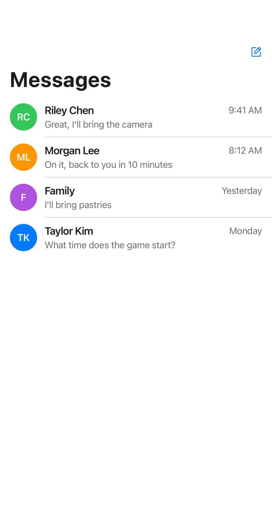
A messages screen with a conversation list that opens into a chat thread, with swipe to delete.
Chat Conversations is an open-source mobile screen from suiss/uim for React Native and Expo, with SwiftUI and Jetpack Compose versions built from the same design tokens. The @esuiss/uim CLI copies its source into your project, so you own the code.
Source: https://uim.suiss.app/docs/blocks/chat-conversations
```tsx title="uniwind/components/blocks/chat-conversations.tsx"
import {
ArrowUpIcon,
InfoIcon,
NotePencilIcon,
PlusIcon,
TrashIcon,
VideoCameraIcon,
} from "phosphor-react-native"
import * as React from "react"
import { Pressable, View } from "react-native"
import {
cancelAnimation,
Easing,
FadeInDown,
ReduceMotion,
useAnimatedStyle,
useSharedValue,
withDelay,
withRepeat,
withSequence,
withTiming,
} from "react-native-reanimated"
import {
SwipeAction,
SwipeActions,
SwipeActionsActions,
SwipeActionsContent,
} from "@/components/interactions/swipe-actions"
import { AnimatedView } from "@/components/ui/animated-view"
import { Avatar, AvatarFallback } from "@/components/ui/avatar"
import { BottomBar, BottomBarContent } from "@/components/ui/bottom-bar"
import { Bubble, BubbleContent } from "@/components/ui/bubble"
import { Button } from "@/components/ui/button"
import {
Header,
HeaderActions,
HeaderBack,
HeaderLargeTitle,
HeaderScrollView,
HeaderTitle,
useHeaderScroll,
} from "@/components/ui/header"
import { Icon } from "@/components/ui/icon"
import {
InputGroup,
InputGroupAddon,
InputGroupButton,
InputGroupInput,
} from "@/components/ui/input-group"
import { Message, MessageContent } from "@/components/ui/message"
import {
MessageScroller,
MessageScrollerItem,
MessageScrollerProvider,
MessageScrollerViewport,
useMessageScroller,
} from "@/components/ui/message-scroller"
import { Screen } from "@/components/ui/screen"
import { Text } from "@/components/ui/text"
type Line = { id: string; from: "me" | "them"; text: string }
type Thread = { name: string; tint: string; time: string; lines: Line[] }
type Row =
| { id: string; kind: "stamp" }
| { id: string; kind: "typing" }
| ({ kind: "line" } & Line)
const THREADS: { name: string; tint: string; time: string; lines: string[] }[] =
[
{
name: "Riley Chen",
tint: "bg-green dark:bg-green",
time: "9:41 AM",
lines: [
"them:Is the weekend trip to the coast still on?",
"me:Yes! We leave Friday evening",
"me:I booked the boat tour, it leaves at 5 AM",
"them:Great, I'll bring the camera",
],
},
{
name: "Morgan Lee",
tint: "bg-orange dark:bg-orange",
time: "8:12 AM",
lines: [
"them:I sent the deck, can you take a look?",
"me:On it, back to you in 10 minutes",
],
},
{
name: "Family",
tint: "bg-purple dark:bg-purple",
time: "Yesterday",
lines: [
"them:Is everyone coming for Sunday brunch?",
"me:We'll be there",
"them:I'll bring pastries",
],
},
{
name: "Taylor Kim",
tint: "bg-blue dark:bg-blue",
time: "Monday",
lines: ["them:What time does the game start?"],
},
]
const REPLIES = [
"Sounds good",
"Great, see you then!",
"Ha, absolutely",
"Let me check and get back to you",
]
const SEND_EASING = Easing.bezier(0.3, 1.25, 0.5, 1)
const initialThreads = (): Thread[] =>
THREADS.map((thread, index) => ({
name: thread.name,
tint: thread.tint,
time: thread.time,
lines: thread.lines.map((line, position) => {
const [from, ...text] = line.split(":")
return {
id: `${index}-${position}`,
from: from as Line["from"],
text: text.join(":"),
}
}),
}))
const initials = (name: string) =>
name
.split(" ")
.map((part) => part[0])
.join("")
.slice(0, 2)
function TypingDot({ index }: { index: number }) {
const opacity = useSharedValue(0.35)
React.useEffect(() => {
opacity.value = withDelay(
index * 180,
withRepeat(
withSequence(
withTiming(1, { duration: 550 }),
withTiming(0.35, { duration: 550 })
),
-1,
false,
undefined,
ReduceMotion.System
)
)
return () => cancelAnimation(opacity)
}, [index, opacity])
const animatedStyle = useAnimatedStyle(() => ({ opacity: opacity.value }))
return (
)
}
function TypingDots() {
return (
{[0, 1, 2].map((dot) => (
))}
)
}
function Composer({
placeholder,
onSend,
onAttach,
}: {
placeholder: string
onSend: (text: string) => void
onAttach?: () => void
}) {
const [value, setValue] = React.useState("")
const { scrollToEnd } = useMessageScroller()
const ready = value.trim().length > 0
const scale = useSharedValue(ready ? 1 : 0)
React.useEffect(() => {
scale.value = withTiming(ready ? 1 : 0, {
duration: 300,
easing: SEND_EASING,
reduceMotion: ReduceMotion.System,
})
}, [ready, scale])
const sendStyle = useAnimatedStyle(() => ({
transform: [{ scale: scale.value }],
}))
const send = () => {
if (!ready) return
onSend(value.trim())
setValue("")
requestAnimationFrame(() => scrollToEnd())
}
return (
)
}
function LineRow({ line }: { line: Line }) {
const mine = line.from === "me"
return (
{line.text}
)
}
function ThreadAvatar({
thread,
className,
}: {
thread: Thread
className?: string
}) {
return (
{initials(thread.name)}
)
}
function ChatConversations({
onSend,
onNewMessage,
onAttach,
onVideoCall,
onDetails,
onDelete,
}: {
onSend?: (text: string, conversation: string) => void
onNewMessage?: () => void
onAttach?: () => void
onVideoCall?: (conversation: string) => void
onDetails?: (conversation: string) => void
onDelete?: (conversation: string) => void
}) {
const [threads, setThreads] = React.useState(initialThreads)
const [selected, setSelected] = React.useState(null)
const [typing, setTyping] = React.useState(null)
const replyCount = React.useRef(0)
const timers = React.useRef[]>([])
const scroll = useHeaderScroll()
const thread = threads.find((item) => item.name === selected)
React.useEffect(
() => () => {
for (const timer of timers.current) clearTimeout(timer)
},
[]
)
const append = (name: string, from: Line["from"], text: string) =>
setThreads((current) =>
current.map((item) =>
item.name === name
? {
...item,
lines: [
...item.lines,
{ id: `${name}-${item.lines.length}`, from, text },
],
}
: item
)
)
const send = (text: string) => {
if (!thread) return
const target = thread.name
onSend?.(text, target)
append(target, "me", text)
timers.current.push(setTimeout(() => setTyping(target), 500))
timers.current.push(
setTimeout(() => {
const reply =
REPLIES[replyCount.current++ % REPLIES.length] ?? REPLIES[0]
setTyping(null)
append(target, "them", reply)
}, 1800)
)
}
if (thread) {
const rows: Row[] = [
{ id: "stamp", kind: "stamp" },
...thread.lines.map((line) => ({ kind: "line" as const, ...line })),
...(typing === thread.name
? [{ id: "typing", kind: "typing" as const }]
: []),
]
return (
setSelected(null)}>Messages
{thread.name}
{typing === thread.name ? "typing…" : "Message"}
row.id}
accessibilityLabel={`Conversation with ${thread.name}`}
contentContainerClassName="gap-1 px-2.5 py-4"
renderItem={({ item }) => (
{item.kind === "stamp" ? (
Today 9:30 AM
) : item.kind === "typing" ? (
) : (
)}
)}
/>
)
}
return (
Messages
{threads.length === 0 ? (
No Messages
) : null}
{threads.map((item, index) => {
const last = item.lines.at(-1)
return (
{index > 0 ? : null}
setSelected(item.name)}
className="flex-row items-center gap-3 px-4 py-2.5 active:bg-item-pressed"
>
{item.name}
{item.time}
{last?.text}
{
onDelete?.(item.name)
setThreads((current) =>
current.filter((entry) => entry.name !== item.name)
)
}}
>
Delete
)
})}
)
}
export { ChatConversations }
```
```swift title="swift/Blocks/ChatConversations.swift"
import PhosphorSwift
import SwiftUI
public struct ChatConversations: View {
struct Line: Identifiable, Equatable {
let id: String
let fromMe: Bool
let text: String
}
struct Thread {
let name: String
let tint: Color
let time: String
let lines: [String]
}
enum Entry: Identifiable {
case day
case line(Line)
case typing
var id: String {
switch self {
case .day: "day"
case .line(let line): line.id
case .typing: "typing"
}
}
}
static var threads: [Thread] {
[
Thread(name: "Riley Chen", tint: .green, time: "9:41 AM", lines: [
"them:Is the weekend trip to the coast still on?",
"me:Yes! We leave Friday evening",
"me:I booked the boat tour, it leaves at 5 AM",
"them:Great, I'll bring the camera",
]),
Thread(name: "Morgan Lee", tint: .orange, time: "8:12 AM", lines: [
"them:I sent the deck, can you take a look?",
"me:On it, back to you in 10 minutes",
]),
Thread(name: "Family", tint: .purple, time: "Yesterday", lines: [
"them:Is everyone coming for Sunday brunch?",
"me:We'll be there",
"them:I'll bring pastries",
]),
Thread(name: "Taylor Kim", tint: .teal, time: "Monday", lines: [
"them:What time does the game start?",
]),
]
}
static let replies = [
"Sounds good",
"Great, see you then!",
"Ha, absolutely",
"Let me check and get back to you",
]
static func lines(_ thread: Thread, index: Int) -> [Line] {
thread.lines.enumerated().map { offset, raw in
let parts = raw.split(separator: ":", maxSplits: 1).map(String.init)
return Line(id: "\(index)-\(offset)", fromMe: parts.first == "me", text: parts.last ?? "")
}
}
private var onSend: ((String, String) -> Void)?
private var onNewMessage: (() -> Void)?
private var onDelete: ((String) -> Void)?
private var onAttach: (() -> Void)?
private var onVideoCall: ((String) -> Void)?
private var onDetails: ((String) -> Void)?
private var swiped: Int?
@State private var conversations: [[Line]]
@State private var visible: [Int]
@State private var selected: Int?
@State private var typing: Bool
@State private var draft: String
@State private var replyCount = 0
@Environment(\.accessibilityReduceMotion) private var reduceMotion
public init(
onSend: ((_ text: String, _ conversation: String) -> Void)? = nil,
onNewMessage: (() -> Void)? = nil,
onDelete: ((_ conversation: String) -> Void)? = nil,
onAttach: (() -> Void)? = nil,
onVideoCall: ((_ conversation: String) -> Void)? = nil,
onDetails: ((_ conversation: String) -> Void)? = nil
) {
self.init(selected: nil)
self.onSend = onSend
self.onNewMessage = onNewMessage
self.onDelete = onDelete
self.onAttach = onAttach
self.onVideoCall = onVideoCall
self.onDetails = onDetails
}
init(selected: Int?, typing: Bool = false, draft: String = "", swiped: Int? = nil) {
_conversations = State(initialValue: Self.threads.enumerated().map { Self.lines($1, index: $0) })
_visible = State(initialValue: Array(Self.threads.indices))
_selected = State(initialValue: selected)
_typing = State(initialValue: typing)
_draft = State(initialValue: draft)
self.swiped = swiped
}
public var body: some View {
ZStack {
if let selected {
detail(selected)
.transition(.move(edge: .trailing))
.zIndex(1)
} else {
list
.transition(.move(edge: .leading))
}
}
.animation(reduceMotion ? nil : .timingCurve(0.32, 0.72, 0, 1, duration: 0.35), value: selected)
}
private var list: some View {
Screen {
HeaderScrollView {
HeaderLargeTitle("Messages")
LazyVStack(spacing: 0) {
ForEach(visible, id: \.self) { index in
let thread = Self.threads[index]
SwipeActions(revealed: swiped == index ? -88 : 0) {
ChatConversationsRow(
thread: thread,
last: conversations[index].last?.text ?? "",
separator: index != visible.last
) {
typing = false
draft = ""
selected = index
}
} leading: {
EmptyView()
} trailing: {
SwipeAction("Delete", icon: Ph.trash.fill, variant: .destructive, fullSwipe: true) {
onDelete?(thread.name)
withAnimation(reduceMotion ? nil : .timingCurve(0.32, 0.72, 0, 1, duration: 0.3)) {
visible.removeAll { $0 == index }
}
}
}
}
}
.padding(.bottom, 24)
} header: {
Header {
HeaderTitle("Messages")
} trailing: {
HeaderActions {
Button {
onNewMessage?()
} label: {
Ph.notePencil.regular
.frame(width: 22, height: 22)
.foregroundStyle(Color.link)
}
.accessibilityLabel(Text("New message"))
}
}
}
}
}
private func detail(_ index: Int) -> some View {
let thread = Self.threads[index]
var entries: [Entry] = [.day] + conversations[index].map(Entry.line)
if typing { entries.append(.typing) }
let ready = !draft.trimmingCharacters(in: .whitespacesAndNewlines).isEmpty
return Screen {
Header {
HStack(spacing: 8) {
ChatConversationsAvatar(name: thread.name, tint: thread.tint, size: 30)
VStack(alignment: .leading, spacing: 0) {
Text(verbatim: thread.name)
.scaledFont(.sm, weight: .semibold)
.foregroundStyle(Color.label)
Text(typing ? "typing…" : "Message")
.scaledFont(.xs2)
.foregroundStyle(Color.labelSecondary)
.contentTransition(.opacity)
}
.lineLimit(1)
}
.accessibilityElement(children: .combine)
} leading: {
HeaderBack("Messages") {
selected = nil
}
} trailing: {
HeaderActions {
Button {
onVideoCall?(thread.name)
} label: {
Ph.videoCamera.regular.frame(width: 22, height: 22)
}
.accessibilityLabel(Text("Video call"))
Button {
onDetails?(thread.name)
} label: {
Ph.info.regular.frame(width: 22, height: 22)
}
.accessibilityLabel(Text("Details"))
}
.foregroundStyle(Color.link)
}
.overlay(alignment: .bottom) {
Color.separator.frame(height: 1)
}
MessageScroller(entries, spacing: 4) { entry in
switch entry {
case .day:
Text("Today 9:30 AM")
.scaledFont(.xs2)
.foregroundStyle(Color.labelSecondary)
.frame(maxWidth: .infinity)
.padding(.top, 4)
.padding(.bottom, 10)
case .line(let line):
Message(align: line.fromMe ? .end : .start) {
MessageContent {
Bubble(variant: line.fromMe ? .default : .muted, align: line.fromMe ? .end : .start) {
BubbleContent(verbatim: line.text)
}
}
}
.transition(.opacity.combined(with: .offset(y: 8)))
case .typing:
ChatConversationsTyping()
}
}
.accessibilityLabel(Text("Conversation with \(thread.name)"))
.frame(maxHeight: .infinity)
BottomBar {
BottomBarContent {
HStack(spacing: 8) {
Button {
onAttach?()
} label: {
Ph.plus.bold.frame(width: 18, height: 18)
}
.buttonStyle(.variant(.secondary, size: .iconSm))
.accessibilityLabel(Text("Add attachment"))
InputGroup {
InputGroupInput("Message", text: $draft)
.submitLabel(.send)
.onSubmit { send(index) }
InputGroupAddon(align: .inlineEnd) {
InputGroupButton(variant: .default, size: .iconXs) {
send(index)
} label: {
Ph.arrowUp.bold.frame(width: 14, height: 14)
}
.scaleEffect(ready ? 1 : 0)
.disabled(!ready)
.accessibilityLabel(Text("Send"))
.animation(reduceMotion ? nil : .spring(response: 0.3, dampingFraction: 0.6), value: ready)
}
}
}
}
}
}
}
private func send(_ index: Int) {
let text = draft.trimmingCharacters(in: .whitespacesAndNewlines)
guard !text.isEmpty else { return }
draft = ""
onSend?(text, Self.threads[index].name)
withAnimation(reduceMotion ? nil : .timingCurve(0.32, 0.72, 0, 1, duration: 0.7)) {
conversations[index].append(Line(id: "\(index)-\(conversations[index].count)", fromMe: true, text: text))
}
let reply = Self.replies[replyCount % Self.replies.count]
replyCount += 1
Task {
try? await Task.sleep(for: .milliseconds(500))
typing = true
try? await Task.sleep(for: .milliseconds(1300))
typing = false
withAnimation(reduceMotion ? nil : .timingCurve(0.32, 0.72, 0, 1, duration: 0.7)) {
conversations[index].append(Line(id: "\(index)-\(conversations[index].count)", fromMe: false, text: reply))
}
}
}
}
private struct ChatConversationsAvatar: View {
let name: String
let tint: Color
let size: CGFloat
var body: some View {
Text(verbatim: name.split(separator: " ").compactMap(\.first).prefix(2).map(String.init).joined())
.font(.system(size: size * 0.38, weight: .semibold))
.foregroundStyle(Color.onAccent)
.frame(width: size, height: size)
.background(tint, in: Circle())
.accessibilityHidden(true)
}
}
private struct ChatConversationsRow: View {
let thread: ChatConversations.Thread
let last: String
let separator: Bool
let action: () -> Void
var body: some View {
Button(action: action) {
HStack(alignment: .top, spacing: 12) {
ChatConversationsAvatar(name: thread.name, tint: thread.tint, size: 44)
VStack(alignment: .leading, spacing: 2) {
HStack(spacing: 6) {
Text(verbatim: thread.name)
.scaledFont(.base, weight: .semibold)
.foregroundStyle(Color.label)
.lineLimit(1)
.frame(maxWidth: .infinity, alignment: .leading)
Text(LocalizedStringKey(thread.time))
.scaledFont(.sm)
.foregroundStyle(Color.labelSecondary)
Ph.caretRight.bold
.frame(width: 12, height: 12)
.foregroundStyle(Color.labelTertiary)
.flipsForRightToLeftLayoutDirection(true)
}
Text(verbatim: last)
.scaledFont(.sm)
.foregroundStyle(Color.labelSecondary)
.lineLimit(2, reservesSpace: true)
.multilineTextAlignment(.leading)
}
.padding(.bottom, 12)
.overlay(alignment: .bottom) {
if separator {
Color.separator.frame(height: 1)
}
}
}
.padding(.top, 12)
.padding(.horizontal, 16)
.contentShape(Rectangle())
}
.buttonStyle(ChatConversationsRowStyle())
.accessibilityElement(children: .combine)
}
}
private struct ChatConversationsRowStyle: ButtonStyle {
func makeBody(configuration: Configuration) -> some View {
configuration.label
.background(configuration.isPressed ? Color.itemPressed : .clear)
}
}
private struct ChatConversationsTyping: View {
@Environment(\.accessibilityReduceMotion) private var reduceMotion
var body: some View {
Message {
MessageContent {
Bubble(variant: .muted) {
BubbleContent {
TimelineView(.animation(paused: reduceMotion)) { context in
let time = context.date.timeIntervalSinceReferenceDate
HStack(spacing: 4) {
ForEach(0..<3, id: \.self) { dot in
Circle()
.fill(Color.labelTertiary)
.frame(width: 8, height: 8)
.opacity(reduceMotion ? 1 : 0.55 + 0.45 * abs(sin((time - Double(dot) * 0.18) * .pi / 1.1)))
}
}
.padding(.vertical, 6)
}
}
}
}
}
.accessibilityElement(children: .ignore)
.accessibilityLabel(Text("Typing"))
}
}
```
```kt title="kotlin/blocks/ChatConversations.kt"
package com.esuiss.ui.blocks
import androidx.compose.animation.AnimatedContent
import androidx.compose.animation.core.Animatable
import androidx.compose.animation.core.CubicBezierEasing
import androidx.compose.animation.core.RepeatMode
import androidx.compose.animation.core.animateFloat
import androidx.compose.animation.core.animateFloatAsState
import androidx.compose.animation.core.infiniteRepeatable
import androidx.compose.animation.core.rememberInfiniteTransition
import androidx.compose.animation.core.tween
import androidx.compose.animation.fadeIn
import androidx.compose.animation.fadeOut
import androidx.compose.animation.slideInHorizontally
import androidx.compose.animation.slideOutHorizontally
import androidx.compose.animation.togetherWith
import androidx.compose.foundation.background
import androidx.compose.foundation.clickable
import androidx.compose.foundation.interaction.MutableInteractionSource
import androidx.compose.foundation.interaction.collectIsPressedAsState
import androidx.compose.foundation.layout.Arrangement
import androidx.compose.foundation.layout.Box
import androidx.compose.foundation.layout.Column
import androidx.compose.foundation.layout.PaddingValues
import androidx.compose.foundation.layout.Row
import androidx.compose.foundation.layout.fillMaxSize
import androidx.compose.foundation.layout.fillMaxWidth
import androidx.compose.foundation.layout.height
import androidx.compose.foundation.layout.padding
import androidx.compose.foundation.layout.size
import androidx.compose.foundation.layout.widthIn
import androidx.compose.foundation.rememberScrollState
import androidx.compose.foundation.shape.CircleShape
import androidx.compose.foundation.text.BasicText
import androidx.compose.foundation.text.KeyboardActions
import androidx.compose.foundation.text.KeyboardOptions
import androidx.compose.foundation.verticalScroll
import androidx.compose.runtime.Composable
import androidx.compose.runtime.LaunchedEffect
import androidx.compose.runtime.getValue
import androidx.compose.runtime.key
import androidx.compose.runtime.mutableIntStateOf
import androidx.compose.runtime.mutableStateListOf
import androidx.compose.runtime.mutableStateOf
import androidx.compose.runtime.remember
import androidx.compose.runtime.rememberCoroutineScope
import androidx.compose.runtime.saveable.rememberSaveable
import androidx.compose.runtime.setValue
import androidx.compose.runtime.snapshots.SnapshotStateList
import androidx.compose.ui.Alignment
import androidx.compose.ui.Modifier
import androidx.compose.ui.graphics.Color
import androidx.compose.ui.graphics.graphicsLayer
import androidx.compose.ui.input.nestedscroll.nestedScroll
import androidx.compose.ui.semantics.LiveRegionMode
import androidx.compose.ui.semantics.Role
import androidx.compose.ui.semantics.contentDescription
import androidx.compose.ui.semantics.liveRegion
import androidx.compose.ui.semantics.semantics
import androidx.compose.ui.text.font.FontWeight
import androidx.compose.ui.text.input.ImeAction
import androidx.compose.ui.text.input.KeyboardCapitalization
import androidx.compose.ui.text.style.TextAlign
import androidx.compose.ui.text.style.TextOverflow
import androidx.compose.ui.unit.Dp
import androidx.compose.ui.unit.dp
import com.adamglin.PhosphorIcons
import com.adamglin.phosphoricons.Bold
import com.adamglin.phosphoricons.Regular
import com.adamglin.phosphoricons.bold.ArrowUp
import com.adamglin.phosphoricons.bold.Plus
import com.adamglin.phosphoricons.bold.Trash
import com.adamglin.phosphoricons.regular.Info
import com.adamglin.phosphoricons.regular.NotePencil
import com.adamglin.phosphoricons.regular.VideoCamera
import com.esuiss.ui.components.BottomBar
import com.esuiss.ui.components.Bubble
import com.esuiss.ui.components.BubbleAlign
import com.esuiss.ui.components.BubbleContent
import com.esuiss.ui.components.BubbleVariant
import com.esuiss.ui.components.Button
import com.esuiss.ui.components.ButtonSize
import com.esuiss.ui.components.ButtonVariant
import com.esuiss.ui.components.Header
import com.esuiss.ui.components.HeaderActions
import com.esuiss.ui.components.HeaderBack
import com.esuiss.ui.components.HeaderLargeTitle
import com.esuiss.ui.components.HeaderTitle
import com.esuiss.ui.components.Icon
import com.esuiss.ui.components.InputGroup
import com.esuiss.ui.components.InputGroupAddon
import com.esuiss.ui.components.InputGroupAddonAlign
import com.esuiss.ui.components.InputGroupButton
import com.esuiss.ui.components.InputGroupButtonSize
import com.esuiss.ui.components.InputGroupInput
import com.esuiss.ui.components.LocalContentStyle
import com.esuiss.ui.components.Message
import com.esuiss.ui.components.MessageAlign
import com.esuiss.ui.components.MessageContent
import com.esuiss.ui.components.MessageScroller
import com.esuiss.ui.components.Screen
import com.esuiss.ui.components.rememberHeaderState
import com.esuiss.ui.interactions.SwipeAction
import com.esuiss.ui.interactions.SwipeActionVariant
import com.esuiss.ui.interactions.SwipeActions
import com.esuiss.ui.theme.Colors
import com.esuiss.ui.theme.EsuissTheme
import com.esuiss.ui.theme.Typography
import kotlinx.coroutines.delay
import kotlinx.coroutines.launch
private val ConversationPopEasing = CubicBezierEasing(0.3f, 1.25f, 0.5f, 1f)
private val ConversationEnterEasing = CubicBezierEasing(0.32f, 0.72f, 0f, 1f)
private class ConversationLine(val id: String, val mine: Boolean, val text: String)
private class Conversation(
val name: String,
val tint: (Colors) -> Color,
val time: String,
val lines: SnapshotStateList,
)
private fun conversation(name: String, tint: (Colors) -> Color, time: String, vararg lines: String) = Conversation(
name,
tint,
time,
mutableStateListOf().apply {
lines.forEachIndexed { index, line ->
val from = line.substringBefore(":")
add(ConversationLine("$name-$index", from == "me", line.substringAfter(":")))
}
},
)
private fun conversations() = listOf(
conversation(
"Riley Chen",
{ it.green },
"9:41 AM",
"them:Is the weekend trip to the coast still on?",
"me:Yes! We leave Friday evening",
"me:I booked the boat tour, it leaves at 5 AM",
"them:Great, I'll bring the camera",
),
conversation(
"Morgan Lee",
{ it.orange },
"8:12 AM",
"them:I sent the deck, can you take a look?",
"me:On it, back to you in 10 minutes",
),
conversation(
"Family",
{ it.purple },
"Yesterday",
"them:Is everyone coming for Sunday brunch?",
"me:We'll be there",
"them:I'll bring pastries",
),
conversation("Taylor Kim", { it.teal }, "Monday", "them:What time does the game start?"),
)
private val ConversationReplies = listOf(
"Sounds good",
"Great, see you then!",
"Ha, absolutely",
"Let me check and get back to you",
)
private const val ConversationStamp = "stamp"
private const val ConversationTyping = "typing"
@Composable
fun ChatConversations(
modifier: Modifier = Modifier,
onSend: (text: String, conversation: String) -> Unit = { _, _ -> },
onNewMessage: () -> Unit = {},
onAttach: () -> Unit = {},
onVideoCall: (conversation: String) -> Unit = {},
onDetails: (conversation: String) -> Unit = {},
onDelete: (conversation: String) -> Unit = {},
) {
val threads = remember { mutableStateListOf().apply { addAll(conversations()) } }
var selected by rememberSaveable { mutableStateOf(null) }
var typing by remember { mutableStateOf(null) }
var replyCount by remember { mutableIntStateOf(0) }
val scope = rememberCoroutineScope()
fun send(thread: Conversation, text: String) {
onSend(text, thread.name)
thread.lines += ConversationLine("${thread.name}-${thread.lines.size}", true, text)
scope.launch {
delay(500)
typing = thread.name
delay(1300)
typing = null
val reply = ConversationReplies[replyCount++ % ConversationReplies.size]
thread.lines += ConversationLine("${thread.name}-${thread.lines.size}", false, reply)
}
}
Screen(modifier) {
AnimatedContent(
targetState = threads.firstOrNull { it.name == selected },
transitionSpec = {
val forward = targetState != null
(slideInHorizontally(tween(300)) { if (forward) it / 3 else -it / 3 } + fadeIn(tween(300))) togetherWith
(slideOutHorizontally(tween(300)) { if (forward) -it / 3 else it / 3 } + fadeOut(tween(200)))
},
label = "conversations",
) { thread ->
if (thread == null) {
ConversationList(
threads = threads,
onOpen = { selected = it },
onNewMessage = onNewMessage,
onDelete = { item ->
onDelete(item.name)
threads.remove(item)
},
)
} else {
ConversationDetail(
thread = thread,
typing = typing == thread.name,
onBack = { selected = null },
onSend = { send(thread, it) },
onAttach = onAttach,
onVideoCall = { onVideoCall(thread.name) },
onDetails = { onDetails(thread.name) },
)
}
}
}
}
@Composable
private fun ConversationList(
threads: List,
onOpen: (String) -> Unit,
onNewMessage: () -> Unit,
onDelete: (Conversation) -> Unit,
) {
val colors = EsuissTheme.colors
val header = rememberHeaderState()
Column(
Modifier
.fillMaxSize()
.nestedScroll(header.nestedScrollConnection),
) {
Header(state = header) {
HeaderTitle("Messages")
HeaderLargeTitle("Messages")
HeaderActions {
Button(onClick = onNewMessage, variant = ButtonVariant.Ghost, size = ButtonSize.Icon) {
Icon(PhosphorIcons.Regular.NotePencil, contentDescription = "New message", size = 20.dp, tint = colors.link)
}
}
}
Column(
Modifier
.weight(1f)
.fillMaxWidth()
.verticalScroll(rememberScrollState()),
) {
threads.forEachIndexed { index, thread ->
key(thread.name) {
SwipeActions(
trailing = listOf(
SwipeAction(
label = "Delete",
onClick = { onDelete(thread) },
icon = PhosphorIcons.Bold.Trash,
variant = SwipeActionVariant.Destructive,
fullSwipe = true,
),
),
) {
ConversationRow(thread, divided = index > 0) { onOpen(thread.name) }
}
}
}
}
}
}
@Composable
private fun ConversationRow(thread: Conversation, divided: Boolean, onClick: () -> Unit) {
val colors = EsuissTheme.colors
val interaction = remember { MutableInteractionSource() }
val pressed by interaction.collectIsPressedAsState()
val last = thread.lines.lastOrNull()?.text.orEmpty()
Box(
Modifier
.fillMaxWidth()
.background(if (pressed) colors.itemPressed else Color.Transparent)
.clickable(interactionSource = interaction, indication = null, role = Role.Button, onClick = onClick),
) {
if (divided) {
Box(
Modifier
.padding(start = 70.dp)
.fillMaxWidth()
.height(1.dp)
.background(colors.separator),
)
}
Row(
modifier = Modifier.padding(horizontal = 16.dp, vertical = 10.dp),
horizontalArrangement = Arrangement.spacedBy(12.dp),
verticalAlignment = Alignment.CenterVertically,
) {
ConversationInitials(thread, 42.dp)
Column(Modifier.weight(1f), verticalArrangement = Arrangement.spacedBy(2.dp)) {
Row(horizontalArrangement = Arrangement.spacedBy(6.dp), verticalAlignment = Alignment.CenterVertically) {
BasicText(
thread.name,
modifier = Modifier.weight(1f),
style = Typography.sm.copy(color = colors.label, fontWeight = FontWeight.SemiBold),
maxLines = 1,
overflow = TextOverflow.Ellipsis,
)
BasicText(thread.time, style = Typography.xs.copy(color = colors.labelSecondary))
}
BasicText(
last,
style = Typography.sm.copy(color = colors.labelSecondary),
maxLines = 1,
overflow = TextOverflow.Ellipsis,
)
}
}
}
}
@Composable
private fun ConversationInitials(thread: Conversation, size: Dp) {
val colors = EsuissTheme.colors
Box(
Modifier
.size(size)
.background(thread.tint(colors), CircleShape),
contentAlignment = Alignment.Center,
) {
BasicText(
thread.name.split(" ").mapNotNull { it.firstOrNull() }.joinToString("").take(2),
style = (if (size > 36.dp) Typography.base else Typography.xs2).copy(color = colors.onMedia, fontWeight = FontWeight.Medium),
)
}
}
@Composable
private fun ConversationDetail(
thread: Conversation,
typing: Boolean,
onBack: () -> Unit,
onSend: (String) -> Unit,
onAttach: () -> Unit,
onVideoCall: () -> Unit,
onDetails: () -> Unit,
) {
val colors = EsuissTheme.colors
val keys = buildList {
add(ConversationStamp)
thread.lines.forEach { add(it.id) }
if (typing) add(ConversationTyping)
}
Column(Modifier.fillMaxSize()) {
Header {
HeaderBack(onClick = onBack, text = "Messages")
HeaderTitle(
thread.name,
modifier = Modifier.semantics { liveRegion = LiveRegionMode.Polite },
subtitle = if (typing) "typing…" else "Message",
)
HeaderActions {
Button(onClick = onVideoCall, variant = ButtonVariant.Ghost, size = ButtonSize.Icon) {
Icon(PhosphorIcons.Regular.VideoCamera, contentDescription = "Video call", size = 20.dp, tint = colors.accent)
}
Button(onClick = onDetails, variant = ButtonVariant.Ghost, size = ButtonSize.Icon) {
Icon(PhosphorIcons.Regular.Info, contentDescription = "Details", size = 20.dp, tint = colors.accent)
}
}
}
MessageScroller(
items = keys,
key = { it },
modifier = Modifier
.weight(1f)
.fillMaxWidth()
.semantics { contentDescription = "Conversation with ${thread.name}" },
contentPadding = PaddingValues(horizontal = 16.dp, vertical = 16.dp),
verticalArrangement = Arrangement.spacedBy(4.dp, Alignment.Bottom),
) { id ->
when (id) {
ConversationStamp -> BasicText(
"Today 9:30 AM",
modifier = Modifier
.fillMaxWidth()
.padding(top = 4.dp, bottom = 10.dp),
style = Typography.xs2.copy(color = colors.labelSecondary, textAlign = TextAlign.Center),
)
ConversationTyping -> ConversationTypingBubble()
else -> thread.lines.firstOrNull { it.id == id }?.let { ConversationBubble(it) }
}
}
ConversationComposer(onSend, onAttach)
}
}
@Composable
private fun ConversationBubble(line: ConversationLine) {
val appear = remember { Animatable(0f) }
LaunchedEffect(Unit) { appear.animateTo(1f, tween(700, easing = ConversationEnterEasing)) }
Message(
modifier = Modifier.graphicsLayer {
alpha = appear.value
translationY = (1f - appear.value) * 8.dp.toPx()
},
align = if (line.mine) MessageAlign.End else MessageAlign.Start,
) {
MessageContent {
Bubble(
modifier = Modifier.widthIn(max = 280.dp),
variant = if (line.mine) BubbleVariant.Default else BubbleVariant.Muted,
align = if (line.mine) BubbleAlign.End else BubbleAlign.Start,
) {
BubbleContent {
BasicText(line.text, style = LocalContentStyle.current)
}
}
}
}
}
@Composable
private fun ConversationTypingBubble() {
val colors = EsuissTheme.colors
val transition = rememberInfiniteTransition(label = "typing")
Message {
MessageContent {
Bubble(variant = BubbleVariant.Muted) {
BubbleContent(Modifier.semantics { contentDescription = "Typing" }) {
Row(
modifier = Modifier.padding(vertical = 5.dp),
horizontalArrangement = Arrangement.spacedBy(4.dp),
) {
repeat(3) { dot ->
val alpha by transition.animateFloat(
initialValue = 0.35f,
targetValue = 1f,
animationSpec = infiniteRepeatable(
animation = tween(550, delayMillis = dot * 180),
repeatMode = RepeatMode.Reverse,
),
label = "dot",
)
Box(
Modifier
.size(8.dp)
.graphicsLayer { this.alpha = alpha }
.background(colors.labelTertiary, CircleShape),
)
}
}
}
}
}
}
}
@Composable
private fun ConversationComposer(onSend: (String) -> Unit, onAttach: () -> Unit) {
val colors = EsuissTheme.colors
var draft by rememberSaveable { mutableStateOf("") }
val ready = draft.isNotBlank()
val scale by animateFloatAsState(if (ready) 1f else 0f, tween(300, easing = ConversationPopEasing), label = "send")
fun submit() {
if (!ready) return
onSend(draft.trim())
draft = ""
}
BottomBar {
Row(
modifier = Modifier
.fillMaxWidth()
.padding(start = 16.dp, end = 16.dp, top = 8.dp, bottom = 12.dp),
horizontalArrangement = Arrangement.spacedBy(8.dp),
verticalAlignment = Alignment.CenterVertically,
) {
Button(onClick = onAttach, variant = ButtonVariant.Secondary, size = ButtonSize.IconSm) {
Icon(PhosphorIcons.Bold.Plus, contentDescription = "Add attachment", size = 18.dp, tint = colors.labelSecondary)
}
InputGroup(Modifier.weight(1f)) {
InputGroupInput(
value = draft,
onValueChange = { draft = it },
placeholder = "Message",
keyboardOptions = KeyboardOptions(capitalization = KeyboardCapitalization.Sentences, imeAction = ImeAction.Send),
keyboardActions = KeyboardActions(onSend = { submit() }),
)
InputGroupAddon(align = InputGroupAddonAlign.InlineEnd) {
InputGroupButton(
onClick = ::submit,
modifier = Modifier.graphicsLayer {
scaleX = scale
scaleY = scale
},
size = InputGroupButtonSize.IconXs,
variant = ButtonVariant.Default,
enabled = ready,
) {
Icon(PhosphorIcons.Bold.ArrowUp, contentDescription = "Send", size = 14.dp)
}
}
}
}
}
}
```
Composes `Screen`, `Header`, `SwipeActions` from the interactions, `Avatar`, `Message`, `Bubble`, `MessageScroller`, `InputGroup`, `Button` and `BottomBar`. Tapping a row opens the thread with a back button, video call and details actions, and a composer. Sending a message shows a typing indicator followed by a sample reply. Swiping a row reveals a Delete action.
## Installation
```bash title="Terminal"
npx @esuiss/uim@latest add chat-conversations
```
```bash title="Terminal"
npx @esuiss/uim@latest add chat-conversations --platform swift
```
```bash title="Terminal"
npx @esuiss/uim@latest add chat-conversations --platform kotlin
```
The CLI also adds what it builds on: [Avatar](/docs/components/avatar), [Bottom Bar](/docs/components/bottom-bar), [Bubble](/docs/components/bubble), [Button](/docs/components/button), [Header](/docs/components/header), [Icon](/docs/components/icon), [Input Group](/docs/components/input-group), [Message](/docs/components/message), [Message Scroller](/docs/components/message-scroller), [Screen](/docs/components/screen), [Swipe Actions](/docs/interactions/swipe-actions), [Text](/docs/components/text).
### Manual
**Uniwind**
1. Install the dependencies:
```bash title="Terminal"
npx expo install phosphor-react-native react-native-reanimated react-native-svg react-native-worklets
```
2. Add the pieces it builds on: [Avatar](/docs/components/avatar), [Bottom Bar](/docs/components/bottom-bar), [Bubble](/docs/components/bubble), [Button](/docs/components/button), [Header](/docs/components/header), [Icon](/docs/components/icon), [Input Group](/docs/components/input-group), [Message](/docs/components/message), [Message Scroller](/docs/components/message-scroller), [Screen](/docs/components/screen), [Swipe Actions](/docs/interactions/swipe-actions), [Text](/docs/components/text).
3. Copy the source into `components/blocks/chat-conversations.tsx`:
```tsx title="uniwind/components/blocks/chat-conversations.tsx"
import {
ArrowUpIcon,
InfoIcon,
NotePencilIcon,
PlusIcon,
TrashIcon,
VideoCameraIcon,
} from "phosphor-react-native"
import * as React from "react"
import { Pressable, View } from "react-native"
import {
cancelAnimation,
Easing,
FadeInDown,
ReduceMotion,
useAnimatedStyle,
useSharedValue,
withDelay,
withRepeat,
withSequence,
withTiming,
} from "react-native-reanimated"
import {
SwipeAction,
SwipeActions,
SwipeActionsActions,
SwipeActionsContent,
} from "@/components/interactions/swipe-actions"
import { AnimatedView } from "@/components/ui/animated-view"
import { Avatar, AvatarFallback } from "@/components/ui/avatar"
import { BottomBar, BottomBarContent } from "@/components/ui/bottom-bar"
import { Bubble, BubbleContent } from "@/components/ui/bubble"
import { Button } from "@/components/ui/button"
import {
Header,
HeaderActions,
HeaderBack,
HeaderLargeTitle,
HeaderScrollView,
HeaderTitle,
useHeaderScroll,
} from "@/components/ui/header"
import { Icon } from "@/components/ui/icon"
import {
InputGroup,
InputGroupAddon,
InputGroupButton,
InputGroupInput,
} from "@/components/ui/input-group"
import { Message, MessageContent } from "@/components/ui/message"
import {
MessageScroller,
MessageScrollerItem,
MessageScrollerProvider,
MessageScrollerViewport,
useMessageScroller,
} from "@/components/ui/message-scroller"
import { Screen } from "@/components/ui/screen"
import { Text } from "@/components/ui/text"
type Line = { id: string; from: "me" | "them"; text: string }
type Thread = { name: string; tint: string; time: string; lines: Line[] }
type Row =
| { id: string; kind: "stamp" }
| { id: string; kind: "typing" }
| ({ kind: "line" } & Line)
const THREADS: { name: string; tint: string; time: string; lines: string[] }[] =
[
{
name: "Riley Chen",
tint: "bg-green dark:bg-green",
time: "9:41 AM",
lines: [
"them:Is the weekend trip to the coast still on?",
"me:Yes! We leave Friday evening",
"me:I booked the boat tour, it leaves at 5 AM",
"them:Great, I'll bring the camera",
],
},
{
name: "Morgan Lee",
tint: "bg-orange dark:bg-orange",
time: "8:12 AM",
lines: [
"them:I sent the deck, can you take a look?",
"me:On it, back to you in 10 minutes",
],
},
{
name: "Family",
tint: "bg-purple dark:bg-purple",
time: "Yesterday",
lines: [
"them:Is everyone coming for Sunday brunch?",
"me:We'll be there",
"them:I'll bring pastries",
],
},
{
name: "Taylor Kim",
tint: "bg-blue dark:bg-blue",
time: "Monday",
lines: ["them:What time does the game start?"],
},
]
const REPLIES = [
"Sounds good",
"Great, see you then!",
"Ha, absolutely",
"Let me check and get back to you",
]
const SEND_EASING = Easing.bezier(0.3, 1.25, 0.5, 1)
const initialThreads = (): Thread[] =>
THREADS.map((thread, index) => ({
name: thread.name,
tint: thread.tint,
time: thread.time,
lines: thread.lines.map((line, position) => {
const [from, ...text] = line.split(":")
return {
id: `${index}-${position}`,
from: from as Line["from"],
text: text.join(":"),
}
}),
}))
const initials = (name: string) =>
name
.split(" ")
.map((part) => part[0])
.join("")
.slice(0, 2)
function TypingDot({ index }: { index: number }) {
const opacity = useSharedValue(0.35)
React.useEffect(() => {
opacity.value = withDelay(
index * 180,
withRepeat(
withSequence(
withTiming(1, { duration: 550 }),
withTiming(0.35, { duration: 550 })
),
-1,
false,
undefined,
ReduceMotion.System
)
)
return () => cancelAnimation(opacity)
}, [index, opacity])
const animatedStyle = useAnimatedStyle(() => ({ opacity: opacity.value }))
return (
)
}
function TypingDots() {
return (
{[0, 1, 2].map((dot) => (
))}
)
}
function Composer({
placeholder,
onSend,
onAttach,
}: {
placeholder: string
onSend: (text: string) => void
onAttach?: () => void
}) {
const [value, setValue] = React.useState("")
const { scrollToEnd } = useMessageScroller()
const ready = value.trim().length > 0
const scale = useSharedValue(ready ? 1 : 0)
React.useEffect(() => {
scale.value = withTiming(ready ? 1 : 0, {
duration: 300,
easing: SEND_EASING,
reduceMotion: ReduceMotion.System,
})
}, [ready, scale])
const sendStyle = useAnimatedStyle(() => ({
transform: [{ scale: scale.value }],
}))
const send = () => {
if (!ready) return
onSend(value.trim())
setValue("")
requestAnimationFrame(() => scrollToEnd())
}
return (
)
}
function LineRow({ line }: { line: Line }) {
const mine = line.from === "me"
return (
{line.text}
)
}
function ThreadAvatar({
thread,
className,
}: {
thread: Thread
className?: string
}) {
return (
{initials(thread.name)}
)
}
function ChatConversations({
onSend,
onNewMessage,
onAttach,
onVideoCall,
onDetails,
onDelete,
}: {
onSend?: (text: string, conversation: string) => void
onNewMessage?: () => void
onAttach?: () => void
onVideoCall?: (conversation: string) => void
onDetails?: (conversation: string) => void
onDelete?: (conversation: string) => void
}) {
const [threads, setThreads] = React.useState(initialThreads)
const [selected, setSelected] = React.useState(null)
const [typing, setTyping] = React.useState(null)
const replyCount = React.useRef(0)
const timers = React.useRef[]>([])
const scroll = useHeaderScroll()
const thread = threads.find((item) => item.name === selected)
React.useEffect(
() => () => {
for (const timer of timers.current) clearTimeout(timer)
},
[]
)
const append = (name: string, from: Line["from"], text: string) =>
setThreads((current) =>
current.map((item) =>
item.name === name
? {
...item,
lines: [
...item.lines,
{ id: `${name}-${item.lines.length}`, from, text },
],
}
: item
)
)
const send = (text: string) => {
if (!thread) return
const target = thread.name
onSend?.(text, target)
append(target, "me", text)
timers.current.push(setTimeout(() => setTyping(target), 500))
timers.current.push(
setTimeout(() => {
const reply =
REPLIES[replyCount.current++ % REPLIES.length] ?? REPLIES[0]
setTyping(null)
append(target, "them", reply)
}, 1800)
)
}
if (thread) {
const rows: Row[] = [
{ id: "stamp", kind: "stamp" },
...thread.lines.map((line) => ({ kind: "line" as const, ...line })),
...(typing === thread.name
? [{ id: "typing", kind: "typing" as const }]
: []),
]
return (
setSelected(null)}>Messages
{thread.name}
{typing === thread.name ? "typing…" : "Message"}
row.id}
accessibilityLabel={`Conversation with ${thread.name}`}
contentContainerClassName="gap-1 px-2.5 py-4"
renderItem={({ item }) => (
{item.kind === "stamp" ? (
Today 9:30 AM
) : item.kind === "typing" ? (
) : (
)}
)}
/>
)
}
return (
Messages
{threads.length === 0 ? (
No Messages
) : null}
{threads.map((item, index) => {
const last = item.lines.at(-1)
return (
{index > 0 ? : null}
setSelected(item.name)}
className="flex-row items-center gap-3 px-4 py-2.5 active:bg-item-pressed"
>
{item.name}
{item.time}
{last?.text}
{
onDelete?.(item.name)
setThreads((current) =>
current.filter((entry) => entry.name !== item.name)
)
}}
>
Delete
)
})}
)
}
export { ChatConversations }
```
4. Update the import paths to match your project.
**NativeWind**
1. Install the dependencies:
```bash title="Terminal"
npx expo install phosphor-react-native react-native-reanimated react-native-svg react-native-worklets
```
2. Add the pieces it builds on: [Avatar](/docs/components/avatar), [Bottom Bar](/docs/components/bottom-bar), [Bubble](/docs/components/bubble), [Button](/docs/components/button), [Header](/docs/components/header), [Icon](/docs/components/icon), [Input Group](/docs/components/input-group), [Message](/docs/components/message), [Message Scroller](/docs/components/message-scroller), [Screen](/docs/components/screen), [Swipe Actions](/docs/interactions/swipe-actions), [Text](/docs/components/text).
3. Copy the source into `components/blocks/chat-conversations.tsx`:
```tsx title="nativewind/components/blocks/chat-conversations.tsx"
import {
ArrowUpIcon,
InfoIcon,
NotePencilIcon,
PlusIcon,
TrashIcon,
VideoCameraIcon,
} from "phosphor-react-native"
import * as React from "react"
import { Pressable, View } from "react-native"
import {
cancelAnimation,
Easing,
FadeInDown,
ReduceMotion,
useAnimatedStyle,
useSharedValue,
withDelay,
withRepeat,
withSequence,
withTiming,
} from "react-native-reanimated"
import {
SwipeAction,
SwipeActions,
SwipeActionsActions,
SwipeActionsContent,
} from "@/components/interactions/swipe-actions"
import { AnimatedView } from "@/components/ui/animated-view"
import { Avatar, AvatarFallback } from "@/components/ui/avatar"
import { BottomBar, BottomBarContent } from "@/components/ui/bottom-bar"
import { Bubble, BubbleContent } from "@/components/ui/bubble"
import { Button } from "@/components/ui/button"
import {
Header,
HeaderActions,
HeaderBack,
HeaderLargeTitle,
HeaderScrollView,
HeaderTitle,
useHeaderScroll,
} from "@/components/ui/header"
import { Icon } from "@/components/ui/icon"
import {
InputGroup,
InputGroupAddon,
InputGroupButton,
InputGroupInput,
} from "@/components/ui/input-group"
import { Message, MessageContent } from "@/components/ui/message"
import {
MessageScroller,
MessageScrollerItem,
MessageScrollerProvider,
MessageScrollerViewport,
useMessageScroller,
} from "@/components/ui/message-scroller"
import { Screen } from "@/components/ui/screen"
import { Text } from "@/components/ui/text"
type Line = { id: string; from: "me" | "them"; text: string }
type Thread = { name: string; tint: string; time: string; lines: Line[] }
type Row =
| { id: string; kind: "stamp" }
| { id: string; kind: "typing" }
| ({ kind: "line" } & Line)
const THREADS: { name: string; tint: string; time: string; lines: string[] }[] =
[
{
name: "Riley Chen",
tint: "bg-green dark:bg-green",
time: "9:41 AM",
lines: [
"them:Is the weekend trip to the coast still on?",
"me:Yes! We leave Friday evening",
"me:I booked the boat tour, it leaves at 5 AM",
"them:Great, I'll bring the camera",
],
},
{
name: "Morgan Lee",
tint: "bg-orange dark:bg-orange",
time: "8:12 AM",
lines: [
"them:I sent the deck, can you take a look?",
"me:On it, back to you in 10 minutes",
],
},
{
name: "Family",
tint: "bg-purple dark:bg-purple",
time: "Yesterday",
lines: [
"them:Is everyone coming for Sunday brunch?",
"me:We'll be there",
"them:I'll bring pastries",
],
},
{
name: "Taylor Kim",
tint: "bg-blue dark:bg-blue",
time: "Monday",
lines: ["them:What time does the game start?"],
},
]
const REPLIES = [
"Sounds good",
"Great, see you then!",
"Ha, absolutely",
"Let me check and get back to you",
]
const SEND_EASING = Easing.bezier(0.3, 1.25, 0.5, 1)
const initialThreads = (): Thread[] =>
THREADS.map((thread, index) => ({
name: thread.name,
tint: thread.tint,
time: thread.time,
lines: thread.lines.map((line, position) => {
const [from, ...text] = line.split(":")
return {
id: `${index}-${position}`,
from: from as Line["from"],
text: text.join(":"),
}
}),
}))
const initials = (name: string) =>
name
.split(" ")
.map((part) => part[0])
.join("")
.slice(0, 2)
function TypingDot({ index }: { index: number }) {
const opacity = useSharedValue(0.35)
React.useEffect(() => {
opacity.value = withDelay(
index * 180,
withRepeat(
withSequence(
withTiming(1, { duration: 550 }),
withTiming(0.35, { duration: 550 })
),
-1,
false,
undefined,
ReduceMotion.System
)
)
return () => cancelAnimation(opacity)
}, [index, opacity])
const animatedStyle = useAnimatedStyle(() => ({ opacity: opacity.value }))
return (
)
}
function TypingDots() {
return (
{[0, 1, 2].map((dot) => (
))}
)
}
function Composer({
placeholder,
onSend,
onAttach,
}: {
placeholder: string
onSend: (text: string) => void
onAttach?: () => void
}) {
const [value, setValue] = React.useState("")
const { scrollToEnd } = useMessageScroller()
const ready = value.trim().length > 0
const scale = useSharedValue(ready ? 1 : 0)
React.useEffect(() => {
scale.value = withTiming(ready ? 1 : 0, {
duration: 300,
easing: SEND_EASING,
reduceMotion: ReduceMotion.System,
})
}, [ready, scale])
const sendStyle = useAnimatedStyle(() => ({
transform: [{ scale: scale.value }],
}))
const send = () => {
if (!ready) return
onSend(value.trim())
setValue("")
requestAnimationFrame(() => scrollToEnd())
}
return (
)
}
function LineRow({ line }: { line: Line }) {
const mine = line.from === "me"
return (
{line.text}
)
}
function ThreadAvatar({
thread,
className,
}: {
thread: Thread
className?: string
}) {
return (
{initials(thread.name)}
)
}
function ChatConversations({
onSend,
onNewMessage,
onAttach,
onVideoCall,
onDetails,
onDelete,
}: {
onSend?: (text: string, conversation: string) => void
onNewMessage?: () => void
onAttach?: () => void
onVideoCall?: (conversation: string) => void
onDetails?: (conversation: string) => void
onDelete?: (conversation: string) => void
}) {
const [threads, setThreads] = React.useState(initialThreads)
const [selected, setSelected] = React.useState(null)
const [typing, setTyping] = React.useState(null)
const replyCount = React.useRef(0)
const timers = React.useRef[]>([])
const scroll = useHeaderScroll()
const thread = threads.find((item) => item.name === selected)
React.useEffect(
() => () => {
for (const timer of timers.current) clearTimeout(timer)
},
[]
)
const append = (name: string, from: Line["from"], text: string) =>
setThreads((current) =>
current.map((item) =>
item.name === name
? {
...item,
lines: [
...item.lines,
{ id: `${name}-${item.lines.length}`, from, text },
],
}
: item
)
)
const send = (text: string) => {
if (!thread) return
const target = thread.name
onSend?.(text, target)
append(target, "me", text)
timers.current.push(setTimeout(() => setTyping(target), 500))
timers.current.push(
setTimeout(() => {
const reply =
REPLIES[replyCount.current++ % REPLIES.length] ?? REPLIES[0]
setTyping(null)
append(target, "them", reply)
}, 1800)
)
}
if (thread) {
const rows: Row[] = [
{ id: "stamp", kind: "stamp" },
...thread.lines.map((line) => ({ kind: "line" as const, ...line })),
...(typing === thread.name
? [{ id: "typing", kind: "typing" as const }]
: []),
]
return (
setSelected(null)}>Messages
{thread.name}
{typing === thread.name ? "typing…" : "Message"}
row.id}
accessibilityLabel={`Conversation with ${thread.name}`}
contentContainerClassName="gap-1 px-2.5 py-4"
renderItem={({ item }) => (
{item.kind === "stamp" ? (
Today 9:30 AM
) : item.kind === "typing" ? (
) : (
)}
)}
/>
)
}
return (
Messages
{threads.length === 0 ? (
No Messages
) : null}
{threads.map((item, index) => {
const last = item.lines.at(-1)
return (
{index > 0 ? (
) : null}
setSelected(item.name)}
className="flex-row items-center gap-3 px-4 py-2.5 active:bg-item-pressed"
>
{item.name}
{item.time}
{last?.text}
{
onDelete?.(item.name)
setThreads((current) =>
current.filter((entry) => entry.name !== item.name)
)
}}
>
Delete
)
})}
)
}
export { ChatConversations }
```
4. Update the import paths to match your project.
**StyleSheet**
1. Install the dependencies:
```bash title="Terminal"
npx expo install phosphor-react-native react-native-reanimated react-native-svg react-native-worklets
```
2. Add the pieces it builds on: [Avatar](/docs/components/avatar), [Bottom Bar](/docs/components/bottom-bar), [Bubble](/docs/components/bubble), [Button](/docs/components/button), [Header](/docs/components/header), [Icon](/docs/components/icon), [Input Group](/docs/components/input-group), [Message](/docs/components/message), [Message Scroller](/docs/components/message-scroller), [Screen](/docs/components/screen), [Swipe Actions](/docs/interactions/swipe-actions), [Text](/docs/components/text).
3. Copy the source into `components/blocks/chat-conversations.tsx`:
```tsx title="stylesheet/components/blocks/chat-conversations.tsx"
import {
ArrowUpIcon,
InfoIcon,
NotePencilIcon,
PlusIcon,
TrashIcon,
VideoCameraIcon,
} from "phosphor-react-native"
import * as React from "react"
import { Pressable, StyleSheet, View } from "react-native"
import {
cancelAnimation,
Easing,
FadeInDown,
ReduceMotion,
useAnimatedStyle,
useSharedValue,
withDelay,
withRepeat,
withSequence,
withTiming,
} from "react-native-reanimated"
import {
SwipeAction,
SwipeActions,
SwipeActionsActions,
SwipeActionsContent,
} from "@/components/interactions/swipe-actions"
import { AnimatedView } from "@/components/ui/animated-view"
import { Avatar, AvatarFallback } from "@/components/ui/avatar"
import { BottomBar, BottomBarContent } from "@/components/ui/bottom-bar"
import { Bubble, BubbleContent } from "@/components/ui/bubble"
import { Button } from "@/components/ui/button"
import {
Header,
HeaderActions,
HeaderBack,
HeaderLargeTitle,
HeaderScrollView,
HeaderTitle,
useHeaderScroll,
} from "@/components/ui/header"
import { Icon } from "@/components/ui/icon"
import {
InputGroup,
InputGroupAddon,
InputGroupButton,
InputGroupInput,
} from "@/components/ui/input-group"
import { Message, MessageContent } from "@/components/ui/message"
import {
MessageScroller,
MessageScrollerItem,
MessageScrollerProvider,
MessageScrollerViewport,
useMessageScroller,
} from "@/components/ui/message-scroller"
import { Screen } from "@/components/ui/screen"
import { Text } from "@/components/ui/text"
import {
fontSize,
radius,
type ThemeColors,
useTheme,
} from "@/components/ui/theme"
type Line = { id: string; from: "me" | "them"; text: string }
type Tint = keyof ThemeColors
type Thread = { name: string; tint: Tint; time: string; lines: Line[] }
type Row =
| { id: string; kind: "stamp" }
| { id: string; kind: "typing" }
| ({ kind: "line" } & Line)
const THREADS: { name: string; tint: Tint; time: string; lines: string[] }[] = [
{
name: "Riley Chen",
tint: "green",
time: "9:41 AM",
lines: [
"them:Is the weekend trip to the coast still on?",
"me:Yes! We leave Friday evening",
"me:I booked the boat tour, it leaves at 5 AM",
"them:Great, I'll bring the camera",
],
},
{
name: "Morgan Lee",
tint: "orange",
time: "8:12 AM",
lines: [
"them:I sent the deck, can you take a look?",
"me:On it, back to you in 10 minutes",
],
},
{
name: "Family",
tint: "purple",
time: "Yesterday",
lines: [
"them:Is everyone coming for Sunday brunch?",
"me:We'll be there",
"them:I'll bring pastries",
],
},
{
name: "Taylor Kim",
tint: "blue",
time: "Monday",
lines: ["them:What time does the game start?"],
},
]
const REPLIES = [
"Sounds good",
"Great, see you then!",
"Ha, absolutely",
"Let me check and get back to you",
]
const SEND_EASING = Easing.bezier(0.3, 1.25, 0.5, 1)
const styles = StyleSheet.create({
dot: { width: 8, height: 8, borderRadius: radius.full },
dots: {
flexDirection: "row",
gap: 4,
paddingHorizontal: 14,
paddingVertical: 12,
},
composer: {
flexDirection: "row",
alignItems: "center",
gap: 8,
paddingHorizontal: 16,
paddingTop: 10,
paddingBottom: 14,
},
group: { flex: 1, height: 36, borderRadius: radius.full },
input: { paddingStart: 14 },
addon: { paddingEnd: 4 },
send: { width: 27, height: 27 },
header: { height: 56, borderBottomWidth: 1 },
title: { flexDirection: "row", alignItems: "center", gap: 10 },
titleText: { flexShrink: 1 },
list: { gap: 4, paddingHorizontal: 10, paddingVertical: 16 },
stamp: {
...fontSize["2xs"],
marginTop: 4,
marginBottom: 10,
textAlign: "center",
},
row: {
flexDirection: "row",
alignItems: "center",
gap: 12,
paddingHorizontal: 16,
paddingVertical: 10,
},
rowText: { flex: 1, gap: 2 },
rowTop: { flexDirection: "row", alignItems: "center", gap: 6 },
name: { ...fontSize.base, flex: 1, fontWeight: "600" },
separator: { height: 1, marginStart: 72 },
empty: {
...fontSize.base,
paddingHorizontal: 16,
paddingTop: 40,
textAlign: "center",
},
})
const initialThreads = (): Thread[] =>
THREADS.map((thread, index) => ({
name: thread.name,
tint: thread.tint,
time: thread.time,
lines: thread.lines.map((line, position) => {
const [from, ...text] = line.split(":")
return {
id: `${index}-${position}`,
from: from as Line["from"],
text: text.join(":"),
}
}),
}))
const initials = (name: string) =>
name
.split(" ")
.map((part) => part[0])
.join("")
.slice(0, 2)
function TypingDot({ index }: { index: number }) {
const { colors } = useTheme()
const opacity = useSharedValue(0.35)
React.useEffect(() => {
opacity.value = withDelay(
index * 180,
withRepeat(
withSequence(
withTiming(1, { duration: 550 }),
withTiming(0.35, { duration: 550 })
),
-1,
false,
undefined,
ReduceMotion.System
)
)
return () => cancelAnimation(opacity)
}, [index, opacity])
const animatedStyle = useAnimatedStyle(() => ({ opacity: opacity.value }))
return (
)
}
function TypingDots() {
return (
{[0, 1, 2].map((dot) => (
))}
)
}
function Composer({
placeholder,
onSend,
onAttach,
}: {
placeholder: string
onSend: (text: string) => void
onAttach?: () => void
}) {
const { colors } = useTheme()
const [value, setValue] = React.useState("")
const { scrollToEnd } = useMessageScroller()
const ready = value.trim().length > 0
const scale = useSharedValue(ready ? 1 : 0)
React.useEffect(() => {
scale.value = withTiming(ready ? 1 : 0, {
duration: 300,
easing: SEND_EASING,
reduceMotion: ReduceMotion.System,
})
}, [ready, scale])
const sendStyle = useAnimatedStyle(() => ({
transform: [{ scale: scale.value }],
}))
const send = () => {
if (!ready) return
onSend(value.trim())
setValue("")
requestAnimationFrame(() => scrollToEnd())
}
return (
)
}
function LineRow({ line }: { line: Line }) {
const mine = line.from === "me"
return (
{line.text}
)
}
function ThreadAvatar({ thread, size }: { thread: Thread; size: number }) {
const { colors } = useTheme()
return (
{initials(thread.name)}
)
}
function ChatConversations({
onSend,
onNewMessage,
onAttach,
onVideoCall,
onDetails,
onDelete,
}: {
onSend?: (text: string, conversation: string) => void
onNewMessage?: () => void
onAttach?: () => void
onVideoCall?: (conversation: string) => void
onDetails?: (conversation: string) => void
onDelete?: (conversation: string) => void
}) {
const { colors } = useTheme()
const [threads, setThreads] = React.useState(initialThreads)
const [selected, setSelected] = React.useState(null)
const [typing, setTyping] = React.useState(null)
const replyCount = React.useRef(0)
const timers = React.useRef[]>([])
const scroll = useHeaderScroll()
const thread = threads.find((item) => item.name === selected)
React.useEffect(
() => () => {
for (const timer of timers.current) clearTimeout(timer)
},
[]
)
const append = (name: string, from: Line["from"], text: string) =>
setThreads((current) =>
current.map((item) =>
item.name === name
? {
...item,
lines: [
...item.lines,
{ id: `${name}-${item.lines.length}`, from, text },
],
}
: item
)
)
const send = (text: string) => {
if (!thread) return
const target = thread.name
onSend?.(text, target)
append(target, "me", text)
timers.current.push(setTimeout(() => setTyping(target), 500))
timers.current.push(
setTimeout(() => {
const reply =
REPLIES[replyCount.current++ % REPLIES.length] ?? REPLIES[0]
setTyping(null)
append(target, "them", reply)
}, 1800)
)
}
if (thread) {
const rows: Row[] = [
{ id: "stamp", kind: "stamp" },
...thread.lines.map((line) => ({ kind: "line" as const, ...line })),
...(typing === thread.name
? [{ id: "typing", kind: "typing" as const }]
: []),
]
return (
setSelected(null)}>Messages
{thread.name}
{typing === thread.name ? "typing…" : "Message"}
row.id}
accessibilityLabel={`Conversation with ${thread.name}`}
contentContainerStyle={styles.list}
renderItem={({ item }) => (
{item.kind === "stamp" ? (
Today 9:30 AM
) : item.kind === "typing" ? (
) : (
)}
)}
/>
)
}
return (
Messages
{threads.length === 0 ? (
No Messages
) : null}
{threads.map((item, index) => {
const last = item.lines.at(-1)
return (
{index > 0 ? (
) : null}
setSelected(item.name)}
style={({ pressed }) => [
styles.row,
pressed && { backgroundColor: colors.itemPressed },
]}
>
{item.name}
{item.time}
{last?.text}
{
onDelete?.(item.name)
setThreads((current) =>
current.filter((entry) => entry.name !== item.name)
)
}}
>
Delete
)
})}
)
}
export { ChatConversations }
```
4. Update the import paths to match your project.
**SwiftUI**
1. Target iOS 17 or later.
2. Add the Swift package to your app:
```swift title="Package.swift"
.package(url: "https://github.com/phosphor-icons/swift", from: "2.1.0")
```
3. Copy the theme files every view uses:
```swift title="swift/Theme/Theme.swift"
import SwiftUI
import UIKit
struct RGBA: Sendable {
let red: CGFloat
let green: CGFloat
let blue: CGFloat
let alpha: CGFloat
init(_ hex: UInt32, _ alpha: CGFloat = 1) {
red = CGFloat((hex >> 16) & 0xFF) / 255
green = CGFloat((hex >> 8) & 0xFF) / 255
blue = CGFloat(hex & 0xFF) / 255
self.alpha = alpha
}
var uiColor: UIColor {
UIColor(red: red, green: green, blue: blue, alpha: alpha)
}
}
extension Color {
static func adaptive(light: RGBA, dark: RGBA) -> Color {
let lightColor = light.uiColor
let darkColor = dark.uiColor
return Color(uiColor: UIColor { traits in
traits.userInterfaceStyle == .dark ? darkColor : lightColor
})
}
}
public struct TextStyle: Sendable, Hashable {
public let size: CGFloat
public let lineHeight: CGFloat
public let letterSpacing: CGFloat
public init(size: CGFloat, lineHeight: CGFloat, letterSpacing: CGFloat) {
self.size = size
self.lineHeight = lineHeight
self.letterSpacing = letterSpacing
}
public func font(weight: Font.Weight = .regular) -> Font {
.system(size: size, weight: weight)
}
public var lineSpacing: CGFloat {
max(0, lineHeight - UIFont.systemFont(ofSize: size).lineHeight)
}
}
extension Hashable where Self == Font {
public static func textStyle(_ style: TextStyle, weight: Font.Weight = .regular) -> Font {
style.font(weight: weight)
}
}
private struct TextStyleModifier: ViewModifier {
let style: TextStyle
let weight: Font.Weight
func body(content: Content) -> some View {
content
.font(style.font(weight: weight))
.tracking(style.letterSpacing)
.lineSpacing(style.lineSpacing)
.padding(.vertical, style.lineSpacing / 2)
}
}
extension View {
public func textStyle(_ style: TextStyle, weight: Font.Weight = .regular) -> some View {
modifier(TextStyleModifier(style: style, weight: weight))
}
}
public struct Shadow: Sendable, Hashable {
public let color: Color
public let radius: CGFloat
public let x: CGFloat
public let y: CGFloat
public init(color: Color, radius: CGFloat, x: CGFloat = 0, y: CGFloat = 0) {
self.color = color
self.radius = radius
self.x = x
self.y = y
}
}
extension View {
public func shadow(_ shadow: Shadow) -> some View {
self.shadow(color: shadow.color, radius: shadow.radius, x: shadow.x, y: shadow.y)
}
}
```
```swift title="swift/Theme/Tokens.swift"
import SwiftUI
extension Color {
public static let surface = Color.adaptive(light: .init(0xFFFFFF), dark: .init(0x000000))
public static let surfaceSecondary = Color.adaptive(light: .init(0xF5F5F7), dark: .init(0x161617))
public static let surfaceTertiary = Color.adaptive(light: .init(0xE8E8ED), dark: .init(0x2C2C2E))
public static let surfaceRaised = Color.adaptive(light: .init(0xFFFFFF), dark: .init(0x1D1D1F))
public static let label = Color.adaptive(light: .init(0x1D1D1F), dark: .init(0xF5F5F7))
public static let labelSecondary = Color.adaptive(light: .init(0x6E6E73), dark: .init(0xA1A1A6))
public static let labelTertiary = Color.adaptive(light: .init(0x86868B), dark: .init(0x86868B))
public static let labelQuaternary = Color.adaptive(light: .init(0xD2D2D7), dark: .init(0x424245))
public static let control = Color.adaptive(light: .init(0x000000, 0.04), dark: .init(0xFFFFFF, 0.1))
public static let controlPressed = Color.adaptive(light: .init(0x000000, 0.12), dark: .init(0xFFFFFF, 0.22))
public static let controlSelected = Color.adaptive(light: .init(0x1D1D1F), dark: .init(0xF5F5F7))
public static let controlDisabled = Color.adaptive(light: .init(0x000000, 0.03), dark: .init(0xFFFFFF, 0.05))
public static let onControlSelected = Color.adaptive(light: .init(0xFFFFFF), dark: .init(0x000000))
public static let itemPressed = Color.adaptive(light: .init(0x000000, 0.08), dark: .init(0xFFFFFF, 0.12))
public static let itemSelected = Color.adaptive(light: .init(0x000000, 0.06), dark: .init(0xFFFFFF, 0.1))
public static let separator = Color.adaptive(light: .init(0xD2D2D7), dark: .init(0x424245))
public static let separatorStrong = Color.adaptive(light: .init(0x86868B), dark: .init(0x6E6E73))
public static let accent = Color.adaptive(light: .init(0x0071E3), dark: .init(0x0071E3))
public static let accentPressed = Color.adaptive(light: .init(0x005BB8), dark: .init(0x004D9E))
public static let accentSelected = Color.adaptive(light: .init(0x0071E3), dark: .init(0x0071E3))
public static let accentDisabled = Color.adaptive(light: .init(0x0071E3, 0.4), dark: .init(0x0071E3, 0.4))
public static let onAccent = Color.adaptive(light: .init(0xFFFFFF), dark: .init(0xFFFFFF))
public static let accentSurface = Color.adaptive(light: .init(0x0071E3, 0.09), dark: .init(0x0071E3, 0.18))
public static let accentSurfacePressed = Color.adaptive(light: .init(0x0071E3, 0.18), dark: .init(0x0071E3, 0.3))
public static let link = Color.adaptive(light: .init(0x0066CC), dark: .init(0x2997FF))
public static let focus = Color.adaptive(light: .init(0x0071E3), dark: .init(0x0071E3))
public static let scrim = Color.adaptive(light: .init(0x000000, 0.48), dark: .init(0x000000, 0.48))
public static let media = Color.adaptive(light: .init(0x000000), dark: .init(0x000000))
public static let onMedia = Color.adaptive(light: .init(0xFFFFFF), dark: .init(0xFFFFFF))
public static let danger = Color.adaptive(light: .init(0xD0000A), dark: .init(0xFF5447))
public static let dangerSurface = Color.adaptive(light: .init(0xD70015, 0.08), dark: .init(0xFF453A, 0.2))
public static let dangerSurfacePressed = Color.adaptive(light: .init(0xD70015, 0.16), dark: .init(0xFF453A, 0.36))
public static let success = Color.adaptive(light: .init(0x008009), dark: .init(0x30D158))
public static let successSurface = Color.adaptive(light: .init(0xEFFAF1), dark: .init(0x30D158, 0.16))
public static let warning = Color.adaptive(light: .init(0xB64400), dark: .init(0xFF9F0A))
public static let warningSurface = Color.adaptive(light: .init(0xFFF5EA), dark: .init(0xFF9F0A, 0.16))
}
public enum Radius {
public static let xs: CGFloat = 3
public static let sm: CGFloat = 5
public static let md: CGFloat = 8
public static let lg: CGFloat = 10
public static let xl: CGFloat = 12
public static let xl2: CGFloat = 18
public static let xl3: CGFloat = 28
public static let full: CGFloat = 9999
}
extension TextStyle {
public static let xs3 = TextStyle(size: 11, lineHeight: 13, letterSpacing: 0.066)
public static let xs2 = TextStyle(size: 12, lineHeight: 16, letterSpacing: 0)
public static let xs = TextStyle(size: 13, lineHeight: 18, letterSpacing: -0.078)
public static let sm = TextStyle(size: 15, lineHeight: 20, letterSpacing: -0.24)
public static let md = TextStyle(size: 16, lineHeight: 21, letterSpacing: -0.32)
public static let base = TextStyle(size: 17, lineHeight: 22, letterSpacing: -0.442)
public static let lg = TextStyle(size: 20, lineHeight: 25, letterSpacing: -0.46)
public static let xl = TextStyle(size: 22, lineHeight: 28, letterSpacing: -0.264)
public static let xl2 = TextStyle(size: 28, lineHeight: 34, letterSpacing: 0.392)
public static let xl3 = TextStyle(size: 34, lineHeight: 41, letterSpacing: 0.408)
public static let allCases: [TextStyle] = [.xs3, .xs2, .xs, .sm, .md, .base, .lg, .xl, .xl2, .xl3]
}
extension Shadow {
public static let md = Shadow(color: .black.opacity(0.08), radius: 6, x: 2, y: 4)
public static let lg = Shadow(color: .black.opacity(0.12), radius: 12, y: 4)
}
```
4. Copy the source and every file it uses:
```swift title="swift/Blocks/ChatConversations.swift"
import PhosphorSwift
import SwiftUI
public struct ChatConversations: View {
struct Line: Identifiable, Equatable {
let id: String
let fromMe: Bool
let text: String
}
struct Thread {
let name: String
let tint: Color
let time: String
let lines: [String]
}
enum Entry: Identifiable {
case day
case line(Line)
case typing
var id: String {
switch self {
case .day: "day"
case .line(let line): line.id
case .typing: "typing"
}
}
}
static var threads: [Thread] {
[
Thread(name: "Riley Chen", tint: .green, time: "9:41 AM", lines: [
"them:Is the weekend trip to the coast still on?",
"me:Yes! We leave Friday evening",
"me:I booked the boat tour, it leaves at 5 AM",
"them:Great, I'll bring the camera",
]),
Thread(name: "Morgan Lee", tint: .orange, time: "8:12 AM", lines: [
"them:I sent the deck, can you take a look?",
"me:On it, back to you in 10 minutes",
]),
Thread(name: "Family", tint: .purple, time: "Yesterday", lines: [
"them:Is everyone coming for Sunday brunch?",
"me:We'll be there",
"them:I'll bring pastries",
]),
Thread(name: "Taylor Kim", tint: .teal, time: "Monday", lines: [
"them:What time does the game start?",
]),
]
}
static let replies = [
"Sounds good",
"Great, see you then!",
"Ha, absolutely",
"Let me check and get back to you",
]
static func lines(_ thread: Thread, index: Int) -> [Line] {
thread.lines.enumerated().map { offset, raw in
let parts = raw.split(separator: ":", maxSplits: 1).map(String.init)
return Line(id: "\(index)-\(offset)", fromMe: parts.first == "me", text: parts.last ?? "")
}
}
private var onSend: ((String, String) -> Void)?
private var onNewMessage: (() -> Void)?
private var onDelete: ((String) -> Void)?
private var onAttach: (() -> Void)?
private var onVideoCall: ((String) -> Void)?
private var onDetails: ((String) -> Void)?
private var swiped: Int?
@State private var conversations: [[Line]]
@State private var visible: [Int]
@State private var selected: Int?
@State private var typing: Bool
@State private var draft: String
@State private var replyCount = 0
@Environment(\.accessibilityReduceMotion) private var reduceMotion
public init(
onSend: ((_ text: String, _ conversation: String) -> Void)? = nil,
onNewMessage: (() -> Void)? = nil,
onDelete: ((_ conversation: String) -> Void)? = nil,
onAttach: (() -> Void)? = nil,
onVideoCall: ((_ conversation: String) -> Void)? = nil,
onDetails: ((_ conversation: String) -> Void)? = nil
) {
self.init(selected: nil)
self.onSend = onSend
self.onNewMessage = onNewMessage
self.onDelete = onDelete
self.onAttach = onAttach
self.onVideoCall = onVideoCall
self.onDetails = onDetails
}
init(selected: Int?, typing: Bool = false, draft: String = "", swiped: Int? = nil) {
_conversations = State(initialValue: Self.threads.enumerated().map { Self.lines($1, index: $0) })
_visible = State(initialValue: Array(Self.threads.indices))
_selected = State(initialValue: selected)
_typing = State(initialValue: typing)
_draft = State(initialValue: draft)
self.swiped = swiped
}
public var body: some View {
ZStack {
if let selected {
detail(selected)
.transition(.move(edge: .trailing))
.zIndex(1)
} else {
list
.transition(.move(edge: .leading))
}
}
.animation(reduceMotion ? nil : .timingCurve(0.32, 0.72, 0, 1, duration: 0.35), value: selected)
}
private var list: some View {
Screen {
HeaderScrollView {
HeaderLargeTitle("Messages")
LazyVStack(spacing: 0) {
ForEach(visible, id: \.self) { index in
let thread = Self.threads[index]
SwipeActions(revealed: swiped == index ? -88 : 0) {
ChatConversationsRow(
thread: thread,
last: conversations[index].last?.text ?? "",
separator: index != visible.last
) {
typing = false
draft = ""
selected = index
}
} leading: {
EmptyView()
} trailing: {
SwipeAction("Delete", icon: Ph.trash.fill, variant: .destructive, fullSwipe: true) {
onDelete?(thread.name)
withAnimation(reduceMotion ? nil : .timingCurve(0.32, 0.72, 0, 1, duration: 0.3)) {
visible.removeAll { $0 == index }
}
}
}
}
}
.padding(.bottom, 24)
} header: {
Header {
HeaderTitle("Messages")
} trailing: {
HeaderActions {
Button {
onNewMessage?()
} label: {
Ph.notePencil.regular
.frame(width: 22, height: 22)
.foregroundStyle(Color.link)
}
.accessibilityLabel(Text("New message"))
}
}
}
}
}
private func detail(_ index: Int) -> some View {
let thread = Self.threads[index]
var entries: [Entry] = [.day] + conversations[index].map(Entry.line)
if typing { entries.append(.typing) }
let ready = !draft.trimmingCharacters(in: .whitespacesAndNewlines).isEmpty
return Screen {
Header {
HStack(spacing: 8) {
ChatConversationsAvatar(name: thread.name, tint: thread.tint, size: 30)
VStack(alignment: .leading, spacing: 0) {
Text(verbatim: thread.name)
.scaledFont(.sm, weight: .semibold)
.foregroundStyle(Color.label)
Text(typing ? "typing…" : "Message")
.scaledFont(.xs2)
.foregroundStyle(Color.labelSecondary)
.contentTransition(.opacity)
}
.lineLimit(1)
}
.accessibilityElement(children: .combine)
} leading: {
HeaderBack("Messages") {
selected = nil
}
} trailing: {
HeaderActions {
Button {
onVideoCall?(thread.name)
} label: {
Ph.videoCamera.regular.frame(width: 22, height: 22)
}
.accessibilityLabel(Text("Video call"))
Button {
onDetails?(thread.name)
} label: {
Ph.info.regular.frame(width: 22, height: 22)
}
.accessibilityLabel(Text("Details"))
}
.foregroundStyle(Color.link)
}
.overlay(alignment: .bottom) {
Color.separator.frame(height: 1)
}
MessageScroller(entries, spacing: 4) { entry in
switch entry {
case .day:
Text("Today 9:30 AM")
.scaledFont(.xs2)
.foregroundStyle(Color.labelSecondary)
.frame(maxWidth: .infinity)
.padding(.top, 4)
.padding(.bottom, 10)
case .line(let line):
Message(align: line.fromMe ? .end : .start) {
MessageContent {
Bubble(variant: line.fromMe ? .default : .muted, align: line.fromMe ? .end : .start) {
BubbleContent(verbatim: line.text)
}
}
}
.transition(.opacity.combined(with: .offset(y: 8)))
case .typing:
ChatConversationsTyping()
}
}
.accessibilityLabel(Text("Conversation with \(thread.name)"))
.frame(maxHeight: .infinity)
BottomBar {
BottomBarContent {
HStack(spacing: 8) {
Button {
onAttach?()
} label: {
Ph.plus.bold.frame(width: 18, height: 18)
}
.buttonStyle(.variant(.secondary, size: .iconSm))
.accessibilityLabel(Text("Add attachment"))
InputGroup {
InputGroupInput("Message", text: $draft)
.submitLabel(.send)
.onSubmit { send(index) }
InputGroupAddon(align: .inlineEnd) {
InputGroupButton(variant: .default, size: .iconXs) {
send(index)
} label: {
Ph.arrowUp.bold.frame(width: 14, height: 14)
}
.scaleEffect(ready ? 1 : 0)
.disabled(!ready)
.accessibilityLabel(Text("Send"))
.animation(reduceMotion ? nil : .spring(response: 0.3, dampingFraction: 0.6), value: ready)
}
}
}
}
}
}
}
private func send(_ index: Int) {
let text = draft.trimmingCharacters(in: .whitespacesAndNewlines)
guard !text.isEmpty else { return }
draft = ""
onSend?(text, Self.threads[index].name)
withAnimation(reduceMotion ? nil : .timingCurve(0.32, 0.72, 0, 1, duration: 0.7)) {
conversations[index].append(Line(id: "\(index)-\(conversations[index].count)", fromMe: true, text: text))
}
let reply = Self.replies[replyCount % Self.replies.count]
replyCount += 1
Task {
try? await Task.sleep(for: .milliseconds(500))
typing = true
try? await Task.sleep(for: .milliseconds(1300))
typing = false
withAnimation(reduceMotion ? nil : .timingCurve(0.32, 0.72, 0, 1, duration: 0.7)) {
conversations[index].append(Line(id: "\(index)-\(conversations[index].count)", fromMe: false, text: reply))
}
}
}
}
private struct ChatConversationsAvatar: View {
let name: String
let tint: Color
let size: CGFloat
var body: some View {
Text(verbatim: name.split(separator: " ").compactMap(\.first).prefix(2).map(String.init).joined())
.font(.system(size: size * 0.38, weight: .semibold))
.foregroundStyle(Color.onAccent)
.frame(width: size, height: size)
.background(tint, in: Circle())
.accessibilityHidden(true)
}
}
private struct ChatConversationsRow: View {
let thread: ChatConversations.Thread
let last: String
let separator: Bool
let action: () -> Void
var body: some View {
Button(action: action) {
HStack(alignment: .top, spacing: 12) {
ChatConversationsAvatar(name: thread.name, tint: thread.tint, size: 44)
VStack(alignment: .leading, spacing: 2) {
HStack(spacing: 6) {
Text(verbatim: thread.name)
.scaledFont(.base, weight: .semibold)
.foregroundStyle(Color.label)
.lineLimit(1)
.frame(maxWidth: .infinity, alignment: .leading)
Text(LocalizedStringKey(thread.time))
.scaledFont(.sm)
.foregroundStyle(Color.labelSecondary)
Ph.caretRight.bold
.frame(width: 12, height: 12)
.foregroundStyle(Color.labelTertiary)
.flipsForRightToLeftLayoutDirection(true)
}
Text(verbatim: last)
.scaledFont(.sm)
.foregroundStyle(Color.labelSecondary)
.lineLimit(2, reservesSpace: true)
.multilineTextAlignment(.leading)
}
.padding(.bottom, 12)
.overlay(alignment: .bottom) {
if separator {
Color.separator.frame(height: 1)
}
}
}
.padding(.top, 12)
.padding(.horizontal, 16)
.contentShape(Rectangle())
}
.buttonStyle(ChatConversationsRowStyle())
.accessibilityElement(children: .combine)
}
}
private struct ChatConversationsRowStyle: ButtonStyle {
func makeBody(configuration: Configuration) -> some View {
configuration.label
.background(configuration.isPressed ? Color.itemPressed : .clear)
}
}
private struct ChatConversationsTyping: View {
@Environment(\.accessibilityReduceMotion) private var reduceMotion
var body: some View {
Message {
MessageContent {
Bubble(variant: .muted) {
BubbleContent {
TimelineView(.animation(paused: reduceMotion)) { context in
let time = context.date.timeIntervalSinceReferenceDate
HStack(spacing: 4) {
ForEach(0..<3, id: \.self) { dot in
Circle()
.fill(Color.labelTertiary)
.frame(width: 8, height: 8)
.opacity(reduceMotion ? 1 : 0.55 + 0.45 * abs(sin((time - Double(dot) * 0.18) * .pi / 1.1)))
}
}
.padding(.vertical, 6)
}
}
}
}
}
.accessibilityElement(children: .ignore)
.accessibilityLabel(Text("Typing"))
}
}
```
```swift title="swift/Components/BottomBar.swift"
import SwiftUI
public struct BottomBar: View {
let separator: Bool
let content: Content
@Environment(\.screenBackground) private var background
public init(separator: Bool = true, @ViewBuilder content: () -> Content) {
self.separator = separator
self.content = content()
}
public var body: some View {
VStack(spacing: 0) {
content
}
.frame(maxWidth: .infinity)
.background(background.ignoresSafeArea(.container, edges: .bottom))
.overlay(alignment: .top) {
if separator {
Color.separator.frame(height: 1)
}
}
.accessibilityElement(children: .contain)
}
}
public struct BottomBarContent: View {
let content: Content
public init(@ViewBuilder content: () -> Content) {
self.content = content()
}
public var body: some View {
VStack(spacing: 8) {
content
}
.padding(.horizontal, 16)
.padding(.vertical, 12)
.frame(maxWidth: .infinity)
}
}
```
```swift title="swift/Components/Bubble.swift"
import SwiftUI
public enum BubbleVariant: CaseIterable, Sendable {
case `default`, secondary, muted, tinted, outline, ghost, destructive
var hasTail: Bool {
self != .ghost && self != .outline
}
}
public enum BubbleAlign: CaseIterable, Sendable {
case start, end
}
public enum BubbleReactionsSide: CaseIterable, Sendable {
case top, bottom
}
struct BubbleRunEntry: Equatable {
let id: UUID
let align: BubbleAlign
let tail: Bool
}
enum BubbleRun {
static func tails(_ entries: [BubbleRunEntry]) -> Set {
var result = Set()
for (index, entry) in entries.enumerated() where entry.tail {
let next = index + 1 < entries.count ? entries[index + 1] : nil
if next?.align != entry.align {
result.insert(entry.id)
}
}
return result
}
}
struct BubbleRunKey: PreferenceKey {
static var defaultValue: [BubbleRunEntry] { [] }
static func reduce(value: inout [BubbleRunEntry], nextValue: () -> [BubbleRunEntry]) {
value.append(contentsOf: nextValue())
}
}
struct BubbleRunScope: ViewModifier {
@State private var tails: Set?
func body(content: Content) -> some View {
content
.environment(\.bubbleTails, tails)
.onPreferenceChange(BubbleRunKey.self) { entries in
tails = BubbleRun.tails(entries)
}
.transformPreference(BubbleRunKey.self) { $0 = [] }
}
}
struct BubbleStyle: Sendable {
var variant: BubbleVariant = .default
var align: BubbleAlign = .start
var tail = false
}
public struct BubbleGroup: View {
let content: Content
public init(@ViewBuilder content: () -> Content) {
self.content = content()
}
public var body: some View {
VStack(alignment: .leading, spacing: 8) {
content
}
.frame(maxWidth: .infinity, alignment: .leading)
.modifier(BubbleRunScope())
}
}
public struct Bubble: View {
public typealias Variant = BubbleVariant
public typealias Align = BubbleAlign
let variant: Variant
let align: Align
let onLongPress: (() -> Void)?
let content: Content
@State private var id = UUID()
@Environment(\.messageAlign) private var messageAlign
@Environment(\.bubbleTails) private var tails
public init(
variant: Variant = .default,
align: Align = .start,
onLongPress: (() -> Void)? = nil,
@ViewBuilder content: () -> Content
) {
self.variant = variant
self.align = align
self.onLongPress = onLongPress
self.content = content()
}
public var body: some View {
let resolved: Align = messageAlign == .end ? .end : align
let tail = variant.hasTail && (tails.map { $0.contains(id) } ?? true)
BubbleLayout(align: resolved, fraction: variant == .ghost ? 1 : 0.8) {
content
}
.environment(\.bubbleStyle, BubbleStyle(variant: variant, align: resolved, tail: tail))
.modifier(BubbleLongPress(action: onLongPress))
.frame(maxWidth: .infinity, alignment: resolved == .end ? .trailing : .leading)
.preference(key: BubbleRunKey.self, value: [BubbleRunEntry(id: id, align: resolved, tail: variant.hasTail)])
.preference(key: MessageGhostKey.self, value: variant == .ghost)
}
}
private struct BubbleLongPress: ViewModifier {
let action: (() -> Void)?
func body(content: Content) -> some View {
if let action {
content
.contentShape(Rectangle())
.onLongPressGesture(minimumDuration: 0.5, maximumDistance: 10, perform: action)
.accessibilityAction(named: Text("Show actions"), action)
} else {
content
}
}
}
public struct BubbleContent: View {
let action: (() -> Void)?
let content: Content
@Environment(\.bubbleStyle) private var style
public init(@ViewBuilder content: () -> Content) {
action = nil
self.content = content()
}
public init(action: @escaping () -> Void, @ViewBuilder content: () -> Content) {
self.action = action
self.content = content()
}
public var body: some View {
if let action {
Button(action: action) {
content
}
.buttonStyle(BubbleContentButtonStyle(style: style))
} else {
BubbleContentBody(style: style, pressed: false) {
content
}
}
}
}
extension BubbleContent where Content == Text {
public init(_ text: LocalizedStringKey) {
self.init { Text(text) }
}
public init(verbatim text: String) {
self.init { Text(verbatim: text) }
}
}
private struct BubbleContentButtonStyle: ButtonStyle {
let style: BubbleStyle
func makeBody(configuration: Configuration) -> some View {
BubbleContentBody(style: style, pressed: configuration.isPressed) {
configuration.label
}
}
}
private struct BubbleContentBody: View {
let style: BubbleStyle
let pressed: Bool
let content: Content
@Environment(\.screenBackground) private var surface
init(style: BubbleStyle, pressed: Bool, @ViewBuilder content: () -> Content) {
self.style = style
self.pressed = pressed
self.content = content()
}
var body: some View {
let ghost = style.variant == .ghost
let shape = BubbleShape(tail: style.tail, mirrored: style.align == .end)
content
.scaledTextStyle(.base)
.foregroundStyle(foreground)
.multilineTextAlignment(.leading)
.fixedSize(horizontal: false, vertical: true)
.padding(.horizontal, ghost ? 0 : 15)
.padding(.vertical, ghost ? 0 : 7)
.background {
if ghost {
Rectangle().fill(pressed ? Color.itemPressed : .clear)
} else {
shape.fill(background)
}
}
.overlay {
if style.variant == .outline {
RoundedRectangle(cornerRadius: Radius.xl2, style: .continuous)
.strokeBorder(Color.separator, lineWidth: 1)
}
}
.contentShape(shape)
}
private var foreground: Color {
switch style.variant {
case .default: .onAccent
case .destructive: .danger
case .secondary, .muted, .tinted, .outline, .ghost: .label
}
}
private var background: Color {
switch style.variant {
case .default: pressed ? .accentPressed : .accent
case .secondary: pressed ? .controlPressed : .control
case .muted: pressed ? .surfaceTertiary : .surfaceSecondary
case .tinted: pressed ? .accentSurfacePressed : .accentSurface
case .outline: pressed ? .control : surface
case .ghost: pressed ? .itemPressed : .clear
case .destructive: pressed ? .dangerSurfacePressed : .dangerSurface
}
}
}
struct BubbleShape: Shape {
let tail: Bool
let mirrored: Bool
func path(in rect: CGRect) -> Path {
let body = RoundedRectangle(cornerRadius: Radius.xl2, style: .continuous).path(in: rect)
guard tail else { return body }
let originX = mirrored ? rect.maxX + 6.9 - 20 : rect.minX - 6.9
let originY = rect.maxY - 20
let points = BubbleShape.tailPoints.map { point in
CGPoint(x: originX + (mirrored ? 20 - point.x : point.x), y: originY + point.y)
}
var tailPath = Path()
tailPath.addLines(points)
tailPath.closeSubpath()
return body.union(tailPath)
}
static let tailPoints: [CGPoint] = {
var points = [CGPoint(x: 7, y: 0), CGPoint(x: 20, y: 0), CGPoint(x: 20, y: 4)]
for step in 1...12 {
let angle = Double(step) / 12 * .pi / 2
points.append(CGPoint(x: 4 + 16 * cos(angle), y: 4 + 16 * sin(angle)))
}
points.append(CGPoint(x: 0, y: 20))
points.append(CGPoint(x: 0, y: 19.54))
let start = atan2(9.54, 3.0)
for step in 1...12 {
let angle = start * (1 - Double(step) / 12)
points.append(CGPoint(x: -3 + 10 * cos(angle), y: 10 + 10 * sin(angle)))
}
return points
}()
}
struct BubbleReactionsPlacement: Equatable, Sendable {
let side: BubbleReactionsSide
let align: BubbleAlign
}
struct BubbleReactionsKey: LayoutValueKey {
static let defaultValue: BubbleReactionsPlacement? = nil
}
public struct BubbleReactions: View {
let side: BubbleReactionsSide
let align: BubbleAlign
let content: Content
@Environment(\.screenBackground) private var surface
public init(
side: BubbleReactionsSide = .bottom,
align: BubbleAlign = .end,
@ViewBuilder content: () -> Content
) {
self.side = side
self.align = align
self.content = content()
}
public var body: some View {
HStack(spacing: 4) {
content
}
.scaledFont(.sm)
.lineLimit(1)
.fixedSize()
.foregroundStyle(Color.label)
.padding(.horizontal, 6)
.padding(.vertical, 2)
.background(Color.surfaceSecondary, in: Capsule())
.background {
Capsule().fill(surface).padding(-3)
}
.accessibilityElement(children: .combine)
.layoutValue(key: BubbleReactionsKey.self, value: BubbleReactionsPlacement(side: side, align: align))
}
}
extension BubbleReactions where Content == Text {
public init(_ text: LocalizedStringKey, side: BubbleReactionsSide = .bottom, align: BubbleAlign = .end) {
self.init(side: side, align: align) { Text(text) }
}
public init(verbatim text: String, side: BubbleReactionsSide = .bottom, align: BubbleAlign = .end) {
self.init(side: side, align: align) { Text(verbatim: text) }
}
}
struct BubbleLayout: Layout {
let align: BubbleAlign
let fraction: CGFloat
private let spacing: CGFloat = 4
private let reactionMargin: CGFloat = 20
private func measure(_ proposal: ProposedViewSize, subviews: Subviews) -> (sizes: [CGSize], width: CGFloat, height: CGFloat) {
let limit = proposal.width.map { $0 * fraction }
var sizes: [CGSize] = []
var width: CGFloat = 0
var height: CGFloat = 0
var count = 0
for subview in subviews {
if subview[BubbleReactionsKey.self] != nil {
sizes.append(subview.sizeThatFits(.unspecified))
continue
}
let size = subview.sizeThatFits(ProposedViewSize(width: limit, height: nil))
sizes.append(size)
width = max(width, size.width)
height += size.height + (count > 0 ? spacing : 0)
count += 1
}
return (sizes, width, height)
}
private func margins(_ subviews: Subviews) -> (top: CGFloat, bottom: CGFloat) {
let sides = subviews.compactMap { $0[BubbleReactionsKey.self]?.side }
return (sides.contains(.top) ? reactionMargin : 0, sides.contains(.bottom) ? reactionMargin : 0)
}
func sizeThatFits(proposal: ProposedViewSize, subviews: Subviews, cache: inout ()) -> CGSize {
let measured = measure(proposal, subviews: subviews)
let margins = margins(subviews)
return CGSize(width: measured.width, height: measured.height + margins.top + margins.bottom)
}
func placeSubviews(in bounds: CGRect, proposal: ProposedViewSize, subviews: Subviews, cache: inout ()) {
let measured = measure(proposal, subviews: subviews)
let margins = margins(subviews)
let box = CGRect(
x: bounds.minX,
y: bounds.minY + margins.top,
width: bounds.width,
height: measured.height
)
var y = box.minY
for (index, subview) in subviews.enumerated() {
let size = measured.sizes[index]
if let placement = subview[BubbleReactionsKey.self] {
let x = placement.align == .end ? box.maxX - 12 - size.width : box.minX + 12
let top = placement.side == .bottom ? box.maxY - size.height * 0.25 : box.minY - size.height * 0.75
subview.place(at: CGPoint(x: x, y: top), proposal: ProposedViewSize(size))
continue
}
let x = align == .end ? box.maxX - size.width : box.minX
subview.place(at: CGPoint(x: x, y: y), proposal: ProposedViewSize(width: size.width, height: size.height))
y += size.height + spacing
}
}
}
extension EnvironmentValues {
@Entry var bubbleStyle = BubbleStyle()
@Entry var bubbleTails: Set? = nil
}
```
```swift title="swift/Components/Button.swift"
import SwiftUI
public struct VariantButtonStyle: ButtonStyle {
public enum Variant: CaseIterable, Sendable {
case `default`, outline, secondary, tinted, ghost, plain, destructive, link
}
public enum Size: CaseIterable, Sendable {
case `default`, xs, sm, lg, xl, icon, iconXs, iconSm, iconLg, iconXl
var height: CGFloat {
switch self {
case .xs, .iconXs: 24
case .sm, .iconSm: 32
case .default, .icon: 36
case .lg, .iconLg: 44
case .xl, .iconXl: 56
}
}
var horizontalPadding: CGFloat {
switch self {
case .xs: 11
case .sm: 12
case .default: 16
case .lg: 22
case .xl: 31
case .icon, .iconXs, .iconSm, .iconLg, .iconXl: 0
}
}
var spacing: CGFloat {
switch self {
case .xs, .sm, .iconXs, .iconSm: 4
case .xl, .iconXl: 8
default: 6
}
}
var textStyle: TextStyle {
switch self {
case .xs, .iconXs: .xs2
case .lg, .xl: .base
default: .sm
}
}
public var iconSize: CGFloat {
switch self {
case .xs, .iconXs: 12
default: 16
}
}
var blockRadius: CGFloat {
switch self {
case .xs, .iconXs: Radius.sm
case .lg, .iconLg: Radius.lg
case .xl, .iconXl: Radius.xl
default: Radius.md
}
}
var isIcon: Bool {
switch self {
case .icon, .iconXs, .iconSm, .iconLg, .iconXl: true
default: false
}
}
}
let variant: Variant
let size: Size
let block: Bool
var metrics: ButtonMetrics?
public init(_ variant: Variant = .default, size: Size = .default, block: Bool = false) {
self.variant = variant
self.size = size
self.block = block
}
init(_ variant: Variant, size: Size, metrics: ButtonMetrics) {
self.variant = variant
self.size = size
self.block = false
self.metrics = metrics
}
public func makeBody(configuration: Configuration) -> some View {
StyledButton(configuration: configuration, variant: variant, size: size, block: block, metrics: metrics)
}
}
struct ButtonMetrics: Sendable {
var horizontalPadding: CGFloat
var spacing: CGFloat
var iconSize: CGFloat
var textStyle: TextStyle
}
private struct StyledButton: View {
let configuration: ButtonStyleConfiguration
let variant: VariantButtonStyle.Variant
let size: VariantButtonStyle.Size
let block: Bool
let metrics: ButtonMetrics?
@Environment(\.colorScheme) private var colorScheme
@Environment(\.isEnabled) private var isEnabled
@Environment(\.buttonGroup) private var group
var body: some View {
let joined = group != nil && variant != .ghost && variant != .plain
let rounded = RoundedRectangle(
cornerRadius: block ? size.blockRadius : Radius.full,
style: .continuous
)
let shape = joined ? AnyShape(Rectangle()) : AnyShape(rounded)
configuration.label
.labelStyle(ButtonLabelStyle(spacing: metrics?.spacing ?? size.spacing, iconSize: metrics?.iconSize ?? size.iconSize))
.font((metrics?.textStyle ?? size.textStyle).font())
.tracking((metrics?.textStyle ?? size.textStyle).letterSpacing)
.underline(variant == .link && pressed && isEnabled)
.lineLimit(1)
.foregroundStyle(foreground)
.padding(.horizontal, metrics?.horizontalPadding ?? size.horizontalPadding)
.frame(width: size.isIcon && !block ? size.height : nil, height: size.height)
.frame(maxWidth: block || group == .vertical ? .infinity : nil)
.background(background, in: shape)
.overlay {
if variant == .outline && !joined {
rounded.strokeBorder(Color.separator)
}
}
.contentShape(shape)
.anchorPreference(key: ButtonGroupFramesKey.self, value: .bounds) { anchor in
joined ? [ButtonGroupFrame(bounds: anchor, outlined: variant == .outline)] : []
}
}
private var isDark: Bool { colorScheme == .dark }
private var pressed: Bool { configuration.isPressed }
private var foreground: Color {
switch variant {
case .default:
.onAccent
case .outline, .secondary, .ghost:
isEnabled ? .label : .labelQuaternary
case .tinted, .plain:
isEnabled ? .link : .link.opacity(0.4)
case .destructive:
isEnabled ? .danger : .danger.opacity(0.4)
case .link:
isEnabled ? .link : .labelQuaternary
}
}
private var background: Color {
switch variant {
case .default:
!isEnabled ? .accentDisabled : pressed ? .accentPressed : .accent
case .outline:
isEnabled && pressed ? .itemPressed : isDark ? .clear : .surface
case .secondary:
!isEnabled ? .controlDisabled : pressed ? .controlPressed : .control
case .tinted:
isEnabled && pressed ? .accentSurfacePressed : .accentSurface
case .ghost:
isEnabled && pressed ? .itemPressed : .clear
case .plain:
isEnabled && pressed ? .itemPressed : .clear
case .destructive:
isEnabled && pressed ? .dangerSurfacePressed : .dangerSurface
case .link:
.clear
}
}
}
struct ButtonLabelStyle: LabelStyle {
let spacing: CGFloat
let iconSize: CGFloat
func makeBody(configuration: Configuration) -> some View {
HStack(spacing: spacing) {
configuration.icon
.frame(width: iconSize, height: iconSize)
configuration.title
}
}
}
extension ButtonStyle where Self == VariantButtonStyle {
public static func variant(
_ variant: VariantButtonStyle.Variant = .default,
size: VariantButtonStyle.Size = .default,
block: Bool = false
) -> VariantButtonStyle {
VariantButtonStyle(variant, size: size, block: block)
}
}
```
```swift title="swift/Components/ButtonGroup.swift"
import SwiftUI
extension EnvironmentValues {
@Entry var buttonGroup: Axis? = nil
@Entry var buttonGroupSize: CGSize = .zero
}
enum ButtonGroupSpace: Hashable {
case group
}
struct ButtonGroupFrame {
let bounds: Anchor
let outlined: Bool
}
struct ButtonGroupFramesKey: PreferenceKey {
static var defaultValue: [ButtonGroupFrame] { [] }
static func reduce(value: inout [ButtonGroupFrame], nextValue: () -> [ButtonGroupFrame]) {
value.append(contentsOf: nextValue())
}
}
struct ButtonGroupNestedKey: PreferenceKey {
static var defaultValue: Bool { false }
static func reduce(value: inout Bool, nextValue: () -> Bool) {
value = value || nextValue()
}
}
public struct ButtonGroup: View {
let orientation: Axis
let content: Content
@State private var nested = false
@State private var size: CGSize = .zero
public init(orientation: Axis = .horizontal, @ViewBuilder content: () -> Content) {
self.orientation = orientation
self.content = content()
}
public var body: some View {
let shape = orientation == .horizontal
? AnyShape(Capsule())
: AnyShape(RoundedRectangle(cornerRadius: Radius.xl2, style: .continuous))
stack
.coordinateSpace(.named(ButtonGroupSpace.group))
.onGeometryChange(for: CGSize.self) { $0.size } action: { size = $0 }
.environment(\.buttonGroup, nested ? nil : orientation)
.environment(\.buttonGroupSize, size)
.onPreferenceChange(ButtonGroupNestedKey.self) { nested = $0 }
.modifier(ButtonGroupClip(shape: nested ? nil : shape))
.overlayPreferenceValue(ButtonGroupFramesKey.self) { frames in
if !nested {
GeometryReader { proxy in
outline(frames.map { (proxy[$0.bounds], $0.outlined) }, shape: shape)
}
}
}
.transformPreference(ButtonGroupFramesKey.self) { $0 = [] }
.transformPreference(ButtonGroupNestedKey.self) { $0 = true }
.fixedSize(horizontal: orientation == .vertical, vertical: orientation == .horizontal)
.accessibilityElement(children: .contain)
}
@ViewBuilder private var stack: some View {
switch orientation {
case .horizontal:
HStack(spacing: nested ? 8 : 0) { content }
case .vertical:
VStack(spacing: nested ? 8 : 0) { content }
}
}
@ViewBuilder private func outline(_ frames: [(CGRect, Bool)], shape: AnyShape) -> some View {
if frames.contains(where: \.1) {
ZStack(alignment: .topLeading) {
shape
.stroke(Color.separator, lineWidth: 1)
.padding(0.5)
.mask {
Path { path in
for (rect, outlined) in frames where outlined {
path.addRect(rect)
}
}
}
ForEach(Array(frames.dropLast().enumerated()), id: \.offset) { _, frame in
if frame.1 {
divider(frame.0)
}
}
}
.clipShape(shape)
.allowsHitTesting(false)
}
}
private func divider(_ rect: CGRect) -> some View {
let horizontal = orientation == .horizontal
return Rectangle()
.fill(Color.separator)
.frame(width: horizontal ? 1 : rect.width, height: horizontal ? rect.height : 1)
.position(
x: horizontal ? rect.maxX - 0.5 : rect.midX,
y: horizontal ? rect.midY : rect.maxY - 0.5
)
}
}
struct ButtonGroupItem: View {
let radius: CGFloat
let content: (UnevenRoundedRectangle) -> Content
@State private var frame: CGRect = .zero
@Environment(\.buttonGroup) private var group
@Environment(\.buttonGroupSize) private var groupSize
init(radius: CGFloat, @ViewBuilder content: @escaping (UnevenRoundedRectangle) -> Content) {
self.radius = radius
self.content = content
}
var body: some View {
if let group {
content(shape(group))
.onGeometryChange(for: CGRect.self) { $0.frame(in: .named(ButtonGroupSpace.group)) } action: { frame = $0 }
} else {
content(UnevenRoundedRectangle(cornerRadii: RectangleCornerRadii(
topLeading: radius,
bottomLeading: radius,
bottomTrailing: radius,
topTrailing: radius
), style: .continuous))
}
}
private func shape(_ group: Axis) -> UnevenRoundedRectangle {
let horizontal = group == .horizontal
let first = horizontal ? frame.minX <= 0.5 : frame.minY <= 0.5
let last = horizontal
? frame.maxX >= groupSize.width - 0.5
: frame.maxY >= groupSize.height - 0.5
let round = horizontal ? frame.height / 2 : Radius.xl2
let start: CGFloat = first ? round : 0
let end: CGFloat = last ? round : 0
let radii = horizontal
? RectangleCornerRadii(topLeading: start, bottomLeading: start, bottomTrailing: end, topTrailing: end)
: RectangleCornerRadii(topLeading: start, bottomLeading: end, bottomTrailing: end, topTrailing: start)
return UnevenRoundedRectangle(cornerRadii: radii, style: .continuous)
}
}
private struct ButtonGroupClip: ViewModifier {
let shape: AnyShape?
func body(content: Content) -> some View {
if let shape {
content.clipShape(shape)
} else {
content
}
}
}
public struct ButtonGroupText: View {
let content: Content
@Environment(\.buttonGroup) private var group
public init(@ViewBuilder content: () -> Content) {
self.content = content()
}
public var body: some View {
let shape = group == nil ? AnyShape(Capsule()) : AnyShape(Rectangle())
HStack(spacing: 8) {
content
}
.labelStyle(ButtonLabelStyle(spacing: 8, iconSize: 16))
.scaledFont(.sm)
.lineLimit(1)
.foregroundStyle(Color.label)
.padding(.horizontal, 10)
.frame(minHeight: 36)
.frame(maxWidth: group == .vertical ? .infinity : nil, maxHeight: group == .horizontal ? .infinity : nil)
.background(Color.control, in: shape)
.anchorPreference(key: ButtonGroupFramesKey.self, value: .bounds) { anchor in
group == nil ? [] : [ButtonGroupFrame(bounds: anchor, outlined: false)]
}
}
}
extension ButtonGroupText where Content == Text {
public init(_ title: LocalizedStringKey) {
self.init { Text(title) }
}
public init(verbatim title: String) {
self.init { Text(verbatim: title) }
}
}
public struct ButtonGroupSeparator: View {
let orientation: Axis
public init(_ orientation: Axis = .vertical) {
self.orientation = orientation
}
public var body: some View {
let vertical = orientation == .vertical
Rectangle()
.fill(Color.label.opacity(0.2))
.frame(width: vertical ? 1 : nil, height: vertical ? nil : 1)
.padding(vertical ? .vertical : .horizontal, 9)
.frame(maxWidth: vertical ? nil : .infinity, maxHeight: vertical ? .infinity : nil)
.padding(vertical ? .trailing : .bottom, -1)
.zIndex(1)
.accessibilityHidden(true)
}
}
```
```swift title="swift/Components/Checkbox.swift"
import PhosphorSwift
import SwiftUI
extension Shadow {
static let control = Shadow(color: .black.opacity(0.08), radius: 0.5, y: 0.5)
static let thumb = Shadow(color: .black.opacity(0.12), radius: 1.5, y: 1)
}
struct SelectionIndicator: View {
let checked: Bool
let pressed: Bool
let cornerRadius: CGFloat
let mark: Mark
@Environment(\.isEnabled) private var isEnabled
@Environment(\.isInvalid) private var invalid
@Environment(\.colorScheme) private var colorScheme
init(checked: Bool, pressed: Bool, cornerRadius: CGFloat, @ViewBuilder mark: () -> Mark) {
self.checked = checked
self.pressed = pressed
self.cornerRadius = cornerRadius
self.mark = mark()
}
var body: some View {
let shape = RoundedRectangle(cornerRadius: cornerRadius, style: .continuous)
ZStack {
shape.fill(fill)
shape.strokeBorder(border, lineWidth: 1)
if checked {
mark
}
}
.frame(width: 16, height: 16)
.shadow(raised ? .control : Shadow(color: .clear, radius: 0))
}
private var isDark: Bool { colorScheme == .dark }
private var raised: Bool { !checked && isEnabled && !isDark }
private var fill: Color {
if checked {
return !isEnabled ? .accentDisabled : pressed ? .accentPressed : .accent
}
if !isEnabled { return .controlDisabled }
if isDark { return pressed ? .labelTertiary.opacity(0.6) : .labelQuaternary }
return pressed ? .control : .surface
}
private var border: Color {
if checked {
return !isEnabled ? .clear : pressed ? .accentPressed : .accent
}
if !isEnabled { return isDark ? .clear : .label.opacity(0.1) }
if invalid { return .danger }
return isDark ? .clear : .label.opacity(0.25)
}
}
struct PressReader: ButtonStyle {
let content: (Bool) -> Content
init(@ViewBuilder content: @escaping (Bool) -> Content) {
self.content = content
}
func makeBody(configuration: Configuration) -> some View {
content(configuration.isPressed)
}
}
public struct CheckboxStyle: ToggleStyle {
public init() {}
public func makeBody(configuration: Configuration) -> some View {
HapticButton(style: PressReader { pressed in
HStack(spacing: 12) {
SelectionIndicator(
checked: configuration.isOn || configuration.isMixed,
pressed: pressed,
cornerRadius: 4
) {
(configuration.isMixed ? Ph.minus.regular : Ph.check.regular)
.frame(width: 14, height: 14)
.foregroundStyle(Color.onAccent)
}
configuration.label
}
.contentShape(Rectangle().inset(by: -8))
}) {
configuration.isOn.toggle()
return true
}
.accessibilityElement(children: .combine)
.accessibilityRemoveTraits(.isButton)
.accessibilityAddTraits(.isToggle)
.accessibilityValue(
configuration.isMixed
? Text("Mixed")
: configuration.isOn ? Text("Checked") : Text("Unchecked")
)
}
}
extension ToggleStyle where Self == CheckboxStyle {
public static var checkbox: CheckboxStyle { CheckboxStyle() }
}
```
```swift title="swift/Components/Field.swift"
import SwiftUI
extension EnvironmentValues {
@Entry public var isInvalid = false
@Entry var fieldInset = false
@Entry var fieldGroupInset = false
@Entry var fieldSetInset = false
}
extension View {
public func invalid(_ isInvalid: Bool = true) -> some View {
environment(\.isInvalid, isInvalid)
}
}
public enum FieldOrientation: CaseIterable, Sendable {
case vertical, horizontal
}
public struct Field: View {
let orientation: FieldOrientation
let invalid: Bool?
let content: Content
@Environment(\.fieldGroupInset) private var inset
@Environment(\.isInvalid) private var inheritedInvalid
public init(
orientation: FieldOrientation = .vertical,
invalid: Bool? = nil,
@ViewBuilder content: () -> Content
) {
self.orientation = orientation
self.invalid = invalid
self.content = content()
}
public var body: some View {
Group {
switch orientation {
case .vertical:
VStack(alignment: .leading, spacing: 12) { content }
case .horizontal:
HStack(alignment: .center, spacing: 12) { content }
}
}
.frame(maxWidth: .infinity, alignment: .leading)
.padding(.horizontal, inset ? 16 : 0)
.padding(.vertical, inset ? 6 : 0)
.frame(minHeight: inset ? 44 : nil)
.overlay(alignment: .top) {
if inset {
Color.separator
.frame(height: 1)
.padding(.leading, 16)
.offset(y: -1)
}
}
.environment(\.fieldInset, inset)
.environment(\.fieldGroupInset, false)
.environment(\.isInvalid, invalid ?? inheritedInvalid)
}
}
public struct FieldContent: View {
let content: Content
public init(@ViewBuilder content: () -> Content) {
self.content = content()
}
public var body: some View {
VStack(alignment: .leading, spacing: 4) {
content
}
.frame(maxWidth: .infinity, alignment: .leading)
}
}
public struct FieldTitle: View {
let text: Text
@Environment(\.isEnabled) private var isEnabled
public init(_ title: LocalizedStringKey) {
text = Text(title)
}
public init(_ title: S) {
text = Text(title)
}
public var body: some View {
text
.scaledTextStyle(.base, weight: .semibold)
.foregroundStyle(isEnabled ? Color.label : .labelQuaternary)
}
}
public struct FieldDescription: View {
let text: Text
@Environment(\.fieldSetInset) private var inset
public init(_ description: LocalizedStringKey) {
text = Text(description)
}
public init(_ description: S) {
text = Text(description)
}
public var body: some View {
text
.scaledTextStyle(inset ? .xs : .sm)
.foregroundStyle(Color.labelSecondary)
.multilineTextAlignment(.leading)
.fixedSize(horizontal: false, vertical: true)
.padding(.leading, inset ? 16 : 0)
}
}
public struct FieldError: View {
let messages: [String]
let text: Text?
public init(_ message: LocalizedStringKey) {
messages = []
text = Text(message)
}
public init(errors: [String?]) {
var seen = Set()
messages = errors.compactMap { $0 }.filter { !$0.isEmpty && seen.insert($0).inserted }
text = nil
}
public var body: some View {
if let content {
content
.scaledTextStyle(.sm)
.foregroundStyle(Color.danger)
.multilineTextAlignment(.leading)
.fixedSize(horizontal: false, vertical: true)
}
}
private var content: Text? {
if let text { return text }
switch messages.count {
case 0: return nil
case 1: return Text(verbatim: messages[0])
default: return Text(verbatim: messages.map { "\u{2022} \($0)" }.joined(separator: "\n"))
}
}
}
public enum FieldGroupVariant: CaseIterable, Sendable {
case `default`, inset
}
public struct FieldGroup: View {
let variant: FieldGroupVariant
let content: Content
public init(_ variant: FieldGroupVariant = .default, @ViewBuilder content: () -> Content) {
self.variant = variant
self.content = content()
}
public var body: some View {
styled
.environment(\.fieldGroupInset, variant == .inset)
.environment(\.fieldSetInset, false)
.transformPreference(FieldSetInsetKey.self) { $0 = variant == .inset }
}
@ViewBuilder private var styled: some View {
let stack = VStack(alignment: .leading, spacing: variant == .inset ? 0 : 28) {
content
}
.frame(maxWidth: .infinity, alignment: .leading)
if variant == .inset {
let shape = RoundedRectangle(cornerRadius: Radius.xl2, style: .continuous)
stack
.background(Color.surfaceSecondary, in: shape)
.clipShape(shape)
} else {
stack
}
}
}
struct FieldSetInsetKey: PreferenceKey {
static let defaultValue = false
static func reduce(value: inout Bool, nextValue: () -> Bool) {
value = value || nextValue()
}
}
public struct FieldSet: View {
let content: Content
@State private var inset = false
public init(@ViewBuilder content: () -> Content) {
self.content = content()
}
public var body: some View {
VStack(alignment: .leading, spacing: inset ? 8 : 24) {
content
}
.frame(maxWidth: .infinity, alignment: .leading)
.environment(\.fieldSetInset, inset)
.onPreferenceChange(FieldSetInsetKey.self) { inset = $0 }
.transformPreference(FieldSetInsetKey.self) { $0 = false }
.accessibilityElement(children: .contain)
}
}
public struct FieldLegend: View {
public enum Variant: CaseIterable, Sendable {
case legend, label
}
let text: Text
let variant: Variant
@Environment(\.fieldSetInset) private var inset
@Environment(\.isEnabled) private var isEnabled
public init(_ title: LocalizedStringKey, variant: Variant = .legend) {
text = Text(title)
self.variant = variant
}
public init(_ title: S, variant: Variant = .legend) {
text = Text(title)
self.variant = variant
}
public var body: some View {
Group {
if inset {
text
.textCase(.uppercase)
.scaledTextStyle(.xs)
.foregroundStyle(isEnabled ? Color.labelSecondary : .labelQuaternary)
.padding(.leading, 16)
} else {
text
.scaledTextStyle(.base, weight: .semibold)
.foregroundStyle(isEnabled ? Color.label : .labelQuaternary)
.padding(.bottom, 12)
}
}
.accessibilityAddTraits(variant == .legend ? .isHeader : [])
}
}
public struct FieldSeparator: View {
let content: Content
public init(@ViewBuilder content: () -> Content) {
self.content = content()
}
public var body: some View {
ZStack {
Separator()
content
.scaledTextStyle(.sm)
.foregroundStyle(Color.labelSecondary)
.padding(.horizontal, 8)
.background(Color.surface)
}
.frame(minHeight: 20)
.padding(.vertical, -8)
}
}
extension FieldSeparator where Content == EmptyView {
public init() {
self.init { EmptyView() }
}
}
extension FieldSeparator where Content == Text {
public init(_ title: LocalizedStringKey) {
self.init { Text(title) }
}
}
```
```swift title="swift/Components/Haptics.swift"
import SwiftUI
extension EnvironmentValues {
@Entry public var hapticsEnabled = true
}
extension View {
public func haptics(_ enabled: Bool) -> some View {
environment(\.hapticsEnabled, enabled)
}
func hapticFeedback(_ feedback: SensoryFeedback, trigger: Trigger) -> some View {
modifier(HapticFeedbackModifier(feedback: feedback, trigger: trigger) { _, _ in true })
}
func hapticFeedback(
_ feedback: SensoryFeedback,
trigger: Trigger,
condition: @escaping (Trigger, Trigger) -> Bool
) -> some View {
modifier(HapticFeedbackModifier(feedback: feedback, trigger: trigger, condition: condition))
}
}
private struct HapticFeedbackModifier: ViewModifier {
let feedback: SensoryFeedback
let trigger: Trigger
let condition: (Trigger, Trigger) -> Bool
@Environment(\.hapticsEnabled) private var enabled
func body(content: Content) -> some View {
let enabled = enabled
let condition = condition
content.sensoryFeedback(feedback, trigger: trigger) { old, new in
enabled && condition(old, new)
}
}
}
enum HapticMoments {
static func step(_ value: Double, bounds: ClosedRange, step: Double?) -> Int? {
guard let step, step > 0 else { return nil }
return Int(((value - bounds.lowerBound) / step).rounded())
}
static func lifted(_ old: Value?, _ new: Value?) -> Bool {
new != nil && old != new
}
static func crossed(_ old: Value?, _ new: Value?) -> Bool {
old == nil && new != nil
}
static func moved(_ old: Int?, _ new: Int?) -> Bool {
guard let old, let new else { return false }
return old != new
}
}
struct HapticButton: View {
let feedback: SensoryFeedback
let action: () -> Bool
let style: Style
@State private var count = 0
init(_ feedback: SensoryFeedback = .selection, style: Style, action: @escaping () -> Bool) {
self.feedback = feedback
self.style = style
self.action = action
}
var body: some View {
Button {
if action() { count += 1 }
} label: {
EmptyView()
}
.buttonStyle(style)
.hapticFeedback(feedback, trigger: count)
}
}
```
```swift title="swift/Components/Header.swift"
import PhosphorSwift
import SwiftUI
extension EnvironmentValues {
@Entry var headerProgress: CGFloat?
@Entry var headerReport: ((CGFloat) -> Void)?
}
enum HeaderMath {
static func progress(minY: CGFloat, height: CGFloat) -> CGFloat {
guard height > 0 else { return 0 }
return min(max(-minY / height, 0), 1)
}
}
public struct Header: View {
let title: Title
let leading: Leading
let trailing: Trailing
@Environment(\.headerProgress) private var progress
@Environment(\.screenBackground) private var background
public init(
@ViewBuilder title: () -> Title,
@ViewBuilder leading: () -> Leading,
@ViewBuilder trailing: () -> Trailing
) {
self.title = title()
self.leading = leading()
self.trailing = trailing()
}
public var body: some View {
HeaderLayout {
HStack(spacing: 0) { leading }
.frame(maxHeight: .infinity)
ZStack { title }
.frame(maxWidth: .infinity, maxHeight: .infinity)
HStack(spacing: 0) { trailing }
.frame(maxHeight: .infinity)
}
.padding(.horizontal, 8)
.frame(height: 44)
.frame(maxWidth: .infinity)
.background(background.ignoresSafeArea(.container, edges: .top))
.overlay(alignment: .bottom) {
Color.separator
.frame(height: 1)
.opacity(progress ?? 0)
}
.accessibilityElement(children: .contain)
.accessibilityAddTraits(.isHeader)
}
}
extension Header where Leading == EmptyView {
public init(@ViewBuilder title: () -> Title, @ViewBuilder trailing: () -> Trailing) {
self.init(title: title, leading: { EmptyView() }, trailing: trailing)
}
}
extension Header where Trailing == EmptyView {
public init(@ViewBuilder title: () -> Title, @ViewBuilder leading: () -> Leading) {
self.init(title: title, leading: leading, trailing: { EmptyView() })
}
}
extension Header where Leading == EmptyView, Trailing == EmptyView {
public init(@ViewBuilder title: () -> Title) {
self.init(title: title, leading: { EmptyView() }, trailing: { EmptyView() })
}
}
struct HeaderLayout: Layout {
var spacing: CGFloat = 8
var minSide: CGFloat = 44
func sizeThatFits(proposal: ProposedViewSize, subviews: Subviews, cache: inout ()) -> CGSize {
let ideal = subviews.reduce(0) { $0 + $1.sizeThatFits(.unspecified).width }
return CGSize(width: proposal.width ?? ideal, height: proposal.height ?? 44)
}
func placeSubviews(in bounds: CGRect, proposal: ProposedViewSize, subviews: Subviews, cache: inout ()) {
guard subviews.count == 3 else { return }
let leading = subviews[0]
let title = subviews[1]
let trailing = subviews[2]
let trailingWidth = trailing.sizeThatFits(.unspecified).width
let leadingIdeal = leading.sizeThatFits(.unspecified).width
let leadingMinimum = leading.sizeThatFits(ProposedViewSize(width: 0, height: nil)).width
let reserve = max(minSide, trailingWidth, leadingMinimum) + spacing
let titleWidth = max(0, min(title.sizeThatFits(.unspecified).width, bounds.width - reserve * 2))
let side = max(0, (bounds.width - titleWidth) / 2 - spacing)
let leadingProposal = ProposedViewSize(width: min(side, leadingIdeal), height: nil)
let leadingWidth = leading.sizeThatFits(leadingProposal).width
let titleInset = max(leadingWidth, trailingWidth) + spacing
leading.place(
at: CGPoint(x: bounds.minX, y: bounds.minY),
anchor: .topLeading,
proposal: ProposedViewSize(width: leadingProposal.width, height: bounds.height)
)
title.place(
at: CGPoint(x: bounds.minX + titleInset, y: bounds.minY),
anchor: .topLeading,
proposal: ProposedViewSize(width: max(0, bounds.width - titleInset * 2), height: bounds.height)
)
trailing.place(
at: CGPoint(x: bounds.maxX - trailingWidth, y: bounds.minY),
anchor: .topLeading,
proposal: ProposedViewSize(width: trailingWidth, height: bounds.height)
)
}
}
public struct HeaderTitle: View {
let title: Text
let subtitle: Text?
@Environment(\.headerProgress) private var progress
public init(_ title: LocalizedStringKey, subtitle: LocalizedStringKey? = nil) {
self.title = Text(title)
self.subtitle = subtitle.map { Text($0) }
}
public init(verbatim title: String, subtitle: String? = nil) {
self.title = Text(verbatim: title)
self.subtitle = subtitle.map { Text(verbatim: $0) }
}
public var body: some View {
VStack(spacing: 0) {
title
.scaledFont(.base, weight: .semibold)
.foregroundStyle(Color.label)
if let subtitle {
subtitle
.scaledFont(.xs2)
.foregroundStyle(Color.labelSecondary)
}
}
.lineLimit(1)
.multilineTextAlignment(.center)
.opacity(progress ?? 1)
.accessibilityElement(children: .combine)
.accessibilityHidden((progress ?? 1) < 0.5)
}
}
public struct HeaderLargeTitle: View {
let title: Text
let subtitle: Text?
@Environment(\.headerReport) private var report
public init(_ title: LocalizedStringKey, subtitle: LocalizedStringKey? = nil) {
self.title = Text(title)
self.subtitle = subtitle.map { Text($0) }
}
public init(verbatim title: String, subtitle: String? = nil) {
self.title = Text(verbatim: title)
self.subtitle = subtitle.map { Text(verbatim: $0) }
}
public var body: some View {
VStack(alignment: .leading, spacing: 2) {
title
.scaledFont(.xl3, weight: .bold)
.foregroundStyle(Color.label)
.accessibilityAddTraits(.isHeader)
if let subtitle {
subtitle
.scaledFont(.sm)
.foregroundStyle(Color.labelSecondary)
}
}
.lineLimit(2)
.padding(.horizontal, 16)
.padding(.top, 4)
.padding(.bottom, 8)
.frame(maxWidth: .infinity, alignment: .leading)
.onGeometryChange(for: CGFloat.self) { proxy in
HeaderMath.progress(minY: proxy.frame(in: .scrollView).minY, height: proxy.size.height)
} action: { value in
report?(value)
}
}
}
public struct HeaderBack: View {
let label: Text?
let action: (() -> Void)?
@Environment(\.dismiss) private var dismiss
@Environment(\.isEnabled) private var isEnabled
public init(_ label: LocalizedStringKey? = nil, action: (() -> Void)? = nil) {
self.label = label.map { Text($0) }
self.action = action
}
public init(verbatim label: String, action: (() -> Void)? = nil) {
self.label = Text(verbatim: label)
self.action = action
}
public var body: some View {
Button {
if let action {
action()
} else {
dismiss()
}
} label: {
EmptyView()
}
.buttonStyle(PressReader { pressed in
HStack(spacing: 2) {
Ph.caretLeft.bold
.frame(width: 20, height: 20)
.flipsForRightToLeftLayoutDirection(true)
if let label {
label
.scaledFont(.base)
.lineLimit(1)
}
}
.foregroundStyle(!isEnabled ? Color.labelQuaternary : pressed ? .link.opacity(0.4) : .link)
.padding(.horizontal, 4)
.frame(minWidth: 44, minHeight: 44, alignment: .leading)
.contentShape(Rectangle())
})
.accessibilityLabel(label ?? Text("Back"))
}
}
public struct HeaderActions: View {
let content: Content
public init(@ViewBuilder content: () -> Content) {
self.content = content()
}
public var body: some View {
HStack(spacing: 4) {
content
}
.buttonStyle(.variant(.ghost, size: .icon))
}
}
public struct HeaderScrollView: View {
let header: HeaderContent
let content: Content
@State private var progress: CGFloat?
public init(@ViewBuilder content: () -> Content, @ViewBuilder header: () -> HeaderContent) {
self.content = content()
self.header = header()
}
public var body: some View {
VStack(spacing: 0) {
header
.environment(\.headerProgress, progress)
.zIndex(1)
KeyboardScrollView {
VStack(alignment: .leading, spacing: 0) {
content
}
}
.environment(\.headerReport) { value in
if progress != value { progress = value }
}
}
}
}
```
```swift title="swift/Components/InputGroup.swift"
import SwiftUI
public enum InputGroupAddonAlign: CaseIterable, Sendable, Hashable {
case inlineStart, inlineEnd, blockStart, blockEnd
var isBlock: Bool {
self == .blockStart || self == .blockEnd
}
}
struct InputGroupContext: Sendable {
var focusRequest = 0
var addons: Set = []
var requestFocus: @MainActor @Sendable () -> Void = {}
}
extension EnvironmentValues {
@Entry var inputGroup: InputGroupContext? = nil
}
struct InputGroupAddonsKey: PreferenceKey {
static var defaultValue: Set { [] }
static func reduce(value: inout Set, nextValue: () -> Set) {
value.formUnion(nextValue())
}
}
struct InputGroupFocusedKey: PreferenceKey {
static var defaultValue: Bool { false }
static func reduce(value: inout Bool, nextValue: () -> Bool) {
value = value || nextValue()
}
}
struct InputGroupMultilineKey: PreferenceKey {
static var defaultValue: Bool { false }
static func reduce(value: inout Bool, nextValue: () -> Bool) {
value = value || nextValue()
}
}
struct InputGroupButtonKey: PreferenceKey {
static var defaultValue: Bool { false }
static func reduce(value: inout Bool, nextValue: () -> Bool) {
value = value || nextValue()
}
}
enum InputGroupSlot: Sendable, Equatable {
case control
case addon(InputGroupAddonAlign)
}
struct InputGroupSlotKey: LayoutValueKey {
static let defaultValue = InputGroupSlot.control
}
public struct InputGroup: View {
let content: Content
@State private var focusRequest = 0
@State private var addons: Set = []
@State private var focused = false
@State private var multiline = false
@Environment(\.isEnabled) private var isEnabled
@Environment(\.isInvalid) private var invalid
@Environment(\.colorScheme) private var colorScheme
public init(@ViewBuilder content: () -> Content) {
self.content = content()
}
public var body: some View {
let request = $focusRequest
let rounded = multiline || addons.contains(.blockStart) || addons.contains(.blockEnd)
ButtonGroupItem(radius: rounded ? Radius.xl : Radius.lg) { shape in
InputGroupLayout {
content
}
.frame(maxWidth: .infinity, minHeight: 44)
.environment(
\.inputGroup,
InputGroupContext(
focusRequest: focusRequest,
addons: addons,
requestFocus: { request.wrappedValue += 1 }
)
)
.onPreferenceChange(InputGroupAddonsKey.self) { addons = $0 }
.onPreferenceChange(InputGroupFocusedKey.self) { focused = $0 }
.onPreferenceChange(InputGroupMultilineKey.self) { multiline = $0 }
.background(background, in: shape)
.overlay {
shape.strokeBorder(border, lineWidth: 1)
}
.contentShape(shape)
}
.accessibilityElement(children: .contain)
}
private var background: Color {
if !isEnabled { return .controlDisabled }
if invalid { return .danger.opacity(colorScheme == .dark ? 0.1 : 0.05) }
return .control
}
private var border: Color {
if invalid { return .danger }
return focused ? .focus : .clear
}
}
struct InputGroupLayout: Layout {
private struct Rows {
var top: [Int] = []
var leading: [Int] = []
var controls: [Int] = []
var trailing: [Int] = []
var bottom: [Int] = []
}
private func rows(_ subviews: Subviews) -> Rows {
var rows = Rows()
for index in subviews.indices {
switch subviews[index][InputGroupSlotKey.self] {
case .control: rows.controls.append(index)
case .addon(.inlineStart): rows.leading.append(index)
case .addon(.inlineEnd): rows.trailing.append(index)
case .addon(.blockStart): rows.top.append(index)
case .addon(.blockEnd): rows.bottom.append(index)
}
}
return rows
}
private func middle(_ rows: Rows, subviews: Subviews, width: CGFloat?) -> [(Int, CGFloat)] {
let fixed = (rows.leading + rows.trailing).map { ($0, subviews[$0].sizeThatFits(.unspecified).width) }
let used = fixed.reduce(0) { $0 + $1.1 }
let share: CGFloat
if let width, !rows.controls.isEmpty {
share = max(width - used, 0) / CGFloat(rows.controls.count)
} else {
share = 0
}
let widths = Dictionary(uniqueKeysWithValues: fixed)
let ordered = rows.leading + rows.controls + rows.trailing
return ordered.map { index in
if let fixedWidth = widths[index] { return (index, fixedWidth) }
return (index, width == nil ? subviews[index].sizeThatFits(.unspecified).width : share)
}
}
func sizeThatFits(proposal: ProposedViewSize, subviews: Subviews, cache: inout ()) -> CGSize {
let rows = rows(subviews)
let width = proposal.width
var height: CGFloat = 0
var widest: CGFloat = 0
for index in rows.top + rows.bottom {
let size = subviews[index].sizeThatFits(ProposedViewSize(width: width, height: nil))
height += size.height
widest = max(widest, size.width)
}
let line = middle(rows, subviews: subviews, width: width)
var lineHeight: CGFloat = 0
var lineWidth: CGFloat = 0
for (index, itemWidth) in line {
lineHeight = max(lineHeight, subviews[index].sizeThatFits(ProposedViewSize(width: itemWidth, height: nil)).height)
lineWidth += itemWidth
}
height += lineHeight
return CGSize(width: width ?? max(widest, lineWidth), height: height)
}
func placeSubviews(in bounds: CGRect, proposal: ProposedViewSize, subviews: Subviews, cache: inout ()) {
let rows = rows(subviews)
var y = bounds.minY
for index in rows.top {
let size = subviews[index].sizeThatFits(ProposedViewSize(width: bounds.width, height: nil))
subviews[index].place(at: CGPoint(x: bounds.minX, y: y), anchor: .topLeading, proposal: ProposedViewSize(width: bounds.width, height: size.height))
y += size.height
}
var bottomHeight: CGFloat = 0
for index in rows.bottom {
bottomHeight += subviews[index].sizeThatFits(ProposedViewSize(width: bounds.width, height: nil)).height
}
let line = middle(rows, subviews: subviews, width: bounds.width)
let lineHeight = max(bounds.maxY - bottomHeight - y, 0)
var x = bounds.minX
for (index, width) in line {
let height = subviews[index].sizeThatFits(ProposedViewSize(width: width, height: nil)).height
let control = subviews[index][InputGroupSlotKey.self] == .control
let placed = control ? max(height, lineHeight) : height
subviews[index].place(
at: CGPoint(x: x, y: y + (lineHeight - placed) / 2),
anchor: .topLeading,
proposal: ProposedViewSize(width: width, height: placed)
)
x += width
}
y += lineHeight
for index in rows.bottom {
let size = subviews[index].sizeThatFits(ProposedViewSize(width: bounds.width, height: nil))
subviews[index].place(at: CGPoint(x: bounds.minX, y: y), anchor: .topLeading, proposal: ProposedViewSize(width: bounds.width, height: size.height))
y += size.height
}
}
}
public struct InputGroupAddon: View {
let align: InputGroupAddonAlign
let content: Content
@State private var hasButton = false
@Environment(\.inputGroup) private var group
@Environment(\.isEnabled) private var isEnabled
public init(align: InputGroupAddonAlign = .inlineStart, @ViewBuilder content: () -> Content) {
self.align = align
self.content = content()
}
public var body: some View {
HStack(spacing: 8) {
content
}
.labelStyle(ButtonLabelStyle(spacing: 8, iconSize: 16))
.scaledFont(.base)
.foregroundStyle(isEnabled ? Color.labelSecondary : .labelQuaternary)
.lineLimit(1)
.padding(.vertical, align.isBlock ? 0 : 8)
.padding(.top, align == .blockStart ? 12 : 0)
.padding(.bottom, align == .blockEnd ? 12 : 0)
.padding(.leading, leading)
.padding(.trailing, trailing)
.frame(maxWidth: align.isBlock ? .infinity : nil, alignment: .leading)
.contentShape(Rectangle())
.onTapGesture { group?.requestFocus() }
.onPreferenceChange(InputGroupButtonKey.self) { hasButton = $0 }
.transformPreference(InputGroupButtonKey.self) { $0 = false }
.preference(key: InputGroupAddonsKey.self, value: [align])
.layoutValue(key: InputGroupSlotKey.self, value: .addon(align))
}
private var leading: CGFloat {
switch align {
case .inlineStart: hasButton ? 8 : 12
case .inlineEnd: 0
case .blockStart, .blockEnd: 12
}
}
private var trailing: CGFloat {
switch align {
case .inlineEnd: hasButton ? 8 : 12
case .inlineStart: 0
case .blockStart, .blockEnd: 12
}
}
}
public enum InputGroupButtonSize: CaseIterable, Sendable {
case xs, sm, iconXs, iconSm
}
public struct InputGroupButton: View {
public typealias Size = InputGroupButtonSize
let variant: VariantButtonStyle.Variant
let size: Size
let action: () -> Void
let label: Label
public init(
variant: VariantButtonStyle.Variant = .ghost,
size: Size = .xs,
action: @escaping () -> Void,
@ViewBuilder label: () -> Label
) {
self.variant = variant
self.size = size
self.action = action
self.label = label()
}
public var body: some View {
Button(action: action) {
label
}
.buttonStyle(style)
.preference(key: InputGroupButtonKey.self, value: true)
}
private var style: VariantButtonStyle {
switch size {
case .xs:
VariantButtonStyle(variant, size: .xs, metrics: ButtonMetrics(horizontalPadding: 6, spacing: 4, iconSize: 14, textStyle: .sm))
case .sm:
VariantButtonStyle(variant, size: .sm)
case .iconXs:
VariantButtonStyle(variant, size: .iconXs, metrics: ButtonMetrics(horizontalPadding: 0, spacing: 4, iconSize: 14, textStyle: .sm))
case .iconSm:
VariantButtonStyle(variant, size: .iconSm)
}
}
}
extension InputGroupButton where Label == Text {
public init(
_ title: LocalizedStringKey,
variant: VariantButtonStyle.Variant = .ghost,
size: Size = .xs,
action: @escaping () -> Void
) {
self.init(variant: variant, size: size, action: action) { Text(title) }
}
}
public struct InputGroupText: View {
let content: Content
public init(@ViewBuilder content: () -> Content) {
self.content = content()
}
public var body: some View {
HStack(spacing: 8) {
content
}
.labelStyle(ButtonLabelStyle(spacing: 8, iconSize: 16))
.scaledFont(.base)
.foregroundStyle(Color.labelSecondary)
}
}
extension InputGroupText where Content == Text {
public init(_ text: LocalizedStringKey) {
self.init { Text(text) }
}
public init(verbatim text: String) {
self.init { Text(verbatim: text) }
}
}
public struct InputGroupInput: View {
let title: LocalizedStringKey
let text: Binding
@Environment(\.inputGroup) private var group
@Environment(\.isEnabled) private var isEnabled
public init(_ title: LocalizedStringKey, text: Binding) {
self.title = title
self.text = text
}
public var body: some View {
let addons = group?.addons ?? []
TextField(title, text: text)
.textFieldStyle(.plain)
.scaledFont(.base)
.foregroundStyle(isEnabled ? Color.label : .labelQuaternary)
.tint(Color.accent)
.padding(.leading, addons.contains(.inlineStart) ? 6 : 12)
.padding(.trailing, addons.contains(.inlineEnd) ? 6 : 12)
.frame(maxWidth: .infinity, minHeight: 44)
.modifier(InputGroupFocus(request: group?.focusRequest ?? 0))
.layoutValue(key: InputGroupSlotKey.self, value: .control)
}
}
public struct InputGroupTextarea: View {
let title: LocalizedStringKey
let text: Binding
let lineLimit: ClosedRange
@Environment(\.inputGroup) private var group
@Environment(\.isEnabled) private var isEnabled
public init(_ title: LocalizedStringKey, text: Binding, lineLimit: ClosedRange = 2...8) {
self.title = title
self.text = text
self.lineLimit = lineLimit
}
public var body: some View {
TextField(title, text: text, axis: .vertical)
.textFieldStyle(.plain)
.lineLimit(lineLimit)
.scaledFont(.base)
.foregroundStyle(isEnabled ? Color.label : .labelQuaternary)
.tint(Color.accent)
.padding(.horizontal, 12)
.padding(.vertical, 10)
.frame(maxWidth: .infinity, alignment: .topLeading)
.modifier(InputGroupFocus(request: group?.focusRequest ?? 0))
.preference(key: InputGroupMultilineKey.self, value: true)
.layoutValue(key: InputGroupSlotKey.self, value: .control)
}
}
struct InputGroupFocus: ViewModifier {
let request: Int
@FocusState private var focused: Bool
func body(content: Content) -> some View {
content
.focused($focused)
.contentShape(Rectangle())
.onTapGesture { focused = true }
.onChange(of: request) { focused = true }
.preference(key: InputGroupFocusedKey.self, value: focused)
}
}
```
```swift title="swift/Components/KeyboardScrollView.swift"
import SwiftUI
import UIKit
public struct KeyboardScrollView: View {
let showsIndicators: Bool
let content: Content
public init(showsIndicators: Bool = true, @ViewBuilder content: () -> Content) {
self.showsIndicators = showsIndicators
self.content = content()
}
public var body: some View {
ScrollView(.vertical, showsIndicators: showsIndicators) {
content
.frame(maxWidth: .infinity, alignment: .topLeading)
.background {
Color.clear
.contentShape(Rectangle())
.onTapGesture { KeyboardScrollView.dismissKeyboard() }
}
}
.scrollDismissesKeyboard(.interactively)
}
@MainActor
static func dismissKeyboard() {
UIApplication.shared.sendAction(#selector(UIResponder.resignFirstResponder), to: nil, from: nil, for: nil)
}
}
```
```swift title="swift/Components/Message.swift"
import SwiftUI
public typealias MessageAlign = BubbleAlign
struct MessageGhostKey: PreferenceKey {
static let defaultValue = false
static func reduce(value: inout Bool, nextValue: () -> Bool) {
value = value || nextValue()
}
}
struct MessageFooterKey: PreferenceKey {
static let defaultValue: CGFloat = 0
static func reduce(value: inout CGFloat, nextValue: () -> CGFloat) {
value = max(value, nextValue())
}
}
struct MessageAvatarKey: LayoutValueKey {
static let defaultValue = false
}
public struct MessageGroup: View {
let spacing: CGFloat
let content: Content
public init(spacing: CGFloat = 8, @ViewBuilder content: () -> Content) {
self.spacing = spacing
self.content = content()
}
public var body: some View {
VStack(alignment: .leading, spacing: spacing) {
content
}
.frame(maxWidth: .infinity, alignment: .leading)
}
}
public struct Message: View {
public typealias Align = MessageAlign
let align: Align
let content: Content
@State private var footer: CGFloat = 0
@State private var ghost = false
public init(align: Align = .start, @ViewBuilder content: () -> Content) {
self.align = align
self.content = content()
}
public var body: some View {
MessageLayout(align: align, lift: footer > 0 ? footer + 10 : 0) {
content
}
.environment(\.messageAlign, align)
.environment(\.messageGhost, ghost)
.onPreferenceChange(MessageFooterKey.self) { footer = $0 }
.onPreferenceChange(MessageGhostKey.self) { ghost = $0 }
.transformPreference(MessageFooterKey.self) { $0 = 0 }
.transformPreference(MessageGhostKey.self) { $0 = false }
.frame(maxWidth: .infinity)
.accessibilityElement(children: .contain)
}
}
public struct MessageAvatar: View {
let content: Content
public init(@ViewBuilder content: () -> Content) {
self.content = content()
}
public var body: some View {
content
.frame(minWidth: 32, minHeight: 32)
.background(Color.surfaceSecondary, in: Circle())
.clipShape(Circle())
.fixedSize()
.layoutValue(key: MessageAvatarKey.self, value: true)
}
}
public struct MessageContent: View {
let content: Content
@Environment(\.messageAlign) private var align
public init(@ViewBuilder content: () -> Content) {
self.content = content()
}
public var body: some View {
let end = align == .end
VStack(alignment: end ? .trailing : .leading, spacing: 10) {
content
}
.frame(maxWidth: .infinity, alignment: end ? .trailing : .leading)
.modifier(BubbleRunScope())
}
}
public struct MessageHeader: View {
let content: Content
@Environment(\.messageAlign) private var align
@Environment(\.messageGhost) private var ghost
public init(@ViewBuilder content: () -> Content) {
self.content = content()
}
public var body: some View {
HStack(spacing: 4) {
content
}
.scaledFont(.xs)
.lineLimit(1)
.foregroundStyle(Color.labelSecondary)
.padding(.horizontal, ghost ? 0 : 14)
.accessibilityElement(children: .combine)
}
}
extension MessageHeader where Content == Text {
public init(_ text: LocalizedStringKey) {
self.init { Text(text) }
}
public init(verbatim text: String) {
self.init { Text(verbatim: text) }
}
}
public struct MessageFooter: View {
let content: Content
@Environment(\.messageAlign) private var align
@Environment(\.messageGhost) private var ghost
public init(@ViewBuilder content: () -> Content) {
self.content = content()
}
public var body: some View {
HStack(spacing: 4) {
content
}
.scaledFont(.xs)
.lineLimit(1)
.foregroundStyle(Color.labelSecondary)
.padding(.horizontal, ghost ? 0 : 14)
.background {
GeometryReader { proxy in
Color.clear.preference(key: MessageFooterKey.self, value: proxy.size.height)
}
}
.accessibilityElement(children: .combine)
}
}
extension MessageFooter where Content == Text {
public init(_ text: LocalizedStringKey) {
self.init { Text(text) }
}
public init(verbatim text: String) {
self.init { Text(verbatim: text) }
}
}
struct MessageLayout: Layout {
let align: MessageAlign
let lift: CGFloat
private let spacing: CGFloat = 8
private func avatarWidth(_ subviews: Subviews) -> CGFloat {
subviews.filter { $0[MessageAvatarKey.self] }.map { $0.sizeThatFits(.unspecified).width }.max() ?? 0
}
private func remaining(_ proposal: ProposedViewSize, subviews: Subviews) -> CGFloat? {
let avatar = avatarWidth(subviews)
return proposal.width.map { max(0, $0 - (avatar > 0 ? avatar + spacing : 0)) }
}
func sizeThatFits(proposal: ProposedViewSize, subviews: Subviews, cache: inout ()) -> CGSize {
let width = remaining(proposal, subviews: subviews)
var height: CGFloat = 0
var contentWidth: CGFloat = 0
for subview in subviews {
if subview[MessageAvatarKey.self] {
height = max(height, subview.sizeThatFits(.unspecified).height)
} else {
let size = subview.sizeThatFits(ProposedViewSize(width: width, height: nil))
height = max(height, size.height)
contentWidth = max(contentWidth, size.width)
}
}
let avatar = avatarWidth(subviews)
return CGSize(width: proposal.width ?? contentWidth + (avatar > 0 ? avatar + spacing : 0), height: height)
}
func placeSubviews(in bounds: CGRect, proposal: ProposedViewSize, subviews: Subviews, cache: inout ()) {
let avatar = avatarWidth(subviews)
let offset = avatar > 0 ? avatar + spacing : 0
let width = max(0, bounds.width - offset)
for subview in subviews {
if subview[MessageAvatarKey.self] {
let size = subview.sizeThatFits(.unspecified)
let x = align == .end ? bounds.maxX - size.width : bounds.minX
let y = max(bounds.minY, bounds.maxY - size.height - lift)
subview.place(at: CGPoint(x: x, y: y), proposal: ProposedViewSize(size))
} else {
let x = align == .end ? bounds.minX : bounds.minX + offset
subview.place(at: CGPoint(x: x, y: bounds.minY), proposal: ProposedViewSize(width: width, height: nil))
}
}
}
}
extension EnvironmentValues {
@Entry var messageAlign: MessageAlign? = nil
@Entry var messageGhost = false
}
```
```swift title="swift/Components/MessageScroller.swift"
import PhosphorSwift
import SwiftUI
public enum MessageScrollerDefaultScrollPosition: CaseIterable, Sendable {
case start, end
}
public enum MessageScrollerScrollDirection: CaseIterable, Sendable, Hashable {
case start, end
}
struct MessageScrollerChange: Equatable {
var appended = 0
var prepended = 0
var reset = false
}
struct MessageScrollerTracker {
var ids: [AnyHashable] = []
var atEnd = true
var atStart = true
var unread = 0
mutating func update(_ next: [AnyHashable]) -> MessageScrollerChange {
defer { ids = next }
guard ids != next else { return MessageScrollerChange() }
guard let first = ids.first, let last = ids.last else {
unread = 0
return MessageScrollerChange(reset: true)
}
guard let lastIndex = next.lastIndex(of: last) else {
unread = 0
return MessageScrollerChange(reset: true)
}
let appended = next.count - 1 - lastIndex
let prepended = next.firstIndex(of: first) ?? 0
if appended > 0 && !atEnd {
unread += appended
}
return MessageScrollerChange(appended: appended, prepended: prepended)
}
mutating func setEdges(atStart: Bool, atEnd: Bool) {
self.atStart = atStart
self.atEnd = atEnd
if atEnd { unread = 0 }
}
}
struct MessageScrollerRequest: Equatable {
enum Target: Equatable {
case start, end
case message(AnyHashable, UnitPoint)
}
let serial: Int
let target: Target
let animated: Bool
}
@MainActor
@Observable
public final class MessageScrollerController {
var tracker = MessageScrollerTracker()
var request: MessageScrollerRequest?
private var serial = 0
public init() {}
public var unreadCount: Int { tracker.unread }
public var isAtEnd: Bool { tracker.atEnd }
public var isAtStart: Bool { tracker.atStart }
public func canScroll(_ direction: MessageScrollerScrollDirection) -> Bool {
direction == .end ? !tracker.atEnd : !tracker.atStart
}
public func scrollToEnd(animated: Bool = true) {
send(.end, animated: animated)
}
public func scrollToStart(animated: Bool = true) {
send(.start, animated: animated)
}
public func scrollToMessage(_ id: ID, anchor: UnitPoint = .top, animated: Bool = true) {
send(.message(AnyHashable(id), anchor), animated: animated)
}
func update(ids: [AnyHashable]) -> MessageScrollerChange {
tracker.update(ids)
}
func setEdges(atStart: Bool, atEnd: Bool) {
guard atStart != tracker.atStart || atEnd != tracker.atEnd || (atEnd && tracker.unread > 0) else { return }
tracker.setEdges(atStart: atStart, atEnd: atEnd)
}
private func send(_ target: MessageScrollerRequest.Target, animated: Bool) {
serial += 1
request = MessageScrollerRequest(serial: serial, target: target, animated: animated)
}
}
struct MessageScrollerMetrics: Equatable {
var minY: CGFloat = 0
var maxY: CGFloat = 0
}
public struct MessageScroller: View {
let data: Data
let id: KeyPath
let spacing: CGFloat
let defaultScrollPosition: MessageScrollerDefaultScrollPosition
let autoScroll: Bool
let scrollEdgeThreshold: CGFloat
let buttons: Set
let controller: MessageScrollerController?
let onLoadOlder: (() -> Void)?
let row: (Data.Element) -> Row
@State private var own = MessageScrollerController()
@State private var position: ID?
@State private var requestedOlder: ID?
@State private var metrics = MessageScrollerMetrics()
@Environment(\.accessibilityReduceMotion) private var reduceMotion
public init(
_ data: Data,
id: KeyPath,
spacing: CGFloat = 12,
defaultScrollPosition: MessageScrollerDefaultScrollPosition = .end,
autoScroll: Bool = true,
scrollEdgeThreshold: CGFloat = 8,
buttons: Set = [.end],
controller: MessageScrollerController? = nil,
onLoadOlder: (() -> Void)? = nil,
@ViewBuilder row: @escaping (Data.Element) -> Row
) {
self.data = data
self.id = id
self.spacing = spacing
self.defaultScrollPosition = defaultScrollPosition
self.autoScroll = autoScroll
self.scrollEdgeThreshold = scrollEdgeThreshold
self.buttons = buttons
self.controller = controller
self.onLoadOlder = onLoadOlder
self.row = row
}
public var body: some View {
let controller = controller ?? own
let ids = data.map { $0[keyPath: id] }
let space = "messageScroller"
GeometryReader { viewport in
ScrollViewReader { proxy in
ScrollView(.vertical) {
LazyVStack(spacing: spacing) {
ForEach(data, id: id) { element in
let key = element[keyPath: id]
row(element)
.padding(.horizontal, 10)
.frame(maxWidth: .infinity)
.onAppear {
if key == ids.first { loadOlder(key) }
}
}
}
.padding(.vertical, 16)
.scrollTargetLayout()
.onGeometryChange(for: MessageScrollerMetrics.self) { content in
let frame = content.frame(in: .named(space))
return MessageScrollerMetrics(minY: frame.minY, maxY: frame.maxY)
} action: { value in
metrics = value
updateEdges(controller, metrics: value, viewport: viewport.size.height)
}
}
.coordinateSpace(.named(space))
.defaultScrollAnchor(defaultScrollPosition == .end ? .bottom : .top)
.scrollPosition(id: $position)
.scrollDismissesKeyboard(.interactively)
.accessibilityLabel(Text("Messages"))
.onChange(of: ids, initial: true) { _, next in
let wasAtEnd = controller.isAtEnd
let change = controller.update(ids: next.map { AnyHashable($0) })
if change.reset {
if defaultScrollPosition == .end, let last = next.last {
proxy.scrollTo(last, anchor: .bottom)
}
} else if change.appended > 0 && wasAtEnd && autoScroll, let last = next.last {
scroll(animated: true) { proxy.scrollTo(last, anchor: .bottom) }
}
}
.onChange(of: viewport.size.height) {
updateEdges(controller, metrics: metrics, viewport: viewport.size.height)
if controller.isAtEnd && autoScroll, let last = ids.last {
proxy.scrollTo(last, anchor: .bottom)
}
}
.onChange(of: controller.request) { _, request in
guard let request else { return }
scroll(animated: request.animated) {
switch request.target {
case .end:
if let last = ids.last { proxy.scrollTo(last, anchor: .bottom) }
case .start:
if let first = ids.first { proxy.scrollTo(first, anchor: .top) }
case .message(let target, let anchor):
proxy.scrollTo(target, anchor: anchor)
}
}
}
}
}
.overlay(alignment: .top) {
if buttons.contains(.start) {
MessageScrollerButton(direction: .start, controller: controller)
.padding(.top, 16)
}
}
.overlay(alignment: .bottom) {
if buttons.contains(.end) {
MessageScrollerButton(direction: .end, controller: controller)
.padding(.bottom, 16)
}
}
.environment(\.messageScroller, controller)
}
private func updateEdges(_ controller: MessageScrollerController, metrics: MessageScrollerMetrics, viewport: CGFloat) {
controller.setEdges(
atStart: metrics.minY >= -scrollEdgeThreshold,
atEnd: metrics.maxY - viewport <= scrollEdgeThreshold
)
}
private func loadOlder(_ key: ID) {
guard let onLoadOlder, requestedOlder != key else { return }
requestedOlder = key
onLoadOlder()
}
private func scroll(animated: Bool, _ action: @escaping () -> Void) {
if animated && !reduceMotion {
withAnimation(.smooth(duration: 0.3)) { action() }
} else {
action()
}
}
}
extension MessageScroller where Data.Element: Identifiable, ID == Data.Element.ID {
public init(
_ data: Data,
spacing: CGFloat = 12,
defaultScrollPosition: MessageScrollerDefaultScrollPosition = .end,
autoScroll: Bool = true,
scrollEdgeThreshold: CGFloat = 8,
buttons: Set = [.end],
controller: MessageScrollerController? = nil,
onLoadOlder: (() -> Void)? = nil,
@ViewBuilder row: @escaping (Data.Element) -> Row
) {
self.init(
data,
id: \.id,
spacing: spacing,
defaultScrollPosition: defaultScrollPosition,
autoScroll: autoScroll,
scrollEdgeThreshold: scrollEdgeThreshold,
buttons: buttons,
controller: controller,
onLoadOlder: onLoadOlder,
row: row
)
}
}
public struct MessageScrollerButton: View {
let direction: MessageScrollerScrollDirection
let controller: MessageScrollerController?
@Environment(\.messageScroller) private var environment
@Environment(\.accessibilityReduceMotion) private var reduceMotion
public init(direction: MessageScrollerScrollDirection = .end, controller: MessageScrollerController? = nil) {
self.direction = direction
self.controller = controller
}
public var body: some View {
let controller = controller ?? environment
let active = controller?.canScroll(direction) ?? false
let unread = direction == .end ? controller?.unreadCount ?? 0 : 0
Button {
guard let controller, active else { return }
if direction == .end {
controller.scrollToEnd()
} else {
controller.scrollToStart()
}
} label: {
Ph.arrowDown.bold
.resizable()
.scaledToFit()
.frame(width: 16, height: 16)
.rotationEffect(.degrees(direction == .start ? 180 : 0))
}
.buttonStyle(MessageScrollerButtonStyle())
.overlay(alignment: .topTrailing) {
if unread > 0 {
Text(unread > 99 ? "99+" : "\(unread)")
.font(TextStyle.xs2.font(weight: .semibold))
.monospacedDigit()
.lineLimit(1)
.fixedSize()
.foregroundStyle(Color.onAccent)
.padding(.horizontal, 5)
.frame(minWidth: 18, minHeight: 18)
.background(Color.accent, in: Capsule())
.background {
Capsule().fill(Color.surfaceRaised).padding(-2)
}
.offset(x: 6, y: -6)
.accessibilityHidden(true)
}
}
.scaleEffect(active ? 1 : 0.95)
.opacity(active ? 1 : 0)
.offset(y: active ? 0 : (direction == .end ? 32 : -32))
.animation(reduceMotion ? nil : .timingCurve(0.23, 1, 0.32, 1, duration: active ? 0.2 : 0.4), value: active)
.allowsHitTesting(active)
.accessibilityHidden(!active)
.accessibilityLabel(Text(direction == .end ? "Scroll to end" : "Scroll to start"))
.accessibilityValue(unread > 0 ? Text("\(unread) new") : Text(verbatim: ""))
}
}
private struct MessageScrollerButtonStyle: ButtonStyle {
func makeBody(configuration: Configuration) -> some View {
configuration.label
.foregroundStyle(Color.label)
.frame(width: 32, height: 32)
.background {
Circle()
.fill(Color.surfaceRaised)
.overlay {
if configuration.isPressed {
Circle().fill(Color.controlPressed)
}
}
}
.overlay {
Circle().strokeBorder(Color.separator, lineWidth: 1)
}
.shadow(.md)
.contentShape(Circle())
}
}
extension EnvironmentValues {
@Entry var messageScroller: MessageScrollerController? = nil
}
```
```swift title="swift/Components/Screen.swift"
import SwiftUI
extension EnvironmentValues {
@Entry var screenBackground: Color = .surface
}
public struct Screen: View {
public enum Background: CaseIterable, Sendable {
case surface, surfaceSecondary
var color: Color {
switch self {
case .surface: .surface
case .surfaceSecondary: .surfaceSecondary
}
}
}
let edges: Edge.Set
let background: Background
let content: Content
public init(
edges: Edge.Set = .all,
background: Background = .surface,
@ViewBuilder content: () -> Content
) {
self.edges = edges
self.background = background
self.content = content()
}
public var body: some View {
VStack(spacing: 0) {
content
}
.frame(maxWidth: .infinity, maxHeight: .infinity, alignment: .top)
.ignoresSafeArea(.container, edges: Edge.Set.all.subtracting(edges))
.foregroundStyle(Color.label)
.background(background.color.ignoresSafeArea())
.environment(\.screenBackground, background.color)
}
}
public struct ScreenContent: View {
let scroll: Bool
let padded: Bool
let content: Content
public init(scroll: Bool = true, padded: Bool = true, @ViewBuilder content: () -> Content) {
self.scroll = scroll
self.padded = padded
self.content = content()
}
public var body: some View {
if scroll {
KeyboardScrollView {
stack
}
} else {
stack
.frame(maxHeight: .infinity, alignment: .top)
}
}
private var stack: some View {
VStack(alignment: .leading, spacing: 16) {
content
}
.padding(padded ? 16 : 0)
.frame(maxWidth: .infinity, alignment: .leading)
}
}
```
```swift title="swift/Components/Separator.swift"
import SwiftUI
public struct Separator: View {
let orientation: Axis
public init(_ orientation: Axis = .horizontal) {
self.orientation = orientation
}
public var body: some View {
Rectangle()
.fill(Color.separator)
.frame(width: orientation == .vertical ? 1 : nil, height: orientation == .horizontal ? 1 : nil)
.frame(maxWidth: orientation == .horizontal ? .infinity : nil, maxHeight: orientation == .vertical ? .infinity : nil)
.accessibilityHidden(true)
}
}
```
```swift title="swift/Components/TextVariant.swift"
import SwiftUI
public enum TextVariant: CaseIterable, Sendable {
case `default`, h1, h2, h3, h4, p, blockquote, code, lead, large, small, muted
var style: TextStyle {
switch self {
case .h1: .xl3
case .h2: .xl2
case .h3: .xl
case .h4, .lead, .large: .lg
case .code, .small, .muted: .sm
default: .base
}
}
var weight: Font.Weight {
switch self {
case .h1, .h2: .bold
case .h3, .h4, .large, .code: .semibold
case .small: .medium
default: .regular
}
}
var color: Color {
switch self {
case .lead, .muted: .labelSecondary
default: .label
}
}
var isHeading: Bool {
switch self {
case .h1, .h2, .h3, .h4: true
default: false
}
}
}
private struct TextVariantModifier: ViewModifier {
let variant: TextVariant
func body(content: Content) -> some View {
switch variant {
case .blockquote:
styled(content)
.italic()
.padding(.leading, 12)
.overlay(alignment: .leading) {
Rectangle().fill(Color.separator).frame(width: 2)
}
.padding(.top, 16)
case .code:
styled(content)
.monospaced()
.padding(.horizontal, 4)
.padding(.vertical, 2)
.background(Color.surfaceSecondary, in: RoundedRectangle(cornerRadius: Radius.sm, style: .continuous))
case .p:
styled(content).padding(.top, 12)
default:
styled(content)
}
}
private func styled(_ content: Content) -> some View {
content
.scaledTextStyle(variant.style, weight: variant.weight)
.foregroundStyle(variant.color)
.accessibilityAddTraits(variant.isHeading ? .isHeader : [])
}
}
extension View {
public func textVariant(_ variant: TextVariant) -> some View {
modifier(TextVariantModifier(variant: variant))
}
}
private struct ScaledTextStyleModifier: ViewModifier {
let style: TextStyle
let weight: Font.Weight
@ScaledMetric(relativeTo: .body) private var scale: CGFloat = 1
func body(content: Content) -> some View {
let size = style.size * scale
let lineSpacing = max(0, style.lineHeight * scale - UIFont.systemFont(ofSize: size).lineHeight)
content
.font(.system(size: size, weight: weight))
.tracking(style.letterSpacing)
.lineSpacing(lineSpacing)
.padding(.vertical, lineSpacing / 2)
}
}
extension View {
func scaledTextStyle(_ style: TextStyle, weight: Font.Weight = .regular) -> some View {
modifier(ScaledTextStyleModifier(style: style, weight: weight))
}
func scaledFont(_ style: TextStyle, weight: Font.Weight = .regular) -> some View {
modifier(ScaledFontModifier(style: style, weight: weight))
}
}
private struct ScaledFontModifier: ViewModifier {
let style: TextStyle
let weight: Font.Weight
@ScaledMetric(relativeTo: .body) private var scale: CGFloat = 1
func body(content: Content) -> some View {
content
.font(.system(size: style.size * scale, weight: weight))
.tracking(style.letterSpacing)
}
}
```
```swift title="swift/Interactions/SwipeActions.swift"
import SwiftUI
public enum SwipeActionVariant: CaseIterable, Sendable {
case `default`, destructive, archive, neutral
var color: Color {
switch self {
case .default: .accent
case .destructive: .adaptive(light: .init(0xD0000A), dark: .init(0xB33B32))
case .archive: .adaptive(light: .init(0x994AC1), dark: .init(0x863FA9))
case .neutral: .adaptive(light: .init(0x66666A), dark: .init(0x555558))
}
}
}
enum SwipeActionsMode: Sendable {
case native, custom, accessibility
}
struct SwipeActionsContext: Sendable {
var mode: SwipeActionsMode = .native
var full = false
var trigger = 0
var direction: LayoutDirection = .leftToRight
var close: @MainActor @Sendable () -> Void = {}
}
extension EnvironmentValues {
@Entry var swipeActions = SwipeActionsContext()
}
struct SwipeFullKey: PreferenceKey {
static var defaultValue: Bool { false }
static func reduce(value: inout Bool, nextValue: () -> Bool) {
value = value || nextValue()
}
}
extension Notification.Name {
static let swipeActionsOpen = Notification.Name("swipe-actions.open")
}
public struct SwipeActions: View {
let background: Color
let content: Content
let leading: Leading
let trailing: Trailing
@State private var id = UUID()
@State private var offset: CGFloat = 0
@State private var start: CGFloat?
@State private var axis: Axis?
@State private var rowWidth: CGFloat = 0
@State private var rowHeight: CGFloat = 0
@State private var leadingWidth: CGFloat = 0
@State private var trailingWidth: CGFloat = 0
@State private var leadingFull = false
@State private var trailingFull = false
@State private var full: HorizontalEdge?
@State private var collapsed: CGFloat?
@State private var trigger = 0
@Environment(\.layoutDirection) private var layoutDirection
@Environment(\.accessibilityReduceMotion) private var reduceMotion
public init(
background: Color = .surface,
@ViewBuilder content: () -> Content,
@ViewBuilder leading: () -> Leading,
@ViewBuilder trailing: () -> Trailing
) {
self.init(background: background, revealed: 0, content: content, leading: leading, trailing: trailing)
}
init(
background: Color = .surface,
revealed: CGFloat,
full: HorizontalEdge? = nil,
@ViewBuilder content: () -> Content,
@ViewBuilder leading: () -> Leading,
@ViewBuilder trailing: () -> Trailing
) {
self.background = background
self.content = content()
self.leading = leading()
self.trailing = trailing()
_offset = State(initialValue: revealed)
_full = State(initialValue: full)
}
public var body: some View {
let close = closeAction
ZStack {
if offset > 0 {
actions(leading, edge: .leading, revealed: offset, close: close)
}
if offset < 0 {
actions(trailing, edge: .trailing, revealed: -offset, close: close)
}
content
.frame(maxWidth: .infinity, alignment: .leading)
.background(background)
.overlay {
if offset != 0 {
Color.clear
.contentShape(Rectangle())
.onTapGesture { settle(0) }
.accessibilityHidden(true)
}
}
.offset(x: offset)
.simultaneousGesture(drag)
.accessibilityActions {
Group {
leading
trailing
}
.environment(\.swipeActions, SwipeActionsContext(mode: .accessibility, close: close))
}
}
.onGeometryChange(for: CGSize.self) { $0.size } action: { size in
rowWidth = size.width
if collapsed == nil { rowHeight = size.height }
}
.background {
ZStack {
measure(leading) { leadingWidth = $0 }
.onPreferenceChange(SwipeFullKey.self) { leadingFull = $0 }
measure(trailing) { trailingWidth = $0 }
.onPreferenceChange(SwipeFullKey.self) { trailingFull = $0 }
}
.hidden()
.accessibilityHidden(true)
.allowsHitTesting(false)
}
.frame(height: collapsed, alignment: .top)
.clipped()
.hapticFeedback(.impact(weight: .medium), trigger: full) { HapticMoments.crossed($0, $1) }
.accessibilityElement(children: .contain)
.accessibilityAction(.escape) { settle(0) }
.onReceive(NotificationCenter.default.publisher(for: .swipeActionsOpen)) { note in
if let other = note.object as? UUID, other != id, offset != 0 {
settle(0)
}
}
}
private var closeAction: @MainActor @Sendable () -> Void {
let offset = $offset
let full = $full
let animation = settleAnimation
return {
withAnimation(animation) {
offset.wrappedValue = 0
full.wrappedValue = nil
}
}
}
private var settleAnimation: Animation? {
reduceMotion ? .easeOut(duration: 0.15) : .timingCurve(0.32, 0.72, 0, 1, duration: 0.3)
}
private func measure(_ view: V, _ update: @escaping (CGFloat) -> Void) -> some View {
HStack(spacing: 0) { view }
.environment(\.swipeActions, SwipeActionsContext(mode: .custom))
.fixedSize()
.onGeometryChange(for: CGFloat.self) { $0.size.width } action: { update($0) }
}
private func actions(_ view: V, edge: HorizontalEdge, revealed: CGFloat, close: @escaping @MainActor @Sendable () -> Void) -> some View {
let flipped: LayoutDirection = layoutDirection == .leftToRight ? .rightToLeft : .leftToRight
return HStack(spacing: 0) { view }
.environment(
\.swipeActions,
SwipeActionsContext(mode: .custom, full: full == edge, trigger: trigger, direction: layoutDirection, close: close)
)
.environment(\.layoutDirection, edge == .leading ? flipped : layoutDirection)
.frame(width: max(revealed, 0), alignment: edge == .leading ? .trailing : .leading)
.frame(maxHeight: .infinity)
.clipped()
.frame(maxWidth: .infinity, alignment: edge == .leading ? .leading : .trailing)
.accessibilityHidden(true)
}
private var drag: some Gesture {
DragGesture(minimumDistance: 8)
.onChanged { value in
if collapsed != nil { return }
if axis == nil {
let dx = abs(value.translation.width)
let dy = abs(value.translation.height)
if dx > 8 && dx > dy {
axis = .horizontal
start = offset
} else if dy > 8 {
axis = .vertical
} else {
return
}
}
guard axis == .horizontal, let start else { return }
var next = start + value.translation.width
if next > 0 && leadingWidth == 0 { next = 0 }
if next < 0 && trailingWidth == 0 { next = 0 }
let edge: HorizontalEdge = next > 0 ? .leading : .trailing
let limit = edge == .leading ? leadingWidth : trailingWidth
let canFull = edge == .leading ? leadingFull : trailingFull
let revealed = abs(next)
if !canFull && revealed > limit {
let extra = revealed - limit
next = (next > 0 ? 1 : -1) * (limit + extra / (1 + extra / 40))
}
let nextFull: HorizontalEdge? = canFull && revealed > rowWidth * 0.6 ? edge : nil
if nextFull != full {
withAnimation(.easeOut(duration: 0.2)) { full = nextFull }
}
offset = next
}
.onEnded { _ in
defer {
axis = nil
start = nil
}
guard axis == .horizontal else { return }
if let full {
fullSwipe(full)
return
}
let edge: HorizontalEdge = offset > 0 ? .leading : .trailing
let width = edge == .leading ? leadingWidth : trailingWidth
if width > 0 && abs(offset) > width / 2 {
settle(edge == .leading ? width : -width)
} else {
settle(0)
}
}
}
private func settle(_ value: CGFloat) {
withAnimation(settleAnimation) {
offset = value
if value == 0 { full = nil }
}
if value != 0 {
NotificationCenter.default.post(name: .swipeActionsOpen, object: id)
}
}
private func fullSwipe(_ edge: HorizontalEdge) {
let width = rowWidth
let height = rowHeight
withAnimation(.timingCurve(0.32, 0.72, 0, 1, duration: 0.18)) {
offset = edge == .leading ? width : -width
} completion: {
collapsed = height
withAnimation(reduceMotion ? nil : .timingCurve(0.32, 0.72, 0, 1, duration: 0.2)) {
collapsed = 0
} completion: {
trigger += 1
Task { @MainActor in
try? await Task.sleep(for: .milliseconds(50))
var transaction = Transaction()
transaction.disablesAnimations = true
withTransaction(transaction) {
offset = 0
full = nil
collapsed = nil
}
}
}
}
}
}
extension SwipeActions where Leading == EmptyView {
public init(
background: Color = .surface,
@ViewBuilder content: () -> Content,
@ViewBuilder trailing: () -> Trailing
) {
self.init(background: background, content: content, leading: { EmptyView() }, trailing: trailing)
}
}
extension SwipeActions where Trailing == EmptyView {
public init(
background: Color = .surface,
@ViewBuilder content: () -> Content,
@ViewBuilder leading: () -> Leading
) {
self.init(background: background, content: content, leading: leading, trailing: { EmptyView() })
}
}
public struct SwipeAction: View {
let title: Text
let variant: SwipeActionVariant
let fullSwipe: Bool
let action: () -> Void
let label: Label
@Environment(\.swipeActions) private var context
public init(
_ title: LocalizedStringKey,
variant: SwipeActionVariant = .default,
fullSwipe: Bool = false,
action: @escaping () -> Void,
@ViewBuilder label: () -> Label
) {
self.title = Text(title)
self.variant = variant
self.fullSwipe = fullSwipe
self.action = action
self.label = label()
}
public var body: some View {
switch context.mode {
case .native:
Button(role: variant == .destructive ? .destructive : nil, action: action) {
label
}
.tint(variant.color)
case .accessibility:
Button(action: action) {
title
}
case .custom:
let hidden = context.full && !fullSwipe
let grow = context.full && fullSwipe
Button {
action()
context.close()
} label: {
label
.labelStyle(SwipeActionLabelStyle())
.font(TextStyle.xs.font(weight: .medium))
.tracking(TextStyle.xs.letterSpacing)
.multilineTextAlignment(.center)
.foregroundStyle(Color.onAccent)
.environment(\.layoutDirection, context.direction)
.padding(.horizontal, hidden ? 0 : 12)
.frame(minWidth: hidden ? 0 : 72, maxWidth: hidden ? 0 : .infinity, maxHeight: .infinity)
.opacity(hidden ? 0 : 1)
.background(variant.color)
.contentShape(Rectangle())
}
.buttonStyle(SwipeActionButtonStyle())
.layoutPriority(grow ? 1 : 0)
.preference(key: SwipeFullKey.self, value: fullSwipe)
.onChange(of: context.trigger) {
if grow { action() }
}
}
}
}
extension SwipeAction where Label == SwiftUI.Label {
public init(
_ title: LocalizedStringKey,
icon: Image,
variant: SwipeActionVariant = .default,
fullSwipe: Bool = false,
action: @escaping () -> Void
) {
self.init(title, variant: variant, fullSwipe: fullSwipe, action: action) {
SwiftUI.Label { Text(title) } icon: { icon }
}
}
}
extension SwipeAction where Label == Text {
public init(
_ title: LocalizedStringKey,
variant: SwipeActionVariant = .default,
fullSwipe: Bool = false,
action: @escaping () -> Void
) {
self.init(title, variant: variant, fullSwipe: fullSwipe, action: action) { Text(title) }
}
}
private struct SwipeActionLabelStyle: LabelStyle {
func makeBody(configuration: Configuration) -> some View {
VStack(spacing: 4) {
configuration.icon.frame(width: 20, height: 20)
configuration.title
}
}
}
private struct SwipeActionButtonStyle: ButtonStyle {
func makeBody(configuration: Configuration) -> some View {
configuration.label
.brightness(configuration.isPressed ? -0.08 : 0)
}
}
```
5. Add the files to your app target.
**Jetpack Compose**
1. Set `minSdk` to 24 or higher and add the dependencies:
```kotlin title="build.gradle.kts"
implementation(platform("androidx.compose:compose-bom:2026.09.00"))
implementation("androidx.compose.foundation:foundation")
implementation("androidx.compose.ui:ui")
implementation("com.adamglin:phosphor-icon-android:1.0.0")
```
2. Copy the theme files every view uses:
```kt title="kotlin/theme/Theme.kt"
package com.esuiss.ui.theme
import androidx.compose.foundation.isSystemInDarkTheme
import androidx.compose.runtime.Composable
import androidx.compose.runtime.CompositionLocalProvider
import androidx.compose.runtime.Immutable
import androidx.compose.runtime.staticCompositionLocalOf
import androidx.compose.ui.Modifier
import androidx.compose.ui.draw.dropShadow
import androidx.compose.ui.graphics.Color
import androidx.compose.ui.graphics.Shape
import androidx.compose.ui.graphics.shadow.Shadow as DropShadow
import androidx.compose.ui.text.TextStyle
import androidx.compose.ui.text.style.LineHeightStyle
import androidx.compose.ui.unit.Dp
import androidx.compose.ui.unit.DpOffset
import androidx.compose.ui.unit.em
import androidx.compose.ui.unit.sp
internal fun textStyle(size: Double, lineHeight: Double, letterSpacing: Double) = TextStyle(
fontSize = size.sp,
lineHeight = lineHeight.sp,
letterSpacing = letterSpacing.em,
lineHeightStyle = LineHeightStyle(
alignment = LineHeightStyle.Alignment.Center,
trim = LineHeightStyle.Trim.None,
),
)
@Immutable
data class Shadow(
val offsetX: Dp,
val offsetY: Dp,
val blur: Dp,
val color: Color,
)
fun Modifier.shadow(shadow: Shadow, shape: Shape): Modifier = dropShadow(
shape,
DropShadow(
radius = shadow.blur,
color = shadow.color,
offset = DpOffset(shadow.offsetX, shadow.offsetY),
),
)
val LocalColors = staticCompositionLocalOf { LightColors }
object EsuissTheme {
val colors: Colors
@Composable get() = LocalColors.current
val typography: Typography
get() = Typography
val radius: Radius
get() = Radius
val shadows: Shadows
get() = Shadows
}
@Composable
fun EsuissTheme(
darkTheme: Boolean = isSystemInDarkTheme(),
content: @Composable () -> Unit,
) {
CompositionLocalProvider(
LocalColors provides if (darkTheme) DarkColors else LightColors,
content = content,
)
}
```
```kt title="kotlin/theme/Tokens.kt"
package com.esuiss.ui.theme
import androidx.compose.runtime.Immutable
import androidx.compose.ui.graphics.Color
import androidx.compose.ui.unit.dp
@Immutable
data class Colors(
val surface: Color,
val surfaceSecondary: Color,
val surfaceTertiary: Color,
val surfaceRaised: Color,
val label: Color,
val labelSecondary: Color,
val labelTertiary: Color,
val labelQuaternary: Color,
val control: Color,
val controlPressed: Color,
val controlSelected: Color,
val controlDisabled: Color,
val onControlSelected: Color,
val itemPressed: Color,
val itemSelected: Color,
val separator: Color,
val separatorStrong: Color,
val accent: Color,
val accentPressed: Color,
val accentSelected: Color,
val accentDisabled: Color,
val onAccent: Color,
val accentSurface: Color,
val accentSurfacePressed: Color,
val link: Color,
val focus: Color,
val scrim: Color,
val media: Color,
val onMedia: Color,
val danger: Color,
val dangerSurface: Color,
val dangerSurfacePressed: Color,
val success: Color,
val successSurface: Color,
val warning: Color,
val warningSurface: Color,
val blue: Color,
val green: Color,
val orange: Color,
val red: Color,
val yellow: Color,
val purple: Color,
val pink: Color,
val indigo: Color,
val teal: Color,
val mint: Color,
val cyan: Color,
val brown: Color,
val gray: Color,
val isDark: Boolean,
)
val LightColors = Colors(
surface = Color(0xFFFFFFFF),
surfaceSecondary = Color(0xFFF5F5F7),
surfaceTertiary = Color(0xFFE8E8ED),
surfaceRaised = Color(0xFFFFFFFF),
label = Color(0xFF1D1D1F),
labelSecondary = Color(0xFF6E6E73),
labelTertiary = Color(0xFF86868B),
labelQuaternary = Color(0xFFD2D2D7),
control = Color(0xFF000000).copy(alpha = 0.04f),
controlPressed = Color(0xFF000000).copy(alpha = 0.12f),
controlSelected = Color(0xFF1D1D1F),
controlDisabled = Color(0xFF000000).copy(alpha = 0.03f),
onControlSelected = Color(0xFFFFFFFF),
itemPressed = Color(0xFF000000).copy(alpha = 0.08f),
itemSelected = Color(0xFF000000).copy(alpha = 0.06f),
separator = Color(0xFFD2D2D7),
separatorStrong = Color(0xFF86868B),
accent = Color(0xFF0071E3),
accentPressed = Color(0xFF005BB8),
accentSelected = Color(0xFF0071E3),
accentDisabled = Color(0xFF0071E3).copy(alpha = 0.4f),
onAccent = Color(0xFFFFFFFF),
accentSurface = Color(0xFF0071E3).copy(alpha = 0.09f),
accentSurfacePressed = Color(0xFF0071E3).copy(alpha = 0.18f),
link = Color(0xFF0066CC),
focus = Color(0xFF0071E3),
scrim = Color(0xFF000000).copy(alpha = 0.48f),
media = Color(0xFF000000),
onMedia = Color(0xFFFFFFFF),
danger = Color(0xFFD0000A),
dangerSurface = Color(0xFFD70015).copy(alpha = 0.08f),
dangerSurfacePressed = Color(0xFFD70015).copy(alpha = 0.16f),
success = Color(0xFF008009),
successSurface = Color(0xFFEFFAF1),
warning = Color(0xFFB64400),
warningSurface = Color(0xFFFFF5EA),
blue = Color(0xFF007AFF),
green = Color(0xFF34C759),
orange = Color(0xFFFF9500),
red = Color(0xFFFF3B30),
yellow = Color(0xFFFFCC00),
purple = Color(0xFFAF52DE),
pink = Color(0xFFFF2D55),
indigo = Color(0xFF5856D6),
teal = Color(0xFF30B0C7),
mint = Color(0xFF00C7BE),
cyan = Color(0xFF32ADE6),
brown = Color(0xFFA2845E),
gray = Color(0xFF8E8E93),
isDark = false,
)
val DarkColors = Colors(
surface = Color(0xFF000000),
surfaceSecondary = Color(0xFF161617),
surfaceTertiary = Color(0xFF2C2C2E),
surfaceRaised = Color(0xFF1D1D1F),
label = Color(0xFFF5F5F7),
labelSecondary = Color(0xFFA1A1A6),
labelTertiary = Color(0xFF86868B),
labelQuaternary = Color(0xFF424245),
control = Color(0xFFFFFFFF).copy(alpha = 0.1f),
controlPressed = Color(0xFFFFFFFF).copy(alpha = 0.22f),
controlSelected = Color(0xFFF5F5F7),
controlDisabled = Color(0xFFFFFFFF).copy(alpha = 0.05f),
onControlSelected = Color(0xFF000000),
itemPressed = Color(0xFFFFFFFF).copy(alpha = 0.12f),
itemSelected = Color(0xFFFFFFFF).copy(alpha = 0.1f),
separator = Color(0xFF424245),
separatorStrong = Color(0xFF6E6E73),
accent = Color(0xFF0071E3),
accentPressed = Color(0xFF004D9E),
accentSelected = Color(0xFF0071E3),
accentDisabled = Color(0xFF0071E3).copy(alpha = 0.4f),
onAccent = Color(0xFFFFFFFF),
accentSurface = Color(0xFF0071E3).copy(alpha = 0.18f),
accentSurfacePressed = Color(0xFF0071E3).copy(alpha = 0.3f),
link = Color(0xFF2997FF),
focus = Color(0xFF0071E3),
scrim = Color(0xFF000000).copy(alpha = 0.48f),
media = Color(0xFF000000),
onMedia = Color(0xFFFFFFFF),
danger = Color(0xFFFF5447),
dangerSurface = Color(0xFFFF453A).copy(alpha = 0.2f),
dangerSurfacePressed = Color(0xFFFF453A).copy(alpha = 0.36f),
success = Color(0xFF30D158),
successSurface = Color(0xFF30D158).copy(alpha = 0.16f),
warning = Color(0xFFFF9F0A),
warningSurface = Color(0xFFFF9F0A).copy(alpha = 0.16f),
blue = Color(0xFF0A84FF),
green = Color(0xFF30D158),
orange = Color(0xFFFF9F0A),
red = Color(0xFFFF453A),
yellow = Color(0xFFFFD60A),
purple = Color(0xFFBF5AF2),
pink = Color(0xFFFF375F),
indigo = Color(0xFF5E5CE6),
teal = Color(0xFF40C8E0),
mint = Color(0xFF66D4CF),
cyan = Color(0xFF64D2FF),
brown = Color(0xFFAC8E68),
gray = Color(0xFF8E8E93),
isDark = true,
)
object Radius {
val xs = 3.dp
val sm = 5.dp
val md = 8.dp
val lg = 10.dp
val xl = 12.dp
val xl2 = 18.dp
val xl3 = 28.dp
val full = 9999.dp
}
object Typography {
val xs3 = textStyle(11.0, 13.0, 0.006)
val xs2 = textStyle(12.0, 16.0, 0.0)
val xs = textStyle(13.0, 18.0, -0.006)
val sm = textStyle(15.0, 20.0, -0.016)
val md = textStyle(16.0, 21.0, -0.02)
val base = textStyle(17.0, 22.0, -0.026)
val lg = textStyle(20.0, 25.0, -0.023)
val xl = textStyle(22.0, 28.0, -0.012)
val xl2 = textStyle(28.0, 34.0, 0.014)
val xl3 = textStyle(34.0, 41.0, 0.012)
val all = listOf(xs3, xs2, xs, sm, md, base, lg, xl, xl2, xl3)
}
object Shadows {
val md = Shadow(2.dp, 4.dp, 12.dp, Color.Black.copy(alpha = 0.08f))
val lg = Shadow(0.dp, 4.dp, 24.dp, Color.Black.copy(alpha = 0.12f))
}
```
3. Copy the source and every file it uses:
```kt title="kotlin/blocks/ChatConversations.kt"
package com.esuiss.ui.blocks
import androidx.compose.animation.AnimatedContent
import androidx.compose.animation.core.Animatable
import androidx.compose.animation.core.CubicBezierEasing
import androidx.compose.animation.core.RepeatMode
import androidx.compose.animation.core.animateFloat
import androidx.compose.animation.core.animateFloatAsState
import androidx.compose.animation.core.infiniteRepeatable
import androidx.compose.animation.core.rememberInfiniteTransition
import androidx.compose.animation.core.tween
import androidx.compose.animation.fadeIn
import androidx.compose.animation.fadeOut
import androidx.compose.animation.slideInHorizontally
import androidx.compose.animation.slideOutHorizontally
import androidx.compose.animation.togetherWith
import androidx.compose.foundation.background
import androidx.compose.foundation.clickable
import androidx.compose.foundation.interaction.MutableInteractionSource
import androidx.compose.foundation.interaction.collectIsPressedAsState
import androidx.compose.foundation.layout.Arrangement
import androidx.compose.foundation.layout.Box
import androidx.compose.foundation.layout.Column
import androidx.compose.foundation.layout.PaddingValues
import androidx.compose.foundation.layout.Row
import androidx.compose.foundation.layout.fillMaxSize
import androidx.compose.foundation.layout.fillMaxWidth
import androidx.compose.foundation.layout.height
import androidx.compose.foundation.layout.padding
import androidx.compose.foundation.layout.size
import androidx.compose.foundation.layout.widthIn
import androidx.compose.foundation.rememberScrollState
import androidx.compose.foundation.shape.CircleShape
import androidx.compose.foundation.text.BasicText
import androidx.compose.foundation.text.KeyboardActions
import androidx.compose.foundation.text.KeyboardOptions
import androidx.compose.foundation.verticalScroll
import androidx.compose.runtime.Composable
import androidx.compose.runtime.LaunchedEffect
import androidx.compose.runtime.getValue
import androidx.compose.runtime.key
import androidx.compose.runtime.mutableIntStateOf
import androidx.compose.runtime.mutableStateListOf
import androidx.compose.runtime.mutableStateOf
import androidx.compose.runtime.remember
import androidx.compose.runtime.rememberCoroutineScope
import androidx.compose.runtime.saveable.rememberSaveable
import androidx.compose.runtime.setValue
import androidx.compose.runtime.snapshots.SnapshotStateList
import androidx.compose.ui.Alignment
import androidx.compose.ui.Modifier
import androidx.compose.ui.graphics.Color
import androidx.compose.ui.graphics.graphicsLayer
import androidx.compose.ui.input.nestedscroll.nestedScroll
import androidx.compose.ui.semantics.LiveRegionMode
import androidx.compose.ui.semantics.Role
import androidx.compose.ui.semantics.contentDescription
import androidx.compose.ui.semantics.liveRegion
import androidx.compose.ui.semantics.semantics
import androidx.compose.ui.text.font.FontWeight
import androidx.compose.ui.text.input.ImeAction
import androidx.compose.ui.text.input.KeyboardCapitalization
import androidx.compose.ui.text.style.TextAlign
import androidx.compose.ui.text.style.TextOverflow
import androidx.compose.ui.unit.Dp
import androidx.compose.ui.unit.dp
import com.adamglin.PhosphorIcons
import com.adamglin.phosphoricons.Bold
import com.adamglin.phosphoricons.Regular
import com.adamglin.phosphoricons.bold.ArrowUp
import com.adamglin.phosphoricons.bold.Plus
import com.adamglin.phosphoricons.bold.Trash
import com.adamglin.phosphoricons.regular.Info
import com.adamglin.phosphoricons.regular.NotePencil
import com.adamglin.phosphoricons.regular.VideoCamera
import com.esuiss.ui.components.BottomBar
import com.esuiss.ui.components.Bubble
import com.esuiss.ui.components.BubbleAlign
import com.esuiss.ui.components.BubbleContent
import com.esuiss.ui.components.BubbleVariant
import com.esuiss.ui.components.Button
import com.esuiss.ui.components.ButtonSize
import com.esuiss.ui.components.ButtonVariant
import com.esuiss.ui.components.Header
import com.esuiss.ui.components.HeaderActions
import com.esuiss.ui.components.HeaderBack
import com.esuiss.ui.components.HeaderLargeTitle
import com.esuiss.ui.components.HeaderTitle
import com.esuiss.ui.components.Icon
import com.esuiss.ui.components.InputGroup
import com.esuiss.ui.components.InputGroupAddon
import com.esuiss.ui.components.InputGroupAddonAlign
import com.esuiss.ui.components.InputGroupButton
import com.esuiss.ui.components.InputGroupButtonSize
import com.esuiss.ui.components.InputGroupInput
import com.esuiss.ui.components.LocalContentStyle
import com.esuiss.ui.components.Message
import com.esuiss.ui.components.MessageAlign
import com.esuiss.ui.components.MessageContent
import com.esuiss.ui.components.MessageScroller
import com.esuiss.ui.components.Screen
import com.esuiss.ui.components.rememberHeaderState
import com.esuiss.ui.interactions.SwipeAction
import com.esuiss.ui.interactions.SwipeActionVariant
import com.esuiss.ui.interactions.SwipeActions
import com.esuiss.ui.theme.Colors
import com.esuiss.ui.theme.EsuissTheme
import com.esuiss.ui.theme.Typography
import kotlinx.coroutines.delay
import kotlinx.coroutines.launch
private val ConversationPopEasing = CubicBezierEasing(0.3f, 1.25f, 0.5f, 1f)
private val ConversationEnterEasing = CubicBezierEasing(0.32f, 0.72f, 0f, 1f)
private class ConversationLine(val id: String, val mine: Boolean, val text: String)
private class Conversation(
val name: String,
val tint: (Colors) -> Color,
val time: String,
val lines: SnapshotStateList,
)
private fun conversation(name: String, tint: (Colors) -> Color, time: String, vararg lines: String) = Conversation(
name,
tint,
time,
mutableStateListOf().apply {
lines.forEachIndexed { index, line ->
val from = line.substringBefore(":")
add(ConversationLine("$name-$index", from == "me", line.substringAfter(":")))
}
},
)
private fun conversations() = listOf(
conversation(
"Riley Chen",
{ it.green },
"9:41 AM",
"them:Is the weekend trip to the coast still on?",
"me:Yes! We leave Friday evening",
"me:I booked the boat tour, it leaves at 5 AM",
"them:Great, I'll bring the camera",
),
conversation(
"Morgan Lee",
{ it.orange },
"8:12 AM",
"them:I sent the deck, can you take a look?",
"me:On it, back to you in 10 minutes",
),
conversation(
"Family",
{ it.purple },
"Yesterday",
"them:Is everyone coming for Sunday brunch?",
"me:We'll be there",
"them:I'll bring pastries",
),
conversation("Taylor Kim", { it.teal }, "Monday", "them:What time does the game start?"),
)
private val ConversationReplies = listOf(
"Sounds good",
"Great, see you then!",
"Ha, absolutely",
"Let me check and get back to you",
)
private const val ConversationStamp = "stamp"
private const val ConversationTyping = "typing"
@Composable
fun ChatConversations(
modifier: Modifier = Modifier,
onSend: (text: String, conversation: String) -> Unit = { _, _ -> },
onNewMessage: () -> Unit = {},
onAttach: () -> Unit = {},
onVideoCall: (conversation: String) -> Unit = {},
onDetails: (conversation: String) -> Unit = {},
onDelete: (conversation: String) -> Unit = {},
) {
val threads = remember { mutableStateListOf().apply { addAll(conversations()) } }
var selected by rememberSaveable { mutableStateOf(null) }
var typing by remember { mutableStateOf(null) }
var replyCount by remember { mutableIntStateOf(0) }
val scope = rememberCoroutineScope()
fun send(thread: Conversation, text: String) {
onSend(text, thread.name)
thread.lines += ConversationLine("${thread.name}-${thread.lines.size}", true, text)
scope.launch {
delay(500)
typing = thread.name
delay(1300)
typing = null
val reply = ConversationReplies[replyCount++ % ConversationReplies.size]
thread.lines += ConversationLine("${thread.name}-${thread.lines.size}", false, reply)
}
}
Screen(modifier) {
AnimatedContent(
targetState = threads.firstOrNull { it.name == selected },
transitionSpec = {
val forward = targetState != null
(slideInHorizontally(tween(300)) { if (forward) it / 3 else -it / 3 } + fadeIn(tween(300))) togetherWith
(slideOutHorizontally(tween(300)) { if (forward) -it / 3 else it / 3 } + fadeOut(tween(200)))
},
label = "conversations",
) { thread ->
if (thread == null) {
ConversationList(
threads = threads,
onOpen = { selected = it },
onNewMessage = onNewMessage,
onDelete = { item ->
onDelete(item.name)
threads.remove(item)
},
)
} else {
ConversationDetail(
thread = thread,
typing = typing == thread.name,
onBack = { selected = null },
onSend = { send(thread, it) },
onAttach = onAttach,
onVideoCall = { onVideoCall(thread.name) },
onDetails = { onDetails(thread.name) },
)
}
}
}
}
@Composable
private fun ConversationList(
threads: List,
onOpen: (String) -> Unit,
onNewMessage: () -> Unit,
onDelete: (Conversation) -> Unit,
) {
val colors = EsuissTheme.colors
val header = rememberHeaderState()
Column(
Modifier
.fillMaxSize()
.nestedScroll(header.nestedScrollConnection),
) {
Header(state = header) {
HeaderTitle("Messages")
HeaderLargeTitle("Messages")
HeaderActions {
Button(onClick = onNewMessage, variant = ButtonVariant.Ghost, size = ButtonSize.Icon) {
Icon(PhosphorIcons.Regular.NotePencil, contentDescription = "New message", size = 20.dp, tint = colors.link)
}
}
}
Column(
Modifier
.weight(1f)
.fillMaxWidth()
.verticalScroll(rememberScrollState()),
) {
threads.forEachIndexed { index, thread ->
key(thread.name) {
SwipeActions(
trailing = listOf(
SwipeAction(
label = "Delete",
onClick = { onDelete(thread) },
icon = PhosphorIcons.Bold.Trash,
variant = SwipeActionVariant.Destructive,
fullSwipe = true,
),
),
) {
ConversationRow(thread, divided = index > 0) { onOpen(thread.name) }
}
}
}
}
}
}
@Composable
private fun ConversationRow(thread: Conversation, divided: Boolean, onClick: () -> Unit) {
val colors = EsuissTheme.colors
val interaction = remember { MutableInteractionSource() }
val pressed by interaction.collectIsPressedAsState()
val last = thread.lines.lastOrNull()?.text.orEmpty()
Box(
Modifier
.fillMaxWidth()
.background(if (pressed) colors.itemPressed else Color.Transparent)
.clickable(interactionSource = interaction, indication = null, role = Role.Button, onClick = onClick),
) {
if (divided) {
Box(
Modifier
.padding(start = 70.dp)
.fillMaxWidth()
.height(1.dp)
.background(colors.separator),
)
}
Row(
modifier = Modifier.padding(horizontal = 16.dp, vertical = 10.dp),
horizontalArrangement = Arrangement.spacedBy(12.dp),
verticalAlignment = Alignment.CenterVertically,
) {
ConversationInitials(thread, 42.dp)
Column(Modifier.weight(1f), verticalArrangement = Arrangement.spacedBy(2.dp)) {
Row(horizontalArrangement = Arrangement.spacedBy(6.dp), verticalAlignment = Alignment.CenterVertically) {
BasicText(
thread.name,
modifier = Modifier.weight(1f),
style = Typography.sm.copy(color = colors.label, fontWeight = FontWeight.SemiBold),
maxLines = 1,
overflow = TextOverflow.Ellipsis,
)
BasicText(thread.time, style = Typography.xs.copy(color = colors.labelSecondary))
}
BasicText(
last,
style = Typography.sm.copy(color = colors.labelSecondary),
maxLines = 1,
overflow = TextOverflow.Ellipsis,
)
}
}
}
}
@Composable
private fun ConversationInitials(thread: Conversation, size: Dp) {
val colors = EsuissTheme.colors
Box(
Modifier
.size(size)
.background(thread.tint(colors), CircleShape),
contentAlignment = Alignment.Center,
) {
BasicText(
thread.name.split(" ").mapNotNull { it.firstOrNull() }.joinToString("").take(2),
style = (if (size > 36.dp) Typography.base else Typography.xs2).copy(color = colors.onMedia, fontWeight = FontWeight.Medium),
)
}
}
@Composable
private fun ConversationDetail(
thread: Conversation,
typing: Boolean,
onBack: () -> Unit,
onSend: (String) -> Unit,
onAttach: () -> Unit,
onVideoCall: () -> Unit,
onDetails: () -> Unit,
) {
val colors = EsuissTheme.colors
val keys = buildList {
add(ConversationStamp)
thread.lines.forEach { add(it.id) }
if (typing) add(ConversationTyping)
}
Column(Modifier.fillMaxSize()) {
Header {
HeaderBack(onClick = onBack, text = "Messages")
HeaderTitle(
thread.name,
modifier = Modifier.semantics { liveRegion = LiveRegionMode.Polite },
subtitle = if (typing) "typing…" else "Message",
)
HeaderActions {
Button(onClick = onVideoCall, variant = ButtonVariant.Ghost, size = ButtonSize.Icon) {
Icon(PhosphorIcons.Regular.VideoCamera, contentDescription = "Video call", size = 20.dp, tint = colors.accent)
}
Button(onClick = onDetails, variant = ButtonVariant.Ghost, size = ButtonSize.Icon) {
Icon(PhosphorIcons.Regular.Info, contentDescription = "Details", size = 20.dp, tint = colors.accent)
}
}
}
MessageScroller(
items = keys,
key = { it },
modifier = Modifier
.weight(1f)
.fillMaxWidth()
.semantics { contentDescription = "Conversation with ${thread.name}" },
contentPadding = PaddingValues(horizontal = 16.dp, vertical = 16.dp),
verticalArrangement = Arrangement.spacedBy(4.dp, Alignment.Bottom),
) { id ->
when (id) {
ConversationStamp -> BasicText(
"Today 9:30 AM",
modifier = Modifier
.fillMaxWidth()
.padding(top = 4.dp, bottom = 10.dp),
style = Typography.xs2.copy(color = colors.labelSecondary, textAlign = TextAlign.Center),
)
ConversationTyping -> ConversationTypingBubble()
else -> thread.lines.firstOrNull { it.id == id }?.let { ConversationBubble(it) }
}
}
ConversationComposer(onSend, onAttach)
}
}
@Composable
private fun ConversationBubble(line: ConversationLine) {
val appear = remember { Animatable(0f) }
LaunchedEffect(Unit) { appear.animateTo(1f, tween(700, easing = ConversationEnterEasing)) }
Message(
modifier = Modifier.graphicsLayer {
alpha = appear.value
translationY = (1f - appear.value) * 8.dp.toPx()
},
align = if (line.mine) MessageAlign.End else MessageAlign.Start,
) {
MessageContent {
Bubble(
modifier = Modifier.widthIn(max = 280.dp),
variant = if (line.mine) BubbleVariant.Default else BubbleVariant.Muted,
align = if (line.mine) BubbleAlign.End else BubbleAlign.Start,
) {
BubbleContent {
BasicText(line.text, style = LocalContentStyle.current)
}
}
}
}
}
@Composable
private fun ConversationTypingBubble() {
val colors = EsuissTheme.colors
val transition = rememberInfiniteTransition(label = "typing")
Message {
MessageContent {
Bubble(variant = BubbleVariant.Muted) {
BubbleContent(Modifier.semantics { contentDescription = "Typing" }) {
Row(
modifier = Modifier.padding(vertical = 5.dp),
horizontalArrangement = Arrangement.spacedBy(4.dp),
) {
repeat(3) { dot ->
val alpha by transition.animateFloat(
initialValue = 0.35f,
targetValue = 1f,
animationSpec = infiniteRepeatable(
animation = tween(550, delayMillis = dot * 180),
repeatMode = RepeatMode.Reverse,
),
label = "dot",
)
Box(
Modifier
.size(8.dp)
.graphicsLayer { this.alpha = alpha }
.background(colors.labelTertiary, CircleShape),
)
}
}
}
}
}
}
}
@Composable
private fun ConversationComposer(onSend: (String) -> Unit, onAttach: () -> Unit) {
val colors = EsuissTheme.colors
var draft by rememberSaveable { mutableStateOf("") }
val ready = draft.isNotBlank()
val scale by animateFloatAsState(if (ready) 1f else 0f, tween(300, easing = ConversationPopEasing), label = "send")
fun submit() {
if (!ready) return
onSend(draft.trim())
draft = ""
}
BottomBar {
Row(
modifier = Modifier
.fillMaxWidth()
.padding(start = 16.dp, end = 16.dp, top = 8.dp, bottom = 12.dp),
horizontalArrangement = Arrangement.spacedBy(8.dp),
verticalAlignment = Alignment.CenterVertically,
) {
Button(onClick = onAttach, variant = ButtonVariant.Secondary, size = ButtonSize.IconSm) {
Icon(PhosphorIcons.Bold.Plus, contentDescription = "Add attachment", size = 18.dp, tint = colors.labelSecondary)
}
InputGroup(Modifier.weight(1f)) {
InputGroupInput(
value = draft,
onValueChange = { draft = it },
placeholder = "Message",
keyboardOptions = KeyboardOptions(capitalization = KeyboardCapitalization.Sentences, imeAction = ImeAction.Send),
keyboardActions = KeyboardActions(onSend = { submit() }),
)
InputGroupAddon(align = InputGroupAddonAlign.InlineEnd) {
InputGroupButton(
onClick = ::submit,
modifier = Modifier.graphicsLayer {
scaleX = scale
scaleY = scale
},
size = InputGroupButtonSize.IconXs,
variant = ButtonVariant.Default,
enabled = ready,
) {
Icon(PhosphorIcons.Bold.ArrowUp, contentDescription = "Send", size = 14.dp)
}
}
}
}
}
}
```
```kt title="kotlin/components/Avatar.kt"
package com.esuiss.ui.components
import androidx.compose.foundation.Image
import androidx.compose.foundation.background
import androidx.compose.foundation.layout.Box
import androidx.compose.foundation.layout.fillMaxSize
import androidx.compose.foundation.layout.offset
import androidx.compose.foundation.layout.padding
import androidx.compose.foundation.layout.size
import androidx.compose.foundation.shape.CircleShape
import androidx.compose.foundation.text.BasicText
import androidx.compose.runtime.Composable
import androidx.compose.runtime.CompositionLocalProvider
import androidx.compose.runtime.staticCompositionLocalOf
import androidx.compose.ui.Alignment
import androidx.compose.ui.Modifier
import androidx.compose.ui.draw.clip
import androidx.compose.ui.graphics.painter.Painter
import androidx.compose.ui.layout.ContentScale
import androidx.compose.ui.layout.Layout
import androidx.compose.ui.text.TextStyle
import androidx.compose.ui.text.font.FontWeight
import androidx.compose.ui.unit.Dp
import androidx.compose.ui.unit.constrainHeight
import androidx.compose.ui.unit.constrainWidth
import androidx.compose.ui.unit.dp
import com.esuiss.ui.theme.EsuissTheme
import com.esuiss.ui.theme.Typography
enum class AvatarSize(
val size: Dp,
internal val iconSize: Dp,
internal val badgeSize: Dp,
internal val badgeIconSize: Dp,
internal val countIconSize: Dp,
) {
Sm(24.dp, 14.dp, 12.dp, 0.dp, 12.dp),
Default(32.dp, 20.dp, 16.dp, 8.dp, 16.dp),
Lg(40.dp, 24.dp, 18.dp, 10.dp, 20.dp),
Xl(64.dp, 40.dp, 22.dp, 12.dp, 28.dp),
;
internal val textStyle: TextStyle
get() = when (this) {
Sm -> Typography.xs3
Default -> Typography.xs
Lg -> Typography.md
Xl -> Typography.xl2
}
}
private val LocalAvatarSize = staticCompositionLocalOf { AvatarSize.Default }
private val LocalAvatarGrouped = staticCompositionLocalOf { false }
@Composable
fun Avatar(
modifier: Modifier = Modifier,
size: AvatarSize = AvatarSize.Default,
image: Painter? = null,
contentDescription: String? = null,
badge: (@Composable () -> Unit)? = null,
fallback: (@Composable () -> Unit)? = null,
) {
val colors = EsuissTheme.colors
val grouped = LocalAvatarGrouped.current
CompositionLocalProvider(LocalAvatarSize provides size, LocalAvatarGrouped provides false) {
Box(modifier.size(size.size)) {
Box(
Modifier
.fillMaxSize()
.then(
if (grouped) {
Modifier.background(colors.surface, CircleShape).padding(2.dp)
} else {
Modifier
},
)
.clip(CircleShape),
contentAlignment = Alignment.Center,
) {
fallback?.invoke()
if (image != null) {
Image(
painter = image,
contentDescription = contentDescription,
modifier = Modifier.fillMaxSize(),
contentScale = ContentScale.Crop,
)
}
}
if (badge != null) {
Box(Modifier.align(Alignment.BottomEnd).offset(2.dp, 2.dp)) {
badge()
}
}
}
}
}
@Composable
fun AvatarFallback(
modifier: Modifier = Modifier,
content: @Composable () -> Unit,
) {
val colors = EsuissTheme.colors
val size = LocalAvatarSize.current
val background = if (colors.isDark) {
colors.labelSecondary.copy(alpha = colors.labelSecondary.alpha * 0.6f)
} else {
colors.labelSecondary
}
Box(
modifier = modifier.fillMaxSize().background(background, CircleShape),
contentAlignment = Alignment.Center,
) {
CompositionLocalProvider(
LocalContentStyle provides size.textStyle.copy(color = colors.onAccent, fontWeight = FontWeight.SemiBold),
LocalContentColor provides colors.onAccent,
LocalIconSize provides size.iconSize,
) {
content()
}
}
}
@Composable
fun AvatarFallback(
text: String,
modifier: Modifier = Modifier,
) {
AvatarFallback(modifier) {
BasicText(text.uppercase(), style = LocalContentStyle.current, maxLines = 1)
}
}
@Composable
fun AvatarBadge(
modifier: Modifier = Modifier,
content: @Composable () -> Unit = {},
) {
val colors = EsuissTheme.colors
val size = LocalAvatarSize.current
Box(
modifier = modifier
.size(size.badgeSize)
.background(colors.surface, CircleShape)
.padding(2.dp)
.background(colors.accent, CircleShape),
contentAlignment = Alignment.Center,
) {
if (size != AvatarSize.Sm) {
CompositionLocalProvider(
LocalContentStyle provides Typography.xs3.copy(color = colors.onAccent),
LocalContentColor provides colors.onAccent,
LocalIconSize provides size.badgeIconSize,
) {
content()
}
}
}
}
@Composable
fun AvatarGroup(
modifier: Modifier = Modifier,
content: @Composable () -> Unit,
) {
Layout(
content = { CompositionLocalProvider(LocalAvatarGrouped provides true, content = content) },
modifier = modifier,
) { measurables, constraints ->
val loose = constraints.copy(minWidth = 0, minHeight = 0)
val placeables = measurables.map { it.measure(loose) }
val large = AvatarSize.Xl.size.roundToPx()
val offsets = IntArray(placeables.size)
var x = 0
placeables.forEachIndexed { index, placeable ->
if (index > 0) x -= if (placeable.height >= large) 16.dp.roundToPx() else 8.dp.roundToPx()
offsets[index] = x
x += placeable.width
}
val height = placeables.maxOfOrNull { it.height } ?: 0
layout(constraints.constrainWidth(x.coerceAtLeast(0)), constraints.constrainHeight(height)) {
placeables.forEachIndexed { index, placeable ->
placeable.placeRelative(offsets[index], (height - placeable.height) / 2)
}
}
}
}
@Composable
fun AvatarGroupCount(
modifier: Modifier = Modifier,
size: AvatarSize = AvatarSize.Default,
content: @Composable () -> Unit,
) {
val colors = EsuissTheme.colors
Box(
modifier = modifier
.size(size.size)
.background(colors.surface, CircleShape)
.padding(2.dp)
.background(colors.surfaceSecondary, CircleShape),
contentAlignment = Alignment.Center,
) {
CompositionLocalProvider(
LocalContentStyle provides size.textStyle.copy(color = colors.label, fontWeight = FontWeight.SemiBold),
LocalContentColor provides colors.label,
LocalIconSize provides size.countIconSize,
) {
content()
}
}
}
@Composable
fun AvatarGroupCount(
text: String,
modifier: Modifier = Modifier,
size: AvatarSize = AvatarSize.Default,
) {
AvatarGroupCount(modifier, size) {
BasicText(text, style = LocalContentStyle.current, maxLines = 1)
}
}
```
```kt title="kotlin/components/BottomBar.kt"
package com.esuiss.ui.components
import androidx.compose.foundation.background
import androidx.compose.foundation.layout.Arrangement
import androidx.compose.foundation.layout.Column
import androidx.compose.foundation.layout.ColumnScope
import androidx.compose.foundation.layout.WindowInsets
import androidx.compose.foundation.layout.WindowInsetsSides
import androidx.compose.foundation.layout.fillMaxWidth
import androidx.compose.foundation.layout.only
import androidx.compose.foundation.layout.padding
import androidx.compose.foundation.layout.safeDrawing
import androidx.compose.foundation.layout.windowInsetsPadding
import androidx.compose.runtime.Composable
import androidx.compose.ui.Alignment
import androidx.compose.ui.Modifier
import androidx.compose.ui.draw.drawBehind
import androidx.compose.ui.geometry.Offset
import androidx.compose.ui.geometry.Size
import androidx.compose.ui.platform.LocalDensity
import androidx.compose.ui.unit.dp
import com.esuiss.ui.theme.EsuissTheme
@Composable
fun BottomBar(
modifier: Modifier = Modifier,
separator: Boolean = false,
content: @Composable ColumnScope.() -> Unit,
) {
val colors = EsuissTheme.colors
Column(
modifier = modifier
.fillMaxWidth()
.background(colors.surface)
.then(
if (separator) {
Modifier.drawBehind { drawRect(colors.separator, Offset.Zero, Size(size.width, 1.dp.toPx())) }
} else {
Modifier
},
)
.windowInsetsPadding(WindowInsets.safeDrawing.only(WindowInsetsSides.Bottom + WindowInsetsSides.Horizontal))
.padding(bottom = with(LocalDensity.current) { (LocalKeyboardAccessory.current?.height ?: 0).toDp() }),
content = content,
)
}
@Composable
fun BottomBarContent(
modifier: Modifier = Modifier,
horizontalAlignment: Alignment.Horizontal = Alignment.CenterHorizontally,
content: @Composable ColumnScope.() -> Unit,
) {
Column(
modifier = modifier
.fillMaxWidth()
.padding(horizontal = 16.dp, vertical = 12.dp),
verticalArrangement = Arrangement.spacedBy(8.dp),
horizontalAlignment = horizontalAlignment,
content = content,
)
}
```
```kt title="kotlin/components/Bubble.kt"
package com.esuiss.ui.components
import androidx.compose.foundation.background
import androidx.compose.foundation.border
import androidx.compose.foundation.combinedClickable
import androidx.compose.foundation.gestures.detectTapGestures
import androidx.compose.foundation.interaction.MutableInteractionSource
import androidx.compose.foundation.interaction.collectIsPressedAsState
import androidx.compose.foundation.layout.Arrangement
import androidx.compose.foundation.layout.Box
import androidx.compose.foundation.layout.Row
import androidx.compose.foundation.layout.RowScope
import androidx.compose.foundation.layout.padding
import androidx.compose.foundation.shape.CircleShape
import androidx.compose.foundation.shape.RoundedCornerShape
import androidx.compose.foundation.text.BasicText
import androidx.compose.runtime.Composable
import androidx.compose.runtime.CompositionLocalProvider
import androidx.compose.runtime.DisposableEffect
import androidx.compose.runtime.SideEffect
import androidx.compose.runtime.compositionLocalOf
import androidx.compose.runtime.getValue
import androidx.compose.runtime.mutableStateOf
import androidx.compose.runtime.remember
import androidx.compose.runtime.setValue
import androidx.compose.ui.Alignment
import androidx.compose.ui.Modifier
import androidx.compose.ui.geometry.CornerRadius
import androidx.compose.ui.geometry.Offset
import androidx.compose.ui.geometry.Size
import androidx.compose.ui.draw.drawBehind
import androidx.compose.ui.graphics.Color
import androidx.compose.ui.graphics.RectangleShape
import androidx.compose.ui.graphics.compositeOver
import androidx.compose.ui.graphics.drawscope.withTransform
import androidx.compose.ui.graphics.lerp
import androidx.compose.ui.graphics.vector.PathParser
import androidx.compose.ui.hapticfeedback.HapticFeedbackType
import androidx.compose.ui.input.pointer.pointerInput
import androidx.compose.ui.layout.Layout
import androidx.compose.ui.layout.layoutId
import androidx.compose.ui.semantics.onLongClick
import androidx.compose.ui.semantics.semantics
import androidx.compose.ui.unit.Constraints
import androidx.compose.ui.unit.constrainHeight
import androidx.compose.ui.unit.constrainWidth
import androidx.compose.ui.unit.Dp
import androidx.compose.ui.unit.LayoutDirection
import androidx.compose.ui.unit.dp
import com.esuiss.ui.theme.Colors
import com.esuiss.ui.theme.EsuissTheme
import com.esuiss.ui.theme.Radius
import com.esuiss.ui.theme.Typography
import kotlin.math.roundToInt
enum class BubbleVariant { Default, Secondary, Muted, Tinted, Outline, Ghost, Destructive }
enum class BubbleAlign { Start, End }
enum class BubbleReactionsSide { Top, Bottom }
internal class BubbleSlot {
var align by mutableStateOf(BubbleAlign.Start)
var tailed by mutableStateOf(true)
}
private class BubbleInfo(val variant: BubbleVariant, val align: BubbleAlign, val slot: BubbleSlot)
private class BubbleReactionsSlot(val side: BubbleReactionsSide, val align: BubbleAlign)
private val LocalBubble = compositionLocalOf { null }
internal val LocalBubbleAlign = compositionLocalOf { BubbleAlign.Start }
private val TailPath = PathParser().parsePathString("M7 0H20V4A16 16 0 0 1 4 20H0V19.54A10 10 0 0 0 7 10Z").toPath()
@Composable
internal fun BubbleStack(
modifier: Modifier,
spacing: Dp,
alignEnd: Boolean,
content: @Composable () -> Unit,
) {
Layout(content = content, modifier = modifier) { measurables, constraints ->
val loose = constraints.copy(minWidth = 0, minHeight = 0)
val placeables = measurables.map { it.measure(loose) }
val slots = measurables.map { it.layoutId as? BubbleSlot }
slots.forEachIndexed { index, slot ->
if (slot != null) {
val next = slots.getOrNull(index + 1)
slot.tailed = next == null || next.align != slot.align
}
}
val gap = spacing.roundToPx()
val width = if (constraints.hasBoundedWidth) constraints.maxWidth else placeables.maxOfOrNull { it.width } ?: 0
val height = placeables.sumOf { it.height } + gap * (placeables.size - 1).coerceAtLeast(0)
layout(width, constraints.constrainHeight(height)) {
var y = 0
placeables.forEachIndexed { index, placeable ->
val end = alignEnd || slots[index]?.align == BubbleAlign.End
placeable.placeRelative(if (end) width - placeable.width else 0, y)
y += placeable.height + gap
}
}
}
}
@Composable
fun BubbleGroup(
modifier: Modifier = Modifier,
content: @Composable () -> Unit,
) {
BubbleStack(modifier, 8.dp, alignEnd = false, content = content)
}
@Composable
fun Bubble(
modifier: Modifier = Modifier,
variant: BubbleVariant = BubbleVariant.Default,
align: BubbleAlign = LocalBubbleAlign.current,
content: @Composable () -> Unit,
) {
val slot = remember { BubbleSlot() }
SideEffect { slot.align = align }
val message = LocalMessage.current
if (variant == BubbleVariant.Ghost && message != null) {
DisposableEffect(message) {
message.ghosts += 1
onDispose { message.ghosts -= 1 }
}
}
val fraction = if (variant == BubbleVariant.Ghost) 1f else 0.8f
val end = align == BubbleAlign.End
CompositionLocalProvider(LocalBubble provides BubbleInfo(variant, align, slot)) {
Layout(content = content, modifier = modifier.layoutId(slot)) { measurables, constraints ->
val maxWidth = if (constraints.hasBoundedWidth) (constraints.maxWidth * fraction).roundToInt() else Constraints.Infinity
val gap = 4.dp.roundToPx()
val inset = 12.dp.roundToPx()
val reserve = 20.dp.roundToPx()
val childConstraints = Constraints(maxWidth = maxWidth, maxHeight = constraints.maxHeight)
val items = measurables.filter { it.layoutId !is BubbleReactionsSlot }.map { it.measure(childConstraints) }
val reactions = measurables.filter { it.layoutId is BubbleReactionsSlot }.map {
it.layoutId as BubbleReactionsSlot to it.measure(Constraints(maxWidth = maxWidth))
}
val columnWidth = items.maxOfOrNull { it.width } ?: 0
val columnHeight = items.sumOf { it.height } + gap * (items.size - 1).coerceAtLeast(0)
val top = if (reactions.any { it.first.side == BubbleReactionsSide.Top }) reserve else 0
val bottom = if (reactions.any { it.first.side == BubbleReactionsSide.Bottom }) reserve else 0
val width = constraints.constrainWidth(columnWidth)
layout(width, constraints.constrainHeight(top + columnHeight + bottom)) {
var y = top
items.forEach { placeable ->
placeable.placeRelative(if (end) width - placeable.width else 0, y)
y += placeable.height + gap
}
reactions.forEach { (data, placeable) ->
val x = if (data.align == BubbleAlign.End) width - inset - placeable.width else inset
val ry = if (data.side == BubbleReactionsSide.Bottom) {
top + columnHeight - placeable.height / 4
} else {
top - placeable.height * 3 / 4
}
placeable.placeRelative(x, ry, 1f)
}
}
}
}
}
@Composable
fun BubbleContent(
modifier: Modifier = Modifier,
onClick: (() -> Unit)? = null,
onLongPress: (() -> Unit)? = null,
content: @Composable () -> Unit,
) {
val colors = EsuissTheme.colors
val info = LocalBubble.current
val variant = info?.variant ?: BubbleVariant.Default
val align = info?.align ?: LocalBubbleAlign.current
val slot = info?.slot
val haptics = rememberHaptics()
val interaction = remember { MutableInteractionSource() }
val clicked by interaction.collectIsPressedAsState()
var holding by remember { mutableStateOf(false) }
val pressed = clicked || holding
val background = bubbleBackground(variant, colors, pressed)
val foreground = bubbleForeground(variant, colors)
val ghost = variant == BubbleVariant.Ghost
val shape = if (ghost) RectangleShape else RoundedCornerShape(Radius.xl2)
val tailing = variant != BubbleVariant.Ghost && variant != BubbleVariant.Outline
val longPress = onLongPress?.let { action ->
{
haptics.perform(HapticFeedbackType.LongPress)
action()
}
}
val gestures = when {
onClick != null -> Modifier.combinedClickable(
interactionSource = interaction,
indication = null,
onLongClick = longPress,
onClick = onClick,
)
longPress != null -> Modifier
.pointerInput(Unit) {
detectTapGestures(
onPress = {
holding = true
tryAwaitRelease()
holding = false
},
onLongPress = { longPress() },
)
}
.semantics {
onLongClick {
longPress()
true
}
}
else -> Modifier
}
Box(
modifier = modifier
.drawBehind {
if (tailing && (slot?.tailed ?: true)) {
val unit = 1.dp.toPx()
val end = (align == BubbleAlign.End) != (layoutDirection == LayoutDirection.Rtl)
val left = if (end) size.width + 6.9f * unit else -6.9f * unit
val top = size.height + unit - 20f * unit
withTransform({
translate(left, top)
scale(if (end) -unit else unit, unit, Offset.Zero)
}) {
drawPath(TailPath, background)
}
}
}
.background(background, shape)
.then(if (variant == BubbleVariant.Outline) Modifier.border(1.dp, colors.separator, shape) else Modifier)
.then(gestures)
.then(if (ghost) Modifier else Modifier.padding(horizontal = 15.dp, vertical = 7.dp)),
) {
CompositionLocalProvider(
LocalContentStyle provides Typography.base.copy(color = foreground),
LocalContentColor provides foreground,
) {
content()
}
}
}
@Composable
fun BubbleContent(
text: String,
modifier: Modifier = Modifier,
onClick: (() -> Unit)? = null,
onLongPress: (() -> Unit)? = null,
) {
BubbleContent(modifier, onClick, onLongPress) {
BasicText(text, style = LocalContentStyle.current)
}
}
@Composable
fun BubbleReactions(
modifier: Modifier = Modifier,
side: BubbleReactionsSide = BubbleReactionsSide.Bottom,
align: BubbleAlign = BubbleAlign.End,
content: @Composable RowScope.() -> Unit,
) {
val colors = EsuissTheme.colors
Row(
modifier = modifier
.layoutId(BubbleReactionsSlot(side, align))
.drawBehind {
val ring = 3.dp.toPx()
drawRoundRect(
color = colors.surface,
topLeft = Offset(-ring, -ring),
size = Size(size.width + ring * 2, size.height + ring * 2),
cornerRadius = CornerRadius(size.height / 2 + ring),
)
}
.background(colors.surfaceSecondary, CircleShape)
.padding(horizontal = 6.dp, vertical = 2.dp),
horizontalArrangement = Arrangement.spacedBy(4.dp, Alignment.CenterHorizontally),
verticalAlignment = Alignment.CenterVertically,
) {
CompositionLocalProvider(
LocalContentStyle provides Typography.sm.copy(color = colors.label),
LocalContentColor provides colors.label,
LocalIconSize provides 16.dp,
) {
content()
}
}
}
@Composable
fun BubbleReactions(
text: String,
modifier: Modifier = Modifier,
side: BubbleReactionsSide = BubbleReactionsSide.Bottom,
align: BubbleAlign = BubbleAlign.End,
) {
BubbleReactions(modifier, side, align) {
BasicText(text, style = LocalContentStyle.current, maxLines = 1)
}
}
private fun bubbleBackground(variant: BubbleVariant, colors: Colors, pressed: Boolean): Color =
if (variant == BubbleVariant.Ghost) bubbleFill(variant, colors, pressed) else bubbleFill(variant, colors, pressed).compositeOver(colors.surface)
private fun bubbleFill(variant: BubbleVariant, colors: Colors, pressed: Boolean): Color = when (variant) {
BubbleVariant.Default -> if (pressed) colors.accentPressed else colors.accent
BubbleVariant.Secondary -> if (pressed) colors.controlPressed else colors.control
BubbleVariant.Muted -> if (pressed) lerp(colors.surfaceSecondary, colors.label, 0.05f) else colors.surfaceSecondary
BubbleVariant.Tinted -> colors.accent.copy(alpha = if (pressed) 0.2f else 0.12f)
BubbleVariant.Outline -> if (pressed) colors.control else colors.surface
BubbleVariant.Ghost -> if (pressed) colors.itemPressed else Color.Transparent
BubbleVariant.Destructive -> if (pressed) colors.dangerSurfacePressed else colors.dangerSurface
}
private fun bubbleForeground(variant: BubbleVariant, colors: Colors): Color = when (variant) {
BubbleVariant.Default -> colors.onAccent
BubbleVariant.Destructive -> colors.danger
else -> colors.label
}
```
```kt title="kotlin/components/Button.kt"
package com.esuiss.ui.components
import androidx.compose.foundation.background
import androidx.compose.foundation.border
import androidx.compose.foundation.clickable
import androidx.compose.foundation.interaction.MutableInteractionSource
import androidx.compose.foundation.interaction.collectIsPressedAsState
import androidx.compose.foundation.layout.Arrangement
import androidx.compose.foundation.layout.Row
import androidx.compose.foundation.layout.RowScope
import androidx.compose.foundation.layout.fillMaxWidth
import androidx.compose.foundation.layout.height
import androidx.compose.foundation.layout.padding
import androidx.compose.foundation.layout.size
import androidx.compose.foundation.shape.CircleShape
import androidx.compose.foundation.shape.RoundedCornerShape
import androidx.compose.foundation.text.BasicText
import androidx.compose.runtime.Composable
import androidx.compose.runtime.CompositionLocalProvider
import androidx.compose.runtime.getValue
import androidx.compose.runtime.remember
import androidx.compose.ui.Alignment
import androidx.compose.ui.Modifier
import androidx.compose.ui.draw.clip
import androidx.compose.ui.graphics.Color
import androidx.compose.ui.semantics.Role
import androidx.compose.ui.text.TextStyle
import androidx.compose.ui.text.style.TextDecoration
import androidx.compose.ui.unit.Dp
import androidx.compose.ui.unit.dp
import com.esuiss.ui.theme.Colors
import com.esuiss.ui.theme.EsuissTheme
import com.esuiss.ui.theme.Radius
import com.esuiss.ui.theme.Typography
enum class ButtonVariant { Default, Outline, Secondary, Tinted, Ghost, Plain, Destructive, Link }
enum class ButtonSize(
val height: Dp,
val horizontalPadding: Dp,
val spacing: Dp,
val iconSize: Dp,
val blockRadius: Dp,
val isIcon: Boolean,
) {
Default(36.dp, 16.dp, 6.dp, 16.dp, Radius.md, false),
Xs(24.dp, 11.dp, 4.dp, 12.dp, Radius.sm, false),
Sm(32.dp, 12.dp, 4.dp, 16.dp, Radius.md, false),
Lg(44.dp, 22.dp, 6.dp, 16.dp, Radius.lg, false),
Xl(56.dp, 31.dp, 8.dp, 16.dp, Radius.xl, false),
Icon(36.dp, 0.dp, 6.dp, 16.dp, Radius.md, true),
IconXs(24.dp, 0.dp, 4.dp, 12.dp, Radius.sm, true),
IconSm(32.dp, 0.dp, 4.dp, 16.dp, Radius.md, true),
IconLg(44.dp, 0.dp, 6.dp, 16.dp, Radius.lg, true),
IconXl(56.dp, 0.dp, 8.dp, 16.dp, Radius.xl, true),
;
val textStyle: TextStyle
get() = when (this) {
Xs, IconXs -> Typography.xs2
Lg, Xl -> Typography.base
else -> Typography.sm
}
}
@Composable
fun Button(
onClick: () -> Unit,
modifier: Modifier = Modifier,
variant: ButtonVariant = ButtonVariant.Default,
size: ButtonSize = ButtonSize.Default,
block: Boolean = false,
enabled: Boolean = true,
content: @Composable RowScope.() -> Unit,
) {
val colors = EsuissTheme.colors
val interaction = remember { MutableInteractionSource() }
val pressed by interaction.collectIsPressedAsState()
val foreground = buttonForeground(variant, colors, enabled)
val group = LocalButtonGroup.current?.takeIf { variant != ButtonVariant.Ghost && variant != ButtonVariant.Plain }
RegisterButtonGroupOutline(group, variant == ButtonVariant.Outline)
val shape = group.itemShape(if (block) RoundedCornerShape(size.blockRadius) else CircleShape)
val sizing = when {
block -> Modifier.fillMaxWidth().height(size.height)
size.isIcon -> Modifier.size(size.height)
else -> Modifier.height(size.height)
}
Row(
modifier = modifier
.then(sizing)
.clip(shape)
.background(buttonBackground(variant, colors, pressed && enabled, enabled), shape)
.then(
when {
variant != ButtonVariant.Outline -> Modifier
group != null -> Modifier.buttonGroupEdge(group, colors.separator)
else -> Modifier.border(1.dp, colors.separator, shape)
},
)
.clickable(
interactionSource = interaction,
indication = null,
enabled = enabled,
role = Role.Button,
onClick = onClick,
)
.padding(horizontal = size.horizontalPadding),
horizontalArrangement = Arrangement.spacedBy(size.spacing, Alignment.CenterHorizontally),
verticalAlignment = Alignment.CenterVertically,
) {
CompositionLocalProvider(
LocalButtonGroup provides null,
LocalContentStyle provides size.textStyle.copy(
color = foreground,
textDecoration = if (variant == ButtonVariant.Link && pressed && enabled) {
TextDecoration.Underline
} else {
null
},
),
LocalContentColor provides foreground,
LocalIconSize provides size.iconSize,
) {
content()
}
}
}
@Composable
fun Button(
text: String,
onClick: () -> Unit,
modifier: Modifier = Modifier,
variant: ButtonVariant = ButtonVariant.Default,
size: ButtonSize = ButtonSize.Default,
block: Boolean = false,
enabled: Boolean = true,
) {
Button(onClick, modifier, variant, size, block, enabled) {
BasicText(text, style = LocalContentStyle.current, maxLines = 1)
}
}
private fun buttonForeground(variant: ButtonVariant, colors: Colors, enabled: Boolean): Color =
when (variant) {
ButtonVariant.Default -> colors.onAccent
ButtonVariant.Outline, ButtonVariant.Secondary, ButtonVariant.Ghost ->
if (enabled) colors.label else colors.labelQuaternary
ButtonVariant.Tinted, ButtonVariant.Plain ->
if (enabled) colors.link else colors.link.copy(alpha = 0.4f)
ButtonVariant.Destructive ->
if (enabled) colors.danger else colors.danger.copy(alpha = 0.4f)
ButtonVariant.Link -> if (enabled) colors.link else colors.labelQuaternary
}
private fun buttonBackground(variant: ButtonVariant, colors: Colors, pressed: Boolean, enabled: Boolean): Color =
when (variant) {
ButtonVariant.Default -> when {
!enabled -> colors.accentDisabled
pressed -> colors.accentPressed
else -> colors.accent
}
ButtonVariant.Outline -> when {
pressed -> colors.itemPressed
colors.isDark -> Color.Transparent
else -> colors.surface
}
ButtonVariant.Secondary -> when {
!enabled -> colors.controlDisabled
pressed -> colors.controlPressed
else -> colors.control
}
ButtonVariant.Tinted -> if (pressed) colors.accentSurfacePressed else colors.accentSurface
ButtonVariant.Ghost -> if (pressed) colors.itemPressed else Color.Transparent
ButtonVariant.Plain -> if (pressed) colors.itemPressed else Color.Transparent
ButtonVariant.Destructive -> if (pressed) colors.dangerSurfacePressed else colors.dangerSurface
ButtonVariant.Link -> Color.Transparent
}
```
```kt title="kotlin/components/ButtonGroup.kt"
package com.esuiss.ui.components
import androidx.compose.foundation.background
import androidx.compose.foundation.gestures.Orientation
import androidx.compose.foundation.layout.Arrangement
import androidx.compose.foundation.layout.Box
import androidx.compose.foundation.layout.Row
import androidx.compose.foundation.layout.RowScope
import androidx.compose.foundation.layout.padding
import androidx.compose.foundation.shape.CircleShape
import androidx.compose.foundation.shape.CornerSize
import androidx.compose.foundation.shape.RoundedCornerShape
import androidx.compose.runtime.Composable
import androidx.compose.runtime.CompositionLocalProvider
import androidx.compose.runtime.DisposableEffect
import androidx.compose.runtime.Immutable
import androidx.compose.runtime.Stable
import androidx.compose.runtime.compositionLocalOf
import androidx.compose.runtime.getValue
import androidx.compose.runtime.mutableIntStateOf
import androidx.compose.runtime.remember
import androidx.compose.runtime.setValue
import androidx.compose.ui.Alignment
import androidx.compose.ui.Modifier
import androidx.compose.ui.draw.clip
import androidx.compose.ui.draw.drawBehind
import androidx.compose.ui.draw.drawWithContent
import androidx.compose.ui.geometry.Offset
import androidx.compose.ui.geometry.Size
import androidx.compose.ui.graphics.Color
import androidx.compose.ui.graphics.RectangleShape
import androidx.compose.ui.graphics.Shape
import androidx.compose.ui.graphics.drawOutline
import androidx.compose.ui.graphics.drawscope.Stroke
import androidx.compose.ui.graphics.drawscope.translate
import androidx.compose.ui.graphics.takeOrElse
import androidx.compose.ui.layout.Layout
import androidx.compose.ui.layout.Placeable
import androidx.compose.ui.layout.layout
import androidx.compose.ui.layout.layoutId
import androidx.compose.ui.layout.onPlaced
import androidx.compose.ui.platform.LocalLayoutDirection
import androidx.compose.ui.semantics.isTraversalGroup
import androidx.compose.ui.semantics.semantics
import androidx.compose.ui.unit.Constraints
import androidx.compose.ui.unit.LayoutDirection
import androidx.compose.ui.unit.constrainHeight
import androidx.compose.ui.unit.constrainWidth
import androidx.compose.ui.unit.dp
import com.esuiss.ui.theme.EsuissTheme
import com.esuiss.ui.theme.Radius
import com.esuiss.ui.theme.Typography
enum class ButtonGroupOrientation { Horizontal, Vertical }
@Stable
internal class ButtonGroupState(val orientation: ButtonGroupOrientation) {
var nested by mutableIntStateOf(0)
var outlined by mutableIntStateOf(0)
}
internal val LocalButtonGroup = compositionLocalOf { null }
internal object ButtonGroupFill
private object ButtonGroupDivider
internal fun ButtonGroupState?.itemShape(default: Shape): Shape = if (this == null) default else RectangleShape
@Immutable
internal class ButtonGroupItem(val shape: Shape, val modifier: Modifier)
@Composable
internal fun rememberButtonGroupItem(group: ButtonGroupState?, default: Shape): ButtonGroupItem {
var edges by remember { mutableIntStateOf(0) }
val horizontal = group?.orientation != ButtonGroupOrientation.Vertical
val rtl = LocalLayoutDirection.current == LayoutDirection.Rtl
val shape = remember(edges, horizontal) {
val round = if (horizontal) CornerSize(50) else CornerSize(Radius.xl2)
val square = CornerSize(0)
val start = if (edges and 1 != 0) round else square
val end = if (edges and 2 != 0) round else square
if (horizontal) {
RoundedCornerShape(topStart = start, topEnd = end, bottomEnd = end, bottomStart = start)
} else {
RoundedCornerShape(topStart = start, topEnd = start, bottomEnd = end, bottomStart = end)
}
}
if (group == null || group.nested > 0) return ButtonGroupItem(default, Modifier)
return ButtonGroupItem(
shape = shape,
modifier = Modifier.onPlaced { coordinates ->
val parent = coordinates.parentLayoutCoordinates ?: return@onPlaced
val bounds = parent.localBoundingBoxOf(coordinates, clipBounds = false)
val first: Boolean
val last: Boolean
if (horizontal) {
val left = bounds.left <= 0.5f
val right = bounds.right >= parent.size.width - 0.5f
first = if (rtl) right else left
last = if (rtl) left else right
} else {
first = bounds.top <= 0.5f
last = bounds.bottom >= parent.size.height - 0.5f
}
edges = (if (first) 1 else 0) or (if (last) 2 else 0)
},
)
}
internal fun Modifier.buttonGroupEdge(group: ButtonGroupState?, color: Color): Modifier {
if (group == null) return this
return drawBehind {
val stroke = 1.dp.toPx()
if (group.orientation == ButtonGroupOrientation.Horizontal) {
val x = if (layoutDirection == LayoutDirection.Rtl) 0f else size.width - stroke
drawRect(color, Offset(x, 0f), Size(stroke, size.height))
} else {
drawRect(color, Offset(0f, size.height - stroke), Size(size.width, stroke))
}
}
}
@Composable
internal fun RegisterButtonGroupOutline(group: ButtonGroupState?, outlined: Boolean) {
DisposableEffect(group, outlined) {
if (group != null && outlined) group.outlined += 1
onDispose {
if (group != null && outlined) group.outlined -= 1
}
}
}
@Composable
fun ButtonGroup(
modifier: Modifier = Modifier,
orientation: ButtonGroupOrientation = ButtonGroupOrientation.Horizontal,
content: @Composable () -> Unit,
) {
val parent = LocalButtonGroup.current
DisposableEffect(parent) {
parent?.let { it.nested += 1 }
onDispose { parent?.let { it.nested -= 1 } }
}
val state = remember(orientation) { ButtonGroupState(orientation) }
val colors = EsuissTheme.colors
val joined = state.nested == 0
val horizontal = orientation == ButtonGroupOrientation.Horizontal
val shape = if (horizontal) CircleShape else RoundedCornerShape(Radius.xl2)
val outline = colors.separator
Layout(
content = {
CompositionLocalProvider(LocalButtonGroup provides state, content = content)
},
modifier = modifier
.semantics { isTraversalGroup = true }
.then(
if (joined) {
Modifier
.clip(shape)
.drawWithContent {
drawContent()
if (state.outlined > 0) {
val stroke = 1.dp.toPx()
val inset = stroke / 2
val path = shape.createOutline(
Size(size.width - stroke, size.height - stroke),
layoutDirection,
this,
)
translate(inset, inset) {
drawOutline(path, outline, style = Stroke(stroke))
}
}
}
} else {
Modifier
},
),
) { measurables, constraints ->
val gap = if (joined) 0 else 8.dp.roundToPx()
val items = measurables.filter { it.layoutId != ButtonGroupDivider }
if (horizontal) {
val height = if (constraints.hasFixedHeight) {
constraints.maxHeight
} else {
constraints.constrainHeight(items.maxOfOrNull { it.maxIntrinsicHeight(Constraints.Infinity) } ?: 0)
}
val fills = measurables.count { it.layoutId == ButtonGroupFill }
val placeables = arrayOfNulls(measurables.size)
var used = 0
measurables.forEachIndexed { index, measurable ->
if (measurable.layoutId != ButtonGroupFill) {
val placeable = measurable.measure(Constraints(minHeight = height, maxHeight = height))
placeables[index] = placeable
used += placeable.width
}
}
val gaps = gap * (items.size - 1).coerceAtLeast(0)
val remaining = if (constraints.hasBoundedWidth) {
(constraints.maxWidth - used - gaps).coerceAtLeast(0)
} else {
0
}
measurables.forEachIndexed { index, measurable ->
if (measurable.layoutId == ButtonGroupFill) {
val placeable = if (constraints.hasBoundedWidth) {
val width = remaining / fills
measurable.measure(Constraints(width, width, height, height))
} else {
measurable.measure(Constraints(minHeight = height, maxHeight = height))
}
placeables[index] = placeable
used += placeable.width
}
}
val width = constraints.constrainWidth(used + gaps)
layout(width, height) {
var x = 0
measurables.forEachIndexed { index, measurable ->
val placeable = placeables[index] ?: return@forEachIndexed
val divider = measurable.layoutId == ButtonGroupDivider
placeable.placeRelative(x, 0, zIndex = if (divider) 1f else 0f)
if (!divider) x += placeable.width + gap
}
}
} else {
val width = if (constraints.hasFixedWidth) {
constraints.maxWidth
} else {
constraints.constrainWidth(items.maxOfOrNull { it.maxIntrinsicWidth(Constraints.Infinity) } ?: 0)
}
val placeables = measurables.map { it.measure(Constraints(minWidth = width, maxWidth = width)) }
val gaps = gap * (items.size - 1).coerceAtLeast(0)
val height = constraints.constrainHeight(
placeables.filterIndexed { index, _ -> measurables[index].layoutId != ButtonGroupDivider }.sumOf { it.height } + gaps,
)
layout(width, height) {
var y = 0
measurables.forEachIndexed { index, measurable ->
val divider = measurable.layoutId == ButtonGroupDivider
placeables[index].placeRelative(0, y, zIndex = if (divider) 1f else 0f)
if (!divider) y += placeables[index].height + gap
}
}
}
}
}
@Composable
fun ButtonGroupText(
modifier: Modifier = Modifier,
content: @Composable RowScope.() -> Unit,
) {
val colors = EsuissTheme.colors
val shape = LocalButtonGroup.current.itemShape(CircleShape)
Row(
modifier = modifier
.clip(shape)
.background(colors.control, shape)
.padding(horizontal = 10.dp),
horizontalArrangement = Arrangement.spacedBy(8.dp),
verticalAlignment = Alignment.CenterVertically,
) {
CompositionLocalProvider(
LocalButtonGroup provides null,
LocalContentStyle provides Typography.sm.copy(color = colors.label),
LocalContentColor provides colors.label,
LocalIconSize provides 16.dp,
) {
content()
}
}
}
@Composable
fun ButtonGroupSeparator(
modifier: Modifier = Modifier,
orientation: Orientation = Orientation.Vertical,
color: Color = Color.Unspecified,
) {
val line = color.takeOrElse { EsuissTheme.colors.label.copy(alpha = 0.2f) }
Box(
modifier = modifier
.layoutId(ButtonGroupDivider)
.then(
if (orientation == Orientation.Vertical) {
Modifier.layout { measurable, constraints ->
val placeable = measurable.measure(constraints.copy(minWidth = 0, maxWidth = 0))
layout(0, placeable.height) { placeable.place(0, 0) }
}
} else {
Modifier.layout { measurable, constraints ->
val placeable = measurable.measure(constraints.copy(minHeight = 0, maxHeight = 0))
layout(placeable.width, 0) { placeable.place(0, 0) }
}
},
)
.drawBehind {
val stroke = 1.dp.toPx()
val inset = 9.dp.toPx()
if (orientation == Orientation.Vertical) {
val x = if (layoutDirection == LayoutDirection.Rtl) -stroke else 0f
drawRect(line, Offset(x, inset), Size(stroke, (size.height - inset * 2).coerceAtLeast(0f)))
} else {
drawRect(line, Offset(inset, 0f), Size((size.width - inset * 2).coerceAtLeast(0f), stroke))
}
},
)
}
```
```kt title="kotlin/components/Content.kt"
package com.esuiss.ui.components
import androidx.compose.runtime.compositionLocalOf
import androidx.compose.ui.graphics.Color
import androidx.compose.ui.text.TextStyle
import androidx.compose.ui.unit.Dp
import androidx.compose.ui.unit.dp
val LocalContentStyle = compositionLocalOf { TextStyle.Default }
val LocalContentColor = compositionLocalOf { Color.Unspecified }
val LocalIconSize = compositionLocalOf { 20.dp }
```
```kt title="kotlin/components/Field.kt"
package com.esuiss.ui.components
import androidx.compose.foundation.background
import androidx.compose.foundation.gestures.Orientation
import androidx.compose.foundation.layout.Arrangement
import androidx.compose.foundation.layout.Box
import androidx.compose.foundation.layout.Column
import androidx.compose.foundation.layout.ColumnScope
import androidx.compose.foundation.layout.LayoutScopeMarker
import androidx.compose.foundation.layout.Row
import androidx.compose.foundation.layout.RowScope
import androidx.compose.foundation.layout.fillMaxWidth
import androidx.compose.foundation.layout.heightIn
import androidx.compose.foundation.layout.padding
import androidx.compose.foundation.shape.RoundedCornerShape
import androidx.compose.foundation.text.BasicText
import androidx.compose.runtime.Composable
import androidx.compose.runtime.CompositionLocalProvider
import androidx.compose.runtime.Immutable
import androidx.compose.runtime.remember
import androidx.compose.runtime.staticCompositionLocalOf
import androidx.compose.ui.Alignment
import androidx.compose.ui.Modifier
import androidx.compose.ui.draw.clip
import androidx.compose.ui.layout.layout
import androidx.compose.ui.platform.LocalConfiguration
import androidx.compose.ui.semantics.LiveRegionMode
import androidx.compose.ui.semantics.heading
import androidx.compose.ui.semantics.liveRegion
import androidx.compose.ui.semantics.semantics
import androidx.compose.ui.text.font.FontWeight
import androidx.compose.ui.unit.dp
import com.esuiss.ui.theme.EsuissTheme
import com.esuiss.ui.theme.Radius
import com.esuiss.ui.theme.Typography
enum class FieldOrientation { Vertical, Horizontal, Responsive }
enum class FieldGroupVariant { Default, Inset }
enum class FieldLegendVariant { Legend, Label }
@Immutable
internal class FieldState(val enabled: Boolean, val invalid: Boolean)
internal val LocalFieldState = staticCompositionLocalOf { FieldState(enabled = true, invalid = false) }
private val LocalFieldSetInset = staticCompositionLocalOf { false }
private val LocalFieldGroupVariant = staticCompositionLocalOf { null }
private val LocalFieldInset = staticCompositionLocalOf { false }
@LayoutScopeMarker
@Immutable
interface FieldScope {
fun Modifier.weight(weight: Float): Modifier
}
private class RowFieldScope(private val scope: RowScope) : FieldScope {
override fun Modifier.weight(weight: Float): Modifier = with(scope) { this@weight.weight(weight, true) }
}
private object ColumnFieldScope : FieldScope {
override fun Modifier.weight(weight: Float): Modifier = this
}
@Composable
fun FieldSet(
modifier: Modifier = Modifier,
variant: FieldGroupVariant = FieldGroupVariant.Default,
enabled: Boolean = true,
content: @Composable ColumnScope.() -> Unit,
) {
val inset = variant == FieldGroupVariant.Inset
CompositionLocalProvider(
LocalFieldSetInset provides inset,
LocalFieldState provides FieldState(enabled, LocalFieldState.current.invalid),
) {
Column(
modifier = modifier.fillMaxWidth(),
verticalArrangement = Arrangement.spacedBy(if (inset) 8.dp else 24.dp),
content = content,
)
}
}
@Composable
fun FieldLegend(
text: String,
modifier: Modifier = Modifier,
variant: FieldLegendVariant = FieldLegendVariant.Legend,
) {
val colors = EsuissTheme.colors
val inset = LocalFieldSetInset.current
val enabled = LocalFieldState.current.enabled
val style = if (inset) {
Typography.xs.copy(color = if (enabled) colors.labelSecondary else colors.labelQuaternary)
} else {
Typography.base.copy(color = if (enabled) colors.label else colors.labelQuaternary, fontWeight = FontWeight.SemiBold)
}
BasicText(
text = if (inset) text.uppercase() else text,
modifier = modifier
.then(if (variant == FieldLegendVariant.Legend) Modifier.semantics { heading() } else Modifier)
.padding(start = if (inset) 16.dp else 0.dp, bottom = if (inset) 0.dp else 12.dp),
style = style,
)
}
@Composable
fun FieldGroup(
modifier: Modifier = Modifier,
variant: FieldGroupVariant = FieldGroupVariant.Default,
content: @Composable () -> Unit,
) {
val colors = EsuissTheme.colors
CompositionLocalProvider(
LocalFieldSetInset provides false,
LocalFieldGroupVariant provides variant,
) {
if (variant == FieldGroupVariant.Inset) {
FormDividedStack(
orientation = Orientation.Vertical,
dividerColor = colors.separator,
modifier = modifier
.fillMaxWidth()
.clip(RoundedCornerShape(Radius.xl2))
.background(colors.surfaceSecondary),
dividerInsetStart = 16.dp,
content = content,
)
} else {
Column(
modifier = modifier.fillMaxWidth(),
verticalArrangement = Arrangement.spacedBy(28.dp),
) {
content()
}
}
}
}
@Composable
fun Field(
modifier: Modifier = Modifier,
orientation: FieldOrientation = FieldOrientation.Vertical,
enabled: Boolean = LocalFieldState.current.enabled,
invalid: Boolean = false,
content: @Composable FieldScope.() -> Unit,
) {
val inset = LocalFieldGroupVariant.current == FieldGroupVariant.Inset
val horizontal = when (orientation) {
FieldOrientation.Vertical -> false
FieldOrientation.Horizontal -> true
FieldOrientation.Responsive -> LocalConfiguration.current.screenWidthDp >= 768
}
val sizing = modifier
.fillMaxWidth()
.then(if (inset) Modifier.heightIn(min = 44.dp).padding(horizontal = 16.dp, vertical = 6.dp) else Modifier)
CompositionLocalProvider(
LocalFieldGroupVariant provides null,
LocalFieldInset provides inset,
LocalFieldState provides FieldState(enabled, invalid),
) {
if (horizontal) {
Row(
modifier = sizing,
horizontalArrangement = Arrangement.spacedBy(12.dp),
verticalAlignment = Alignment.CenterVertically,
) {
val scope = remember(this) { RowFieldScope(this) }
scope.content()
}
} else {
Column(
modifier = sizing,
verticalArrangement = Arrangement.spacedBy(12.dp, Alignment.CenterVertically),
) {
ColumnFieldScope.content()
}
}
}
}
@Composable
fun FieldScope.FieldContent(
modifier: Modifier = Modifier,
content: @Composable ColumnScope.() -> Unit,
) {
Column(
modifier = modifier.weight(1f),
verticalArrangement = Arrangement.spacedBy(4.dp),
content = content,
)
}
@Composable
fun FieldLabel(text: String, modifier: Modifier = Modifier) {
val colors = EsuissTheme.colors
val enabled = LocalFieldState.current.enabled
BasicText(
text = text,
modifier = modifier,
style = Typography.base.copy(
color = if (enabled) colors.label else colors.labelQuaternary,
fontWeight = if (LocalFieldInset.current) FontWeight.Normal else FontWeight.SemiBold,
),
)
}
@Composable
fun FieldTitle(text: String, modifier: Modifier = Modifier) {
val colors = EsuissTheme.colors
val enabled = LocalFieldState.current.enabled
BasicText(
text = text,
modifier = modifier,
style = Typography.base.copy(
color = if (enabled) colors.label else colors.labelQuaternary,
fontWeight = FontWeight.SemiBold,
),
)
}
@Composable
fun FieldDescription(text: String, modifier: Modifier = Modifier) {
val colors = EsuissTheme.colors
val inset = LocalFieldSetInset.current
BasicText(
text = text,
modifier = modifier.padding(start = if (inset) 16.dp else 0.dp),
style = (if (inset) Typography.xs else Typography.sm).copy(color = colors.labelSecondary),
)
}
@Composable
fun FieldSeparator(
modifier: Modifier = Modifier,
text: String? = null,
) {
val colors = EsuissTheme.colors
Box(
modifier = modifier
.fillMaxWidth()
.layout { measurable, constraints ->
val placeable = measurable.measure(constraints)
val overlap = 8.dp.roundToPx()
val height = (placeable.height - overlap * 2).coerceAtLeast(0)
layout(placeable.width, height) { placeable.place(0, -overlap) }
}
.heightIn(min = 20.dp),
contentAlignment = Alignment.Center,
) {
Separator()
if (text != null) {
BasicText(
text = text,
modifier = Modifier.background(colors.surface).padding(horizontal = 8.dp),
style = Typography.sm.copy(color = colors.labelSecondary),
)
}
}
}
@Composable
fun FieldError(text: String?, modifier: Modifier = Modifier) {
if (text.isNullOrEmpty()) return
BasicText(
text = text,
modifier = modifier.semantics { liveRegion = LiveRegionMode.Polite },
style = Typography.sm.copy(color = EsuissTheme.colors.danger),
)
}
@Composable
fun FieldError(errors: List, modifier: Modifier = Modifier) {
val messages = errors.filterNotNull().filter { it.isNotEmpty() }.distinct()
val text = when (messages.size) {
0 -> null
1 -> messages[0]
else -> messages.joinToString("\n") { "• $it" }
}
FieldError(text, modifier)
}
```
```kt title="kotlin/components/FormSupport.kt"
package com.esuiss.ui.components
import android.provider.Settings
import androidx.compose.animation.core.CubicBezierEasing
import androidx.compose.foundation.background
import androidx.compose.foundation.border
import androidx.compose.foundation.gestures.Orientation
import androidx.compose.foundation.text.selection.TextSelectionColors
import androidx.compose.runtime.Composable
import androidx.compose.runtime.mutableStateOf
import androidx.compose.runtime.remember
import androidx.compose.ui.Modifier
import androidx.compose.ui.draw.clip
import androidx.compose.ui.draw.drawWithContent
import androidx.compose.ui.geometry.Offset
import androidx.compose.ui.geometry.Size
import androidx.compose.ui.graphics.Color
import androidx.compose.ui.graphics.Shape
import androidx.compose.ui.layout.Layout
import androidx.compose.ui.layout.layout
import androidx.compose.ui.platform.LocalContext
import androidx.compose.ui.unit.Constraints
import androidx.compose.ui.unit.Dp
import androidx.compose.ui.unit.LayoutDirection
import androidx.compose.ui.unit.constrainHeight
import androidx.compose.ui.unit.constrainWidth
import androidx.compose.ui.unit.dp
import com.esuiss.ui.theme.Colors
import com.esuiss.ui.theme.Shadow
internal val FormShadowXs = Shadow(0.dp, 1.dp, 2.dp, Color.Black.copy(alpha = 0.05f))
internal val FormShadowSm = Shadow(0.dp, 1.dp, 3.dp, Color.Black.copy(alpha = 0.1f))
internal val FormEasing = CubicBezierEasing(0.32f, 0.72f, 0f, 1f)
internal fun Modifier.formTouchTarget(): Modifier = layout { measurable, constraints ->
val minimum = 48.dp.roundToPx()
val placeable = measurable.measure(constraints)
val width = constraints.constrainWidth(maxOf(placeable.width, minimum))
val height = constraints.constrainHeight(maxOf(placeable.height, minimum))
layout(width, height) {
placeable.place((width - placeable.width) / 2, (height - placeable.height) / 2)
}
}
@Composable
internal fun formReducedMotion(): Boolean {
val context = LocalContext.current
return remember(context) {
Settings.Global.getFloat(context.contentResolver, Settings.Global.ANIMATOR_DURATION_SCALE, 1f) == 0f
}
}
internal fun formSelectionColors(colors: Colors) = TextSelectionColors(
handleColor = colors.accent,
backgroundColor = colors.accent.copy(alpha = 0.3f),
)
internal fun Modifier.formInputSurface(
colors: Colors,
shape: Shape,
focused: Boolean,
invalid: Boolean,
enabled: Boolean,
): Modifier {
val background = when {
!enabled -> colors.controlDisabled
invalid -> colors.danger.copy(alpha = if (colors.isDark) 0.1f else 0.05f)
else -> colors.control
}
val border = when {
invalid -> colors.danger
focused -> colors.focus
else -> Color.Transparent
}
return clip(shape).background(background, shape).border(1.dp, border, shape)
}
@Composable
internal fun FormDividedStack(
orientation: Orientation,
dividerColor: Color,
modifier: Modifier = Modifier,
dividerInsetStart: Dp = 0.dp,
content: @Composable () -> Unit,
) {
val boundaries = remember { mutableStateOf(IntArray(0)) }
val vertical = orientation == Orientation.Vertical
Layout(
content = content,
modifier = modifier.drawWithContent {
drawContent()
val stroke = 1.dp.toPx()
val inset = dividerInsetStart.toPx()
boundaries.value.forEach { position ->
if (vertical) {
val start = if (layoutDirection == LayoutDirection.Rtl) 0f else inset
drawRect(dividerColor, Offset(start, position.toFloat()), Size(size.width - inset, stroke))
} else {
val x = if (layoutDirection == LayoutDirection.Rtl) size.width - position - stroke else position.toFloat()
drawRect(dividerColor, Offset(x, 0f), Size(stroke, size.height))
}
}
},
) { measurables, constraints ->
if (vertical) {
val width = if (constraints.hasFixedWidth) {
constraints.maxWidth
} else {
constraints.constrainWidth(measurables.maxOfOrNull { it.maxIntrinsicWidth(Constraints.Infinity) } ?: 0)
}
val placeables = measurables.map {
it.measure(Constraints(minWidth = width, maxWidth = width))
}
val offsets = IntArray(placeables.size)
var y = 0
placeables.forEachIndexed { index, placeable ->
offsets[index] = y
y += placeable.height
}
val next = offsets.drop(1).toIntArray()
if (!next.contentEquals(boundaries.value)) boundaries.value = next
layout(width, constraints.constrainHeight(y)) {
placeables.forEachIndexed { index, placeable -> placeable.placeRelative(0, offsets[index]) }
}
} else {
val height = if (constraints.hasFixedHeight) {
constraints.maxHeight
} else {
constraints.constrainHeight(measurables.maxOfOrNull { it.maxIntrinsicHeight(Constraints.Infinity) } ?: 0)
}
val placeables = measurables.map {
it.measure(Constraints(minHeight = height, maxHeight = height))
}
val offsets = IntArray(placeables.size)
var x = 0
placeables.forEachIndexed { index, placeable ->
offsets[index] = x
x += placeable.width
}
val next = offsets.drop(1).toIntArray()
if (!next.contentEquals(boundaries.value)) boundaries.value = next
layout(constraints.constrainWidth(x), height) {
placeables.forEachIndexed { index, placeable -> placeable.placeRelative(offsets[index], 0) }
}
}
}
}
```
```kt title="kotlin/components/Haptics.kt"
package com.esuiss.ui.components
import androidx.compose.runtime.Composable
import androidx.compose.runtime.CompositionLocalProvider
import androidx.compose.runtime.remember
import androidx.compose.runtime.staticCompositionLocalOf
import androidx.compose.ui.hapticfeedback.HapticFeedback
import androidx.compose.ui.hapticfeedback.HapticFeedbackType
import androidx.compose.ui.platform.LocalHapticFeedback
val LocalHapticsEnabled = staticCompositionLocalOf { true }
@Composable
fun ProvideHaptics(enabled: Boolean, content: @Composable () -> Unit) {
CompositionLocalProvider(LocalHapticsEnabled provides enabled, content = content)
}
internal class Haptics(private val feedback: HapticFeedback, private val enabled: Boolean) {
fun perform(type: HapticFeedbackType) {
if (enabled) feedback.performHapticFeedback(type)
}
fun toggle(on: Boolean) = perform(if (on) HapticFeedbackType.ToggleOn else HapticFeedbackType.ToggleOff)
fun selection() = perform(HapticFeedbackType.SegmentTick)
}
@Composable
internal fun rememberHaptics(): Haptics {
val feedback = LocalHapticFeedback.current
val enabled = LocalHapticsEnabled.current
return remember(feedback, enabled) { Haptics(feedback, enabled) }
}
```
```kt title="kotlin/components/Header.kt"
package com.esuiss.ui.components
import androidx.compose.animation.core.animate
import androidx.compose.animation.core.animateFloatAsState
import androidx.compose.animation.core.tween
import androidx.compose.foundation.clickable
import androidx.compose.foundation.interaction.MutableInteractionSource
import androidx.compose.foundation.interaction.collectIsPressedAsState
import androidx.compose.foundation.layout.Arrangement
import androidx.compose.foundation.layout.Column
import androidx.compose.foundation.layout.Row
import androidx.compose.foundation.layout.RowScope
import androidx.compose.foundation.layout.height
import androidx.compose.foundation.layout.padding
import androidx.compose.foundation.text.BasicText
import androidx.compose.runtime.Composable
import androidx.compose.runtime.CompositionLocalProvider
import androidx.compose.runtime.Stable
import androidx.compose.runtime.getValue
import androidx.compose.runtime.mutableFloatStateOf
import androidx.compose.runtime.remember
import androidx.compose.runtime.setValue
import androidx.compose.runtime.staticCompositionLocalOf
import androidx.compose.ui.Alignment
import androidx.compose.ui.Modifier
import androidx.compose.ui.draw.clipToBounds
import androidx.compose.ui.draw.drawWithContent
import androidx.compose.ui.geometry.Offset
import androidx.compose.ui.geometry.Size
import androidx.compose.ui.graphics.graphicsLayer
import androidx.compose.ui.input.nestedscroll.NestedScrollConnection
import androidx.compose.ui.input.nestedscroll.NestedScrollSource
import androidx.compose.ui.layout.Layout
import androidx.compose.ui.layout.layoutId
import androidx.compose.ui.semantics.Role
import androidx.compose.ui.semantics.heading
import androidx.compose.ui.semantics.semantics
import androidx.compose.ui.text.font.FontWeight
import androidx.compose.ui.text.style.TextAlign
import androidx.compose.ui.text.style.TextOverflow
import androidx.compose.ui.unit.Constraints
import androidx.compose.ui.unit.Velocity
import androidx.compose.ui.unit.dp
import com.adamglin.PhosphorIcons
import com.adamglin.phosphoricons.Regular
import com.adamglin.phosphoricons.regular.CaretLeft
import com.esuiss.ui.theme.EsuissTheme
import com.esuiss.ui.theme.Typography
private val HeaderBarHeight = 44.dp
private enum class HeaderSlot { Back, Start, End, Title, LargeTitle }
enum class HeaderActionsSide { Leading, Trailing }
@Stable
class HeaderState {
internal var range by mutableFloatStateOf(0f)
internal var offset by mutableFloatStateOf(0f)
val collapsedFraction: Float
get() = if (range <= 0f) 1f else (offset / range).coerceIn(0f, 1f)
val nestedScrollConnection: NestedScrollConnection = object : NestedScrollConnection {
override fun onPreScroll(available: Offset, source: NestedScrollSource): Offset {
if (available.y >= 0f || range <= 0f) return Offset.Zero
val next = (offset - available.y).coerceAtMost(range)
val used = next - offset
offset = next
return Offset(0f, -used)
}
override fun onPostScroll(consumed: Offset, available: Offset, source: NestedScrollSource): Offset {
if (available.y <= 0f || range <= 0f) return Offset.Zero
val next = (offset - available.y).coerceAtLeast(0f)
val used = offset - next
offset = next
return Offset(0f, used)
}
override suspend fun onPostFling(consumed: Velocity, available: Velocity): Velocity {
settle()
return Velocity.Zero
}
}
internal suspend fun settle() {
if (range <= 0f || offset <= 0f || offset >= range) return
val target = if (offset < range / 2f) 0f else range
animate(offset, target, animationSpec = tween(250)) { value, _ -> offset = value }
}
}
@Composable
fun rememberHeaderState(): HeaderState = remember { HeaderState() }
private val LocalHeaderState = staticCompositionLocalOf { null }
@Composable
fun Header(
modifier: Modifier = Modifier,
state: HeaderState = rememberHeaderState(),
content: @Composable () -> Unit,
) {
val colors = EsuissTheme.colors
val collapsed = state.range > 0f && state.offset >= state.range
val separator by animateFloatAsState(if (state.range <= 0f || collapsed) 1f else 0f, tween(150), label = "separator")
CompositionLocalProvider(LocalHeaderState provides state) {
Layout(
content = content,
modifier = modifier
.clipToBounds()
.drawWithContent {
drawContent()
val stroke = 1.dp.toPx()
drawRect(colors.separator.copy(alpha = colors.separator.alpha * separator), Offset(0f, size.height - stroke), Size(size.width, stroke))
},
) { measurables, constraints ->
val width = constraints.maxWidth
val bar = HeaderBarHeight.roundToPx()
val inset = 8.dp.roundToPx()
val loose = Constraints(maxWidth = width, maxHeight = bar)
val back = measurables.firstOrNull { it.layoutId == HeaderSlot.Back }?.measure(loose)
val start = measurables.firstOrNull { it.layoutId == HeaderSlot.Start }?.measure(loose)
val end = measurables.firstOrNull { it.layoutId == HeaderSlot.End }?.measure(loose)
val leading = (back?.width ?: 0) + (start?.width ?: 0)
val side = maxOf(leading, end?.width ?: 0) + inset
val titleWidth = (width - side * 2).coerceAtLeast(0)
val title = measurables.firstOrNull { it.layoutId == HeaderSlot.Title }
?.measure(Constraints(maxWidth = titleWidth, maxHeight = bar))
val large = measurables.firstOrNull { it.layoutId == HeaderSlot.LargeTitle }
?.measure(Constraints(minWidth = width, maxWidth = width))
val range = (large?.height ?: 0).toFloat()
if (state.range != range) state.range = range
val offset = state.offset.coerceIn(0f, range).toInt()
val height = bar + (large?.height ?: 0) - offset
layout(width, height) {
var x = inset
back?.let {
it.placeRelative(x, (bar - it.height) / 2)
x += it.width
}
start?.placeRelative(x, (bar - (start.height)) / 2)
end?.let { it.placeRelative(width - inset - it.width, (bar - it.height) / 2) }
title?.placeRelative((width - title.width) / 2, (bar - title.height) / 2)
large?.placeRelative(0, bar - offset)
}
}
}
}
@Composable
fun HeaderTitle(
text: String,
modifier: Modifier = Modifier,
subtitle: String? = null,
) {
val colors = EsuissTheme.colors
val state = LocalHeaderState.current
Column(
modifier = modifier
.layoutId(HeaderSlot.Title)
.graphicsLayer {
val fraction = state?.collapsedFraction ?: 1f
alpha = if (state == null || state.range <= 0f) 1f else ((fraction - 0.6f) / 0.4f).coerceIn(0f, 1f)
}
.semantics { heading() },
horizontalAlignment = Alignment.CenterHorizontally,
) {
BasicText(
text,
style = Typography.base.copy(color = colors.label, fontWeight = FontWeight.SemiBold, textAlign = TextAlign.Center),
maxLines = 1,
overflow = TextOverflow.Ellipsis,
)
if (subtitle != null) {
BasicText(
subtitle,
style = Typography.xs2.copy(color = colors.labelSecondary, textAlign = TextAlign.Center),
maxLines = 1,
overflow = TextOverflow.Ellipsis,
)
}
}
}
@Composable
fun HeaderLargeTitle(
text: String,
modifier: Modifier = Modifier,
subtitle: String? = null,
) {
val colors = EsuissTheme.colors
val state = LocalHeaderState.current
Column(
modifier = modifier
.layoutId(HeaderSlot.LargeTitle)
.graphicsLayer {
val fraction = state?.collapsedFraction ?: 0f
alpha = (1f - fraction * 1.4f).coerceIn(0f, 1f)
}
.padding(start = 16.dp, end = 16.dp, top = 4.dp, bottom = 8.dp),
verticalArrangement = Arrangement.spacedBy(2.dp),
) {
BasicText(
text,
modifier = Modifier.semantics { heading() },
style = Typography.xl3.copy(color = colors.label, fontWeight = FontWeight.Bold),
maxLines = 2,
overflow = TextOverflow.Ellipsis,
)
if (subtitle != null) {
BasicText(subtitle, style = Typography.sm.copy(color = colors.labelSecondary))
}
}
}
@Composable
fun HeaderBack(
onClick: () -> Unit,
modifier: Modifier = Modifier,
text: String? = "Back",
contentDescription: String = text ?: "Back",
) {
val colors = EsuissTheme.colors
val interaction = remember { MutableInteractionSource() }
val pressed by interaction.collectIsPressedAsState()
Row(
modifier = modifier
.layoutId(HeaderSlot.Back)
.height(HeaderBarHeight)
.clickable(
interactionSource = interaction,
indication = null,
role = Role.Button,
onClickLabel = contentDescription,
onClick = onClick,
)
.graphicsLayer { alpha = if (pressed) 0.4f else 1f }
.padding(end = 8.dp),
horizontalArrangement = Arrangement.spacedBy(2.dp),
verticalAlignment = Alignment.CenterVertically,
) {
Icon(PhosphorIcons.Regular.CaretLeft, contentDescription = if (text == null) contentDescription else null, size = 24.dp, tint = colors.link)
if (text != null) {
BasicText(text, style = Typography.base.copy(color = colors.link), maxLines = 1)
}
}
}
@Composable
fun HeaderActions(
modifier: Modifier = Modifier,
side: HeaderActionsSide = HeaderActionsSide.Trailing,
content: @Composable RowScope.() -> Unit,
) {
Row(
modifier = modifier.layoutId(if (side == HeaderActionsSide.Leading) HeaderSlot.Start else HeaderSlot.End),
horizontalArrangement = Arrangement.spacedBy(4.dp),
verticalAlignment = Alignment.CenterVertically,
content = content,
)
}
```
```kt title="kotlin/components/Icon.kt"
package com.esuiss.ui.components
import androidx.compose.foundation.Image
import androidx.compose.foundation.layout.size
import androidx.compose.runtime.Composable
import androidx.compose.ui.Modifier
import androidx.compose.ui.graphics.Color
import androidx.compose.ui.graphics.ColorFilter
import androidx.compose.ui.graphics.takeOrElse
import androidx.compose.ui.graphics.vector.ImageVector
import androidx.compose.ui.unit.Dp
import com.esuiss.ui.theme.EsuissTheme
@Composable
fun Icon(
imageVector: ImageVector,
contentDescription: String?,
modifier: Modifier = Modifier,
size: Dp = LocalIconSize.current,
tint: Color = LocalContentColor.current.takeOrElse { EsuissTheme.colors.label },
) {
Image(
imageVector = imageVector,
contentDescription = contentDescription,
modifier = modifier.size(size),
colorFilter = ColorFilter.tint(tint),
)
}
```
```kt title="kotlin/components/InputGroup.kt"
package com.esuiss.ui.components
import androidx.compose.foundation.gestures.detectTapGestures
import androidx.compose.foundation.layout.Arrangement
import androidx.compose.foundation.layout.Box
import androidx.compose.foundation.layout.Row
import androidx.compose.foundation.layout.RowScope
import androidx.compose.foundation.layout.fillMaxWidth
import androidx.compose.foundation.layout.padding
import androidx.compose.foundation.shape.RoundedCornerShape
import androidx.compose.foundation.text.BasicText
import androidx.compose.foundation.text.BasicTextField
import androidx.compose.foundation.text.KeyboardActions
import androidx.compose.foundation.text.KeyboardOptions
import androidx.compose.foundation.text.selection.LocalTextSelectionColors
import androidx.compose.runtime.Composable
import androidx.compose.runtime.CompositionLocalProvider
import androidx.compose.runtime.DisposableEffect
import androidx.compose.runtime.Stable
import androidx.compose.runtime.getValue
import androidx.compose.runtime.mutableIntStateOf
import androidx.compose.runtime.mutableStateOf
import androidx.compose.runtime.remember
import androidx.compose.runtime.setValue
import androidx.compose.runtime.staticCompositionLocalOf
import androidx.compose.ui.Alignment
import androidx.compose.ui.Modifier
import androidx.compose.ui.focus.FocusRequester
import androidx.compose.ui.focus.focusRequester
import androidx.compose.ui.focus.onFocusChanged
import androidx.compose.ui.graphics.SolidColor
import androidx.compose.ui.input.pointer.pointerInput
import androidx.compose.ui.layout.Layout
import androidx.compose.ui.layout.Placeable
import androidx.compose.ui.layout.layoutId
import androidx.compose.ui.semantics.error
import androidx.compose.ui.semantics.isTraversalGroup
import androidx.compose.ui.semantics.semantics
import androidx.compose.ui.text.input.VisualTransformation
import androidx.compose.ui.unit.Constraints
import androidx.compose.ui.unit.dp
import com.esuiss.ui.theme.EsuissTheme
import com.esuiss.ui.theme.Radius
import com.esuiss.ui.theme.Typography
enum class InputGroupAddonAlign { InlineStart, InlineEnd, BlockStart, BlockEnd }
enum class InputGroupButtonSize(internal val buttonSize: ButtonSize) {
Xs(ButtonSize.Xs),
Sm(ButtonSize.Sm),
IconXs(ButtonSize.IconXs),
IconSm(ButtonSize.IconSm),
}
private object InputGroupControl
@Stable
private class InputGroupState {
val focusRequester = FocusRequester()
var focused by mutableStateOf(false)
var enabled by mutableStateOf(true)
var invalid by mutableStateOf(false)
var inlineStart by mutableIntStateOf(0)
var inlineEnd by mutableIntStateOf(0)
var blockStart by mutableIntStateOf(0)
var blockEnd by mutableIntStateOf(0)
var multiline by mutableIntStateOf(0)
var controls by mutableIntStateOf(0)
}
@Stable
private class InputGroupAddonState {
var buttons by mutableIntStateOf(0)
}
private val LocalInputGroup = staticCompositionLocalOf { null }
private val LocalInputGroupAddon = staticCompositionLocalOf { null }
@Composable
fun InputGroup(
modifier: Modifier = Modifier,
enabled: Boolean = LocalFieldState.current.enabled,
invalid: Boolean = LocalFieldState.current.invalid,
content: @Composable () -> Unit,
) {
val colors = EsuissTheme.colors
val state = remember { InputGroupState() }
state.enabled = enabled
state.invalid = invalid
val tall = state.blockStart > 0 || state.blockEnd > 0 || state.multiline > 0
val item = rememberButtonGroupItem(LocalButtonGroup.current, RoundedCornerShape(if (tall) Radius.xl else Radius.lg))
CompositionLocalProvider(
LocalInputGroup provides state,
LocalTextSelectionColors provides formSelectionColors(colors),
) {
Layout(
content = content,
modifier = modifier
.then(item.modifier)
.fillMaxWidth()
.formInputSurface(colors, item.shape, state.focused, invalid, enabled)
.semantics { isTraversalGroup = true },
) { measurables, constraints ->
val width = if (constraints.hasBoundedWidth) constraints.maxWidth else 320.dp.roundToPx()
val rowMin = 44.dp.roundToPx()
val blockStart = measurables.filter { it.layoutId == InputGroupAddonAlign.BlockStart }
.map { it.measure(Constraints(minWidth = width, maxWidth = width)) }
val blockEnd = measurables.filter { it.layoutId == InputGroupAddonAlign.BlockEnd }
.map { it.measure(Constraints(minWidth = width, maxWidth = width)) }
var used = 0
val start = measurables.filter { it.layoutId == InputGroupAddonAlign.InlineStart }
.map { it.measure(Constraints(maxWidth = (width - used).coerceAtLeast(0))).also { p -> used += p.width } }
val end = measurables.filter { it.layoutId == InputGroupAddonAlign.InlineEnd }
.map { it.measure(Constraints(maxWidth = (width - used).coerceAtLeast(0))).also { p -> used += p.width } }
val middleMeasurables = measurables.filter { it.layoutId !is InputGroupAddonAlign }
val remaining = (width - used).coerceAtLeast(0)
val share = if (middleMeasurables.isEmpty()) 0 else remaining / middleMeasurables.size
val middle = middleMeasurables.map { it.measure(Constraints(minWidth = share, maxWidth = share)) }
val inline: List = start + middle + end
val rowHeight = maxOf(if (tall) 0 else rowMin, inline.maxOfOrNull { it.height } ?: 0)
val height = blockStart.sumOf { it.height } + rowHeight + blockEnd.sumOf { it.height }
layout(width, height.coerceIn(constraints.minHeight, constraints.maxHeight)) {
var y = 0
blockStart.forEach {
it.placeRelative(0, y)
y += it.height
}
var x = 0
inline.forEach {
it.placeRelative(x, y + (rowHeight - it.height) / 2)
x += it.width
}
y += rowHeight
blockEnd.forEach {
it.placeRelative(0, y)
y += it.height
}
}
}
}
}
@Composable
fun InputGroupAddon(
modifier: Modifier = Modifier,
align: InputGroupAddonAlign = InputGroupAddonAlign.InlineStart,
content: @Composable RowScope.() -> Unit,
) {
val colors = EsuissTheme.colors
val group = LocalInputGroup.current
val addon = remember { InputGroupAddonState() }
if (group != null) {
DisposableEffect(group, align) {
when (align) {
InputGroupAddonAlign.InlineStart -> group.inlineStart += 1
InputGroupAddonAlign.InlineEnd -> group.inlineEnd += 1
InputGroupAddonAlign.BlockStart -> group.blockStart += 1
InputGroupAddonAlign.BlockEnd -> group.blockEnd += 1
}
onDispose {
when (align) {
InputGroupAddonAlign.InlineStart -> group.inlineStart -= 1
InputGroupAddonAlign.InlineEnd -> group.inlineEnd -= 1
InputGroupAddonAlign.BlockStart -> group.blockStart -= 1
InputGroupAddonAlign.BlockEnd -> group.blockEnd -= 1
}
}
}
}
val enabled = group?.enabled ?: true
val hasButton = addon.buttons > 0
val hasControl = (group?.controls ?: 0) > 0 && (group?.multiline ?: 0) == 0
val edge = if (hasButton) 8.dp else 12.dp
val padding = when (align) {
InputGroupAddonAlign.InlineStart -> Modifier.padding(start = edge, top = 8.dp, bottom = 8.dp)
InputGroupAddonAlign.InlineEnd -> Modifier.padding(end = edge, top = 8.dp, bottom = 8.dp)
InputGroupAddonAlign.BlockStart -> Modifier.padding(start = 12.dp, end = 12.dp, top = if (hasControl) 14.dp else 12.dp)
InputGroupAddonAlign.BlockEnd -> Modifier.padding(start = 12.dp, end = 12.dp, bottom = if (hasControl) 14.dp else 12.dp)
}
val foreground = if (enabled) colors.labelSecondary else colors.labelQuaternary
Row(
modifier = modifier
.layoutId(align)
.pointerInput(group) {
detectTapGestures {
if (group != null && group.enabled && group.controls > 0) group.focusRequester.requestFocus()
}
}
.then(padding),
horizontalArrangement = Arrangement.spacedBy(8.dp, if (align == InputGroupAddonAlign.BlockStart || align == InputGroupAddonAlign.BlockEnd) Alignment.Start else Alignment.CenterHorizontally),
verticalAlignment = Alignment.CenterVertically,
) {
CompositionLocalProvider(
LocalInputGroupAddon provides addon,
LocalContentStyle provides Typography.base.copy(color = foreground),
LocalContentColor provides foreground,
LocalIconSize provides 16.dp,
) {
content()
}
}
}
@Composable
fun InputGroupText(
modifier: Modifier = Modifier,
content: @Composable RowScope.() -> Unit,
) {
Row(
modifier = modifier,
horizontalArrangement = Arrangement.spacedBy(8.dp),
verticalAlignment = Alignment.CenterVertically,
content = content,
)
}
@Composable
fun InputGroupText(text: String, modifier: Modifier = Modifier) {
BasicText(text, modifier = modifier, style = LocalContentStyle.current, maxLines = 1)
}
@Composable
fun InputGroupButton(
onClick: () -> Unit,
modifier: Modifier = Modifier,
size: InputGroupButtonSize = InputGroupButtonSize.Xs,
variant: ButtonVariant = ButtonVariant.Ghost,
enabled: Boolean = true,
content: @Composable RowScope.() -> Unit,
) {
val addon = LocalInputGroupAddon.current
if (addon != null) {
DisposableEffect(addon) {
addon.buttons += 1
onDispose { addon.buttons -= 1 }
}
}
val groupEnabled = LocalInputGroup.current?.enabled ?: true
Button(
onClick = onClick,
modifier = modifier,
variant = variant,
size = size.buttonSize,
enabled = enabled && groupEnabled,
) {
CompositionLocalProvider(LocalIconSize provides if (size == InputGroupButtonSize.Xs) 14.dp else LocalIconSize.current) {
content()
}
}
}
@Composable
fun InputGroupButton(
text: String,
onClick: () -> Unit,
modifier: Modifier = Modifier,
size: InputGroupButtonSize = InputGroupButtonSize.Xs,
variant: ButtonVariant = ButtonVariant.Ghost,
enabled: Boolean = true,
) {
InputGroupButton(onClick, modifier, size, variant, enabled) {
BasicText(text, style = LocalContentStyle.current, maxLines = 1)
}
}
@Composable
private fun RegisterControl(group: InputGroupState?, multiline: Boolean) {
if (group == null) return
DisposableEffect(group, multiline) {
group.controls += 1
if (multiline) group.multiline += 1
onDispose {
group.controls -= 1
if (multiline) group.multiline -= 1
}
}
}
@Composable
fun InputGroupInput(
value: String,
onValueChange: (String) -> Unit,
modifier: Modifier = Modifier,
placeholder: String? = null,
readOnly: Boolean = false,
keyboardOptions: KeyboardOptions = KeyboardOptions.Default,
keyboardActions: KeyboardActions = KeyboardActions.Default,
visualTransformation: VisualTransformation = VisualTransformation.None,
) {
val group = LocalInputGroup.current
RegisterControl(group, multiline = false)
val colors = EsuissTheme.colors
val enabled = group?.enabled ?: true
val invalid = group?.invalid ?: false
val textStyle = Typography.base.copy(color = if (enabled) colors.label else colors.labelQuaternary)
val start = if ((group?.inlineStart ?: 0) > 0) 6.dp else 12.dp
val end = if ((group?.inlineEnd ?: 0) > 0) 6.dp else 12.dp
val hasBlockStart = (group?.blockStart ?: 0) > 0
val hasBlockEnd = (group?.blockEnd ?: 0) > 0
val top = when {
hasBlockEnd -> 12.dp
hasBlockStart -> 8.dp
else -> 11.dp
}
val bottom = when {
hasBlockStart -> 12.dp
hasBlockEnd -> 8.dp
else -> 11.dp
}
BasicTextField(
value = value,
onValueChange = onValueChange,
modifier = modifier
.layoutId(InputGroupControl)
.then(if (group != null) Modifier.focusRequester(group.focusRequester).onFocusChanged { group.focused = it.isFocused } else Modifier)
.then(if (invalid) Modifier.semantics { error("Invalid") } else Modifier),
enabled = enabled,
readOnly = readOnly,
textStyle = textStyle,
keyboardOptions = keyboardOptions,
keyboardActions = keyboardActions,
singleLine = true,
visualTransformation = visualTransformation,
cursorBrush = SolidColor(colors.accent),
decorationBox = { inner ->
Box(
modifier = Modifier
.fillMaxWidth()
.padding(start = start, end = end, top = top, bottom = bottom),
contentAlignment = Alignment.CenterStart,
) {
if (value.isEmpty() && placeholder != null) {
BasicText(
placeholder,
style = textStyle.copy(color = if (enabled) colors.labelSecondary else colors.labelQuaternary),
maxLines = 1,
)
}
inner()
}
},
)
}
@Composable
fun InputGroupTextarea(
value: String,
onValueChange: (String) -> Unit,
modifier: Modifier = Modifier,
placeholder: String? = null,
readOnly: Boolean = false,
minLines: Int = 3,
maxLines: Int = Int.MAX_VALUE,
keyboardOptions: KeyboardOptions = KeyboardOptions.Default,
keyboardActions: KeyboardActions = KeyboardActions.Default,
) {
val group = LocalInputGroup.current
RegisterControl(group, multiline = true)
val colors = EsuissTheme.colors
val enabled = group?.enabled ?: true
val invalid = group?.invalid ?: false
val textStyle = Typography.base.copy(color = if (enabled) colors.label else colors.labelQuaternary)
BasicTextField(
value = value,
onValueChange = onValueChange,
modifier = modifier
.layoutId(InputGroupControl)
.then(if (group != null) Modifier.focusRequester(group.focusRequester).onFocusChanged { group.focused = it.isFocused } else Modifier)
.then(if (invalid) Modifier.semantics { error("Invalid") } else Modifier),
enabled = enabled,
readOnly = readOnly,
textStyle = textStyle,
keyboardOptions = keyboardOptions,
keyboardActions = keyboardActions,
minLines = minLines,
maxLines = maxLines,
cursorBrush = SolidColor(colors.accent),
decorationBox = { inner ->
Box(
modifier = Modifier
.fillMaxWidth()
.padding(horizontal = 12.dp, vertical = 10.dp),
contentAlignment = Alignment.TopStart,
) {
if (value.isEmpty() && placeholder != null) {
BasicText(
placeholder,
style = textStyle.copy(color = if (enabled) colors.labelSecondary else colors.labelQuaternary),
)
}
inner()
}
},
)
}
```
```kt title="kotlin/components/Label.kt"
package com.esuiss.ui.components
import androidx.compose.foundation.layout.Arrangement
import androidx.compose.foundation.layout.Row
import androidx.compose.foundation.layout.RowScope
import androidx.compose.foundation.text.BasicText
import androidx.compose.runtime.Composable
import androidx.compose.runtime.CompositionLocalProvider
import androidx.compose.ui.Alignment
import androidx.compose.ui.Modifier
import androidx.compose.ui.text.font.FontWeight
import androidx.compose.ui.unit.dp
import com.esuiss.ui.theme.EsuissTheme
import com.esuiss.ui.theme.Typography
@Composable
fun Label(
modifier: Modifier = Modifier,
enabled: Boolean = true,
content: @Composable RowScope.() -> Unit,
) {
val colors = EsuissTheme.colors
val color = if (enabled) colors.label else colors.labelQuaternary
Row(
modifier = modifier,
horizontalArrangement = Arrangement.spacedBy(8.dp),
verticalAlignment = Alignment.CenterVertically,
) {
CompositionLocalProvider(
LocalContentStyle provides Typography.base.copy(color = color, fontWeight = FontWeight.SemiBold),
LocalContentColor provides color,
) {
content()
}
}
}
@Composable
fun Label(
text: String,
modifier: Modifier = Modifier,
enabled: Boolean = true,
) {
Label(modifier, enabled) {
BasicText(text, style = LocalContentStyle.current)
}
}
```
```kt title="kotlin/components/Message.kt"
package com.esuiss.ui.components
import androidx.compose.foundation.background
import androidx.compose.foundation.layout.Arrangement
import androidx.compose.foundation.layout.Box
import androidx.compose.foundation.layout.BoxScope
import androidx.compose.foundation.layout.Column
import androidx.compose.foundation.layout.ColumnScope
import androidx.compose.foundation.layout.Row
import androidx.compose.foundation.layout.RowScope
import androidx.compose.foundation.layout.fillMaxWidth
import androidx.compose.foundation.layout.padding
import androidx.compose.foundation.layout.widthIn
import androidx.compose.foundation.shape.CircleShape
import androidx.compose.foundation.text.BasicText
import androidx.compose.runtime.Composable
import androidx.compose.runtime.CompositionLocalProvider
import androidx.compose.runtime.DisposableEffect
import androidx.compose.runtime.Stable
import androidx.compose.runtime.getValue
import androidx.compose.runtime.mutableIntStateOf
import androidx.compose.runtime.remember
import androidx.compose.runtime.setValue
import androidx.compose.runtime.staticCompositionLocalOf
import androidx.compose.ui.Alignment
import androidx.compose.ui.Modifier
import androidx.compose.ui.draw.clip
import androidx.compose.ui.layout.Layout
import androidx.compose.ui.layout.layoutId
import androidx.compose.ui.layout.onSizeChanged
import androidx.compose.ui.text.style.TextOverflow
import androidx.compose.ui.unit.Constraints
import androidx.compose.ui.unit.constrainHeight
import androidx.compose.ui.unit.constrainWidth
import androidx.compose.ui.unit.dp
import com.esuiss.ui.theme.EsuissTheme
import com.esuiss.ui.theme.Typography
enum class MessageAlign { Start, End }
@Stable
internal class MessageState(val align: MessageAlign) {
var ghosts by mutableIntStateOf(0)
var footers by mutableIntStateOf(0)
var footerHeight by mutableIntStateOf(0)
}
private enum class MessageSlot { Avatar, Content }
internal val LocalMessage = staticCompositionLocalOf { null }
@Composable
fun MessageGroup(
modifier: Modifier = Modifier,
content: @Composable ColumnScope.() -> Unit,
) {
Column(
modifier = modifier.fillMaxWidth(),
verticalArrangement = Arrangement.spacedBy(8.dp),
content = content,
)
}
@Composable
fun Message(
modifier: Modifier = Modifier,
align: MessageAlign = MessageAlign.Start,
content: @Composable () -> Unit,
) {
val state = remember(align) { MessageState(align) }
val end = align == MessageAlign.End
CompositionLocalProvider(
LocalMessage provides state,
LocalBubbleAlign provides if (end) BubbleAlign.End else BubbleAlign.Start,
) {
Layout(content = content, modifier = modifier.fillMaxWidth()) { measurables, constraints ->
val gap = 8.dp.roundToPx()
val width = if (constraints.hasBoundedWidth) constraints.maxWidth else Constraints.Infinity
val fixed = measurables.filter { it.layoutId != MessageSlot.Content }
.associateWith { it.measure(Constraints(maxWidth = width, maxHeight = constraints.maxHeight)) }
val flexible = measurables.filter { it.layoutId == MessageSlot.Content }
val used = fixed.values.sumOf { it.width } + gap * (measurables.size - 1).coerceAtLeast(0)
val remaining = if (width == Constraints.Infinity) Constraints.Infinity else (width - used).coerceAtLeast(0)
val share = if (flexible.isEmpty() || remaining == Constraints.Infinity) remaining else remaining / flexible.size
val measured = flexible.associateWith {
it.measure(
if (share == Constraints.Infinity) {
Constraints(maxHeight = constraints.maxHeight)
} else {
Constraints(minWidth = share, maxWidth = share, maxHeight = constraints.maxHeight)
},
)
}
val placeables = measurables.map { fixed[it] ?: measured.getValue(it) }
val totalWidth = placeables.sumOf { it.width } + gap * (placeables.size - 1).coerceAtLeast(0)
val layoutWidth = constraints.constrainWidth(totalWidth)
val height = constraints.constrainHeight(placeables.maxOfOrNull { it.height } ?: 0)
val lift = if (state.footers > 0) state.footerHeight + 10.dp.roundToPx() else 0
layout(layoutWidth, height) {
var x = if (end) layoutWidth else 0
measurables.forEachIndexed { index, measurable ->
val placeable = placeables[index]
val y = if (measurable.layoutId == MessageSlot.Avatar) {
(height - placeable.height - lift).coerceAtLeast(0)
} else {
0
}
if (end) {
x -= placeable.width
placeable.placeRelative(x, y)
x -= gap
} else {
placeable.placeRelative(x, y)
x += placeable.width + gap
}
}
}
}
}
}
@Composable
fun MessageAvatar(
modifier: Modifier = Modifier,
content: @Composable BoxScope.() -> Unit,
) {
Box(
modifier = modifier
.layoutId(MessageSlot.Avatar)
.widthIn(min = 32.dp)
.clip(CircleShape)
.background(EsuissTheme.colors.surfaceSecondary, CircleShape),
contentAlignment = Alignment.Center,
content = content,
)
}
@Composable
fun MessageContent(
modifier: Modifier = Modifier,
content: @Composable () -> Unit,
) {
val message = LocalMessage.current
BubbleStack(
modifier = modifier.layoutId(MessageSlot.Content),
spacing = 10.dp,
alignEnd = message?.align == MessageAlign.End,
content = content,
)
}
@Composable
private fun MessageLine(
modifier: Modifier,
content: @Composable RowScope.() -> Unit,
) {
val colors = EsuissTheme.colors
val message = LocalMessage.current
Row(
modifier = modifier.padding(horizontal = if ((message?.ghosts ?: 0) > 0) 0.dp else 14.dp),
horizontalArrangement = Arrangement.spacedBy(4.dp),
verticalAlignment = Alignment.CenterVertically,
) {
CompositionLocalProvider(
LocalContentStyle provides Typography.xs.copy(color = colors.labelSecondary),
LocalContentColor provides colors.labelSecondary,
LocalIconSize provides 14.dp,
) {
content()
}
}
}
@Composable
fun MessageHeader(
modifier: Modifier = Modifier,
content: @Composable RowScope.() -> Unit,
) {
MessageLine(modifier, content)
}
@Composable
fun MessageHeader(text: String, modifier: Modifier = Modifier) {
MessageHeader(modifier) {
BasicText(text, style = LocalContentStyle.current, maxLines = 1, overflow = TextOverflow.Ellipsis)
}
}
@Composable
fun MessageFooter(
modifier: Modifier = Modifier,
content: @Composable RowScope.() -> Unit,
) {
val message = LocalMessage.current
if (message != null) {
DisposableEffect(message) {
message.footers += 1
onDispose {
message.footers -= 1
if (message.footers == 0) message.footerHeight = 0
}
}
}
MessageLine(
modifier.onSizeChanged { message?.footerHeight = it.height },
content,
)
}
@Composable
fun MessageFooter(text: String, modifier: Modifier = Modifier) {
MessageFooter(modifier) {
BasicText(text, style = LocalContentStyle.current, maxLines = 1, overflow = TextOverflow.Ellipsis)
}
}
```
```kt title="kotlin/components/MessageScroller.kt"
package com.esuiss.ui.components
import androidx.compose.animation.core.CubicBezierEasing
import androidx.compose.animation.core.animateFloatAsState
import androidx.compose.animation.core.tween
import androidx.compose.foundation.background
import androidx.compose.foundation.border
import androidx.compose.foundation.clickable
import androidx.compose.foundation.interaction.MutableInteractionSource
import androidx.compose.foundation.interaction.collectIsPressedAsState
import androidx.compose.foundation.layout.Arrangement
import androidx.compose.foundation.layout.Box
import androidx.compose.foundation.layout.BoxScope
import androidx.compose.foundation.layout.PaddingValues
import androidx.compose.foundation.layout.defaultMinSize
import androidx.compose.foundation.layout.fillMaxSize
import androidx.compose.foundation.layout.fillMaxWidth
import androidx.compose.foundation.layout.offset
import androidx.compose.foundation.layout.padding
import androidx.compose.foundation.layout.size
import androidx.compose.foundation.lazy.LazyColumn
import androidx.compose.foundation.lazy.LazyItemScope
import androidx.compose.foundation.lazy.LazyListState
import androidx.compose.foundation.lazy.items
import androidx.compose.foundation.lazy.rememberLazyListState
import androidx.compose.foundation.shape.CircleShape
import androidx.compose.foundation.text.BasicText
import androidx.compose.runtime.Composable
import androidx.compose.runtime.CompositionLocalProvider
import androidx.compose.runtime.LaunchedEffect
import androidx.compose.runtime.SideEffect
import androidx.compose.runtime.Stable
import androidx.compose.runtime.derivedStateOf
import androidx.compose.runtime.getValue
import androidx.compose.runtime.mutableIntStateOf
import androidx.compose.runtime.remember
import androidx.compose.runtime.rememberCoroutineScope
import androidx.compose.runtime.rememberUpdatedState
import androidx.compose.runtime.setValue
import androidx.compose.runtime.snapshotFlow
import androidx.compose.runtime.staticCompositionLocalOf
import androidx.compose.ui.Alignment
import androidx.compose.ui.Modifier
import androidx.compose.ui.draw.clip
import androidx.compose.ui.draw.rotate
import androidx.compose.ui.graphics.graphicsLayer
import androidx.compose.ui.graphics.lerp
import androidx.compose.ui.platform.LocalDensity
import androidx.compose.ui.semantics.Role
import androidx.compose.ui.semantics.clearAndSetSemantics
import androidx.compose.ui.semantics.contentDescription
import androidx.compose.ui.semantics.onClick
import androidx.compose.ui.semantics.role
import androidx.compose.ui.text.font.FontWeight
import androidx.compose.ui.unit.dp
import com.adamglin.PhosphorIcons
import com.adamglin.phosphoricons.Regular
import com.adamglin.phosphoricons.regular.ArrowDown
import com.esuiss.ui.theme.EsuissTheme
import com.esuiss.ui.theme.Typography
import kotlinx.coroutines.launch
enum class MessageScrollerScrollDirection { Start, End }
private const val MessageScrollerLoader = "com.esuiss.ui.MessageScroller.loader"
private const val LoadOlderThreshold = 3
@Stable
class MessageScrollerState internal constructor(
internal val listState: LazyListState,
private val edgeThreshold: Float,
) {
internal var newestKey: Any? = null
internal var keys: List = emptyList()
var unreadCount by mutableIntStateOf(0)
internal set
val isAtEnd: Boolean
get() = listState.firstVisibleItemIndex == 0 && listState.firstVisibleItemScrollOffset <= edgeThreshold
val canScrollToEnd: Boolean
get() = !isAtEnd
val canScrollToStart: Boolean
get() = listState.canScrollForward
val visibleKeys: List
get() = listState.layoutInfo.visibleItemsInfo.map { it.key }.filter { it != MessageScrollerLoader }.asReversed()
suspend fun scrollToEnd(animated: Boolean = true) {
if (animated) {
if (listState.firstVisibleItemIndex > 12) listState.scrollToItem(12)
listState.animateScrollToItem(0)
} else {
listState.scrollToItem(0)
}
unreadCount = 0
}
suspend fun scrollToStart(animated: Boolean = true) {
val last = keys.size - 1
if (last < 0) return
if (animated) {
if (last - listState.firstVisibleItemIndex > 12) listState.scrollToItem(last - 12)
listState.animateScrollToItem(last)
} else {
listState.scrollToItem(last)
}
}
suspend fun scrollToMessage(key: Any, animated: Boolean = true): Boolean {
val index = keys.indexOf(key)
if (index < 0) return false
if (animated) listState.animateScrollToItem(index) else listState.scrollToItem(index)
return true
}
}
@Composable
fun rememberMessageScrollerState(): MessageScrollerState {
val listState = rememberLazyListState()
val threshold = with(LocalDensity.current) { 8.dp.toPx() }
return remember(listState, threshold) { MessageScrollerState(listState, threshold) }
}
private val LocalMessageScroller = staticCompositionLocalOf { null }
@Composable
fun MessageScroller(
items: List,
key: (T) -> Any,
modifier: Modifier = Modifier,
state: MessageScrollerState = rememberMessageScrollerState(),
onLoadOlder: (() -> Unit)? = null,
loadingOlder: Boolean = false,
contentPadding: PaddingValues = PaddingValues(16.dp),
verticalArrangement: Arrangement.Vertical = Arrangement.spacedBy(12.dp, Alignment.Bottom),
overlay: @Composable BoxScope.() -> Unit = { MessageScrollerButton() },
content: @Composable LazyItemScope.(T) -> Unit,
) {
val newest = items.lastOrNull()?.let(key)
SideEffect {
state.keys = items.asReversed().map(key)
val previous = state.newestKey
if (previous != null && newest != null && previous != newest) {
val at = items.indexOfLast { key(it) == previous }
if (at >= 0) {
if (state.isAtEnd) {
state.listState.requestScrollToItem(0)
} else {
state.unreadCount += items.size - 1 - at
}
}
}
state.newestKey = newest
}
LaunchedEffect(state) {
snapshotFlow { state.isAtEnd }.collect { if (it) state.unreadCount = 0 }
}
val load by rememberUpdatedState(onLoadOlder)
val loading by rememberUpdatedState(loadingOlder)
val count by rememberUpdatedState(items.size)
LaunchedEffect(state) {
snapshotFlow {
val info = state.listState.layoutInfo
val last = info.visibleItemsInfo.lastOrNull { it.key != MessageScrollerLoader }?.index ?: -1
if (count > 0 && last >= count - 1 - LoadOlderThreshold) count else -1
}.collect { size ->
if (size >= 0 && !loading) load?.invoke()
}
}
Box(modifier) {
LazyColumn(
modifier = Modifier.fillMaxSize(),
state = state.listState,
contentPadding = contentPadding,
reverseLayout = true,
verticalArrangement = verticalArrangement,
) {
items(items.asReversed(), key = key) { item ->
content(item)
}
if (loadingOlder) {
item(key = MessageScrollerLoader) {
Box(Modifier.fillMaxWidth().padding(vertical = 8.dp), contentAlignment = Alignment.Center) {
Spinner(size = 20.dp)
}
}
}
}
CompositionLocalProvider(LocalMessageScroller provides state) {
overlay()
}
}
}
private val EnterEasing = CubicBezierEasing(0.23f, 1f, 0.32f, 1f)
private val ExitEasing = CubicBezierEasing(0.7f, 0f, 0.84f, 0f)
@Composable
fun BoxScope.MessageScrollerButton(
modifier: Modifier = Modifier,
direction: MessageScrollerScrollDirection = MessageScrollerScrollDirection.End,
animated: Boolean = true,
contentDescription: String = if (direction == MessageScrollerScrollDirection.End) "Scroll to end" else "Scroll to start",
) {
val state = LocalMessageScroller.current ?: return
val colors = EsuissTheme.colors
val scope = rememberCoroutineScope()
val end = direction == MessageScrollerScrollDirection.End
val active by remember(state, end) { derivedStateOf { if (end) state.canScrollToEnd else state.canScrollToStart } }
val progress by animateFloatAsState(
targetValue = if (active) 1f else 0f,
animationSpec = if (active) tween(200, easing = EnterEasing) else tween(400, easing = ExitEasing),
label = "message-scroller-button",
)
if (!active && progress == 0f) return
val unread = if (end) state.unreadCount else 0
val interaction = remember { MutableInteractionSource() }
val pressed by interaction.collectIsPressedAsState()
val scroll = {
scope.launch {
if (end) state.scrollToEnd(animated) else state.scrollToStart(animated)
}
Unit
}
val description = if (unread > 0) "$contentDescription, $unread new" else contentDescription
Box(
modifier = modifier
.align(if (end) Alignment.BottomCenter else Alignment.TopCenter)
.padding(vertical = 16.dp)
.graphicsLayer {
alpha = progress
val scale = 0.95f + 0.05f * progress
scaleX = scale
scaleY = scale
translationY = (1f - progress) * size.height * (if (end) 1f else -1f)
}
.clearAndSetSemantics {
if (active) {
this.contentDescription = description
role = Role.Button
onClick {
scroll()
true
}
}
},
) {
Box(
modifier = Modifier
.size(32.dp)
.clip(CircleShape)
.background(if (pressed) lerp(colors.surface, colors.label, 0.1f) else colors.surface, CircleShape)
.border(1.dp, colors.separator, CircleShape)
.clickable(
interactionSource = interaction,
indication = null,
enabled = active,
onClick = scroll,
),
contentAlignment = Alignment.Center,
) {
Icon(
PhosphorIcons.Regular.ArrowDown,
contentDescription = null,
modifier = if (end) Modifier else Modifier.rotate(180f),
size = 16.dp,
tint = colors.label,
)
}
if (unread > 0) {
Box(
modifier = Modifier
.align(Alignment.TopEnd)
.offset(x = 8.dp, y = (-6).dp)
.background(colors.surface, CircleShape)
.padding(2.dp)
.defaultMinSize(minWidth = 18.dp, minHeight = 18.dp)
.background(colors.accent, CircleShape)
.padding(horizontal = 5.dp),
contentAlignment = Alignment.Center,
) {
BasicText(
if (unread > 99) "99+" else unread.toString(),
style = Typography.xs2.copy(color = colors.onAccent, fontWeight = FontWeight.SemiBold),
maxLines = 1,
)
}
}
}
}
```
```kt title="kotlin/components/Screen.kt"
package com.esuiss.ui.components
import android.app.Activity
import android.content.Context
import android.content.ContextWrapper
import android.os.Build
import android.view.View
import android.view.Window
import android.view.WindowInsetsController
import androidx.compose.foundation.background
import androidx.compose.foundation.layout.Arrangement
import androidx.compose.foundation.layout.Box
import androidx.compose.foundation.layout.BoxScope
import androidx.compose.foundation.layout.Column
import androidx.compose.foundation.layout.ExperimentalLayoutApi
import androidx.compose.foundation.layout.ColumnScope
import androidx.compose.foundation.layout.PaddingValues
import androidx.compose.foundation.layout.WindowInsets
import androidx.compose.foundation.layout.WindowInsetsSides
import androidx.compose.foundation.layout.displayCutout
import androidx.compose.foundation.layout.fillMaxSize
import androidx.compose.foundation.layout.fillMaxWidth
import androidx.compose.foundation.layout.only
import androidx.compose.foundation.layout.padding
import androidx.compose.foundation.layout.statusBarsIgnoringVisibility
import androidx.compose.foundation.layout.systemBars
import androidx.compose.foundation.layout.union
import androidx.compose.foundation.layout.windowInsetsPadding
import androidx.compose.foundation.rememberScrollState
import androidx.compose.foundation.verticalScroll
import androidx.compose.runtime.Composable
import androidx.compose.runtime.CompositionLocalProvider
import androidx.compose.runtime.SideEffect
import androidx.compose.runtime.Stable
import androidx.compose.runtime.getValue
import androidx.compose.runtime.mutableIntStateOf
import androidx.compose.runtime.remember
import androidx.compose.runtime.setValue
import androidx.compose.runtime.staticCompositionLocalOf
import androidx.compose.ui.Modifier
import androidx.compose.ui.platform.LocalView
import androidx.compose.ui.unit.dp
import com.esuiss.ui.theme.EsuissTheme
import com.esuiss.ui.theme.Typography
@Stable
internal class KeyboardAccessoryInset {
var height by mutableIntStateOf(0)
}
internal val LocalKeyboardAccessory = staticCompositionLocalOf { null }
enum class ScreenEdge { Top, Bottom, Left, Right }
enum class ScreenVariant { Default, Secondary }
private val AllScreenEdges = setOf(ScreenEdge.Top, ScreenEdge.Bottom, ScreenEdge.Left, ScreenEdge.Right)
private fun Set.sides(): WindowInsetsSides? = map {
when (it) {
ScreenEdge.Top -> WindowInsetsSides.Top
ScreenEdge.Bottom -> WindowInsetsSides.Bottom
ScreenEdge.Left -> WindowInsetsSides.Left
ScreenEdge.Right -> WindowInsetsSides.Right
}
}.reduceOrNull { sides, side -> sides + side }
internal tailrec fun Context.findActivity(): Activity? = when (this) {
is Activity -> this
is ContextWrapper -> baseContext.findActivity()
else -> null
}
@Suppress("DEPRECATION")
private fun Window.applyLightBars(light: Boolean) {
if (Build.VERSION.SDK_INT >= Build.VERSION_CODES.R) {
val mask = WindowInsetsController.APPEARANCE_LIGHT_STATUS_BARS or WindowInsetsController.APPEARANCE_LIGHT_NAVIGATION_BARS
insetsController?.setSystemBarsAppearance(if (light) mask else 0, mask)
return
}
var flags = decorView.systemUiVisibility
flags = if (light) flags or View.SYSTEM_UI_FLAG_LIGHT_STATUS_BAR else flags and View.SYSTEM_UI_FLAG_LIGHT_STATUS_BAR.inv()
if (Build.VERSION.SDK_INT >= Build.VERSION_CODES.O) {
flags = if (light) flags or View.SYSTEM_UI_FLAG_LIGHT_NAVIGATION_BAR else flags and View.SYSTEM_UI_FLAG_LIGHT_NAVIGATION_BAR.inv()
}
if (decorView.systemUiVisibility != flags) decorView.systemUiVisibility = flags
}
@OptIn(ExperimentalLayoutApi::class)
@Composable
fun Screen(
modifier: Modifier = Modifier,
edges: Set = AllScreenEdges,
variant: ScreenVariant = ScreenVariant.Default,
content: @Composable BoxScope.() -> Unit,
) {
val colors = EsuissTheme.colors
val view = LocalView.current
val light = !colors.isDark
SideEffect {
if (!view.isInEditMode) view.context.findActivity()?.window?.applyLightBars(light)
}
val sides = edges.sides()
val accessory = remember { KeyboardAccessoryInset() }
val fill = when (variant) {
ScreenVariant.Default -> colors.surface
ScreenVariant.Secondary -> colors.surfaceSecondary
}
Box(
modifier = modifier
.fillMaxSize()
.background(fill)
.then(
if (sides != null) {
Modifier.windowInsetsPadding(WindowInsets.systemBars.union(WindowInsets.displayCutout).union(WindowInsets.statusBarsIgnoringVisibility).only(sides))
} else {
Modifier
},
),
) {
CompositionLocalProvider(
LocalKeyboardAccessory provides accessory,
LocalContentStyle provides Typography.base.copy(color = colors.label),
LocalContentColor provides colors.label,
) {
content()
}
}
}
@Composable
fun ScreenContent(
modifier: Modifier = Modifier,
scrollable: Boolean = false,
contentPadding: PaddingValues = PaddingValues(16.dp),
verticalArrangement: Arrangement.Vertical = Arrangement.spacedBy(16.dp),
content: @Composable ColumnScope.() -> Unit,
) {
Column(
modifier = modifier
.fillMaxWidth()
.then(if (scrollable) Modifier.verticalScroll(rememberScrollState()) else Modifier)
.padding(contentPadding),
verticalArrangement = verticalArrangement,
content = content,
)
}
```
```kt title="kotlin/components/Separator.kt"
package com.esuiss.ui.components
import androidx.compose.foundation.background
import androidx.compose.foundation.gestures.Orientation
import androidx.compose.foundation.layout.Box
import androidx.compose.foundation.layout.fillMaxHeight
import androidx.compose.foundation.layout.fillMaxWidth
import androidx.compose.foundation.layout.height
import androidx.compose.foundation.layout.width
import androidx.compose.runtime.Composable
import androidx.compose.ui.Modifier
import androidx.compose.ui.unit.dp
import com.esuiss.ui.theme.EsuissTheme
@Composable
fun Separator(
modifier: Modifier = Modifier,
orientation: Orientation = Orientation.Horizontal,
) {
val sizing = if (orientation == Orientation.Horizontal) {
Modifier.fillMaxWidth().height(1.dp)
} else {
Modifier.fillMaxHeight().width(1.dp)
}
Box(modifier.then(sizing).background(EsuissTheme.colors.separator))
}
```
```kt title="kotlin/components/SignaturePad.kt"
package com.esuiss.ui.components
import androidx.compose.foundation.Canvas
import androidx.compose.foundation.background
import androidx.compose.foundation.border
import androidx.compose.foundation.gestures.awaitEachGesture
import androidx.compose.foundation.gestures.awaitFirstDown
import androidx.compose.foundation.layout.Box
import androidx.compose.foundation.layout.fillMaxWidth
import androidx.compose.foundation.layout.height
import androidx.compose.foundation.layout.padding
import androidx.compose.foundation.shape.RoundedCornerShape
import androidx.compose.foundation.text.BasicText
import androidx.compose.runtime.Composable
import androidx.compose.runtime.Immutable
import androidx.compose.runtime.getValue
import androidx.compose.runtime.mutableStateListOf
import androidx.compose.runtime.mutableStateOf
import androidx.compose.runtime.remember
import androidx.compose.runtime.rememberUpdatedState
import androidx.compose.runtime.setValue
import androidx.compose.ui.Alignment
import androidx.compose.ui.Modifier
import androidx.compose.ui.draw.clip
import androidx.compose.ui.geometry.Offset
import androidx.compose.ui.geometry.Size
import androidx.compose.ui.graphics.Color
import androidx.compose.ui.graphics.ImageBitmap
import androidx.compose.ui.graphics.Path
import androidx.compose.ui.graphics.PathEffect
import androidx.compose.ui.graphics.StrokeCap
import androidx.compose.ui.graphics.StrokeJoin
import androidx.compose.ui.graphics.drawscope.CanvasDrawScope
import androidx.compose.ui.graphics.drawscope.DrawScope
import androidx.compose.ui.graphics.drawscope.Stroke
import androidx.compose.ui.graphics.Canvas as GraphicsCanvas
import androidx.compose.ui.input.pointer.pointerInput
import androidx.compose.ui.layout.layout
import androidx.compose.ui.input.pointer.positionChange
import androidx.compose.ui.semantics.CustomAccessibilityAction
import androidx.compose.ui.semantics.contentDescription
import androidx.compose.ui.semantics.customActions
import androidx.compose.ui.semantics.semantics
import androidx.compose.ui.semantics.stateDescription
import androidx.compose.ui.unit.Density
import androidx.compose.ui.unit.Dp
import androidx.compose.ui.unit.LayoutDirection
import androidx.compose.ui.unit.dp
import com.esuiss.ui.theme.EsuissTheme
import com.esuiss.ui.theme.Radius
import com.esuiss.ui.theme.Typography
import java.util.Locale
@Immutable
class SignatureStroke(val points: List)
fun List.toPath(scale: Float = 1f): Path {
val path = Path()
forEach { stroke ->
val points = stroke.points
if (points.isEmpty()) return@forEach
val first = points.first() * scale
path.moveTo(first.x, first.y)
if (points.size == 1) {
path.lineTo(first.x + 0.01f, first.y)
return@forEach
}
for (i in 1 until points.size) {
val previous = points[i - 1] * scale
val current = points[i] * scale
val middle = (previous + current) / 2f
if (i == 1) path.lineTo(middle.x, middle.y) else path.quadraticTo(previous.x, previous.y, middle.x, middle.y)
}
val last = points.last() * scale
path.lineTo(last.x, last.y)
}
return path
}
fun List.toSvg(width: Float, height: Float, strokeWidth: Float = 3f, color: String = "#000000"): String {
fun format(value: Float) = String.format(Locale.US, "%.1f", value)
val paths = joinToString("") { stroke ->
val points = stroke.points
if (points.isEmpty()) return@joinToString ""
val data = StringBuilder("M${format(points[0].x)} ${format(points[0].y)}")
if (points.size == 1) data.append(" l0.01 0")
for (i in 1 until points.size) {
val previous = points[i - 1]
val middle = (previous + points[i]) / 2f
if (i == 1) data.append(" L${format(middle.x)} ${format(middle.y)}")
else data.append(" Q${format(previous.x)} ${format(previous.y)} ${format(middle.x)} ${format(middle.y)}")
}
if (points.size > 1) data.append(" L${format(points.last().x)} ${format(points.last().y)}")
""
}
return ""
}
fun List.toImageBitmap(
width: Dp,
height: Dp,
density: Density,
color: Color = Color.Black,
strokeWidth: Dp = 3.dp,
background: Color = Color.Transparent,
): ImageBitmap {
val bitmap = with(density) { ImageBitmap(width.roundToPx().coerceAtLeast(1), height.roundToPx().coerceAtLeast(1)) }
val scope = CanvasDrawScope()
val size = Size(bitmap.width.toFloat(), bitmap.height.toFloat())
scope.draw(density, LayoutDirection.Ltr, GraphicsCanvas(bitmap), size) {
if (background != Color.Transparent) drawRect(background)
drawSignature(this@toImageBitmap, density.density, color, strokeWidth.toPx())
}
return bitmap
}
private fun DrawScope.drawSignature(strokes: List, scale: Float, color: Color, width: Float) {
drawPath(strokes.toPath(scale), color, style = Stroke(width, cap = StrokeCap.Round, join = StrokeJoin.Round))
}
@Composable
fun SignaturePad(
modifier: Modifier = Modifier,
value: List? = null,
onValueChange: ((List) -> Unit)? = null,
defaultValue: List = emptyList(),
strokeWidth: Dp = 3.dp,
enabled: Boolean = true,
placeholder: String = "Sign here",
clearLabel: String = "Clear",
showClearButton: Boolean = true,
) {
val colors = EsuissTheme.colors
var uncontrolled by remember { mutableStateOf(defaultValue) }
val strokes = value ?: uncontrolled
val latest by rememberUpdatedState(strokes)
val change by rememberUpdatedState<(List) -> Unit>({ next ->
if (value == null) uncontrolled = next
onValueChange?.invoke(next)
})
val live = remember { mutableStateListOf() }
val empty = strokes.isEmpty() && live.isEmpty()
val shape = RoundedCornerShape(Radius.xl)
val ink = if (enabled) colors.label else colors.labelQuaternary
val guide = colors.separatorStrong
Box(
modifier = modifier
.fillMaxWidth()
.height(200.dp)
.clip(shape)
.background(if (enabled) colors.surface else colors.controlDisabled, shape)
.border(1.dp, colors.separator, shape)
.semantics {
contentDescription = "Signature pad"
stateDescription = if (strokes.isEmpty()) "Empty" else "Signed"
if (enabled && strokes.isNotEmpty()) {
customActions = listOf(
CustomAccessibilityAction(clearLabel) {
change(emptyList())
true
},
)
}
},
) {
Canvas(
modifier = Modifier
.matchParentSize()
.then(
if (!enabled) {
Modifier
} else {
Modifier.pointerInput(Unit) {
awaitEachGesture {
val down = awaitFirstDown()
down.consume()
val scale = density
live.clear()
live.add(down.position / scale)
while (true) {
val event = awaitPointerEvent()
val pointer = event.changes.firstOrNull { it.id == down.id } ?: break
if (!pointer.pressed) break
if (pointer.positionChange() != Offset.Zero) {
live.add(pointer.position / scale)
pointer.consume()
}
}
val stroke = SignatureStroke(live.toList())
live.clear()
change(latest + stroke)
}
}
},
),
) {
val inset = 24.dp.toPx()
val baseline = size.height * 0.72f
drawLine(
guide,
Offset(inset, baseline),
Offset(size.width - inset, baseline),
strokeWidth = 1.dp.toPx(),
pathEffect = PathEffect.dashPathEffect(floatArrayOf(4.dp.toPx(), 4.dp.toPx())),
)
val width = strokeWidth.toPx()
drawSignature(strokes, density, ink, width)
if (live.isNotEmpty()) drawSignature(listOf(SignatureStroke(live.toList())), density, ink, width)
}
if (empty) {
BasicText(
placeholder,
modifier = Modifier.layout { measurable, constraints ->
val placeable = measurable.measure(constraints.copy(minWidth = 0, minHeight = 0))
layout(constraints.maxWidth, constraints.maxHeight) {
placeable.place(24.dp.roundToPx(), (constraints.maxHeight * 0.72f).toInt() + 8.dp.roundToPx())
}
},
style = Typography.sm.copy(color = colors.labelTertiary),
)
}
if (showClearButton && enabled && strokes.isNotEmpty()) {
Button(
text = clearLabel,
onClick = { change(emptyList()) },
modifier = Modifier
.align(Alignment.TopEnd)
.padding(8.dp),
variant = ButtonVariant.Ghost,
size = ButtonSize.Sm,
)
}
}
}
```
```kt title="kotlin/components/Spinner.kt"
package com.esuiss.ui.components
import androidx.compose.animation.core.LinearEasing
import androidx.compose.animation.core.RepeatMode
import androidx.compose.animation.core.animateFloat
import androidx.compose.animation.core.infiniteRepeatable
import androidx.compose.animation.core.rememberInfiniteTransition
import androidx.compose.animation.core.tween
import androidx.compose.foundation.Canvas
import androidx.compose.foundation.layout.size
import androidx.compose.runtime.Composable
import androidx.compose.runtime.State
import androidx.compose.runtime.remember
import androidx.compose.runtime.mutableFloatStateOf
import androidx.compose.ui.Modifier
import androidx.compose.ui.geometry.CornerRadius
import androidx.compose.ui.geometry.Offset
import androidx.compose.ui.geometry.Size
import androidx.compose.ui.graphics.Color
import androidx.compose.ui.graphics.drawscope.DrawScope
import androidx.compose.ui.graphics.drawscope.rotate
import androidx.compose.ui.graphics.takeOrElse
import androidx.compose.ui.semantics.LiveRegionMode
import androidx.compose.ui.semantics.ProgressBarRangeInfo
import androidx.compose.ui.semantics.contentDescription
import androidx.compose.ui.semantics.liveRegion
import androidx.compose.ui.semantics.progressBarRangeInfo
import androidx.compose.ui.semantics.semantics
import androidx.compose.ui.unit.Dp
import androidx.compose.ui.unit.dp
import com.esuiss.ui.theme.EsuissTheme
import kotlin.math.floor
internal const val SpinnerSpokes = 8
internal fun spinnerSpokeOpacity(index: Int): Float = 0.2f + 0.8f * index / (SpinnerSpokes - 1)
internal fun DrawScope.drawSpinnerSpokes(color: Color, rotation: Float = 0f, opacity: (Int) -> Float) {
val unit = size.minDimension / 24f
val center = Offset(size.width / 2f, size.height / 2f)
rotate(rotation, center) {
for (index in 0 until SpinnerSpokes) {
val alpha = opacity(index).coerceIn(0f, 1f)
if (alpha <= 0f) continue
rotate(index * 360f / SpinnerSpokes, center) {
drawRoundRect(
color = color,
topLeft = Offset(center.x - 1.56f * unit, center.y - 11.5f * unit),
size = Size(3.12f * unit, 7.2f * unit),
cornerRadius = CornerRadius(1.56f * unit),
alpha = alpha * color.alpha,
)
}
}
}
}
@Composable
fun Spinner(
modifier: Modifier = Modifier,
size: Dp = 16.dp,
color: Color = Color.Unspecified,
contentDescription: String = "Loading",
) {
val tint = color.takeOrElse { LocalContentColor.current.takeOrElse { EsuissTheme.colors.label } }
val reduced = formReducedMotion()
val step: State = if (reduced) {
remember { mutableFloatStateOf(0f) }
} else {
rememberInfiniteTransition(label = "spinner").animateFloat(
initialValue = 0f,
targetValue = SpinnerSpokes.toFloat(),
animationSpec = infiniteRepeatable(tween(800, easing = LinearEasing), RepeatMode.Restart),
label = "step",
)
}
Canvas(
modifier = modifier
.size(size)
.semantics {
this.contentDescription = contentDescription
progressBarRangeInfo = ProgressBarRangeInfo.Indeterminate
liveRegion = LiveRegionMode.Polite
},
) {
val rotation = (floor(step.value) % SpinnerSpokes) * 360f / SpinnerSpokes
drawSpinnerSpokes(tint, rotation) { spinnerSpokeOpacity(it) }
}
}
```
```kt title="kotlin/interactions/SwipeActions.kt"
package com.esuiss.ui.interactions
import androidx.compose.animation.core.Animatable
import androidx.compose.animation.core.animateFloatAsState
import androidx.compose.animation.core.tween
import androidx.compose.foundation.background
import androidx.compose.foundation.clickable
import androidx.compose.foundation.gestures.AnchoredDraggableDefaults
import androidx.compose.foundation.gestures.AnchoredDraggableState
import androidx.compose.foundation.gestures.DraggableAnchors
import androidx.compose.foundation.gestures.Orientation
import androidx.compose.foundation.gestures.anchoredDraggable
import androidx.compose.foundation.gestures.animateTo
import androidx.compose.foundation.gestures.detectTapGestures
import androidx.compose.foundation.gestures.snapTo
import androidx.compose.foundation.interaction.MutableInteractionSource
import androidx.compose.foundation.interaction.collectIsPressedAsState
import androidx.compose.foundation.layout.Arrangement
import androidx.compose.foundation.layout.Box
import androidx.compose.foundation.layout.Column
import androidx.compose.foundation.layout.fillMaxWidth
import androidx.compose.foundation.layout.offset
import androidx.compose.foundation.layout.padding
import androidx.compose.foundation.text.BasicText
import androidx.compose.runtime.Composable
import androidx.compose.runtime.DisposableEffect
import androidx.compose.runtime.Immutable
import androidx.compose.runtime.LaunchedEffect
import androidx.compose.runtime.SideEffect
import androidx.compose.runtime.Stable
import androidx.compose.runtime.State
import androidx.compose.runtime.derivedStateOf
import androidx.compose.runtime.getValue
import androidx.compose.runtime.mutableIntStateOf
import androidx.compose.runtime.mutableStateOf
import androidx.compose.runtime.remember
import androidx.compose.runtime.rememberCoroutineScope
import androidx.compose.runtime.rememberUpdatedState
import androidx.compose.runtime.setValue
import androidx.compose.runtime.snapshotFlow
import androidx.compose.ui.Alignment
import androidx.compose.ui.Modifier
import androidx.compose.ui.draw.clipToBounds
import androidx.compose.ui.graphics.Color
import androidx.compose.ui.graphics.compositeOver
import androidx.compose.ui.graphics.lerp
import androidx.compose.ui.graphics.vector.ImageVector
import androidx.compose.ui.hapticfeedback.HapticFeedbackType
import androidx.compose.ui.input.pointer.pointerInput
import androidx.compose.ui.layout.Layout
import androidx.compose.ui.layout.layout
import androidx.compose.ui.layout.onSizeChanged
import androidx.compose.ui.platform.LocalLayoutDirection
import androidx.compose.ui.semantics.CustomAccessibilityAction
import androidx.compose.ui.semantics.Role
import androidx.compose.ui.semantics.clearAndSetSemantics
import androidx.compose.ui.semantics.customActions
import androidx.compose.ui.semantics.semantics
import androidx.compose.ui.text.font.FontWeight
import androidx.compose.ui.text.style.TextAlign
import androidx.compose.ui.unit.Constraints
import androidx.compose.ui.unit.IntOffset
import androidx.compose.ui.unit.LayoutDirection
import androidx.compose.ui.unit.dp
import com.esuiss.ui.components.FormEasing
import com.esuiss.ui.components.Icon
import com.esuiss.ui.components.formReducedMotion
import com.esuiss.ui.components.rememberHaptics
import com.esuiss.ui.theme.Colors
import com.esuiss.ui.theme.EsuissTheme
import com.esuiss.ui.theme.Typography
import kotlinx.coroutines.CoroutineScope
import kotlinx.coroutines.delay
import kotlinx.coroutines.flow.first
import kotlinx.coroutines.launch
import kotlin.math.abs
import kotlin.math.roundToInt
import kotlinx.coroutines.flow.drop
import kotlinx.coroutines.flow.filter
enum class SwipeActionsSide { Leading, Trailing }
enum class SwipeActionVariant { Default, Destructive, Archive, Neutral }
@Immutable
class SwipeAction(
val label: String,
val onClick: () -> Unit,
val icon: ImageVector? = null,
val variant: SwipeActionVariant = SwipeActionVariant.Default,
val fullSwipe: Boolean = false,
)
internal enum class SwipeActionsValue { Closed, Leading, Trailing, LeadingFull, TrailingFull }
private val SwipeSpec = tween(300, easing = FormEasing)
@Stable
class SwipeActionsState internal constructor() {
internal val anchored = AnchoredDraggableState(SwipeActionsValue.Closed)
internal var scope: CoroutineScope? = null
internal var reduced = false
val openSide: SwipeActionsSide?
get() = when (anchored.currentValue) {
SwipeActionsValue.Leading, SwipeActionsValue.LeadingFull -> SwipeActionsSide.Leading
SwipeActionsValue.Trailing, SwipeActionsValue.TrailingFull -> SwipeActionsSide.Trailing
SwipeActionsValue.Closed -> null
}
suspend fun close() = moveTo(SwipeActionsValue.Closed)
suspend fun open(side: SwipeActionsSide) =
moveTo(if (side == SwipeActionsSide.Leading) SwipeActionsValue.Leading else SwipeActionsValue.Trailing)
internal fun requestClose() {
scope?.launch { close() }
}
private suspend fun moveTo(target: SwipeActionsValue) {
if (anchored.anchors.size == 0) snapshotFlow { anchored.anchors.size }.first { it > 0 }
if (!anchored.anchors.hasPositionFor(target)) return
if (reduced) anchored.snapTo(target) else anchored.animateTo(target, SwipeSpec)
}
}
@Composable
fun rememberSwipeActionsState(): SwipeActionsState = remember { SwipeActionsState() }
private object SwipeActionsRegistry {
var open: SwipeActionsState? = null
fun claim(state: SwipeActionsState) {
val previous = open
open = state
if (previous != null && previous !== state) previous.requestClose()
}
fun release(state: SwipeActionsState) {
if (open === state) open = null
}
}
@Composable
fun SwipeActions(
modifier: Modifier = Modifier,
leading: List = emptyList(),
trailing: List = emptyList(),
state: SwipeActionsState = rememberSwipeActionsState(),
enabled: Boolean = true,
background: Color = EsuissTheme.colors.surface,
content: @Composable () -> Unit,
) {
val rtl = LocalLayoutDirection.current == LayoutDirection.Rtl
val reduced = formReducedMotion()
val scope = rememberCoroutineScope()
SideEffect {
state.scope = scope
state.reduced = reduced
}
DisposableEffect(state) {
onDispose { SwipeActionsRegistry.release(state) }
}
var rowWidth by remember { mutableIntStateOf(0) }
var leadingWidth by remember { mutableIntStateOf(0) }
var trailingWidth by remember { mutableIntStateOf(0) }
var removing by remember { mutableStateOf(false) }
val removal = remember { Animatable(1f) }
val leadingFull = leading.any { it.fullSwipe }
val trailingFull = trailing.any { it.fullSwipe }
val currentLeading by rememberUpdatedState(leading)
val currentTrailing by rememberUpdatedState(trailing)
val hasLeading = leading.isNotEmpty()
val hasTrailing = trailing.isNotEmpty()
LaunchedEffect(rowWidth, leadingWidth, trailingWidth, hasLeading, hasTrailing, leadingFull, trailingFull) {
if (rowWidth == 0) return@LaunchedEffect
val anchors = DraggableAnchors {
SwipeActionsValue.Closed at 0f
if (hasLeading && leadingWidth > 0) {
SwipeActionsValue.Leading at leadingWidth.toFloat()
if (leadingFull && rowWidth > leadingWidth) SwipeActionsValue.LeadingFull at rowWidth.toFloat()
}
if (hasTrailing && trailingWidth > 0) {
SwipeActionsValue.Trailing at -trailingWidth.toFloat()
if (trailingFull && rowWidth > trailingWidth) SwipeActionsValue.TrailingFull at -rowWidth.toFloat()
}
}
val target = state.anchored.targetValue
state.anchored.updateAnchors(anchors, if (anchors.hasPositionFor(target)) target else SwipeActionsValue.Closed)
}
LaunchedEffect(state) {
snapshotFlow { state.anchored.settledValue }.collect { value ->
when (value) {
SwipeActionsValue.Closed -> SwipeActionsRegistry.release(state)
SwipeActionsValue.Leading, SwipeActionsValue.Trailing -> SwipeActionsRegistry.claim(state)
SwipeActionsValue.LeadingFull, SwipeActionsValue.TrailingFull -> {
SwipeActionsRegistry.release(state)
val actions = if (value == SwipeActionsValue.LeadingFull) currentLeading else currentTrailing
val action = actions.firstOrNull { it.fullSwipe }
removing = true
if (!state.reduced) {
delay(180)
removal.animateTo(0f, tween(220, easing = FormEasing))
}
action?.onClick?.invoke()
delay(50)
state.anchored.snapTo(SwipeActionsValue.Closed)
removal.snapTo(1f)
removing = false
}
}
}
}
val offsetState = remember(state) {
derivedStateOf { state.anchored.offset.let { if (it.isNaN()) 0f else it } }
}
val fullSide by remember(state) {
derivedStateOf {
val anchors = state.anchored.anchors
val offset = offsetState.value
when {
offset > 0f && anchors.hasPositionFor(SwipeActionsValue.LeadingFull) -> {
val open = anchors.positionOf(SwipeActionsValue.Leading)
val full = anchors.positionOf(SwipeActionsValue.LeadingFull)
if (offset > (open + full) / 2f) SwipeActionsSide.Leading else null
}
offset < 0f && anchors.hasPositionFor(SwipeActionsValue.TrailingFull) -> {
val open = anchors.positionOf(SwipeActionsValue.Trailing)
val full = anchors.positionOf(SwipeActionsValue.TrailingFull)
if (offset < (open + full) / 2f) SwipeActionsSide.Trailing else null
}
else -> null
}
}
}
val currentHaptics by rememberUpdatedState(rememberHaptics())
LaunchedEffect(state) {
snapshotFlow { fullSide }
.drop(1)
.filter { it != null }
.collect { currentHaptics.perform(HapticFeedbackType.GestureThresholdActivate) }
}
val fullProgress = animateFloatAsState(
targetValue = if (fullSide != null) 1f else 0f,
animationSpec = if (reduced) tween(0) else tween(200, easing = FormEasing),
label = "full",
)
val revealedSide by remember(state) {
derivedStateOf {
val offset = offsetState.value
when {
offset > 0.5f -> SwipeActionsSide.Leading
offset < -0.5f -> SwipeActionsSide.Trailing
else -> null
}
}
}
val isOpen = revealedSide != null
val accessibilityActions = remember(leading, trailing) {
(leading + trailing).map { action ->
CustomAccessibilityAction(action.label) {
action.onClick()
true
}
}
}
Box(
modifier = modifier
.fillMaxWidth()
.onSizeChanged { rowWidth = it.width }
.layout { measurable, constraints ->
val placeable = measurable.measure(constraints)
val height = (placeable.height * removal.value).roundToInt()
layout(placeable.width, height) { placeable.place(0, 0) }
}
.clipToBounds()
.anchoredDraggable(
state = state.anchored,
orientation = Orientation.Horizontal,
enabled = enabled && !removing,
reverseDirection = rtl,
flingBehavior = AnchoredDraggableDefaults.flingBehavior(
state = state.anchored,
positionalThreshold = { it * 0.5f },
animationSpec = SwipeSpec,
),
),
) {
if (hasLeading) {
SwipeActionsStrip(
actions = leading,
side = SwipeActionsSide.Leading,
offset = offsetState,
fullProgress = fullProgress,
fullActive = fullSide == SwipeActionsSide.Leading,
visible = revealedSide == SwipeActionsSide.Leading,
onNaturalWidth = { leadingWidth = it },
onAction = { state.requestClose() },
modifier = Modifier.matchParentSize(),
)
}
if (hasTrailing) {
SwipeActionsStrip(
actions = trailing,
side = SwipeActionsSide.Trailing,
offset = offsetState,
fullProgress = fullProgress,
fullActive = fullSide == SwipeActionsSide.Trailing,
visible = revealedSide == SwipeActionsSide.Trailing,
onNaturalWidth = { trailingWidth = it },
onAction = { state.requestClose() },
modifier = Modifier.matchParentSize(),
)
}
Box(
modifier = Modifier
.fillMaxWidth()
.offset { IntOffset(offsetState.value.roundToInt(), 0) }
.background(background)
.pointerInput(Unit) {}
.semantics(mergeDescendants = true) {
if (enabled) customActions = accessibilityActions
},
) {
content()
if (isOpen) {
Box(
modifier = Modifier
.matchParentSize()
.clearAndSetSemantics {}
.pointerInput(state) {
detectTapGestures { state.requestClose() }
},
)
}
}
}
}
internal fun swipeActionColor(variant: SwipeActionVariant, colors: Colors): Color = when (variant) {
SwipeActionVariant.Default -> colors.accent
SwipeActionVariant.Destructive -> if (colors.isDark) lerp(colors.danger, colors.surface, 0.3f) else colors.danger
SwipeActionVariant.Archive -> if (colors.isDark) lerp(colors.purple, colors.surface, 0.3f) else lerp(colors.purple, colors.label, 0.15f)
SwipeActionVariant.Neutral -> if (colors.isDark) lerp(colors.gray, colors.surface, 0.4f) else lerp(colors.gray, colors.label, 0.35f)
}
@Composable
private fun SwipeActionsStrip(
actions: List,
side: SwipeActionsSide,
offset: State,
fullProgress: State,
fullActive: Boolean,
visible: Boolean,
onNaturalWidth: (Int) -> Unit,
onAction: () -> Unit,
modifier: Modifier,
) {
val fullIndex = actions.indexOfFirst { it.fullSwipe }
Layout(
modifier = modifier.then(if (visible) Modifier else Modifier.clearAndSetSemantics {}),
content = {
actions.forEachIndexed { index, action ->
SwipeActionButton(action, hidden = fullActive && index != fullIndex, onAction = onAction)
}
},
) { measurables, constraints ->
val height = constraints.maxHeight
val width = constraints.maxWidth
val minimum = 72.dp.roundToPx()
val natural = measurables.sumOf { maxOf(minimum, it.maxIntrinsicWidth(height)) }
onNaturalWidth(natural)
val raw = offset.value
val revealed = (if (side == SwipeActionsSide.Leading) raw else -raw).coerceAtLeast(0f)
val count = measurables.size
val base = maxOf(minimum.toFloat(), revealed / count)
val progress = if (fullIndex >= 0) fullProgress.value else 0f
val widths = IntArray(count) { index ->
val target = when {
fullIndex < 0 -> base
index == fullIndex -> base + (revealed - base) * progress
else -> base * (1f - progress)
}
if (revealed <= 0f) 0 else target.roundToInt().coerceAtLeast(0)
}
val placeables = measurables.mapIndexed { index, measurable ->
measurable.measure(Constraints.fixed(widths[index], height))
}
layout(width, height) {
if (side == SwipeActionsSide.Trailing) {
var x = width - revealed.roundToInt()
placeables.forEachIndexed { index, placeable ->
val alpha = if (fullIndex >= 0 && index != fullIndex) 1f - progress else 1f
placeable.placeRelativeWithLayer(x, 0) { this.alpha = alpha }
x += placeable.width
}
} else {
var x = revealed.roundToInt()
placeables.forEachIndexed { index, placeable ->
x -= placeable.width
val alpha = if (fullIndex >= 0 && index != fullIndex) 1f - progress else 1f
placeable.placeRelativeWithLayer(x, 0) { this.alpha = alpha }
}
}
}
}
}
@Composable
private fun SwipeActionButton(action: SwipeAction, hidden: Boolean, onAction: () -> Unit) {
val colors = EsuissTheme.colors
val interaction = remember { MutableInteractionSource() }
val pressed by interaction.collectIsPressedAsState()
val base = swipeActionColor(action.variant, colors)
val fill = if (pressed) Color.Black.copy(alpha = 0.12f).compositeOver(base) else base
Column(
modifier = Modifier
.background(fill)
.then(if (hidden) Modifier.clearAndSetSemantics {} else Modifier)
.clickable(
interactionSource = interaction,
indication = null,
role = Role.Button,
onClick = {
action.onClick()
onAction()
},
)
.padding(horizontal = 12.dp),
horizontalAlignment = Alignment.CenterHorizontally,
verticalArrangement = Arrangement.spacedBy(4.dp, Alignment.CenterVertically),
) {
if (action.icon != null) Icon(action.icon, contentDescription = null, size = 20.dp, tint = colors.onAccent)
BasicText(
action.label,
style = Typography.xs.copy(color = colors.onAccent, fontWeight = FontWeight.Medium, textAlign = TextAlign.Center),
maxLines = 2,
)
}
}
```
4. Update the `com.esuiss.ui` package names to match your project.
## Usage
```tsx
import { ChatConversations } from "@/components/blocks/chat-conversations"
```
```tsx
```
Replace `THREADS` and `REPLIES` with your conversations and drop the canned replies. Wire `onSend`, `onNewMessage`, `onAttach`, `onVideoCall`, `onDetails` and `onDelete` to your messaging backend.